Home » Posts tagged '#lollipopchart'
Tag Archives: #lollipopchart
Lollipop Charts

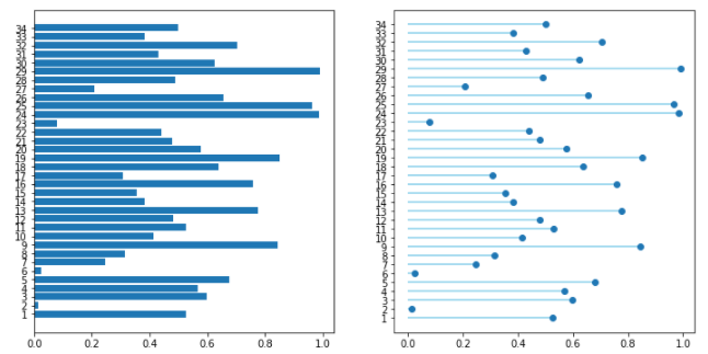
A lollipop chart is a data visualization tool similar to a bar chart but with the shape of a lollipop. It shows data points at the end of a line that attaches to the chart’s baseline. This chart effectively compares values from a small data set where numbers aren’t very far apart. It makes it much easier to understand the differences in these values at a quick glance. These charts are best used when you need something the provides a simple look and wants to highlight the comparability of certain data points. These types of charts are also very good if you want to emphasize a certain data point. This is because you can highlight or change the appearance of each data point to make it stand out more or less. The given example shows different types of devices and how much online data they use. While some data points there are obvious differences. Some with closer values can be hard to distinguish without this chart.
Lollipop Charts
What is a Lollipop Chart?
A lollipop chart is another way to make lengthy bar charts less visually overwhelming. It is very similar to your standard bar chart, just without the “extra ink.” Instead of using a solid bar, the data is visualized using a lollipop shape (a thin line with a circle on top). After all, the main focus in a bar chart is the endpoint. The lollipop chart allows viewers to easily digest the data by focusing in on the values.
Examples…
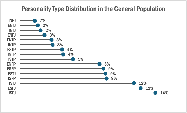
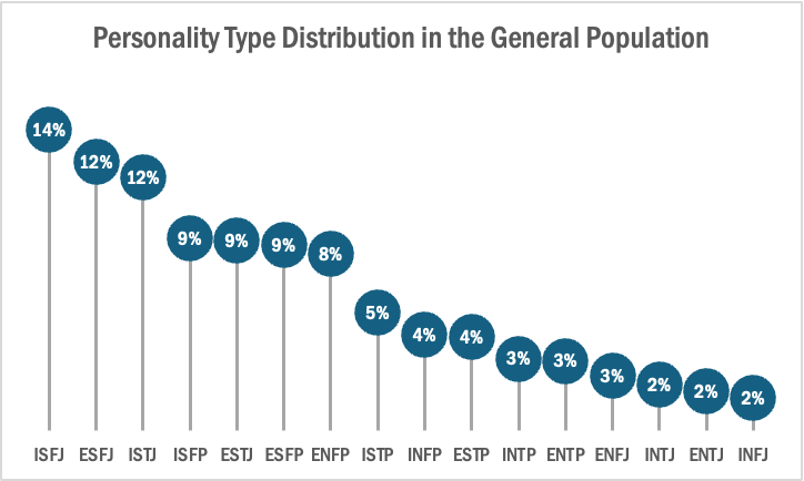
The two images above are examples of lollipop charts that I created. The data shows the percentage of each MBTI personality type within the general population. Lollipop charts can be both horizontal or vertical. The main point of the graph is to focus in on the endpoint values. I created my charts in Excel, and provided hyperlinks to my spreadsheet which includes my data and formatting. The vertical version was definitely easier to create. It only took a couple minutes, while the horizontal version had more steps and precise settings.
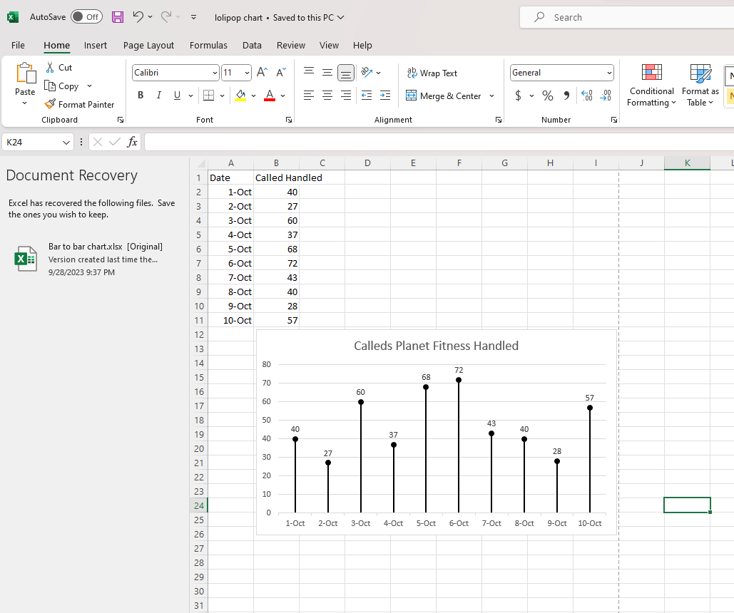
How to create a vertical lollipop chart:
- Insert a line graph with markers
- Delete the line
- Add Drop Lines
- Add data labels to center of markers
…and that’s it!
When to use a Lollipop Chart
A lollipop chart can be used for any kind of data that would work in a bar graph. It is simply an alternative that is more simplistic. Its “ink-friendly” design can impact readability of the data and lead to faster response times and greater accuracy (Gillan & Richman, 1994). It is especially useful when the visualization includes many data points that can become overpowering due to the solid bars.
Lollipop Chart
Lollipop Charts are used to compare objects or groups the same way that bar or column charts do. So why not just use a bar chart? Lollipop charts are a great way to make longer bars less visually distracting by removing the ink from actual bars themselves and highlighting the key data being portrayed. That has been some research conducted (Blasio &Bisantz, 2002) that supports that ideology and that by making a more ink friendly design can impact readers ability to interpret the data and lead to faster response times.
Lollipop charts are derivates of more commonly known charts and can be created by modifying a scatter chart or line with marker charts. While this may be a little more complex and require you to have a better understanding of excel it is a great tool to add to the toolbelt. They are essentially a large dot with a tail attached to it which is adjusted based on the height of the bar.
It a normal everyday practical use like the chart below they can very easily highlight the end point data you are looking for without the other distractions. Below is a chart of the average points allowed per game by NFL teams so far this 2024 season. The NFL has 32 teams in it and to have a thick column or bar chart could lead to the bars being closer together and more difficult to read. By eliminating that we can clearly see the data that we are focused on looking at.
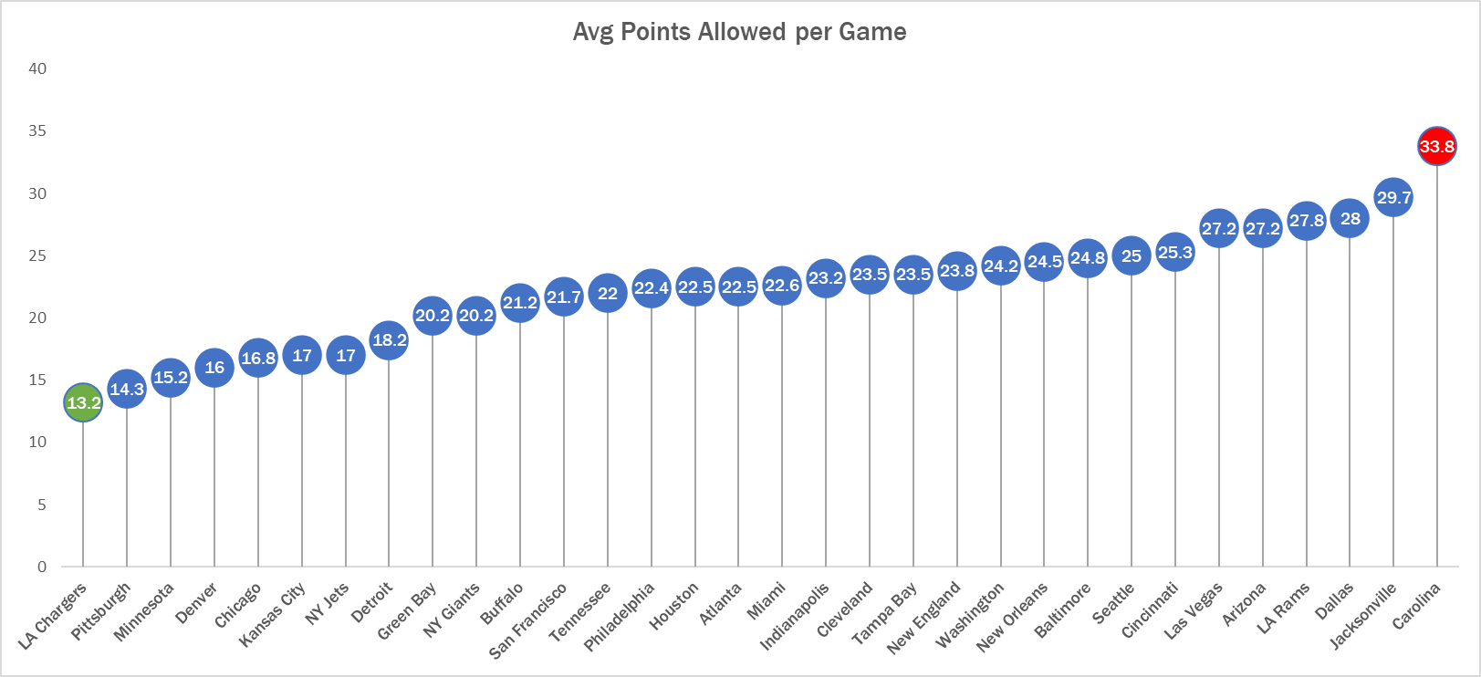
See! Super easy to read. Here we can clearly see that the Carolina Panthers are allowing the most points in the NFL while the LA Chargers are allowing the least. Simple but very effective.
Lollipop Chart
Lollipop charts are used to compare several objects or groups, similar to the purpose of bar graphs. They can be very useful in analyzing and visualizing trends. A lollipop chart can work well for comparing the values of different groups while accentuating individual data points, especially if some values are extremely high or low. They make it easier to identify deviations or substantial differences between data points. Lollipop charts should not be used for distribution or relationships in data. The Lollipop chart that I created in excel is shown below.
Lollipop charts are modified bar charts with dots representing points and thin lines for bars so that more data may fit in a smaller space. A lollipop chart is a good option for placing or focusing on specific values within a dataset because it minimizes visual clutter from crowded bars. The line helps guide the viewer’s eyes directly from the data labels on the x or y-axis straight to the data point value. The image shown below is a good example of how sometimes bar graphs can look cluttered with too much data. Using a lollipop chart takes some excess color off the screen making it easier to visualize the values of each data point for analysis or comparisons.
Unveiling the Power of Pie Charts in Data Visualization
The Strength of Pie Charts
Pie charts are like the unsung heroes of data visualization. They might appear humble, but their ability to convey the composition of a whole is unmatched. They shine when you need to represent percentages and proportions, making it easy to grasp the distribution of elements. For instance, in a recent project, I employed a pie chart to showcase a company’s revenue breakdown by product category. The result was a clear and accessible snapshot of each category’s contribution to the total revenue.
When to Use Alternatives
While pie charts have their merits, it’s crucial to recognize when to opt for an alternative chart type. Bar charts are more effective when comparing many categories, and line charts excel at illustrating time-series data. In cases with numerous subcategories, stacked bar charts or treemaps might be the better choice.
Designing a Winning Pie Chart
To create an impactful pie chart, follow a few design principles. Use labels to identify each segment, explode important segments for emphasis, limit your color palette, avoid 3D effects, and add a legend if needed. These tweaks ensure clarity and readability, making your pie chart an engaging and comprehensible tool for data presentation.
In a world where data speaks volumes, mastering the art of pie chart design is a valuable skill for college students and aspiring data analysts. It’s simplicity combined with its versatility makes it a go-to choice for visually representing data. By understanding when to use a pie chart, and by adhering to these design principles, we can present data effectively and be well-prepared for the data-driven challenges of tomorrow.
Example
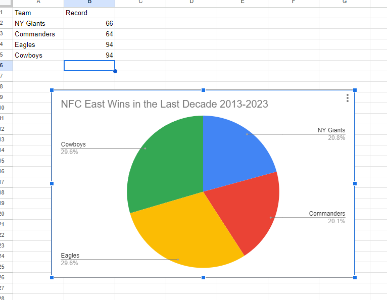
I made a pie chart on the NFC East in the NFL of choice to visualize the data. The chart effectively conveys the distribution of wins among the four teams in the division: the NY Giants, Washington Commanders, Philadelphia Eagles, and the Dallas Cowboys. This choice is compelling because it simplifies the complex data by visually showcasing how each team’s wins contribute to the whole, which, in this case, is the total wins in the division over the specified timeframe.
The pie chart excels when there’s a limited number of categories, which aligns perfectly with our scenario of only four teams. This ensures a clear and straightforward representation, making it easy to understand the proportions of wins each team has contributed. For viewers, this pie chart serves as a quick and intuitive way to gauge the performance of each team in the NFC East during the past decade.
By Shaun Sneddon
Lollipop Charts
A lollipop chart is a novel spin on the classic and universally appreciated bar chart. Applicable in the same situations as the illustrious bar chart, lollipops serve the same purpose but have the added benefit of cutting back on unnecessary clutter. When your data has a large number of data points being compared or you’re just aiming for a simpler visualization (that saves on ink!) a lollipop chart stands out as a strong alternative.
Some research (Blasio & Bisantz, 2002) even shows that lollipop design can lead to faster response times and greater accuracy (Gillan & Richman, 1994). Some other studies have shown (Inbar, Tractinsky & Meyer, 2007) that lollipop charts are not viewed as visually appealing as the timeless bar chart. As time goes on and these new minimalists styles of data visualization command more mainstream use, who knows what the future holds?
Below is a chart showing the percent of National GDP each of the top ten states makes up:

A simple, no-frills method that shows the single important value for each data point clearly and quickly, that is the strength of the lollipop chart.
Lollipop Graphs
By Shaun Sneddon
Unveiling the Lollipop Chart: A Sweet Way to Visualize Data
In the world of data visualization, a lollipop chart stands out as a charming and efficient tool. It combines the best of bar charts and scatter plots to make your data pop. In this post, we’ll explore what a lollipop chart is, when you should use it, and we’ll create one together.
What’s a Lollipop Chart?
Imagine a vertical line (the “stick”) with data points as markers (the “candies”). This is a lollipop chart! It’s ideal for showcasing a handful of data points, ranking items, highlighting outliers, and tracking changes.
When to Use Lollipop Charts
Few Data Points: If you have a small set of data to compare, a lollipop chart simplifies it elegantly.
Outliers: It’s great at spotting unusual data points that stand out.
Rankings: Show rankings or positions in a dataset clearly.
Changes Over Time: Use it to track how data changes over time or across categories.
Data Distributions: Combine it with other charts to display data distributions.
Creating a Lollipop Chart
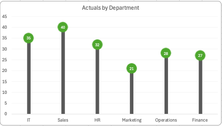
For our example, let’s track the quarterly sales of three products – A, B, and C.
Input Data: Use your preferred data tool, like Excel or Google Sheets. Create columns for “Product” and “Sales.”
Design the Chart: In your tool, use a bar chart or scatter plot. Make the data points circular (or use candies).
Customize: Personalize your chart by adding labels, changing colors, and adjusting the size.
Titles and Legends: Don’t forget to label your chart correctly.
Conclusion
Lollipop charts are a delightful way to make data more appealing and understandable. They shine when you want to highlight key points, compare a small dataset, or reveal outliers. So, spice up your data visualization and give lollipop charts a whirl!
SNL SCREENTIME STATS
By John Wickham
One of things that I do when I work on something is to try to put numbers into the things that I enjoy watching. For example, sometimes when I watch an episode of television is tracking to see how much screentime they have in an episode. This helps really show the importance of each cast member in the whole of show. However, until I was unsure of how to best display this data in a form to enjoy, until I read this chapter
The chart below shows the percentage of time each cast member was on screen in the very first episode of Saturday Night Live. The original cast (Laraine Newman, Jane Curtin, Dan Aykroyd, Garrett Morris, Chevy Chase, Gilda Radner, John Belushi and the short-term cast members George Coe and Michael O’Donoghue) was a boom in the 70’s comedy scene. Without them, both comedy and modern SNL would not exist to this day. However, it is hard to get a picture of the impact on the actual show.
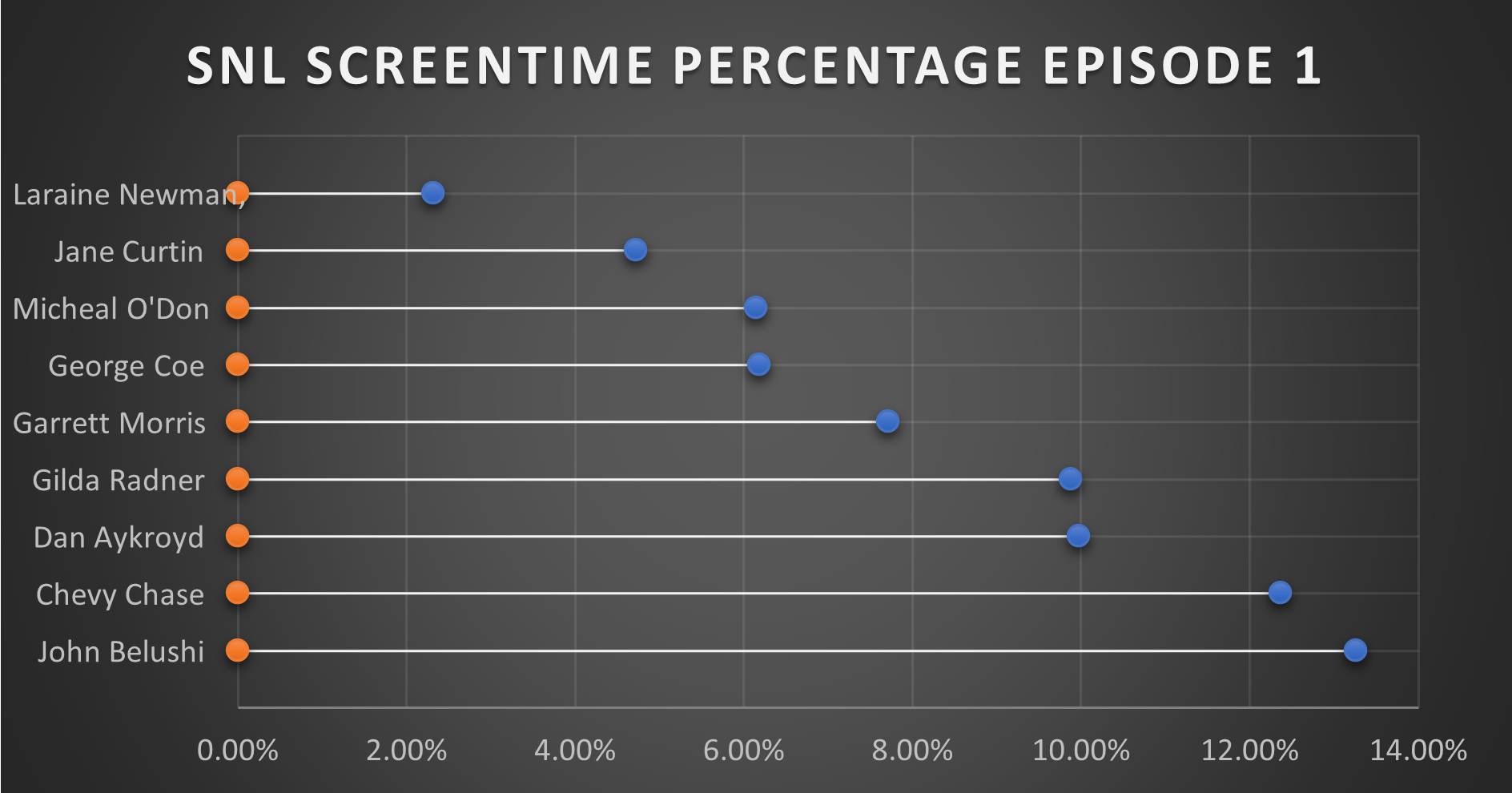
This is where this chart comes together in a quantitative fashion. From the data, you can see that John Belushi, Chevy Chase, Dan Aykroyd, and Gilda Radner where the frontrunners right away. Those would be the major stars on the show, and even in episode 1, the show had some faith in them. The other cast members had some work.
It is interesting that George Coe and Michael O’Donoghue (cast members who would be off the show in episode 5) had a decent amount of screen time in these first episode. Even more than long-term cast members Jane Curtin and Laraine Newman. It is a very interesting figure in the history of Saturday Night Live.
You can watch the first episode of Saturday Night Live on Peacock.