Home » Posts tagged '#Infographics' (Page 2)
Tag Archives: #Infographics
Using the Visualizing Health tool
The website titled “Visualizing Health” is a scientifically vetted tool created by the University of Michigan in order to help healthcare professionals and others alike to communicate data about health. It contains graphic displays of health data through different types of visuals and imaging. It’s goal is to assist audiences in making informed decisions about their health, and also helps aid healthcare professionals in their efforts to seamlessly communicate health risk information to the public.
The website makes it accessible and shares an easy-to-use guide on how to create data visualizations. Below, I have made one as an example based on information from the World Health Organization. This is one of the many ways these tools can be used to communicate data to an audience.
VizHealth – The Uses of Infographics for Public Information
It is important for people who know how to read data to understand how privileged they are when assessing public information. Although, luckily, sometimes information is displayed in a way that is easily digestible to the average person, sometimes there are graphics involved that are aimed to convey information, but they are not easily understood by those who are not well-versed in data or graph reading.
Luckily, sites such as VizHealth give users the opportunity to learn in real time the ways that information can be displayed in an infographic. Using the risk calculator, individuals can input their own personal information and get an easily assessable visual of their personal risk for cardiac disease. The additional explanation under the bar graph aids in the user’s understanding of this tool.
As you can see, the layout of the graph that is displayed above is user-friendly and can be easily understood. Simple coloration is used and the information that is pertinent is magnified and displayed in a bold font, which draws the attention of the viewer.
Icon Array Generator
VizHealth offers an additional service which offers users the chance to visualize statistics. Through multiple google searches, I assessed the prevalence of multiple ailments that plague the American population today. By seeing how many individuals out of 100 were liable of contracting certain diseases, I was able to log this information into the Icon Array Generator of VizHealth’s website. This provided me with a well constructed, easily digestible graph of the statistics that I had previously input. Below you can view the graphs that I (with the help of the icon generator) made to display the prevalence of Alzheimer’s disease (in individuals over 85), prostate cancer in men, and breast cancer in women.
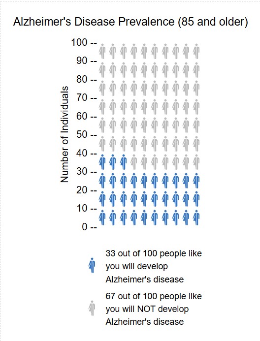
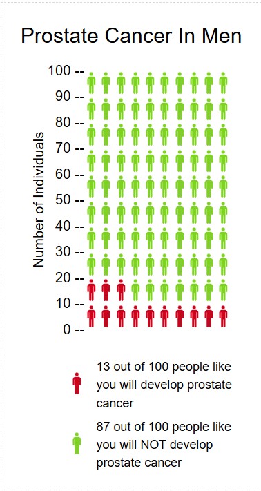
Through using this icon generator, I do believe that it is a useful tool to display variables that have an effect on the public. The ability to display icons in a male, female, or neutral way (with the availability to apply different coloration to the icons) makes VizHealth’s icon generator feature a personally customizable platform for the general public to learn more about how they can assess data.
Icon Array
After exploring this website for quite some time, I would say it definitely opened up a new perspective on infographics for me. To a beginner, this website can be extremely valuable for learning about infographics. After experimenting with the Icon array feature, I have created an infographic regarding the number of golfers who are likely to hit a hole in 1 in their lifetime.


Podcast: Play in new window | Download
Examples Of “Good” Infographics
Infographics are a great tool for learning, retaining information, and organizing data sets to efficiently display information. There are infographics that can be considered “good” and some that can be considered “bad”. In this blog post I will share what makes a good infographic.
A good infographic often presents complex data into a more clear, simple, and concise way. A good infographic should use its visuals to help the audience interpret the main ideas through storytelling. Most importantly, a good infographic should be useful to the viewers.
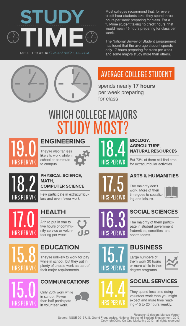
In this infographic on which college majors study the most, takes data that would most likely be very complex on a data sheet, and turns the data into a concise yet comprehensive story that displays the information readily available to the audience. This infographic is clear, easy to interpret, and tells the story on study times. Above all, it is useful information to the intended audiences.

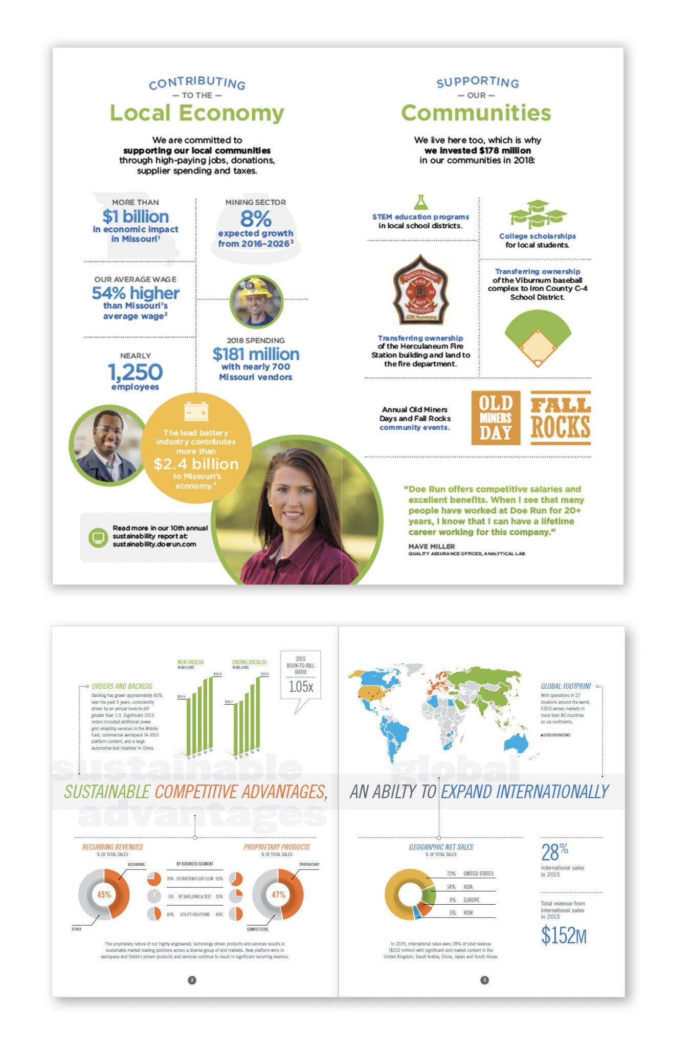
This is another example a good infographic, that displays information clearly, effectively, and is useful to the intended audiences. It tells the story of students and what their weeks consist of. It utilizes good visuals that help the reader interpret the data effectively, making it a memorable visual.
These graphs are great examples of insightful infographics. They’re useful, clear, effective, and display comprehensive data sets that are now easily interpreted by the audience. This is what every good infographic should look like.
Sources
Visualizing Health
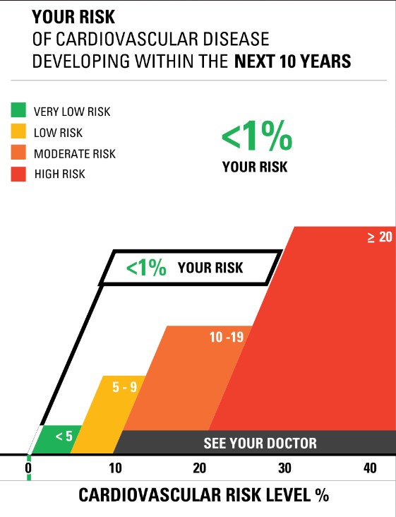
This week’s chapter in Effective Data Visualization is all about the importance of a single number. Chapter 2 explains that sometimes all we really need is for people to remember one important number because the number itself is impactful.
Risk Calculator
The Risk Calculator on VizHealth.org is a great example of the importance of a single number. It was very easy to input your information, and the calculated results display an effective visualization on your risk of developing cardiovascular disease within the next 10 years. When the results popped up, I immediately looked at the percentage for my risk. The number was big and bold, immediately attracting my attention. I believe this was the creator’s intent, so I would say they were successful in making an effective visualization.

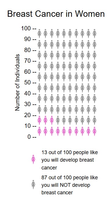
Icon Array Generator
Another useful tool in creating an effective visualization is the Icon Array Generator on VizHealth.org. I was able to quickly input data and easily navigate through the various editing options. This is a great way to display a percentage because it clearly maps out the amount of people out of 100 that are at risk for a certain condition. You can adjust the quantity, gender, and color of each outcome value as well as adjust the labels for the Y-axis, legends, and title.
If I could change one thing about this generator, it would be to have the ability to edit the “default outcome value.” This website is meant to effectively communicate health data and risks, and I believe some data would be more effective out of different numbers such as 10, 20, etc. For example, in my Visualize a Big Number assignment this week I displayed the same data on breast cancer risks in women. Instead of showing 13 out of 100 women (as seen above), I wrote “1 out of 8.” In my opinion, 1 out of 8 seems like a lot more than 13 out of 100. Women may be more apt to get screened if the ratio is more impactful. I believe this minor change would positively help communicate health data.
Infographics


This is a great infographic of one of my favorite vegan restaurants to go to whenever I’m in Atlanta, Georgia. This restaurant promotes a healthy lifestyle of eating a plant-based diet that is not only good for the body, but good for the earth as well! Lol, TRY to be MATURE and MOVE PAST THE NAME, the name of its menu items, and what it might imply, and moreover FOCUS on its TRUE MESSAGE!!! https://sluttyveganatl.com/
Podcast: Play in new window | Download
Infographics
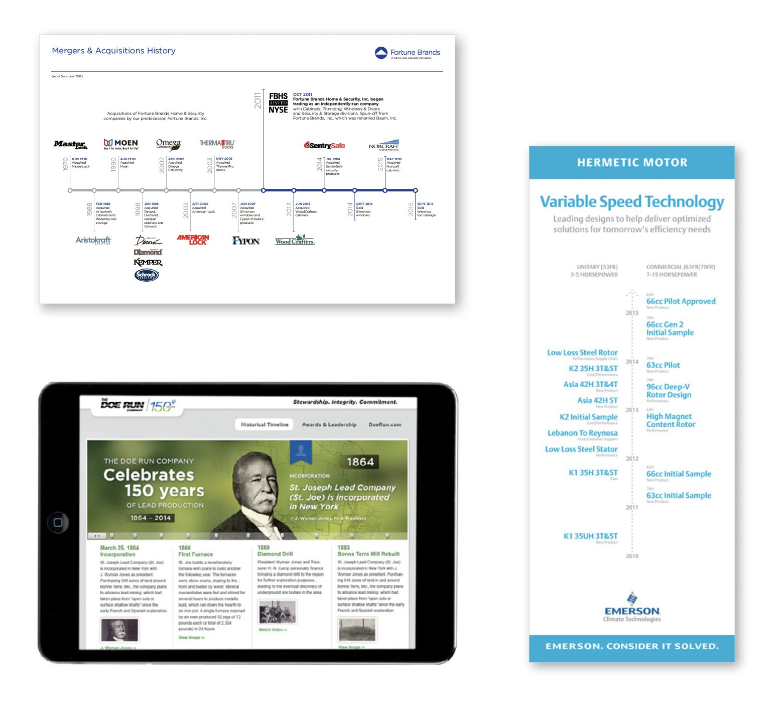
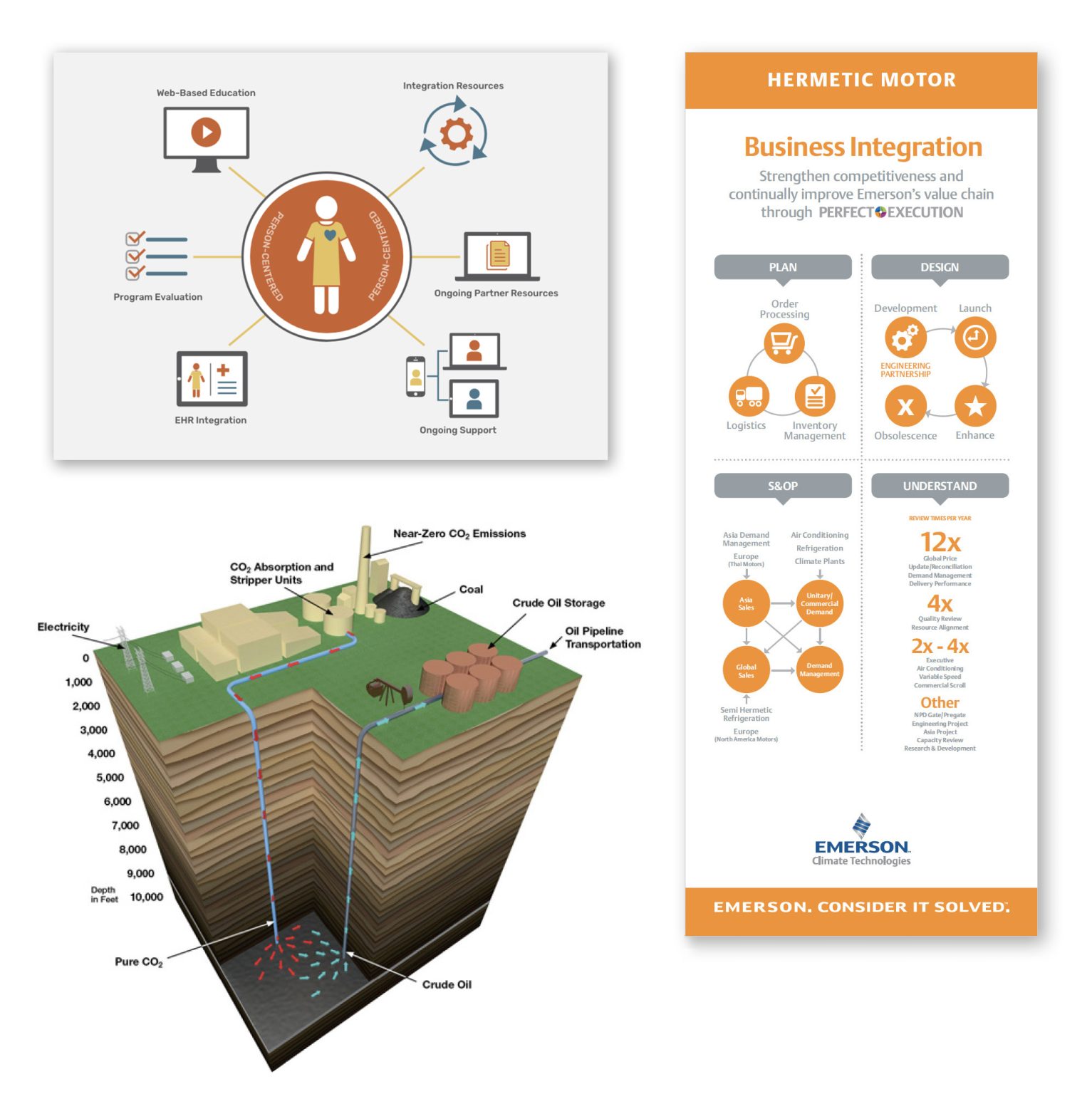
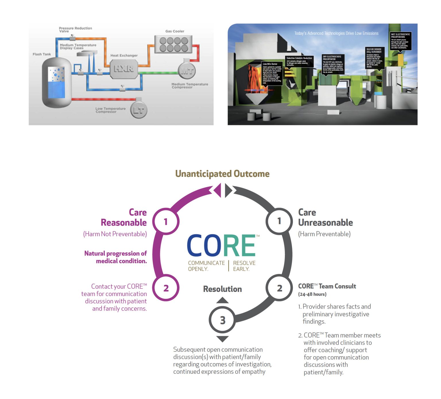
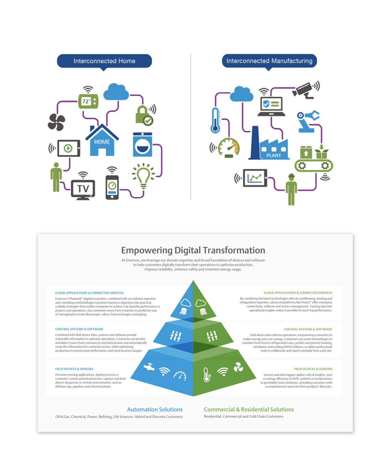
Examples of Insightful Infographics
Robert Kosara shares in Visualization Criticism- The Missing Link Between Information Visualization and Art, that there are many different classifications in data visualization. However, the following criteria are a minimal set of requirements for any visualization: information is based on (non-visual) data, it produces an image, and the result is readable and recognizable. There are many different examples of insightful infographics within this general definition, and below I will share a few common types of infographics that can be insightful and help convey a message to an audience efficiently and effectively.
- Mixed Charts Infographics
2. Informational Infographics
3. Timeline Infographics
4. Flow Chart Infographics
5. Process Infographics
6. Comparison Infographics
7. Location Infographics
8. Photographic Infographics

9. Hierarchical Infographics
10. Interactive Infographics
All of the infographics listed above are different types of commonly used infographics. It is important to note that these are all from one website, and there are many other infographics that are commonly used to convey information.
Sources:
R. Kosara, “Visualization Criticism – The Missing Link Between Information Visualization and Art,” 2007 11th International Conference Information Visualization (IV ’07), Zurich, Switzerland, 2007, pp. 631-636, doi: 10.1109/IV.2007.130. keywords: {Art;Data visualization;Bridges;Computer science;Visual communication;Computer graphics;Handicapped aids;Mice;Joining processes;Concrete},
Prow, B. (2024, July 24). Common types of infographics and when to use them. OBATA. https://obata.com/10-types-of-infographics/
Infographics

This is an example of an insightful infographic. This infographic is for if you get into an accident and you don’t know where to start. These help people in Panic mode, but also people who do not speak the languages in your country. It is also for people who can’t see very well or read well. These pictures are to help a person understand what they are trying to say without saying anything at all. You can find this and more examples of insightful infographics here.
Tools to Help Construct Infographics
Infographics turn data into an appealing visual that is easily comprehendible. It has become an increasingly popular tool in presenting data. Here are a few online tools to construct a good infographic.
Canva

Canva is a free and easy-to-use design tool. It has an infographic creator where users can choose from hundreds of templates. Each template has many options to add information and customize your own visual. They offer millions of stock photos or you can upload your own. Along with infographics, Canva offers tools to create presentations, logos, videos, business cards, brochures, flyers, and many more.
Piktochart

Piktochart is another great tool for creating infographics. The basic plan is free, and they offer a premium plan that starts at $14 per month. It is a great way to turn complex data into a clear data visualization. They have a gallery of over 230 unique infographic templates to choose from. From charts, graphs, interactive maps, and many more. You are also able to create custom color palettes as well as upload fonts into the editor.
Visme

Visme is a platform for creating infographics, presentations, branded documents, data visualizations, videos, and more. It is an easy and effective way to get data across. Users can choose from an array of templates and mix and match designed content blocks to customize their results. There are thousands of templates and over a million stock photos to choose from. The basic membership is free, and they also offer a premium plan starting at $12.25 per month.
Podcast: Play in new window | Download
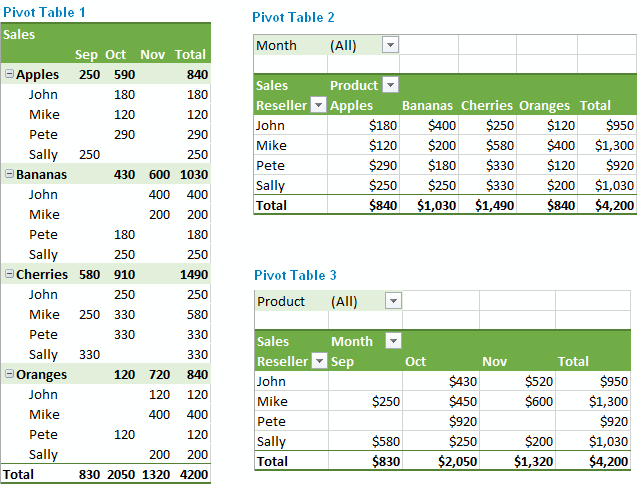
Demystifying Pivot Tables: A College Student’s Guide to Data Analysis
Introduction:
Just a little bit of interest and a desire to try something new will do; coding is not anything to be concerned about. We’ll dispel common misconceptions about pivot tables, go over their applicability, and demonstrate how to utilize them to make an impression on potential employers and teachers in this blog post.
What Makes Pivot Tables So Special?
“How on earth do I make sense of all this?” is undoubtedly on your mind as you look at this enormous spreadsheet filled with figures. Presenting pivot tables, your newfound ally in the data analysis space. You can organize and summarize your data using these useful tools without having to be a Ph.D. spreadsheet expert.
How Do They Work?
Think of pivot tables as virtual LEGO blocks for your data. You can drag and drop your columns into different areas to create a customized table that highlights the trends and insights you’re looking for. It’s like magic, but for data geeks like us.
Cool Features You Need to Know:
Summarize Like a Pro: Want to know the average, sum, or count of your data? Pivot tables have got you covered.
Filtering Magic: Zoom in on the stuff that matters by using filters to focus on specific data points.
Grouping Goodness: Let pivot tables do the heavy lifting by automatically grouping your data by date, category, or any other field you fancy.
Make it Pretty: Customize the look of your data with formatting options. Impress your friends with a sleek and professional-looking report.
Real-Life Applications for College Life:
Grade Analysis: Wondering which classes are your strong suits? Pivot tables can help you break down your grades by subject or semester.
Budget Crunching: Keep track of your spending habits by categorizing expenses and creating a budget overview.
Extracurricular Excellence: Use pivot tables to analyze your involvement in clubs, sports, or other activities. Spot trends and areas where you can level up.
Conclusion:
Pivot tables might sound a bit intimidating at first, but trust us, they’re a game-changer for anyone dealing with data – and that includes you, college student! As you navigate through your academic and personal life, having these skills in your toolkit will make you stand out. So, grab that spreadsheet, give pivot tables a spin, and get ready to conquer the world of data analysis with confidence!