Home » Posts tagged '#Infographics'
Tag Archives: #Infographics
Infographics

This is an example of a mind map that can be made on a tool called Canva. Canva helps create info graphics. These graphics just don’t stop at minds it also expands further making charts, and diagrams. This tool makes it easy to map out where you would like to set elements to make your graphic easy to understand and fun to look at!
Sankey Visualizations
The Sankey Energy Data Visualization shows energy systems and it’s flows. It provides additional information on each category and is interactive.

After looking through this visualization for a while, I think that it is very effective for representing a basic knowledge of energy flows. I think anyone could look at this data and understand what it means.
At first, while looking at this data it seemed like a lot of lines that I could not tell where exactly they went. Making this chart interactive was a great decision by the makers because it clarifies where the lines are going, and provides additional information.

The only critique I have for this visualization is that I wish it would have provided more information and visuals on energy losses. Maybe a hyperlink with an additional visualization about energy losses and where or when they occur.
Sankey Visualizations
Needtoknow.nas.edu provides many visualizations about energy usage in the United States. I learned that the flow of energy in the U.S. is complex and comes from numerous different sources. More than half of energy supplied is lost as waste heat or through inefficiencies.

This Sankey visualization breaks down our energy system from the source all the way to its usage. As you can see, Oil is the largest source of energy with a total output of 36% and total CO2 emission of 43% in the U.S. Although this visual is interactive and provides a large amount of information/data, I find Sankey visualizations to be difficult to interpret. There is a lot of data being displayed within a single visual, and it would be more effective to break it down into multiple different visualizations. For example, the data regarding % of Total Output and % of Total CO2 Emissions could be visualized as a Side-by-Side Column Graph. Another example could be the use of a Pie Chart to compare the % of energy used and unused.

This visual of Lumens per Watt for different types of lightbulbs is highly effective. The visualization clearly shows which lightbulb they are talking about and its lm/W. Viewers can interpret the graph efficiently due to its simplicity. This particular chart is a good example of a Large Number With Icons, as we have learned in the textbook.

Another good visualization is this Back-to-Back Bar Graph displaying the efficiency of energy on the road. You can compare energy used, gasoline burned, CO2 vented, and fuel economy between the two different types of vehicles. Again, the simplicity of this chart makes it more effective.
I believe this site would highly benefit from simplifying their visualizations. The data they want to explain would be easier to interpret, therefore, more effective if they were to take a more minimal approach.
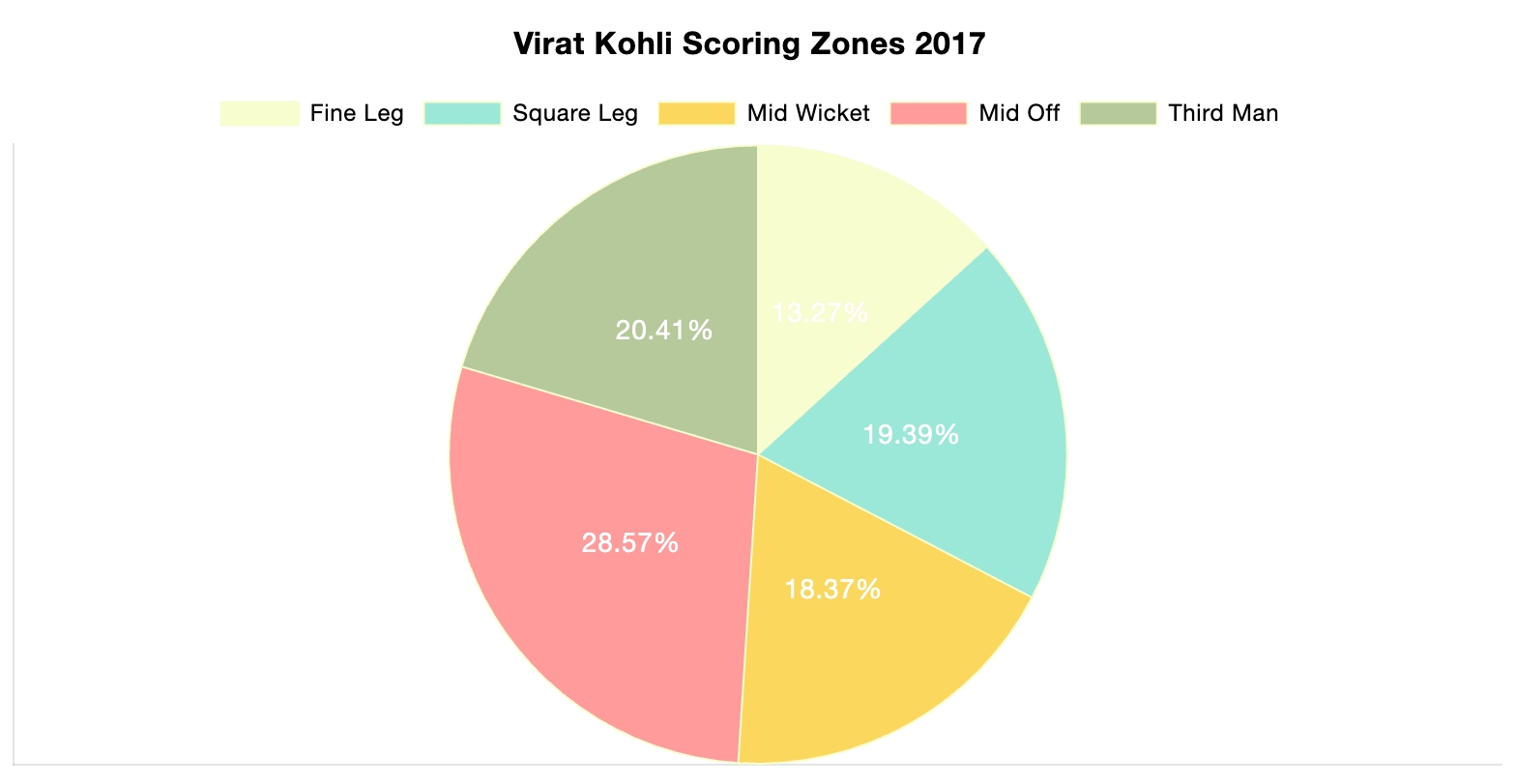
Pie Charts

Shown above is a pie chart I created based on the percentages of total energy use. Knowing when to use a pie chart can be a difficult skill to master. The following link including provides evidence as to why this type of chart is best for this data. The given data set represents different parts of whole adding the percentages of each data variable adds up to 100% as a whole. Additionally, a pie chart shouldn’t be used when you have too many different data points. This infographic only uses 5 which means a pie chart is a perfect fit for this data set. This pie chart has the appropriate amount of data points and data labels to make it effective at relaying this information to the reader.


Podcast: Play in new window | Download
Pie Charts
What is a Pie Chart?
A Pie Chart is a common type of visualization that demonstrates parts of a whole. Each section represents a value in relation to the entire composition. The slices should be proportionate to the amount in each data set so that the viewer can compare each section by size to determine its value.
When should I use a Pie Chart?
A Pie Chart is a great visual for a part-to-whole relationship. It should be used when displaying the “percent of…” or “part of…” something. StorytellingWithData provides two primary use cases for a pie chart:
- having a general sense of the part-to-whole relationship is more important than comparing the precise sizes of the slices
- to convey that one segment is relatively small or large in comparison
The percentages should sum to 100% so that the visual is relative in size to its value.
The Perfect Pie
I created the “perfect pie” in Excel using 2024 Coffee Statistics by DriveResearch. I will break down what makes this a perfect use case as well as design tips for creating an effective pie. You can click on the image below to open my Excel spreadsheet.
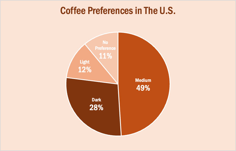
The data in this set is great for a pie chart because it equals 100% and one value is significantly larger than the others. It is also split up into 2-5 categories which is not too overwhelming for the viewer. The coffee preferences are all parts of a whole, making a pie chart the best choice over bar charts and other visualizations. To make it aesthetically pleasing to look at, I used different shades of brown throughout the entire chart which correlates with the coffee theme. I deleted the legend for a more minimalistic appearance, which the author of our textbook reiterates throughout each chapter. Because the values for Light Preference and No Preference are very similar, I added data labels to each segment so it is easy to comprehend. I also increased the font size for the numbers to make them stand out. Stephanie D.H. Evergreen suggests “unwrapping the pie” by making the largest slice start at noon and run clockwise in descending order (as seen above). When creating this chart, I was sure to avoid 3D and exploding effects in order to increase legibility. For more information, I suggest checking out this article on Tableau, which provides more examples of effective and ineffective pie charts.
Lollipop Charts
What is a Lollipop Chart?
A lollipop chart is another way to make lengthy bar charts less visually overwhelming. It is very similar to your standard bar chart, just without the “extra ink.” Instead of using a solid bar, the data is visualized using a lollipop shape (a thin line with a circle on top). After all, the main focus in a bar chart is the endpoint. The lollipop chart allows viewers to easily digest the data by focusing in on the values.
Examples…
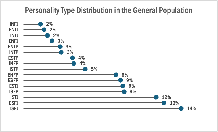
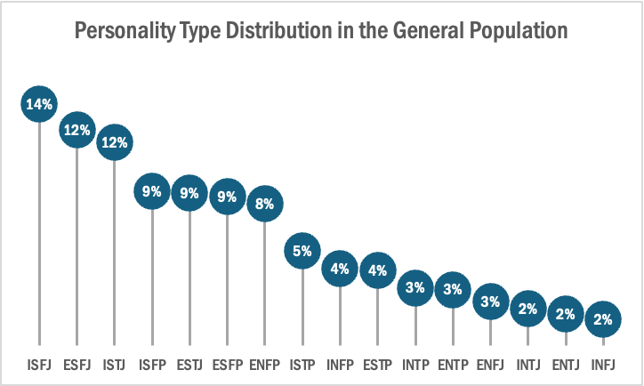
The two images above are examples of lollipop charts that I created. The data shows the percentage of each MBTI personality type within the general population. Lollipop charts can be both horizontal or vertical. The main point of the graph is to focus in on the endpoint values. I created my charts in Excel, and provided hyperlinks to my spreadsheet which includes my data and formatting. The vertical version was definitely easier to create. It only took a couple minutes, while the horizontal version had more steps and precise settings.
How to create a vertical lollipop chart:
- Insert a line graph with markers
- Delete the line
- Add Drop Lines
- Add data labels to center of markers
…and that’s it!
When to use a Lollipop Chart
A lollipop chart can be used for any kind of data that would work in a bar graph. It is simply an alternative that is more simplistic. Its “ink-friendly” design can impact readability of the data and lead to faster response times and greater accuracy (Gillan & Richman, 1994). It is especially useful when the visualization includes many data points that can become overpowering due to the solid bars.
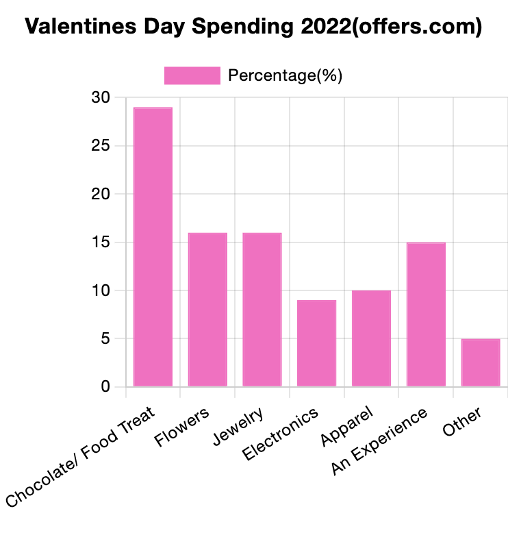
Comparing Numbers
The photo above is included in the linked article of this post. The article demonstrates the importance of using the correct infographic when comparing different data sets. It discusses the importance of making comparison charts, the best types of data comparison charts, and when to use each type of chart. One of the most commonly used comparison charts is the pie chart which is shown above. Pie charts are most effectively used when comparing sizes or percentages of numbers within a single data set.
Podcast: Play in new window | Download
Examples of insightful data visualizations that compare numbers + Tools that may help us construct visualizations that compare numbers.
Lamar Miller
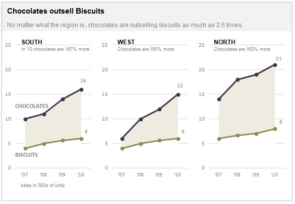
Here I found an informative article on making Small Multiples. This chart type stood out to me in Chapter 3 of our text not because of its design but the purpose behind the design. In our text, it explains the human psychology behind why the Small Multiple visual must be constructed in a way so it can be quickly interpreted with accuracy. It stated that eye-tracking studies show that people see a set of line graphs like the one depicting chocolate sales vs biscuits as one chunk. This style of visual is clearer than putting all lines in one graph which creates a confusing cluster of data points. This style also allows an illustrator to compare more than two pieces of data while maintaining visual cohesiveness. The key here is to ensure all lines along the X axis are symmetrical and that the Y axis numbers are mirrored within each subsequent data set so that an audience can see the comparison being made.
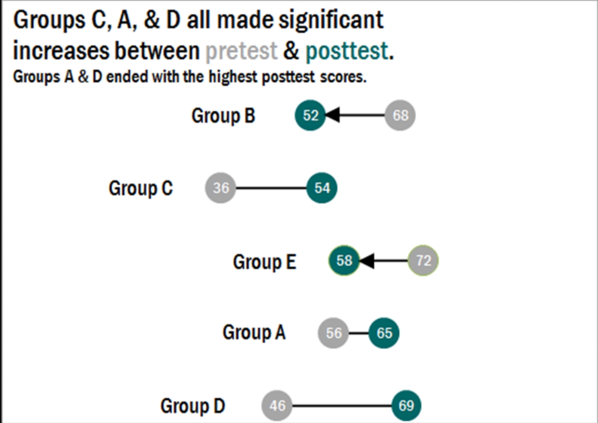
Here I found a step-by-step process on how dumbbell plots are constructed and a useful visual when comparing numbers. The main difference between the dumbbell plot and the standard dot plot is that the line connecting two data points emphasizes the distance between the data being compared. This helps an audience scan a graphic quickly and interpret the visuals intended purpose or story. This type of chart stood out to me because it’s a concise way of comparing two or more numbers across multiple groups or regions. The chart shows groups from A through E and their scores both pretest and posttest. This can be beneficial when segmenting groups of people to conduct case studies.
Comparing Numbers
Examples of Insightful Data Visualizations that Compare Numbers
Data visualizations can be a great tool to use when comparing numbers. Comparing numbers can show many different stories, including the following examples:
“Option A is better than Option B”
“Posttest scores are higher than pretest scores in almost all subject areas”
“Group F and Group G disagree on five of the eight measures”
“There were no differences between the treatment and control groups”
“Youth rates are significantly lower than adult rates”
“We have equal participation from boys and girls with the exception of girls ages 10 to 13”
“All sites increased performance, but Site L did so at a faster rate than other sites”
“The performance of Class L is in contrast to Class K”
Results such as these can be shown in various types of charts. Below are some examples of insightful data visualization that compare numbers.
- Pie Chart

2. Bar Chart
3. Histogram

4. Line Chart

5. Doughnut Chart

6. Overlapping Area Chart

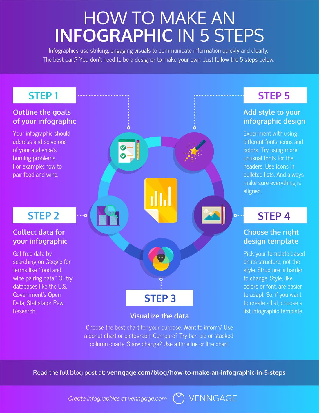
Tools for Constructing a Good Infographic
An information graphic is an assortment of graphics, data visualizations, and brief text that provides a clear summary of a subject. Infographics are easy to make and are the perfect balance when dealing with an abundance of information. In this blog post I will show examples of good infographics that provide a clear message without overloading information.
Clicking on the Infograph below will take you to the website where I found it!
Infographics may be used for many purposes. You may share them on social media and post them on your blog. When creating an infographic, there are several internet resources available to assist. During this procedure, there are few stages that you should not skip. Creating an infographic outline, selecting a template, and adding your own customizations to your infographic are all important steps in creating a useful infographic.
Clicking on the Infograph below will take you to the website where I found it!