Home » Posts tagged '#DataVisualizations' (Page 4)
Tag Archives: #DataVisualizations
Pie Charts
Pie charts, when done the right way, can portray some of the simplest data in a very uniform and easy to comprehend way. The easiest data to portray using a pie chart would be data that represents “parts of a whole”, but this is not the only data that can be used in a pie chart. We can also use percentages to show contributions to a whole. One of the most important things to remember though when creating a chart to show this type of relationship, is that the data values within the pie chart must always add up to 100. It is also important to remember that pie charts, as well as any other chart or infographic, are used to tell stories. Because of this, we have to remember to keep the story as straightforward and concise as possible. Always remember to keep your infographics as clear as possible and to not jumble too much information or design in the graphic.
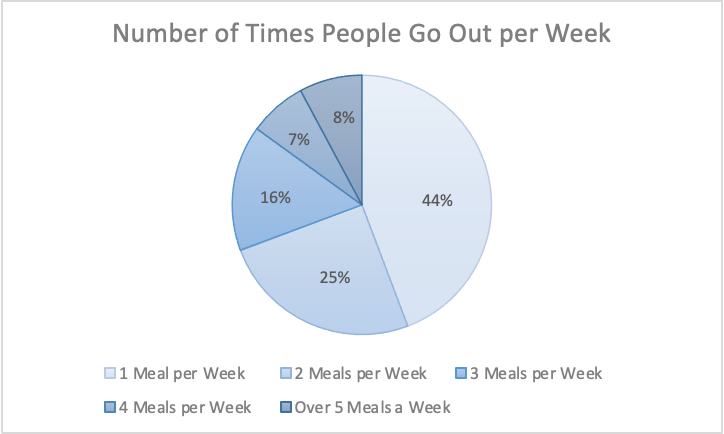
The information I gathered was from a study done of 626 restaurant goers, asking how many times a week they go out to eat. This information gathered from Tasting Table, I believe is best suited in a pie chart because it was presented to me in percentages of people. Percentages are easiest represented in a pie chart because it represents part of the 626 people surveyed.
Link to study: https://www.tastingtable.com/912246/new-survey-shows-how-often-people-typically-eat-out/
Pie Charts
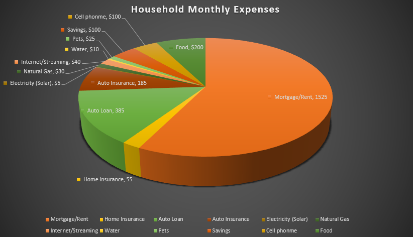
I felt a pie chart was an ideal choice to show monthly household expenses. It provides a clear and visually appealing way to represent various expense categories within a budget in proportion. Viewers can quickly identify the larger and smaller slices, thus providing immediate understanding where the money is going. You are able to make comparisons and it helps with seeing where spending is a priority and make informed decisions. I referred to From data to Viz | Find the graphic you need (data-to-viz.com) which helps you choosing an appropriate graph for your data and excel itself had tutorials that walked you through choosing correct pie chart. I also think a bar chart could work in this example as well.
Unveiling the Power of Pie Charts in Data Visualization
The Strength of Pie Charts
Pie charts are like the unsung heroes of data visualization. They might appear humble, but their ability to convey the composition of a whole is unmatched. They shine when you need to represent percentages and proportions, making it easy to grasp the distribution of elements. For instance, in a recent project, I employed a pie chart to showcase a company’s revenue breakdown by product category. The result was a clear and accessible snapshot of each category’s contribution to the total revenue.
When to Use Alternatives
While pie charts have their merits, it’s crucial to recognize when to opt for an alternative chart type. Bar charts are more effective when comparing many categories, and line charts excel at illustrating time-series data. In cases with numerous subcategories, stacked bar charts or treemaps might be the better choice.
Designing a Winning Pie Chart
To create an impactful pie chart, follow a few design principles. Use labels to identify each segment, explode important segments for emphasis, limit your color palette, avoid 3D effects, and add a legend if needed. These tweaks ensure clarity and readability, making your pie chart an engaging and comprehensible tool for data presentation.
In a world where data speaks volumes, mastering the art of pie chart design is a valuable skill for college students and aspiring data analysts. It’s simplicity combined with its versatility makes it a go-to choice for visually representing data. By understanding when to use a pie chart, and by adhering to these design principles, we can present data effectively and be well-prepared for the data-driven challenges of tomorrow.
Example
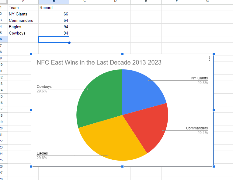
I made a pie chart on the NFC East in the NFL of choice to visualize the data. The chart effectively conveys the distribution of wins among the four teams in the division: the NY Giants, Washington Commanders, Philadelphia Eagles, and the Dallas Cowboys. This choice is compelling because it simplifies the complex data by visually showcasing how each team’s wins contribute to the whole, which, in this case, is the total wins in the division over the specified timeframe.
The pie chart excels when there’s a limited number of categories, which aligns perfectly with our scenario of only four teams. This ensures a clear and straightforward representation, making it easy to understand the proportions of wins each team has contributed. For viewers, this pie chart serves as a quick and intuitive way to gauge the performance of each team in the NFC East during the past decade.
By Shaun Sneddon
Lollipop Charts
A lollipop chart is a novel spin on the classic and universally appreciated bar chart. Applicable in the same situations as the illustrious bar chart, lollipops serve the same purpose but have the added benefit of cutting back on unnecessary clutter. When your data has a large number of data points being compared or you’re just aiming for a simpler visualization (that saves on ink!) a lollipop chart stands out as a strong alternative.
Some research (Blasio & Bisantz, 2002) even shows that lollipop design can lead to faster response times and greater accuracy (Gillan & Richman, 1994). Some other studies have shown (Inbar, Tractinsky & Meyer, 2007) that lollipop charts are not viewed as visually appealing as the timeless bar chart. As time goes on and these new minimalists styles of data visualization command more mainstream use, who knows what the future holds?
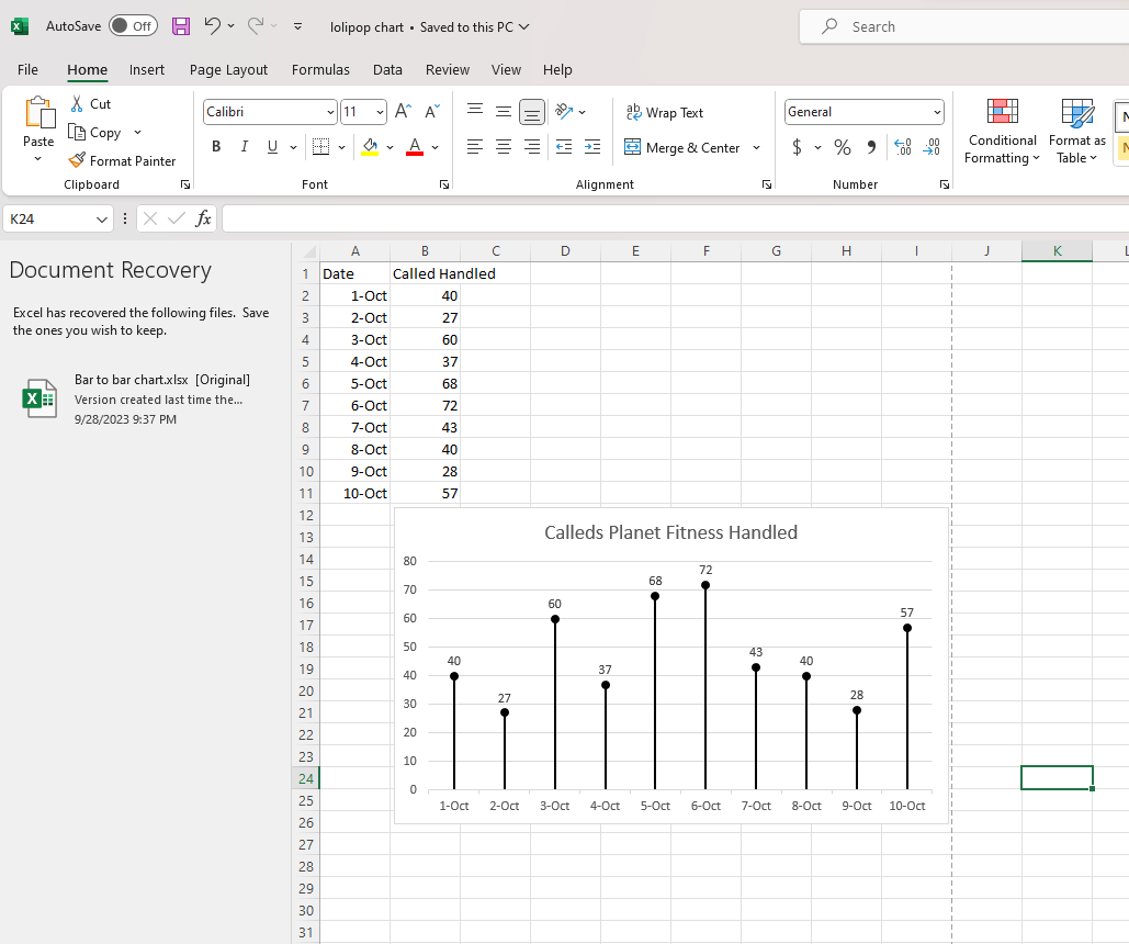
Below is a chart showing the percent of National GDP each of the top ten states makes up:

A simple, no-frills method that shows the single important value for each data point clearly and quickly, that is the strength of the lollipop chart.
Lollipop Graphs
By Shaun Sneddon
Unveiling the Lollipop Chart: A Sweet Way to Visualize Data
In the world of data visualization, a lollipop chart stands out as a charming and efficient tool. It combines the best of bar charts and scatter plots to make your data pop. In this post, we’ll explore what a lollipop chart is, when you should use it, and we’ll create one together.
What’s a Lollipop Chart?
Imagine a vertical line (the “stick”) with data points as markers (the “candies”). This is a lollipop chart! It’s ideal for showcasing a handful of data points, ranking items, highlighting outliers, and tracking changes.
When to Use Lollipop Charts
Few Data Points: If you have a small set of data to compare, a lollipop chart simplifies it elegantly.
Outliers: It’s great at spotting unusual data points that stand out.
Rankings: Show rankings or positions in a dataset clearly.
Changes Over Time: Use it to track how data changes over time or across categories.
Data Distributions: Combine it with other charts to display data distributions.
Creating a Lollipop Chart
For our example, let’s track the quarterly sales of three products – A, B, and C.
Input Data: Use your preferred data tool, like Excel or Google Sheets. Create columns for “Product” and “Sales.”
Design the Chart: In your tool, use a bar chart or scatter plot. Make the data points circular (or use candies).
Customize: Personalize your chart by adding labels, changing colors, and adjusting the size.
Titles and Legends: Don’t forget to label your chart correctly.
Conclusion
Lollipop charts are a delightful way to make data more appealing and understandable. They shine when you want to highlight key points, compare a small dataset, or reveal outliers. So, spice up your data visualization and give lollipop charts a whirl!
Benchmark Comparisons
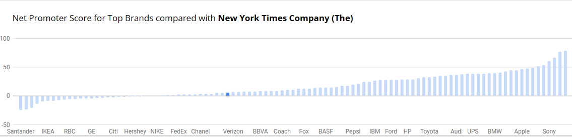
Benchmarks provide context, allows for assessment of performance, helps identify outliers within data and can be used to set goals and targets. Decision-making benefits, more informed choices, performance improvements and communication become effective with benchmark comparisons. There is quality assurance, allows for competitive analysis and even assessing effectiveness with programs and policy. You are able to conclude with meaningful insights. The example below is from NY Times and the Net Promoter Score for Top Brands. It’s a simple bar graph with minimal color. Net Promotor Score (NPS) is a customer loyalty metric that measures a customer’s willingness to return for another purchase/service but make recommendations as well. This can increase a company’s revenue. Scores higher than 0 are typically good and above 50 is excellent. The bar graph has list of companies on the y-axis with the scores on the x-axis
Benchmarking Graphs
Benchmarking your data visualizations is an excellent way to convey an important
factor in your graphs, what the numbers should look like, and how they fare
in comparison to that number. Helpful in showing outliers like how something is over-
or under-performing, or showing how perfect fit a value is towards some specified goal
benchmarks are a powerful tool that can be added to most graphs.
To show you an example, the following graph tracks goods and services pre-
and post-pandemic.
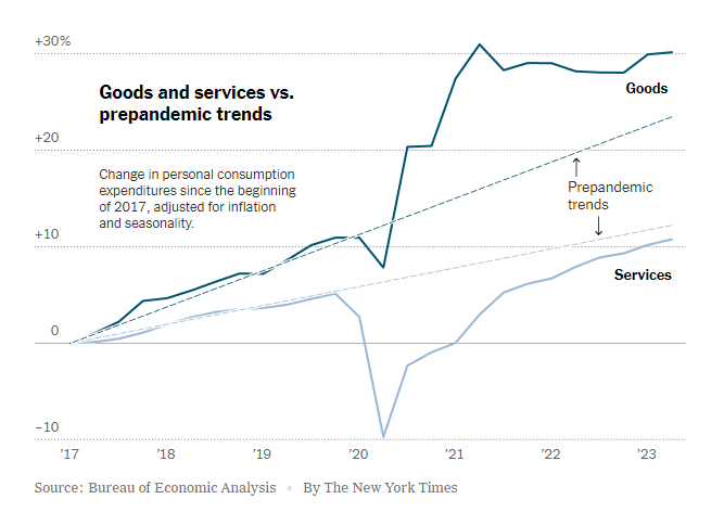
https://www.nytimes.com/2023/07/27/business/economy/us-economy-gdp-q2.html
It is easy to see the strengths of the trend lines as a way to measure the expected
values for the services and goods and how they compare to the trendlines before and
after the pandemic.
The following graph makes use of a perfectly horizontal benchmark line. This makes
reading the graph even easier than trend lines as being able to reference the single
value of the benchmark reduces user effort.
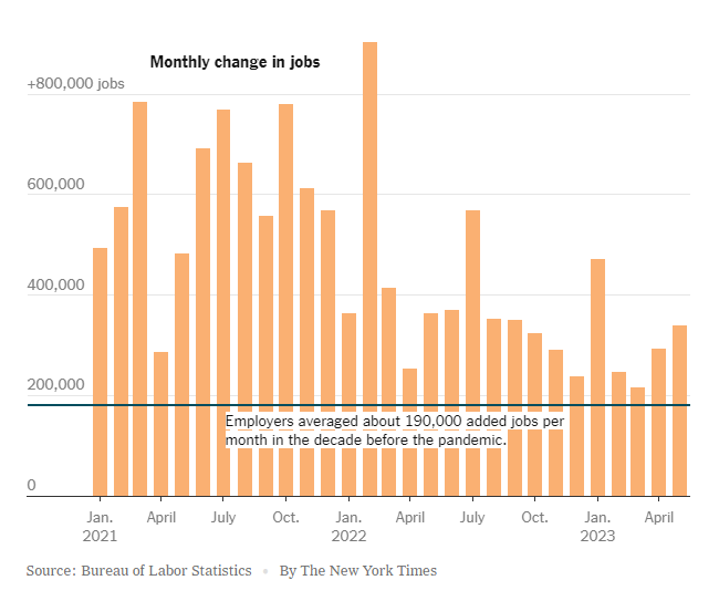
https://www.nytimes.com/2023/06/08/business/economy/us-economy-inflation-fed.html
The anomaly of the employment boom following the pandemic is immediately apparent with this example, highlighting the clarity that benchmarking provides.
Finally, this benchmark is just an average of the values in the graph. While not as
easy to interpret as the other methods, this one is a near-universal improvement that
can be made to any graph.
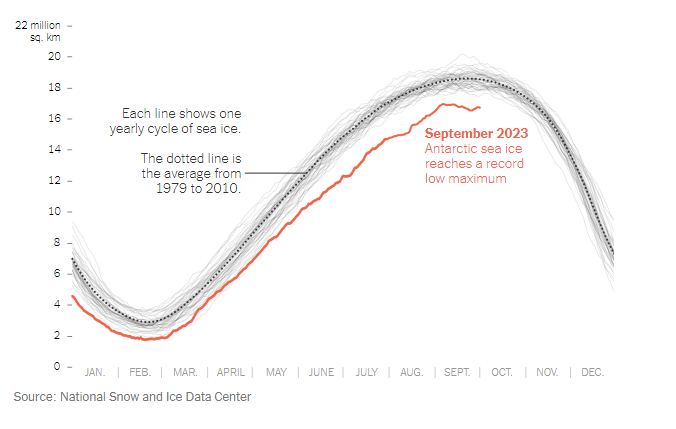
https://www.nytimes.com/2023/10/04/climate/antarctic-sea-ice-record-low.html?searchResultPosition=4
Benchmarks: Standardized Testing
Today we will be deep diving into how different people show comparisons to the benchmark. A benchmark is a standard or point of reference in which things can be compare. A great example is when benchmark testing was taken place during schooling. This data was used to see where you compare against students the same age as you.
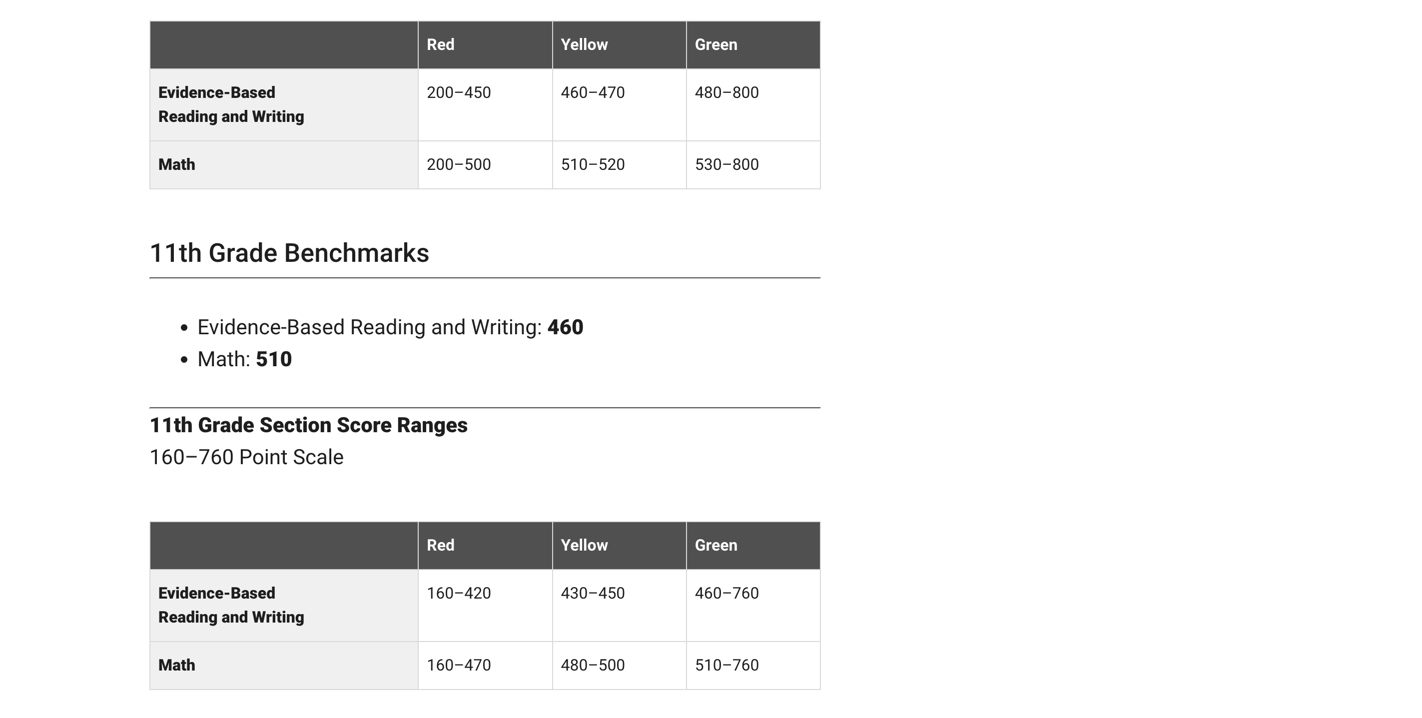
I will be using the college board SAT testing as an example. The college board uses benchmarking in order to determine where your test score should land based on your grade level. In the example below, they state that the benchmark is 430 for reading and 480 for math. These scores are based on if you were a 10th grader. They then breakdown the score into three categories: Red, Yellow, and Green. These sections represent how below or how above you are the benchmark.
In the article, How Perceptions Can Skew Reality: A Data Visualization Approach How NYC schools’ academic performance differs from public perception, they use benchmarking to determine where each borough of NYC lands with regards to SAT testing. In this article they take into consideration things such as poverty level.
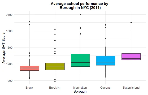
Schools in the Bronx performed worse due to the fact that the poverty rate is much higher. I feel as if data visualizations are very important especially with regards to benchmarking. It allows for an individual to compare themselves to the norm and make adjustments where needed. Everyone has grown up with benchmarking especially with regards to academic performance on things such as standardized testing. its interesting to put this into perspective.
Benchmark Comparisons
Some different ways people can show comparisons to a benchmark is through competitive, strategic, & performance. Competitive benchmarking is emphasized as the most effective form of benchmarking for businesses, allowing them to assess their true success by comparing themselves to competitors. It provides insights into industry trends and competitor strategies. To perform competitive benchmarking effectively, companies should establish clear goals and parameters and leverage digital tools for in-depth analysis, going beyond basic benchmarks like revenue and growth to gain a granular view of competitors’ data for more informed decision-making. Strategic benchmarking focuses on learning from industry leaders and best-in-class companies to understand their success and identify areas for improvement in your own business. It involves analyzing their business models and strategies to optimize various aspects of your own organization, such as marketing, online presence, or finances. Mobile app intelligence tools like Similarweb are highlighted as essential for gaining insights into mobile app trends and competitors’ strategies. Performance benchmarking aims to compare profitability and establish ambitious but achievable goals based on quantitative data comparisons, focusing on performance indicators like price, quality, speed, and reliability, ultimately driving continuous improvement.
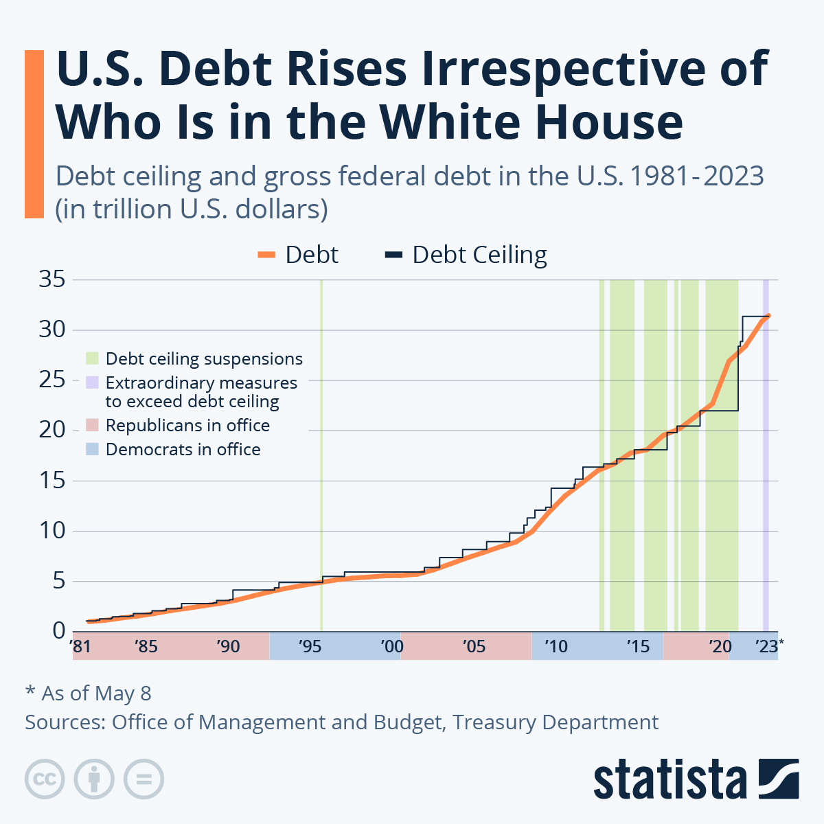
is this graph of the “U.S. Debt Rises Irrespective of Who Is in the White House” the benchmark is the debt. In this graph the numbers highlighted in blue at the bottom represent Democrats in office and red represents Republican. In this graph it shows typically it doesnt matter which group is in office because the debt rises no matter what.
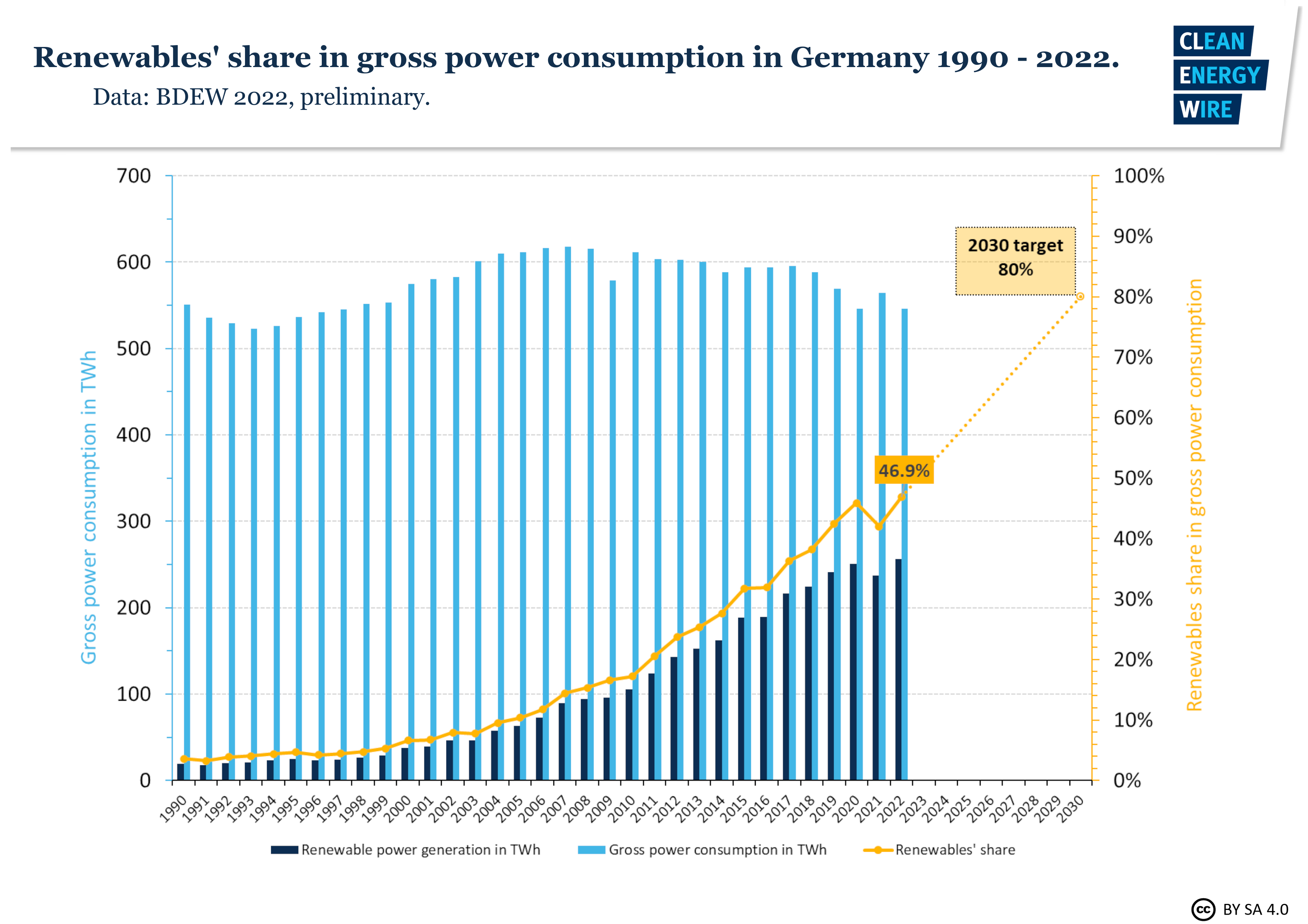
In this graph it shows Germanys power consumption throughout the years. The benchmark line is the yellow line indicating renewable shares. Germany is predicting that it will raise from 50% to 80% in the next 10 years.
sources
https://www.statista.com/chart/1505/americas-debt-ceiling-dilemma/
Comparing Products to Find the Best Fit
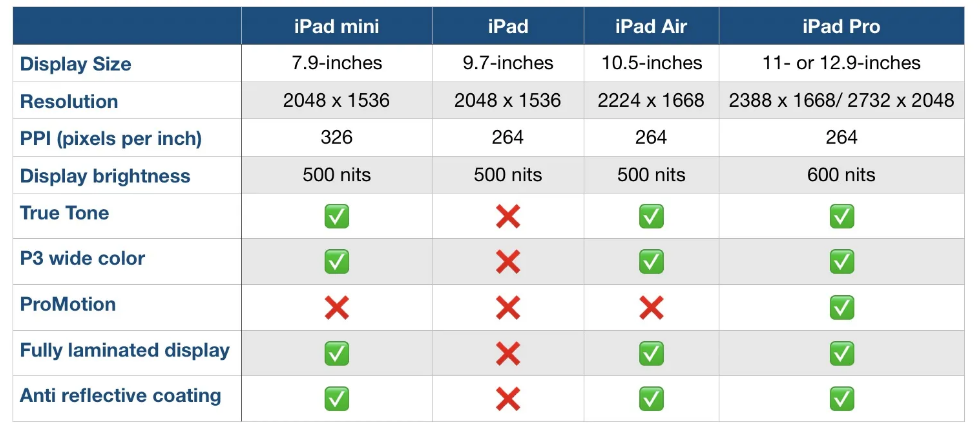
Comparison charts are a great way for consumers to compare multiple products from a company in order to determine which one is right for them. Let’s take the company Apple for instance. They provide many options on buying an IPad, but how do you know which one to get? There are many different charts that you can look at in to determine which one is best for you. First let’s start with the basics. Think about what you are using the IPad for. If you are simply taking notes then a regular IPad will do just fine. However if you plan to use it for editing or designing you might want to look closer at display sizes and resolution options.
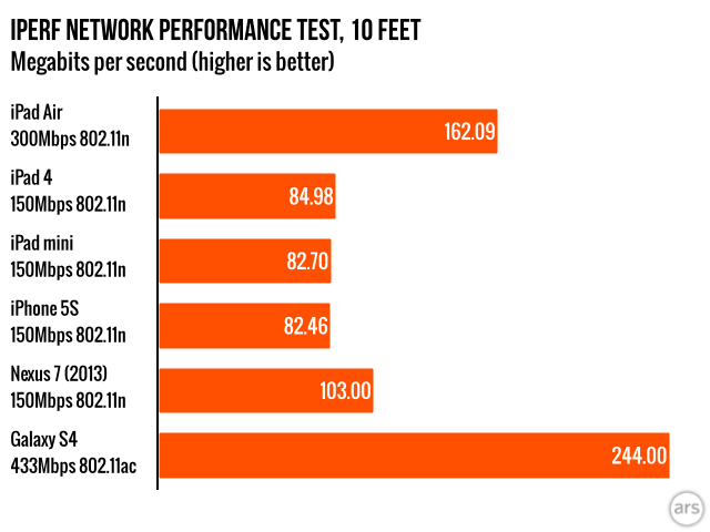
Another way to compare them is how well they perform. Someone who needs this device for high demanding and important work may wanna go with the IPad that has a higher megabit speed.
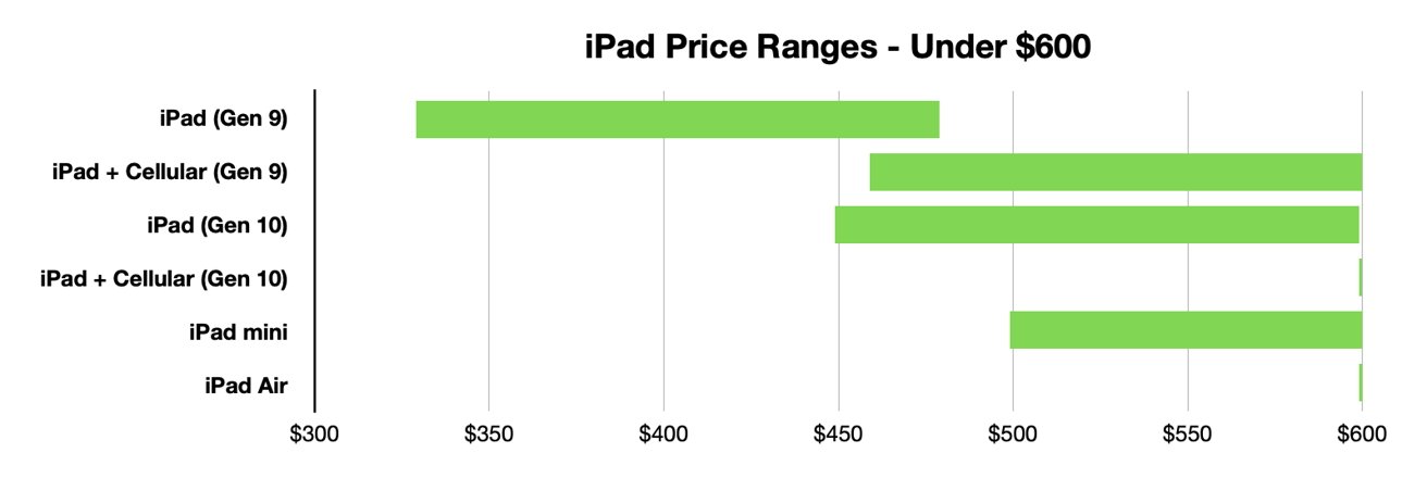
Lastly, and I think the most important to a lot of people, is how much each device costs. Comparison charts like this allow you to gauge how much this investment could cost you. Charts like the one below or the two above can usually be found on the company’s website or online forums for tech users.
Resources and Further Reading