Home » Posts tagged '#DataVisualizations' (Page 2)
Tag Archives: #DataVisualizations
Lollipop Charts
What is a Lollipop Chart?
A lollipop chart is another way to make lengthy bar charts less visually overwhelming. It is very similar to your standard bar chart, just without the “extra ink.” Instead of using a solid bar, the data is visualized using a lollipop shape (a thin line with a circle on top). After all, the main focus in a bar chart is the endpoint. The lollipop chart allows viewers to easily digest the data by focusing in on the values.
Examples…
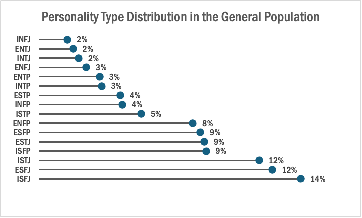
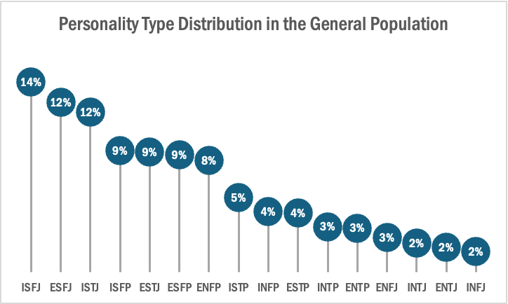
The two images above are examples of lollipop charts that I created. The data shows the percentage of each MBTI personality type within the general population. Lollipop charts can be both horizontal or vertical. The main point of the graph is to focus in on the endpoint values. I created my charts in Excel, and provided hyperlinks to my spreadsheet which includes my data and formatting. The vertical version was definitely easier to create. It only took a couple minutes, while the horizontal version had more steps and precise settings.
How to create a vertical lollipop chart:
- Insert a line graph with markers
- Delete the line
- Add Drop Lines
- Add data labels to center of markers
…and that’s it!
When to use a Lollipop Chart
A lollipop chart can be used for any kind of data that would work in a bar graph. It is simply an alternative that is more simplistic. Its “ink-friendly” design can impact readability of the data and lead to faster response times and greater accuracy (Gillan & Richman, 1994). It is especially useful when the visualization includes many data points that can become overpowering due to the solid bars.
Lollipop Chart
Lollipop charts are used to compare several objects or groups, similar to the purpose of bar graphs. They can be very useful in analyzing and visualizing trends. A lollipop chart can work well for comparing the values of different groups while accentuating individual data points, especially if some values are extremely high or low. They make it easier to identify deviations or substantial differences between data points. Lollipop charts should not be used for distribution or relationships in data. The Lollipop chart that I created in excel is shown below.
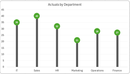
Lollipop charts are modified bar charts with dots representing points and thin lines for bars so that more data may fit in a smaller space. A lollipop chart is a good option for placing or focusing on specific values within a dataset because it minimizes visual clutter from crowded bars. The line helps guide the viewer’s eyes directly from the data labels on the x or y-axis straight to the data point value. The image shown below is a good example of how sometimes bar graphs can look cluttered with too much data. Using a lollipop chart takes some excess color off the screen making it easier to visualize the values of each data point for analysis or comparisons.
Benchmarks
An important element in any display of data is a benchmark– this can be a target, long-term goal, average, or standard. Oftentimes, benchmarks are written down in memos, but aren’t included in the actual data visualization. This can potentially help an audience visually the data in a more informed and efficient manner. The stories that can be told include:
“Our key indicators met the preestablished targets in three out of seven areas.”
“Regions A and B did not meet quarterly benchmarks”
“Here is how our groups compared to the national norm”
“Students in the Chemistry Department are above average on final exams this year.”
“We did not meet our fundraising goal, but we got very close.”
“Our click rate was 25.6%, while the industry standard is 4.3”
There are many different ways to include benchmarks in data presentations. The most common form is a simple line.
Another example is a bullet chart, which has gray shaded area of comparisons behind a bar of column.

Benchmark Comparisons
Lamar Miller
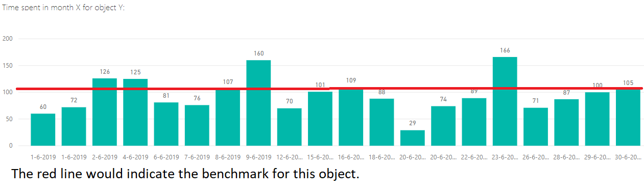
Here you will find a visual on phone phishing data. This visual uses the dashed line to indicate the benchmark for the industry. The visual goes on further to use stacked columns to indicate the different ways phishing can be delivered. The dashed line is a good way to show a benchmark because it is simple and stands out on a visual without a need for additional labels. Not using a solid line also allows a viewer to quickly interpret that it is intended to stand out and be different than the other lines in the visual.

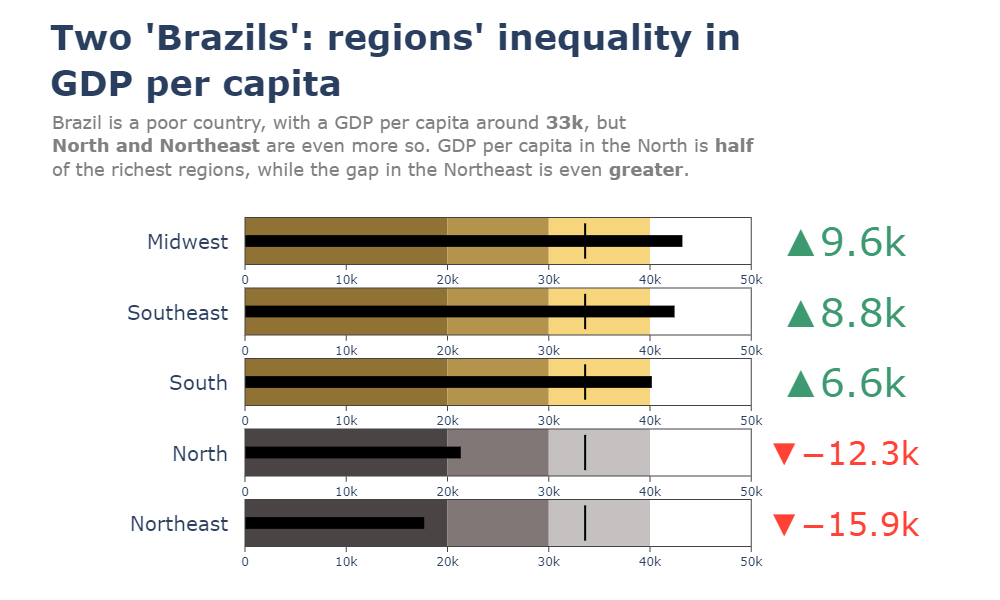
Here you will find a horizontal bullet chart depicting a comparison between North and Northeast Brazil GDP per capita while also indicating where the other regions stand. The benchmark is represented as a target line of 33k which can be easily interpreted. The visual goes on to show the gap in GDP by region.
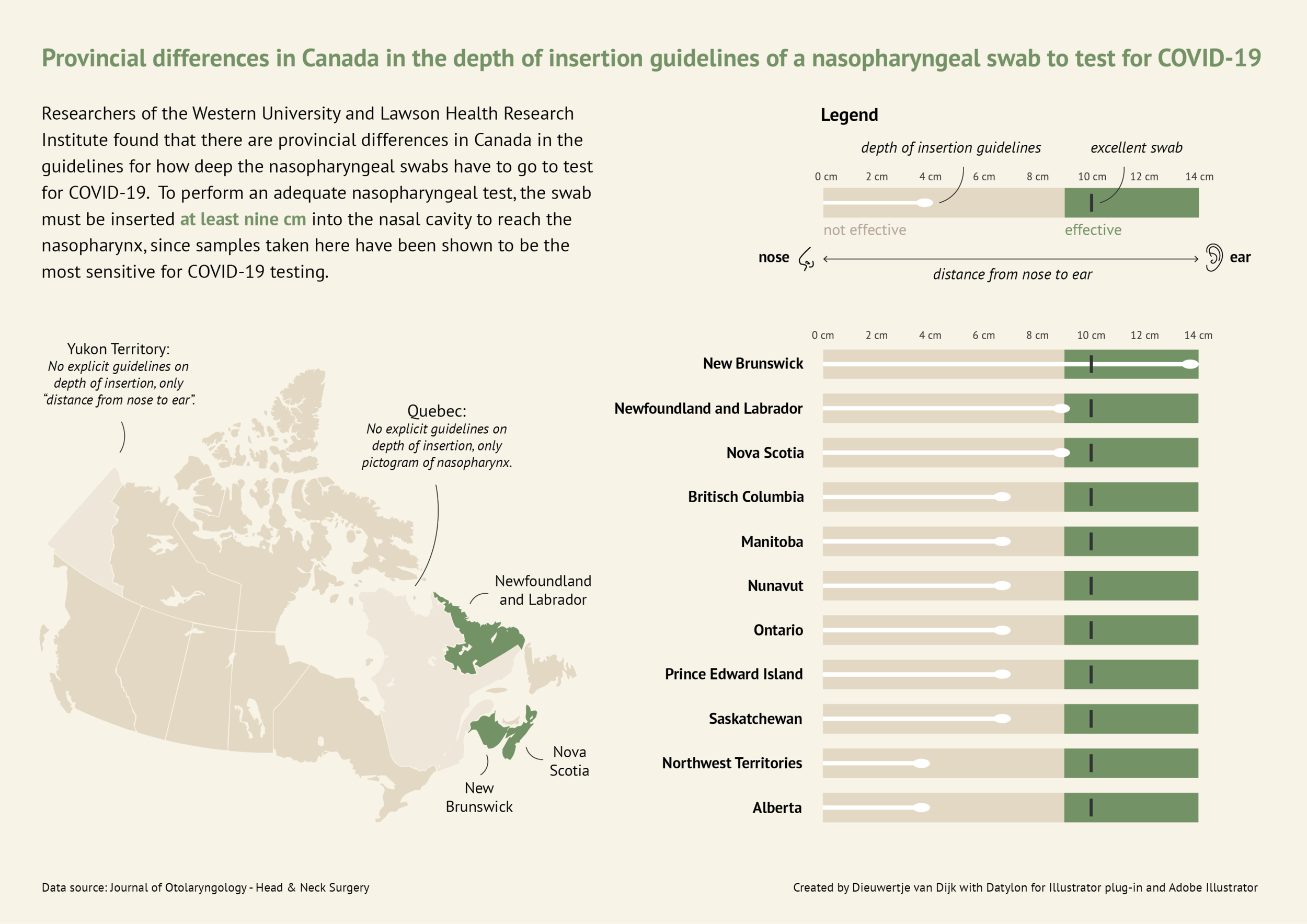
Here you will find a more in-depth horizontal bullet chart. I like this visual as it combines not only elements of a benchmark visual but incorporates other visual elements and really tells a story. This chart also uses target lines depicting the provincial differences in Canada regarding nasopharyngeal swab tests of Covid-19. The benchmark is indicated as 10cm in depth for the most effective swab.
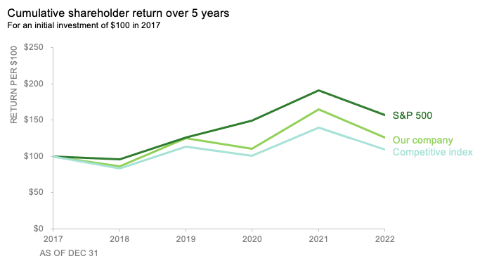
Here you will find a line graph with benchmark lines. The lines are represented as the competitive index and S&P 500 index versus their company. This chart incorporates two comparable benchmarks for a viewer to interpret against their trend. The visual shows the cumulative shareholder return over 5 years on an initial investment of $100 back in 2017. This chart is quick and to the point and provides an audience with just enough data to compare.
Benchmark Comparisons
This week we review Chapter 4 in our textbook, Effective Data Visualization, which goes over the importance of including a benchmark in our visuals. Benchmarks are extremely important because without that context, we limit the amount of information we can pull from a graph. Adding benchmark information clearly displays what the data is being compared to. This simple detail allows the viewer to easily determine whether performance was good, bad, or close to the mark.

This graph from The New York Times shows the monthly global temperature compared with preindustrial levels. The benchmark on this graph is the data for the year 2023, and the other years since 1940 are what is being compared to the benchmark. Just by quickly looking at this visual we can tell that global temperatures were much lower in previous years than in 2023. This benchmark stands out because the line is a darker color and much bolder than all of the others. This visualization is highly effective because the years prior to 2023 are a lighter opacity and color. The creator also only included data labels for the points in 2023.

Another graph from The New York Times displays the daily average sea surface temperatures. This visualization also includes a benchmark to help viewers easily process the data being shown. The gray dotted line, representing the average temperatures from 1991-2020, is the benchmark in this data. The blue line is the most current information which is being compared to the benchmark. In this graph we see that the temperatures in 2023 are much higher than the average between 1991-2020.

Lastly, this graph of Antarctica’s sea ice mass shows that levels in 2023 are much lower than the average from 1979-2010. The gray dotted line is the benchmark, while the red line is the data being compared. While this visualization is still effective, I believe the previous two were better. This is because the gray dotted line is not as prominent as the benchmarks in the other graphs. It gets lost in the data and takes a second for the viewer to notice it is there. Making the benchmark line a different color would help make it stand out.
Benchmark Comparisons
This post demonstrates the understanding of different types of graphs and data sets being compared to a benchmark line. By definition, a benchmark is a measure or comparison. The article includes many different graphs demonstrating climate change over the years. This article aims to compare the climate of previous years to the climate of 2023. The two following charts come from the same article on climate change.

The graph above is an example of a line graph. The orange line in this example is the benchmark line. The primary goal of this graph is to compare the climate change cross an entire year to the climate in 2023 which is highlighted.

Similar to the previous graph, this graph conveys a similar message except the creator has used two different benchmark lines instead of one.
Overall a benchmark line can convey a compelling message to a viewer. A benchmark line can allow a viewer with no previous knowledge of a certain topic to be able to follow along with a certain infographic. A viewer having other data to compare something to can help keep an audience engaged for extensive periods of time.


Podcast: Play in new window | Download
Comparing Numbers
The photo above is included in the linked article of this post. The article demonstrates the importance of using the correct infographic when comparing different data sets. It discusses the importance of making comparison charts, the best types of data comparison charts, and when to use each type of chart. One of the most commonly used comparison charts is the pie chart which is shown above. Pie charts are most effectively used when comparing sizes or percentages of numbers within a single data set.
Podcast: Play in new window | Download
Examples of insightful data visualizations that compare numbers + Tools that may help us construct visualizations that compare numbers.
Lamar Miller
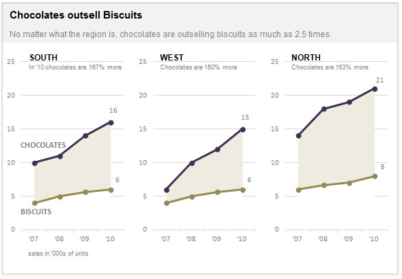
Here I found an informative article on making Small Multiples. This chart type stood out to me in Chapter 3 of our text not because of its design but the purpose behind the design. In our text, it explains the human psychology behind why the Small Multiple visual must be constructed in a way so it can be quickly interpreted with accuracy. It stated that eye-tracking studies show that people see a set of line graphs like the one depicting chocolate sales vs biscuits as one chunk. This style of visual is clearer than putting all lines in one graph which creates a confusing cluster of data points. This style also allows an illustrator to compare more than two pieces of data while maintaining visual cohesiveness. The key here is to ensure all lines along the X axis are symmetrical and that the Y axis numbers are mirrored within each subsequent data set so that an audience can see the comparison being made.
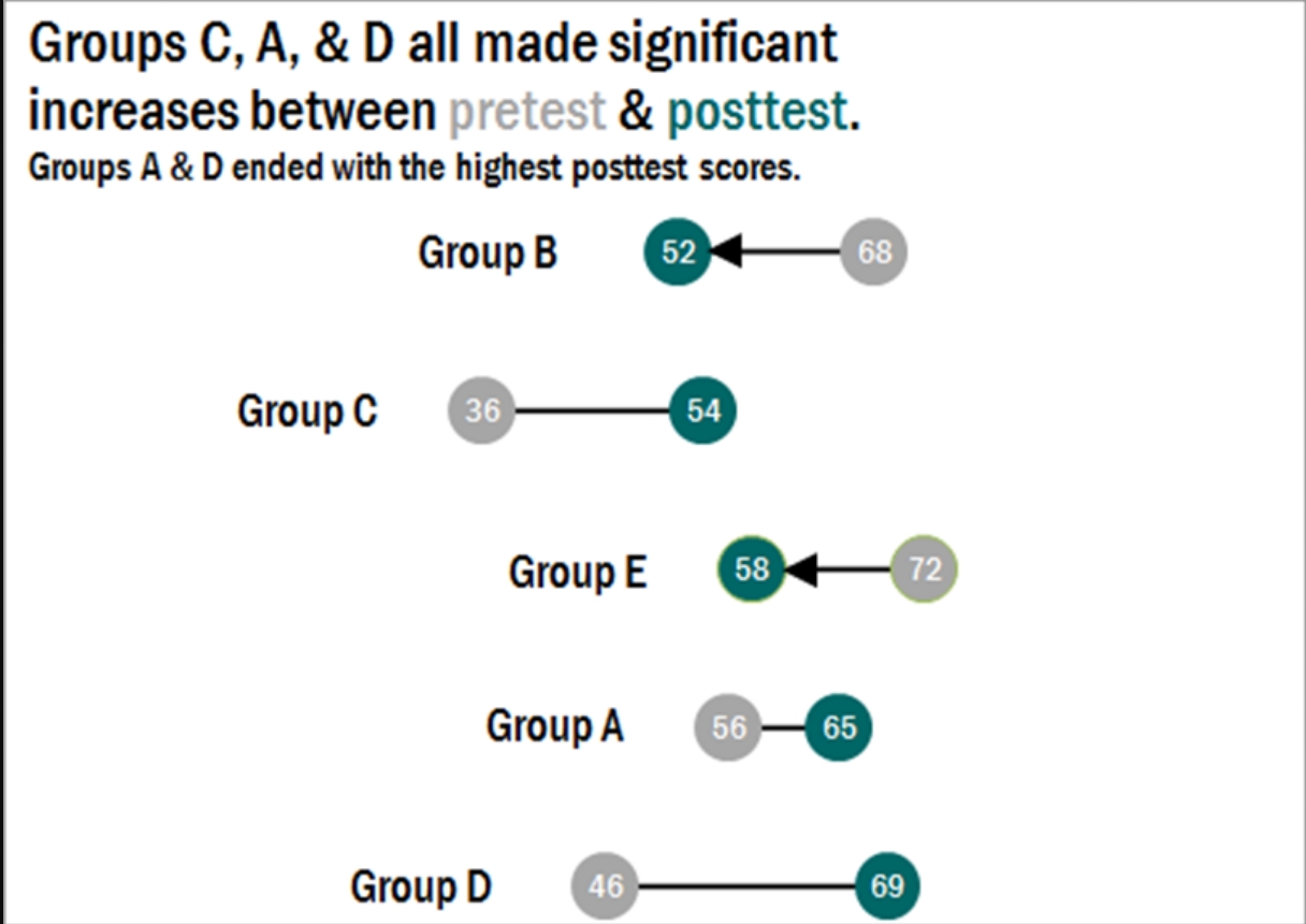
Here I found a step-by-step process on how dumbbell plots are constructed and a useful visual when comparing numbers. The main difference between the dumbbell plot and the standard dot plot is that the line connecting two data points emphasizes the distance between the data being compared. This helps an audience scan a graphic quickly and interpret the visuals intended purpose or story. This type of chart stood out to me because it’s a concise way of comparing two or more numbers across multiple groups or regions. The chart shows groups from A through E and their scores both pretest and posttest. This can be beneficial when segmenting groups of people to conduct case studies.
Comparing Numbers
Examples of Insightful Data Visualizations that Compare Numbers
Data visualizations can be a great tool to use when comparing numbers. Comparing numbers can show many different stories, including the following examples:
“Option A is better than Option B”
“Posttest scores are higher than pretest scores in almost all subject areas”
“Group F and Group G disagree on five of the eight measures”
“There were no differences between the treatment and control groups”
“Youth rates are significantly lower than adult rates”
“We have equal participation from boys and girls with the exception of girls ages 10 to 13”
“All sites increased performance, but Site L did so at a faster rate than other sites”
“The performance of Class L is in contrast to Class K”
Results such as these can be shown in various types of charts. Below are some examples of insightful data visualization that compare numbers.
- Pie Chart

2. Bar Chart
3. Histogram

4. Line Chart
5. Doughnut Chart

6. Overlapping Area Chart

Comparing Numbers
This week in Chapter 3 of Effective Data Visualization we learn about how two or more numbers are alike or different. There are several ways to visualize comparisons between two numbers, as well as multiple, which is very important when choosing your visualization. The main question we have to answer is why Option A is better than Option B.
Bar Charts

Bar charts are an extremely popular option, but its ability to convey data works best when comparing just two things. Any more can become difficult to interpret because it is challenging to compare the lengths of nonadjacent columns. The textbook also explains how it helps to have some extra white space between each set of clustered columns. The data visualization shown above is very insightful because you can easily digest the information comparing profits and discounts between products. The colors are distinguishable from one another and the columns are grouped so the viewer can easily decipher between products 1-6. The creator also included data labels above each column which makes it easy to tell the definitive amount and compare the numbers.
Dumbbell Dot Plot
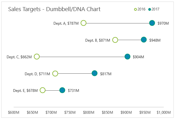
Dumbbell Dot Plots are similar to standard dot plot graphs. The only difference is a line between two dots to emphasize growth between points. The example above is a great data visualization of sales targets for the years 2016 and 2017. The use of empty dots to represent the previous year versus the filled in dot for the more current year is easy to comprehend before really analyzing the data. The line draws your attention from left to right and its length makes it easy to compare the growth between each department. Department C clearly had the most growth within a year, and the data points at the end of each dot helps solidify the viewer’s observation. I believe it is important to have a thin and simple line like above so the chart does not appear too cluttered. I was not aware of dumbbell dot plots until reading Chapter 3 this week, but they have definitely become one of my favorites.
This site provides more valuable insights on how to choose the right data visualization.