Home » Posts tagged '#DataVisualizations'
Tag Archives: #DataVisualizations
The Importance of Pivot Tables
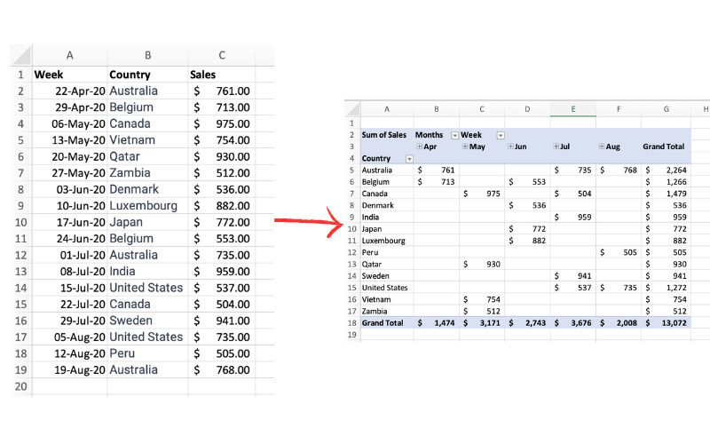
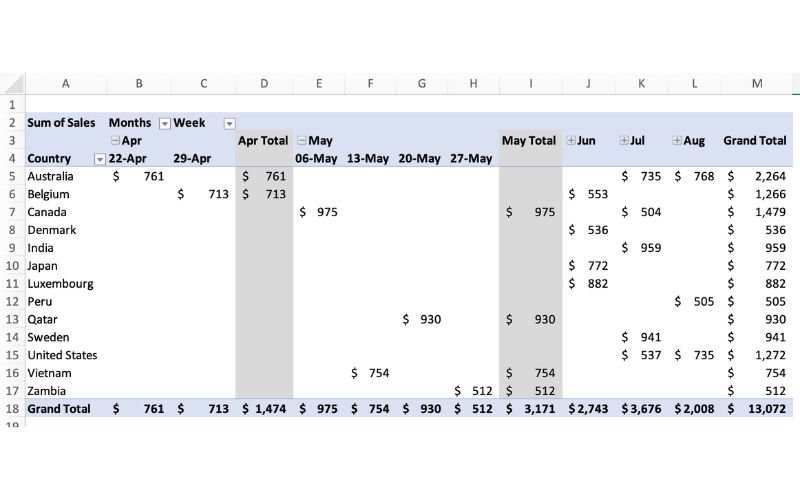
The picture above exemplifies a pivot table and one of the many different ways it can be utilized. One of the main reasons pivot tables can be such amazing tools for representing data is how interactive they can be. The table above shows sales by each country sorted chronologically by week. The table is very easily changed to reinterpret the data to be sorted by country instead of by time. Pivot tables allow the user to represent their total sales by region, or even be specific salespersons. They also can allow the ser to group data into even more specific groups such as other time periods (months, years, etc), or other custom grouping methods. This is shown in the pivot table below.
In terms of efficiency, there is no better table to use than a pivot table. They can save you hours by allowing the user to quickly change how a data set is represented. They also add a sense of flexibility. Pivot tables make it very easy to incorporate any new data that may be found instead of having to create a whole new table/chart.
Pivot Tables
Pivot Tables are a highly useful interactive way to quickly summarize large amounts of data. It takes user-specified data fields and converts the headers into a data option that can be easily manipulated. Data can be summarized in numerous ways, including averages and frequencies. Lorman Education published an informative article about pivot tables. They describe 6 benefits of using a pivot table in Excel:
- Simplicity
- Data Analysis
- Data Summaries
- Pattern Recognition
- Quick Reports
- Decision Making
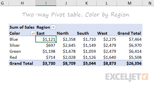
The image above is an example of a pivot table created by ExcelJet. It clearly demonstrates Sum of Sales by color in each region. Colors are sorted by row and regions are sorted by columns. The table also includes a total row according to each color and region, as well as a grand total.

This is another example of a pivot table created by ExcelJet using the same data, just with the rows and columns switched. There is a simple drag-and-drop method that can change the parameters of the table within seconds. ExcelJet also provides a few benefits of pivot tables:
- Simplicity
- Speed
- Flexibility
- Accuracy
- Formatting
- Updates
- Filtering
- Charts
Pivot Tables
Pivot tables are an incredibly powerful tool for organizing, analyzing, and summarizing large datasets. They enable users to transform raw data into meaningful insights with minimal effort.
Pivot tables allow you to quickly group, filter, and aggregate data. For example, you can calculate totals, averages, or counts with ease. Users have the ability to customize rows, columns, and values to focus on the specific insights that they need from their data.
The pivot table below shows the sum of sales over several years, broken down by product colors. It aggregates data annually from 2016 to 2019 and provides a grand total for each color across all years.

This layout is useful for identifying trends in sales performance for each color over time, helping businesses to determine which of their products have consistent demand from customers.
This next pivot table displays the sum of sales quantities for various fruits and vegetables across different countries. It also calculates grand totals for each product and country.

The above pivot table provides insights into the regional demand for specific products, supporting decisions on regional marketing strategies or inventory management.
The last pivot table, displayed below, summarizes monthly household spending across different categories for January, February, and March. It shows total amounts per category for each month and overall. This table is great for personal budgeting or financial analysis, offering a clear breakdown of expenses across categories over a defined period.

Pivot tables are indispensable for anyone who needs to make sense of data, whether for work, school, or personal use. They help you organize and summarize large amounts of information in a clear and easy-to-understand way. By grouping and analyzing data, pivot tables can show important patterns or trends, like which products sell best or where most money is being spent.
In short, pivot tables make data simple and actionable, helping you make better decisions with less effort.
Sankey Visualizations
The Sankey Energy Data Visualization shows energy systems and it’s flows. It provides additional information on each category and is interactive.

After looking through this visualization for a while, I think that it is very effective for representing a basic knowledge of energy flows. I think anyone could look at this data and understand what it means.
At first, while looking at this data it seemed like a lot of lines that I could not tell where exactly they went. Making this chart interactive was a great decision by the makers because it clarifies where the lines are going, and provides additional information.

The only critique I have for this visualization is that I wish it would have provided more information and visuals on energy losses. Maybe a hyperlink with an additional visualization about energy losses and where or when they occur.
Sankey Visualizations
Needtoknow.nas.edu provides many visualizations about energy usage in the United States. I learned that the flow of energy in the U.S. is complex and comes from numerous different sources. More than half of energy supplied is lost as waste heat or through inefficiencies.

This Sankey visualization breaks down our energy system from the source all the way to its usage. As you can see, Oil is the largest source of energy with a total output of 36% and total CO2 emission of 43% in the U.S. Although this visual is interactive and provides a large amount of information/data, I find Sankey visualizations to be difficult to interpret. There is a lot of data being displayed within a single visual, and it would be more effective to break it down into multiple different visualizations. For example, the data regarding % of Total Output and % of Total CO2 Emissions could be visualized as a Side-by-Side Column Graph. Another example could be the use of a Pie Chart to compare the % of energy used and unused.

This visual of Lumens per Watt for different types of lightbulbs is highly effective. The visualization clearly shows which lightbulb they are talking about and its lm/W. Viewers can interpret the graph efficiently due to its simplicity. This particular chart is a good example of a Large Number With Icons, as we have learned in the textbook.

Another good visualization is this Back-to-Back Bar Graph displaying the efficiency of energy on the road. You can compare energy used, gasoline burned, CO2 vented, and fuel economy between the two different types of vehicles. Again, the simplicity of this chart makes it more effective.
I believe this site would highly benefit from simplifying their visualizations. The data they want to explain would be easier to interpret, therefore, more effective if they were to take a more minimal approach.
Sankey Interpretations
Lamar Miller
Based on what I learned about Sankey visualizations, it appears coal is our largest resource contributing to electricity production. In addition, oil is used primarily for transportation. Overall, I would say this is a good use of a Sankey visual. The color coding within the visuals allows the viewer to decipher between the different resources. The thickness of each bar indicates the quantity. The flow of each resource to its intended use case shows which resources flow into which utility. Source

In the MD, OH, PA, WV region there is a large amount of coal production.
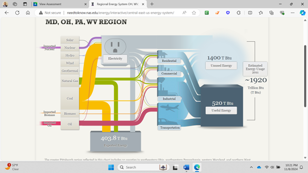
California has very minimal coal production but uses natural gas as an energy source more commonly.

Pie Charts

Shown above is a pie chart I created based on the percentages of total energy use. Knowing when to use a pie chart can be a difficult skill to master. The following link including provides evidence as to why this type of chart is best for this data. The given data set represents different parts of whole adding the percentages of each data variable adds up to 100% as a whole. Additionally, a pie chart shouldn’t be used when you have too many different data points. This infographic only uses 5 which means a pie chart is a perfect fit for this data set. This pie chart has the appropriate amount of data points and data labels to make it effective at relaying this information to the reader.


Podcast: Play in new window | Download
Pie Charts
The ideal uses for pie charts are to illustrate the corresponding ratios of components to a whole and to demonstrate how a whole is divided into its individual pieces. When properly sized categories are present pie charts can be used for straightforward, equal comparison. For more in-depth comparisons a bar graph would work better than a pie chart. Labeling, ordering, and limiting slices are some tips when creating a pie chart. When labeling, verify that the appropriate number or percentage is written on the label of each slice. To keep a pie chart organized slices can be arranged from largest to smallest or smallest to largest. Use a different chart type if the chart includes more than five slices to limit clutter. There are certain cases where pie charts are not the ideal option. When there are too many categories in the data or the data values are too similar a pie chart would not be the best fit. If the data contains any values that are not positive integers, a pie chart is not the right choice.
Below I have included a good example of a pie chart that is properly labeled, ordered, and contains limited data.
Pie charts provide a clear visual representation of percentages and proportions, which makes it easier to understand data distribution. Making judgments based on data representation is simple with the use of pie chart analysis. Pie charts offer an immediately comprehensible visual depiction. Pie charts make it simple to compare different areas and provide information about those with the greatest impact. Pie charts are very helpful in the business world. They can guide investments and have an impact on plans for advertising and the creation of products. Decision-making based on data can be substantially improved by the use of pie charts and their interpretations.
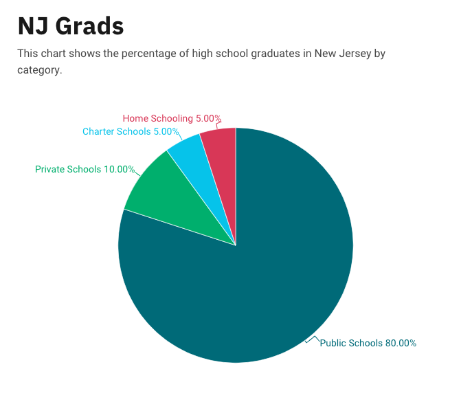
Below is a pie chart that I created in excel. It represents college graduates in New Jersey by fields.

Pie Charts
What is a Pie Chart?
A Pie Chart is a common type of visualization that demonstrates parts of a whole. Each section represents a value in relation to the entire composition. The slices should be proportionate to the amount in each data set so that the viewer can compare each section by size to determine its value.
When should I use a Pie Chart?
A Pie Chart is a great visual for a part-to-whole relationship. It should be used when displaying the “percent of…” or “part of…” something. StorytellingWithData provides two primary use cases for a pie chart:
- having a general sense of the part-to-whole relationship is more important than comparing the precise sizes of the slices
- to convey that one segment is relatively small or large in comparison
The percentages should sum to 100% so that the visual is relative in size to its value.
The Perfect Pie
I created the “perfect pie” in Excel using 2024 Coffee Statistics by DriveResearch. I will break down what makes this a perfect use case as well as design tips for creating an effective pie. You can click on the image below to open my Excel spreadsheet.
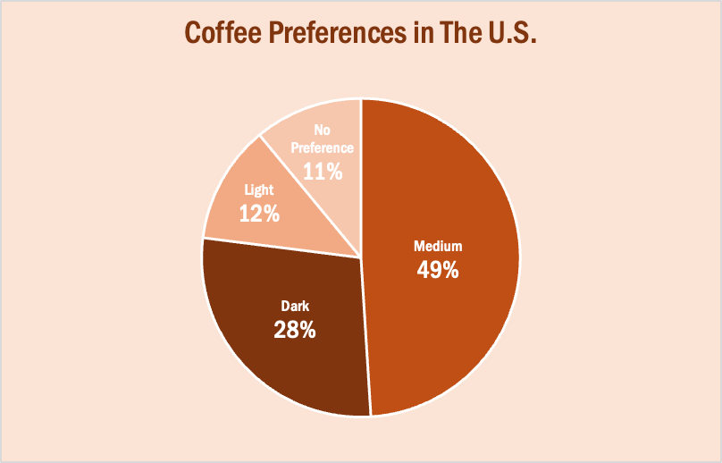
The data in this set is great for a pie chart because it equals 100% and one value is significantly larger than the others. It is also split up into 2-5 categories which is not too overwhelming for the viewer. The coffee preferences are all parts of a whole, making a pie chart the best choice over bar charts and other visualizations. To make it aesthetically pleasing to look at, I used different shades of brown throughout the entire chart which correlates with the coffee theme. I deleted the legend for a more minimalistic appearance, which the author of our textbook reiterates throughout each chapter. Because the values for Light Preference and No Preference are very similar, I added data labels to each segment so it is easy to comprehend. I also increased the font size for the numbers to make them stand out. Stephanie D.H. Evergreen suggests “unwrapping the pie” by making the largest slice start at noon and run clockwise in descending order (as seen above). When creating this chart, I was sure to avoid 3D and exploding effects in order to increase legibility. For more information, I suggest checking out this article on Tableau, which provides more examples of effective and ineffective pie charts.
Lollipop Charts

A lollipop chart is a data visualization tool similar to a bar chart but with the shape of a lollipop. It shows data points at the end of a line that attaches to the chart’s baseline. This chart effectively compares values from a small data set where numbers aren’t very far apart. It makes it much easier to understand the differences in these values at a quick glance. These charts are best used when you need something the provides a simple look and wants to highlight the comparability of certain data points. These types of charts are also very good if you want to emphasize a certain data point. This is because you can highlight or change the appearance of each data point to make it stand out more or less. The given example shows different types of devices and how much online data they use. While some data points there are obvious differences. Some with closer values can be hard to distinguish without this chart.