Home » Posts tagged 'comparing numbers'
Tag Archives: comparing numbers
Comparing Numbers (McDonalds Age Demographics)

This graph was pulled from our final project and it highlights the comparison of ages that frequent McDonalds. This graph also highlights the most popular demographic, that being the ages 25-34. This age group visually is larger than the others and also can be seen through a number. Showing how large this demographic really is.
Benchmark Comparisons
This post demonstrates the understanding of different types of graphs and data sets being compared to a benchmark line. By definition, a benchmark is a measure or comparison. The article includes many different graphs demonstrating climate change over the years. This article aims to compare the climate of previous years to the climate of 2023. The two following charts come from the same article on climate change.

The graph above is an example of a line graph. The orange line in this example is the benchmark line. The primary goal of this graph is to compare the climate change cross an entire year to the climate in 2023 which is highlighted.

Similar to the previous graph, this graph conveys a similar message except the creator has used two different benchmark lines instead of one.
Overall a benchmark line can convey a compelling message to a viewer. A benchmark line can allow a viewer with no previous knowledge of a certain topic to be able to follow along with a certain infographic. A viewer having other data to compare something to can help keep an audience engaged for extensive periods of time.


Podcast: Play in new window | Download
Comparing Numbers
An efficient way to visualize data is with comparison charts, which are clear and well-organized. By simplifying the data, they can help viewers see patterns among the variables. A person may choose a good or service more efficiently by comparing data points visually. Understanding complicated data is made much easier and faster with the use of comparison charts. Comparing numbers visually is a way to focus attention to connections and distinctions that allow for improved data analysis.
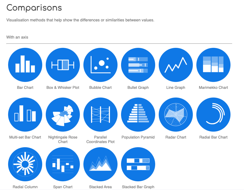
I found a website called the Data Visualization Catalogue. It is a great resource to have when trying to decide which chart is best to use for your data. This image above is a screenshot I got from the website, it gives examples of different comparison charts. If you click on any of the blue circles, the catalogue will provide a page full of details for each chart/graph. In the Data Visualization Catalogue an example, a description, and the anatomy of each chart/graph are shown in the details. A link to the website is posted below.
Examples of insightful data visualizations that compare numbers + Tools that may help us construct visualizations that compare numbers.
Lamar Miller
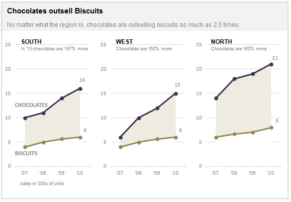
Here I found an informative article on making Small Multiples. This chart type stood out to me in Chapter 3 of our text not because of its design but the purpose behind the design. In our text, it explains the human psychology behind why the Small Multiple visual must be constructed in a way so it can be quickly interpreted with accuracy. It stated that eye-tracking studies show that people see a set of line graphs like the one depicting chocolate sales vs biscuits as one chunk. This style of visual is clearer than putting all lines in one graph which creates a confusing cluster of data points. This style also allows an illustrator to compare more than two pieces of data while maintaining visual cohesiveness. The key here is to ensure all lines along the X axis are symmetrical and that the Y axis numbers are mirrored within each subsequent data set so that an audience can see the comparison being made.
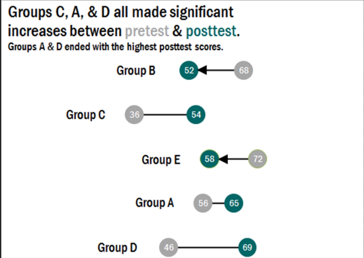
Here I found a step-by-step process on how dumbbell plots are constructed and a useful visual when comparing numbers. The main difference between the dumbbell plot and the standard dot plot is that the line connecting two data points emphasizes the distance between the data being compared. This helps an audience scan a graphic quickly and interpret the visuals intended purpose or story. This type of chart stood out to me because it’s a concise way of comparing two or more numbers across multiple groups or regions. The chart shows groups from A through E and their scores both pretest and posttest. This can be beneficial when segmenting groups of people to conduct case studies.
Comparing Products to Find the Best Fit
Comparison charts are a great way for consumers to compare multiple products from a company in order to determine which one is right for them. Let’s take the company Apple for instance. They provide many options on buying an IPad, but how do you know which one to get? There are many different charts that you can look at in to determine which one is best for you. First let’s start with the basics. Think about what you are using the IPad for. If you are simply taking notes then a regular IPad will do just fine. However if you plan to use it for editing or designing you might want to look closer at display sizes and resolution options.
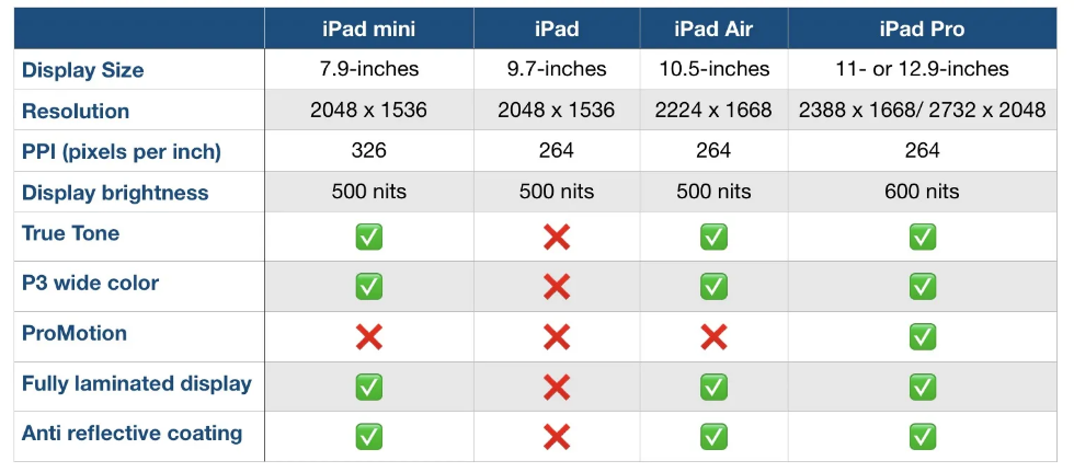
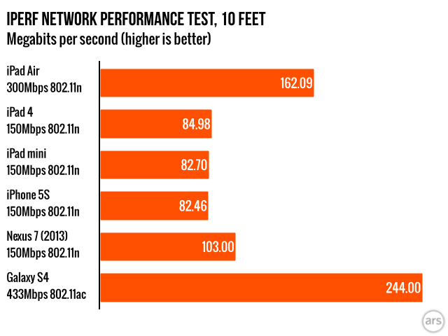
Another way to compare them is how well they perform. Someone who needs this device for high demanding and important work may wanna go with the IPad that has a higher megabit speed.
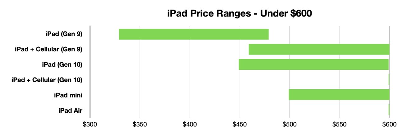
Lastly, and I think the most important to a lot of people, is how much each device costs. Comparison charts like this allow you to gauge how much this investment could cost you. Charts like the one below or the two above can usually be found on the company’s website or online forums for tech users.
Resources and Further Reading
Comparing Numbers
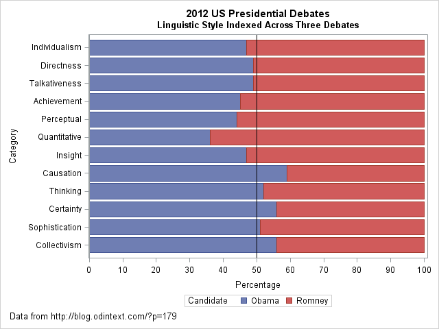
I came across an interesting dataset and a corresponding visualization that compared the characteristics of Barack Obama and Mitt Romney during the 2012 US presidential debates. The graph in question is a radar plot displaying 12 characteristics of the candidates’ words during the debates. These characteristics include “directness,” “talkativeness,” “sophistication,” and more.
However, I found the radar chart a bit challenging to interpret effectively when comparing the two candidates. I’d like to discuss two valuable tips that can make such comparisons clearer when using graph visualizations:
- Graphing the Differences: When comparing two groups, it’s often more intuitive to graph the differences between them rather than plotting each group separately. This can help viewers focus on what sets the groups apart. In the context of the 2012 debates, this could mean creating a graph that visually emphasizes the differences in characteristics between Obama and Romney, making it easier to identify distinctions in their speaking styles.
- Sorting Categories by Meaningful Quantity: In any plot that has a categorical axis, it’s essential to sort the categories by a meaningful quantity. This ensures that the visualization effectively conveys the message you intend. For instance, if the radar chart includes characteristics like “directness” and “sophistication,” consider sorting these characteristics in a way that highlights the most relevant differences between the candidates.
As for the dataset provided, it appears that the numbers represent the relative percentages of each characteristic attributed to Obama and Romney during the debates. For example, in the category “Individualism,” 47% of the phrases were attributed to Obama, while 53% were attributed to Romney.
By Shaun Sneddon
https://blogs.sas.com/content/iml/2013/08/21/comparing-two-groups-graphically.html