Home » Posts tagged '#Benchmarks' (Page 2)
Tag Archives: #Benchmarks
Benchmarking Graphs
Benchmarking your data visualizations is an excellent way to convey an important
factor in your graphs, what the numbers should look like, and how they fare
in comparison to that number. Helpful in showing outliers like how something is over-
or under-performing, or showing how perfect fit a value is towards some specified goal
benchmarks are a powerful tool that can be added to most graphs.
To show you an example, the following graph tracks goods and services pre-
and post-pandemic.
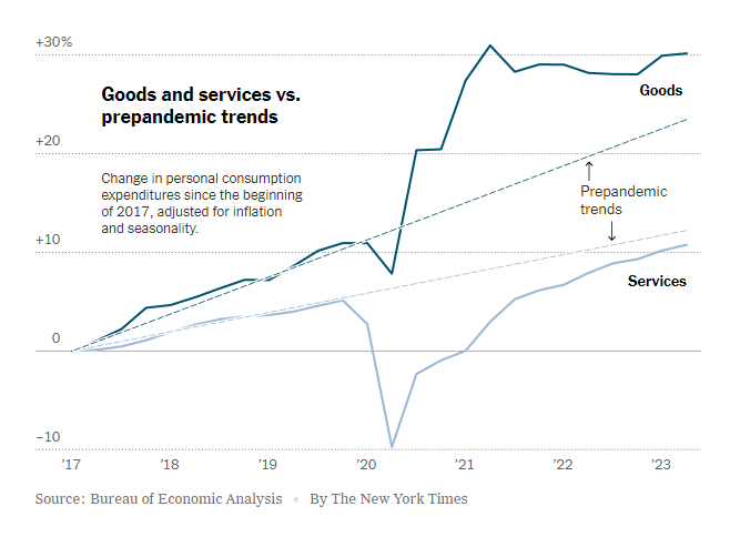
https://www.nytimes.com/2023/07/27/business/economy/us-economy-gdp-q2.html
It is easy to see the strengths of the trend lines as a way to measure the expected
values for the services and goods and how they compare to the trendlines before and
after the pandemic.
The following graph makes use of a perfectly horizontal benchmark line. This makes
reading the graph even easier than trend lines as being able to reference the single
value of the benchmark reduces user effort.
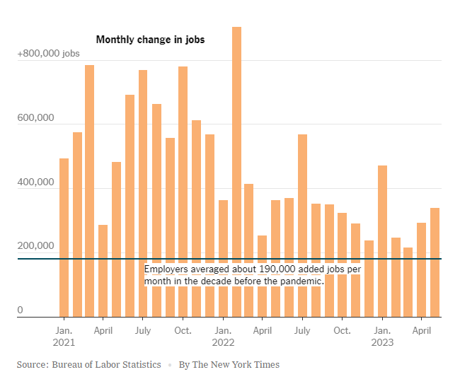
https://www.nytimes.com/2023/06/08/business/economy/us-economy-inflation-fed.html
The anomaly of the employment boom following the pandemic is immediately apparent with this example, highlighting the clarity that benchmarking provides.
Finally, this benchmark is just an average of the values in the graph. While not as
easy to interpret as the other methods, this one is a near-universal improvement that
can be made to any graph.
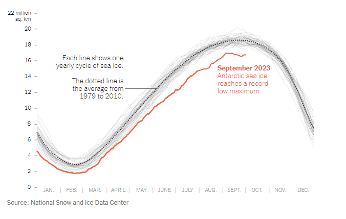
https://www.nytimes.com/2023/10/04/climate/antarctic-sea-ice-record-low.html?searchResultPosition=4
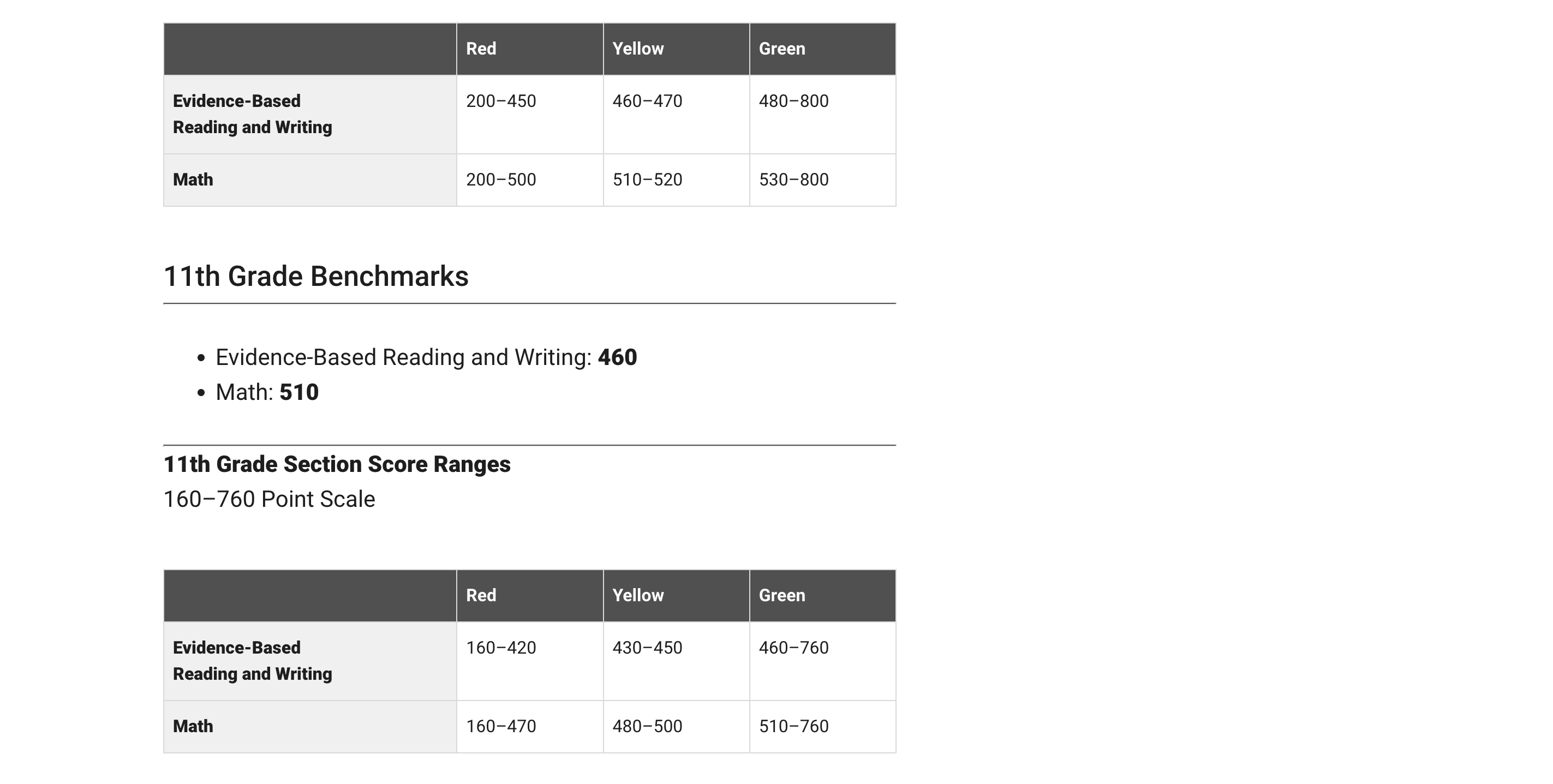
Benchmarks: Standardized Testing
Today we will be deep diving into how different people show comparisons to the benchmark. A benchmark is a standard or point of reference in which things can be compare. A great example is when benchmark testing was taken place during schooling. This data was used to see where you compare against students the same age as you.
I will be using the college board SAT testing as an example. The college board uses benchmarking in order to determine where your test score should land based on your grade level. In the example below, they state that the benchmark is 430 for reading and 480 for math. These scores are based on if you were a 10th grader. They then breakdown the score into three categories: Red, Yellow, and Green. These sections represent how below or how above you are the benchmark.
In the article, How Perceptions Can Skew Reality: A Data Visualization Approach How NYC schools’ academic performance differs from public perception, they use benchmarking to determine where each borough of NYC lands with regards to SAT testing. In this article they take into consideration things such as poverty level.
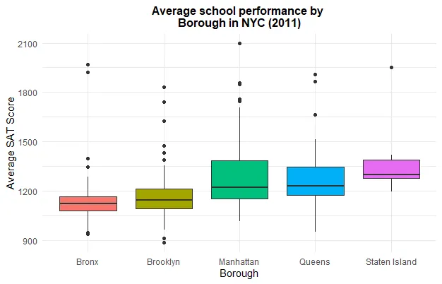
Schools in the Bronx performed worse due to the fact that the poverty rate is much higher. I feel as if data visualizations are very important especially with regards to benchmarking. It allows for an individual to compare themselves to the norm and make adjustments where needed. Everyone has grown up with benchmarking especially with regards to academic performance on things such as standardized testing. its interesting to put this into perspective.
Benchmark Comparisons
Some different ways people can show comparisons to a benchmark is through competitive, strategic, & performance. Competitive benchmarking is emphasized as the most effective form of benchmarking for businesses, allowing them to assess their true success by comparing themselves to competitors. It provides insights into industry trends and competitor strategies. To perform competitive benchmarking effectively, companies should establish clear goals and parameters and leverage digital tools for in-depth analysis, going beyond basic benchmarks like revenue and growth to gain a granular view of competitors’ data for more informed decision-making. Strategic benchmarking focuses on learning from industry leaders and best-in-class companies to understand their success and identify areas for improvement in your own business. It involves analyzing their business models and strategies to optimize various aspects of your own organization, such as marketing, online presence, or finances. Mobile app intelligence tools like Similarweb are highlighted as essential for gaining insights into mobile app trends and competitors’ strategies. Performance benchmarking aims to compare profitability and establish ambitious but achievable goals based on quantitative data comparisons, focusing on performance indicators like price, quality, speed, and reliability, ultimately driving continuous improvement.
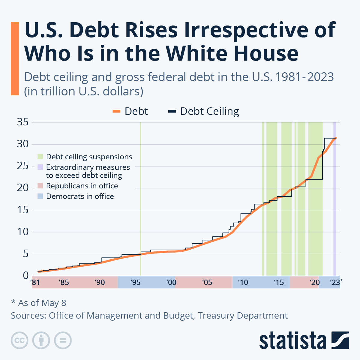
is this graph of the “U.S. Debt Rises Irrespective of Who Is in the White House” the benchmark is the debt. In this graph the numbers highlighted in blue at the bottom represent Democrats in office and red represents Republican. In this graph it shows typically it doesnt matter which group is in office because the debt rises no matter what.
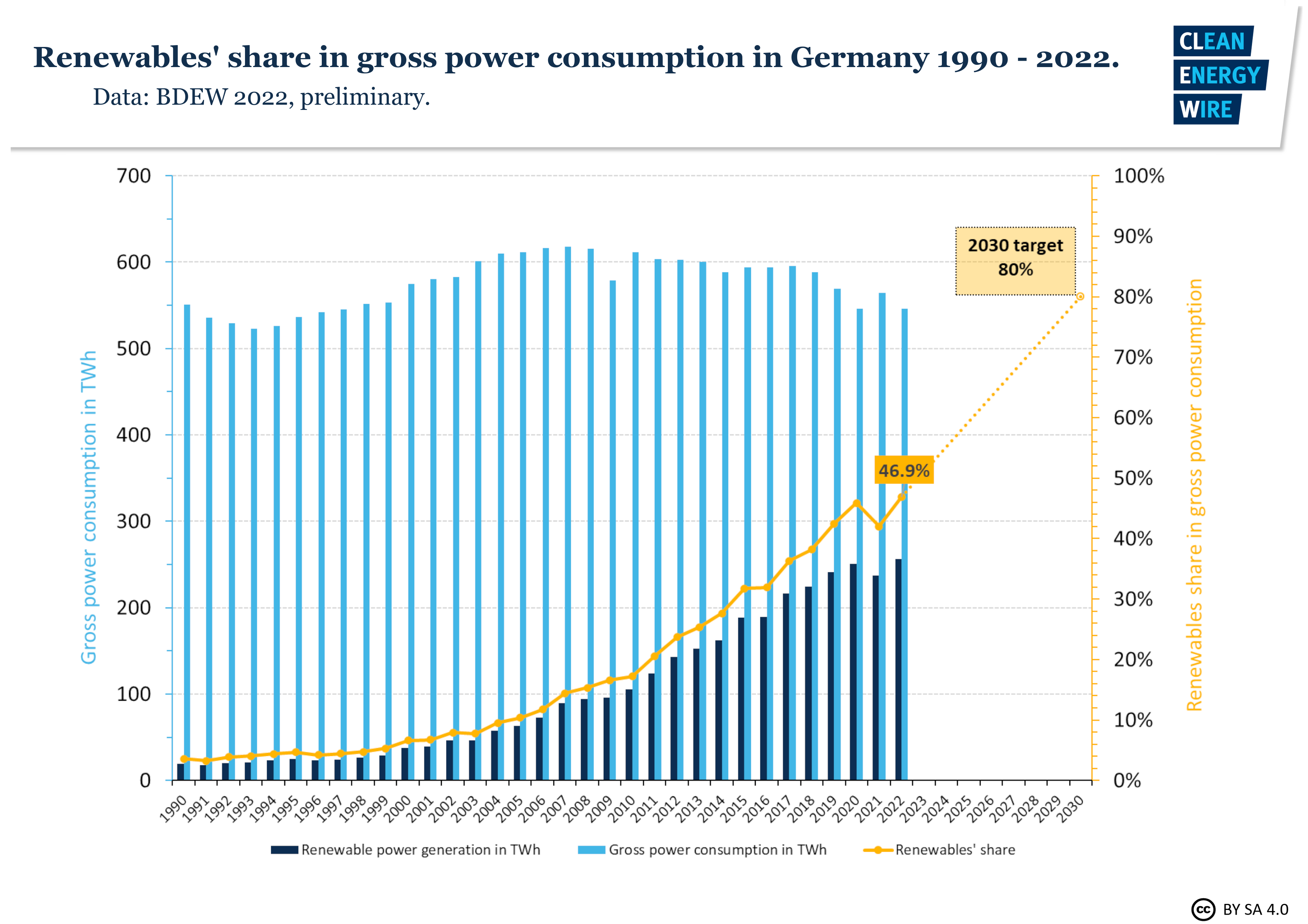
In this graph it shows Germanys power consumption throughout the years. The benchmark line is the yellow line indicating renewable shares. Germany is predicting that it will raise from 50% to 80% in the next 10 years.
sources
https://www.statista.com/chart/1505/americas-debt-ceiling-dilemma/
Benchmark Visualizations
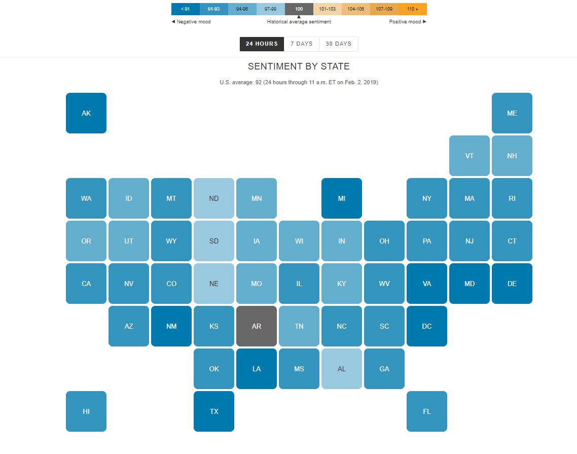
I find the “U.S. Social Sentiment Index” quite intriguing. It’s a creative way of harnessing the power of social media, specifically Twitter, to gauge our nation’s mood in near-real-time. What caught my attention, in particular, is how they use benchmarks to add context to the sentiment data.
In this case, they don’t just look at raw sentiment but also compare it to the current sentiment on Twitter. This means that they calculate a benchmark sentiment level based on the tweets they’re analyzing and then position the current sentiment relative to that benchmark. This approach is crucial because it provides a point of reference. It helps us understand whether the current sentiment is above or below the average sentiment of tweets from people across the country. For instance, if “most states are in the negative,” it suggests that the sentiment in those states is predominantly negative compared to the average sentiment in the analyzed tweets.
What’s even more fascinating is how this data is presented in near-real-time, updating hourly. It’s like having a live pulse on the nation’s emotions, and for data enthusiasts like us, that’s a treasure trove of insights. It’s a reminder of how data visualization can make complex information accessible and meaningful.
By Shaun Sneddon
http://graphics.wsj.com/twitter-sentiment/
Benchmark Comparisons
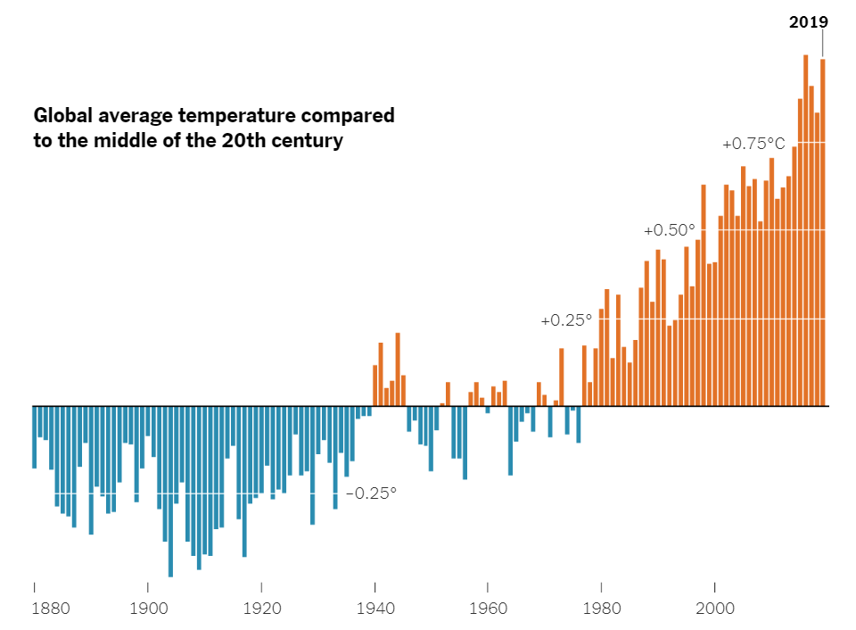
Here is a chart that uses a benchmark to show the varying global average temperatures. The benchmark is used along the x axis at 0 degrees Celsius. The blue lines represent the average temperature for that year, and it falls below the average global temperature of the middle 20th century. The orange lines represent the years with the average global temperature being above the average global temperature from the middle 20th century. As you can see, there is a general increase in global average temperature over the years. A benchmark is very effective here because it splits up the data into two groups. The years that fall below average, and the years that are above average. The trend of rising global temperatures is easily seen here, making this a very effective infographic.
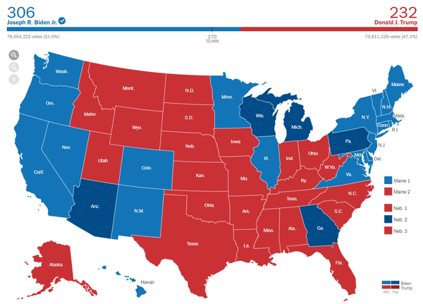
Here is another infographic that uses a benchmark in a different way. This is the 2020 presidential election map. The benchmark is shown above the map. It says “270 to win”. This means that 270 electoral college votes are needed in order to win the race. 270 is the benchmark. Joe Biden exceeded this benchmark, and Donald Trump failed to reach the benchmark. Therefore, Joe Biden won the election because he passed the benchmark. On the graph, you can see that Joe Biden passed the benchmark through color coding. Joe Biden is blue, and the blue line passes the benchmark of 270. This is a very effective infographic that uses a benchmark in a unique way. As shown by these two examples, there are many different ways to use benchmarks, and there are many different forms of benchmarks.