Home » Posts tagged '#Benchmarks'
Tag Archives: #Benchmarks
Benchmark Comparisons
Visual components are used in comparison infographics to compare two or more objects, such as ideas or products. They may be a useful tool for assisting individuals in the comprehension of difficult facts and making reasonable choices. By comparing a company’s operations to other businesses’, benchmarking infographics can help find areas for growth. Benchmark graphs illustrate how various groups, like nations or businesses, perform against one another by comparing statistics. For example in the image shown below, benchmark comparisons assist in evaluating the performance and quality of products, goods, and industries as well. As shown below through a series of procedures and tests, you can find out if your system is operating at peak efficiency or whether there are issues that need to be fixed.
Infographics may be used in a variety of ways to display comparisons to a benchmark. Comparison infographics are frequently used by marketers when comparing a competitor’s product against their own. A great way to compare two items directly is by using comparison infographics. Utilizing a range of charts while choosing the appropriate chart and including visual features are some strategies for using infographics to display comparisons to a benchmark. To illustrate how a topic performs when compared to several groups, use a scatter plot with a solid benchmark line, a stacked bar chart, or a pie chart to compare portions of a whole. An infographic may display several kinds of information using a variety of chart formats. A table can be used to arrange information so that readers can look it up, or a numbered list can be used to indicate rank or order. Infographics demonstrate relationships between data, procedures, or individuals through the use of visual components.
Benchmark Comparison
Benchmarks in graphs provide a reference point, allowing viewers to quickly assess how data compares to a standard goal or historical average. They help to contextualize values, which highlights trends or performance gaps. By including benchmarks in graphs, data visualizations become more informative, making it easier to interpret progress, identify outliers, and support information assessment at a glance.
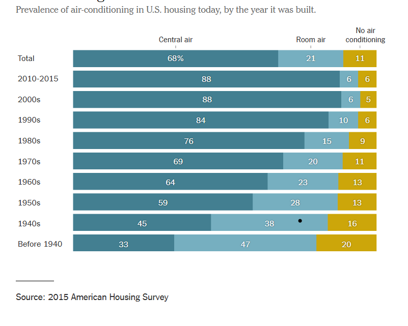
The graph below depicts the change over time of air conditioner use within residential buildings. By constructing this informative graphic using bars, the data can easily be assessed even by those who are not adept at data analysis. The topmost bar shows the benchmark for central air, room air, and no air conditioning while the bars below show a breakdown of each category in 10 year increments. The use of stacked row bars and a clearly separated benchmark lend to an organized, easy to read graphic that allows viewers to clearly determine the difference of each category over time. By visiting this article, you can read more about the changes in air conditioner use over time.
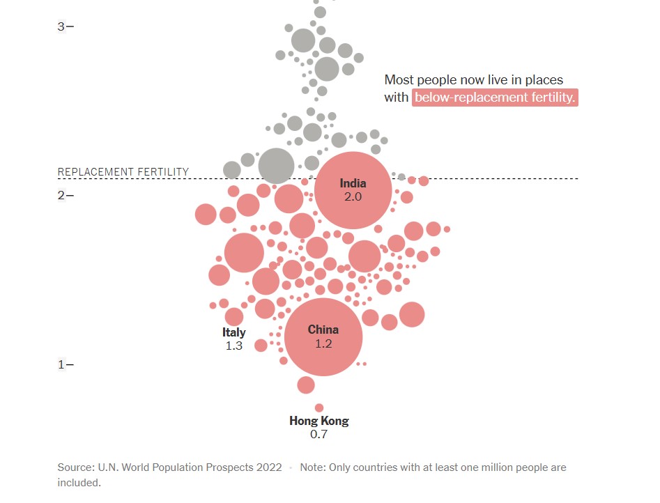
The next graph, found below, shows a comparison of countries (with populations over one million) and their replacement fertility rates. While there are only a few markers that have labels attached to them, population size is indicated by the size of the circle used to represent the country. This is not only a visually pleasing detail in this graph, but it is a simple and effective way to offer knowledge to the viewer without overcomplicating the graph. In this graph, the benchmark is displayed in the form of a dashed line with a label. This shows a clear indication of which countries fall above or below the benchmark for replacement fertility rate. Additionally, the coloration of the country markers help to indicate which countries are below the benchmark, even if it appears that they are touching it. To read more about population growth and decline, follow this link.
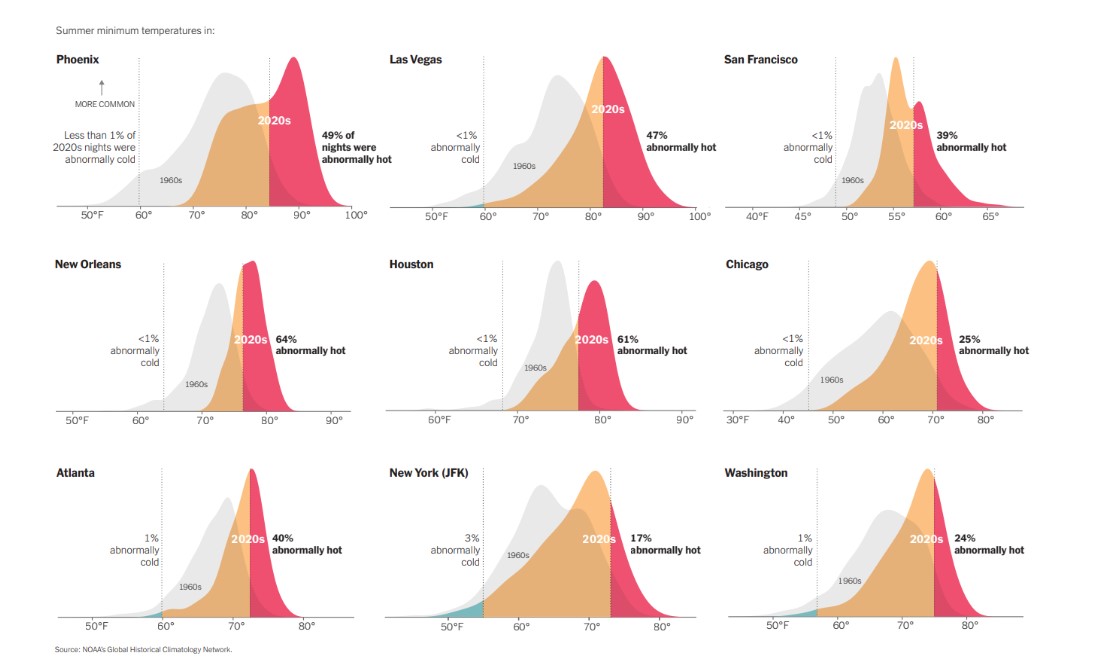
Another use of a line as a benchmark can be seen below in various graphs used to compare summer minimum temperatures in different cities across the United States. By utilizing vertical solid lines to show boundaries of where outlier temperatures are located, density plots are able to be used to properly display the temperature information for each city. Not only are solid vertical lines used, but temperature data from previous years are displayed as a benchmark to show the difference between summer temperatures in the 1960’s compared to 2020’s. There are additional graphs and information to compare climate change over time at this webpage.
Benchmarks
An important element in any display of data is a benchmark– this can be a target, long-term goal, average, or standard. Oftentimes, benchmarks are written down in memos, but aren’t included in the actual data visualization. This can potentially help an audience visually the data in a more informed and efficient manner. The stories that can be told include:
“Our key indicators met the preestablished targets in three out of seven areas.”
“Regions A and B did not meet quarterly benchmarks”
“Here is how our groups compared to the national norm”
“Students in the Chemistry Department are above average on final exams this year.”
“We did not meet our fundraising goal, but we got very close.”
“Our click rate was 25.6%, while the industry standard is 4.3”
There are many different ways to include benchmarks in data presentations. The most common form is a simple line.
Another example is a bullet chart, which has gray shaded area of comparisons behind a bar of column.

Benchmark Comparisons
Lamar Miller
Here you will find a visual on phone phishing data. This visual uses the dashed line to indicate the benchmark for the industry. The visual goes on further to use stacked columns to indicate the different ways phishing can be delivered. The dashed line is a good way to show a benchmark because it is simple and stands out on a visual without a need for additional labels. Not using a solid line also allows a viewer to quickly interpret that it is intended to stand out and be different than the other lines in the visual.

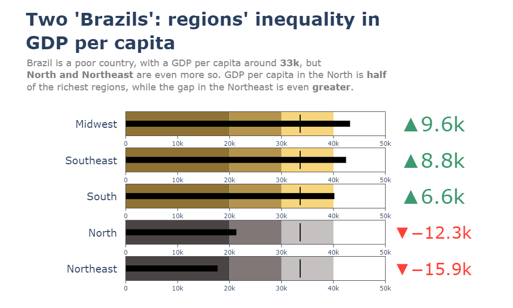
Here you will find a horizontal bullet chart depicting a comparison between North and Northeast Brazil GDP per capita while also indicating where the other regions stand. The benchmark is represented as a target line of 33k which can be easily interpreted. The visual goes on to show the gap in GDP by region.
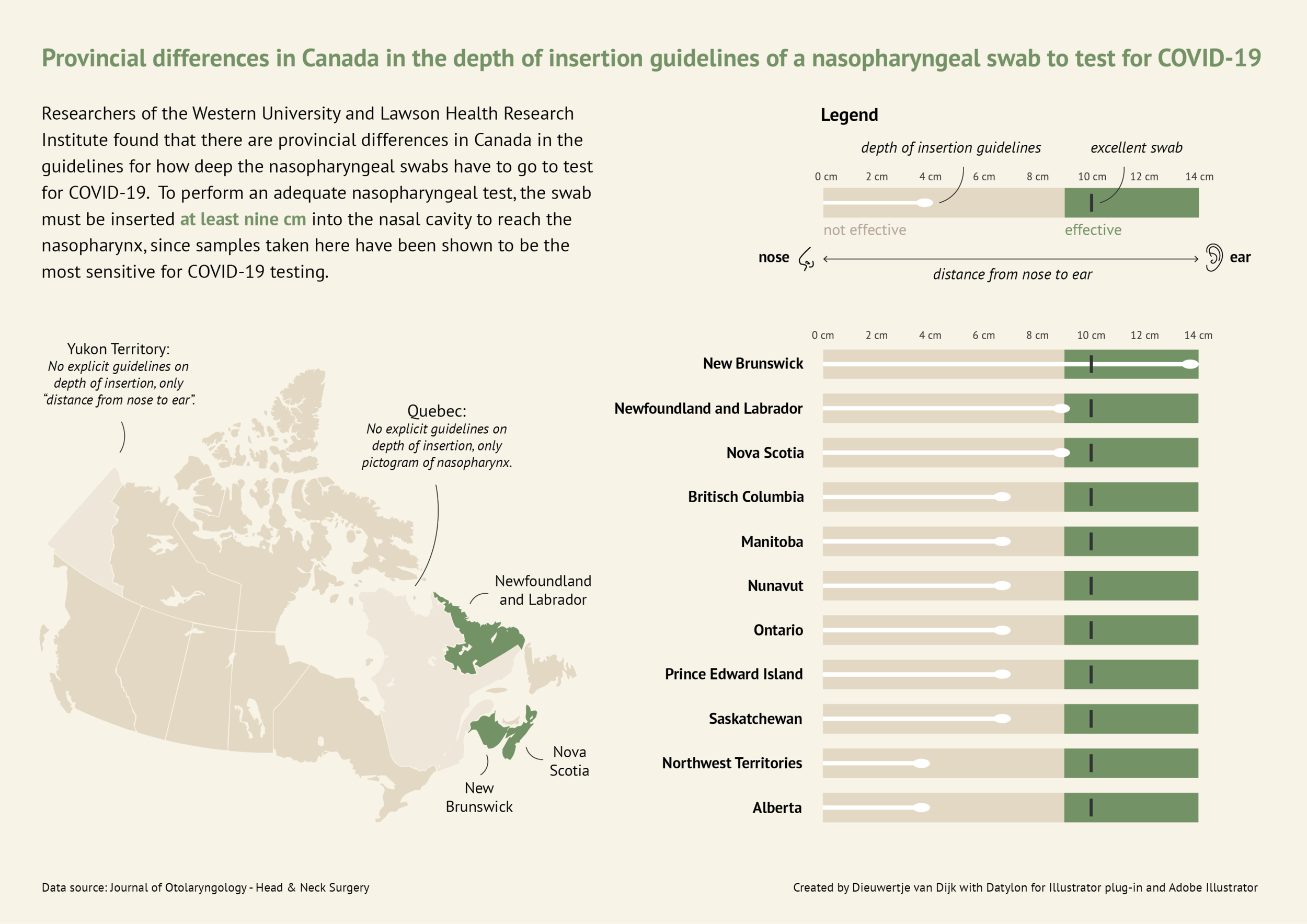
Here you will find a more in-depth horizontal bullet chart. I like this visual as it combines not only elements of a benchmark visual but incorporates other visual elements and really tells a story. This chart also uses target lines depicting the provincial differences in Canada regarding nasopharyngeal swab tests of Covid-19. The benchmark is indicated as 10cm in depth for the most effective swab.
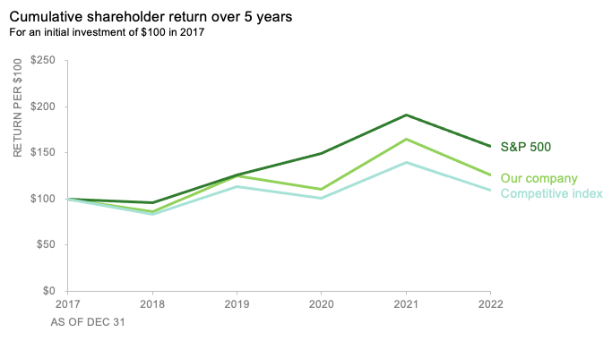
Here you will find a line graph with benchmark lines. The lines are represented as the competitive index and S&P 500 index versus their company. This chart incorporates two comparable benchmarks for a viewer to interpret against their trend. The visual shows the cumulative shareholder return over 5 years on an initial investment of $100 back in 2017. This chart is quick and to the point and provides an audience with just enough data to compare.
Benchmark Comparisons
This week we review Chapter 4 in our textbook, Effective Data Visualization, which goes over the importance of including a benchmark in our visuals. Benchmarks are extremely important because without that context, we limit the amount of information we can pull from a graph. Adding benchmark information clearly displays what the data is being compared to. This simple detail allows the viewer to easily determine whether performance was good, bad, or close to the mark.

This graph from The New York Times shows the monthly global temperature compared with preindustrial levels. The benchmark on this graph is the data for the year 2023, and the other years since 1940 are what is being compared to the benchmark. Just by quickly looking at this visual we can tell that global temperatures were much lower in previous years than in 2023. This benchmark stands out because the line is a darker color and much bolder than all of the others. This visualization is highly effective because the years prior to 2023 are a lighter opacity and color. The creator also only included data labels for the points in 2023.

Another graph from The New York Times displays the daily average sea surface temperatures. This visualization also includes a benchmark to help viewers easily process the data being shown. The gray dotted line, representing the average temperatures from 1991-2020, is the benchmark in this data. The blue line is the most current information which is being compared to the benchmark. In this graph we see that the temperatures in 2023 are much higher than the average between 1991-2020.

Lastly, this graph of Antarctica’s sea ice mass shows that levels in 2023 are much lower than the average from 1979-2010. The gray dotted line is the benchmark, while the red line is the data being compared. While this visualization is still effective, I believe the previous two were better. This is because the gray dotted line is not as prominent as the benchmarks in the other graphs. It gets lost in the data and takes a second for the viewer to notice it is there. Making the benchmark line a different color would help make it stand out.
Benchmark Comparisons
This post demonstrates the understanding of different types of graphs and data sets being compared to a benchmark line. By definition, a benchmark is a measure or comparison. The article includes many different graphs demonstrating climate change over the years. This article aims to compare the climate of previous years to the climate of 2023. The two following charts come from the same article on climate change.

The graph above is an example of a line graph. The orange line in this example is the benchmark line. The primary goal of this graph is to compare the climate change cross an entire year to the climate in 2023 which is highlighted.

Similar to the previous graph, this graph conveys a similar message except the creator has used two different benchmark lines instead of one.
Overall a benchmark line can convey a compelling message to a viewer. A benchmark line can allow a viewer with no previous knowledge of a certain topic to be able to follow along with a certain infographic. A viewer having other data to compare something to can help keep an audience engaged for extensive periods of time.


Podcast: Play in new window | Download
Benchmarks and Economics
The United States economy and stock market like many other countries is driven by forecasts and hitting those expectations also considered to be benchmarks. In addition, most economies are dependent on how other countries economies are performing as we operate primarily in a global economy where the news and events of one country directly impact other countries. Forecasts act as benchmarks for particular data news such as consumer price index (CPI), producer price index (PPI), job creation numbers and unemployment rate to name a few. This forecasts act as targets and if the news comes in above or below expectations this can create volatility in the markets.
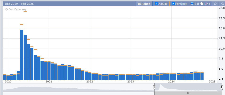
Above is a chart of the unemployment numbers represented as percentages. Each month the forecasts are created by analysis displayed as the gold bar. The actual number is the blue bar. When major news is released it is typically released at 8:30am EST an hour before the New York Stock Exchange opens. This is important as this will influence in what happens in the market that day and how it affects long term trends. A majority of people save for retirement by investing in 401ks, IRAs, and other retirement plans and the numbers being released give you a read on the pulse of the economy. These negative reactions can create downward pressure on the markets and lead to losing money or having diminishing returns on those accounts.
Another way benchmark performances are evaluated is by comparing a particular stock versus an index fund that is similar to the underlying stock. Take a look at the chart below.
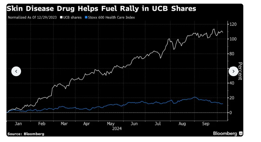
The chart above uses line graphs to compare ticker symbol UCB versus the Stoxx 600 Health Care Index. This shows that the shares of UCB has outperformed the index significantly. This largely is because of their release of a drug to treat psoriasis. This is important when managing funds and rotating different investments to receive the highest return possible.
Benchmark analysis is a critical component to not only our economy but the global economy. By being able to accurately evaluate the data it can help make informed decisions. There are different ways to display benchmarks but all are important when understanding the data and how to evaluate it.
Benchmarks Comparison
What is a Benchmark and why does the World use them? Well, a Benchmark is a standard or point of reference used to measure the performance, quality, or value of something. To get literal, according to the Cambridge Dictionary, a benchmark is “a level of quality that can be used as a standard when comparing other things“. Therefore, a benchmark has endless opportunities to be used in the World. Some may use them for a finance report to compare performance or investments. Others may use a benchmark in technology comparing speed, efficiency, and capabilities of a program. For me I would be using it in the education world maybe to compare my students grade point averages, or how they have progressed or declined in performance. Overall, benchmarks help establish goals and measure progress or success in any aspect you use one.
In this case I am going to show you a few examples of how Benchmarks can compare in the benefits of using one to display data versus how they compare in the ways they were used.
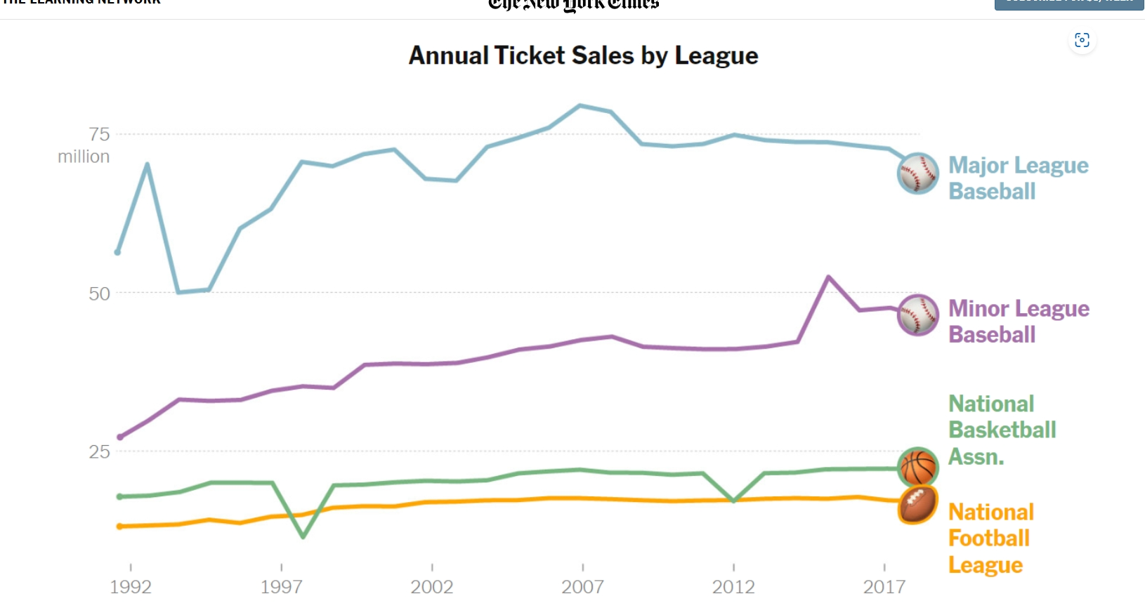
Below is a picture of a line graph used to compare Annual ticket sales by different Sport Leagues. The difference in color used for each specific league, as well as the icon attached at the end of the line to differentiate each benchmark really caught my eye. Clearly Major Leage baseball has the most consistently high sales. Perhaps that is because tickets prices compared to NFL prices are lower, or maybe America just likes their past time sport of baseball best. You would need to read this NYT article to get the details, but the benchmark is a great example of data visualization and the different ways to enhance them. https://www.nytimes.com/2019/10/24/learning/whats-going-on-in-this-graph-oct-30-2019.html
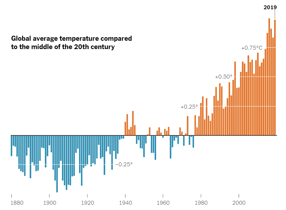
Now lets look at something compeltely differernt than Sports and ticket pricing. There was another article in the NYT digital genre that compared the Hottest and Coldest temperatures of the world on a timeline from 1880 to mid 2000’s. https://www.nytimes.com/2020/04/23/learning/whats-going-on-in-this-graph-global-temperature-change.htmlThis data visualization used the blue color for cold temps, and red for hot temps which the brain typically relates as one another as well. Also, the bars on the graphs go below the benchmark used in this graph to show freezing/cold temps while the bar go above the benchmark for hot temps. The benchmark is used for the comparing of data and was used really well here in my opinion. There is a lot of data being displayed but it doesn’t seems as congested or confusing in this delivery.
Benchmarks to circle back around are a great tool to use when comparing information or data. The means of them are endless and can be used in many different ways. I hope this Blog was helpful in explaining their purpose and giving some insight on how they have been used successfully.
Demystifying Pivot Tables: A College Student’s Guide to Data Analysis
Introduction:
Just a little bit of interest and a desire to try something new will do; coding is not anything to be concerned about. We’ll dispel common misconceptions about pivot tables, go over their applicability, and demonstrate how to utilize them to make an impression on potential employers and teachers in this blog post.
What Makes Pivot Tables So Special?
“How on earth do I make sense of all this?” is undoubtedly on your mind as you look at this enormous spreadsheet filled with figures. Presenting pivot tables, your newfound ally in the data analysis space. You can organize and summarize your data using these useful tools without having to be a Ph.D. spreadsheet expert.
How Do They Work?
Think of pivot tables as virtual LEGO blocks for your data. You can drag and drop your columns into different areas to create a customized table that highlights the trends and insights you’re looking for. It’s like magic, but for data geeks like us.
Cool Features You Need to Know:
Summarize Like a Pro: Want to know the average, sum, or count of your data? Pivot tables have got you covered.
Filtering Magic: Zoom in on the stuff that matters by using filters to focus on specific data points.
Grouping Goodness: Let pivot tables do the heavy lifting by automatically grouping your data by date, category, or any other field you fancy.
Make it Pretty: Customize the look of your data with formatting options. Impress your friends with a sleek and professional-looking report.
Real-Life Applications for College Life:
Grade Analysis: Wondering which classes are your strong suits? Pivot tables can help you break down your grades by subject or semester.
Budget Crunching: Keep track of your spending habits by categorizing expenses and creating a budget overview.
Extracurricular Excellence: Use pivot tables to analyze your involvement in clubs, sports, or other activities. Spot trends and areas where you can level up.
Conclusion:
Pivot tables might sound a bit intimidating at first, but trust us, they’re a game-changer for anyone dealing with data – and that includes you, college student! As you navigate through your academic and personal life, having these skills in your toolkit will make you stand out. So, grab that spreadsheet, give pivot tables a spin, and get ready to conquer the world of data analysis with confidence!
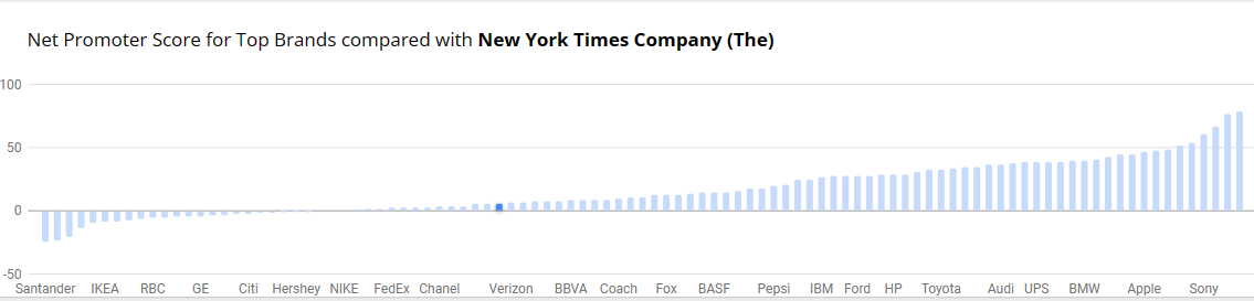
Benchmark Comparisons
Benchmarks provide context, allows for assessment of performance, helps identify outliers within data and can be used to set goals and targets. Decision-making benefits, more informed choices, performance improvements and communication become effective with benchmark comparisons. There is quality assurance, allows for competitive analysis and even assessing effectiveness with programs and policy. You are able to conclude with meaningful insights. The example below is from NY Times and the Net Promoter Score for Top Brands. It’s a simple bar graph with minimal color. Net Promotor Score (NPS) is a customer loyalty metric that measures a customer’s willingness to return for another purchase/service but make recommendations as well. This can increase a company’s revenue. Scores higher than 0 are typically good and above 50 is excellent. The bar graph has list of companies on the y-axis with the scores on the x-axis