Comparing Numbers
Statista is perhaps well known to many people including myself as I have used their website a few times. Statista offer wide range of useful data visualizations regarding some available topics and include detail explanations.

Netflix is a great choice to use because when someone such as myself think of Netflix I think it would be a massive platform available worldwide and it is. The number of users in Netflix is incredible but it does not mean that Netflix is at all the number one choice in all countries perhaps due to strong regional competitors or availability of content in that region. As we can see on the infographic, Netflix is well known to many American but Netflix is not the strongest in the market, only one-fifth of the entire market. As I stated above, this is possibly due to strong region competitors such as Disney+, Hulu, HBO, and many on the rise such as Apple TV+. The most surprising fact included in the picture is India. Netflix only took up 3% of the entire market. I have not deep dive into India’s streaming market to fully understand what Netflix is competing in the region. Moreover, as the infographic only include a few notable countries from each continents, some region I would want to see more such as China or Russia. Despite them label all major streaming providers included, it is unsure whether China or Russia does not provide any data or that Netflix dominated in their markets. It is the censorship in China and whether the sanction by the United States effect the availability of Netflix in those two regions.
Statista offers more information regarding Netflix about financials, number of employees, etc… can be found here. This particular infographic can also be found here.
Comparing Numbers For political candidates

Data visualizations are a major aspect in simplifying complex data to a broad population of people with different cultures, and languages. As shown by the New York Times bar graph of the speaking times of political candidates and the amount of attacks that each political candidate received in comparison to their speaking times. Taking a look at the bar graph, it is very clear what it is trying to convey. The graph not only labels the time in increments with labels, but also states the total amount of time that each candidate ended up speaking for. Though the graph for comparison is separate from the bar graph of the total time, the clarity of the information being presented leaves very little room in regards to which graph is what, and what it is they are trying to convey. What was interesting about this comparison is that the person that was the most attacked was surprisingly not the person that spoke the most, but rather someone that they didn’t even speak at all. Furthermore, there are also a plethora of other data visualizations that compare numbers that could have also been used to portray the data besides the a bar graph. Two such examples would be doughnut chart or a pie chart. Both would not only accurately represent the data, but also offer a visual representation of the percentages that each candidate spoke in comparison to the total time given. With that being said, Data visualizations for comparison of numbers can be applicable for a number of different topics, aside from political topics, and portrayed in many different kinds of graphs.
Comparing Numbers
Tools that may help us construct visualizations that compare numbers.
Before researching the tools that help us construct visualizations that compare numbers, through this class, it was primarily about infographics or, more importantly, different types of charts. Charts help us by visually representing data, making complex information more accessible and understandable.These visual representations, such as bar graphs, line charts, and scatter plots, enable us to identify trends, patterns, and outliers in datasets effortlessly. They serve as powerful tools for conveying insights and supporting data-driven decision-making processes. Exploring the various chart types and their applications has been a fundamental part of our journey in mastering data visualization.

Through researching and this class, excell is the easiest and most effective tool in hrlping onstruct visualizations that compare numbers. Excel helps construct visualizations that compare numbers by offering a user-friendly Chart Wizard, data sorting and filtering capabilities, customization options, and interactive features. It also provides the flexibility to work with various data sources and create professional-looking charts and graphs, making it a versatile tool for data analysis and presentation.
Some cool things about Excel include its comprehensive help options, allowing users to type in queries and receive relevant results. Additionally, the abundance of online resources, forums, and tutorial videos makes it easy to find solutions to any difficulties you may encounter while using Excel for data visualization, benefiting from its widespread popularity. Also, Excel’s consistent updates and improvements ensure that users have access to the latest features and functionalities, enhancing their capabilities for creating even more dynamic and insightful visualizations for comparing numbers.
sources
Comparing Numbers
Insightful data visualization comparison: Statista Chart
Statista.com is an excellent infographic source with exceptional examples of how data research and the art of digital design merge to tell a story. For this week’s blog post I will be sharing several examples of infographics I found to be interesting.
Many individuals, myself included, may fear the thought of wading or swimming through waters containing sharks. However scary this may seem; sharks are not the bloodthirsty and ravenous creatures they are depicted as in the media. Statista’s infographics on data pertaining to shark attacks does an excellent job at backing up this claim, as the numbers speak for themselves. The information sourced for both of the following infographics was obtained from the Florida Museum of Natural History located at the University of Florida.
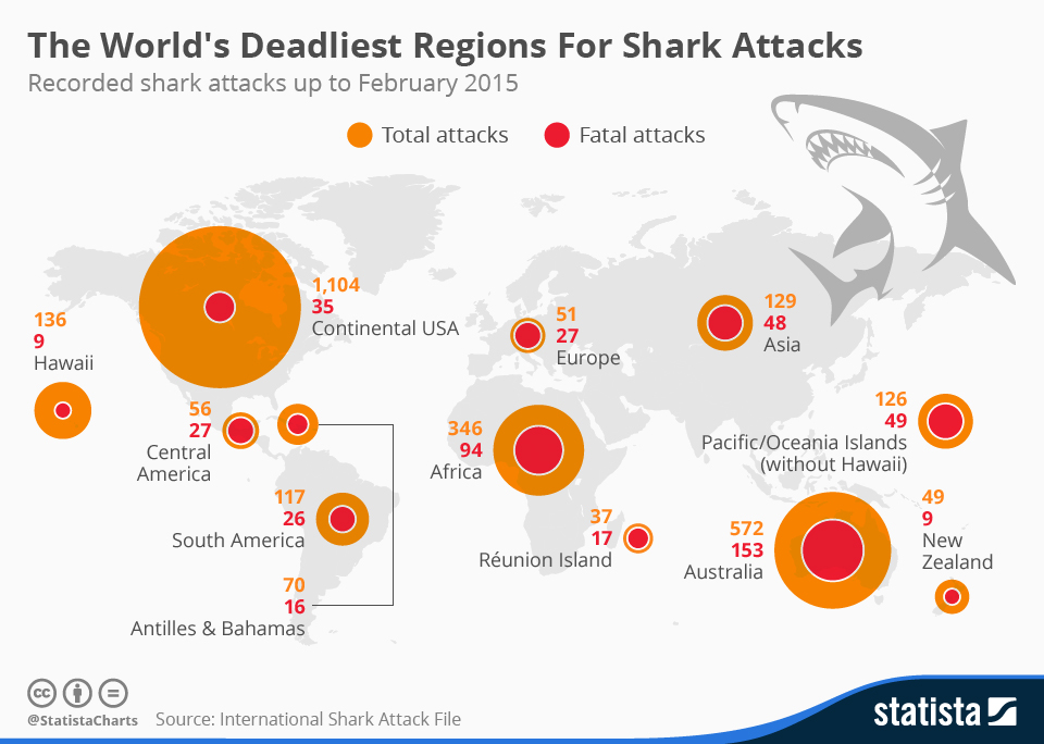
Chart: The World’s Deadliest Regions For Shark Attacks | Statista
The first excellent thing about this infographic that I noticed, is how quickly a few stories or interpretations may be picked up upon viewing this chart and the numbers. The concentrations of the total attacks are greater in the continental USA, Australia, and Africa. This sheds light upon which regions of the world contain the most concentrations of individuals swimming in large bodies of water. Additionally, by providing the total attacks versus the fatal attacks via a circle with increasing area within another, more interpretations may be derived. Do some of these regions have geographical constraints inhibiting healthcare providers from responding quick enough to attacks? Or are there different species resulting in different severity of the ultimate damage from these attacks across different regions? I also felt that the placement and scale of the circles atop the world map was strategically smart. By scaling the circles area roughly in unison with total attacks directly above the associated region, one can easier visualize where the most attacks were occurring.
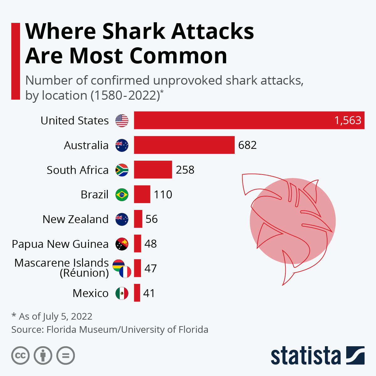
Chart: The World’s Shark Attack Hotspots | Statista
This chart provides an interesting and efficient addition with a miniature frame of each country’s flag, allowing the viewer quick association of the shark attacks per country. An interesting observation from the last infographic to this one, is how the number of sharks attacks has significantly increased in the last 7 years in the United States.
Sources:
McCarthy, N. (2015, May 25). Infographic: The World’s Deadliest Regions For Shark Attacks. Statista Infographics. https://www.statista.com/chart/3590/the-worlds-deadliest-regions-for-shark-attacks/
Armstrong, M. (2022, July 5). Infographic: The World’s Shark Attack Hotspots. Statista Infographics. https://www.statista.com/chart/8272/the-worlds-shark-attack-hotspots/
COVID-19 Vaccine Comparison Chart
A comparison chart is an effective way to show and compare multiple options between two or more items. In this blog, there is a comparison between two COVID-19 vaccines which are Pfizer/BioNTech and Moderna COVID-19 vaccines. When both these vaccines approved by the FDA many people had questions about which vaccines were more effective and what are the side effects after receiving them. This comparison chart contains details of the vaccine age eligibility requirements, the number of shots required, days between shots, as well as side effects.
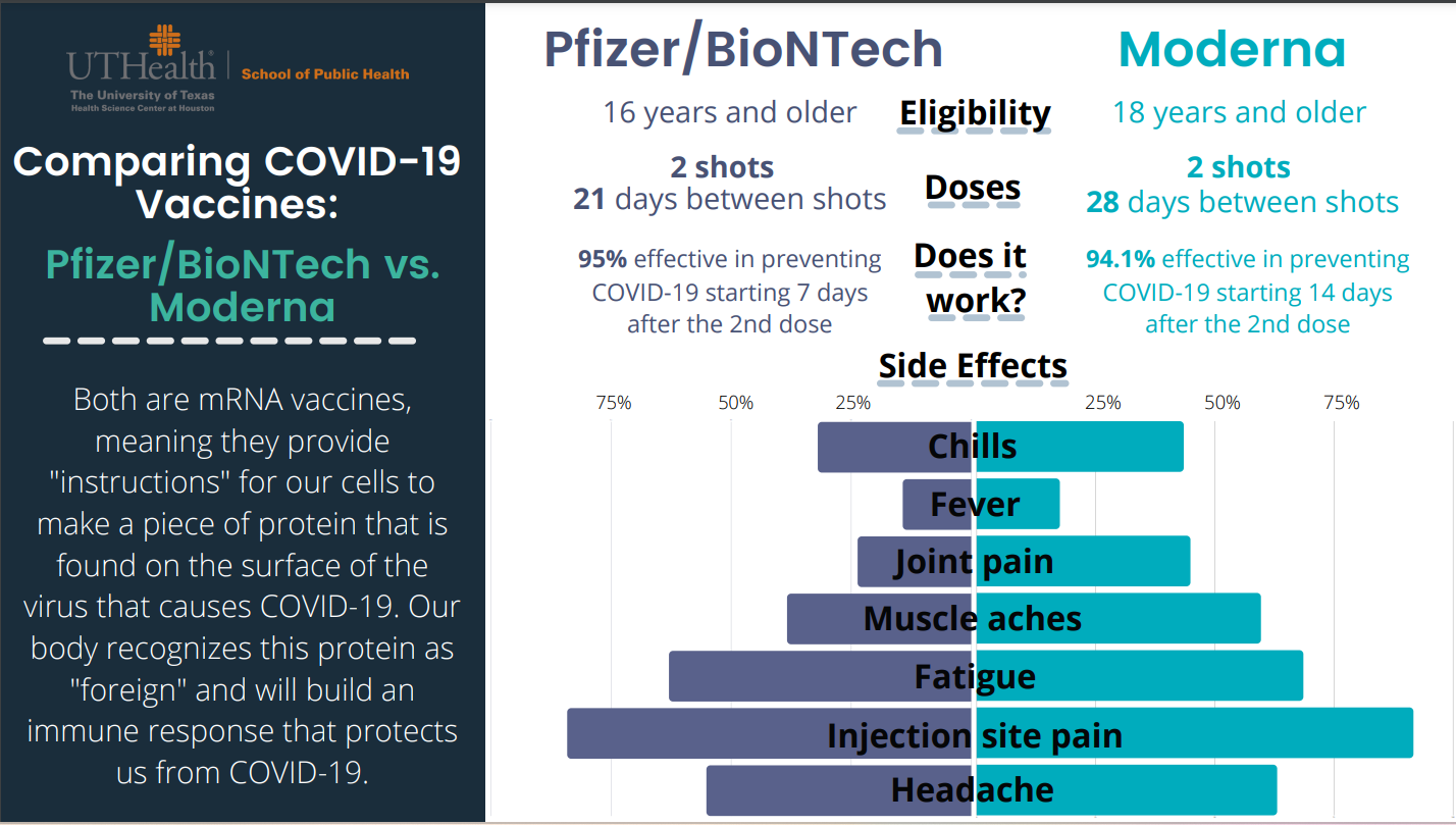
On the left-hand side, Pfizer/BioNTech provided data about the effectiveness of the vaccine and on the right-hand side, Moderna provided data about the effectiveness of the vaccine. Both vaccines are safe and effective based on their clinical trial results. The beauty of the comparison chart is it attracts reader at first sight and give important information right away about these two vaccines instead of reading whole in-text information. In addition, this chart mentions both vaccine’s side effects with percentage values so anyone can get an idea. The reason I choose this comparison chart since I am a certified immunizer and pharmacy technician at Walgreens and every time people have questions about vaccine’s effectiveness and their side effects. In conclusion, comparison charts enable us to make informed decisions and bring meaningful insights.
Reference
https://eagleanalytical.com/uthealth-covid-19-vaccine-comparison-chart/
Insightful Data Visuals: Health Science
When presenting a variety of information, such as comparing numbers, graphs and tables are the most effective means of presenting. The use of visualizations is an excellent method of creating visual representations that are complex to explain verbally. Chart interpretation and design can be challenging, especially when you have to construct imperative information, such as in health-related topics where reliability and validity are of utmost importance.
How to Ensure Self-explanatory Graphics
During my research, I found a resourceful website that provides guidance and further explanations about how we can improve our ability to create visuals. This is especially true when numbers are involved. This is in a manner that our audience can understand. During my research, I found a resourceful website that provides guidance and further explanations about how we can improve our ability to create visuals. This is especially true when numbers are involved. This is in a manner that our audience can understand. Using the website AHRQ, we can create our numbers comparison infographics with in-depth detail and pictures that along with their information.
AHRQ: How To Interpret Bar Charts Effectively
Below are a few tips provided by the Agency for Healthcare Research and Quality AHRQ to assist you in this process.
- Bar charts are examples of visuals easily understood by your audience. This is if you use a tool to make this type of visual more intuitive. Rather than displaying multiple responses in a single barm you can be display the response most meaningful to your audience.
- It is important to provide additional resources. Providing additional labels that correspond with the numbers you are presenting allows the audience to remain focused on the topic you are presenting and the numbers that align with the data being displayed.
- Design plays an important role when color visuals and different shades are involved since you want your audience to be able to identify which numbers correspond to which color. The following image illustrates the use of the patterned bar when comparing more than one type of data.
- As well, it is imperative to ensure that the title or label of the bar chart accurately describers what the bars represent.
There are also several helpful tips provided on the AHRQ website on how to use things like symbols when comparing multiple numbers. The use of graphics as visuals means of displaying information to your audience or reader is highly prevalent in healthcare, therefore I shared tips that have grown most useful to me and can be applied to other professions when designing data visualizations.
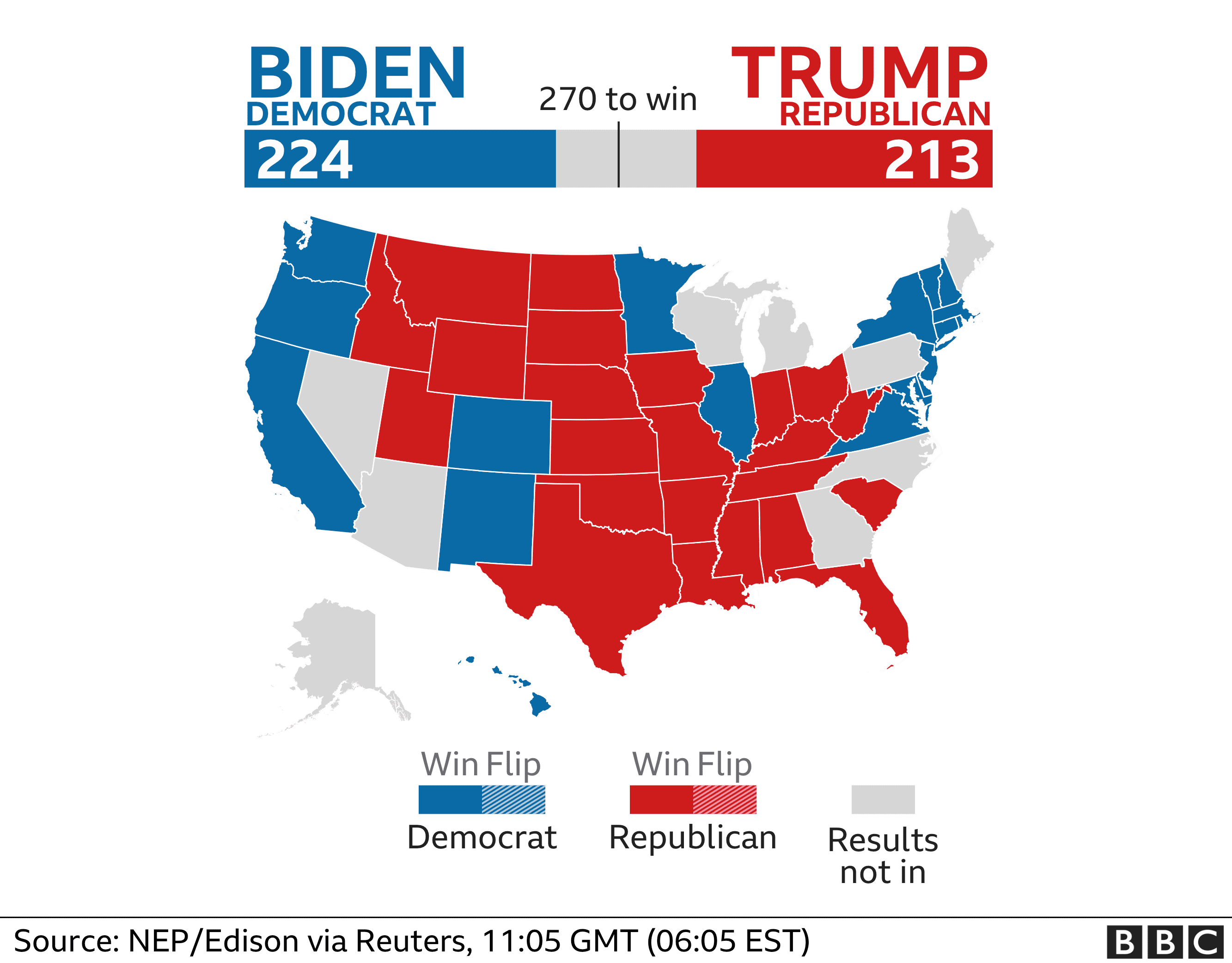
How to Compare Numbers
When analyzing multiple sets of data we must remember what the message is that we want to convey. While comparing two numbers to each other it is imperative that we portray them in a way that is easily readable for our audience. The first comparison visual that came to my mind is an election map. The reason this stood out to me is that they compare multiple things at once. They share with the audience the overall electoral votes for each candidate using raw numbers and then share where they came from using color on the states. These are a perfect example of how we want to compare our data, show the data and then the evidence for why it is this way. Pictured below is an example from 2020, notice how easy it is to comprehend at a glance.
Comparison Tools
There is countless ways to do analysis of data to create a comparison visual. The most user friendly is Microsoft Excel to record data and to evaluate it. There are many others however, companies are finding quicker and easier ways to take your data and do this work for you. Coding is something a little less user friendly and understood so companies are taking advantage of this knowledge and creating programs to do analysis and data comparison for their customers. One of these companies is Segment, collecting data “The right way”. These companies are extremely marketable to other organizations who want to do some research and development and don’t have the means to do it themselves.
Attached below is a link to the segment website which includes a product overview and tutorial.
Visualizing Health
http://www.vizhealth.org is a informational website developed by the University of Michigan, dedicated to providing resources for creating better data visualizations in healthcare and medicine.
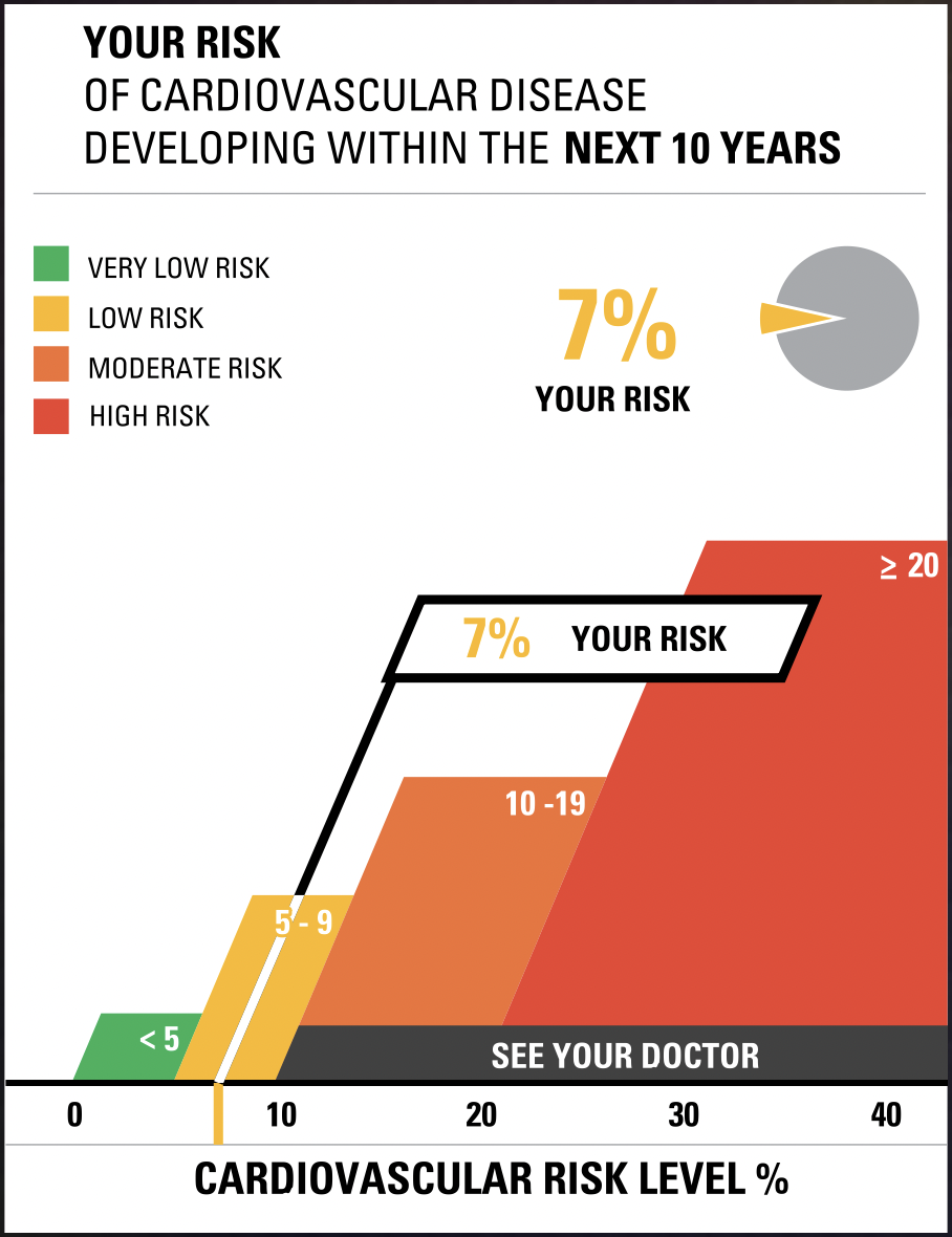
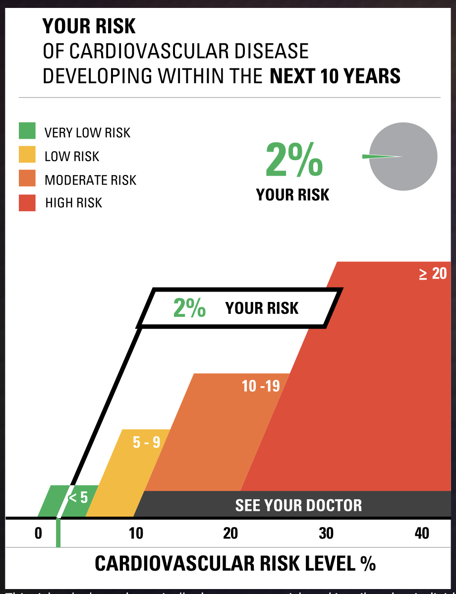
Although many pages of the website are currently defunct, a few useful resources are still functional. vizhealth.org has a built-in cardiovascular disease assessment which after a very brief questionnaire displays your risk for developing cardiovascular disease within the next 10 years. The formula used by the risk calculator was supplied by the Farmington Heart Study, an ongoing research effort which began in the 1940’s. This risk calculator is an exemplary display of interactive data visualization, my results below shows how a professional graph can be produced through engagement from an audience
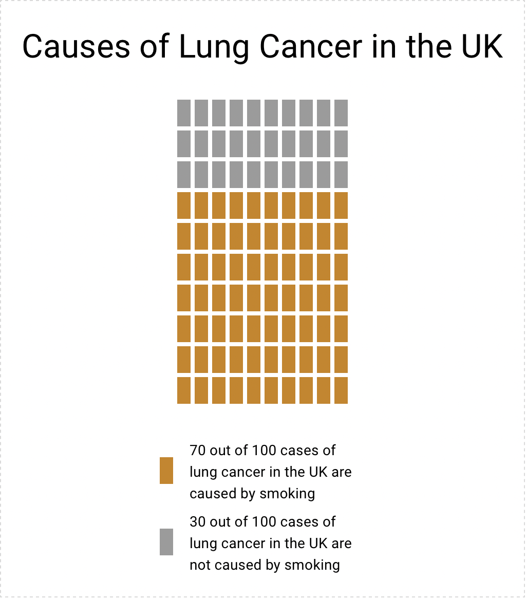
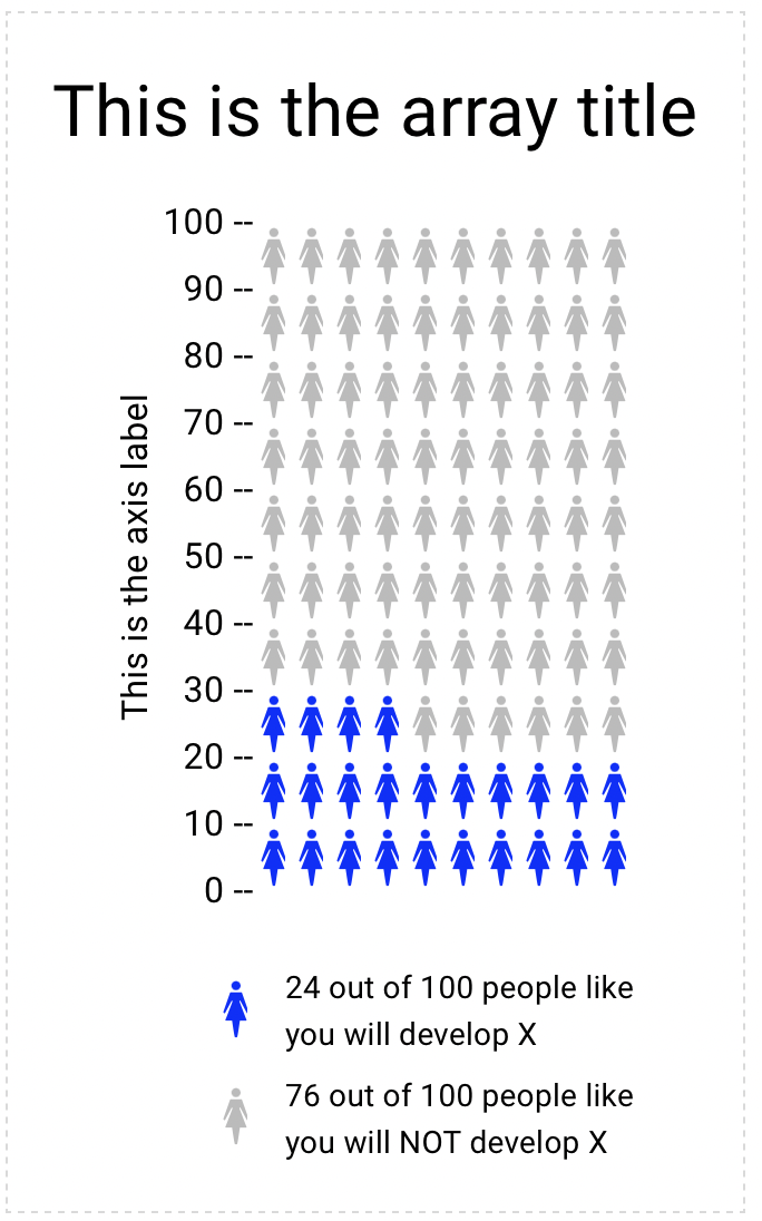
Another useful tool on vizhealth.org is a link to https://iconarray.com, another University of Michigan platform which hosts an interactive icon array visitors are able to experiment with and produce. Below are some examples:
Overall, vizhealth.org provides some useful resources for those interested in data visualization, and is indicative of all the useful tools available on the web.
Visualizing Health Data With VizHealth
This weeks chapter in Effective Data Visualization was about the importance of a single number. Sometimes the impact of an important data point is obscured by too much other information. The icon array seemed to be difficult to create in excel but the VizHealth website has a great tool that health care professionals can use to convey complicated data in a simple and concise way to patients and other interested parties.
The risk calculator tool on the site was extremely easy to use and I can see the application for health care professionals to input a few data points while speaking with a patient and being able to give the visualization with the patient summary at the end of the visit. This cardiovascular risk data can be especially useful with people who are tracking lifestyle changes recommended by their provider. Visualizations of progress can be very motivating. This infographic is very well designed and highlights the important facts in a way that is easy to read for most people.
Smoking is a large contributor to negative cardiovascular health outcomes so I checked the CDC website for some statistics on how many adults in the United States currently smoke. The number was quite higher than I imagined at approximately 12 percent.
While I chose to show two different types of information in the graphics, I think both types of visualization are great for multiple applications. The visualization has a great deal of potential and is much more sophisticated in design. Tracking metrics and benchmarking would be great with the first type of visualization.
The icon array is great because it is a simple way to convey a percentage. You can imagine each one of the icons as a person in a room. It can be used for so many different applications and is more universal and probably easier to understand for most viewers. I also appreciated that the icon generator had options for gender neutral because it allowed for me to use data that was aggregated to adults vs. mens’ data vs. womens’ data.
https://www.cdc.gov/nchs/data/nhis/earlyrelease/earlyrelease202304.pdf
These images are based on original research and designs from Visualizing Health, a collaborative project between the University of Michigan and the Robert Wood Johnson Foundation made publicly available via Creative Commons license. Our use of this image should not be considered an endorsement from Visualizing Health. For more information, visit www.vizhealth.org.
Visualizing Health
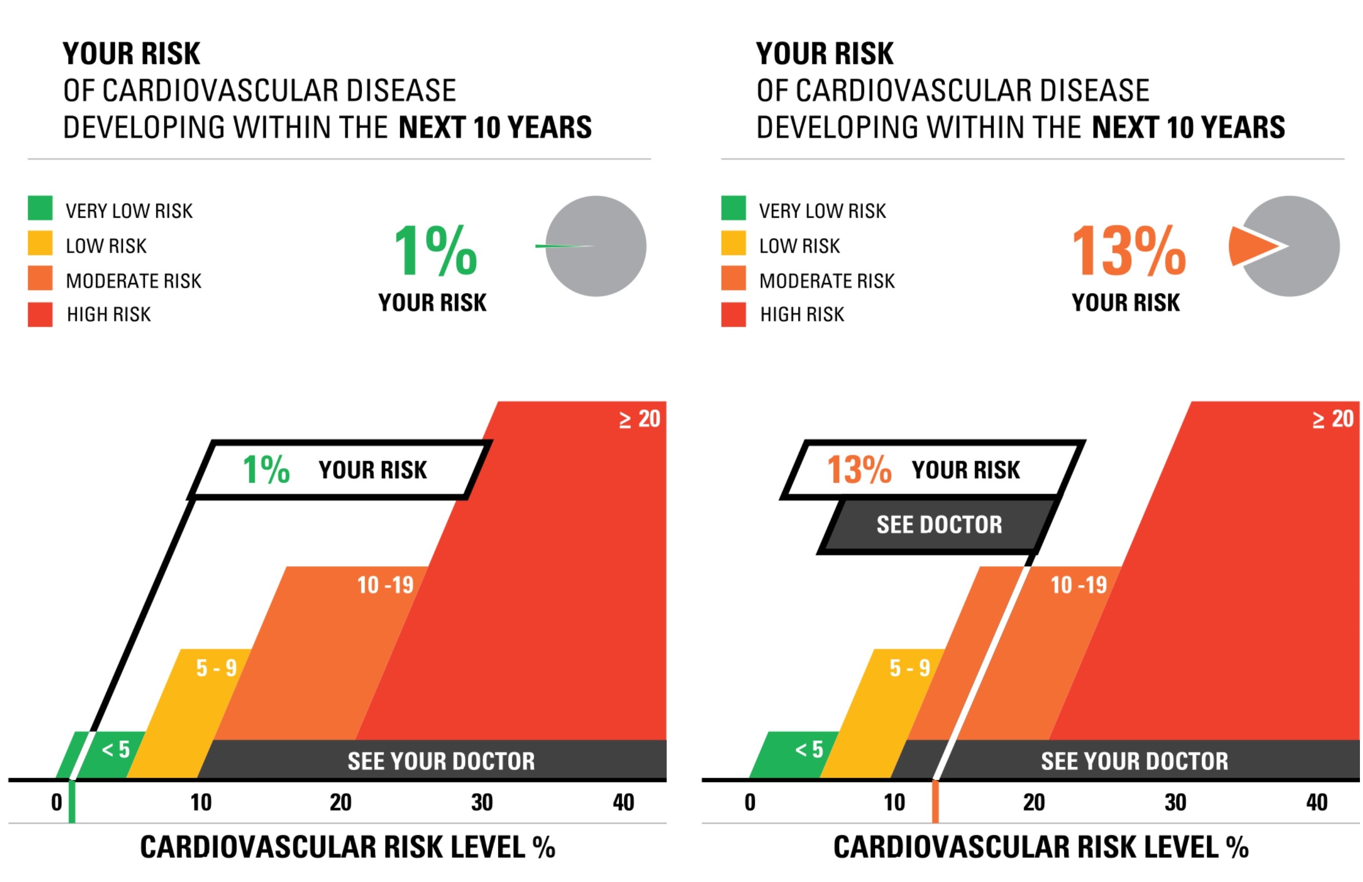
The site for Visualizing Health was very informative and neat to use. There were two data sets/numbers that I messed around with while using the risk calculator. The first was a young female (average height and weight) with normal levels for cholesterol, blood pressure, and overall good health. When I ran this calculator, I found that the risk for developing a cardiovascular disease was around 1%. I then ran the test again with a middle aged man (average height and weight) who had slightly elevated cholesterol and blood pressure, and was a smoker. The results for this test showed a 13% chance of developing a cardiovascular disease. While the website states that someone should not go directly based on this information and should still consult a doctor or another professional, I do believe that this provides a good starting point for someone who is concerned about their health and odds of developing a cardiovascular disease.
When I tested out the Icon Array generator, I felt as though I had a pleasant experience with it. Everything was very easy to navigate and understand, and it is a quick and easy tool to go to whenever someone has to create data visualizations such as this. I think it is beneficial that there are only four options for shapes and anywhere between 2 and three colors used. It makes it easier to look at and still very impactful in the end. The Icon Array I decided to create was based on the odds of women developing breast cancer. Upon research from the American Cancer Society, I found that 1 in 8 women develop breast cancer at least once in their lifetime, which translates to about 13 women out of 100. This data visualization is more impactful than simply hearing the statistic because it gives a better visual representation of just how many people are affected. I also like that I was able to change the color of the icons to light pink to represent and match the color for breast cancer. This simple feature once again makes it very impactful.
Overall, the sight is definitely valuable for learning about data visualizations because it teaches two simple ways to make data visualizations and is interactive, so learners are able to practice and have fun with it, which is key in learning these days.