Benchmark Analyses
By using infographic tools, benchmark analyses are presented in a variety of visual formats. In accordance with the Robert Wood Johnson Foundation’s considerations for selecting a benchmark for health equity. In other words, benchmarking can be used to evaluate health gaps and assess the quality of care to address these disparities. There are advantages and disadvantages when using different approaches to benchmarking health equity. It was concluded that there was no bet method for selecting a benchmark for health equity assessment.
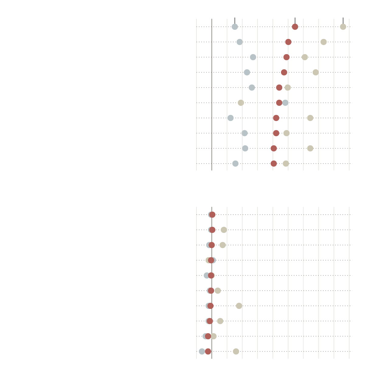
Examining the results of the RAND study reveals how much hospitals are charging private insurers. Two scatter plots are used in New York Times article, to illustrate the most and least expensive hospitals for private insurers, compared to Medicare. In the first scatter plot, the most expensive hospitals are displayed, while in the second plot, the least expensive hospitals are displayed. Among the benchmarks was Michigan, where private sectors are about two and a half times those charged my Medicare. Further details about how prices vary greatly
This is powerful distinction that RAND made to conclude that market forces are not working. This is always important to know and understand, since this involves financial income and it’s everyone’s right to know when they have been taken advantage of. The ability to see these data numerics visually makes all the difference.
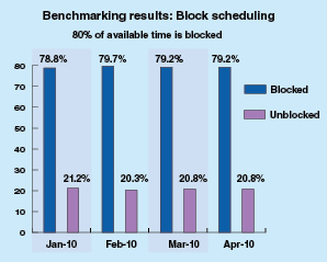
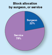
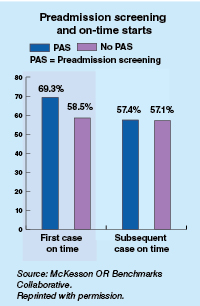
As another example of an infographic benchmark, the ormanager analyst offers benchmarks based on actual data from the sample of hospitals displayed. Comparisons are between two bar and 1 pie charts. As a result these correlations, they can differentiate between hospital productivity, hospital factors, like country (US or Canada), building type, and number of operating rooms. It was found that on average, US hospitals had lower scheduling quality than their Canadian counterparts. The turnaround time for US facilities was 15 minutes longer than expected compared to Canadian facilities.
Final Thoughts
As a result of my research, I have gained a in-depth understanding of infographic benchmark and the many domains and employment that they can be applied to in order to assist with the comparison of analytical data displayed in graphs. These tools have further piqued my interest and I would like to see more visual infographic comparisons in my own research fields and use them to make distinctions and not differences in future research papers.
Benchmark’s in Data
Many different types of data have an underlying benchmark included. A benchmark put simply is just a target or a goal that the organizer wants to meet or exceed. I have worked for multiple organizations who set these goals on a monthly or quarterly level then looked back over them to make predictions for the future. There are multiple different ways we can use benchmarks to visualize our achievements. We will take a look at some of these different visuals and see which ones work the best to portray a message.
The Benchmark Bar Graph
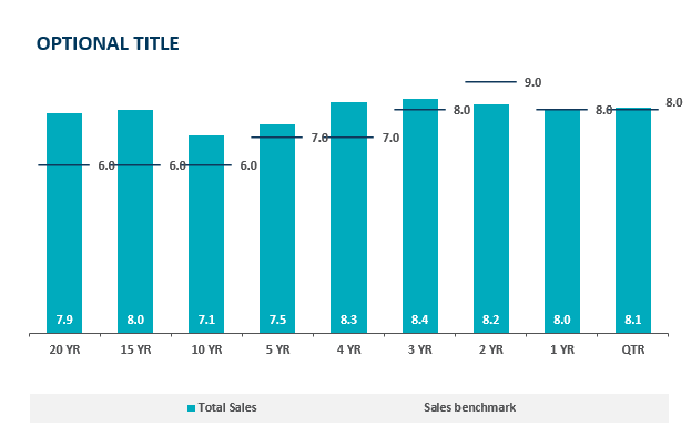
In a bar graph we can compare a value over time very easily but with the addition of a benchmark line we can see which time periods performed the best. Sometimes pure quantity doesn’t tell a whole story. Some months can see higher sales year after year. If we put a benchmark line in that month it is easier to see how it is really performing. This idea is highlighted in the above chart, the 20 year sales have exceeded goals by 2% which is great but as we get closer to the 2 year mark we see a miss of the goal yet a higher total sales. The 2 year mark obviously has a higher target to meet based on history and other factors. Growing benchmarks must mean the company is growing because they are achieving more and more goals.
Benchmark Line Graph
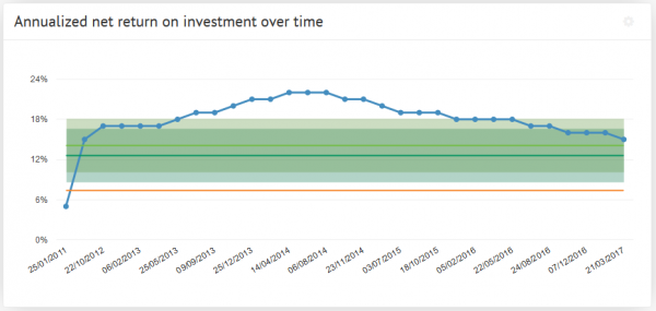
Here we see a different type of measuring a benchmark over time. The benchmark line here is the green portion and we can observe either exceeding expectations or shortcomings based on the blue line above. The benchmark is set steady at 18% and does not change. This means their goals do not change based on history or trends. Without changing goals how would this example grow. If we are trying to meet goals that always stay the same we’ll never see long term growth. Pushing goals up and up based on success will lead to meeting higher goals and higher growth.
Comparing Multiple Line Graphs
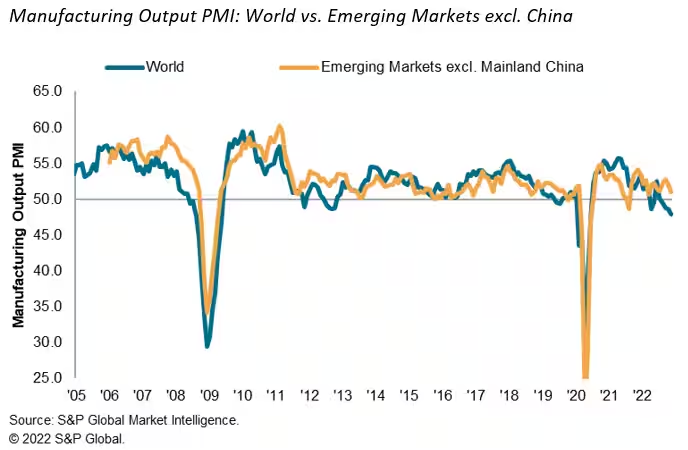
Here we have a graph of the emerging markets and how they stack up against the rest of the world. It measures total manufacturing output over the last 17 years. After a quick glance you don’t come away with much of an impression, this is due to a closely overlapping graph. I think this is a useful graph but it takes some time to really make a judgement on since the two lines are so closely related. I think it would be of more use if we saw it on a monthly level to really get some separation to see where the emerging markets are exceeding the world.
I think after all of these visuals we can understand what a benchmark really consists of. We also saw multiple different uses of them and can probably choose a favorite. I think the easiest one to read was the bar graph with clear benchmark lines that made it clear what points fell where in comparison with the benchmark.
Benchmark Comparisons
Some different ways people can show comparisons to a benchmark is through competitive, strategic, & performance. Competitive benchmarking is emphasized as the most effective form of benchmarking for businesses, allowing them to assess their true success by comparing themselves to competitors. It provides insights into industry trends and competitor strategies. To perform competitive benchmarking effectively, companies should establish clear goals and parameters and leverage digital tools for in-depth analysis, going beyond basic benchmarks like revenue and growth to gain a granular view of competitors’ data for more informed decision-making. Strategic benchmarking focuses on learning from industry leaders and best-in-class companies to understand their success and identify areas for improvement in your own business. It involves analyzing their business models and strategies to optimize various aspects of your own organization, such as marketing, online presence, or finances. Mobile app intelligence tools like Similarweb are highlighted as essential for gaining insights into mobile app trends and competitors’ strategies. Performance benchmarking aims to compare profitability and establish ambitious but achievable goals based on quantitative data comparisons, focusing on performance indicators like price, quality, speed, and reliability, ultimately driving continuous improvement.
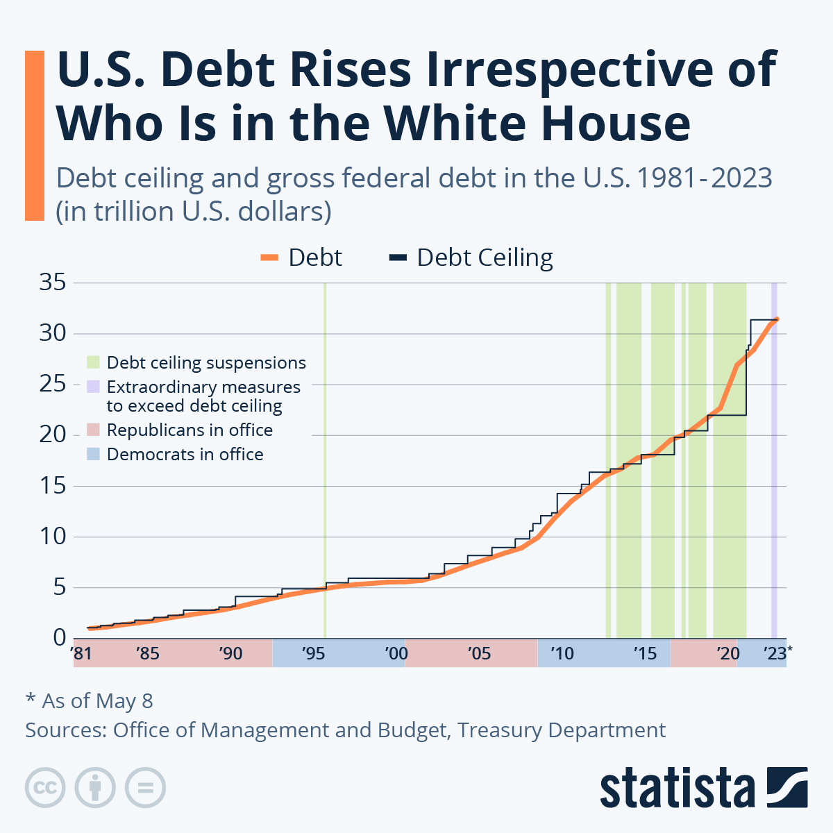
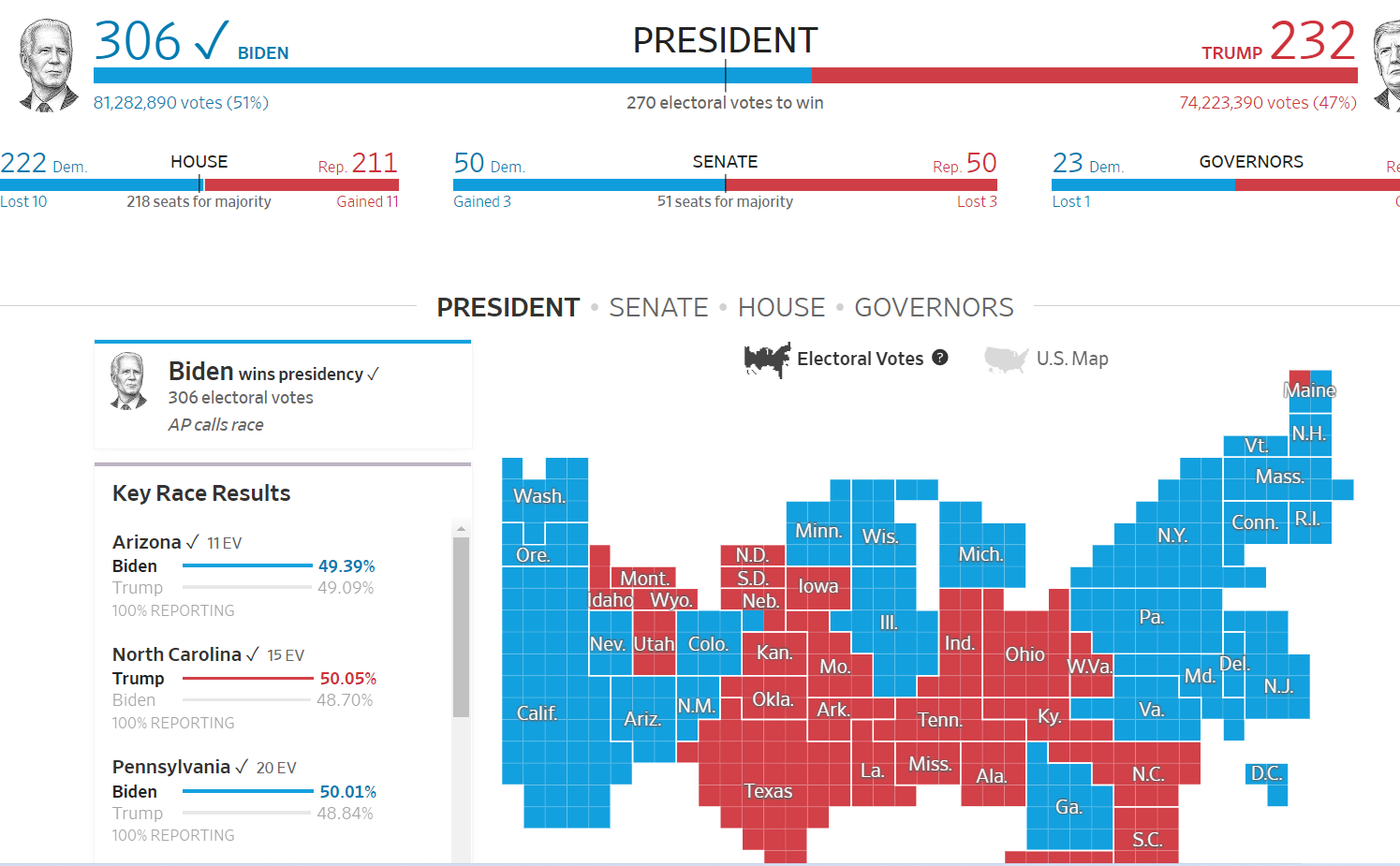
is this graph of the “U.S. Debt Rises Irrespective of Who Is in the White House” the benchmark is the debt. In this graph the numbers highlighted in blue at the bottom represent Democrats in office and red represents Republican. In this graph it shows typically it doesnt matter which group is in office because the debt rises no matter what.
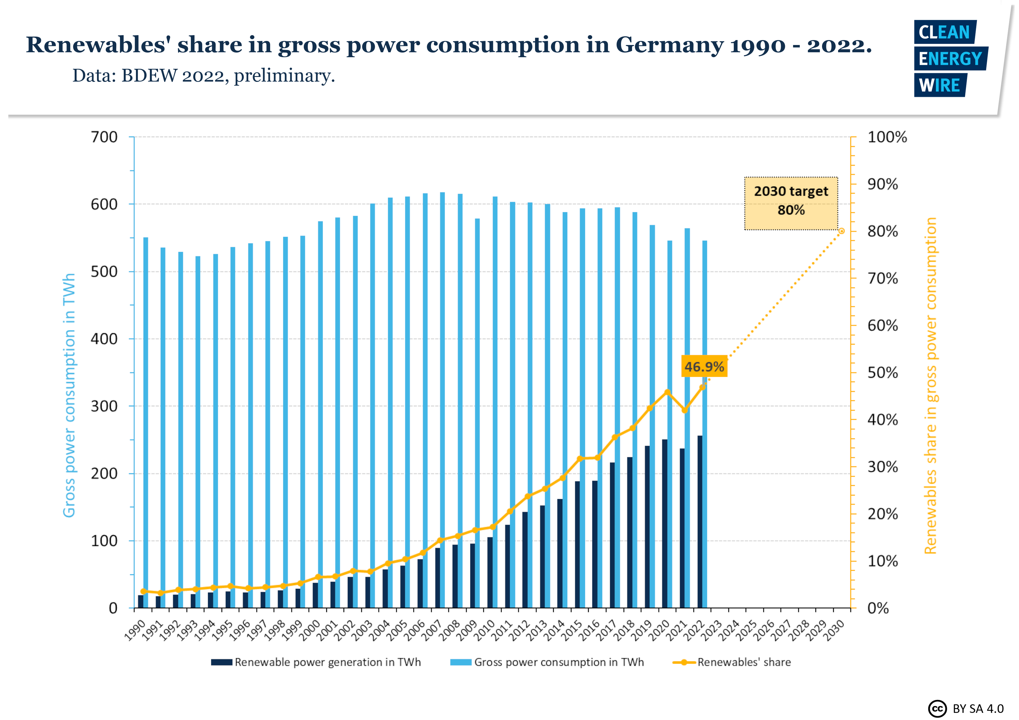
In this graph it shows Germanys power consumption throughout the years. The benchmark line is the yellow line indicating renewable shares. Germany is predicting that it will raise from 50% to 80% in the next 10 years.
sources
https://www.statista.com/chart/1505/americas-debt-ceiling-dilemma/
Comparing Numbers
This blog is about ways we can use insightful data visualizations to compare numbers. Data visualizations can make complex information more comprehensive. At the point when you analyze numbers visually, examples, patterns, and connections become more obvious. Comparing data is an effective way to show similarities or differences between two known subjects. With that being said, it can be very difficult to digest information when it is not presented in a way that speaks to the language of the eye. In order to draw someones attention you have to know how to visualize data in an easy to understand way. However, there are different charts and graph that digest certain types of information and data. Choosing the most effective tool is extremely beneficial.
For example, the author gives different charts for the appropriate data sets in the article “7 Types of Comparison Charts for Effective Data Visualization” by Tanzil Ebad Chowdhury. When comparing numbers, pie charts are the most commonly used technique because they are easy to understand and interpret. This is best used when comparing a part to a whole, like percentages. https://ninjatables.com/types-of-comparison-charts/
Bar charts a great way to incorporate numerical data in a straight forward way. It is commonly displayed with an x axis for categories and the y axis for numerical values. This is good for monitoring changes over time.
Histograms are best used for quantitative data because they are specifically designed to display the frequency distribution of quantitative data. This can visualize the shape of the distribution so that you can analyze whether it is normal, skewed, etc.
Overall, there is a different chart/graph for every form of information, choosing the right one is the most important part. The article linked displays about 7 different ways you can do this and explains the primary approach for each one. It is essential to choose the best type of chart based on the specific characteristics of the data and the information you want to present. Other types of charts, such as line charts and scatterplots can be more suitable for different scenarios, so choosing the most appropriate visualization method is critical for effective data visualizations.


Podcast: Play in new window | Download
Comparing Products to Find the Best Fit
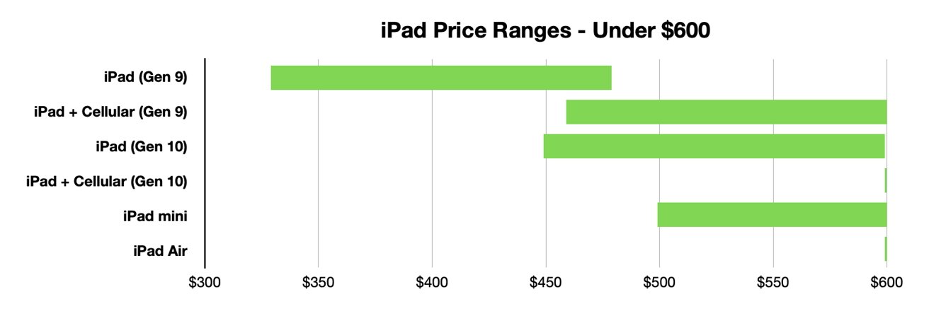
Comparison charts are a great way for consumers to compare multiple products from a company in order to determine which one is right for them. Let’s take the company Apple for instance. They provide many options on buying an IPad, but how do you know which one to get? There are many different charts that you can look at in to determine which one is best for you. First let’s start with the basics. Think about what you are using the IPad for. If you are simply taking notes then a regular IPad will do just fine. However if you plan to use it for editing or designing you might want to look closer at display sizes and resolution options.
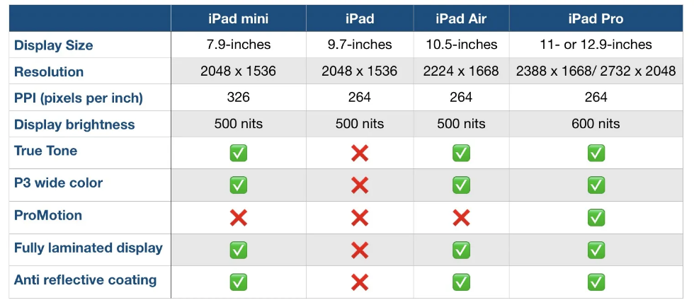
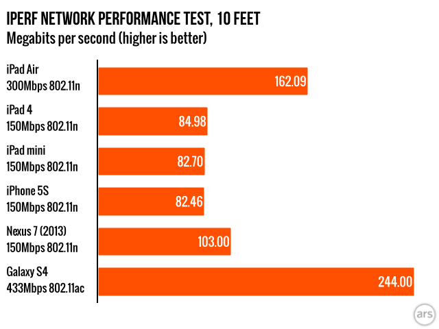
Another way to compare them is how well they perform. Someone who needs this device for high demanding and important work may wanna go with the IPad that has a higher megabit speed.
Lastly, and I think the most important to a lot of people, is how much each device costs. Comparison charts like this allow you to gauge how much this investment could cost you. Charts like the one below or the two above can usually be found on the company’s website or online forums for tech users.
Resources and Further Reading
Insightful Visualizations that Compare Numbers
There are many different factors that contribute to quality of life for people around the world. One of those factors tends to be leisure. How do we spend our “time off?” Many people work through their weeks and dream about weekend plans or where they are going for their holiday in the summer. The difference in that dream can be what country you live in. Some countries have statutory paid vacation, while some countries, including the United States, leaves paid time off rules up to employers. The graphic below shows guaranteed vacation time in several countries. It is shocking to see that most U.S. workers are guaranteed only 10 days off for public holidays, while Austrian citizens have 38 days between annual leave and holidays. Many U.S. workers are not even guaranteed the public holidays off because many services continue during those days.
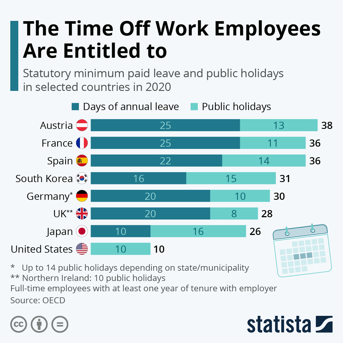
https://www.statista.com/chart/15005/statutory-minimum-paid-leave-and-public-holidays/
Paid leave can affect more parts of life than leisure. There are huge discrepancies in different countries on both paid sick leave and family or maternity leave. Again, some countries mandatory minimums for maternity leave. This graphic from Capital and Main shows the how much maternity leave is mandated by the United States versus other countries.
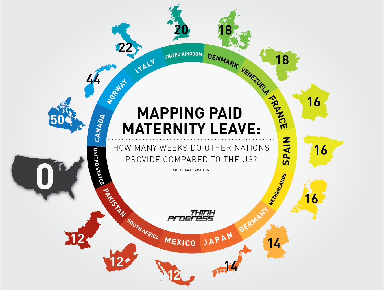
https://capitalandmain.com/the-right-to-care-states-paid-family-leave-turns-10
Graphics like these, that show how one country compares to other countries around the world can paint a picture the differences. Why those differences exist and how they affect populations are questions that we can research further to understand, but these graphics give us a great starting point.
Comparing Numbers Through Data Visualization
When comparing data across multiple categories it is crucial for the reader to understand the graph first. A good graph will label their axis’ along with the numerical values of their data. When analyzing the graphs, the reader can use the similarities between the graphs and the data to compare them. Through this comparison of data, a deeper understanding of the graphs can be reached. Visualizing the data makes comparing data especially easy, as the reader can quickly go from graph to graph reading the data. An article from Medium.com further explains the importance of visualizing data, the author states “humans will face a lot of difficult time interpreting datasets because normally human eyes can’t process a lot of information simultaneously, which is the job of data visualization to make it easier for us to understand.” This quote makes it easy to understand why data visualization is important when comparing numbers and data
Comparing Numbers
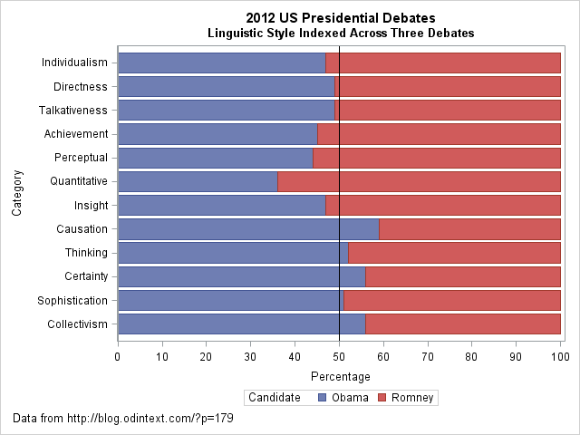
I came across an interesting dataset and a corresponding visualization that compared the characteristics of Barack Obama and Mitt Romney during the 2012 US presidential debates. The graph in question is a radar plot displaying 12 characteristics of the candidates’ words during the debates. These characteristics include “directness,” “talkativeness,” “sophistication,” and more.
However, I found the radar chart a bit challenging to interpret effectively when comparing the two candidates. I’d like to discuss two valuable tips that can make such comparisons clearer when using graph visualizations:
- Graphing the Differences: When comparing two groups, it’s often more intuitive to graph the differences between them rather than plotting each group separately. This can help viewers focus on what sets the groups apart. In the context of the 2012 debates, this could mean creating a graph that visually emphasizes the differences in characteristics between Obama and Romney, making it easier to identify distinctions in their speaking styles.
- Sorting Categories by Meaningful Quantity: In any plot that has a categorical axis, it’s essential to sort the categories by a meaningful quantity. This ensures that the visualization effectively conveys the message you intend. For instance, if the radar chart includes characteristics like “directness” and “sophistication,” consider sorting these characteristics in a way that highlights the most relevant differences between the candidates.
As for the dataset provided, it appears that the numbers represent the relative percentages of each characteristic attributed to Obama and Romney during the debates. For example, in the category “Individualism,” 47% of the phrases were attributed to Obama, while 53% were attributed to Romney.
By Shaun Sneddon
https://blogs.sas.com/content/iml/2013/08/21/comparing-two-groups-graphically.html
Benchmark Visualizations
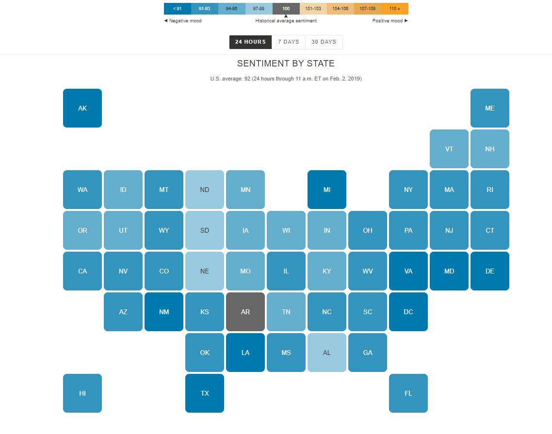
I find the “U.S. Social Sentiment Index” quite intriguing. It’s a creative way of harnessing the power of social media, specifically Twitter, to gauge our nation’s mood in near-real-time. What caught my attention, in particular, is how they use benchmarks to add context to the sentiment data.
In this case, they don’t just look at raw sentiment but also compare it to the current sentiment on Twitter. This means that they calculate a benchmark sentiment level based on the tweets they’re analyzing and then position the current sentiment relative to that benchmark. This approach is crucial because it provides a point of reference. It helps us understand whether the current sentiment is above or below the average sentiment of tweets from people across the country. For instance, if “most states are in the negative,” it suggests that the sentiment in those states is predominantly negative compared to the average sentiment in the analyzed tweets.
What’s even more fascinating is how this data is presented in near-real-time, updating hourly. It’s like having a live pulse on the nation’s emotions, and for data enthusiasts like us, that’s a treasure trove of insights. It’s a reminder of how data visualization can make complex information accessible and meaningful.
By Shaun Sneddon
http://graphics.wsj.com/twitter-sentiment/
Insightful Data Visualizations that Compare Numbers
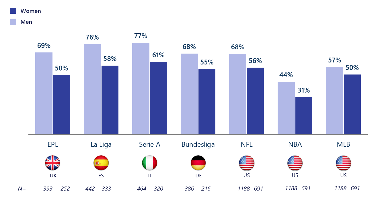
If there is one thing that should be known about data visualizations, it is that one can find a data visualization about almost any topic with the click of a button – and a quick google search. Due to the fact that baseball season is about to come to an end with the post-season approaching and the football season coming in full swing now, I thought it would be interesting to find a data visualization about sports and who exactly it is (by gender) that watches sports. As a female who watches baseball and even hopes to work for the MLB one day, I knew that the “MLB fan club” was mostly male dominated, but thanks to this data visualization, there is a better grasp about the true difference in the amount of males and females that watch and engage in sports such as baseball.
The unique thing about this visualization is that it not only focuses on U.S. statistics and sports, but also the UK, Spain, Italy, and Germany. This provides a perspective that might not have otherwise been known to people in the U.S. and other countries, and overall adds to the value of the data visualization.
Altman Solon, a telecommunications, media, and technology strategy consulting firm, created the data visualization pictured above and even went beyond by breaking it down even further. For instance, in the data visualization pictured below, viewers are able to just look at statistics for women in different countries and their interests in different sports leagues around the world.
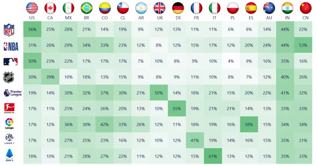
By breaking it down this far, viewers are able to get a better understanding of where females stand with sports interest compared to males, and hopefully make a difference so that the level of viewership becomes more balanced by gender in the future.