Sankey Visualizations
The Sankey Energy Data Visualization shows energy systems and it’s flows. It provides additional information on each category and is interactive.

After looking through this visualization for a while, I think that it is very effective for representing a basic knowledge of energy flows. I think anyone could look at this data and understand what it means.
At first, while looking at this data it seemed like a lot of lines that I could not tell where exactly they went. Making this chart interactive was a great decision by the makers because it clarifies where the lines are going, and provides additional information.

The only critique I have for this visualization is that I wish it would have provided more information and visuals on energy losses. Maybe a hyperlink with an additional visualization about energy losses and where or when they occur.
Sankey Visualizations
Overall, this presentation was highly informative. The goal of educating people about the total amount of energy being used in the United States through different types of visualizations is very effective. I learned about the different types of energy Americans use every year, how much is wasted, and what types of energy go towards what.

This screenshot above shows that 59.4 out of 98.3 quadrillion btu in 2014 was considered unused energy. That’s over 60% of our total energy. This screenshot also shows the main contributors to our energy supply in the United States with Oil being the number one contributor and natural gas and coal falling not too far behind. The oil used as useful energy primarily is used to power our transportation systems, such as cars, planes, and trains, and then the rest goes into the industrial industry such as factories. The chart also shows which type of energy is used the most with industrial energy having a significant lead over residential, commercial, and transportation.
Overall, I think the biggest thing I learned from this interactive chart is how much energy we waste in the United States. I always knew most countries were not as efficient as possible when using energy, but I never would guess over 60% of generated energy goes unused every year.
Sankey Visualizations
One visual aid for showing a flow from one set of data to another is a Sankey diagram. The connections are known as links, and the objects that are linked are known as nodes. Comparing quantities at various levels is done via Sankey diagrams. Among other things, they are able to display budgets, financial outcomes, the narrative of an application process, multi-round elections, and more. On the website Our Energy System, it shows you the flow of energy in the United States. The sankey visualization is very pleasing to the eye and I like how each different type of energy has more information and each word you can click on it and it will give you brief facts about the use of energy in the United States.
Here is the sankey visualization:

As you can see they have a different color for each electricity we use in America. Then they go into another section where they give you more information. Ans then they give you the whole scale on how much energy we actually use. I also like the visualizations like the icons they used. There are also other in-depth energy systems one this website that you can use. Every single word on this sankey visualization you can click and give you more information. This is really cool and I don’t think I ever seen this type of visualization, but it is very useful and probably be using this in the future.
Sankey Energy Visualizations
The National Academies’ interactive feature, “Our Energy System,” offers a comprehensive overview of the United States’ energy production, distribution, and consumption. Central to this presentation is a Sankey diagram, which visually represents the flow of energy from its sources through various sectors to its end uses.
Sankey diagrams are effective for illustrating the flow of resources, highlighting the proportions and pathways from origin to destination. In this context, the diagram delineates how energy from sources like coal, natural gas, nuclear, and renewables is allocated across sectors such as residential, commercial, industrial, and transportation. The width of each arrow corresponds to the quantity of energy, providing an immediate sense of scale and distribution.
Displayed below is a screenshot of the Sankey visualization created by The National Academy of Sciences which depicts the different avenues of energy production and use for the nation.
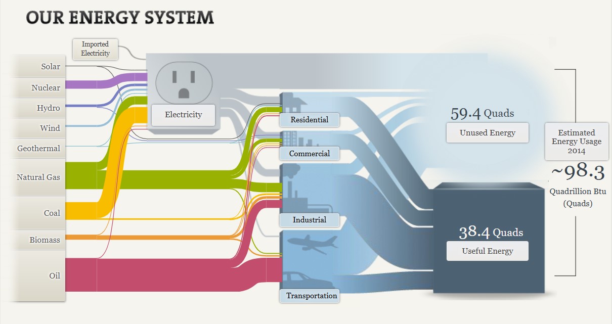
There are many strengths to this visualization. Not only does it provide clarity through succinct conveyance of complex energy flows, it provides both proportional representation and a comprehensive overview. The varying widths of the arrows effectively depict the relative contributions of different energy sources and their utilization, providing a visual proportional representation. By encompassing the entire energy system, the diagram facilitates an understanding of the interconnectedness of energy production and consumption.
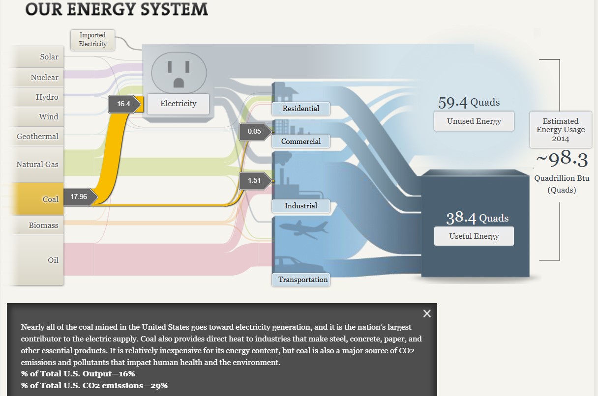
Additionally, the visualization is highly interactive, allowing users to click on different aspects of the graphic to see more information. As seen above, when selecting the coal energy source, it is highlighted in the graph and additional information is provided to the viewer. This capability allows the viewer to focus on one section of the graph at a time, as the visualization as a whole can become overwhelming with all off the details equally highlighted at once.
Interactivity also helps to more clearly explain details of the graph to the viewer. Having already viewed the section on coal, I clicked on the natural gas tab within the graph. Although the width of the coal and natural gas lines are visually similar, when you click on these sections separately you are given information about the output percentages of each of these types of energy. By viewing this information, I learned that while coal makes up 16% of the total U.S. output while natural gas makes up 29%.

The Sankey diagram on the National Academies’ “Our Energy System” page serves as a valuable tool for visualizing the complexities of energy flows in the United States. I believe that while there are multiple benefits to this type of graph when displaying data such as this, the interactivity of the graph is one of the most important aspects.
Global Health and Socioeconomic Indicators Analysis Report
Introduction
The Country Health Trends Dataset sourced from Kaggle provides key indicators such as life expectancy, fertility rate, population, and regional classifications for countries worldwide. This data allows researchers to explore global development trends, perform comparative analysis across regions, and investigate correlations between health and socioeconomic factors. This report provides a statistical overview and analysis of these indicators, uncovering insights into global health disparities and patterns across regions.
Objectives
The main objectives of this analysis are as follows:
- Perform Exploratory Data Analysis (EDA) to understand the distribution and range of key indicators.
- Conduct comparative analysis across regions for life expectancy and fertility rate.
- Explore correlations between life expectancy and fertility rate.
- Visualize global life expectancy using an interactive map.
- Highlight population distribution by region.
Data Overview
The dataset contains the following columns:
- Country: Name of the country or territory.
- Life Expectancy: Average years a newborn is expected to live if current mortality rates continue.
- Fertility Rate: Average number of children a woman would have over her lifetime.
- Population: Total population of the country.
- Region: Geographical region or political classification of each country.
Data Summary:

- Total Entries: 191
- Regions Represented: Six main regions, including America, Europe & Central Asia, East Asia & Pacific, Middle East & North Africa, South Asia, and Sub-Saharan Africa.
Methodology
- Data Cleaning and Preparation:
- Checked and handled missing values.
- Prepared the data for region-wise analysis by grouping and summarizing statistics for each region.
- Summary Statistics by Region:
- Calculated the mean, median, minimum, and maximum for life expectancy and fertility rate across each region.
- Aggregated population data to determine total and average population for each region.
- Exploratory Data Analysis (EDA):
- Visualized the distribution of life expectancy and fertility rates to understand skewness and distribution patterns.
- Created box plots to compare life expectancy and fertility rate across regions.
- Constructed scatter plots to assess relationships between life expectancy, fertility rate, and population size.
- Correlation Analysis:
- Used Pearson correlation to evaluate the relationship between life expectancy and fertility rate.
- Geospatial and Population Visualizations:
- Developed an interactive world map of life expectancy by country.
- Plotted a bar chart showing population distribution by region.
Key Findings
Regional Summary of Life Expectancy and Fertility Rate

- Life Expectancy:
- The highest average life expectancies are observed in America (73.2 years) and Middle East & North Africa (72.8 years), while the lowest is found in Sub-Saharan Africa (56.5 years).
- Fertility Rate:
- Regions such as Sub-Saharan Africa exhibit significantly higher fertility rates (average 5.4), while Europe & Central Asia show the lowest rates (average 1.7).
- Population:
- South Asia leads in total population, suggesting higher resource needs, followed by Sub-Saharan Africa and Europe & Central Asia.
Distribution Analysis
- Life Expectancy Distribution:

- The life expectancy distribution displays a negative skew, indicating that most countries have higher life expectancies, with a few outliers on the lower side.
- Fertility Rate Distribution:

- Fertility rate has a positive skew, with several countries displaying high fertility rates, especially in Sub-Saharan Africa.
Comparative Analysis of Life Expectancy and Fertility Rate by Region
- Life Expectancy:

- A box plot reveals that America and Middle East & North Africa have relatively higher and more consistent life expectancy values.
- Sub-Saharan Africa shows both the lowest median and broader range, indicating variability in healthcare and socioeconomic conditions.
- Fertility Rate:
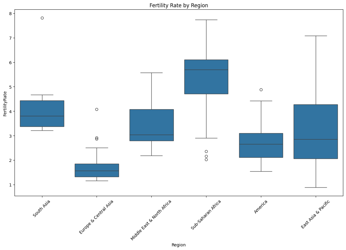
- Fertility rates are notably high in Sub-Saharan Africa, while Europe & Central Asia consistently exhibit low fertility, aligning with trends in more economically developed regions.
Correlation Analysis: Life Expectancy vs. Fertility Rate

- A negative correlation (Pearson’s r = -0.85) was observed between life expectancy and fertility rate, suggesting that higher fertility rates tend to coincide with lower life expectancy. This pattern aligns with demographic transition models, where lower fertility rates are often seen in countries with higher life expectancy due to improved healthcare and economic conditions.
Geospatial Analysis of Life Expectancy

- A map highlights countries with high life expectancies, including Iceland, Sweden, Canada, and Spain. This visualization reveals stark contrasts across regions, particularly between developed nations and regions such as Sub-Saharan Africa.
Population Distribution by Region
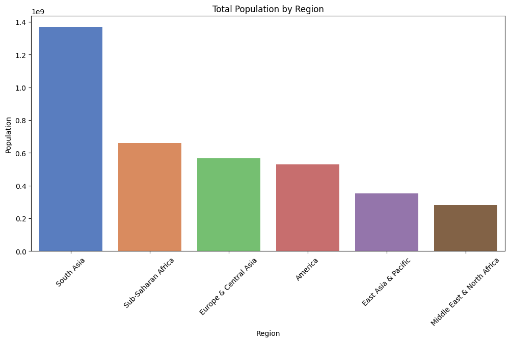
- A bar chart indicates that South Asia holds the largest population, followed by Sub-Saharan Africa and Europe & Central Asia. This regional breakdown emphasizes the need for tailored health policies in densely populated areas to address specific regional health challenges.
Conclusion
This analysis of global health and socioeconomic data reveals significant disparities in life expectancy and fertility rates across regions. A clear inverse relationship exists between life expectancy and fertility rate, aligning with global health and economic development patterns. The regional comparisons underscore the influence of socioeconomic factors, with Sub-Saharan Africa facing unique challenges related to high fertility rates and lower life expectancies, while regions like America and Europe & Central Asia exhibit higher life expectancy and lower fertility rates.
Recommendations for Further Analysis
- Time-Series Analysis: Examining trends over time would allow for tracking progress in life expectancy and fertility rates.
- Income and Education Analysis: Adding these variables could clarify the socioeconomic factors influencing life expectancy and fertility rates.
- Policy Impact Study: Assessing the effect of health policies on life expectancy and fertility rate changes across regions could provide actionable insights for policymakers.
Sankey Visualizations
Through this highly-informative presentation, the tools used to create these visualizations were very impactful in the goal of educating people about energy issues throughout the United States. In this visualization, I learned about the amount of energy wasted each year, how it impacts us, and what are the main contributors to creating our energy that is used either for commercial, industrial, or residential lifestyles.

In this screenshot, it is shown what are the main contributors to our total energy supply, and what industries rely on what types of energy. For example, it is shown that roughly 20 percent of the total energy created by oil goes to the industrial industry, and most of oil helps fuel the energy needs of the transportation sector. This visualization is very interactive and helps keep readers engaged throughout.
Something that I had learned by going through this visualization, is how much energy is wasted each year, which is well over half of the total supply! Aside from the environmental impact of this situation, which is all very well known and highly covered through various news sources, I was unable to find the financial burden this leaves the country with. A process this inefficient must be incredibly burdening to the people paying for this, which as South Jersey residents, I think everyone can understand.
I want to further explore how this can relate to continuous price hike that many New Jersey residents are facing right now, specifically South Jersey residents. With Atlantic City Electric increasing electric bills by a mind-boggling 20% just last year, I wonder if the situation we are currently viewing through the Sankey visualization can help explain these egregious price hikes.
Sankey Visualizations
National Academies Presents: What You Need to Know About Energy (nas.edu)
Sankey Visualizations was a really well displayed and organized site not only explaining what Energy sources are, what it means, and how we can better improve the American Energy Standard. “The energy choices we make shape not only our quality of life, but the health of the environment, how we work and play, the strength of our economy, and our national security”. This site has different links (tabs) the viewer can click on to toggle between How we use our Energy, Energy Sources, The cost, and Energy Efficiency. I drew arrows below on the screenshot to indicate which tabs I am referring to.

Then it breaks down even further how the Energy we use correlates from where it comes from and into percentages as well. Residentual and commercial ( aka our homes and work palces) accounts for 40% of energy consumed in the US according to a 2015 record. Transportation consumes about 28% and us Americans sure do like to Go Go Go. Then the third breakdown goes to Industry which accounts for 32% of energy.

The most significant section of this site is the “Cost of Energy” link. At first I thought it was going to show information about what Energy is taking from the American pocket since it is well known that we use so much of it. This is more focused on stressing the fact that we as human beings are deplesting our source of energy from the Earth faster than we are replacing it. We are using up our plant and fossil fuels more and more as time goes on. “At present, oil accounts for 36% of total energy consumption in the United States. Coal provides 18% and natural gas provides 29% of our energy. Another 9% comes from nuclear power plants. Renewable energy sources round out the roster, accounting for 10% of consumption—mostly as the result of hydropower investments made in the past century and the use of biomass (organic matter such as wood, municipal waste, and agricultural crops) for fuel and electricity production”.

It is clear that we need Energy sources to continue on living, but this will not be the case if we continue living the way we are. Changes need to be made. And changes need to be made fast. This Sankey Visualization and site did a great job of displaying the content and statistics of Energy. The truths, the reality, and the dangers.
Sankey Visualizations
Needtoknow.nas.edu provides many visualizations about energy usage in the United States. I learned that the flow of energy in the U.S. is complex and comes from numerous different sources. More than half of energy supplied is lost as waste heat or through inefficiencies.

This Sankey visualization breaks down our energy system from the source all the way to its usage. As you can see, Oil is the largest source of energy with a total output of 36% and total CO2 emission of 43% in the U.S. Although this visual is interactive and provides a large amount of information/data, I find Sankey visualizations to be difficult to interpret. There is a lot of data being displayed within a single visual, and it would be more effective to break it down into multiple different visualizations. For example, the data regarding % of Total Output and % of Total CO2 Emissions could be visualized as a Side-by-Side Column Graph. Another example could be the use of a Pie Chart to compare the % of energy used and unused.

This visual of Lumens per Watt for different types of lightbulbs is highly effective. The visualization clearly shows which lightbulb they are talking about and its lm/W. Viewers can interpret the graph efficiently due to its simplicity. This particular chart is a good example of a Large Number With Icons, as we have learned in the textbook.

Another good visualization is this Back-to-Back Bar Graph displaying the efficiency of energy on the road. You can compare energy used, gasoline burned, CO2 vented, and fuel economy between the two different types of vehicles. Again, the simplicity of this chart makes it more effective.
I believe this site would highly benefit from simplifying their visualizations. The data they want to explain would be easier to interpret, therefore, more effective if they were to take a more minimal approach.
SANKEY Visualizations

A SANKEY diagram is used to show the connections between different values. In this case this diagram is about our energy system. I think this is a perfect representation of when a SANKEY diagram should be used. There is a variety of values here that are interconnected. In this diagram in particular, the viewer can see that oil is mainly used for transportation and industrial use. I can clearly se that coal is mainly used for electricity. I believe these diagrams could get a bit confusing, however, here it is clear with the different colors to indicate the values of the sources of energy.
Sankey Interpretations
Lamar Miller
Based on what I learned about Sankey visualizations, it appears coal is our largest resource contributing to electricity production. In addition, oil is used primarily for transportation. Overall, I would say this is a good use of a Sankey visual. The color coding within the visuals allows the viewer to decipher between the different resources. The thickness of each bar indicates the quantity. The flow of each resource to its intended use case shows which resources flow into which utility. Source

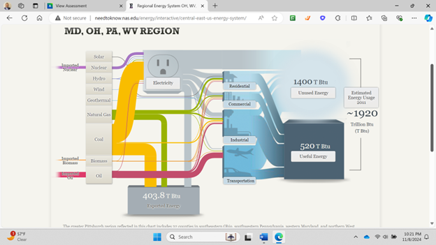
In the MD, OH, PA, WV region there is a large amount of coal production.
California has very minimal coal production but uses natural gas as an energy source more commonly.
