Infographic Design Tools: Canva

The following is an Informative Infographic that provides insight into how to build confidence in your children. The Infographic is well-designed and set up in an order that’s easy to follow. The design provides a perfect combination of images and color contrast, pleasing the eye.
Here is a link to the Infographic Image https://edmontonfetalalcoholnetwork.org/2015/05/28/confidence-building-in-children/
Sites For Creating Infographics
Sites such as Canva, Venngage, Infogram, Piktochart, Vise, and others provide tips and templates for creating the perfect Infographic for your audience.
Canva
I will discuss Canva in more detail since it is an excellent tool for guiding you through designing your Infographic and offers a variety of templates and designs to choose from. The possibilities with Canva are virtually endless. You can select themes such as medical, mental health, science, health, environmental, etc.
You can even watch a video that demonstrates how to create an infographic by clicking here
Canva Infographic Maker
The Canva website also provides a one-page guide to making an Infographic. In addition, this includes information regarding their photo library, which contains millions of photos that can be used in your Infographic. You also upload your own photos to the graphic if you have your own graphics that you wish to use.
Infographics
By Shaun Sneddon
- Examples of insightful data visualizations:
- First example I found that very interesting because I do love Star Wars was a graph of all the characters (over 20,000) are connected.

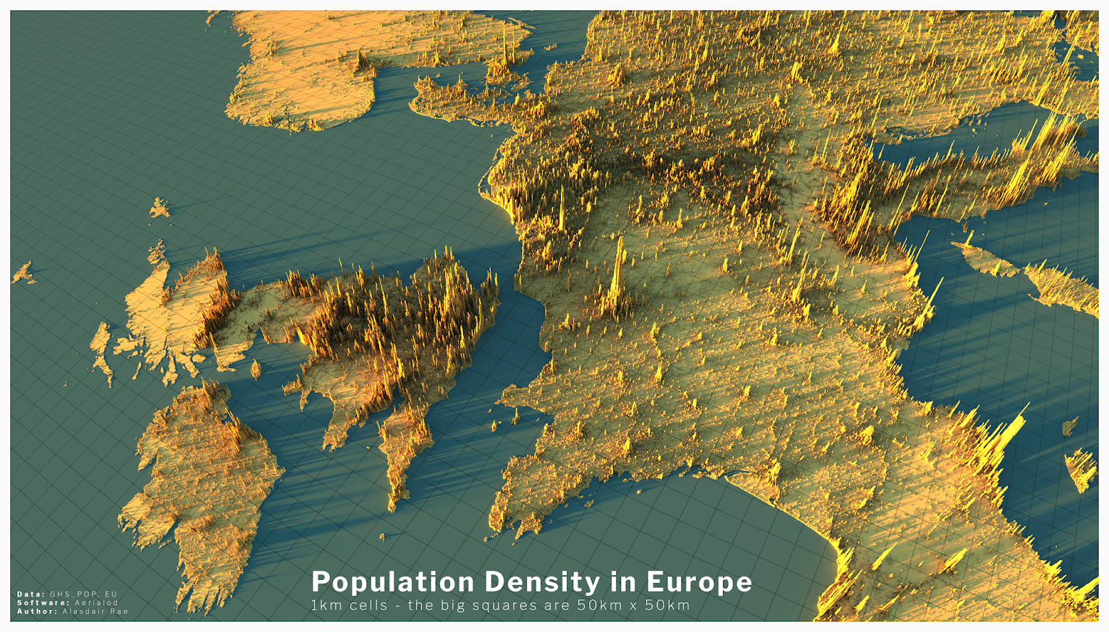
- The second example I found intriguing was a 3D data visual of where higher populations are located in Europe. When you look at a map of Europe you see the cities and can think that’s where a lot of people live but with this 3D visual you can see where people are vastly located.
- Example datasets for potential project use:
- Airline Safety
- Traffic accidents in a community
- Fatal Car accidents by country
- Stress at universities
- Tools that may help us construct Infographics:
- There is many websites that can help students construct Infographics such as Infogram, Adobe Express, and many more.
- Tools such as accessing data and images on the Internet.
- Website used for the images https://careerfoundry.com/en/blog/data-analytics/data-visualization-examples/
Welcome Fall 23 class
We will be posting our visualizations here each week. You can scroll through and see SOME of the past posts by students. Most of the previous class posts are password-protected, and I will release those at the end of the semester. I look forward to reading about your challenges and successes as you create your visualizations.
Pivot Table for Garlic
For my example of uses for pivot tables I decided to make a pivot table for some research I’ve been doing for the past 3 years at Stockton looking at yield data for garlic harvests.
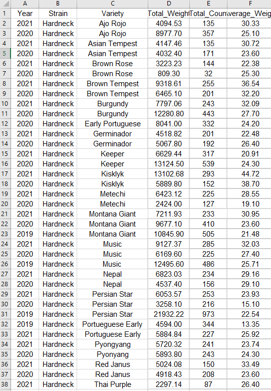
The above screenshot is just a segment of the stacked data in its raw format. It floods you with numbers and is difficult to sort through and get any information out of. That’s where a pivot table comes in. These let you easily select data to look at with the click of a button, and they also have a huge amount of customization to get the exact information you need.
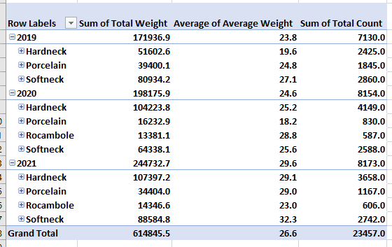
This first example shows how well each type of garlic grew during each year of the study. We can see from this that the top grower varied from year to year. Hardnecks were often grown in the highest volumes, making their total weight the highest, but either Rocambole or Softnecks had the highest average weight during each year. This means that if these varieties were grown in higher volumes they may outcompete the hardnecks.
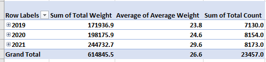
Another factor we can look at is time. This pivot table selection shows us that overall, we grew larger crops with each year. This is probably because with each year we learned how to take better care of the garlic, as well as we selectively picked the best garlic to grow each year. These are factors that you have to take into consideration.
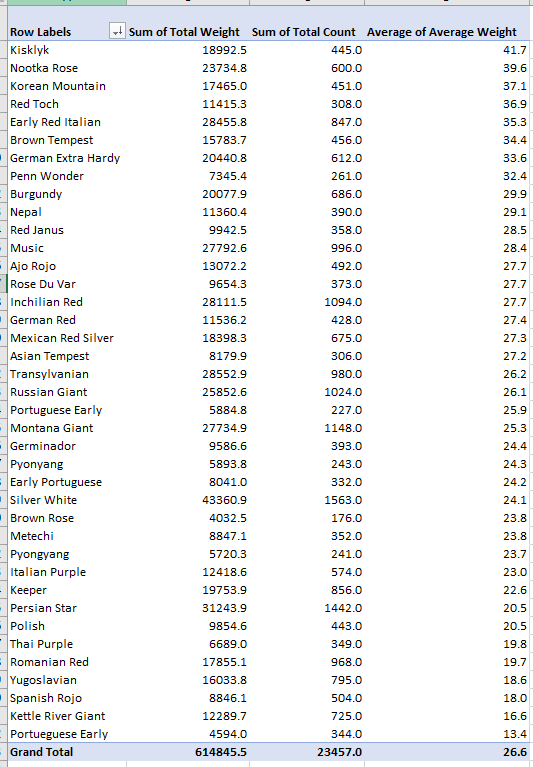
The final pivot table I made looks at each variety of garlic and is ranking them based on their average weight. We can see from this that on average, Kisklyk was the most successful variety. I like to have these numbers next to the total count and sum of the harvest weights because we can see the best producing garlic isn’t always the one that has the highest total weight. This graph shows us that Silver white is our highest producer because we also happened to grow way more of it then our other varieties.
In the end this process of creating pivot tables can give us answers to our experimental questions. However it also leads us to more questions, which we can answer with further experimentation or reasearch.
-Jack Swenson
Pivot Tables
A pivot table is an extremely useful and powerful feature in Excel. It allows you to extract the significant information from a large, detailed data set. When you have a very large data set it is hard to see any trends or come to conclusions about the data. With a couple clicks, pivot tables can help readers better understand the data by summarizing it and showcasing the important information.
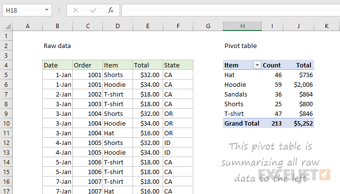
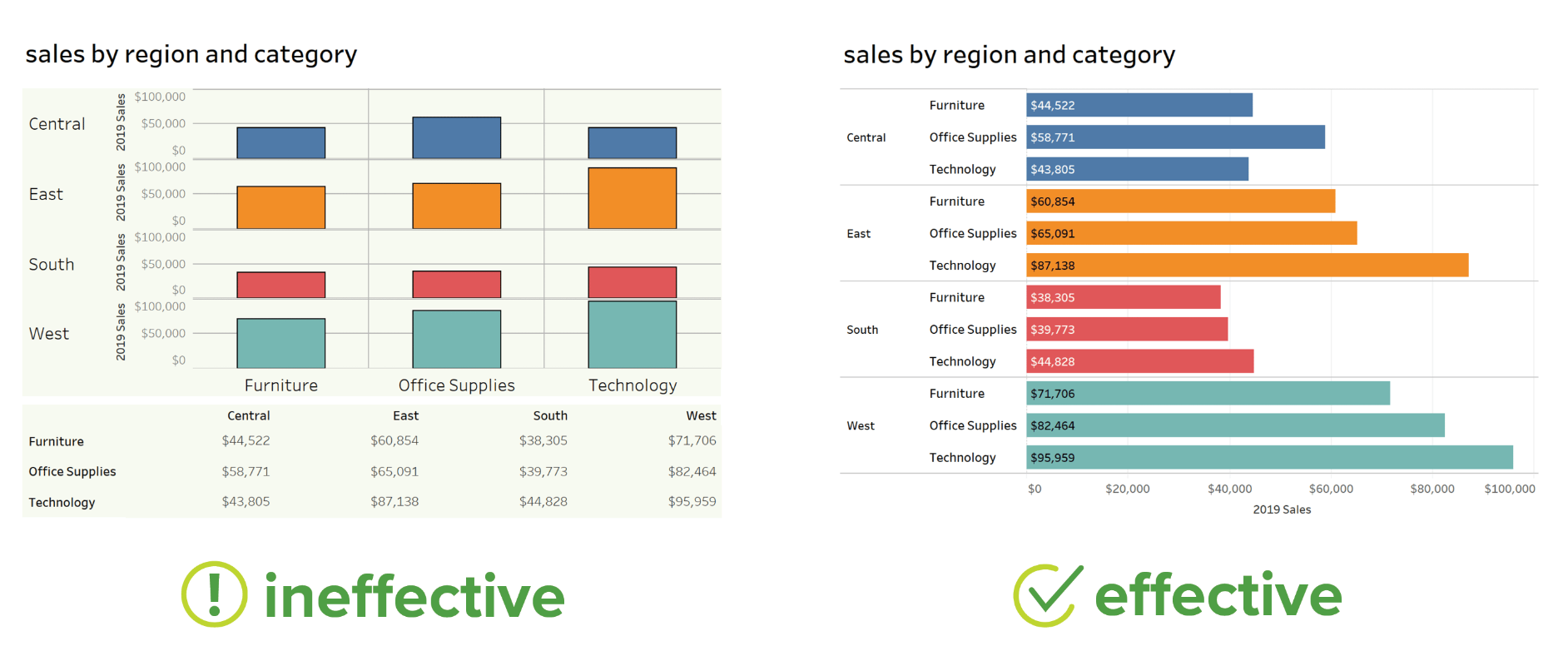
On the left is a raw data set of clothes sales. It includes the date of the sale, order number, item type, total cost, and state of purchase. The sheet extends for many rows and gets super overwhelming. The pivot table of the data is shown on the right. This organized the data and sorted it by the item of clothing. It then tallied up how much of each item was sold and also presented the total sales from each item. This is way easier to read and helps show trends and important information. You can see that hoodies were sold the most with 59 of them, and they also made the most money with $2,006. You can also see a total of 213 items were sold for $5,252. In conclusion, pivot tables are a great way to summarize a lot of information very quickly and easily.
Pivot Tables
Pivot tables are a great tool to use when able to summarize, analyze, explore, and present summary data.
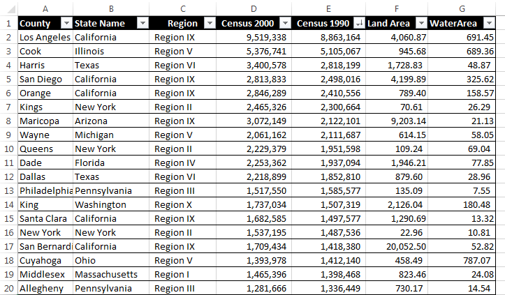
Here is an example that compares the data of 19 different state county’s based on region, two different census years and water/land area. Besides what is shown in this one image there are many different things one can do with pivot tables to express their data. Some examples include averaging, grouping by date, directional icons, and percentage of row total.
More things that can be done with pivot table can be found here.
Pivot Tables
By Nick Ligameri
A Pivot Table is an extremely powerful tool that Excel offers that is used to easily manipulate aggregated data. According to www.lumeer.io, “a Pivot Table is used to summarise, sort, reorganise, group, count, total or average data stored in a table. It allows us to transform columns into rows and rows into columns. It allows grouping by any field (column), and using advanced calculations on them.” I think that, for most people, Pivot Tables can be intimidating because there are a lot of uses for them. In this post, we’ll look at a couple of uses that make learning how to use Pivot Tables worth it.
Pivot Tables are useful when you have large amounts of data that you want to analyze quickly. If you are a direct-to-customer (D2C) business, you should probably learn how to utilize Pivot Tables. My wife falls into this category, as she operates a cottage food business from our home. She sells her baked goods directly to customers. A way that I am going to investigate implementing a Pivot Table specifically for her business is to see how many of which ingredients she uses each month. This can allow her to forecast how much she’ll need to buy each month. This would allow her to purchase from a supplier in bulk, vs going to the grocery store on a weekly basis. She’ll save time and money, which leads to larger profits!
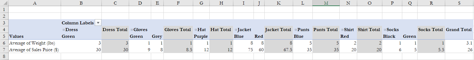
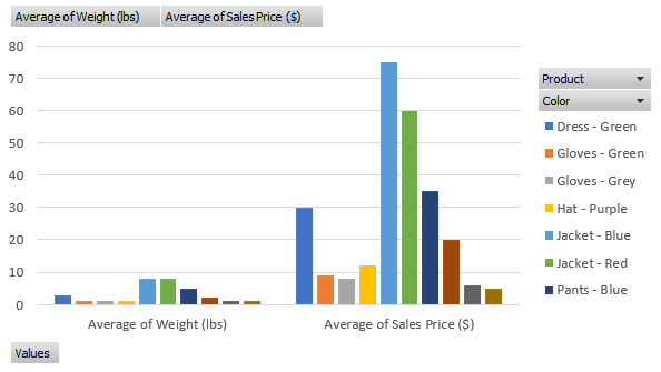
The above example I found from lido.app shows us that you can use a Pivot Table to quickly show average prices without having to create any formulas. It also organizes the data based on product information. This example breaks it down by color. You can also use Pivot Tables to quickly insert graphs based on what you need the data to tell you. Below you can see that the same data is used to create a visualization that can be used in reports.
Pivot Tables
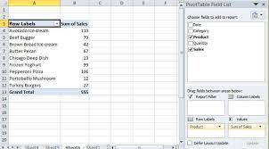
Pivot Tables, also known as summary tables, are tables that allow the user to observe all of their collected data in one place to analyze it. Upon entering the data, the user will then be allowed to analyze, find, or use any of the data they may need. A Pivot Table can be used for plenty of topics as well. Such as sales, how often something happens, keeping records of people, and more. For example, we have a short Pivot Table that discusses foods and their sales, after entering more data or leaving it as is, you should be able to use the analyzer tool inside excel and add a slicer.
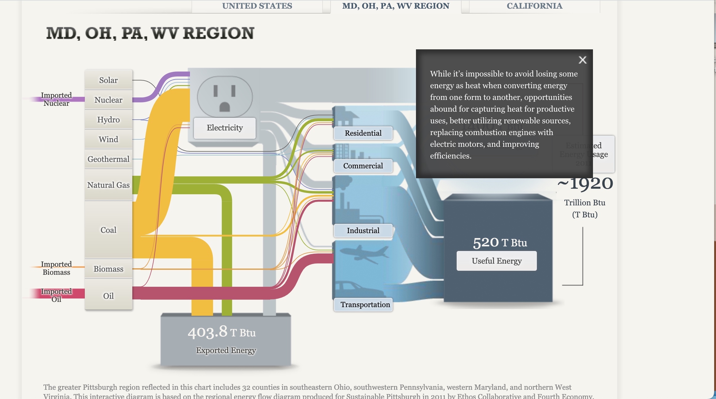
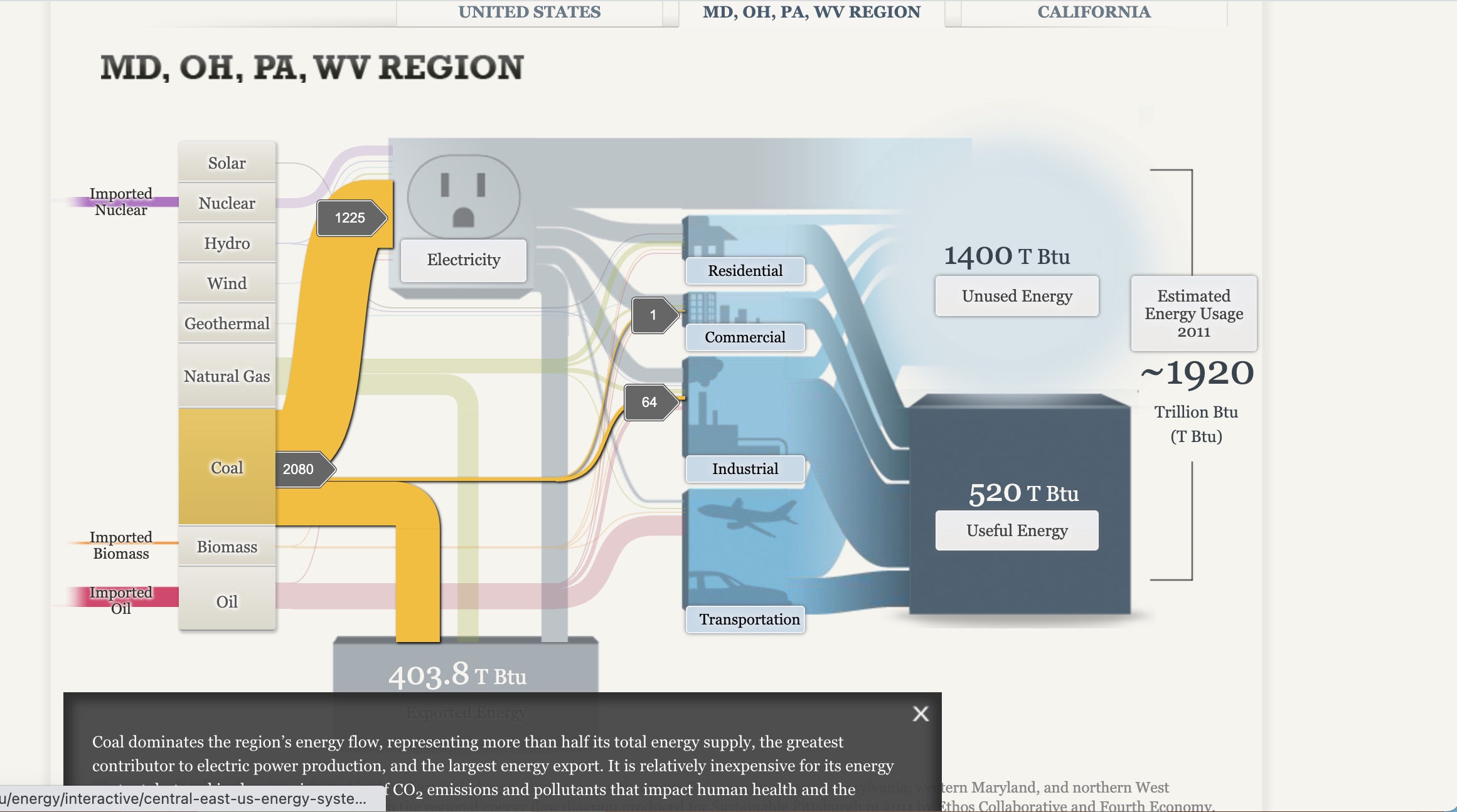
Sankey Visualizations
After playing with the site for some time, I got to see the ups and downs of using Sankey. It was nice and useful being able to click the different tabs and have them explain their purpose to the conductive flow, yet I can see where it still can be seen as confusing with the color of the lines being similar despite the background being blurred. I also noticed how some of the information is bunched together instead of flowing together. I would say making it easier to navigate for the person on the site is another way the site could improve