Cardiovascular Health
Through the visualizing health website I gained useful knowledge of a beneficial new tool. This website allows you to view different scenarios and how they may affect your health. For example in the risk calculator you could fill in statistics that resemble yourself and see how you fair against developing certain health risks. I tried multiple different outcomes to see the differences in outcomes. Things like smoking and body weight were key factors for risk of cardiovascular disease risk. A website such as this one can be a valuable tool for people concerned for their health and want to evaluate risk.
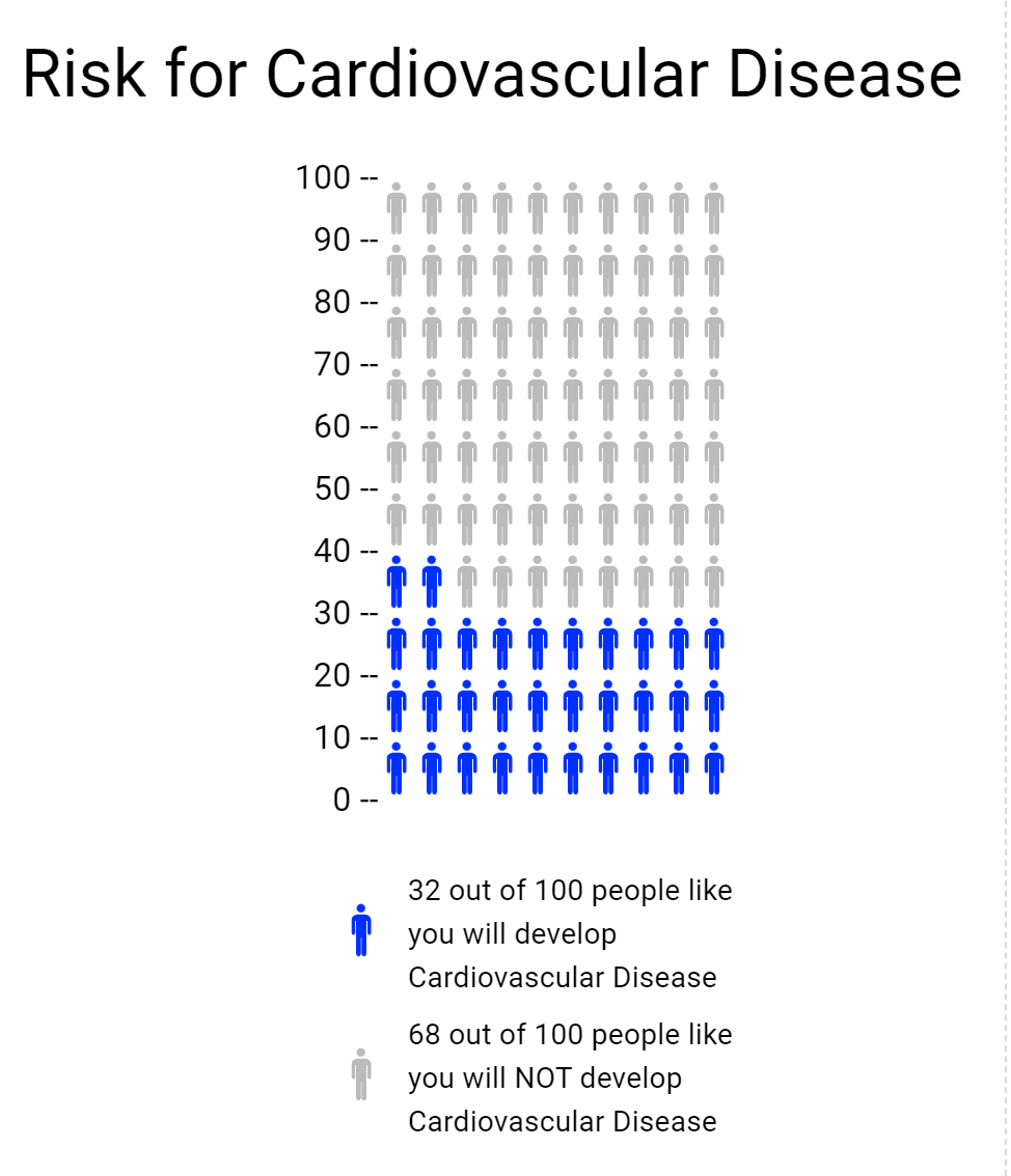
The icon array was another tool on the website used for creating a visual representation of risk. I used it to build on to the cardiovascular health from the risk calculator. I took a percentage from that and then made it into an array, pictured below.
Vizhealth
Visualization plays a crucial role in health science fields in terms of health education, analysis of numerical values, diagnosis treatment, and research. In this blog two important items: first of all risk calculator and second of all icon array. In the risk calculator going to calculate how much risk of cardiovascular risk in the next 10 years. The exciting thing about a risk calculator calculate the data and gives information in a color graph which basically, makes complex data into simplified information. The Icon Array Generator uses small icons to represent data.
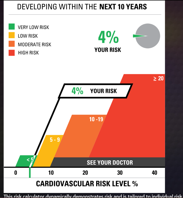
Example of Risk Calculator
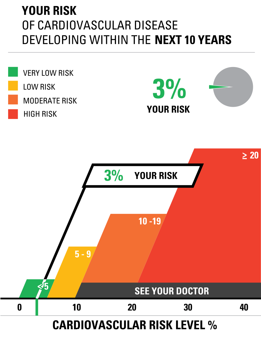
This is the chart used based on my father’s blood report in which I enter the data of cholesterol and blood measure at risk calculator. Finally, data visualization is the best tool to crack the numerical data into graphs.
Example of Icon Array
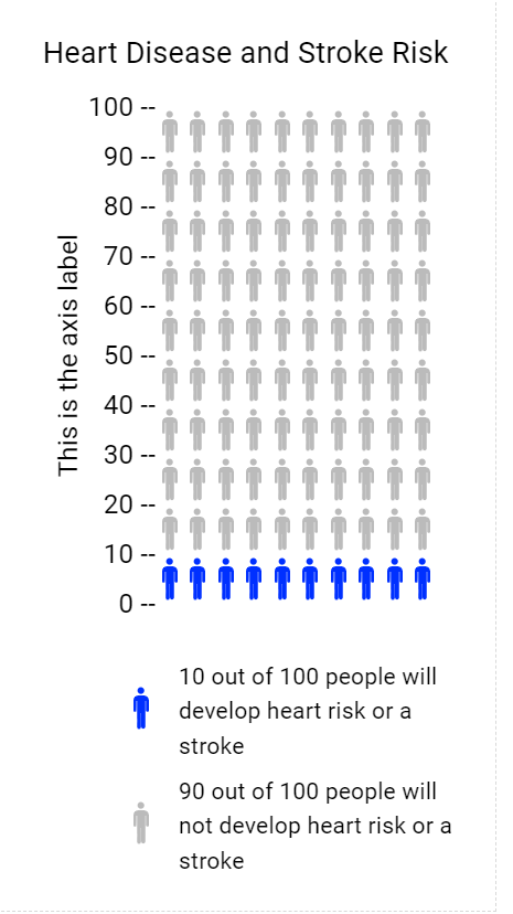
The Icon Array Generator I chose the topic of Heart Disease and Stroke Risk. Colored icons show the frequency of those at risk of Heart Disease and Stroke Risk and uncolored icons show the frequency of those not at risk. Both these tools of visualization are helpful techniques in the health science field. In addition, the Icon Arrays method is usually used in surveys, gathering data from worldwide, and many more.
Reference
www.cdc.gov
VizHealth
Risk Calculator
I entered demographic data into the risk calculator and say how it displayed different images based on the data I provided. Based on the information that I entered into the Risk Calculator, it was interesting to see how the graph and percentage changed. As a I played with the generator, I discovered that if I input higher numbers and the risk factor changed percentage rate, my risk of developing Cardiovascular Disease within the next 10 years increased to 7%.
Icon Array Generator: ASD Prevalence
By utilizing the IconArray, I was able to display the prevalence of children with ASD in comparison to children without ASD. Using the data statistics found here, I was able to create an IconArray. As I was creating my icon array, I discovered that I was not able to use percentage statistics, so I was unable to use the data that I had previously wanted to use. Using this tool, I was guided through the steps of how to construct an icon array and provided with options for how to customize your own, which was a new experience for me since I had never created one before. For learning about Data Visualizations, the Icon Array generator step-by-step instructions on how to create an icon array that visualizes the data. In my field of Health Science, I am always interested in applying different data visuals that I learn to my related field. In general, I felt the site offered some valuable aspects when it comes to learning about data visualizations. It offered gender-specific icons as well as an option to chose a shape to depict a graphical representation of the data. As a result, I was able to change the title and subheadings in order to indicate to audience viewers what data I was discussing rather than just displaying icon arrays with no intended meaning.
Insightful Data Visualizations
Crash Course YouTube and Website
Infographics are a creative and fun way to better explain information in a way that sticks with the reader more effectively.
They are used in both professional and academic settings to aid in learning for all ages across all subjects.
One of the best aids in not only data visualization, but in general learning is the YouTube channel and website “Crash Course“.
These two brothers create informative videos and lessons that give you a ‘crash course’ in a particular subject or topic. By browsing their YouTube channel you can see over one thousand videos categorized in different playlists by subject. These videos can aid anyone in continued learning at any age.
While these videos are not in depth each contains immense amounts of information , cited by reputable sources, as well as each links resources for you to delve deeper into each topic.
These videos are filled with different infographics, they even have a video about data visualization, that help the watcher better understand the information better. As a partner of PBS Studios these brothers are aiding in bringing free education to everyone.
They have a diverse and inclusive creation space that can be appreciated by any learner.
In their two video course on data visualization another member of the team explains the different ways and forms of infographics.
Watch both videos here:
Watching any of their content will help you become just a little more fluent in any topic. If more interested be sure to check out their links as well!
Sources:
https://thecrashcourse.tumblr.com/downloads/stats
Vizhealth
I truly believe that including visualizations in an event improves its relatability by enabling people to see it take place in front of their very eyes. Take the blood pressure visualization as an example, where viewing the actual numerical values expressed as percentages makes them more relatable and understandable. Having a concrete object of focus makes it easier for people to understand and integrate difficult topics by giving them a visual depiction.
For the first chart, I used my mother’s real doctor cholesterol data. She agreed with the correctness of the final data visualization, demonstrating the validity of the visualization tool.
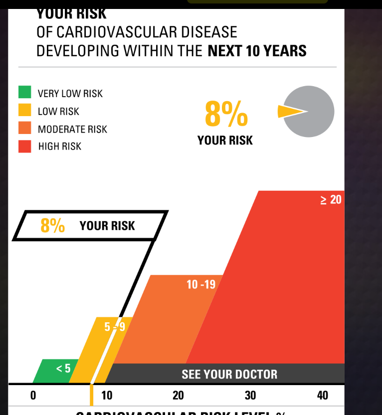
For the second one, I raised the numbers in every bar a little bit higher and checked yes for smoking and dietbites. I was shocked to find that it only went up 4 points. I was expecting a lot more.
The Icon Array Generator was an instrestiing graph. I played aroudn with this for a little bit and made my own on hair data
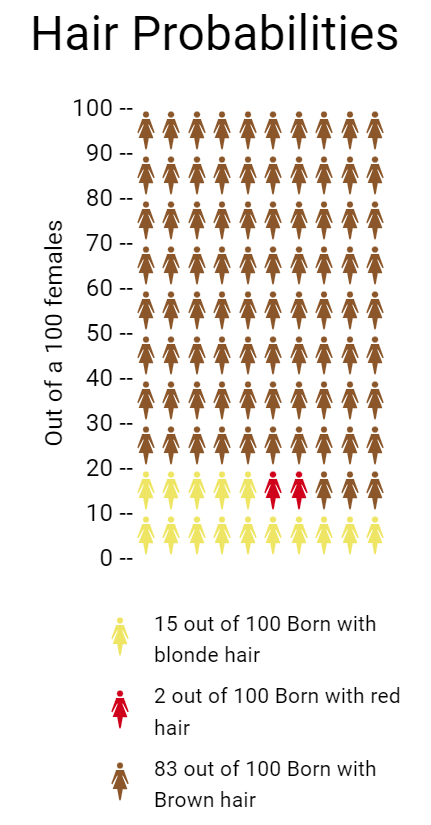
- Blonde Hair: Approximately 10–15 people out of 100 may have blonde hair. This is a very general estimate.
- Brown Hair: The majority of the global population has brown hair, so a significant proportion, around 70–80 people out of 100, may have brown hair
- Red Hair: Red hair is relatively rare, and only around 1–2% of the world’s population has red hair. So, roughly 1-2 people out of 100 may have red hair
per https://www.eupedia.com/genetics/origins_of_red_hair.shtml
Helpful Tools for Creating Effective Infographics

Link to image: https://www.buzzfeednews.com/article/stefficao/friendship-pinterest-board-tiktok-trends
One of the most important tools for creating an infographic, is finding a solid platform to find useful photos and images pertaining to the topic of your graphic. One of the most useful platforms I have found for this job is Pinterest. Pinterest is an interactive social media platform that allows you to create a virtual “scrapbook” of images and links pertaining to your interests and needs. Once the user makes their own account, they are then able to browse through millions of photos, videos, links, and webpages curated to their specific interests. The user is then able to create virtual boards and folders that can be personalized with names to keep projects and ideas organized. All the user has to do is “pin” whatever image or link they may find interesting to one of their personal boards. Many times Pinterest is used for planning parties, costume ideas, organizational tips, style inspiration, and so much more. There is also a growing use of people sharing art, photos, and different images that can be used in digital design and the making of infographics. These images can help curate different aesthetics and appeal to different audiences’ moods and emotions.
Tools That May Helps Us Construct Infographics
Infographics are becoming increasingly popular over the years. With most information now being shared online there are some tools that can help you create the best infographic.
- Canva
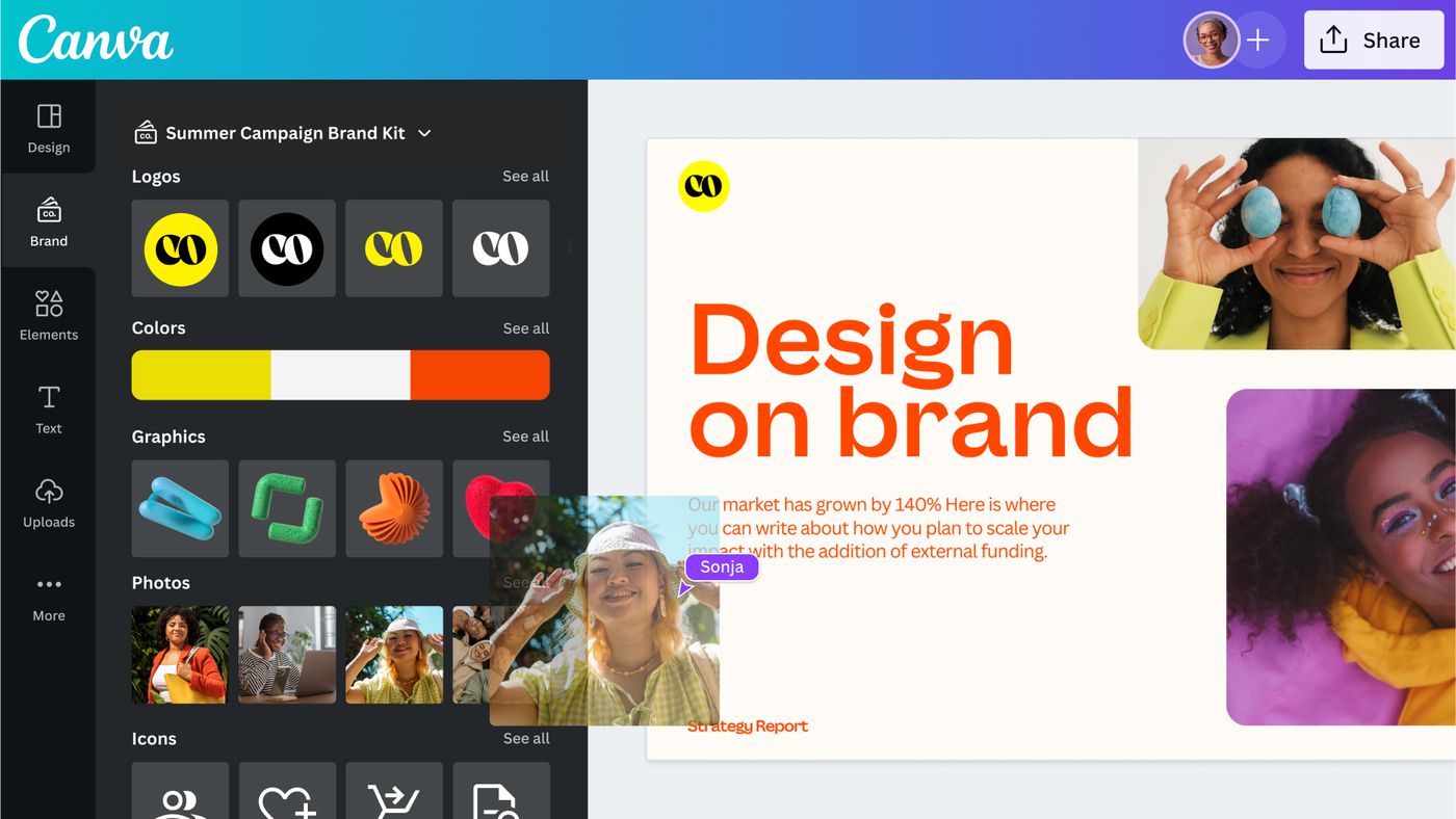
Canva is a free design webpage that provides hundreds of templates for flyers, posters, presentations, and more. If you do not want to use the templates you are still able to create your own work. They offer many options for graphics or you could upload your own. The website also allows you to share your design so multiple people on your team can work together. Students can sign up for CanvaEducation and get access to even more templates and graphics for free.
2. Procreate
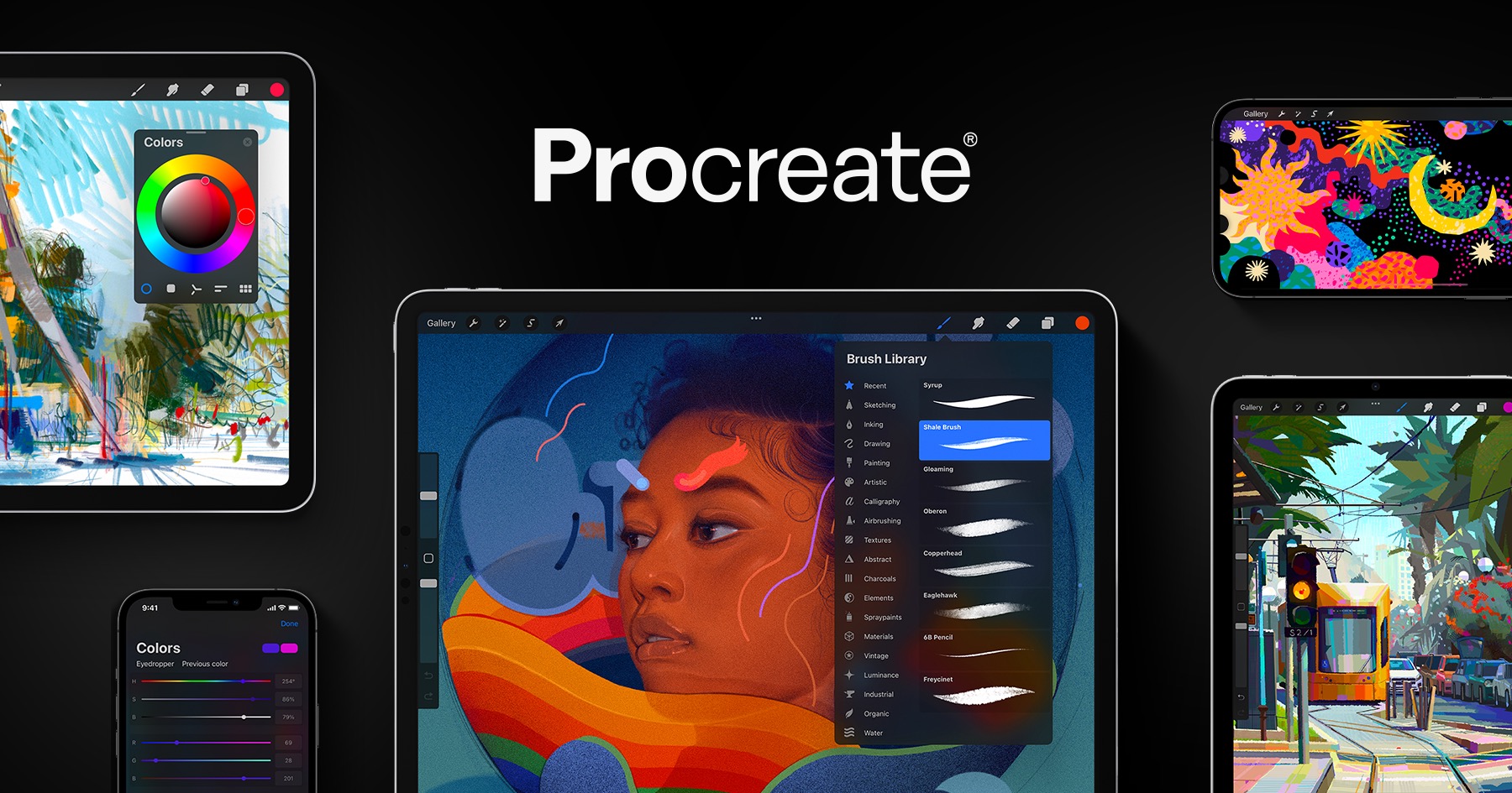
Procreate is an editing and art software that allows users to create artwork and edit images. It can be downloaded in the app store for Apple product users for $10. The app gives you options of multiple tools to draw, write, add images, and crop whatever you want.
3. Adobe Illustrator
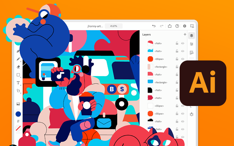
Similar to Procreate, Adobe Illustrator or Ai allows you to create just about anything you want. Ai can be downloaded on any desktop, PC, or tablet. It allows you to draw designs, add text, and upload graphics to your canvas. Adobe Illustrator does require you to have an adobe account and is free to download and use. However to unlock more features and tools it costs a monthly subscription $20.99.
Useful Dataset Repositories for Information Visualization.
With the overwhelming of data to sort through to begin working on your infographics, choosing where to start can be daunting. Here are a few websites to get you started:
UC Irvine Machine Learning Repository
Link: https://archive.ics.uci.edu
UCI Machine Learning Repository is a free repository of datasets purposed for machine learning, maintained by UCI. With over 600 datasets excellently catalogued this website has excellent datasets to work from and build ideas if you’re unsure where to start.
If you’re unsure where you want to start and you want a well curated dataset to start off with.
Kaggle
Link: https://www.kaggle.com
Kaggle is a similar resource to the UCI Machine Learning Repository, in that it is also a repository geared to machine learning and A.I. applications, but the breadth is much greater as it is not as well curated as the UCI collection.
Perfect if you have a good idea of the type of data you’re looking for.
Data.gov
Link: https://data.gov
Data.gov is the United States government’s free and open repository featuring data collected from census, state and lower governments, and other various agencies and bureaus from around the country.
Great for information directly related to statistics regarding state and national characteristics.
Insightful Data Visualizations
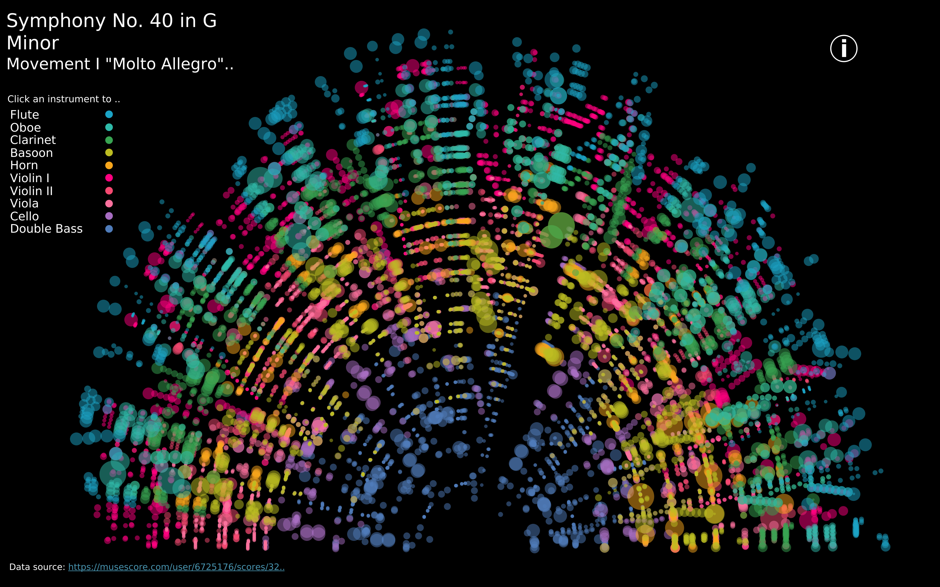
https://public.tableau.com/app/profile/louise.shorten/viz/BeautifulMusic/1_Mozart-SymphonyNo40
We live in such an information rich world that visualizations are everywhere. When we interact with our phones to get directions to our next location, we are met with a visualization that displays travel time, route, traffic, and other helpful data to help us choose how to navigate to our destination. This creates a data rich landscape that helps us understand more of what is going on in the world around us. Navigation and mapping visualizations have given us more efficient ways to commute, travel, and explore.
Other maps can be created using data that is not traditionally geographical. Pictured above is a visualization of Mozart’s Symphony 40 created by Louise Shorten using Tableau. This is basically a map of the sound. Different colors represent different instruments. The musical scale moves from the inside of the arc (lowest notes) to the outside of the arc (highest notes) with the size of each circle being the length of time each note is played. The song moves in time from left to right along the arc and each note has a position on that line. This type of visualization is very powerful because it allows us to interpret something we already interact with in a whole new way.
Click the link above to interact with this visualization.
Tools That Can Help Us Construct Infographics
Canva is interesting infographics that are also instructive is easy with Canva. It is so easy to use with its user-friendly interface and extensive library of templates and graphic elements.it is the perfect choice for individuals and organizations looking to visually engage audiences with complex data and statistics, and it can come at no cost to the user. If you are really ready to buy the program and want he full experience the full software is only $12.99 per month. Canva’s enables its users, regardless of prior experience in graphic design, to produce infographics that look polished and professional. Due to the wide range of pre-designed templates that are catered for various themes and applications, the final product will reflect the user’s message. To add, a variety of customizable components from Canva, like symbols, pictures, charts, and graphs, make it simple to modify infographics to meet specific needs. On the platform, groups of people may work together in real time to produce a more extensive and well created infographic visualization.