Home » Uncategorized (Page 6)
Category Archives: Uncategorized
Comparing Products to Find the Best Fit
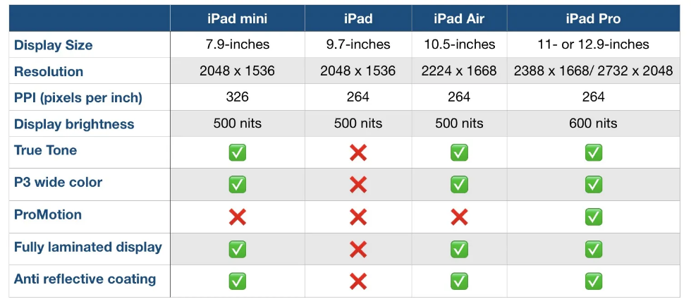
Comparison charts are a great way for consumers to compare multiple products from a company in order to determine which one is right for them. Let’s take the company Apple for instance. They provide many options on buying an IPad, but how do you know which one to get? There are many different charts that you can look at in to determine which one is best for you. First let’s start with the basics. Think about what you are using the IPad for. If you are simply taking notes then a regular IPad will do just fine. However if you plan to use it for editing or designing you might want to look closer at display sizes and resolution options.
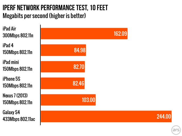
Another way to compare them is how well they perform. Someone who needs this device for high demanding and important work may wanna go with the IPad that has a higher megabit speed.
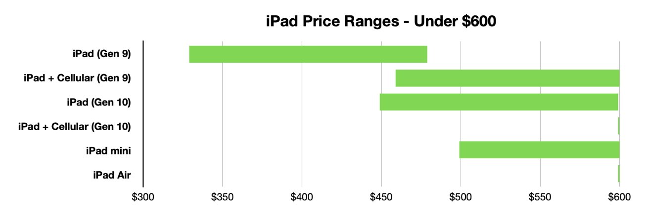
Lastly, and I think the most important to a lot of people, is how much each device costs. Comparison charts like this allow you to gauge how much this investment could cost you. Charts like the one below or the two above can usually be found on the company’s website or online forums for tech users.
Resources and Further Reading
Insightful Visualizations that Compare Numbers
There are many different factors that contribute to quality of life for people around the world. One of those factors tends to be leisure. How do we spend our “time off?” Many people work through their weeks and dream about weekend plans or where they are going for their holiday in the summer. The difference in that dream can be what country you live in. Some countries have statutory paid vacation, while some countries, including the United States, leaves paid time off rules up to employers. The graphic below shows guaranteed vacation time in several countries. It is shocking to see that most U.S. workers are guaranteed only 10 days off for public holidays, while Austrian citizens have 38 days between annual leave and holidays. Many U.S. workers are not even guaranteed the public holidays off because many services continue during those days.
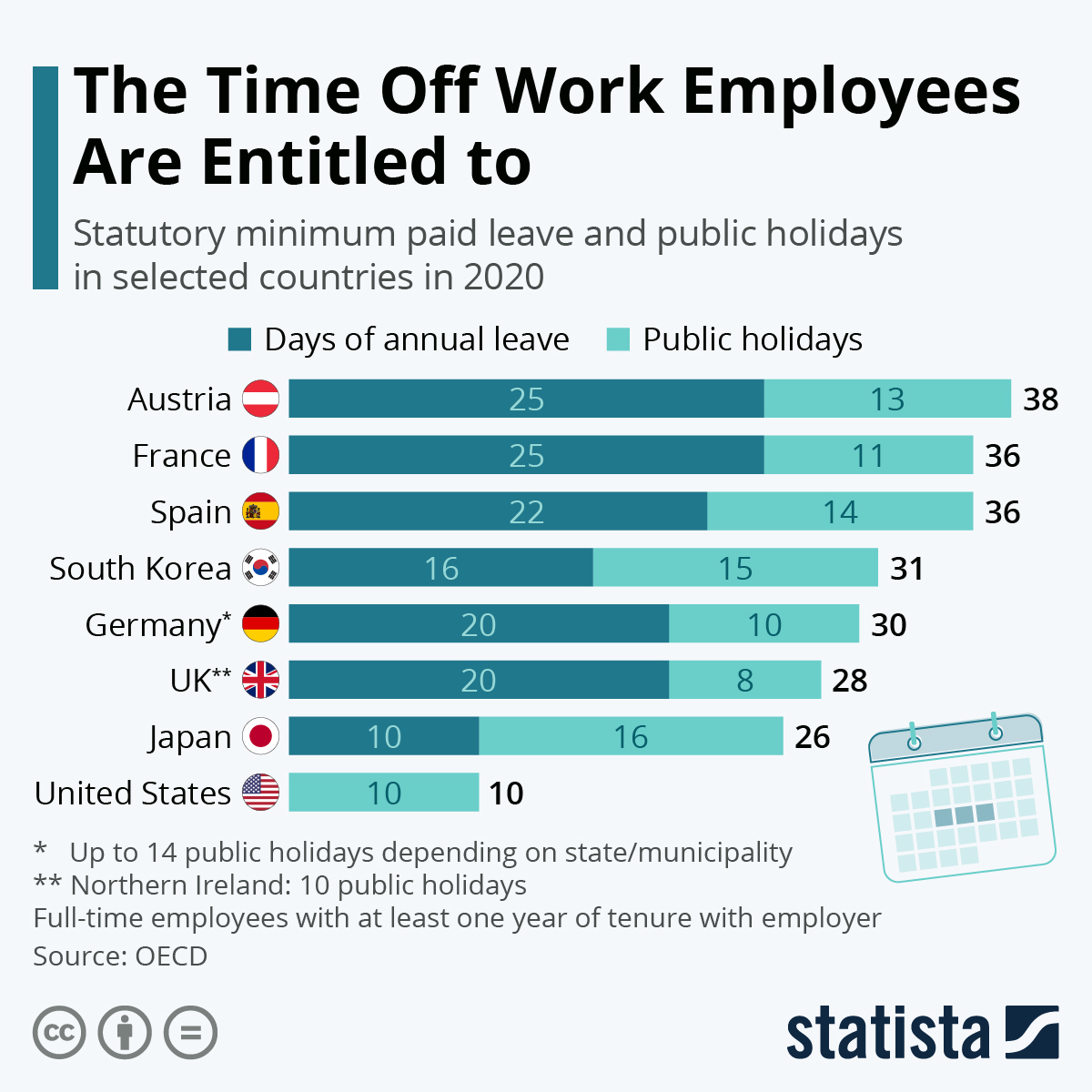
https://www.statista.com/chart/15005/statutory-minimum-paid-leave-and-public-holidays/
Paid leave can affect more parts of life than leisure. There are huge discrepancies in different countries on both paid sick leave and family or maternity leave. Again, some countries mandatory minimums for maternity leave. This graphic from Capital and Main shows the how much maternity leave is mandated by the United States versus other countries.
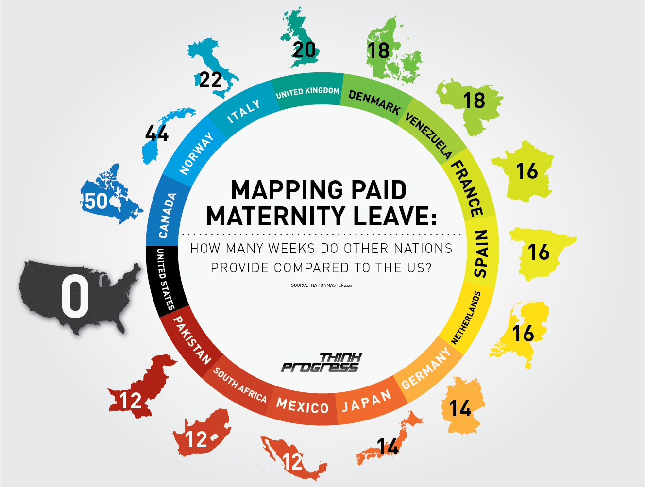
https://capitalandmain.com/the-right-to-care-states-paid-family-leave-turns-10
Graphics like these, that show how one country compares to other countries around the world can paint a picture the differences. Why those differences exist and how they affect populations are questions that we can research further to understand, but these graphics give us a great starting point.
Comparing Numbers Through Data Visualization
When comparing data across multiple categories it is crucial for the reader to understand the graph first. A good graph will label their axis’ along with the numerical values of their data. When analyzing the graphs, the reader can use the similarities between the graphs and the data to compare them. Through this comparison of data, a deeper understanding of the graphs can be reached. Visualizing the data makes comparing data especially easy, as the reader can quickly go from graph to graph reading the data. An article from Medium.com further explains the importance of visualizing data, the author states “humans will face a lot of difficult time interpreting datasets because normally human eyes can’t process a lot of information simultaneously, which is the job of data visualization to make it easier for us to understand.” This quote makes it easy to understand why data visualization is important when comparing numbers and data
Comparing Numbers
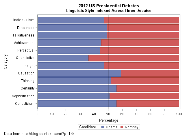
I came across an interesting dataset and a corresponding visualization that compared the characteristics of Barack Obama and Mitt Romney during the 2012 US presidential debates. The graph in question is a radar plot displaying 12 characteristics of the candidates’ words during the debates. These characteristics include “directness,” “talkativeness,” “sophistication,” and more.
However, I found the radar chart a bit challenging to interpret effectively when comparing the two candidates. I’d like to discuss two valuable tips that can make such comparisons clearer when using graph visualizations:
- Graphing the Differences: When comparing two groups, it’s often more intuitive to graph the differences between them rather than plotting each group separately. This can help viewers focus on what sets the groups apart. In the context of the 2012 debates, this could mean creating a graph that visually emphasizes the differences in characteristics between Obama and Romney, making it easier to identify distinctions in their speaking styles.
- Sorting Categories by Meaningful Quantity: In any plot that has a categorical axis, it’s essential to sort the categories by a meaningful quantity. This ensures that the visualization effectively conveys the message you intend. For instance, if the radar chart includes characteristics like “directness” and “sophistication,” consider sorting these characteristics in a way that highlights the most relevant differences between the candidates.
As for the dataset provided, it appears that the numbers represent the relative percentages of each characteristic attributed to Obama and Romney during the debates. For example, in the category “Individualism,” 47% of the phrases were attributed to Obama, while 53% were attributed to Romney.
By Shaun Sneddon
https://blogs.sas.com/content/iml/2013/08/21/comparing-two-groups-graphically.html
Benchmark Visualizations
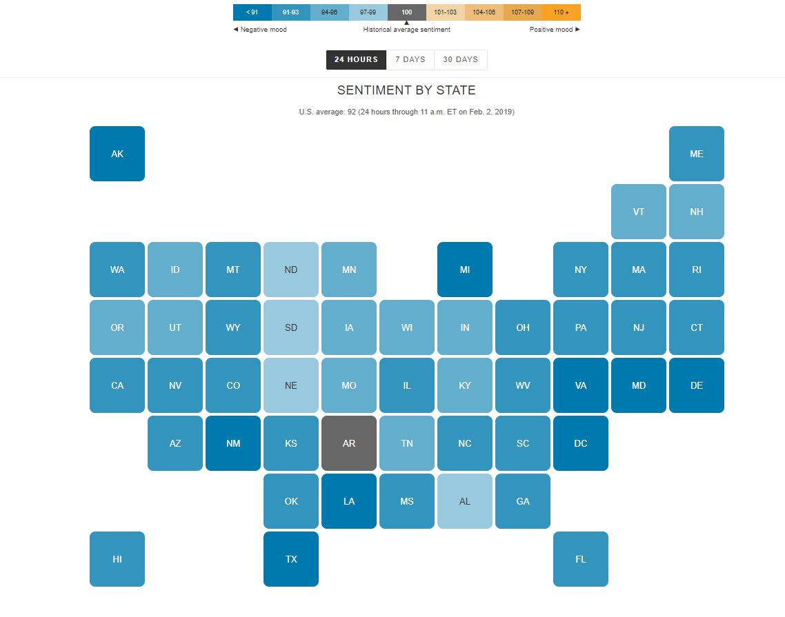
I find the “U.S. Social Sentiment Index” quite intriguing. It’s a creative way of harnessing the power of social media, specifically Twitter, to gauge our nation’s mood in near-real-time. What caught my attention, in particular, is how they use benchmarks to add context to the sentiment data.
In this case, they don’t just look at raw sentiment but also compare it to the current sentiment on Twitter. This means that they calculate a benchmark sentiment level based on the tweets they’re analyzing and then position the current sentiment relative to that benchmark. This approach is crucial because it provides a point of reference. It helps us understand whether the current sentiment is above or below the average sentiment of tweets from people across the country. For instance, if “most states are in the negative,” it suggests that the sentiment in those states is predominantly negative compared to the average sentiment in the analyzed tweets.
What’s even more fascinating is how this data is presented in near-real-time, updating hourly. It’s like having a live pulse on the nation’s emotions, and for data enthusiasts like us, that’s a treasure trove of insights. It’s a reminder of how data visualization can make complex information accessible and meaningful.
By Shaun Sneddon
http://graphics.wsj.com/twitter-sentiment/
Insightful Data Visualizations that Compare Numbers
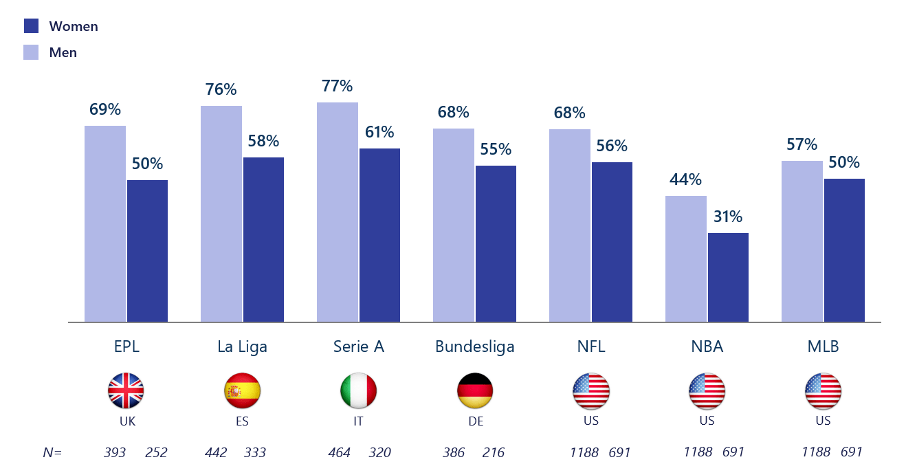
If there is one thing that should be known about data visualizations, it is that one can find a data visualization about almost any topic with the click of a button – and a quick google search. Due to the fact that baseball season is about to come to an end with the post-season approaching and the football season coming in full swing now, I thought it would be interesting to find a data visualization about sports and who exactly it is (by gender) that watches sports. As a female who watches baseball and even hopes to work for the MLB one day, I knew that the “MLB fan club” was mostly male dominated, but thanks to this data visualization, there is a better grasp about the true difference in the amount of males and females that watch and engage in sports such as baseball.
The unique thing about this visualization is that it not only focuses on U.S. statistics and sports, but also the UK, Spain, Italy, and Germany. This provides a perspective that might not have otherwise been known to people in the U.S. and other countries, and overall adds to the value of the data visualization.
Altman Solon, a telecommunications, media, and technology strategy consulting firm, created the data visualization pictured above and even went beyond by breaking it down even further. For instance, in the data visualization pictured below, viewers are able to just look at statistics for women in different countries and their interests in different sports leagues around the world.
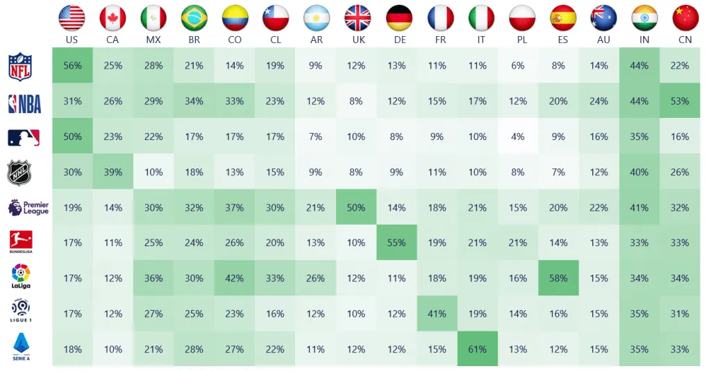
By breaking it down this far, viewers are able to get a better understanding of where females stand with sports interest compared to males, and hopefully make a difference so that the level of viewership becomes more balanced by gender in the future.
Comparing Numbers
Statista is perhaps well known to many people including myself as I have used their website a few times. Statista offer wide range of useful data visualizations regarding some available topics and include detail explanations.

Netflix is a great choice to use because when someone such as myself think of Netflix I think it would be a massive platform available worldwide and it is. The number of users in Netflix is incredible but it does not mean that Netflix is at all the number one choice in all countries perhaps due to strong regional competitors or availability of content in that region. As we can see on the infographic, Netflix is well known to many American but Netflix is not the strongest in the market, only one-fifth of the entire market. As I stated above, this is possibly due to strong region competitors such as Disney+, Hulu, HBO, and many on the rise such as Apple TV+. The most surprising fact included in the picture is India. Netflix only took up 3% of the entire market. I have not deep dive into India’s streaming market to fully understand what Netflix is competing in the region. Moreover, as the infographic only include a few notable countries from each continents, some region I would want to see more such as China or Russia. Despite them label all major streaming providers included, it is unsure whether China or Russia does not provide any data or that Netflix dominated in their markets. It is the censorship in China and whether the sanction by the United States effect the availability of Netflix in those two regions.
Statista offers more information regarding Netflix about financials, number of employees, etc… can be found here. This particular infographic can also be found here.
Comparing Numbers For political candidates

Data visualizations are a major aspect in simplifying complex data to a broad population of people with different cultures, and languages. As shown by the New York Times bar graph of the speaking times of political candidates and the amount of attacks that each political candidate received in comparison to their speaking times. Taking a look at the bar graph, it is very clear what it is trying to convey. The graph not only labels the time in increments with labels, but also states the total amount of time that each candidate ended up speaking for. Though the graph for comparison is separate from the bar graph of the total time, the clarity of the information being presented leaves very little room in regards to which graph is what, and what it is they are trying to convey. What was interesting about this comparison is that the person that was the most attacked was surprisingly not the person that spoke the most, but rather someone that they didn’t even speak at all. Furthermore, there are also a plethora of other data visualizations that compare numbers that could have also been used to portray the data besides the a bar graph. Two such examples would be doughnut chart or a pie chart. Both would not only accurately represent the data, but also offer a visual representation of the percentages that each candidate spoke in comparison to the total time given. With that being said, Data visualizations for comparison of numbers can be applicable for a number of different topics, aside from political topics, and portrayed in many different kinds of graphs.
Comparing Numbers
Tools that may help us construct visualizations that compare numbers.
Before researching the tools that help us construct visualizations that compare numbers, through this class, it was primarily about infographics or, more importantly, different types of charts. Charts help us by visually representing data, making complex information more accessible and understandable.These visual representations, such as bar graphs, line charts, and scatter plots, enable us to identify trends, patterns, and outliers in datasets effortlessly. They serve as powerful tools for conveying insights and supporting data-driven decision-making processes. Exploring the various chart types and their applications has been a fundamental part of our journey in mastering data visualization.

Through researching and this class, excell is the easiest and most effective tool in hrlping onstruct visualizations that compare numbers. Excel helps construct visualizations that compare numbers by offering a user-friendly Chart Wizard, data sorting and filtering capabilities, customization options, and interactive features. It also provides the flexibility to work with various data sources and create professional-looking charts and graphs, making it a versatile tool for data analysis and presentation.
Some cool things about Excel include its comprehensive help options, allowing users to type in queries and receive relevant results. Additionally, the abundance of online resources, forums, and tutorial videos makes it easy to find solutions to any difficulties you may encounter while using Excel for data visualization, benefiting from its widespread popularity. Also, Excel’s consistent updates and improvements ensure that users have access to the latest features and functionalities, enhancing their capabilities for creating even more dynamic and insightful visualizations for comparing numbers.
sources
Comparing Numbers
Insightful data visualization comparison: Statista Chart
Statista.com is an excellent infographic source with exceptional examples of how data research and the art of digital design merge to tell a story. For this week’s blog post I will be sharing several examples of infographics I found to be interesting.
Many individuals, myself included, may fear the thought of wading or swimming through waters containing sharks. However scary this may seem; sharks are not the bloodthirsty and ravenous creatures they are depicted as in the media. Statista’s infographics on data pertaining to shark attacks does an excellent job at backing up this claim, as the numbers speak for themselves. The information sourced for both of the following infographics was obtained from the Florida Museum of Natural History located at the University of Florida.
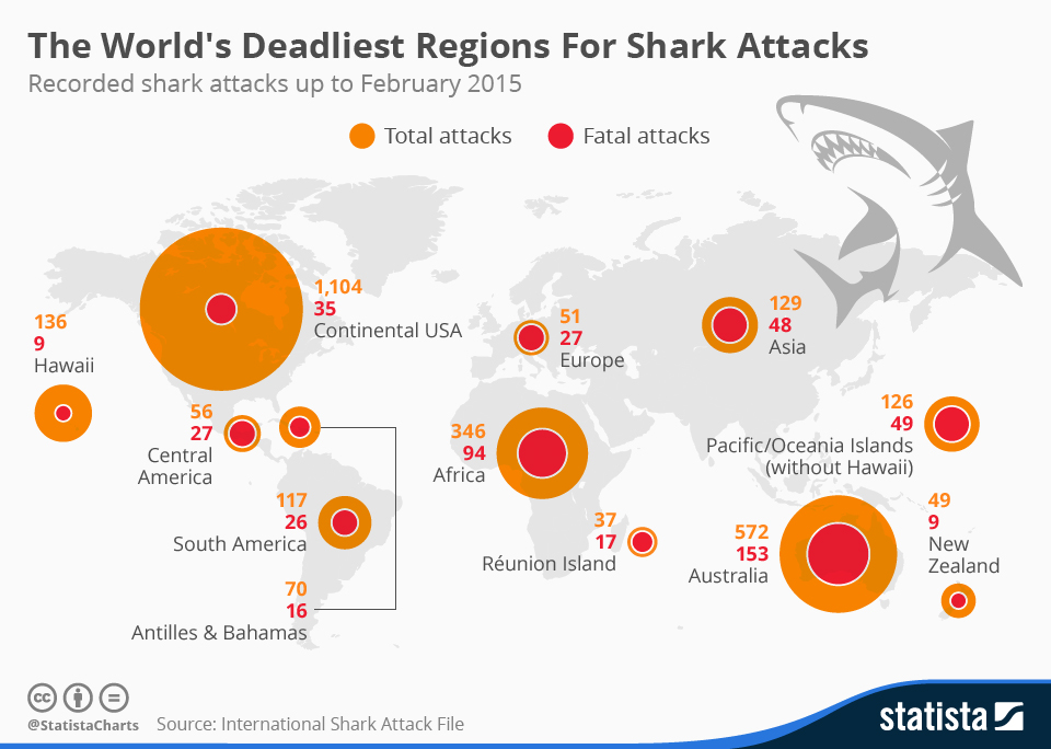
Chart: The World’s Deadliest Regions For Shark Attacks | Statista
The first excellent thing about this infographic that I noticed, is how quickly a few stories or interpretations may be picked up upon viewing this chart and the numbers. The concentrations of the total attacks are greater in the continental USA, Australia, and Africa. This sheds light upon which regions of the world contain the most concentrations of individuals swimming in large bodies of water. Additionally, by providing the total attacks versus the fatal attacks via a circle with increasing area within another, more interpretations may be derived. Do some of these regions have geographical constraints inhibiting healthcare providers from responding quick enough to attacks? Or are there different species resulting in different severity of the ultimate damage from these attacks across different regions? I also felt that the placement and scale of the circles atop the world map was strategically smart. By scaling the circles area roughly in unison with total attacks directly above the associated region, one can easier visualize where the most attacks were occurring.
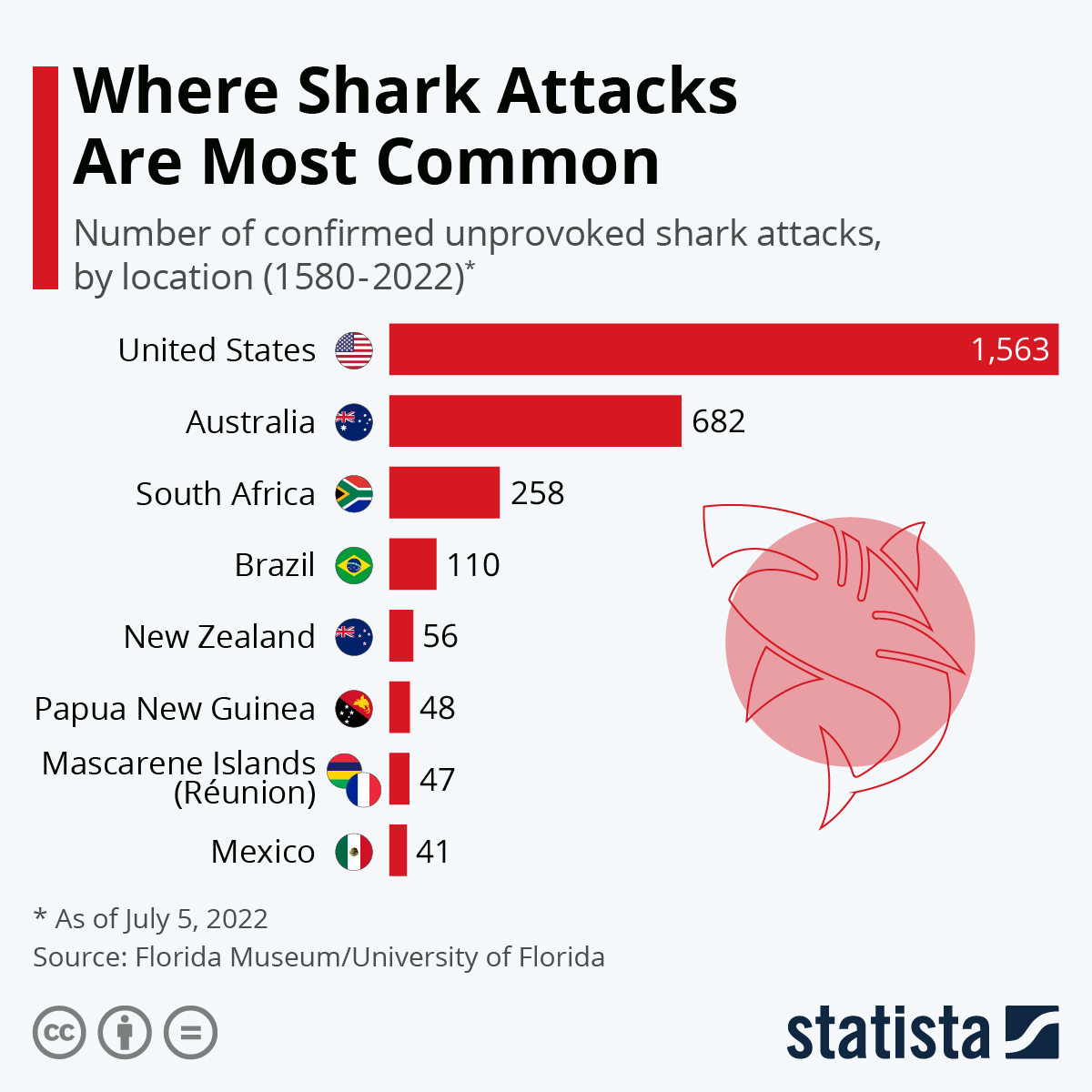
Chart: The World’s Shark Attack Hotspots | Statista
This chart provides an interesting and efficient addition with a miniature frame of each country’s flag, allowing the viewer quick association of the shark attacks per country. An interesting observation from the last infographic to this one, is how the number of sharks attacks has significantly increased in the last 7 years in the United States.
Sources:
McCarthy, N. (2015, May 25). Infographic: The World’s Deadliest Regions For Shark Attacks. Statista Infographics. https://www.statista.com/chart/3590/the-worlds-deadliest-regions-for-shark-attacks/
Armstrong, M. (2022, July 5). Infographic: The World’s Shark Attack Hotspots. Statista Infographics. https://www.statista.com/chart/8272/the-worlds-shark-attack-hotspots/