Home » Uncategorized (Page 4)
Category Archives: Uncategorized
Using Pie Charts
By Ryan Metch
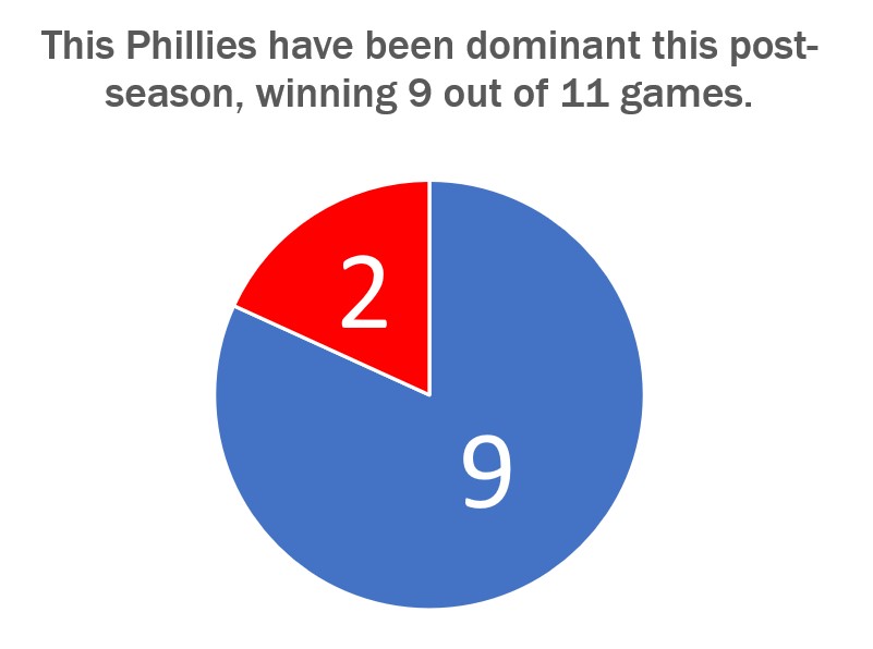
There are many ways to use a pie chart, but also many ways to misused one. The pie chart is a staple in data visualizations and is one of the most popular graphics used. To use a pie chart successfully there a few key pillars to go by; first, make sure that the pieces of the pie add up to a whole number which is already presented to a reader. For example most pie charts have pieces that add up to 100% the number 100% does not need to be displayed to the reader as it is already assumed that the pieces will add up to that number. Only present the number the pieces are adding up to when it is something other than 100, for example the pie chart shown above adds up to 11, and this number is clearly listed above. Second is that the pieces are clearly labeled with a number or image. This ensures that the pieces can easily be identified. Third is that the slices are color assigned to their value to show differences in the data. Fourth and final is that the legends clearly explain the data so the graph is easy to read.
Pie Charts
A perfect use case for a pie chart that I could think of right of my head is one for a academic performance breakdown. This type of chart is good to use for if you are an educator, and you want to provide a clear visualization of how students in a class have performed on their recent final exam, other assignments, and overall grade. It can the class’s collective progress. Additionally, it helps in identifying trends in academic performance over time, highlighting areas of strength and areas that may require additional attention within the classroom. Furthermore, this chart aids in fostering a transparent and data-driven approach to education, making it an essential resource for educators dedicated to enhancing their teaching methodologies and student outcomes.
If a professor takes a 100 of there students and compairs all there grades it would look like this, ( I used a random number generater for students grades on a exam)
When you look at the resulting pie chart, you can quickly see the distribution of student grades in the class. In this case:
- The largest slice of the pie represents the “C” grade, indicating that 34% of students achieved this grade.
- The “B” and “A” categories follow, with 13% and 8% of students.
- The “D” and “F” categories follow, with 17% and 28% of students.
Usefulness:
- Communication: This pie chart is a powerful communication tool, especially during parent-teacher conferences or academic meetings, to visually and intuitively convey the distribution of student performance.
- Decision-Making: Educators and administrators can use this chart to assess the effectiveness of teaching methods or the difficulty of the exam. If a significant portion of students received a low grade, it may trigger a review of the curriculum.
- Goal Setting: Students can use this chart to set goals for improvement. If a student received a “C” and wants to aim for an “A,” they can see that they are in the 34% of students who achieved that grade.
- Motivation: It can also motivate students to see the distribution and strive to achieve higher grades, as they can visually see their progress relative to their peers.
Now, a teacher can look at this chart and quickly see that their students are struggling to understand the material. This may prompt them to change how they teach to help students learn better.
sources
https://ourworldindata.org/global-education
https://www.researchgate.net/figure/The-Chart-of-the-Students-Performance-Result_fig1_283696801
https://educlimber.illuminateed.com/hc/en-us/articles/1260802416249-Understanding-Academic-Charts
Lollipop Chart
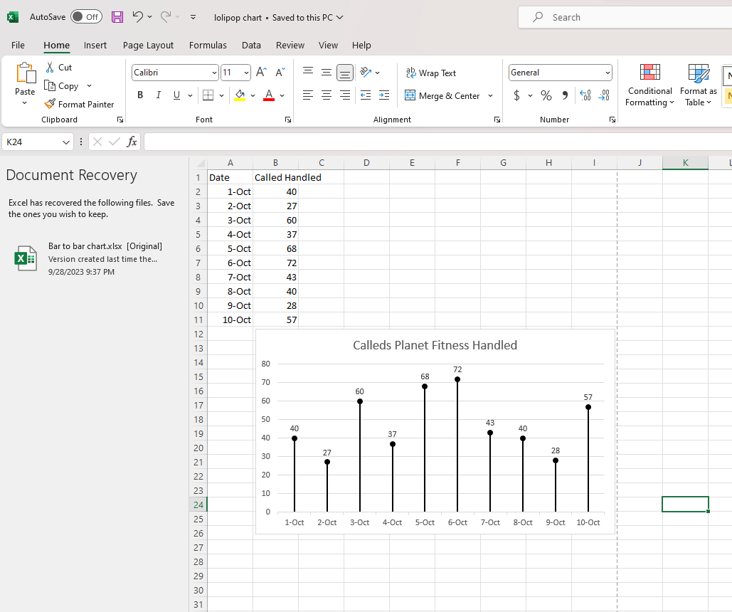
A lollipop chart is basically a combination of a bar chart and a dot plot or scatterplot. It can be used anywhere that a bar/column chart would be appropriate. Lollipop charts are great for reducing visual clutter and making use of white space, which can make important data stand out more and make the differences between data points more apparent. Numpy Ninja makes the point that one strength of lollipop charts are that they are highly customizable. One of the weaknesses is that the circular markers can create some ambiguity in where the actual datapoint lies, making it more difficult to discern scale. This type of chart actually works best when there is a large discrepancy between datapoints such as in the below. The second chart I made has much less deviation between data points so the chart overall is less impactful. This is one of those things that you have to see for yourself to understand that there really is a best chart for different types of datasets.
I was recently at Disney and got the sales pitch for DVC timeshares. I thought a fun lollipop chart would be to show how many one bedroom villas each different resort has. This can be important information for a family looking into which resort to purchase if they need a specific room type. This chart clearly shows that a family that requires a one bedroom villa to be comfortable should stay away from purchasing at certain resorts or they may not be able to book the room they desire due to low availability. This lollipop chart was created in Excel.
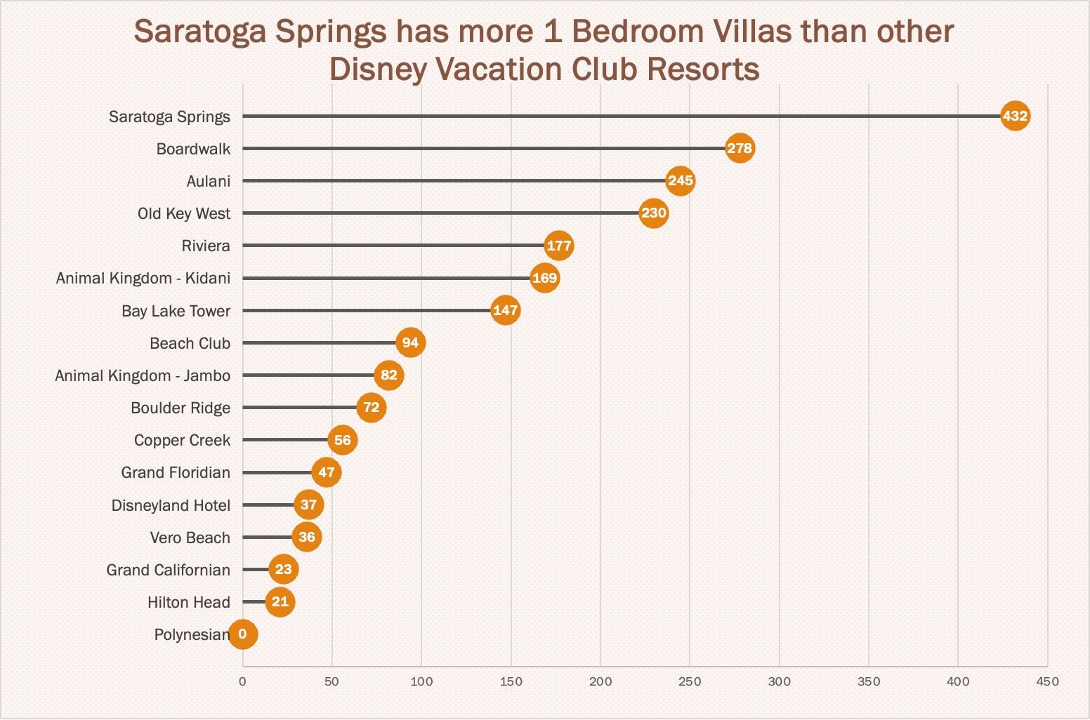
https://www.dvcfieldguide.com/blog/disney-vacation-club-1-bedrooms
I tried to create a lollipop chart in Tableau using data on consumer spending. I found some information on what categories of purchases consumers intend to splurge on in 2023. This application can be tricky to figure out, but I love that I can export my charts with tooltips for readers to interact with. 37 percent of consumers intend to splurge on something in 2023 and this chart breaks it down into categories. We can see that most people intend to splurge on restaurants and groceries and the fewest people intend to splurge on fitness and household essentials.
Usage of Lollipop Charts
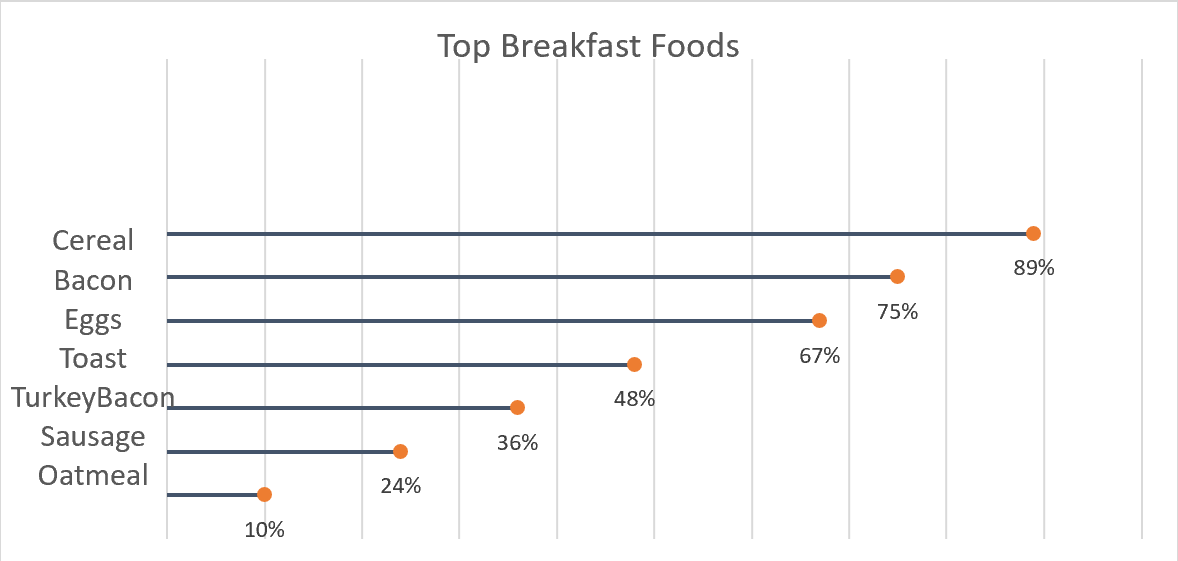
A good way to go about comparing large percentages is through a lollipop chart. Here we made one to show a percentage of the top breakfast foods that people eat. We could have used a bar chart or something similar to portray this same message but a lollipop was useful because we have some data points that are close in length and it also make it look less cluttered. Here we can use a very simplistic design, no need for different colors or legends. The chart I made was done in excel, by using a scatter plot of my data and then adding error bars. After modifying the bars a bit I got the look of bars with a round end point and the final product of the lollipop graph.
Usage of Lollipop Chart
When it comes to the creating a chart in Excel to display the needed information, we tend to only think of a bar, line, or pie graph. However, it is possible to be more creative and workaround with those existing graph choices. This time we learned about the lollipop chart. From what I think, lollipop is much more appealing to the eyes than other standard horizontal bar chart. It can tell length which distinguish the proportion in which one is higher or longer in value. In other words, it works the same as a bar chart. There is a difference. Bar charts are most likely used when there are not too many data to display and then it would become clustered. Being clustered can basically fill out the entire chart with all different colors which can irritate the eyes. Lollipop chart achieved the minimalistic view even with higher number of data. It does require many additional steps comparing to just insert a graph with the traditional bar chart. It started with a scatterplot and with a number of formatting the data sets, labels, etc…. There is a down side to use this lollipop chart. The value needs to be clear and apart from another. It is difficult to tell the end point of each line if there is no label especially when data are close to each other. I can see this graph to be use in a more professional environment.
Lollipop Chart
As we continue to learn throughout the course of this class, there are dozens of ways to display data aside from the typical charts that we are used to seeing. One such example of this is a lollipop chart. A lollipop chart is a great alternative to displaying a significant amount of data that may be too overwhelming to look at and compare in a bar graph due to all of the shapes, shading, and numbers. It can also be helpful with a smaller set of data that may look odd or misplaced in other types of graphs. A lollipop graph – which gets its name due to the fact that it replicates what a lollipop looks like – takes this significant data and displays the same information in a much simpler way due to the design of it. Many people describe it as being a more “minimalistic” graph compared to the typical bar graph and prefer to use it when some data are similar.
A lollipop chart can be created a few different ways, however, the two ways I chose to use started with a scatter plot and a line graph. The scatter plot gives the horizontal lollipop look (due to the way it formats) whereas the line graph creates a vertical lollipop shape, once again due to the way it formats. Using Excel, I decided to create both types of graphs using the same data to compare how it looks.

The image above shows the lollipop graph in a horizontal display, while the image below shows the graph in a vertical format. The main difference between the two is accuracy. As we read about in the textbook, the vertical lollipop graph looks “prettier” but is not always as accurate due to the size that the lollipops are made in order to look more “put together”. For this reason, I prefer the horizontal look better as it is easier for me to comprehend, and yes also more challenging to make!
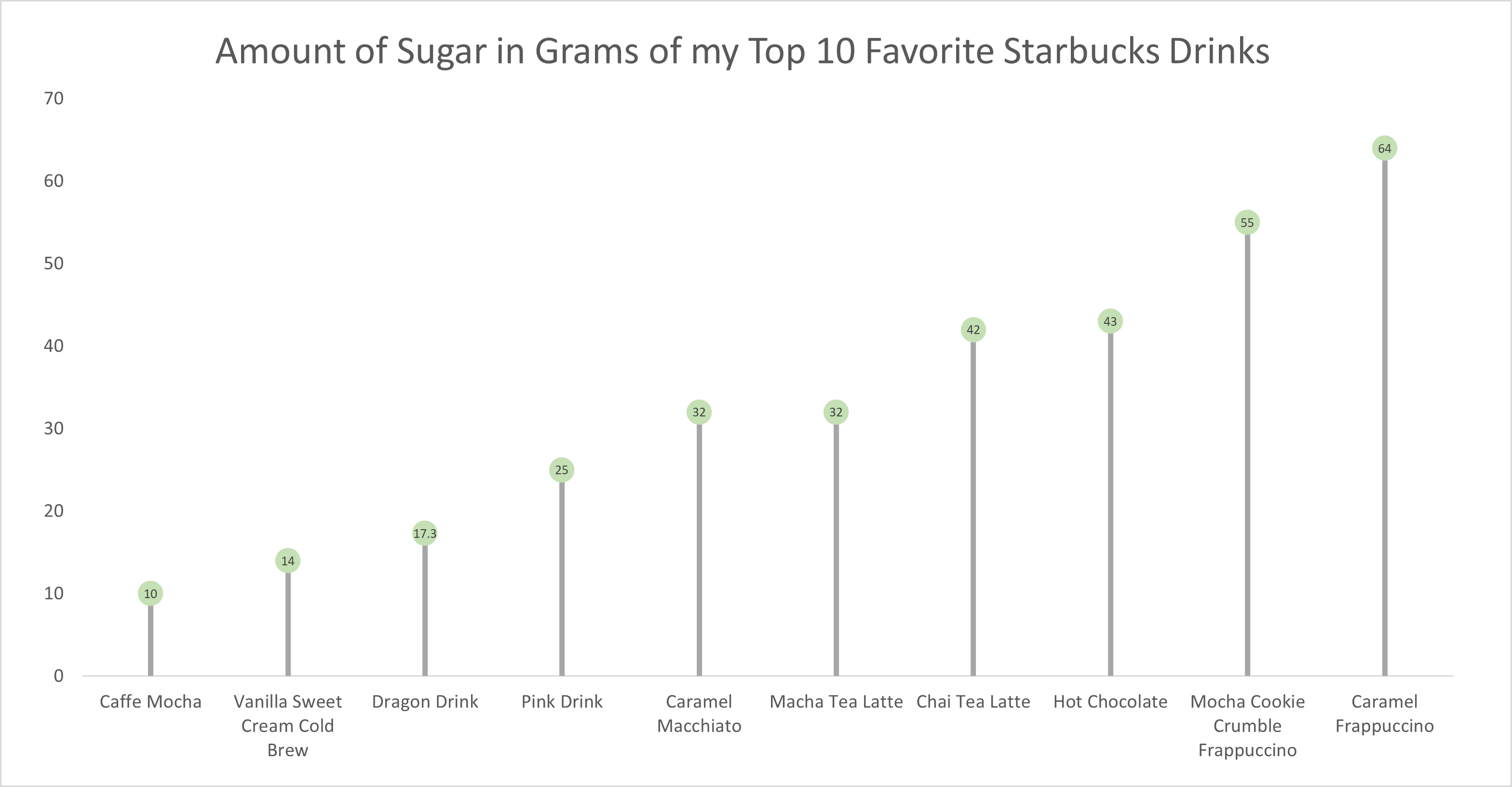
As for the actual data shown in each graph, I chose to create my own data based on research of the grams of sugar in my top ten favorite Starbucks drinks. The reason I chose to do this was because I am constantly getting Starbucks and attempting to “hop on the trends” of newer drinks, so I wanted to inform not only myself, but other people who like these popular drinks about how much sugar is in them. The grams of sugar are based on their “grande” size, although I typically end up getting a “venti”. As you can tell in the chart, which goes in order from least grams of sugar to most grams of sugar, nearly every drink with the exception of a few, has more than twenty grams of sugar in one of the smallest sizes available. Once again, this information presented is very eye-opening and something to be aware of. I ultimately think a lollipop chart was an easy and effective way to present this data because it is easy to get the important information and comparisons without getting overwhelmed.
Lollipop Chart
As data is becoming both increasingly important and more widely used/applied, it only makes sense that simultaneously there would be a growing number of fields working around such factors. This can become an issue for visualization artists, as with an increasing complexity and density to existing bases and collection methods, too much data may often be readily available than immediately necessary for an infographic. Sometimes many words may be conveyed within the motion or placement of the simplest of figures. One clever chart that may assist with certain large data pools, is a lollipop chart.
A lollipop chart is an excellent way to effectively illustrate a pattern to an audience when this pattern is hidden within a lengthy or complex dataset. As a lollipop chart is a variant of a bar chart with less visual clutter, these graphs are best used to display a distribution of values.
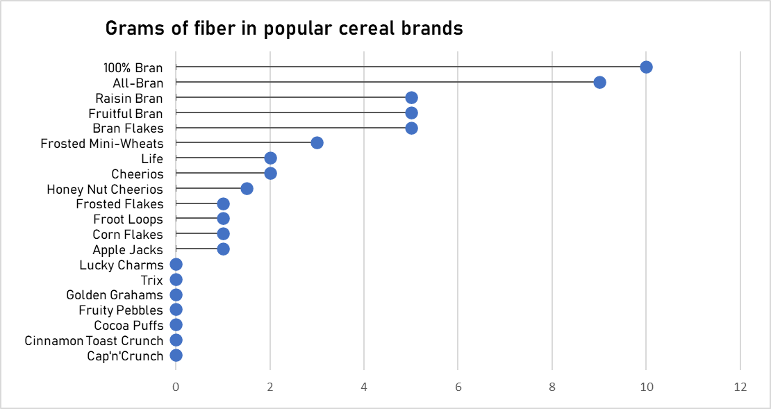
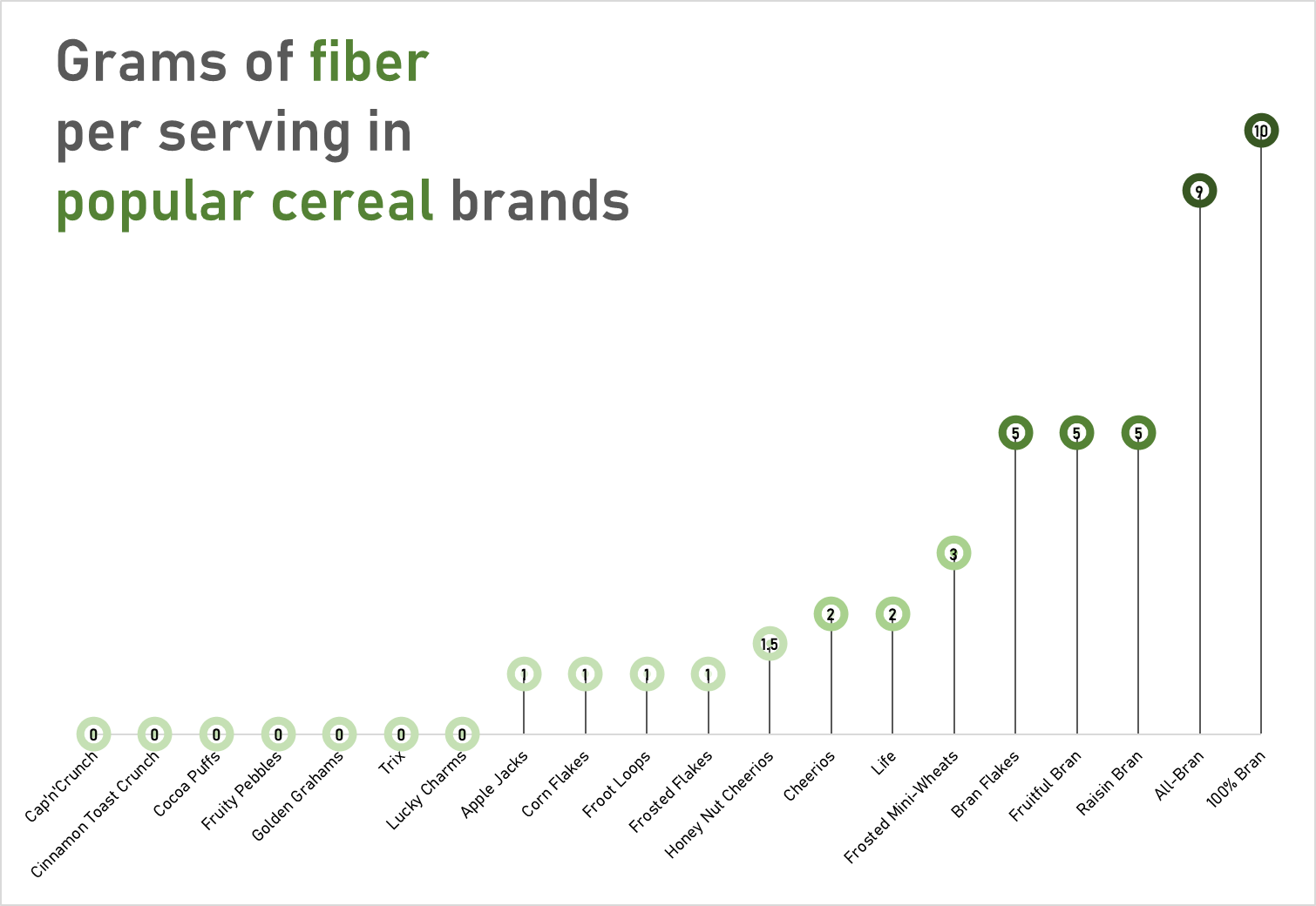
The data used to construct these charts was obtained from the “80 Cereals” dataset on kaggle.com
These charts would most likely visually fit a dataset with a more broadened distribution of values. However, with these two charts you can quickly see how a lollipop graph can demonstrate a concept with plenty of data to be easily deciphered. These graphs that I have created may be useful for someone who is looking to adjust their fiber intake, as I have separated the fiber content per serving in grams across popular cereal brands. However, the second graph is most effective, as with making use of the color spectrum of light to dark with increasing fiber content, the human eye may quickly identify significant regions of the graph.
Lollipop Chart
There are many forms in which data can be presented, such as a column chart or a bar chart, but what happens when there is a wide range of percentage rates, such as 90%? It is often the case that data can be visually distasteful when it is aggressive or overstimulating, and this is when the Lollipop chart is recommended and is visually pleasing. An axis is connected to a dot when the value sits on a stick.
By Analytics Vidhya, Lollipop charts are used for comparing different categories within a category. As a result of this chart, a well-organized comparison between classes can be seen. Here is an example of how a Lollipop chart can look. You can see the unique visualization that differentiates it from other charts by the small circles above the lines. When examining relationships, distributions, etc., this type of chart may not be the best option. Also, it does not work with all data as I discovered when I searched for a data set that would look visually appealing with a Lollipop chart. If you do not have the correct data, your Lollipop chart will not be accurate.
With data from the United States Census, I constructed a Lollipop chart that measured the effectiveness of changing business conditions during COVID-19 using the Small Business Pulse Survey. I selected 10 cities and calculated the percentage of businesses affected by the Corona VIrus Pandemic. As you can see in this visualization below, with the 10 cities I selected, I created a Lollipop chart. Choosing more cities in the data center would have made labeling more complex. I would have had to play around with the numbers and ensure they matched the bar that represented them. As well, it is also imperative to consider what tool you are using to create this chart. Excel will you a more complex method than if you go to a reputable website and follow the steps there.
Lollipop Graphs
By Shaun Sneddon
Unveiling the Lollipop Chart: A Sweet Way to Visualize Data
In the world of data visualization, a lollipop chart stands out as a charming and efficient tool. It combines the best of bar charts and scatter plots to make your data pop. In this post, we’ll explore what a lollipop chart is, when you should use it, and we’ll create one together.
What’s a Lollipop Chart?
Imagine a vertical line (the “stick”) with data points as markers (the “candies”). This is a lollipop chart! It’s ideal for showcasing a handful of data points, ranking items, highlighting outliers, and tracking changes.
When to Use Lollipop Charts
Few Data Points: If you have a small set of data to compare, a lollipop chart simplifies it elegantly.
Outliers: It’s great at spotting unusual data points that stand out.
Rankings: Show rankings or positions in a dataset clearly.
Changes Over Time: Use it to track how data changes over time or across categories.
Data Distributions: Combine it with other charts to display data distributions.
Creating a Lollipop Chart
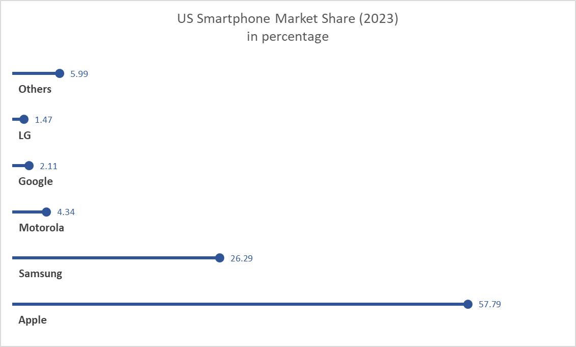
For our example, let’s track the quarterly sales of three products – A, B, and C.
Input Data: Use your preferred data tool, like Excel or Google Sheets. Create columns for “Product” and “Sales.”
Design the Chart: In your tool, use a bar chart or scatter plot. Make the data points circular (or use candies).
Customize: Personalize your chart by adding labels, changing colors, and adjusting the size.
Titles and Legends: Don’t forget to label your chart correctly.
Conclusion
Lollipop charts are a delightful way to make data more appealing and understandable. They shine when you want to highlight key points, compare a small dataset, or reveal outliers. So, spice up your data visualization and give lollipop charts a whirl!
Lollipop Chart
This blog is all about how lollipop charts should be used and how they effectively visualize data. A lollipop chart is typically used to compare two or more categories or variables. It consists of a horizontal axis and vertical lines that represent the values of each category or variable. Lollipop charts show changes over time since charts can be used to visualize changes in data over time. Lollipop chart highlighting differences between categories or variables. It is also used for presenting ranking or ordering. For instance, I made a lollipop chart in Excel based on ranking.
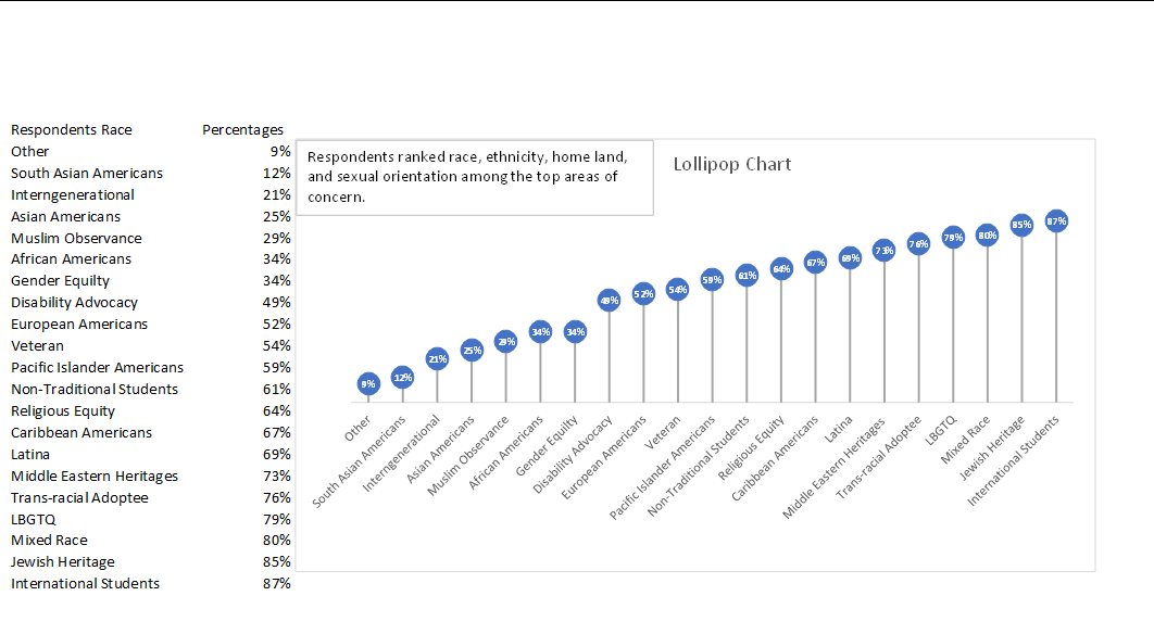
This lollipop chart is about respondents ranked race, ethnicity, homeland, and sexual orientation among the top areas of concern. You can see how each lollipop is labeled with data according to rank. Overall, lollipop charts are suitable for situations where you want to compare, rank, or highlight differences between categories or variables. Lollipop charts usually attract the reader because of the patterns within the data.
Reference
I chose this data from Evergreen Data.