Home » Uncategorized (Page 3)
Category Archives: Uncategorized
Pie Chart
The humble pie chart, a simple yet effective tool for anyone interesting in making data visualizations. Aside from the necessities that pie charts should represent 100% of a total figure, and the chart should be legible, it’s hard to go wrong with a pie chart.
In addition to the above factors, there are others that make a pie chart go from a working choice to the correct one. For the true strengths of a pie chart to shine the data should tell a story. Components of the chart should be instantly recognizable as a very large or small fraction of the total figure.
For my example I chose the distribution of wealth in the United States, and I was able to find data from 2017. This data has a clear total figure, the sum total wealth owned by civilians in the U.S., and the data tells a clear story.
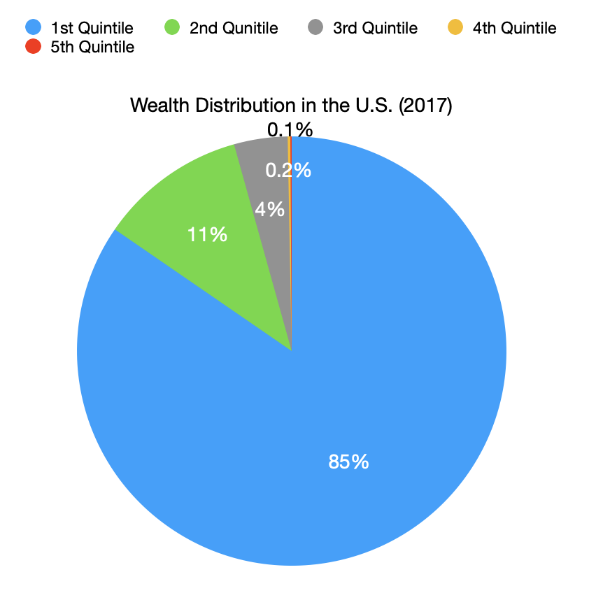
No other chart would tell readers what I was trying to convey as quickly and clearly, that wealth inequality in the U.S. is staggering.
When making your own visualizations, remember to choose a pie chart if the individual components tell a story by their relation to the total figure.
Usage of Pie Chart
From my knowledge, pie charts alongside with bar graphs and line graphs are the most used type of graphs when it come to comparing data. They each have different uses. For bar graphs, it can be used to compare between different groups or track the progression over time. For line graphs, it usage can be quite the same literally but it can pick out the tiny difference between values and can compare data progression over a much longer period of time and wouldn’t cluster the graph like a bar graph would do. Pie chart does compare between groups or categories. However, a pie chart does not compare the values over time. Instead it compares the data of a whole subject and represents percentage, as if everything would add up to 100%, the total.
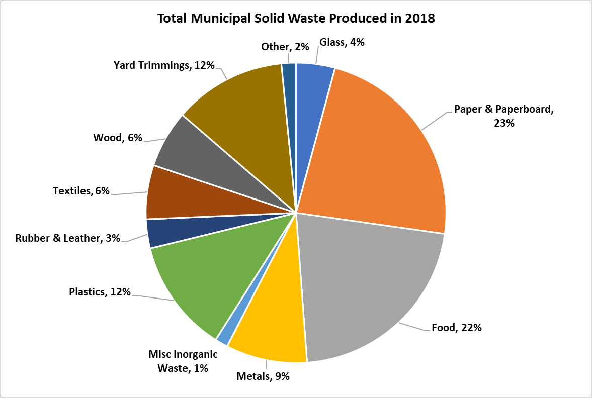
Here I take an example about the total municipal solid waste (MSW) produced in 2018 from the EPA. Using pie chart is ideal here because you would want to compare between each value (type of waste) of an entire subject (waste produced) and each slide of color here represent each value. Readers can easily see the difference base solely on the size of each slide and quickly understand the data. A pie chart of this consist of 11 values and if used on a bar graph, I would think the graph would be clustered with 11 bars and from there you would have to adjust the size accordingly to squeeze every bar into a graph thus made a bar graph a hassle for this type of data. A line graph for this one is also out of consideration. The topic here is the ‘Total amount’ and not ‘Wastes produced from month to month’, there are no over time progression in the data to compare using a line chart. Overall, a pie chart for this type of data is easy to made, easy to understand with minimal effort.
Pie Charts. AS
In the world of data visualization tools, pie charts appear simple and easy to use upon appearance, but actually require significant prior consideration and thought upon creation. This is due to its simplistic nature and form of distribution, which may lead many to believe that categorical data will translate well.
Pie charts may best be utilized to accomplish several end goals:
- To demonstrate a part to whole relationship
- To place emphasis on a particular segment (smaller or larger)

The pie chart I have created attempts to demonstrate how many individuals in the population of Texas lack health insurance coverage. As these two demographics are easily separated into two groups, a pie chart is an extremely effective way of calling attention to this statistic by placing emphasis on one segment.
Source:
Bureau, U. C. (2019, November 7). State-by-State Health Insurance Coverage in 2018. The United States Census Bureau. https://www.census.gov/library/stories/2019/11/state-by-state-health-insurance-coverage-2018.html
Pie charts
By Joseph
Pie charts are one of the many types of visualizations that one can use to portray both complex or simple data. A pie chart can be especially good when the data being portrayed are all parts of a whole. As shown by the pie chart above, the values for the Recommended diet intake are all individual parts that add up to a 100%. Furthermore there are both small and large data sets that needed to be represented such as, the dairy value and the fruits value. Both data sets are vastly different in terms of percentage and hence the amount of space that they take up visually. To convey this, a pie chart is the perfect visualization to use in this instance. This is especially true when one considers that the appearance of a pie chart also falls in line with the topic of the graph itself which is diet and food intake. the values not only add up to a 100%, but also the data appear to reflect a plate, with each data set representing a specific food intake. Upon making this pie chart, I did come across some suggestions as to how I could improve my data such as changing the color of the data set or make one value stand out by removing color from every value except for one. One could also disconnect a certain piece from the whole to visually represent something to the audience. These design methods are all very valid and useful in data visualization, but I decided to make the pie chart I created very simple to understand. The more elements that one adds to something, the more important it is that the information is clearly conveyed. Not only was there not a need to apply extra designs for the data that was conveyed, but there would also be a risk that the audience may misinterpret certain designs choices if they poorly represent the data. All in all, a pie chart is very efficient visualization to represent data that is part of whole.
Pie Charts
Pie charts are commonly used to visualize data that can be divided into distinct categories. Pie charts are used for showing the composition or distribution of a dataset. Using different colors, labels, and percentages, pie charts allow viewers to quickly understand the relative sizes of the categories and compare them visually. In a pie chart, the colors assigned to each slice play a crucial role in conveying information and making the chart easily interpretable. The choice of colors should be made carefully to ensure readability and accessibility. Pie charts are effective for displaying data with a small number of categories or when the differences in proportions are significant. Sometimes, it becomes less effective when too many slicers are created, and hard to understand for the reader. Here are examples of pie charts and how it used in data.
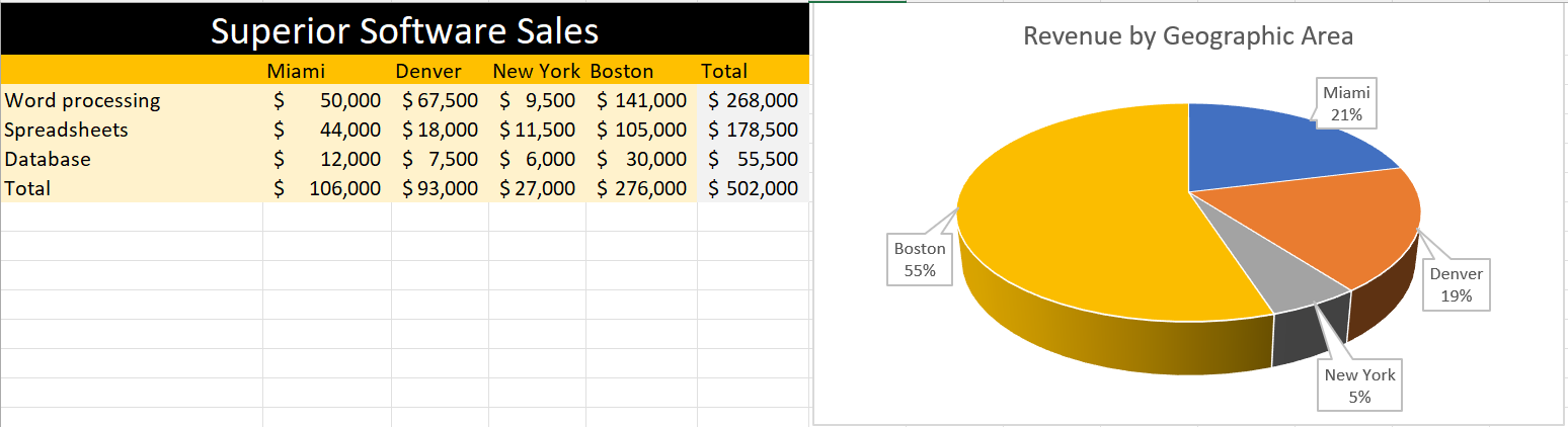
In this pie, I created data on superior software sales based on the top cities in the USA. The pie chart differentiate cities with different color giving the percentage values that Boston is getting 55% which highest and the lowest is New York which is 5%. Looking at the table feels like little complicated to understand but the pie chart attracts at first sight without any complication.
In conclusion, pie charts provide a clear and concise representation of categorical data and can be valuable tool for data visualization and communication.
Pie Charts
The perfect time to use a pie chart is to differentiate parts of a whole. A pie chart is easy to understand because slices of a pie are just a percentage of the whole thing. Bigger slices are bigger percentages for that variable. Pie charts need to be used sparingly because when they are used wrong they can be very confusing especially if portions of the graph are similar in size. When pie charts are used in the right scenarios they can be one of the most recognizable forms of data visualization.
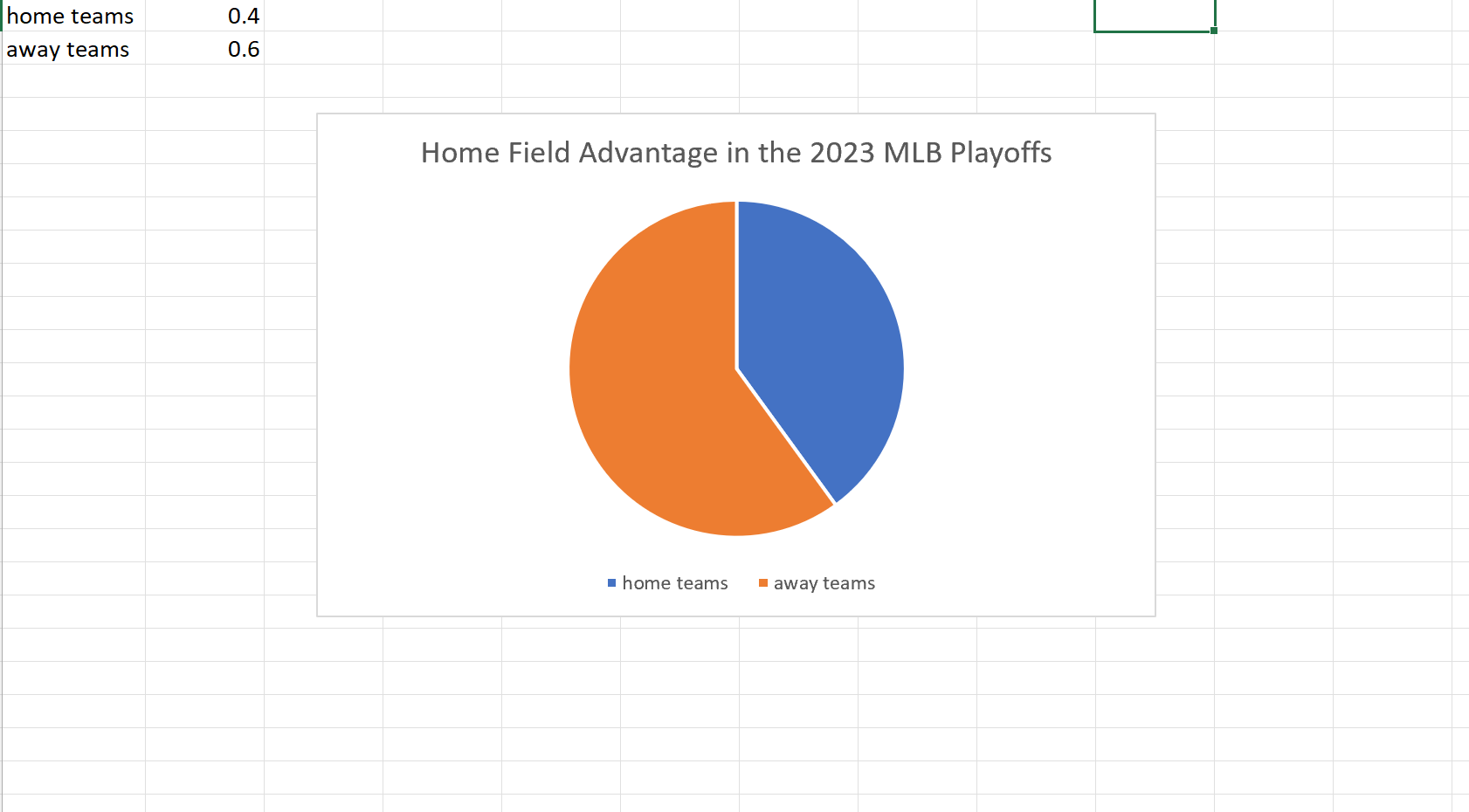
My example of a pie chart takes two variables. The win percentage for the home teams versus that of the away teams in this years MLB Championship Series. Although we usually see home field advantage in sports here we can clearly see a slight edge for the away teams. I found these results surprising but it is a small sample size so that may be why the results could be skewed one way or another.
Pie Charts
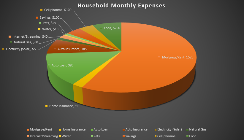
I felt a pie chart was an ideal choice to show monthly household expenses. It provides a clear and visually appealing way to represent various expense categories within a budget in proportion. Viewers can quickly identify the larger and smaller slices, thus providing immediate understanding where the money is going. You are able to make comparisons and it helps with seeing where spending is a priority and make informed decisions. I referred to From data to Viz | Find the graphic you need (data-to-viz.com) which helps you choosing an appropriate graph for your data and excel itself had tutorials that walked you through choosing correct pie chart. I also think a bar chart could work in this example as well.
Pie Charts and When to Use Them
Pie charts are a form of data visualization that can be used to compare part-to-whole relationships. They are circular graphs illustrated through different proportions of categories within a whole. It is commonly and best used for percentages because it all adds up to 100%. It makes it easier to understand this way because each segment in the pie chart represents the percentage of the whole that each category represents. However, not all data is best represented through a pie chart.
Pie charts work best with minimal components due to the risk of overcrowding. So, if the data has too many points, it becomes challenging to read. In this case, bar charts might be a better fit. Pie charts are also not made to compare more than one data set and do not work well when comparing small differences. Anything that can not be broken down into minimal slices and easy to distinguish, is not meant to be represented by a pie chart.
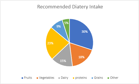
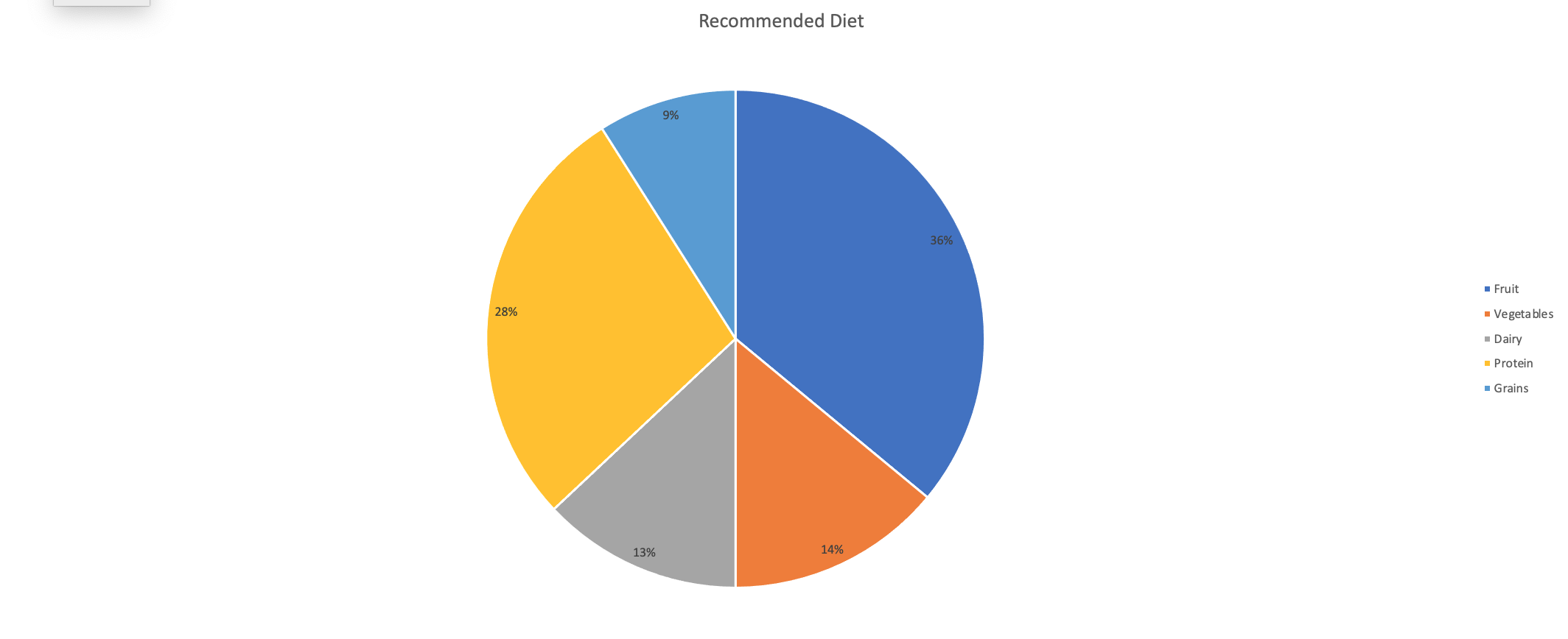
An example of a good data set to be represented by a pie chart would be a recommended diet plan divided into sections. I made myself a diet plan to balance out what food groups should be ingested more than others. In the chart, you can clearly see that fruits, vegetables, and protein are the main components that I need to have compared to dairy and grains. All percentages create a whole and each slice is representative of the whole.
Unveiling the Power of Pie Charts in Data Visualization
The Strength of Pie Charts
Pie charts are like the unsung heroes of data visualization. They might appear humble, but their ability to convey the composition of a whole is unmatched. They shine when you need to represent percentages and proportions, making it easy to grasp the distribution of elements. For instance, in a recent project, I employed a pie chart to showcase a company’s revenue breakdown by product category. The result was a clear and accessible snapshot of each category’s contribution to the total revenue.
When to Use Alternatives
While pie charts have their merits, it’s crucial to recognize when to opt for an alternative chart type. Bar charts are more effective when comparing many categories, and line charts excel at illustrating time-series data. In cases with numerous subcategories, stacked bar charts or treemaps might be the better choice.
Designing a Winning Pie Chart
To create an impactful pie chart, follow a few design principles. Use labels to identify each segment, explode important segments for emphasis, limit your color palette, avoid 3D effects, and add a legend if needed. These tweaks ensure clarity and readability, making your pie chart an engaging and comprehensible tool for data presentation.
In a world where data speaks volumes, mastering the art of pie chart design is a valuable skill for college students and aspiring data analysts. It’s simplicity combined with its versatility makes it a go-to choice for visually representing data. By understanding when to use a pie chart, and by adhering to these design principles, we can present data effectively and be well-prepared for the data-driven challenges of tomorrow.
Example
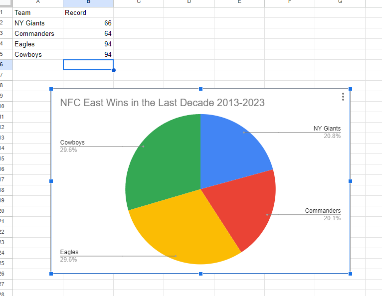
I made a pie chart on the NFC East in the NFL of choice to visualize the data. The chart effectively conveys the distribution of wins among the four teams in the division: the NY Giants, Washington Commanders, Philadelphia Eagles, and the Dallas Cowboys. This choice is compelling because it simplifies the complex data by visually showcasing how each team’s wins contribute to the whole, which, in this case, is the total wins in the division over the specified timeframe.
The pie chart excels when there’s a limited number of categories, which aligns perfectly with our scenario of only four teams. This ensures a clear and straightforward representation, making it easy to understand the proportions of wins each team has contributed. For viewers, this pie chart serves as a quick and intuitive way to gauge the performance of each team in the NFC East during the past decade.
By Shaun Sneddon
Pie Charts
We can use Pie Charts in a variety of ways, and they are one of the most common visual representations of data. The pie chart, according to storytellingwithdata, can display a part-to-whole relationship, in which each slice represents one component of the whole, and all slices taken together equal the whole.
When To Use A Pie Chart
There are two primary uses for a pie chart in this situation:
- An understanding of the whole-part relationship in your data
- A relatively small or large segment of the pie is being represented
When To Not Use A Pie Chart
When analyzing categories, and comparing data across pies, Pie Charts should not be considered.
Share of Children in Primary School Who are in School Pie

I compared the percent of children who attend primary school in four countries using data from ourworldindata: Afghanistan, Belgium, the United Stated, and Africa. It is clear from the chart that the Belgium had the highest percentage of children attending school, with 98.80%, and Afghanistan had the lowest, with 26.80%. It was very interesting to see this visual because even without the numbers and simply displaying the names of the countries you can see how Afghanistan’s share of the pie is much smaller than the other countries.