Home » Uncategorized (Page 14)
Category Archives: Uncategorized
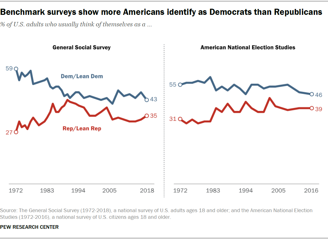
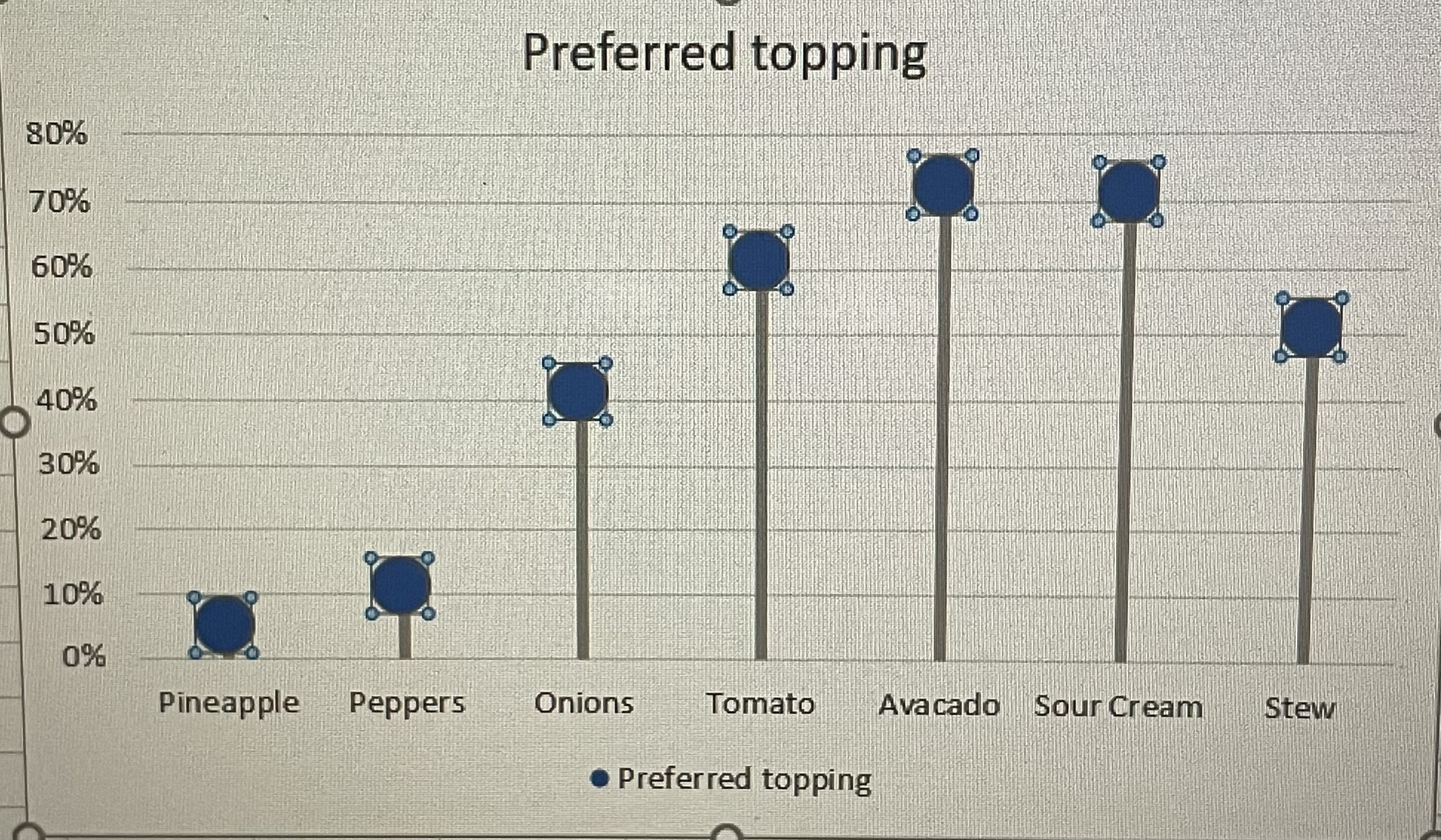
Lollipop Chart
When thinking about a lollipop , you tend to don’t think of a chart. Some people compare it to a bar graph, but it is slightly different as it a line and a dot, which gives it the lollipop shape. Not an actual bar and many people comment that there is no distinct different besides the shape. The chart is actually used to compare categorical data. I think it gives a different dimension and a fun way to show data.
See below for the table I created for this table.
| Ice Cream Toppings | Percentages |
| Fudge | 20% |
| Rainbow Sprinkles | 33% |
| Caramel | 13% |
| Pineapple | 0% |
| Chocolate Sprinkles | 33% |
This was a fun in making. Will be using this type a graph again!
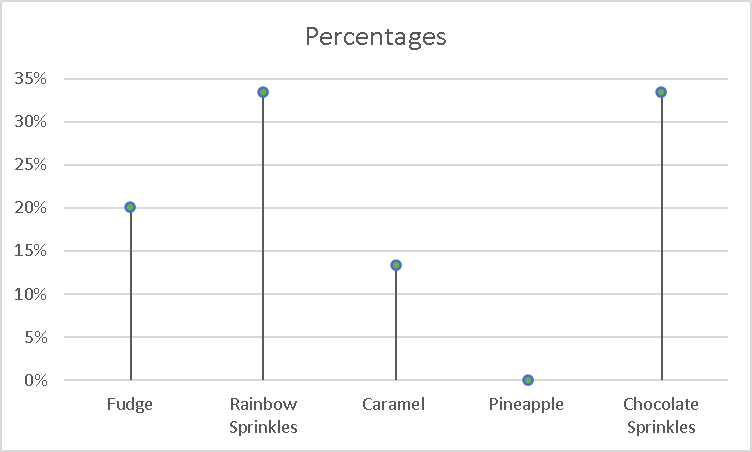
Lollipop Charts
Lollipop Charts are a type of visualization that assist in a form of a scatterplot. This scatterplot involves comparing different variations of possibly something in the same category. For the scatterplot, I compared the prices of a BigMac all over the world, with U.S Conversions. Lollipop charts should be used when comparing similarities in data.
here is my data
Switzerland $1.70 Denmark $0.04 Britain $0.63 Argentina $1.00 Japan $1.06 Euro Area $1.07 South Korea $1.08 Canada $1.47 Australia $1.68 Brazil $1.79 New Zealand $2.01 Malaysia $3.80 Isreal $4.05 Poland $4.30 Chile $5.14 Indonesia $7.45 Hong Kong $7.79 China $8.28 Mexico $9.41 Hungary $29.00 Czech Republic $39.10
Lollipop Charts
Bar charts are very boring when it comes to displaying data. We see them being used all of the time. They are very simple and easy to create but are not very eye catching. Lollipop charts are much more visually appealing and fun to look at.
Lollipop charts can be used in place of a bar chart. Any information you can display in a bar chart, can be displayed in a lollipop chart. Since they are not as popular and overused like a bar chart is, you will draw in more viewers to your chart because it is more unique and attractive to look at. Here is what one may look like:
Lollipop charts can be horizontal like the one above, or vertical just like a bar chart. They are not difficult to create if you follow directions from a website or in the textbook “Effective Data Visualizations”. They are very easy to understand and a great way to display information. Next time you think of using a bar chart to display your information, remember that the lollipop can display the same information but in a fun and creative way.
Lollipop Chart
A lollipop chart is a different variation of many graphs and visualizations one can use. It’s just a line and a dot, instead of the typical bar. Visually similar to a lollipop. Lollipop graphs are useful for measuring trends, categories, ranking, and comparing data.
Here is an example of a lollipop graph, my own created lollipop graph.
Lollipop Chart
What is it? What is it used for?

Lollipop charts are used to make comparisons between different items or categories. They are great for when you need to display trends over time. They have both x and y values. It is best to use when you have a large set of high numbers. This includes comparing big sales or percentages. It looks similar to a bar chart, but the lines are normally thinner and there are dots/circles on the end of the lines just like the candy. I would not advise to use lollipop charts when showing relationships. All in all, it is a super unique chart type to display your data in a fun way.
Here is my lollipop chart!
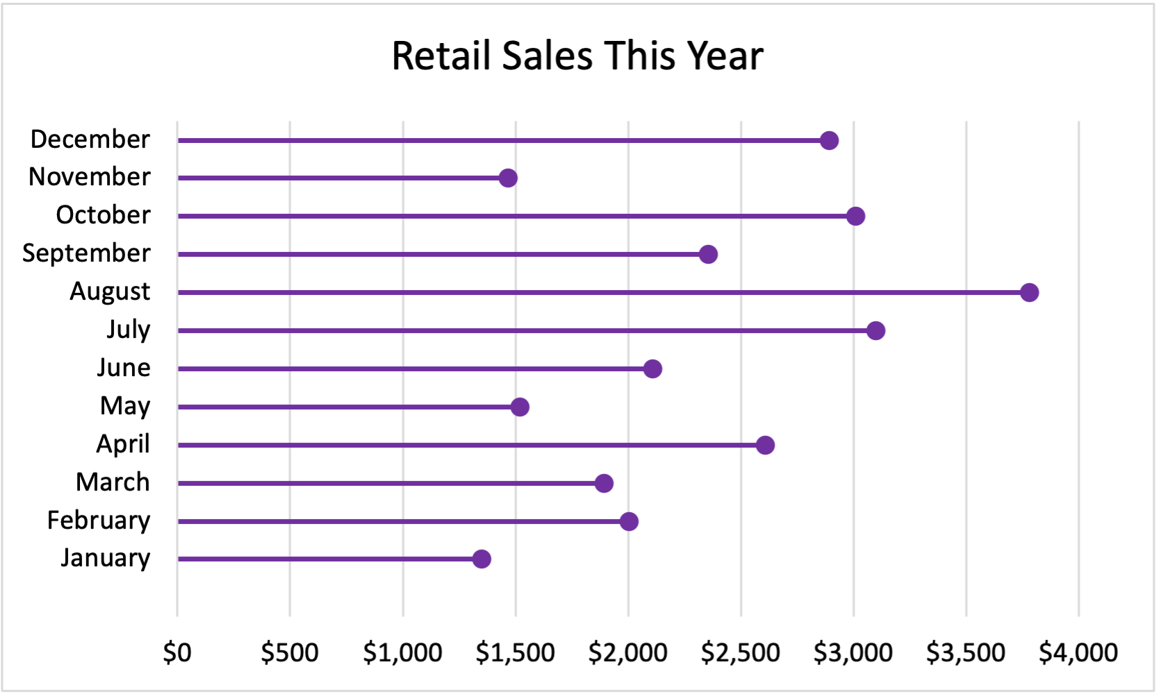
My Data:
January $1,350
February $2,003
March $1,894
April $2,609
May $1,521
June $2,109
July $3,100
August $3,780
September $2,356
October $3,009
November $1,467
December $2,891
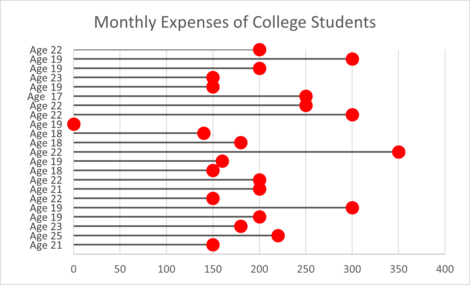
Lollipop Chart
Lollipop charts can be both vertical and horizontal. This is similar to a scatterplot and a bar chart. It has both x and y values. Using a lollipop chart is good for when you have a large value of numbers and when your number values are high . These are usually used for high percentages such as test grades and more. You can use this chart when you are making a comparison between categories and/or items. It can also be used for ranking. You can use color for the categories and the length of the bar can measure the magnitude. The circle at the end of the line represents the end of the data value and matches up to the number on the y axis.
My example:
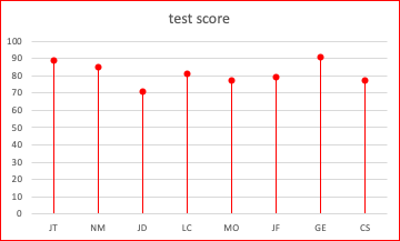
| Initials | Test Score |
| JT | 89 |
| NM | 85 |
| JD | 71 |
| LC | 81 |
| MO | 77 |
| JF | 79 |
| GE | 91 |
| CS | 77 |
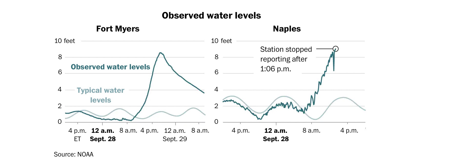
Benchmark Comparisons
The Washington Post shared an article “Maps show the impacts of Hurricane Ian.” Within this article the author shows the comparison of two different cities in Florida that got affected by Hurricane Ian on the same day. The light blue lines show the normal water levels while the turquoise line is how the levels were during the hurricane. After 8a.m. in both graphs, the levels started increasing a huge amount. The only thing that is different is the way the turquoise line is. One is smoother while the other is rigid and bumpy.
Benchmark comparison
The graph I chose shows both general social surveys vs. American National election studies. This graph displayed one side with the general social survey, asking Americans on what side they may see themselves. On the other side of the graph, it showed actual American elections and what people were under. This uses the left side of the graph as a benchmark of what sides Americans say they are on vs. who they actually vote for.