Home » Uncategorized (Page 13)
Category Archives: Uncategorized
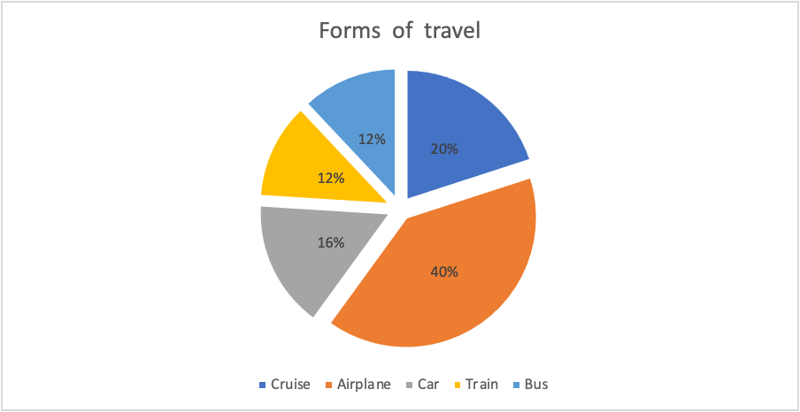
Piechart
For my data set I chose to show people’s favorite ways of traveling for vacation. I think using a pie for this because it visually breaks up the surveyed population into sections. Doing this allows for someone to easily see which sections were more in favor.
Pie Chart
The pie chart that I chose to make depicts the poverty level of people under the age of 18 in the United States in the year 2020.
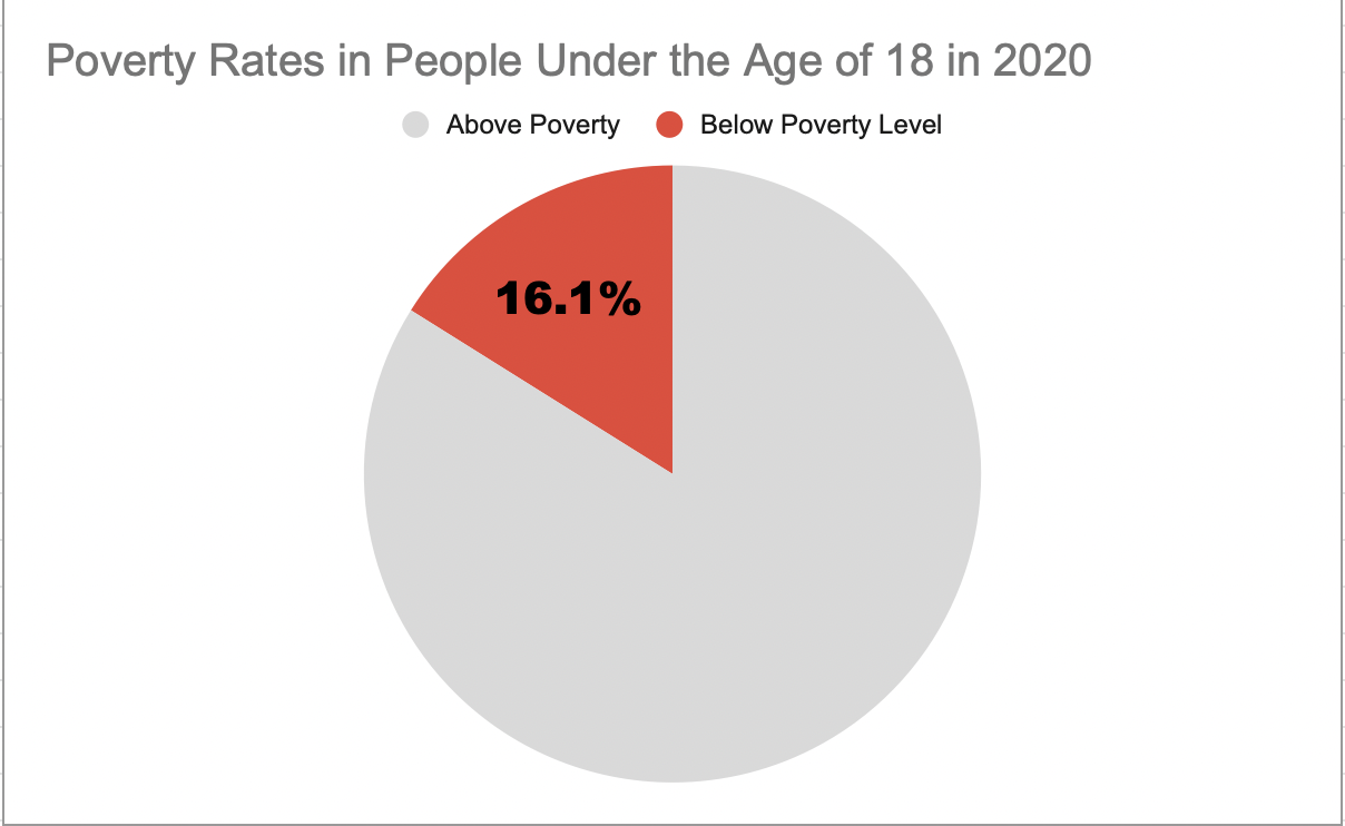
I believe this was a good example of data to use in a pie chart because it represents a part of a whole. Data like this I believe is perfect for pie charts. In this specific example, the whole is the US population under the age of 18 and the part is the percentage of those citizens who are under the poverty level.
This specific data I feel is best represented as a pie chart, however, the other data I found in the article I got this information from would have benefitted better from something like a line chart. That is because not only did this website tell me the percentage of minors under the poverty line, but it also told me that 2020 was the first time poverty rates have increased in the last 5 years. It would have been very beneficial to show the steady decline and sudden increase of poverty rates over the line chart. However, like I previously mentioned, for this specific data example I believe the pie chart was best.
As far as design choices I made for this chart, I chose to go with a bright color to highlight the important part of the chart. I also chose a muted grey color so the audience would focus more on the children in poverty. I also decided to only put the percentage of impoverished children to once again highlight the point of the chart.
This is the website I obtained my information from: https://www.census.gov/newsroom/stories/poverty-awareness-month.html
Abigail Moore
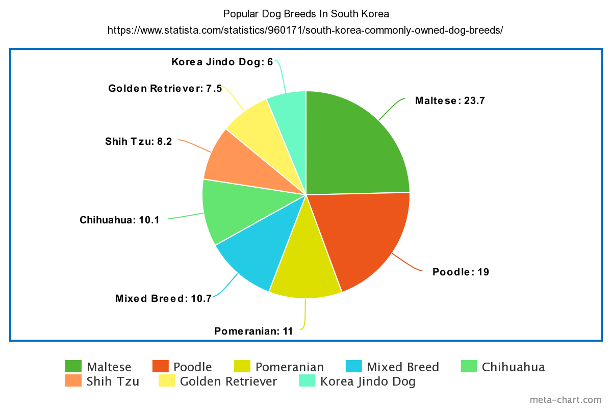
Pie Charts
I chose to display the Popular Dog Breeds in South Korea. I feel as though a pie chart is the best way to visualize this dataset. this is because of the ease that comes with working with pie charts. Pie charts are a type of data visualization that breaks down the slices as categories of their amount or percentage. This lets the consumer know which parts are heavier than others or vice versa. This is because more often than not there are categories close in similarity and very different. The separation in colors aids in what slices belong to each category
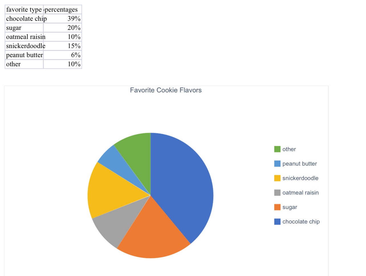
Blog Post 5- Pie Charts
Here is the pie chart that I created for a group of people’s favorite cookie type. I think a pie chart would be the best for this because it is measured in percentages. If we were measuring it by exact number of people, we could have used a different chart or graph.
Pie charts are very fast and easy to make. All you need for a perfect pie chart are some labels, color, percentages, and data!
(The percentages inside the pie chart will not upload onto this website, but it is on the excel document attached to my assignment on blackboard!)
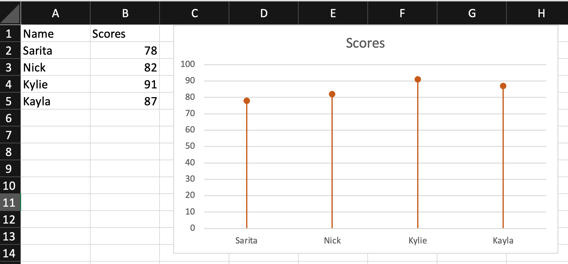
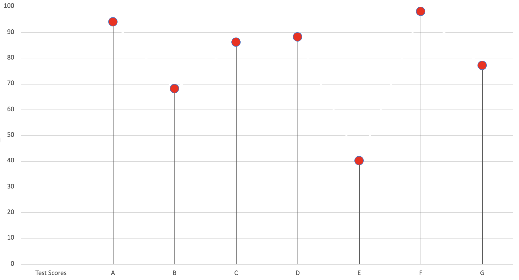
Lollipop Chart
Lollipop charts are a really simple and useful infographic to get basic information across. Here I made a lollipop chart using test scores for A, B, C, D, E, F and G. It is easy to follow and see the test score that each letter received. In my opinion, this graph is a very simply play on a normal bar graph just with a bit of added “fun” to make it less basic and square.
Lollipop Chart and When to Use It
When it comes to the decision on whether or not to use a lollipop chart or a regular bar chart there are some advantages that the lollipop graph has in it’s favor.
One of these advantages being that the columns of the lollipop chart are very skinny so when dealing with charts that use high value numbers it will make the chart more appealing to the reader compared to long thick bars.
This is an example of a lollipop chart used to represent the percentage of different streaming services used among the 34% of streaming viewers.
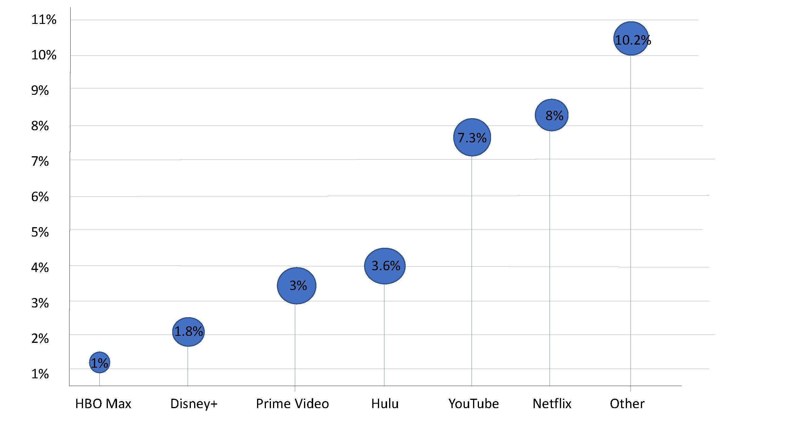
As you can see the stick of the lollipop chart takes up very little room and makes it easier to highlight the top of the lollipop that displays the exact percentages.
For more information on lollipop charts visit here.
Lolipop Chart
By Robert Fox
A lollipop chart is a variation of a column/bar chart. The bars you would normally encounter are instead replaced with a line and a dot at the end of said line. Lollipop charts serve the same purpose as bar charts however, and a simply a different visual. They still compare data values with one another.
When would it be best to utilize a lollipop chart instead of a bar chart?
Lollipop charts tend display data better when there is a large number of values that are close to one another, causing it to visually be hard to read as a bar graph. With a standard bar chart, the infographic would be to be mashed together, and thus making it hard to differentiate between two similar values. The lollipop chart makes these small differences easier to see, and it is also a more clear visualization.
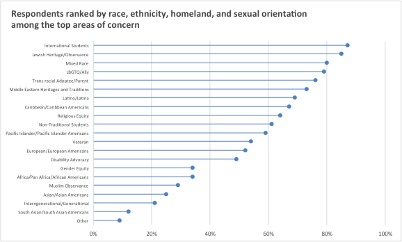
Here is an example of a lollipop chart based of data taken on the overall population percentage of student voters in the New York Area. Here we can see many data points of close value, it being in this format making it able to be understood.
Lollipop Chart
After making my own lollipop chart, I can see the appeal of using that instead of a bar or line graph. The traditional line or bar graph has been done countless times, using this graph changes that up and creates an easy way to display data. Bar graphs can sometimes be clustered when a lot of data is being presented, varying in length. This type of graph can make it clearer to the reader and free up space.