Home » Uncategorized (Page 12)
Category Archives: Uncategorized
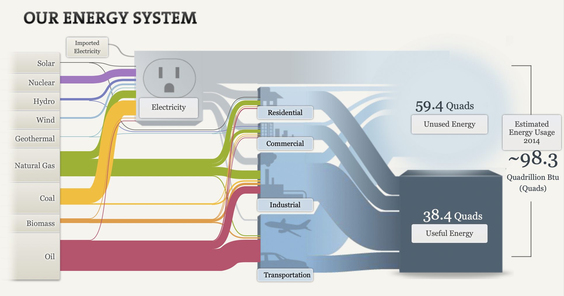
Sankey
By Robert Fox
Though some analysis of the website, I’ve come to like the format and layout of this blog. It doesn’t have a clear start or finish from the tabs, but i still felt it was organized and had proper visualizations to boot. I liked the features they added upon clicking certain prompt and such, it made it interesting to look at.
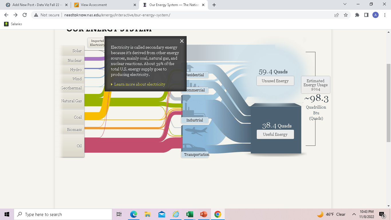
After clicking on the word text, it gives you more opinions to read. More info is also provided upon each click. The manner of making this guide go hand and hand with an electrical outlet was a clever idea as well.
After playing around on it for some time, I found it to be a great asset when it comes to the production of similar graphics. I think I would like to utilize a Sankey visualization on a future assignment as it seems easy to incorporate a easy means of laying out the visualizations.
Sankey
By: Veronica Perkins
Sankey is a tool that can be used to create interactive visualizations in a way that helps your audience follow. Upon exploring Sankey for over ten minutes, I was so intrigued. However, it can be a little intimidating.
Now let’s discuss the usage in our energy system…

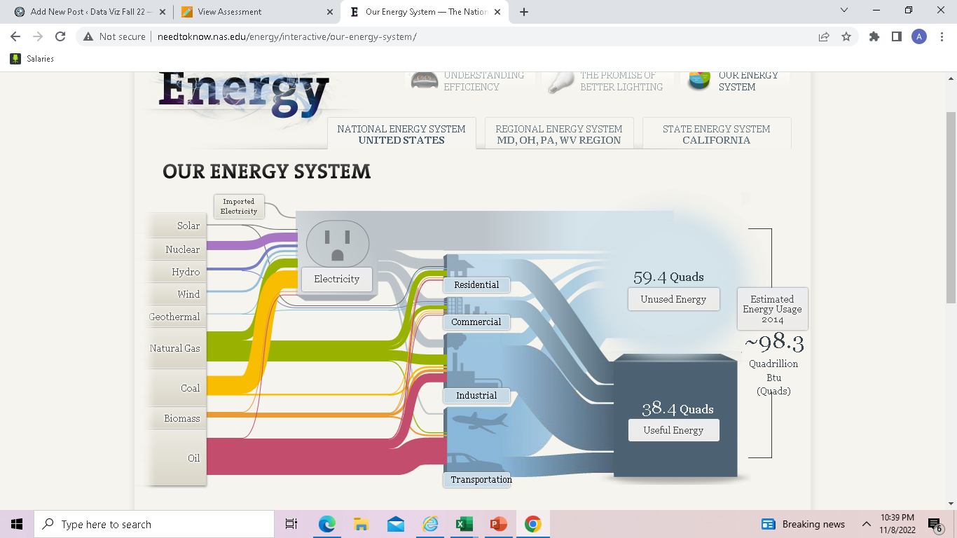
Right upon entry of this visualization, it takes you to the home screen pictured above. Within this home screen, you can see how at the top, it lists several other tabs that can move you to another data set. For example:

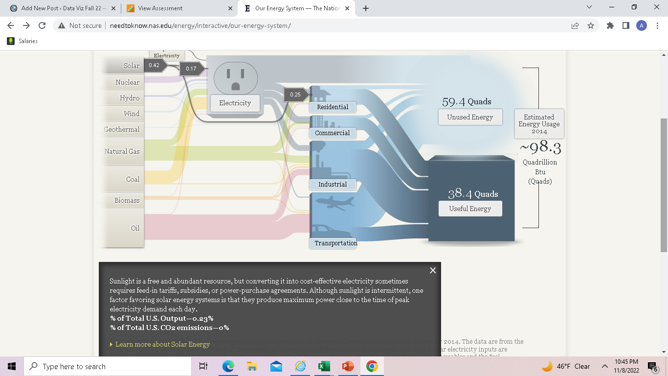
When I clicked on the “Understanding Efficiency” tab, it brought me to this page. On this page, it briefly explains the point of efficiency and what it does, while on the side it has two interactive buttons. These interactive buttons are just one great example out of the whole project. They allow the audience to click on them and explore. By having interactive features throughout your project, it allows for the audience to read, comprehend, and travel through each data set at their own pace.
Overall, I really enjoyed how interactive this project was. It was very well organized and left the reader/audience to go through each data set at their own pace. However, sometimes I feel like an entire website can feel like a bit of overkill when it comes to project like these. I feel as though there are other ways to keep your audience entertained while presenting them with data set; without having to do all of this. To be less harsh, I believe that sometimes an entire website can be a bit much and sometimes the audience can get bored or not want to participate anymore. Also, the Sankey graphs themselves can be very overwhelming to the audience and may even leave them feeling lost. Instead, providing simpler graphs with a lot of color variations and details, may be easier for both the creator and the audience.
Data Visualization Commentaries/Blog Content
After spending over 10 minutes wondering whether I like this blog and visualization as someone who cares about the environment, The website does seem confusing at first as it took a while to find the, sanity for our energy system. Honestly, it was great fun playing around with this blog as I loved clicking on the word text.
After clicking on the word text, it gives you more opinions to read. More about it, which was, honestly it was pretty entertaining and cool. I like how they used a surge protector, which was very creative. It did keep it interesting.
Then when I clicked on the solar, it was almost a circuit which was cool and very directive. Which I then thought, this site has put alot of effort into their website. I did enjoy this blog greatly.
I think I would like to use a sankey visualization in my future projects as it helps show the flow of a project.
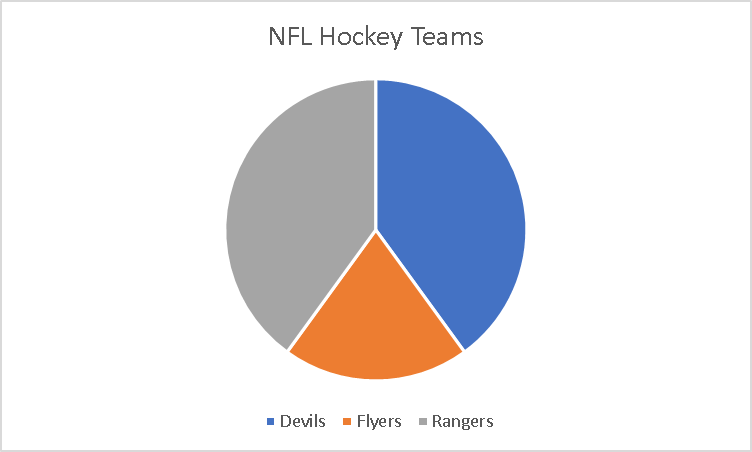
Pie Charts
A pie chart is to summarize data almost a piece of a whole. As when the word pie reminds me of a circle as it will always need to equal 100%. Each slice of the pie is component of the whole.
I took a small poll amoung my friends on which teams they prefer. It was made of small poll group between three teams that were major in the New Jersey area and the poll was taken by 10 people. It has very visualizing pleasing as it doesnt look like it is missing . It is making up a parts of a whole where the whole is the Major NFL Hockey Teams in the area and it was split into three so the subparts.
I would sugguest using these types of charts if it is to display something like this. I also would like to also put different colors of the pie chart instead of the same color to defferentiate the different teams.
UN CONTRIBUTION: Pie Chart Edition
Pie charts are a difficult tool to use because they require very specific scenarios to be the most applicable. For my perfect-use case I decided to display the contributions of countries to the UN budget, shown as a percentage.
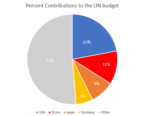
I think this is a perfect data set to use a pie chart because it’s simple and doesn’t have an excess of labels. This data set as it’s shown tells you that the US contributes almost one quarter of the total UN budget, and that the top four countries combined contribute nearly as much as the remaining 130 members combined. You may be able to add a fifth or sixth country to this pie chart, but then you lose the 50:50 narrative that is very easily read here.
Source: www.auswaertiges-amt.de/
-Jack Swenson
Pie Charts
A pie chart can be an exceptional tool when trying to display the totals out of 100% compared to other kinds of charts and graphs. When using a pie chart to break down complete totals it helps the viewer visualize the 100% since the whole pie is right there and they can see the portions of it cut out relative to the percentage.
This is an example pie chart I made which breaks down the weekly phone screen time usage between a handful of apps on my phone.
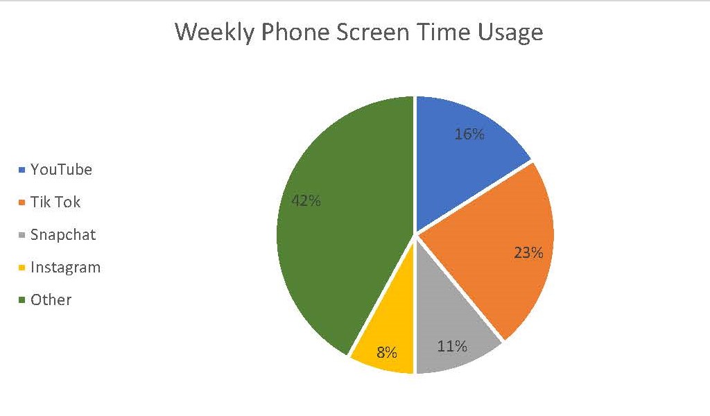
As one can see the slices very clearly show how 100% of a weeks worth of phone screen time can be broken up between these 5 subjects. One tip however for creating an effective pie chart is to limit yourself on how many slices or subjects are in the chart. If there starts to become too many then it makes it harder for the viewer to see each respective slice. In that situation than something like a bar graph will be more effective.
For more on the effectiveness of pie charts, click here.
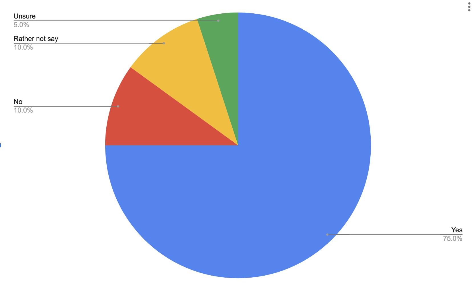
Pie Charts
Part charts extremely easy to make and they can get the point of your data across very clearly. Pie charts tend to do better with a few categories rather than more because they can also become too busy very quick. Here is a pie chart to show data from a simple poll of whether people like ice cream or not.
Pie Charts
by Robert Fox
The pie chart that I chose to make depicts the method of learning students were most interested in in the United States, in the year 2021.
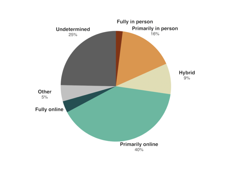
I believe this was a good example of data to use in a pie chart because it represents a part for the population out of the whole. In this specific example, the whole is the students who participated in this survey in the U.S and each part is filled with a certain percentage of those citizens based on how they entered said poverty.
As far as design choices I made for this chart, I chose to go with a bright with countered darker colors color in order to make the chart itself more eye catching to the audience. That and making sure each title in the figure had the data variable with it.
Pie Chart
I decided to create a pie chart based on the types of pools within the U.S.
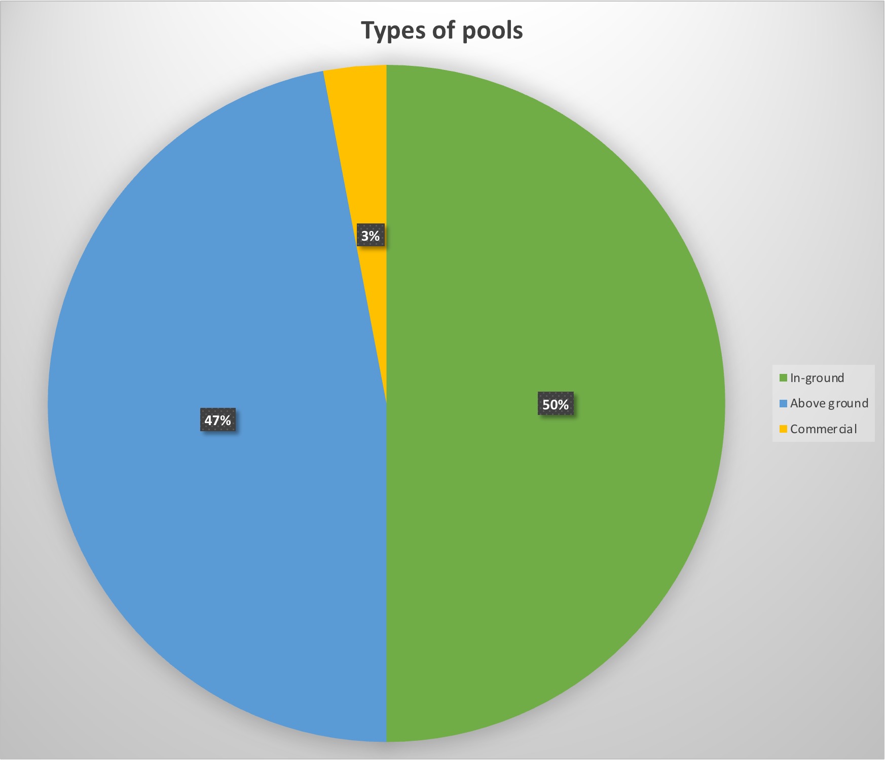
For my data, I decided to use data of the 10 million pools within the country to see what was America’s favorite set-up for their pool.
The reason this data is served best as a pie chart is the simple fact that percentages are perfect for pie charts. Not only do they look visually appealing, but they show exactly in visual terms what America prefers best, which looks split between above and in-ground pools. It’s a simple and visually pleasing way to show percentage data without being too complicated.
Pro-tips for creating a pie chart is to include the percentages within the graph. That way the reader does not have to search long for the data but instead focus on the graph data with ease.
Perfect Case Pie Chart

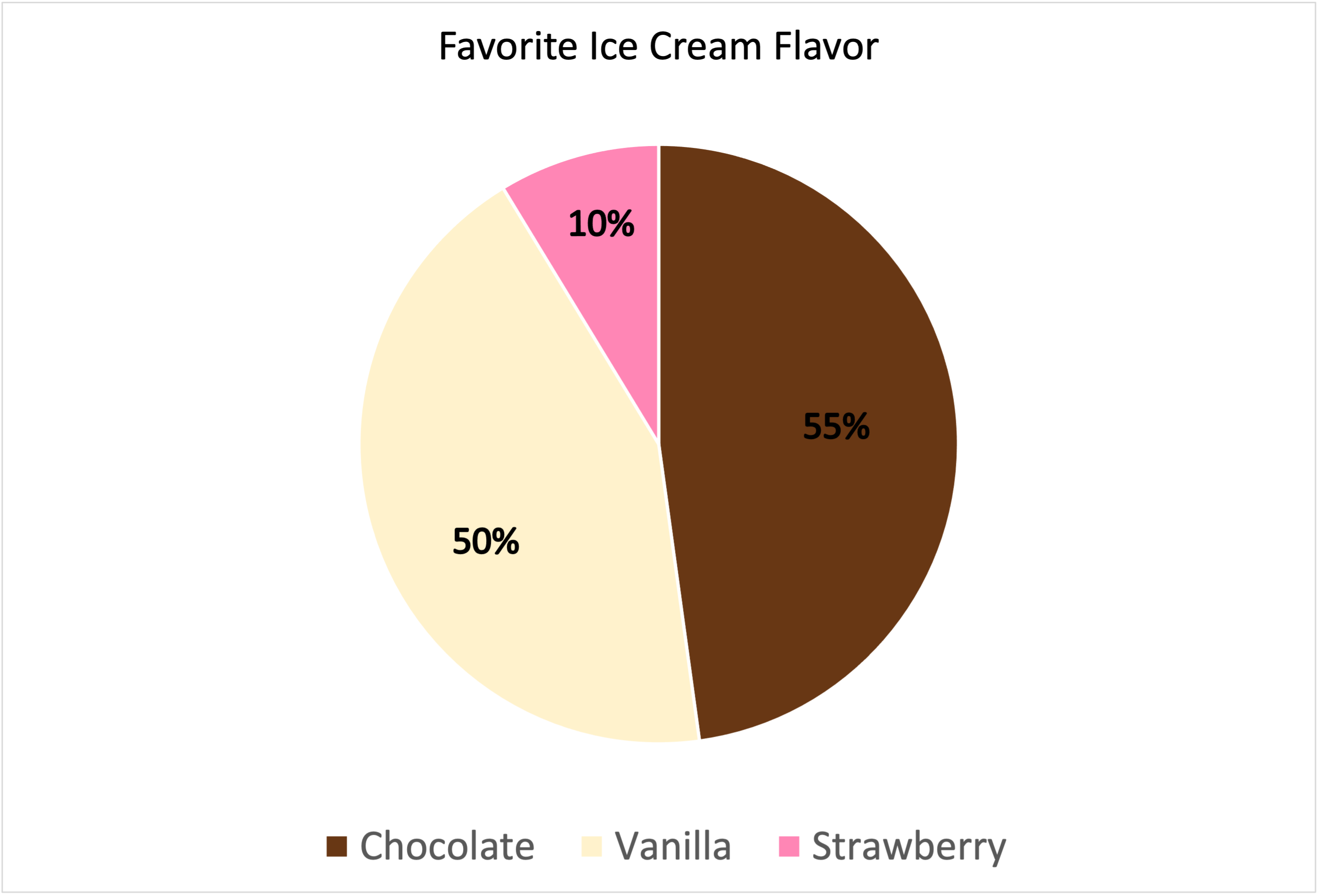
I decided to use “Favorite Ice Cream Flavors” as my data set for this Pie Chart.
Why is this a “Perfect Case”?
Pie Charts are appropriate for parts-to-whole relationship data. Percentages and proportional data are great for pie charts. Here, I am showing vanilla, chocolate, and strawberry flavors. These are the three most popular ice cream flavors. When you take a count of how many people like each flavor, this is the normal outcome. The majority likes chocolate and vanilla flavor. The least amount of people like strawberry. This is the perfect case because it is showing a proportionate amount of data with a percentage and it is simple yet effective. I chose those colors for obvious reasons, they match the flavor of ice cream!
—————————————————————————-
Data is based out of 115%.