Home » Uncategorized (Page 10)
Category Archives: Uncategorized
Welcome Fall 23 class
We will be posting our visualizations here each week. You can scroll through and see SOME of the past posts by students. Most of the previous class posts are password-protected, and I will release those at the end of the semester. I look forward to reading about your challenges and successes as you create your visualizations.
Pivot Table for Garlic
For my example of uses for pivot tables I decided to make a pivot table for some research I’ve been doing for the past 3 years at Stockton looking at yield data for garlic harvests.
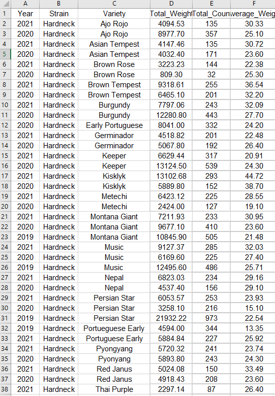
The above screenshot is just a segment of the stacked data in its raw format. It floods you with numbers and is difficult to sort through and get any information out of. That’s where a pivot table comes in. These let you easily select data to look at with the click of a button, and they also have a huge amount of customization to get the exact information you need.
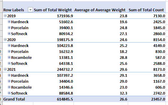
This first example shows how well each type of garlic grew during each year of the study. We can see from this that the top grower varied from year to year. Hardnecks were often grown in the highest volumes, making their total weight the highest, but either Rocambole or Softnecks had the highest average weight during each year. This means that if these varieties were grown in higher volumes they may outcompete the hardnecks.
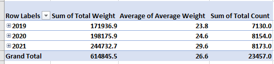
Another factor we can look at is time. This pivot table selection shows us that overall, we grew larger crops with each year. This is probably because with each year we learned how to take better care of the garlic, as well as we selectively picked the best garlic to grow each year. These are factors that you have to take into consideration.
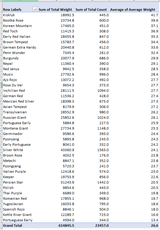
The final pivot table I made looks at each variety of garlic and is ranking them based on their average weight. We can see from this that on average, Kisklyk was the most successful variety. I like to have these numbers next to the total count and sum of the harvest weights because we can see the best producing garlic isn’t always the one that has the highest total weight. This graph shows us that Silver white is our highest producer because we also happened to grow way more of it then our other varieties.
In the end this process of creating pivot tables can give us answers to our experimental questions. However it also leads us to more questions, which we can answer with further experimentation or reasearch.
-Jack Swenson
Pivot Tables
Pivot tables are a great tool to use when able to summarize, analyze, explore, and present summary data.
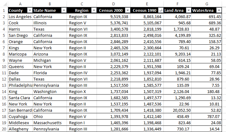
Here is an example that compares the data of 19 different state county’s based on region, two different census years and water/land area. Besides what is shown in this one image there are many different things one can do with pivot tables to express their data. Some examples include averaging, grouping by date, directional icons, and percentage of row total.
More things that can be done with pivot table can be found here.
Pivot Tables
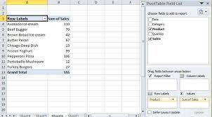
Pivot Tables, also known as summary tables, are tables that allow the user to observe all of their collected data in one place to analyze it. Upon entering the data, the user will then be allowed to analyze, find, or use any of the data they may need. A Pivot Table can be used for plenty of topics as well. Such as sales, how often something happens, keeping records of people, and more. For example, we have a short Pivot Table that discusses foods and their sales, after entering more data or leaving it as is, you should be able to use the analyzer tool inside excel and add a slicer.
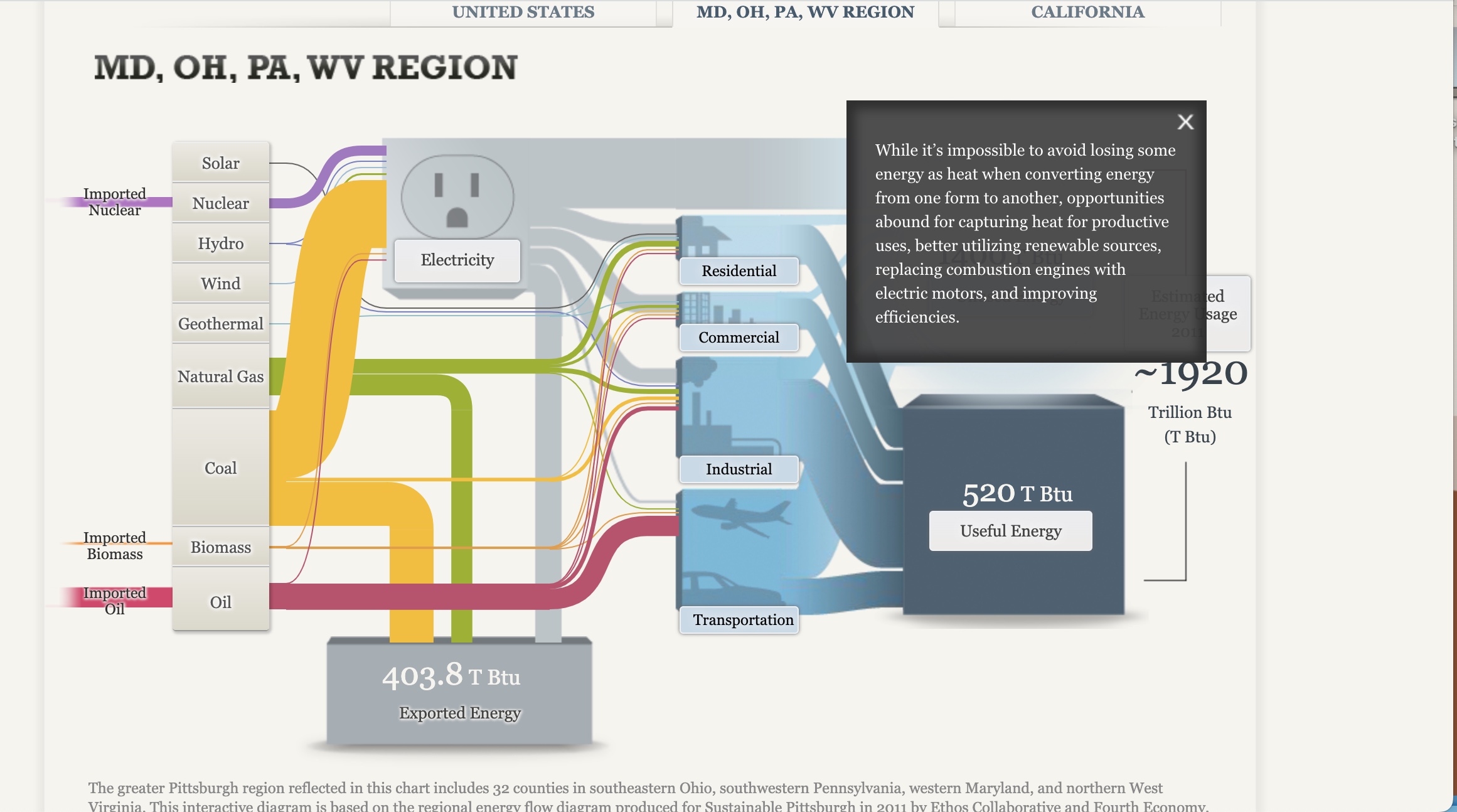
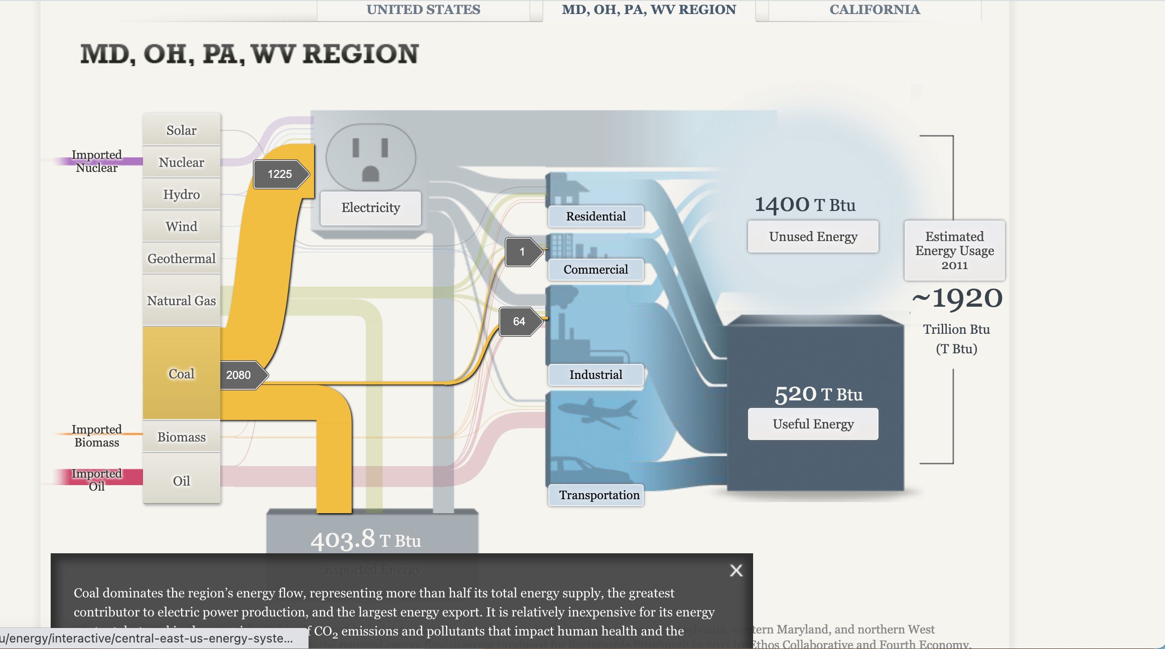
Sankey Visualizations
After playing with the site for some time, I got to see the ups and downs of using Sankey. It was nice and useful being able to click the different tabs and have them explain their purpose to the conductive flow, yet I can see where it still can be seen as confusing with the color of the lines being similar despite the background being blurred. I also noticed how some of the information is bunched together instead of flowing together. I would say making it easier to navigate for the person on the site is another way the site could improve
Blog 7-Pivot Table
As someone taking an accounting course. I’ve used pivot tables before because they’re an easy way to summarize large amounts of data so they’re easier to read. The table categorizes the information and summarizes the results. This item is an important feature that helps in business as it can show if a product is worth making or which department is making how much revenue. This visual is more of a table and lacks a visual.

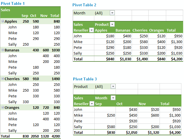
Please see table above for example of Pivot Table. From reading this table, it talks about the four different reseller and their sales on fruit. Sally did well for the Month of September, but Mike sold more than Sally in the overall 3 months.
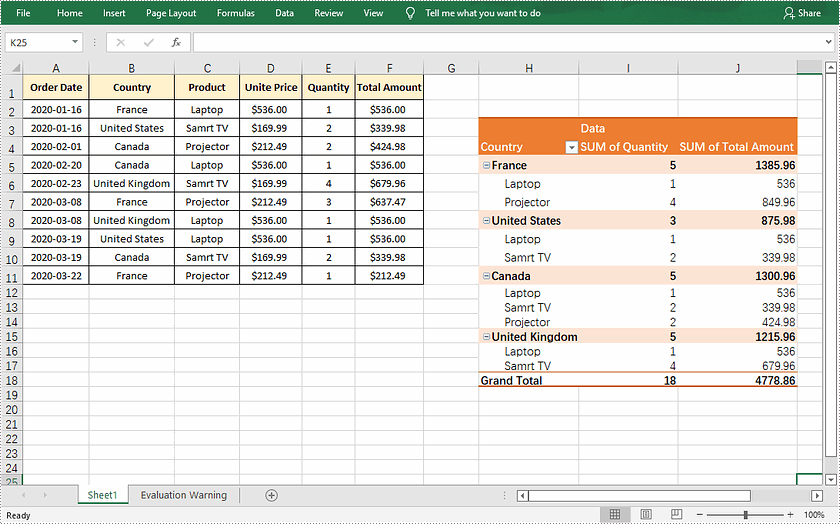
This table is showing the difference of laptops , Tv, and Projector sold in France, US, Canada and the United Kingdom. As the Pivot table shows the grand total and it is easier to read to know how many of each thing was sold, the amount and the Country.
Overall, Pivot Tables are able to read and a wonderful tool.
Pivot Table
What is a pivot table?
“A pivot table is a statistics tool that summarizes and reorganizes selected columns and rows of data in a spreadsheet or database table to obtain a desired report. The tool does not actually change the spreadsheet or database itself, it simply “pivots” or turns the data to view it from different perspectives.”
Example:
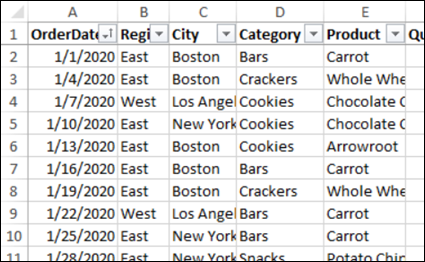
This here is an example of data that deals with food sales. This is much less than half of the data, it goes on to 244 rows. There are columns and one is filled with calculations.
Here is another example. This one has 10 columns and 500 rows. These columns do not have calculations, but the rows have data on insurance policy.
Citations:
Debra, A. (2020, November 12). Excel sample data for pivot table testing. Excel Pivot Tables. Retrieved from https://www.pivot-table.com/2020/11/04/excel-sample-data-for-pivot-table-testing/
Lewis, S. (2019, August 8). What is a pivot table? definition from whatis.com. Data Management. Retrieved from https://www.techtarget.com/searchdatamanagement/definition/pivot-table
Pivot Table
By: Nicholas Mesa
What is a pivot table?
Pivot tables are normally sheets that categorize data to make it easier for a reader to understand the meaning. They automatically sort and display data in columns and tables.
Why are they helpful?
Pivot tables are helpful because they allow data to be quickly sorted and summarized so the reader can easily see what corresponds to what, and what the data means to them.
Here is an example of an effective table and some reasons why:
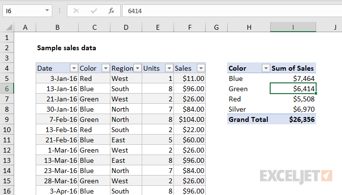
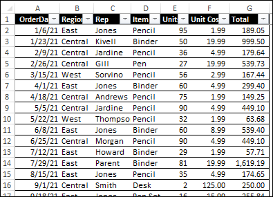
This pivot table allows each category to be displayed to make navigation easy. Breaking the data up into date, color, region, units, and sales, can allow someone to go in and be guided to exactly what numbers they need.
Pivot tables
By Robert Fox
What is a pivot table?
A pivot table is a type of visualization that allows the user lay out samples of data into one sheet to easily analyze and a examine. Here is an example of one.
A user can take data and organize or like the name implies, “pivot”, the information to reconstruct and look at the information differently.
That is one reason pivot tables are so handy when dealing with large data sets; being able to organize large complex sets of data and organize them into more digestible forms of data makes it much easier for everyone to examine. Attached I have added a video describing how to create a pivot table of your own.