Home » Uncategorized
Category Archives: Uncategorized
Comparing Numbers (McDonalds Age Demographics)

This graph was pulled from our final project and it highlights the comparison of ages that frequent McDonalds. This graph also highlights the most popular demographic, that being the ages 25-34. This age group visually is larger than the others and also can be seen through a number. Showing how large this demographic really is.
The Beauty of PivotTables
PivotTables are a useful type of table within Excel that allow for automatic aggregation and summary of data for easy retrieval. For example, in a spreadsheet filled with people’s favorite choices of food and drink, a PivotTable can be used to automatically count how many people chose Coca-Cola as their favorite drink.

This article showcases ways to use PivotTables on a set of data. By selecting different fields, a PivotTable can be used to automate summation of a column. This is useful so that you don’t have to keep manually updating the sum whenever the data changes or gets added to.
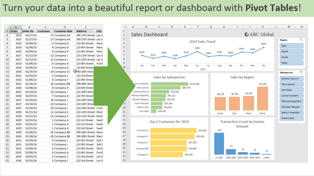
These tables have a lot of have flexibility too. In this example from Medium, a PivotTable is used to add together quantities within regional subsets of data while simultaneously calculating revenue. The usefulness of PivotTables comes from their ability to quickly pull data matching specific conditions and efficiently summarize them in a readable format. I personally foresee PivotTables dramatically reducing the amount of effort it takes for me to summarize my data.
Importance of Pivot Tables
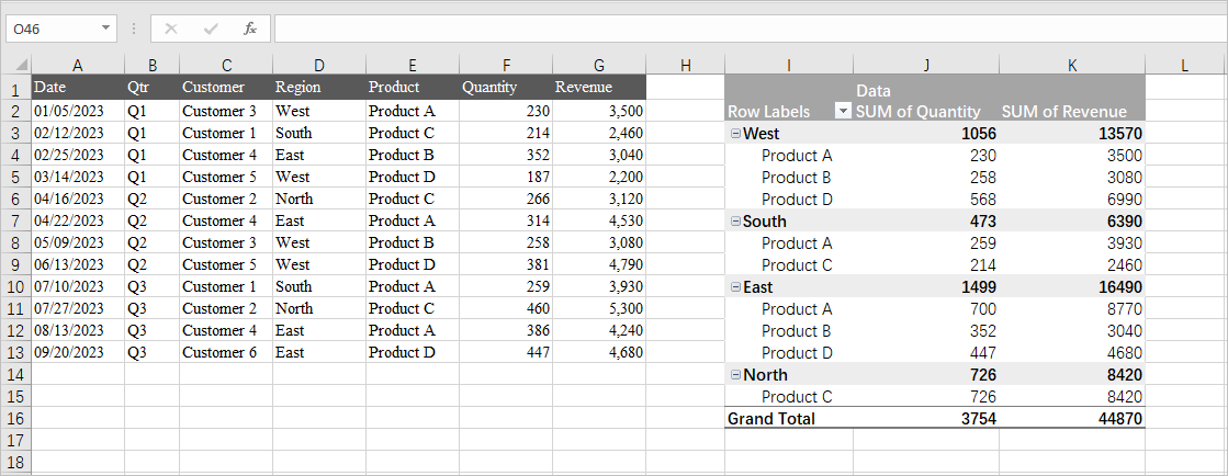
Pivot Tables are an essential tool in Excel that are useful for organizing and grouping large amounts of information. They are extremely versatile and can be used for a numerable amount of ways. By using pivot tables you can turn clumps of data into meaningful and insightful information that can be used for analysis. Some practical uses are in finance analysis, sales analysis, product information, inventory analysis, and more.
Above, we see sales analysis for produce. It is well organized and easy to interpret.

Above, we see another practical use of pivot tables for sales analysis. We can see here the sales for each product, the year it was made, and the category each product falls under.
Overall, pivot tables are useful for anything that needs to be organized into multiple different categories. From there, you can filter using the drop down arrows that prove to be extremely useful with many entries. Since in Excel, you can then make charts and other analysis more readily.
Pivot Tables
Any situation where you need to quickly summarize and compare large datasets across multiple variables, making it easy to identify trends and patterns, can benefit from the use of a pivot table. Examples of these scenarios include analyzing sales data by product and region, tracking website traffic by source and time of day, examining customer demographics by purchase history, evaluating employee performance metrics across departments, or summarizing project progress based on team members and deadlines.
You can use pivot tables to:
- Run automatic calculations on summed or counted values
- Create percentages of totals
- Segment data by date, the user, or other variables and calculate totals
Here are some examples of how to use pivot tables in Excel:
- Summarizing Data: Pivot tables can automatically summarize data, such as combining view totals for duplicate blog posts.
- Counting Rows: Pivot tables can count rows that have something in common, such as the number of employees in each department.
- Analyzing Sales Data: Pivot tables can be used to analyze sales data, such as total revenue by month and region.
- Calculating percentages:
Here is an example from ExcelJet.
- Excel builds a two-way pivot table that breaks down sales by color and region:

- Swap Region and Color:

The Importance of Pivot Tables
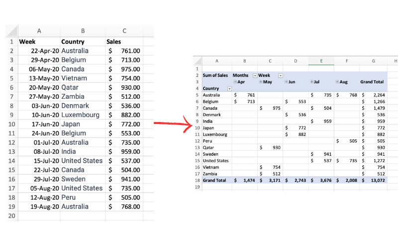
The picture above exemplifies a pivot table and one of the many different ways it can be utilized. One of the main reasons pivot tables can be such amazing tools for representing data is how interactive they can be. The table above shows sales by each country sorted chronologically by week. The table is very easily changed to reinterpret the data to be sorted by country instead of by time. Pivot tables allow the user to represent their total sales by region, or even be specific salespersons. They also can allow the ser to group data into even more specific groups such as other time periods (months, years, etc), or other custom grouping methods. This is shown in the pivot table below.
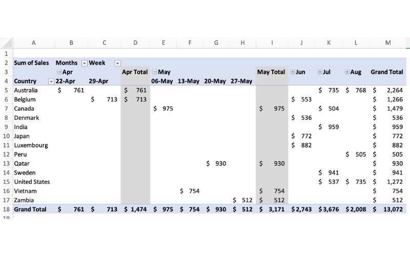
In terms of efficiency, there is no better table to use than a pivot table. They can save you hours by allowing the user to quickly change how a data set is represented. They also add a sense of flexibility. Pivot tables make it very easy to incorporate any new data that may be found instead of having to create a whole new table/chart.
What Are Pivot Tables?
Pivot tables are an incredibly powerful feature found in various spreadsheet software applications, such as Microsoft Excel, Google Sheets, and others. They serve as a vital tool for users who need to summarize, analyze, and interpret large sets of data efficiently. By allowing users to reorganize and manipulate data, pivot tables transform rows into columns, which significantly enhances the ability to identify patterns, trends, and relationships within the data. This transformation is crucial for extracting meaningful insights from complex datasets, making pivot tables an indispensable resource for data analysis.
One of the standout advantages of pivot tables is their ability to facilitate quick data manipulation without making any changes to the original dataset. This means that users can experiment with different arrangements of data, apply filters to focus on specific subsets, and perform various calculations—all while preserving the integrity of the original information. This non-destructive approach to data analysis empowers users to explore their data from multiple angles, leading to more informed and effective decision-making. The flexibility offered by pivot tables is particularly appealing to a wide range of users, from students conducting research projects to professionals analyzing business performance.
Moreover, pivot tables allow users to create dynamic reports that can be easily updated as new data becomes available. This capability is especially beneficial in fast-paced environments where timely insights are crucial. Users can quickly adjust their pivot tables to reflect changes in the underlying data, ensuring that their analyses remain relevant and accurate. The ability to generate visual representations of data, such as charts and graphs, further enhances the interpretability of the information presented in pivot tables.
In summary, pivot tables significantly simplify the process of data analysis by providing users with a versatile and user-friendly interface for creating comprehensive reports. They save time and effort by automating many aspects of data manipulation, allowing users to concentrate on the most critical elements of their analysis. Overall, pivot tables are an essential tool for anyone looking to work with data effectively, whether for academic purposes, business intelligence, or personal projects. Their capacity to streamline data analysis and uncover valuable insights makes them a favorite among both novice and experienced users alike.
Pivot Table
Pivot tables help provide incredible insight for larger, more complex data sets, where end users are able to vary the functionality of the tables to better suit their needs. For example, a use case for a pivot table would be using it to manage inventory management. By implementing an inventory management system into a pivot table, we are able to see what items are used most frequently, identify less commonly used items that a business may have in stock, and could go a step further and implement a customer analysis pivot table with the data derived from the inventory management system.
In short, a pivot table summarizes large, complex data sets that can then be used to generate insights depending on which way the data leads it. The reason why they are so widely used is because of the simplicity they offer for the end user, allowing the user to know minimal skills but still create a very valuable data-driven tool through excel.
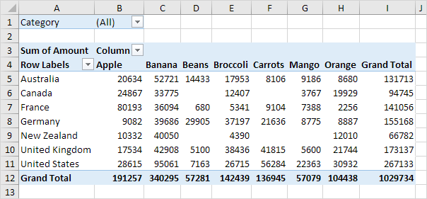
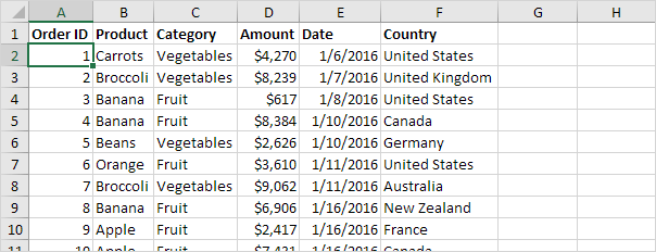
In this example, we can see how end users can manipulate this data set to see which countries have the most fruit, export the most fruit, or even rank them accordingly to biggest producers of each fruit! The possibilities of uses can go on, but the most important takeaway is to learn how to use the functionality within the pivot tables!
Pivot Pivot Pivot
What is a pivot table you may ask? A pivot table is a powerful data analysis tool used in spreadsheets (like Microsoft Excel or Google Sheets) to summarize, analyze, explore, and present large datasets. It allows users to organize and aggregate data in a way that makes it easier to identify trends, patterns, and insights. Pivot tables are especially helpful when dealing with complex data that would be difficult to analyze manually.
A site I found that was really useful in breaking down what a pivot table is and why they are useful was from Polymer. What is a Pivot Table? Guide (Excel & Google) · Polymer · Polymer. This site even gave some real-life examples of when a pivot table would be used. For example:
1.Identifying your top-performing sales agents based on the value and volume of transactions.
2.Tracking the average transaction value across different customer segments.
3.Analyzing marketing or advertising campaigns in terms of leads generated, spending, and so on.
4.Highlighting the biggest business expenses per month, quarter, or year.
“Some of the best tools for building pivot tables utilize functions like SUM, AVERAGE, and MEDIAN to help answer data-related questions. The use of interactive elements, like filters and “sort” buttons, also differentiates pivot tables from regular, non-interactive tables”(POLYMER).
There is a youtube video that shows how to create your own pivot table using Excell https://www.youtube.com/watch?v=BkmxrvIfDGA&embeds_referring_euri=https%3A%2F%2Fwww.polymersearch.com%2F&source_ve_path=OTY3MTQ
and also a video link of how to create one using Google Sheets https://www.youtube.com/watch?time_continue=3&v=Tty0RyD1KLw&embeds_referring_euri=https%3A%2F%2Fwww.polymersearch.com%2F&source_ve_path=Mjg2NjY.
Here is an example of a Dataset that was more concisely organized into a pivot table and therefore easier to read and easier on the eyes if you ask me.
Step 1 Example Dataset:
| Date | Product | Region | Sales Amount |
|---|---|---|---|
| 2024-01-01 | Widget A | North | 100 |
| 2024-01-01 | Widget B | South | 150 |
| 2024-01-02 | Widget A | East | 120 |
| 2024-01-02 | Widget B | North | 200 |
| 2024-01-03 | Widget A | South | 90 |
| 2024-01-03 | Widget C | East | 130 |
| 2024-01-04 | Widget C | North | 180 |
| 2024-01-04 | Widget B | South | 220 |
Step 2: Resulting Pivot Table
| Product | East | North | South | Grand Total |
|---|---|---|---|---|
| Widget A | 120 | 100 | 90 | 310 |
| Widget B | 0 | 200 | 370 | 570 |
| Widget C | 130 | 180 | 0 | 310 |
| Grand Total | 250 | 480 | 460 | 1190 |
So, if you’re trying to display a large quantity data set, with a lot of different numbers and you’re trying to figure out the best way to do this… don’t just settle and clump all the data together on a report page. Rather PIVOT that plan and make yourself a pivot table of it.
Pivot Tables
Pivot tables are an extremely important data visualization tool. While they are usually not fancy eye catching infographics or your everyday chart you are used to seeing they are immensely important when it comes to summarizing data. According to an article posted by Lorman Education (https://www.lorman.com/resources/the-6-benefits-of-using-a-pivot-table-in-excel-17423?srsltid=AfmBOorilMT3KbGTr5SUhkNiuLVKiUIeKvuuAmAej7E1n-N3S3G7kmtX) there are 6 main benefits for using pivot tables:
- Simplicity
- Data Analysis
- Data Summaries
- Pattern Recognition
- Quick Reports
- Decision Making
Pivot tables can be helpful in distilling down large raw data into a summary of thousands or more entries to create a report based on data collected. For example, our book gives us a couple thousand survey entries on student’s gender, race, whether their parent has a college education, free or reduced lunch. high school name, graduation year, and other data. It becomes a sea of data to comb through and calculate.

This is where pivot tables come into play. It takes messy raw data like this and converts it into this.

It also gives us the ability to change the parameters of the chart if we want to examine it a different way. The applications of pivot tables could be endless such as business financials evaluations, evaluating performance, and any other thing that you collect data on!