Home » Sankey Diagrams (Page 2)
Category Archives: Sankey Diagrams
SANKEY VISUALIZATIONS
By Emmanuel Mattey
A Sankey chart/visualization is the type that provides an overview of the flows in a system, such as movements, cost, energy or materials, or in advertising, the customer journey. Elements within the chart are represented with rectangles and texts from a source with links represented by arrows or arcs that have a width proportional to the importance of the flow to a corresponding destination.
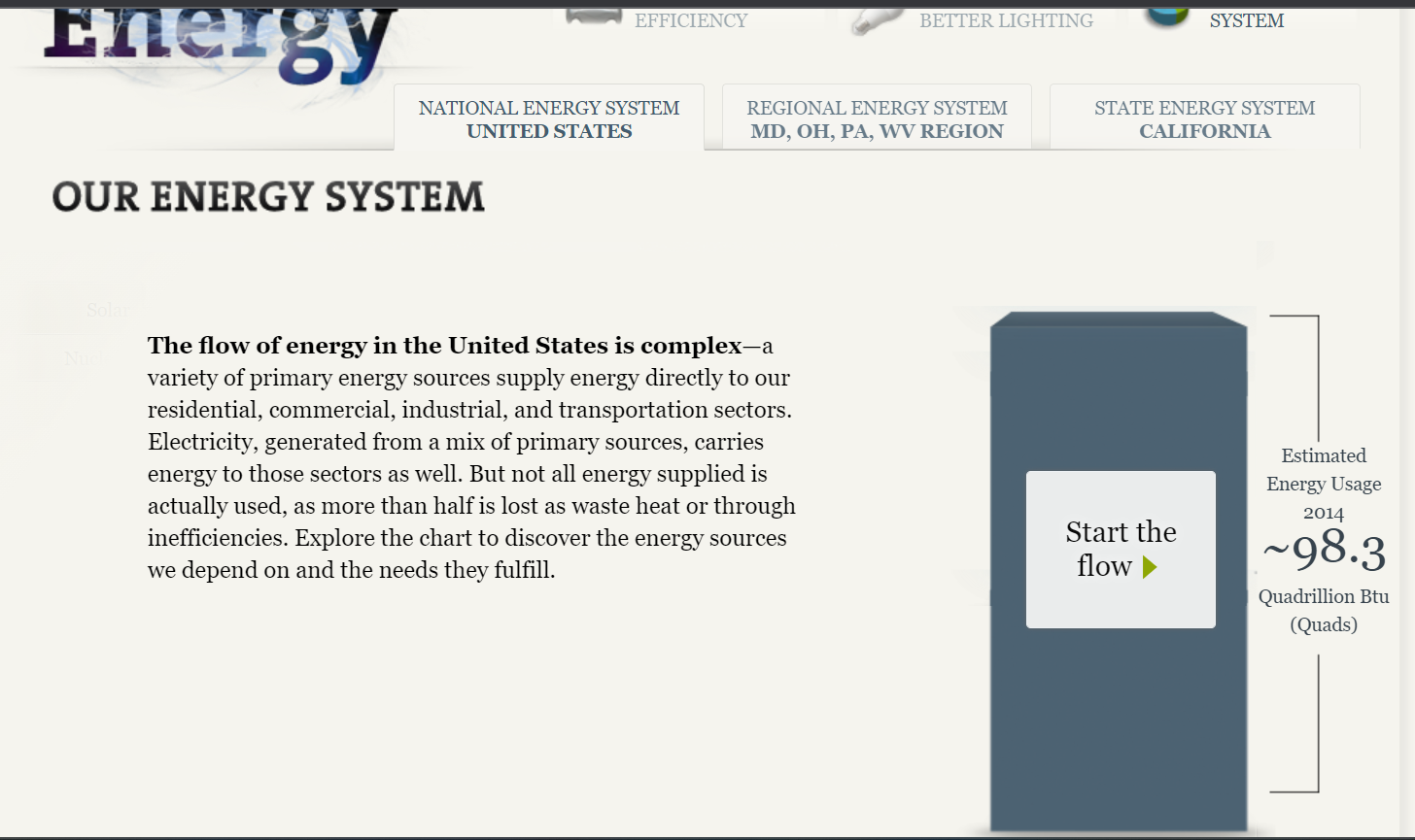
The National Academies of Sciences, Engineering and Medicine displayed Our Energy System using a Sankey chart/visualization which gives simply but detailed information on the energy sources/generation and the respective entities that use the energy in proportions and the overall useful and unused energy.
The site initially gives an overview of the energy situation and the respective end-users who make up the total. It also has tabs that lead to other important sources for more information on the subject as shown in the image below.
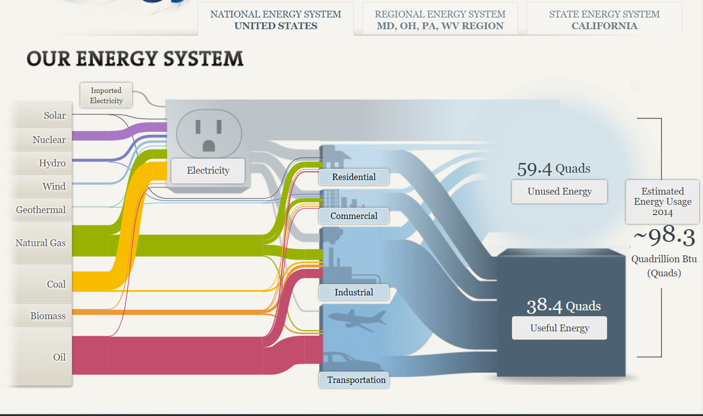
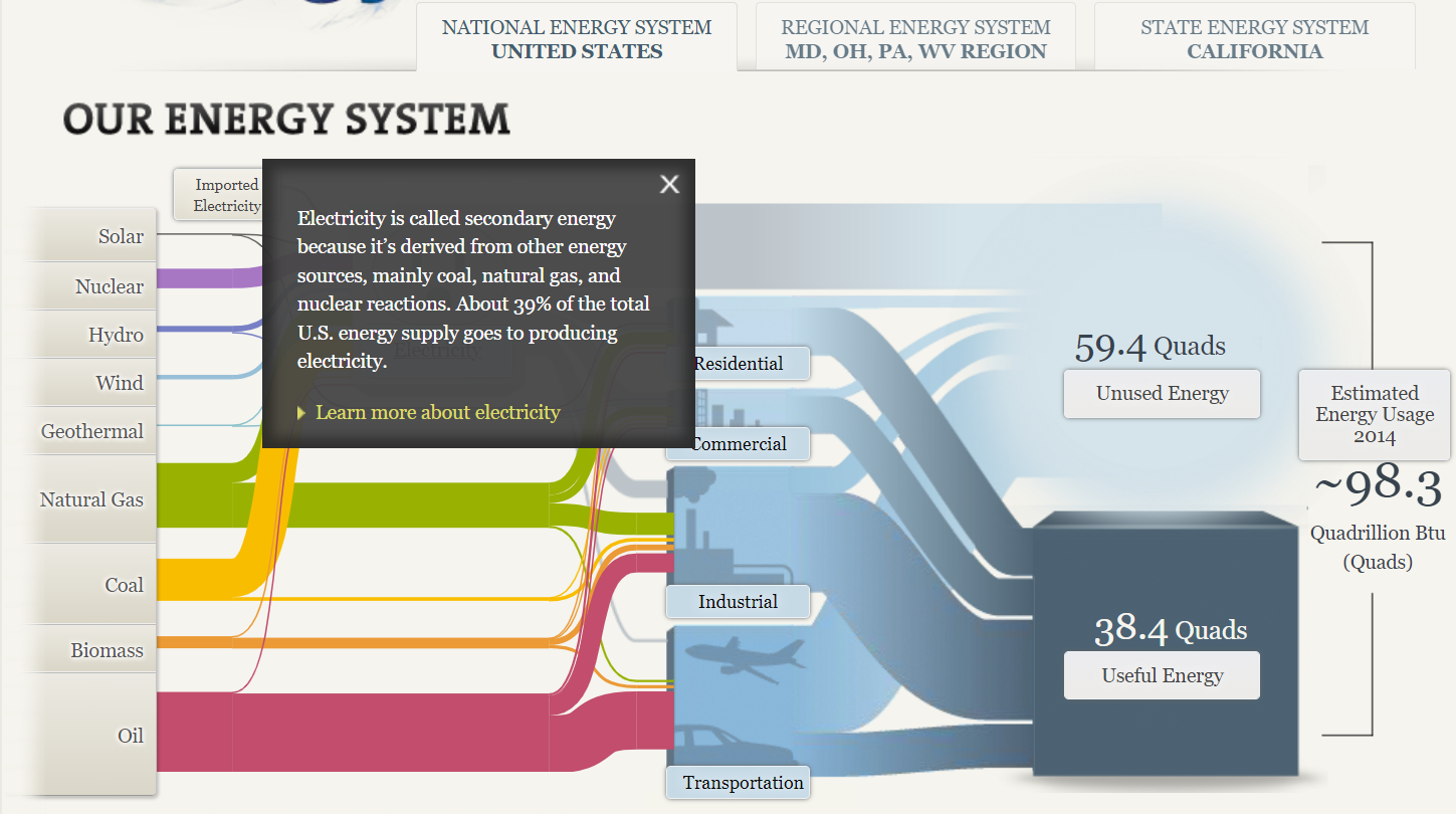
By clicking on the “start the flow” button, it displayed the chart with the sources of energy through to the respective users and the overall usage. The chart did not make much sense to me when it first opened but upon careful study and navigation, I got the concept and how it depicts the information therein. At the click of every button comes a pop-up containing (shown in the images below) information that gives the audience a better understanding of the concept/chart.
A Sankey chart/visualization is a great way of displaying information in a flow format. However, it does not readily make sense until carefully studied due to the complex look/nature with arrows/arcs crossing. It is therefore advisable to not over-clutter the figure and if possible ignore all weak connections.
Sankey Visualizations
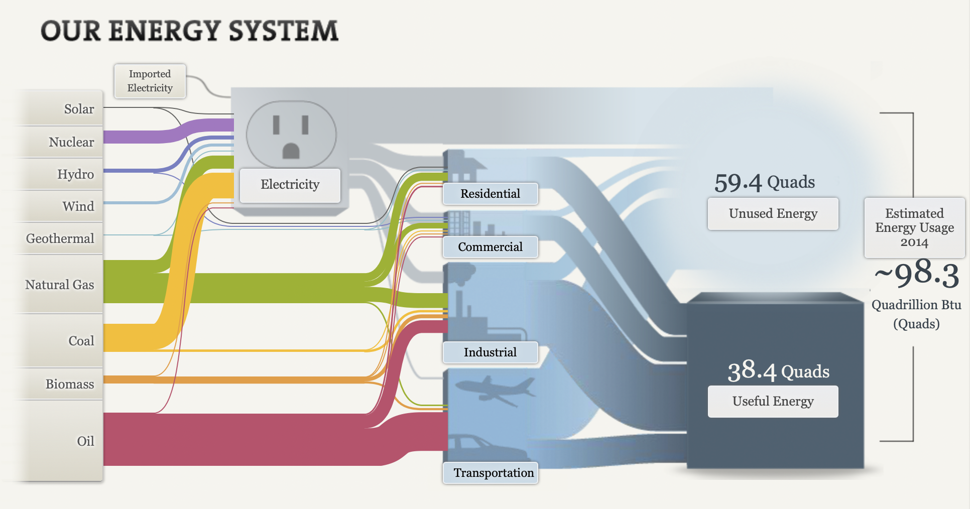
The picture above is an example of a snaky visualization. It is typically used to show the flow of the information being discussed. In this example, it is being used to show the flow of energy and how it is used.
Originally, I was extremely overwhelmed when looking at this chart. I had no idea where to look or where to start. After the initial shock, I just started reading from left to right like I would any other chart. I began clicking around on all the headings and reading what they said. I ended up finding this chart very helpful and interesting!
First, I really like the creativity behind it. It is about electricity and I could tell that right off the bat without actually reading anything on it. Second, I like that the information is hidden within the chart. I think it makes it look a lot more clean than it would if all the paragraphs were jumbled all over the screen. Lastly, I really like how it ties everything together. It starts out with the different kinds of ways we get electric and ends with how much we use.
Overall, while it can be a little overwhelming, I think it is a great way to show data because there are a lot of different facts that can be rolled up in one visualization that is easy to navigate.
Website: http://needtoknow.nas.edu/energy/interactive/our-energy-system/