Home » Sankey Diagrams
Category Archives: Sankey Diagrams
Sankey Graphs (Data on the move)

This is a Sankey Graph of energy moving from solar panels moving through the energy grid. I took an interest in this one because with California being such a progressive state, I would assume that solar would have a bigger impact to the energy grid when in reality the numbers state other wise. Seems that natural gas and oil sill are the main strong points that carry our energy consumption. I really enjoy this way to represent data because it is interactive. These types of graphs should only be used when the audience is on an unguided tour of collected data. It allows for the audience to explore and see how data can move from one place to another. Though this data can be represented by pie charts this is an amazing visual only due to the fact that it is interactive.
Sankey Energy Visualizations
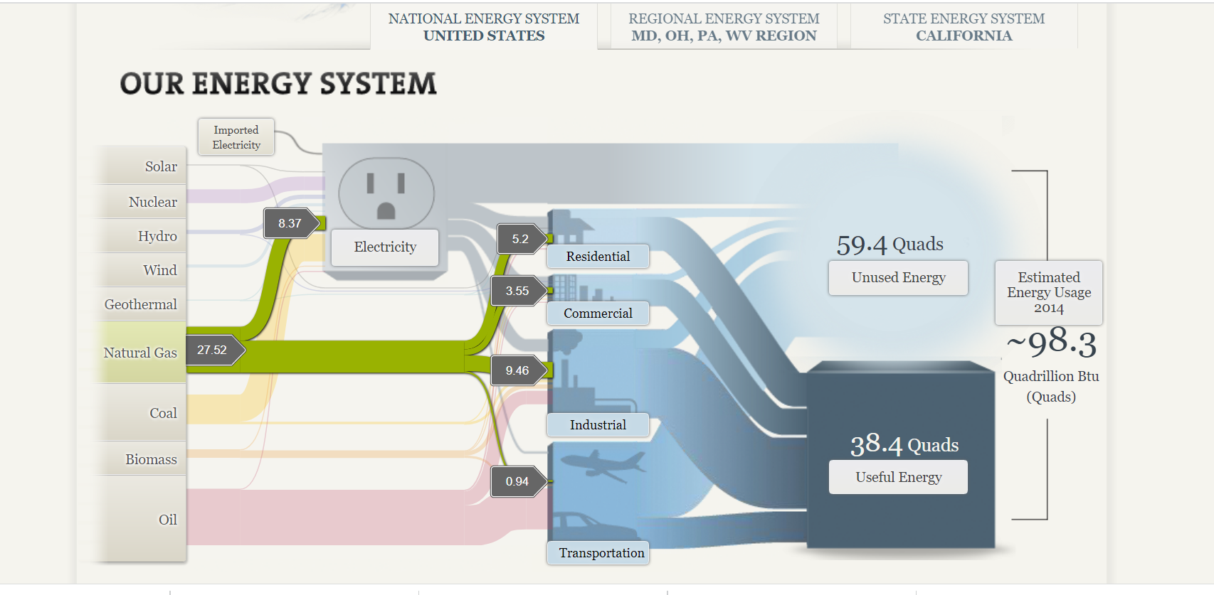
The National Academies’ interactive feature, “Our Energy System,” offers a comprehensive overview of the United States’ energy production, distribution, and consumption. Central to this presentation is a Sankey diagram, which visually represents the flow of energy from its sources through various sectors to its end uses.
Sankey diagrams are effective for illustrating the flow of resources, highlighting the proportions and pathways from origin to destination. In this context, the diagram delineates how energy from sources like coal, natural gas, nuclear, and renewables is allocated across sectors such as residential, commercial, industrial, and transportation. The width of each arrow corresponds to the quantity of energy, providing an immediate sense of scale and distribution.
Displayed below is a screenshot of the Sankey visualization created by The National Academy of Sciences which depicts the different avenues of energy production and use for the nation.
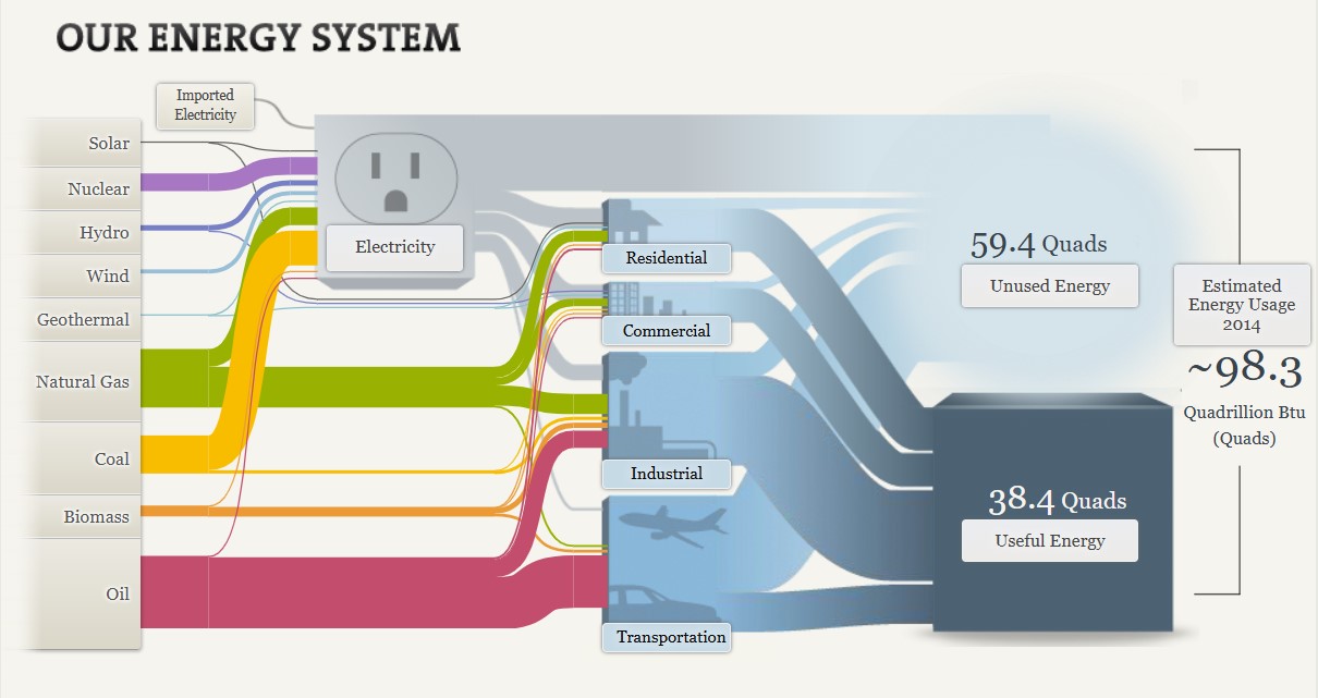
There are many strengths to this visualization. Not only does it provide clarity through succinct conveyance of complex energy flows, it provides both proportional representation and a comprehensive overview. The varying widths of the arrows effectively depict the relative contributions of different energy sources and their utilization, providing a visual proportional representation. By encompassing the entire energy system, the diagram facilitates an understanding of the interconnectedness of energy production and consumption.
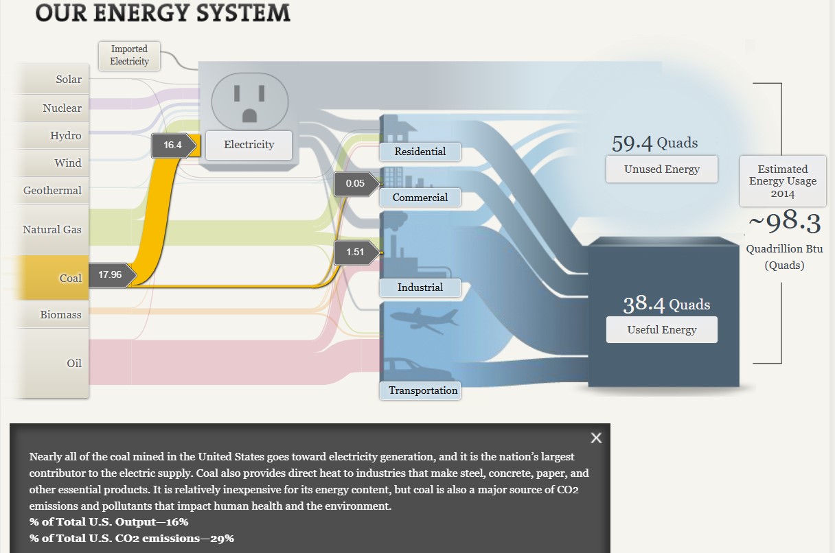
Additionally, the visualization is highly interactive, allowing users to click on different aspects of the graphic to see more information. As seen above, when selecting the coal energy source, it is highlighted in the graph and additional information is provided to the viewer. This capability allows the viewer to focus on one section of the graph at a time, as the visualization as a whole can become overwhelming with all off the details equally highlighted at once.
Interactivity also helps to more clearly explain details of the graph to the viewer. Having already viewed the section on coal, I clicked on the natural gas tab within the graph. Although the width of the coal and natural gas lines are visually similar, when you click on these sections separately you are given information about the output percentages of each of these types of energy. By viewing this information, I learned that while coal makes up 16% of the total U.S. output while natural gas makes up 29%.

The Sankey diagram on the National Academies’ “Our Energy System” page serves as a valuable tool for visualizing the complexities of energy flows in the United States. I believe that while there are multiple benefits to this type of graph when displaying data such as this, the interactivity of the graph is one of the most important aspects.
Sankey Visualizations
Needtoknow.nas.edu provides many visualizations about energy usage in the United States. I learned that the flow of energy in the U.S. is complex and comes from numerous different sources. More than half of energy supplied is lost as waste heat or through inefficiencies.

This Sankey visualization breaks down our energy system from the source all the way to its usage. As you can see, Oil is the largest source of energy with a total output of 36% and total CO2 emission of 43% in the U.S. Although this visual is interactive and provides a large amount of information/data, I find Sankey visualizations to be difficult to interpret. There is a lot of data being displayed within a single visual, and it would be more effective to break it down into multiple different visualizations. For example, the data regarding % of Total Output and % of Total CO2 Emissions could be visualized as a Side-by-Side Column Graph. Another example could be the use of a Pie Chart to compare the % of energy used and unused.

This visual of Lumens per Watt for different types of lightbulbs is highly effective. The visualization clearly shows which lightbulb they are talking about and its lm/W. Viewers can interpret the graph efficiently due to its simplicity. This particular chart is a good example of a Large Number With Icons, as we have learned in the textbook.

Another good visualization is this Back-to-Back Bar Graph displaying the efficiency of energy on the road. You can compare energy used, gasoline burned, CO2 vented, and fuel economy between the two different types of vehicles. Again, the simplicity of this chart makes it more effective.
I believe this site would highly benefit from simplifying their visualizations. The data they want to explain would be easier to interpret, therefore, more effective if they were to take a more minimal approach.
Sankey Interpretations
Lamar Miller
Based on what I learned about Sankey visualizations, it appears coal is our largest resource contributing to electricity production. In addition, oil is used primarily for transportation. Overall, I would say this is a good use of a Sankey visual. The color coding within the visuals allows the viewer to decipher between the different resources. The thickness of each bar indicates the quantity. The flow of each resource to its intended use case shows which resources flow into which utility. Source

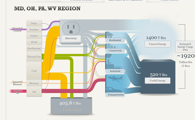
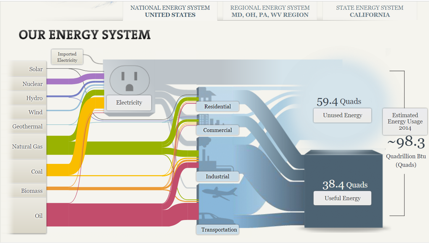
In the MD, OH, PA, WV region there is a large amount of coal production.
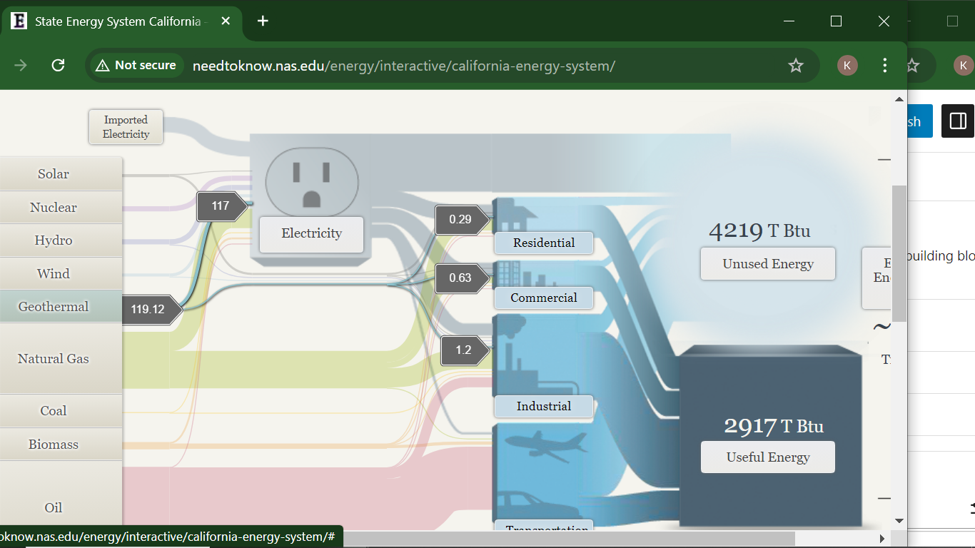
California has very minimal coal production but uses natural gas as an energy source more commonly.

Sankey Diagram
Overview of the Sankey Diagram
The Sankey diagram effectively illustrates the complex relationships between various energy sources and their end-use applications. It shows how energy flows from primary sources (like fossil fuels, nuclear, and renewables) to different sectors, including residential, commercial, industrial, and transportation.
Key Findings
Energy Flow Representation:
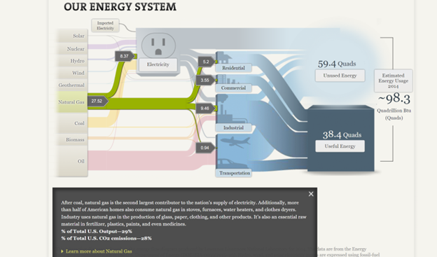
The diagram visualizes both useful and unused energy, highlighting that a significant portion (~59.4 Quads) is wasted, primarily as heat. This effectively communicates the inefficiencies in our energy system.
Interactive Features:
Users can click on different energy sources (e.g., solar, wind, hydro) to see detailed information and visualize their contribution to useful and unused energy. This interactivity enhances engagement and allows users to explore specific data points more thoroughly.
Comparative Analysis:
The representation of renewables alongside traditional fossil fuels on a similar basis helps demystify their efficiency relative to conventional energy sources. This is a strong point of the visualization, as it underscores the role of renewables in a comparable framework.
End-Use Efficiency: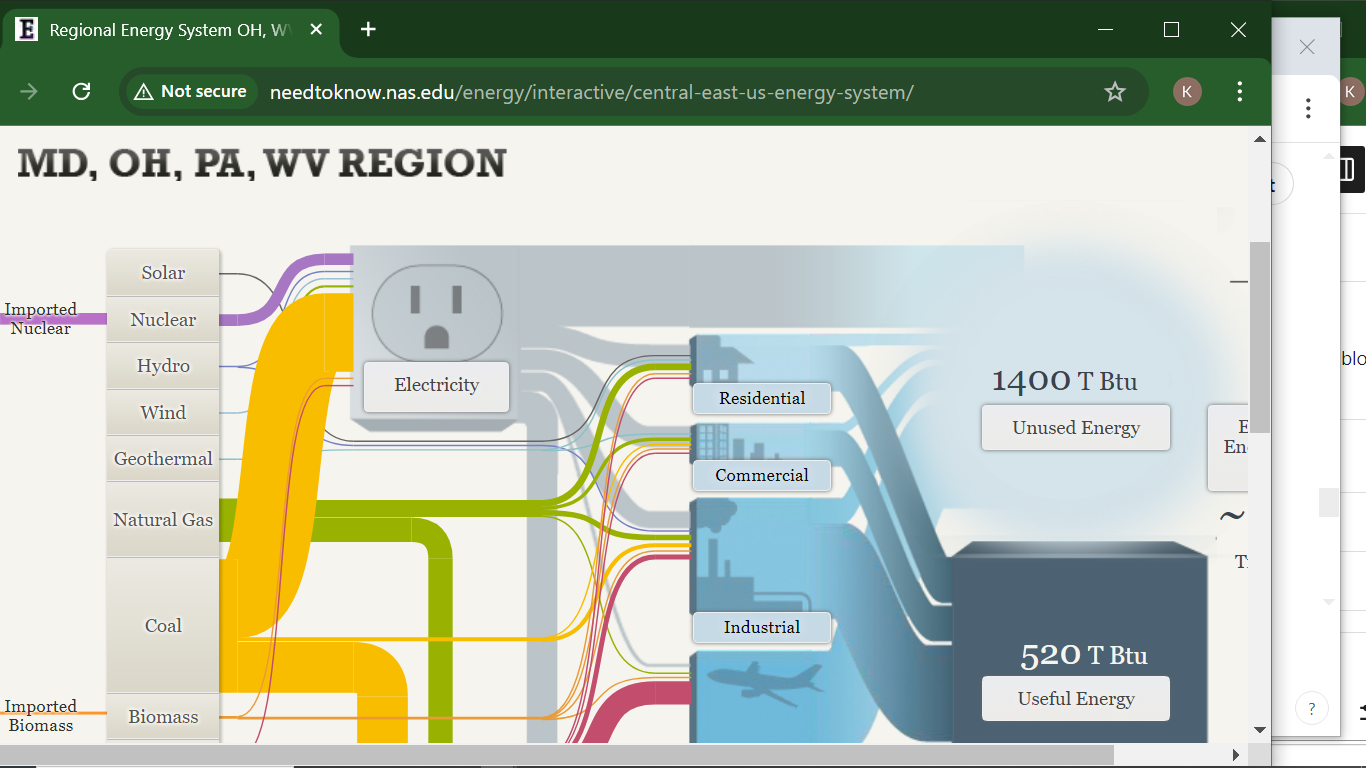
The efficiency metrics provided for various sectors (65% for residential and commercial, 80% for industrial, and 21% for transportation) are crucial for understanding where improvements are needed. However, the stark contrast between the transportation sector and others raises questions about potential reforms.
Critique of the Sankey Visualization
While the Sankey diagram is effective, there are areas for improvement:
Complexity:
For some users, the complexity of the diagram might be overwhelming. Simplifying the design or providing a guided walkthrough could enhance comprehension, especially for those unfamiliar with energy systems.
Static vs. Dynamic Data:
The diagram focuses on 2014 data, which may not reflect current trends. Regular updates or an option to view historical data trends could provide deeper insights into how energy usage patterns have evolved over time.
Alternative Visualizations:
Other visualization methods, such as bar graphs or pie charts, could complement the Sankey diagram by providing quick visual cues about the proportions of different energy sources or waste versus useful energy. This could help in communicating key takeaways at a glance.
Narrative Context:
The addition of narrative context or case studies could help users understand the implications of the data. For example, linking specific energy sources to current policy discussions or technological advancements would enrich the learning experience.
Conclusion
The Sankey diagram on the website serves as a powerful tool for visualizing the energy flow in the U.S. It successfully highlights the interplay between energy sources and their efficiency. However, incorporating user-friendly features, updating data, and using supplementary visualizations could enhance its effectiveness and accessibility. As the energy landscape evolves, such tools will be vital for educating the public about energy use and efficiency.
Sankey Visualization
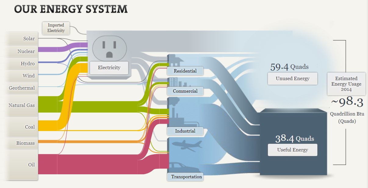
After examining the website on our Energy System by the National Academies of Science, Engineering, and Medicine, there is one main conclusion to be drawn: the energy system is very complex and there is a lot of data to unpack from it. The website attempts to do its best to explain energy usage and statistics through the use of a Sankey visualization, however without actually clicking on any data or the specifics, it appears very overwhelming to even look at. For instance, when you look at the section/visualization that focuses strictly on the MD, OH, PA, WV Region and do not click on the energy type (solar, nuclear, hydro, etc…) the visualization shows hardly any data that is clearly understandable and interpretable. The image shown below is what this visualization looks like without using the interactive feature.
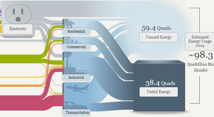
As you can see, the numbers are all over the place and hard to follow due to all of the “lines” and colors surrounding it. When you actually click on an energy source, however, the numbers, color, and “line” are singled out with more data and information that is more understandable. The image below is taken from the National energy system but is clicked to focus on the natural gas section of it. Here, the numbers are more directly highlighted, and an explanation is given and broken down in a way that is easier to understand. You can tell that 27.52 is the total energy in natural gas and the smaller numbers are where the energy is actually broken down.
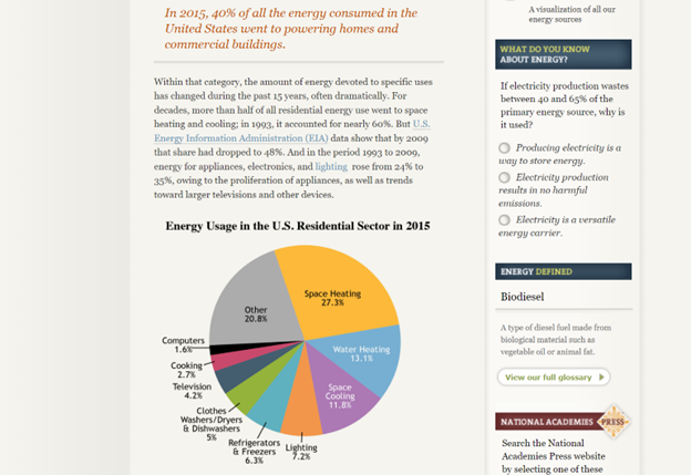
Despite this being a more clarified version of the Sankey visualization, I am not entirely sure that this was the best way to display the information. I feel that the website has too much information that they want to share and not enough innovative ways to share it, that the information becomes too overwhelming to look at in any section, not just the Sankey visualization. The entire website is very text heavy with a few visualizations thrown in between (including the Sankey visualization) and the visualizations end up having too much data because there are so few of them. For instance, even the pie chart featured below looks very overwhelming due to the amount of information and colors being packed into it. To add to this, there is also too much going on in the side legends of the website with the quizzes, polls, links, etc.. that your eyes are not truly able to focus on everything and take it all in.
In all, the Sankey visualization is a unique way to display information when done correctly. While this website tried its best to make it interactive and comprehensive, there was simply too much data and information in each that it became a little overwhelming until a specific part was highlighted. A simple flow chart may have been easier to read, but then again there was just too much information and text to fully know and understand.
Sankey Diagram
The Sankey Diagram originated in 1898 to show the energy efficiency of a steam engine. This makes it the perfect choice of visualization to depict the efficiency and usage of our energy systems in the United States. I appreciate that the diagrams show how different states aggregate their energy to show that the United States is not a monolith in energy production and consumption. Our energy use is nuanced and these diagrams show that our energy production and usage is very inefficient. This first screenshot shows the amount of energy that solar contributes to our total power usage. It is very low at 0.23%. I was actually shocked that less than ¼ of a percent of our energy is produced by solar. When you click on solar it also shows that most of our solar usage is going directly to residential homes and very little is going into the grid.

The second screenshot shows the MD/OH/PA/WV region, who are major exporters of coal energy. The diagram shows that the region has much lower energy efficiency than the nation due to the use of coal. 73% of energy is unused in this region because the region is heavily reliant on the coal, biomass, and oil.

The last slide shows energy production and import in California. California is one of the most energy efficient states in the country and this diagram shows why. The top 6 sources of energy listed: solar, nuclear, hydro, wind, geothermal, and natural gas are much more efficient than the bottom three. This results in 41% of California’s energy produced being usable.

I would say that this is one of the best use cases for a Sankey Diagram. It allows the user to easily follow the flow of information (energy) and understand more about the topic than many other types of charts. All of the relevant information was able to captured in three different versions of the same diagram, so when users move on to the second and third charts they are expert users and it makes analysis more streamlined. This was a great way to show inefficiencies and areas of opportunity in a simple and easy to understand way. My mind works in percentages so the only thing I would have done differently is include percentages in the useful and unused energy labels or tooltips. Lastly, the only thing that I don’t really like about this Sankey Diagram is that all of the numbers are not visible without clicking around. Many people prefer to be able to see all of the information and just be able to explore visually without interaction.
Sankey Visualizations
A Sankey Diagram is a visualization that Is used to depict a flow from one set of values to another. They help locate the most important contributions to a flow. Sankey visualizations are best used when the topic is energy, time, or money.
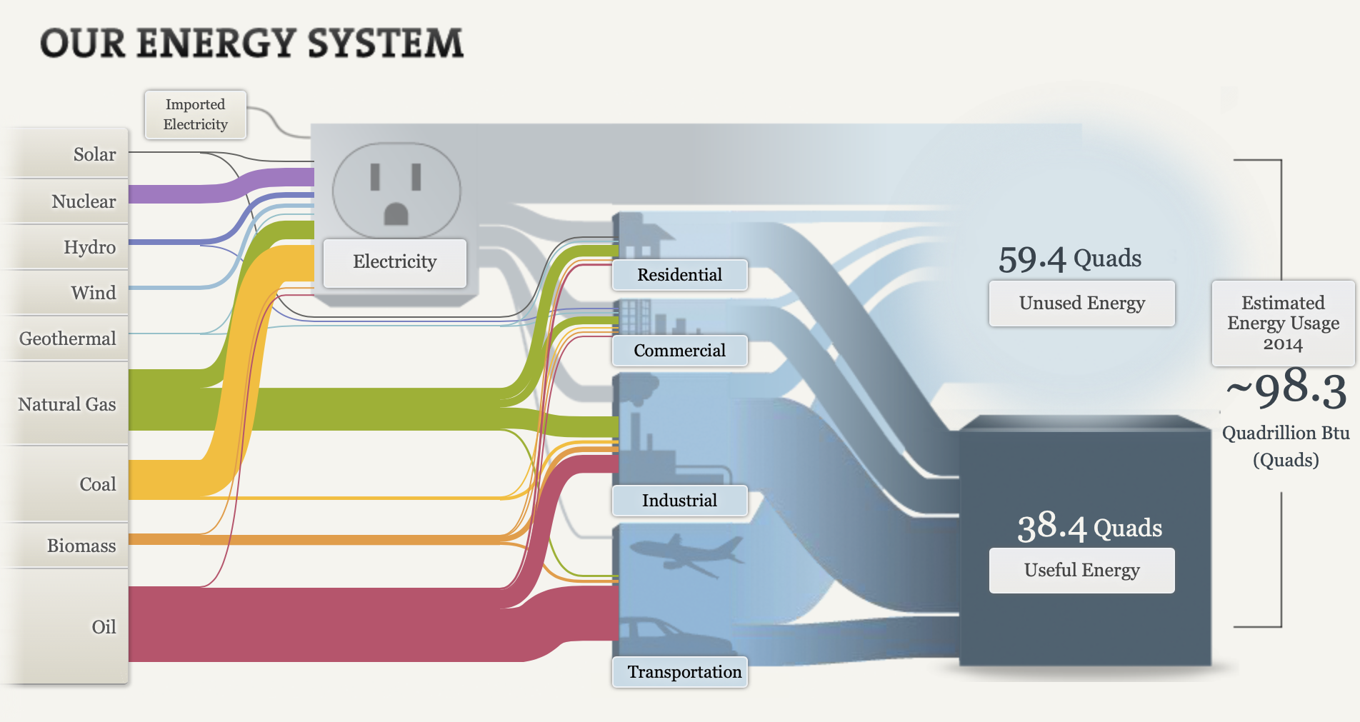
Although there is a ton of information presented in this visualization and it seems cluttered, I think this is the most effective way to view this data. This visualization is super effective considering that there are so many different aspects on this chart that are combined into one piece. Firstly, the energy system is broken down into the types of energy on the left hand side. The visualization allows you to click on each tab. When you click on each type of energy, it shows you what percentage of energy is expended and where it goes. For example, when you click on solar energy it shows you that solar energy accounts for 0.42% of all energy expended, and that 0.17% goes to electricity, and 0.25% goes to residential use. The infographic then breaks it down even more. It shows the amount of energy that is unused, and used from each category (electricity, residential, commercial, industrial, transportation). The thickness of the flow indicates the amount of energy. For example, you can see that most of the energy from transportation is unused because a larger flow moves from transportation to unused energy. All in all, there is so much information that can be digested from this visualization. It appears to be a lot, but when you break it down into pieces it is very effective. I believe this is the best way to display this information.
Sankey Visualization
By Nick Ligameri
According to www.ifu.com, a Sankey diagram is a “specific type of flow diagram used for visualization of material, cost or energy flows. They show energy or mass flows with arrows proportional to the flow quantity. They have directed arrows featuring flows in a process, production system or supply chain.” Given this definition, it is easy to understand why this visualization was chosen to represent the flow of energy within our country.
The above Sankey visualization does a wonderful job at taking a complex dataset and showing not only how much of each resource is used, but where it is used. At a glance, the visualization does seem a bit messy, but I like to think of it as organized chaos. What I like about this is that you can quickly see what resource we utilize the most and, more importantly, what industries have the most waste.
In the above image, you can see that the most waste is generated from electricity and the transportation industry. When you click on the Unused Energy button, it explains that the waste comes in the form of heat that is generated when converting energy into a different form of energy. It is striking that we produce more wasted energy than we consume. From this diagram, you can quickly determine the need to produce a more efficient energy source.

This website also shows two different energy systems besides the national system. My immediate thought was to compare these two systems. To do that, I had to click back and forth between each page. I think this tool would be even more powerful if the author could have provided an easier way to compare the two. This is even more important considering that California consumes roughly three times more energy than Maryland, Ohio, Pennsylvania, and West Virginia combined. I would want to highlight this somehow, possibly with some variation of a column or bar chart.
Overall, I feel this Sankey visualization does an effective job of communicating a complex story in a relatively simple way. The user interactions feel intuitive and lead the viewer along. This type of visualization seems like it would be difficult to learn how to build, but completely worth the effort.
SANKEY VISUALIZATIONS.
Sankey Diagram is a visualization technique that allows the display of flows. Many experts argue that Sankey diagrams do a better job than pie charts, visualizing flows in their proportions. The things connected are called nodes and the connections are known as links. Sankey diagrams are also perfect for showing many-to-many mapping relationships.
They are very good at showing particular kinds of complex information:
- Energy flow
- Budget flow ( where the money came from and went to
- Number of people migrating from one country to another
- The flow of goods from one place to another
SANKEY VISUALIZATIONS – OUR ENERGY SYSTEM
A Sankey diagram was used to visualize the primary energy source supply directly to the residential, industrial, commercial, and transportation sectors in the USA. It also showed how electricity was generated from a list of primary sources.
The diagram appeared complex at first view but very with careful observation, it gives out detailed information.
The Sankey diagram shows the primary sources of energy: solar, nuclear, hydro, wind, geothermal, natural gas, coal, biomass, and oil. The colored links show the flow of energy from these primary sources to their destinations: residential, commercial, industrial and transportation uses. The width of the links shows the proportion of energy flow to its primary source.
The visualization allows you to click on a primary “source of energy” to examine its “flow of energy.” It places the other categories in the rear and reduces the clutter of information. The use of labels also helps ascertain the value of the amount of energy flowing from the primary source to its destination.
Sankey diagrams can be very effective in displaying visual information about complex data. The caveat is to be very cautious of cluttering information due to its complexity.