Home » Pivot Tables (Page 2)
Category Archives: Pivot Tables
Pivot Tables
A pivot table is an extremely useful and powerful feature in Excel. It allows you to extract the significant information from a large, detailed data set. When you have a very large data set it is hard to see any trends or come to conclusions about the data. With a couple clicks, pivot tables can help readers better understand the data by summarizing it and showcasing the important information.
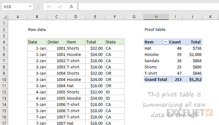
On the left is a raw data set of clothes sales. It includes the date of the sale, order number, item type, total cost, and state of purchase. The sheet extends for many rows and gets super overwhelming. The pivot table of the data is shown on the right. This organized the data and sorted it by the item of clothing. It then tallied up how much of each item was sold and also presented the total sales from each item. This is way easier to read and helps show trends and important information. You can see that hoodies were sold the most with 59 of them, and they also made the most money with $2,006. You can also see a total of 213 items were sold for $5,252. In conclusion, pivot tables are a great way to summarize a lot of information very quickly and easily.
Pivot Tables
By Nick Ligameri
A Pivot Table is an extremely powerful tool that Excel offers that is used to easily manipulate aggregated data. According to www.lumeer.io, “a Pivot Table is used to summarise, sort, reorganise, group, count, total or average data stored in a table. It allows us to transform columns into rows and rows into columns. It allows grouping by any field (column), and using advanced calculations on them.” I think that, for most people, Pivot Tables can be intimidating because there are a lot of uses for them. In this post, we’ll look at a couple of uses that make learning how to use Pivot Tables worth it.
Pivot Tables are useful when you have large amounts of data that you want to analyze quickly. If you are a direct-to-customer (D2C) business, you should probably learn how to utilize Pivot Tables. My wife falls into this category, as she operates a cottage food business from our home. She sells her baked goods directly to customers. A way that I am going to investigate implementing a Pivot Table specifically for her business is to see how many of which ingredients she uses each month. This can allow her to forecast how much she’ll need to buy each month. This would allow her to purchase from a supplier in bulk, vs going to the grocery store on a weekly basis. She’ll save time and money, which leads to larger profits!
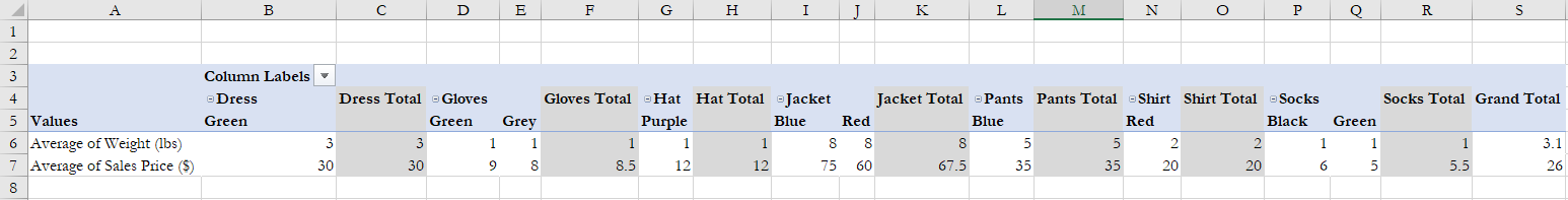
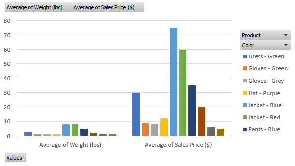
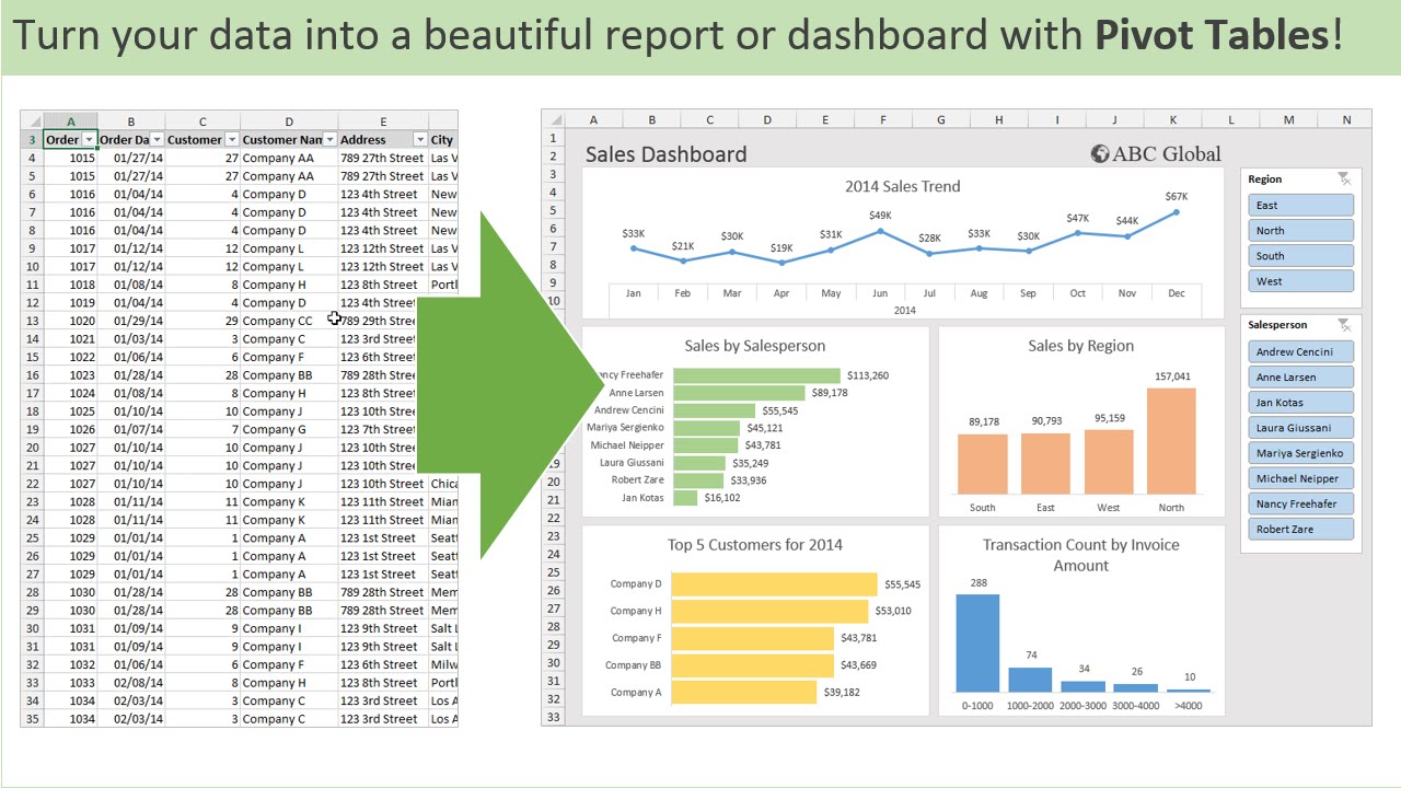
The above example I found from lido.app shows us that you can use a Pivot Table to quickly show average prices without having to create any formulas. It also organizes the data based on product information. This example breaks it down by color. You can also use Pivot Tables to quickly insert graphs based on what you need the data to tell you. Below you can see that the same data is used to create a visualization that can be used in reports.
Pivot Tables
Pivot tables can be classified as a data analysis technique that can summarize large datasets and allows one to extract the significance from them. It sorts and summarizes large datasets, automatically.
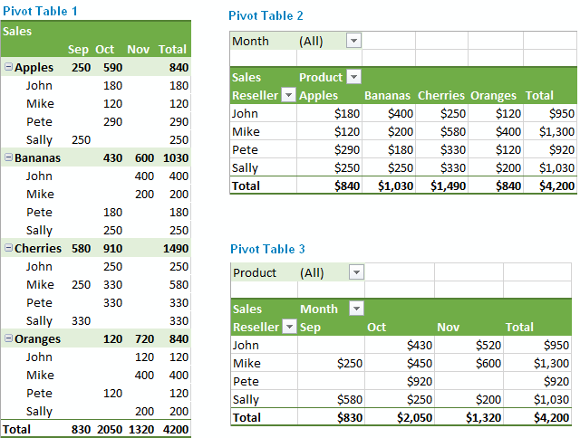
Below is a typical example of a pivot table:
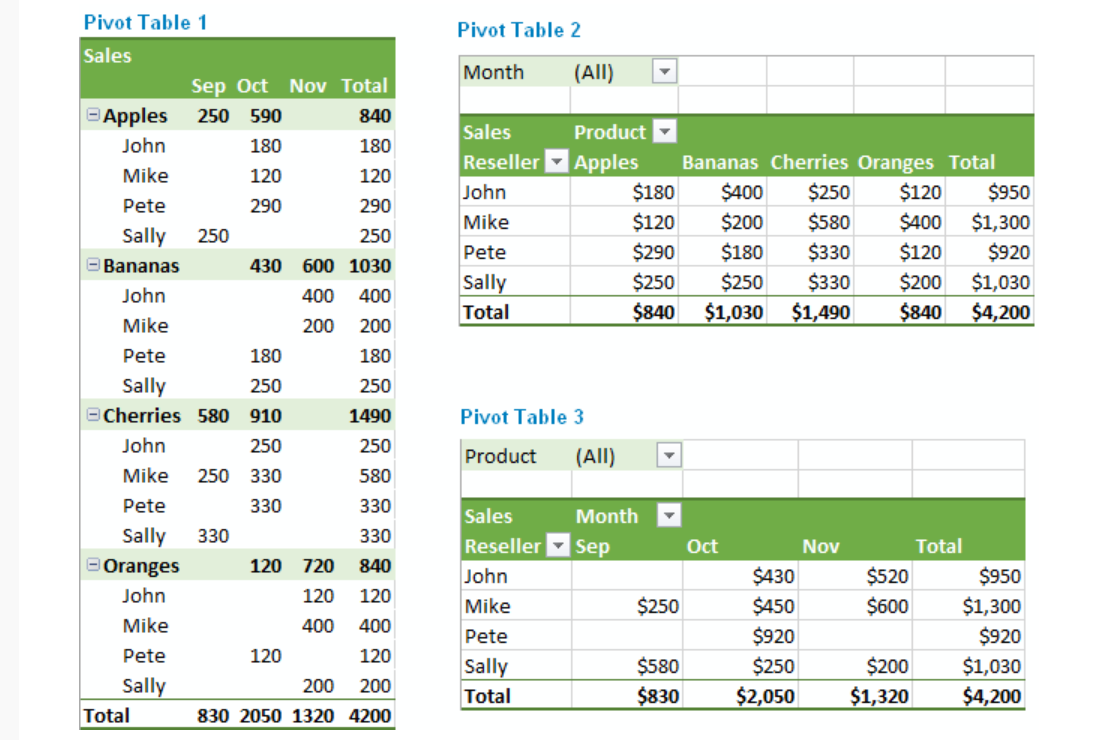
The pivot table above summarizes large data sets, making it easy to comprehend. In pivot table 1 above, the apples are summed up in the fourth column and first row. It categorizes the total number of apples owned by John, Mike, et cetera. Pivot tables may appear to be cumbersome when trying to create them for the first time. However, they are very easy to create once the steps are followed carefully.
There are many uses for pivot tables. The list includes, querying large amounts of data in many user-friendly ways, subtotaling and aggregating numeric data, summarizing data by categories and sub-categories, et cetera.
This link teaches you how to create a pivot table within few minutes.
Pivot Tables
I have found that pivot tables are good ways to summarize a lot of data. I think they work particularly well with data that involves a large quantity of numbers. They are very useful because they are great visual and interactive ways for readers to conceptualize numbers within the data set and clearly see what is being portrayed in the overall data story.
Here are some great examples of pivot charts and why they are so helpful:
Example #1
This is an example of a pivot table I got from a very helpful website that shows how to create great tables! On the left is their source data and on the right is their pivot table. It is much easier to see the data within the pivot table because it is much more condensed and only has the information that is important to the reader. Instead of being overwhelmed with numbers and data, it is way more digestible in this form.
Example #2
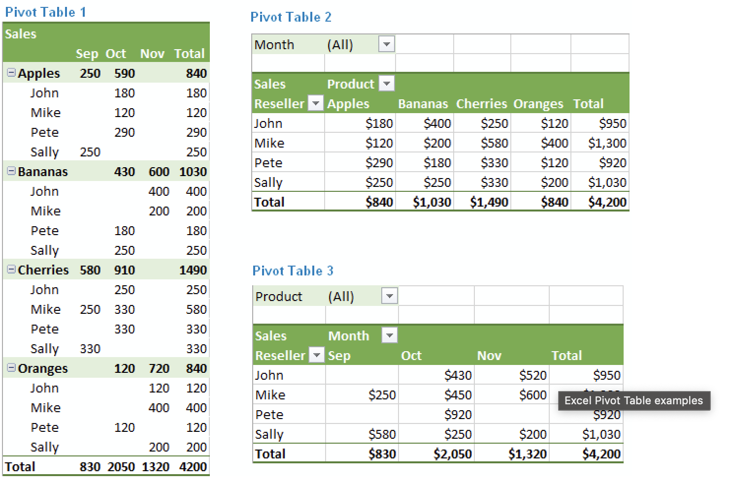
This next example also comes from a really helpful website to aid in creating pivot tables. What I really like about this particular example is that it highlights all the different ways the same information can be laid out. Excel does a really good job at offering the creator choices in layouts to make the creation of an effective pivot chart much easier. As seen here in this example, the layout of a pivot chart can really change the goals of what you want the chart to do.
All in all, I think pivot charts are great ways to display numerical information. There are plenty of websites to help in the aid of creating them and using tools like Excel also makes it very easy!
Pivot Tables
By: Veronica Perkins
Like any other visualization, the intention is to help visualize the data being presented to an audience. The purpose of a pivot table, is to help visualize and a large amount of data at one time. A typical pivot table looks like this:
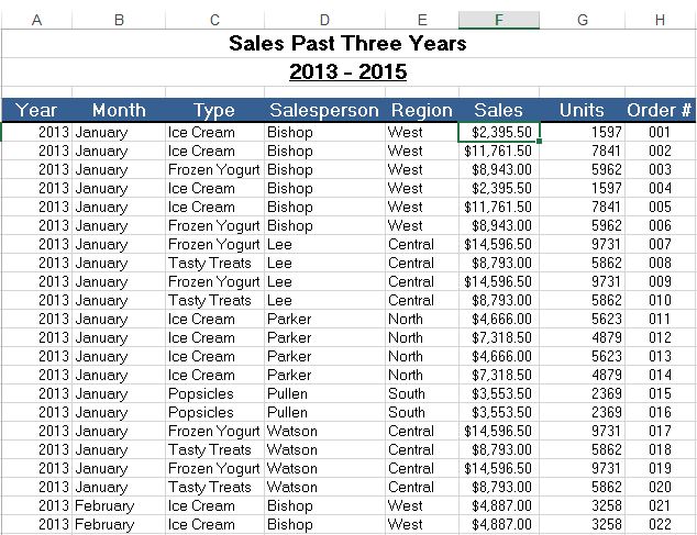
As you can see, a lot of information is presented in the format of a pivot table. This pivot table is an example of how a lot of information is summarized. In this example, the maker wanted to present the sales from the past three years. They decided to break it down between the following: year, month, type (meaning what was sold), the salesperson that sold it, the region of the sale, the sale amount, how many units were ordered and the order number that correlates to the sale. Pivot tables can be so helpful to use because they can help break down a large amount of data at a glance. This information, can also be used to make visualizations to help represent the data.
Pivot Tables
Pivot tables are very user friendly. You do not need to be an expert in Microsoft Excel in order to create one. Pivot tables summarize large amounts of data and automatically sort and count the data and display it in a table. It allows you to convert rows into columns and columns into rows. They make it very easy to find patterns within your data. You can analyze your data in numerous ways with just a few clicks of a button. Pivot tables sort your information in different ways which allows you to get insight about your data that might not have been so obvious in a different type of table.
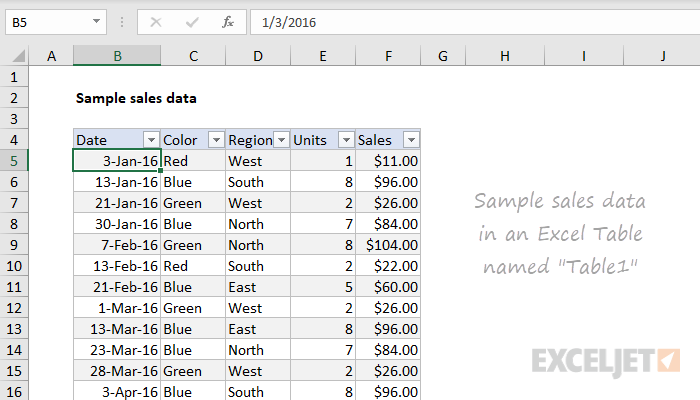
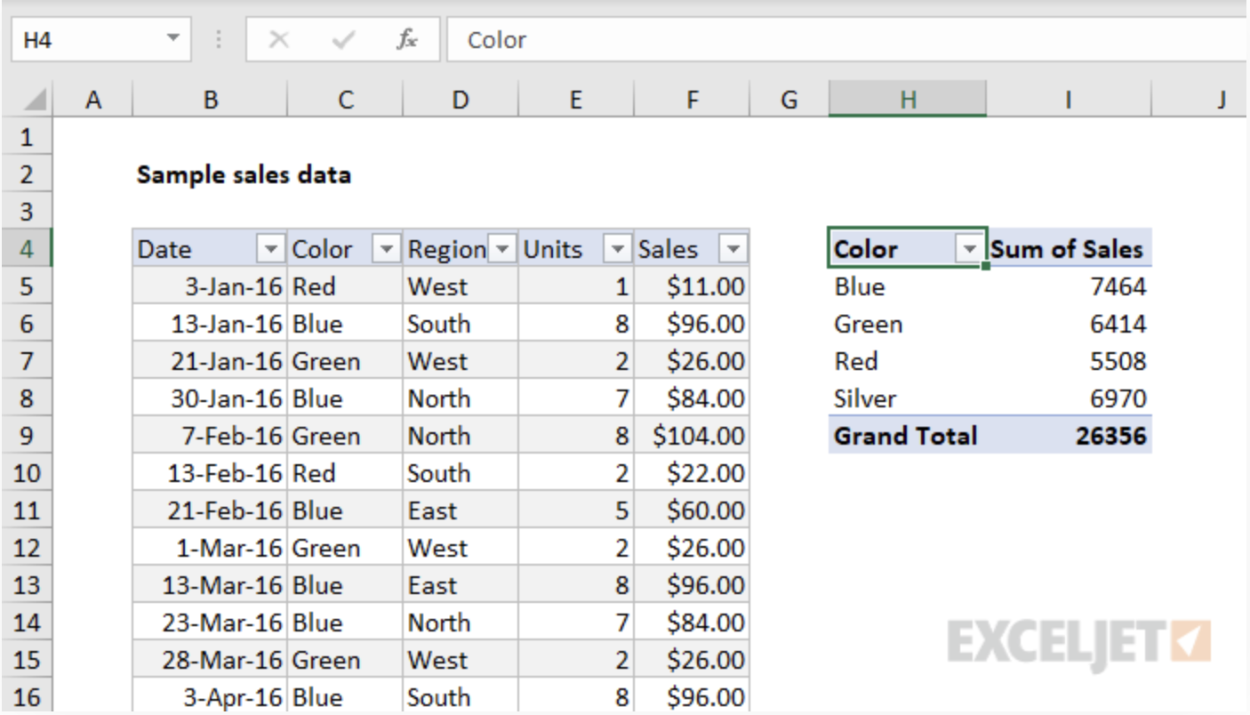
Here is an example data set that we will look at as a pivot table. We have lots of data that is being displayed here: dates, color, region, units and sales. This is a lot to look at and comprehend in just one table, so we are going to look at it in a pivot table and it’ll be more understandable and appealing.
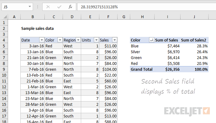
Here, we see a pivot table on the right summarizing the sum of sales by color. It looks better then the chart on the right because we are just looking at colors rather than dates and regions, but we are able to look at this data as well.
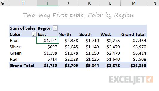
Now, this is a good pivot table. We can look at the sum of sales per region and by color. This one table shows us lots of information here that we can interpret. And if you click on the drop down bar next to “Region”, it will change our table to be “Sum of Sales per Date”. This is why pivot tables are great. You can display certain information at a time, or all of your information at once.
Pivot tables allow you to focus in on specific information, or look at the whole picture. Some people may be overwhelmed by looking at the very first picture and all of that information. But, by turning this information into a pivot table, we can focus on specific data in our table and we are simply able to change to other data with an easy click of the drop down bar and changing it to what we would like to see. Pivot tables are easy to read, easy to create and easy to use.
Pictures from: https://exceljet.net/articles/excel-pivot-tables
PIVOT TABLES
A pivot table is a data analysis technique used to summarize large datasets and answer questions about the data. It is available in spreadsheet applications such as Microsoft Excel and Google Sheets. Pivot tables are designed to extract meaning from a seemingly multitudinous clutter of numbers on the screen. And more specifically, it allows the grouping of data in different ways so one can easily draw helpful conclusions.
It is termed a pivot table because you can turn around the data in the table at any angle that deems fit to view depending on the viewer’s perspective. There is no addition or subtraction from the data when creating a pivot table but rather entails the reorganization of data to reveal the needed information as being sort after.
Though might seem cumbersome to create without any data analytical background due to the technicalities of creating one, it is easy to learn how to create it in a short period and begin to work with it for all of its benefits.
There are many uses for pivot tables or scenarios that require the use of pivot tables and some of these are;
- Present large amounts of data in a user-friendly way.
- Summarize data by categories and subcategories.
- Filter, group, sort and conditionally format different subsets of data so that you can focus on the most relevant information.
- Rotate rows to columns or columns to rows (which is called “pivoting”) to view different summaries of the source data.
- Subtotal and aggregate numeric data in the spreadsheet.
- Expand or collapse the levels of data and drill down to see the details behind any total.
- Present concise and attractive online of your data or printed reports.