Home » Pivot Tables
Category Archives: Pivot Tables
Pivot Charts
An interactive method for instantly summarizing a lot of data is a pivot table. Finding patterns and trends, organizing data, creating reports, and being more efficient are all made possible by pivot tables. These are a helpful tool for analyzing and summarizing a lot of data. Pivot tables are also a good way to make sure that your data is automatically staying up-to-date.
In this example below, it shows Raw Data vs. Pivot Report. As you can see, the data in the Pivot Report is much more organized and clear to read than the raw data. The data is condensed into a less complex chart that is interactive and automatically updates calculations.


Real world use of Pivot Tables

This screenshot shows a real world example of how any company can quickly sort and summarize candidates for interviews. This pivot table houses over 1000+ people that are interviewing for different roles within a company. For a single person to manage this data and collect performance with experience is tough even through an excel sheet. A Pivot Table can make it easy for anyone to manage people to this size!
Using Pivot Tables
Lamar Miller
In our text, we learn that pivot tables are a great tool that allow us to see the relevant data within a flat file or summary table. A summary table is where your raw data are aggregated so you can build a graph.
A flat file has each piece of data on its own line. Here, you will find a site that explains use cases for pivot tables as well as what they can do to help us export and visualize data.
Some elements of a pivot table include values, rows, columns and filters.

Pivot tables can help with various real-world examples such as sales volume by country. This data can be aggregated in a way where it is simplified down to the relevant data when telling a data story. This data can be sorted by country, year, quarter and dollar amount. This is useful when presenting to clients at your job or helping analyze trends for your own business.

After editing your data to your liking, you will be able to create the example above. This example depicts multiple categories of data which have been aggregated to include sub-categories, timelines and financials.
Pivot Tables
Pivot Tables are a highly useful interactive way to quickly summarize large amounts of data. It takes user-specified data fields and converts the headers into a data option that can be easily manipulated. Data can be summarized in numerous ways, including averages and frequencies. Lorman Education published an informative article about pivot tables. They describe 6 benefits of using a pivot table in Excel:
- Simplicity
- Data Analysis
- Data Summaries
- Pattern Recognition
- Quick Reports
- Decision Making
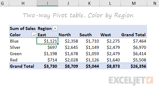
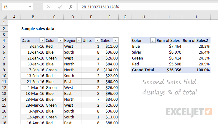
The image above is an example of a pivot table created by ExcelJet. It clearly demonstrates Sum of Sales by color in each region. Colors are sorted by row and regions are sorted by columns. The table also includes a total row according to each color and region, as well as a grand total.

This is another example of a pivot table created by ExcelJet using the same data, just with the rows and columns switched. There is a simple drag-and-drop method that can change the parameters of the table within seconds. ExcelJet also provides a few benefits of pivot tables:
- Simplicity
- Speed
- Flexibility
- Accuracy
- Formatting
- Updates
- Filtering
- Charts
Pivot Tables
Pivot tables are an incredibly powerful tool for organizing, analyzing, and summarizing large datasets. They enable users to transform raw data into meaningful insights with minimal effort.
Pivot tables allow you to quickly group, filter, and aggregate data. For example, you can calculate totals, averages, or counts with ease. Users have the ability to customize rows, columns, and values to focus on the specific insights that they need from their data.
The pivot table below shows the sum of sales over several years, broken down by product colors. It aggregates data annually from 2016 to 2019 and provides a grand total for each color across all years.

This layout is useful for identifying trends in sales performance for each color over time, helping businesses to determine which of their products have consistent demand from customers.
This next pivot table displays the sum of sales quantities for various fruits and vegetables across different countries. It also calculates grand totals for each product and country.

The above pivot table provides insights into the regional demand for specific products, supporting decisions on regional marketing strategies or inventory management.
The last pivot table, displayed below, summarizes monthly household spending across different categories for January, February, and March. It shows total amounts per category for each month and overall. This table is great for personal budgeting or financial analysis, offering a clear breakdown of expenses across categories over a defined period.

Pivot tables are indispensable for anyone who needs to make sense of data, whether for work, school, or personal use. They help you organize and summarize large amounts of information in a clear and easy-to-understand way. By grouping and analyzing data, pivot tables can show important patterns or trends, like which products sell best or where most money is being spent.
In short, pivot tables make data simple and actionable, helping you make better decisions with less effort.
Pivot Tables
A pivot table is a data analysis tool that can be used to organize and summarize large data sets. Large data sets can be cumbersome and include extraneous data that does not pertain to the use case. A pivot table can create an organized chart that functions to create a subset of data that can be explored in a more dynamic way.
Pivot tables are great for interactive dashboards that aid in data analysis. They can simplify very large and complex data sets. Pivot tables can be simple or more advanced using techniques like slicers and calculated fields. Slicers are great for dashboards because they allow users to select different groups of data to view. Users have a more granular view of the dataset that is relevant to specific information they may be looking for. Slicers also allow users to navigate dashboards like the example in the textbook. I’ve tried creating pivot tables multiple software and have found that Excel is the best application and Numbers is also easy to use.
Myexcelonline.com has a great tutorial to create a pivot table. They also have a picture of the final table showing the different elements of a pivot table.
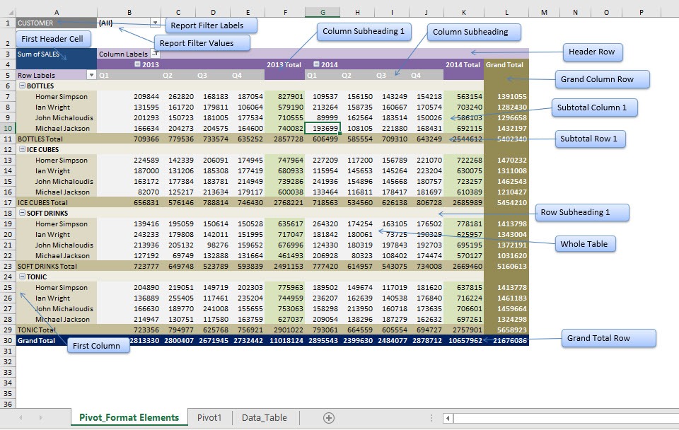
https://www.myexcelonline.com/blog/customising-pivot-table-styles/
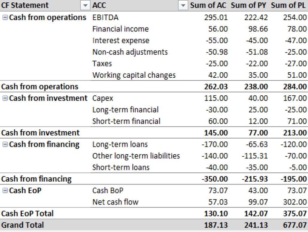
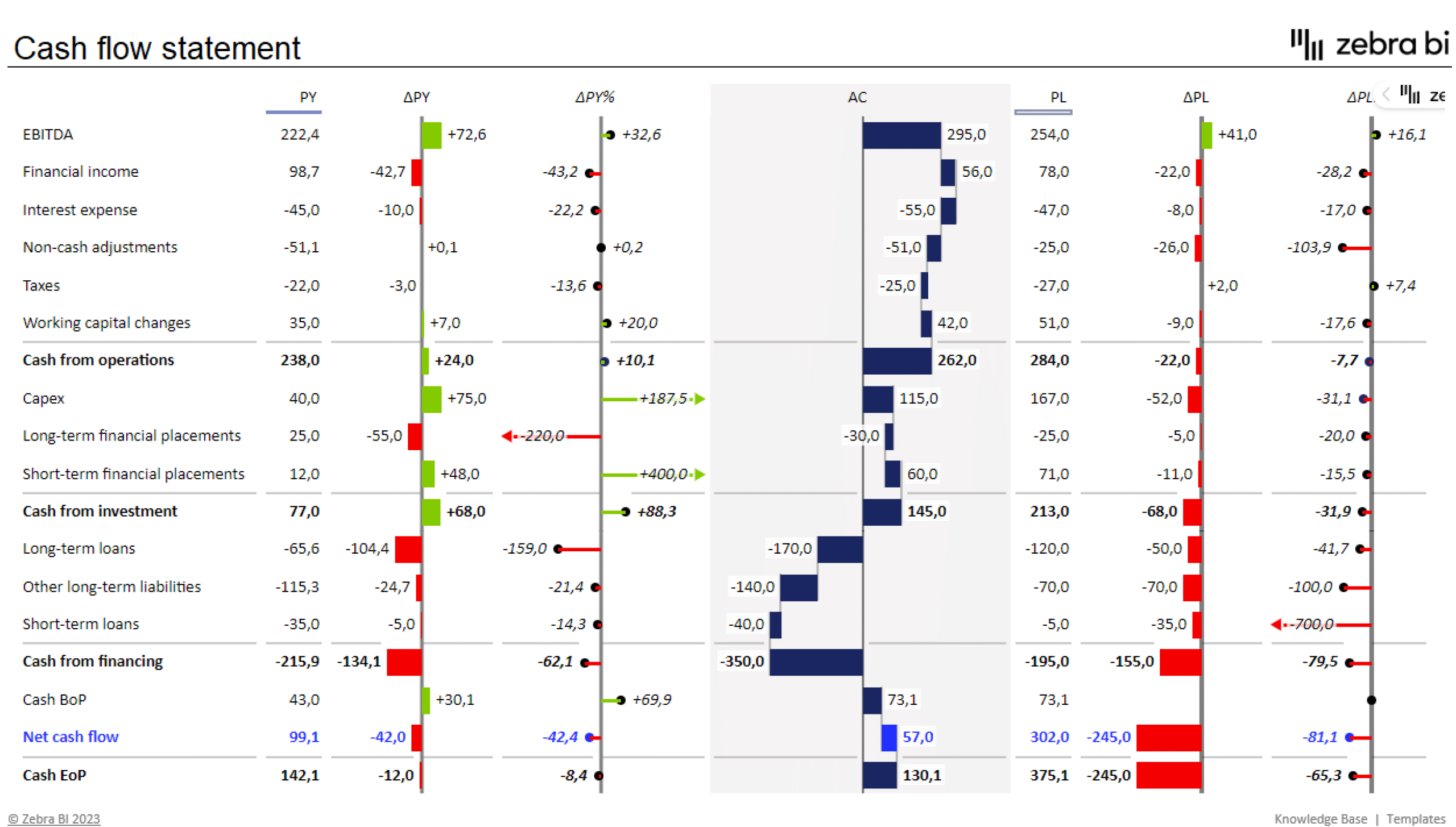
I would actually like to master pivot tables because I know that they are ideal for use in financial reporting. Financial datasets tend to be overwhelmingly large and difficult to summarize. Zebrabi.com suggests using a tabular hierarchy pivot table as shown below along with visuals for financial reporting.
Pivot Tables
A pivot table is a useful way to sum up large amounts of categorized data into a shorter and simpler table. It does this by taking each group or category and summing it up to get the totals per group rather than the every little piece of information. By using a pivot table, the information is presented in a much neater and efficient way. Pivot tables also allow you to sort and analyze the data much quicker and spot any outliers, or other sums that may need addressing.
The image below shows a sample of some data that could be best presented in a pivot table. The example uses resellers with different types of fruit over a three-month period to see how many sales and overall income each reseller brings in for each type of fruit.
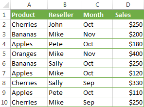
If we were to turn this charted data into a pivot table, we could easily see totals per fruit, per reseller, and per month in order to more easily analyze the data and get the results we need. The chart below shows the pivot table of this data.

As you can see, there are several different ways to display the data in a pivot table, depending on which type of information you want highlighted. Each of these examples gives the results and totals more quickly than if you were to just stare at the initial table and figure this out. While this example is just a sample with random fruits and resellers, it could also be applied to major corporations who are trying to figure out which of their chains needs more help or which is the most successful. Once again, pivot tables can really be used for a variety of data and ultimately make a person’s life a lot easier when it comes to analyzing and summarizing big sets of data.
https://www.ablebits.com/office-addins-blog/excel-pivot-table-tutorial/
Pivot Tables
Pivot tables are a powerful excel features that allows users to organize their data with the click of a button. Useful for quickly analyzing large sets of data, pivot tables allow you to quickly find the measures of central tendency, frequency of data entries, as well as sums, products, and more. To dig into an example, check out the pivot table below:
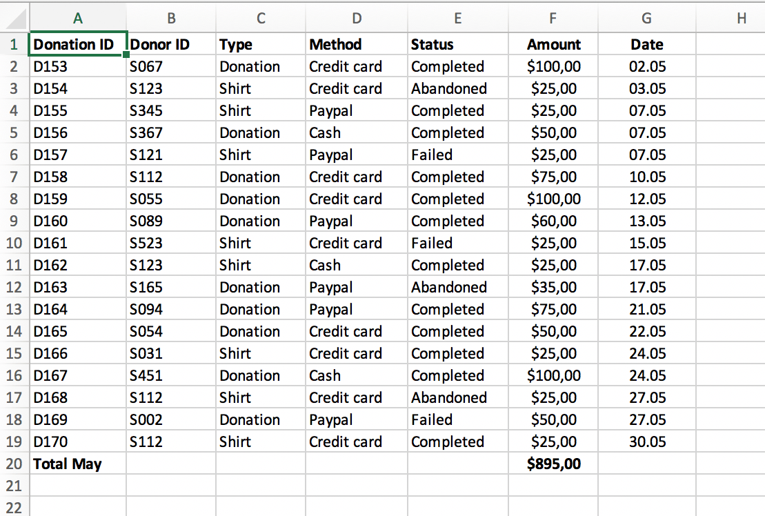
To highlight some useful functions, imagine a business that has a system of keeping track of client transactions. The table above contains information regarding the donorID, which is a unique identifier for each donor. If a business owner was interested in keeping track of their most frequent and largest donors, trending dates in which donations are more likely, or the average donation, all of this information would be available at the click of a button.
Source: https://www.perfectxl.com/excel-glossary/how-to-use-pivot-table-excel/
Pivot Tables
https://exceljet.net/articles/excel-pivot-tables
A pivot table can be used for a variety of reasons to portray data. A pivot tables usefulness truly comes to light when one has to summarize large amounts of qualitative/quantitative data. It can provide a flexible and efficient way to not only separate the data into individual rows and columns, but also make it easier to identify patterns, and trends that may not have been noticed. As shown by the data provided above by Exceljet, the pivot table ran automatic calculations on the summed/counted values and the data was segmented by date, color and other variables. Furthermore, with the information provided, the user can now calculate the percentage values of each calculation if desired. Lastly a pivot table is also very easy to create as well as understand. There is no need to learn complex formulas and one simply has to enter the data and insert the table or use drag and drop tool depending on what visualization tool they are using. All in all, pivot tables are a great way to organize data into rows/columns and simplify data.