Home » Pie Charts (Page 2)
Category Archives: Pie Charts
Pie Chart/ Practice
By John Wickham
Pie charts are weirdly one of controversial bits of infographics scene. People say that they are very common in the space, but most people do not understand how to make. People make it hard to understand with problems such as not understanding the percentages or just having to many slices for the chart.
Pie charts are best used to show comparisons between small number of different categories (2-5 different sections) and when you want to highlight one specific piece of data.
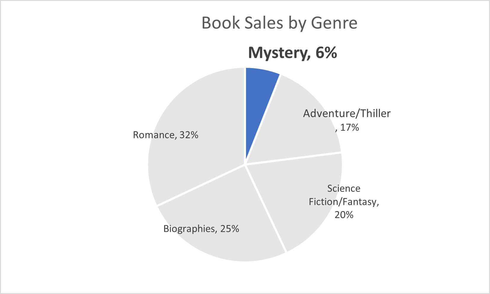
This pie chart above is about the sales of books within a group of genres. The main point I wanted to show was the low number of sales from the mystery genre. This highlights that more people should by mystery sections
Pie Charts
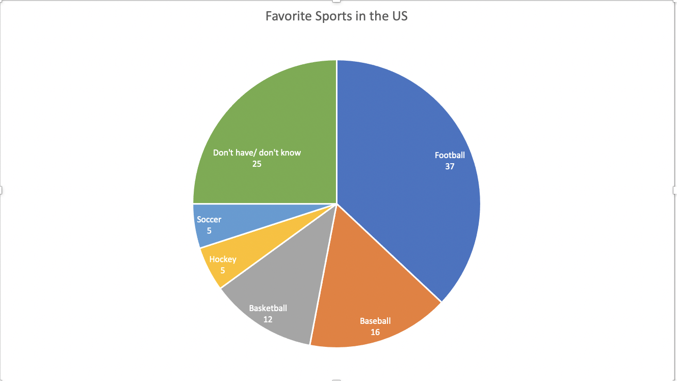
This data set is a perfect case for a pie chart. The percentages add up to 100. This means that all of the parts add up to a whole, which is a crucial part of a pie chart. A pie chart is also good to use here because there are only 6 categories. There is not too much going on and the chart does not look cluttered. It is very easy to read and the audience can easily compare the sizes of the slices to each other to tell which sport is more popular.
The data here is not served better as something other than a pie. A bar chart would work, but a pie chart is the most effective visualization for this data set.
I came across multiple design strategies to make this pie chart more appealing. First I color coded the different slices. This makes it easier to differentiate the slices from one another. Another thing I did was I put the category name and percentage in every slice of the pie. The percentage provides a more in depth look at the data. Also, adding the category name allowed me to take away the legend. This makes it easier for the reader to digest the information. They no longer have to glance at the legend, then to the chart, then back and forth. All of the information is in the pie chart.
PIE CHART – A PERFECT USE CASE
A pie chart is a graphical representation technique that displays data in a circular-shaped graph. A pie chart best suits the parts-to-whole relationship for categorical or nominal or proportional data which sums up to a whole, mostly 100% or 1. Due to its unique display of data, it is better to not use so many data points in order to keep it simple and attractive. Often time, people use large amounts of data points which displays a crowded chart with many points of less significance making the chart not relatable or difficult to analyze.
make sense to show a parts-to-whole relationship for categorical or nominal data. The slices in the pie typically represent percentages of the total.
Pie charts should be considered when the data possesses the following,
- Few components
- No time representation
- Distinct parts
- Easy visualization
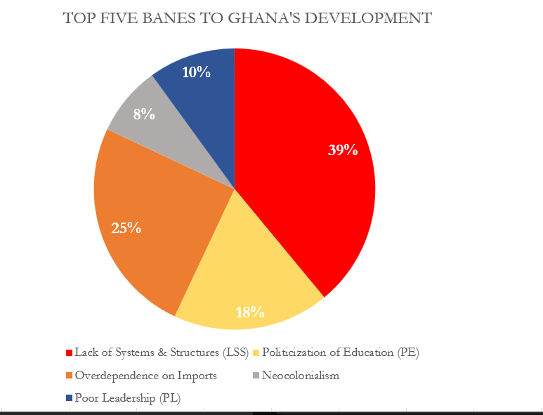
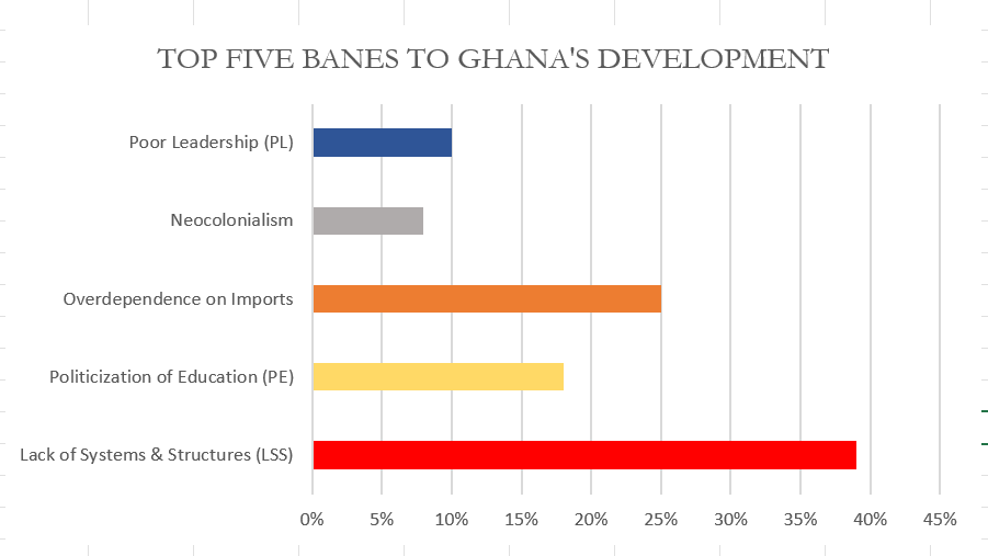
Figure 1.00 is a simple display of data on a pie chart. It has fewer data point and the total of the proportions sums up to 100%.
Though the data as presented in figure 1.00 can be presented in a column chart and would make sense just as the pie chart, I would still prefer the use of the pie as it is more engaging compared to a column chart. Figure 1.01 below show a column chart of the same data as in figure 1.00. Though simple, audience will naturally not be able to tell the proportions of each column or what the total is so in this case I will prefer to use the pie chart for much convenience and easy visualization.
There are some few design tips to consider when designing a pie chart and some of these are;
- Avoid using 3-D designs
- Use colors that match your data
- Avoid too many slices
- Use presentable fonts
- And many more…
Using Pie Charts to Represent NHL Playoff Percentages
Using pie charts is beneficial for showing percentages that display the proportions of the data. Each section of the pie chart resembles a different piece of data. For my pie chart example, I decided to take the Metropolitan NHL Teams and researched their percentages of making it into the NHL playoffs. It is still early in the season, so the data I have researched changes weekly. My information is based on playoff chances as of Sunday, October 23rd, 2022. Using monkeypuck, I took the percentages of all the Metropolitan Division Teams, which can be found on the NHL’s official website.
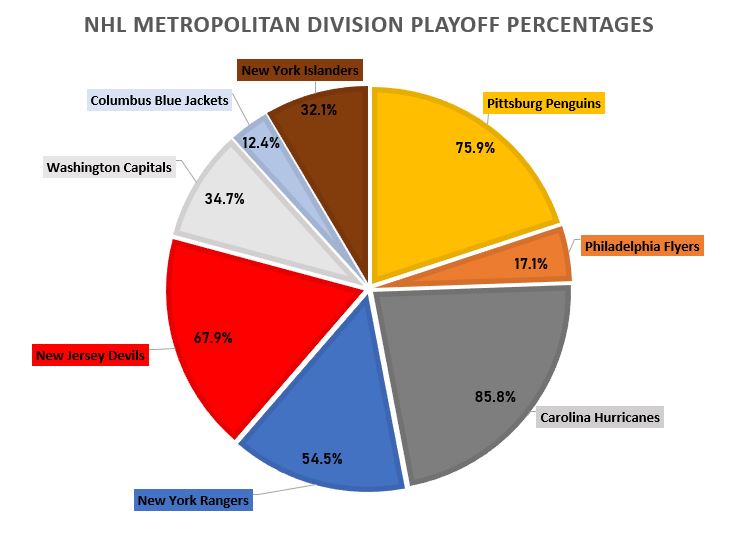
As I was making my pie chart, it was rather easy to display the numbers and data. I then realized, if I moved the data labels while they are outside of the pie chart, it would automatically draw a line to the corresponding data. I made each data label color match the corresponding team as well as each slot in the pie chart. For example, the Philadelphia Flyer’s team consists of black, orange, and white. As shown on the pie chart, you can see the Philadelphia Flyer’s slot is colored orange. I also related the colors of the other teams, to the boxes as well, which can be seen in my pie chart. I also changed the fonts and font sizes, along with adding text boxes for the percentages of each team, inside the pie chart. Specifically for the data set I used, the pie chart is the best way to display this data. Otherize, a bar graph could be used as well, but I do not think it is as visually appealing in this scenario. I believe this data is better served as a pie chart to visually see the different percentages of each team’s playoff odds.
Pie Charts
By: Veronica Perkins
Pie charts are a form of data visualizations that can help represent data given to us. Pie charts are ideal when your data adds up to 100. I made a pie chart to help represent this:
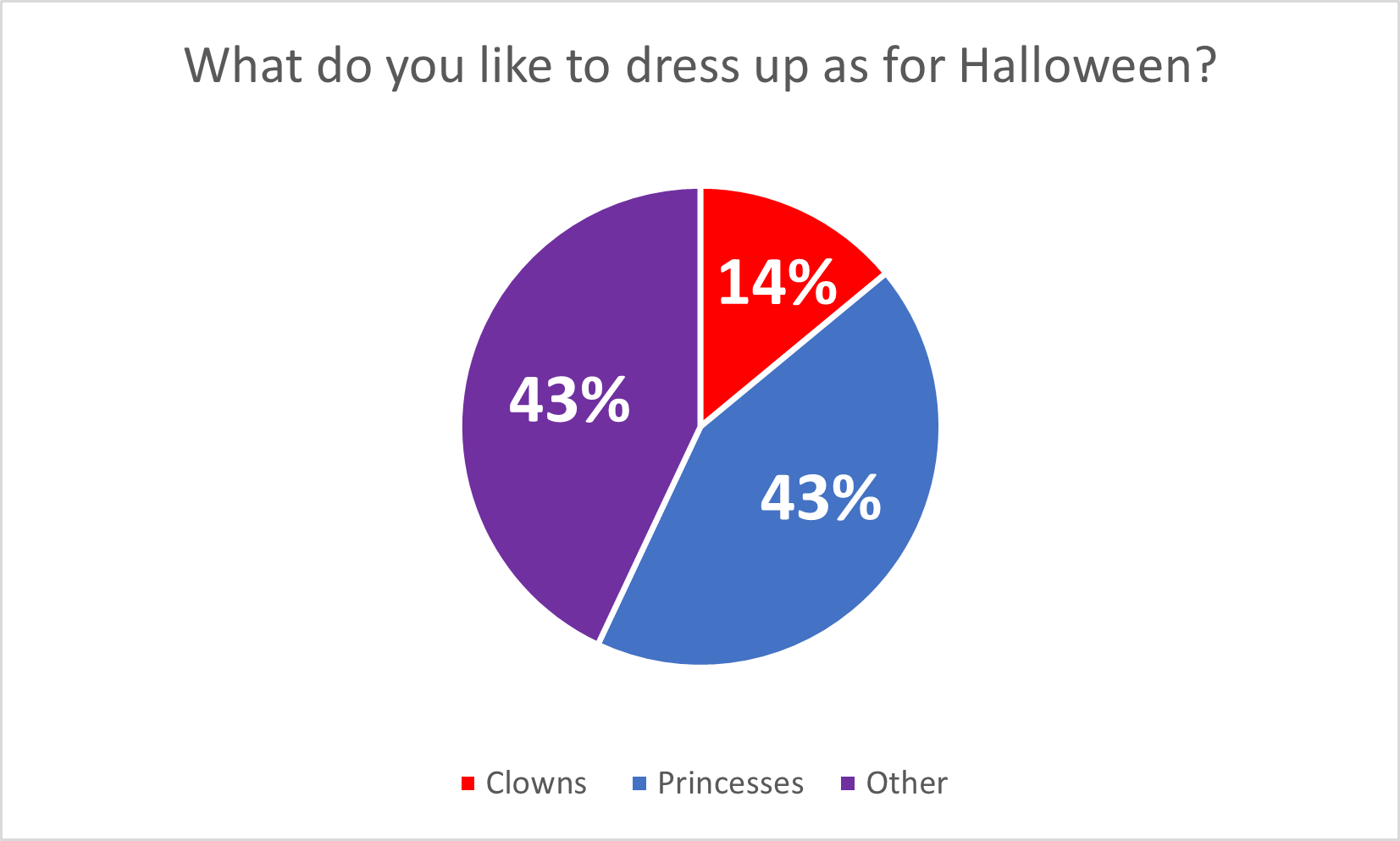
Pie charts are great for when you have multiple data points (that add up to 100%) because it allows the audience to see how the data is divided. In this case, the data I chose, represents what people want to be for Halloween and the data is completely made up. However, even though the data is made up completely, it still allows for the audience to see the data in a simpler way. I believe that this pie chart is a great version of data visualizations, but this data could also work on bar graphs as well. Here are a few tips for making pie charts: Be sure to vary each slice using different colors. Also adding data labels, such as numbers, can be a big help visually for the audience as well.
Happy creating! 🙂
Pie Chart
The pie chart that I chose to make depicts the poverty level of people under the age of 18 in the United States in the year 2020.
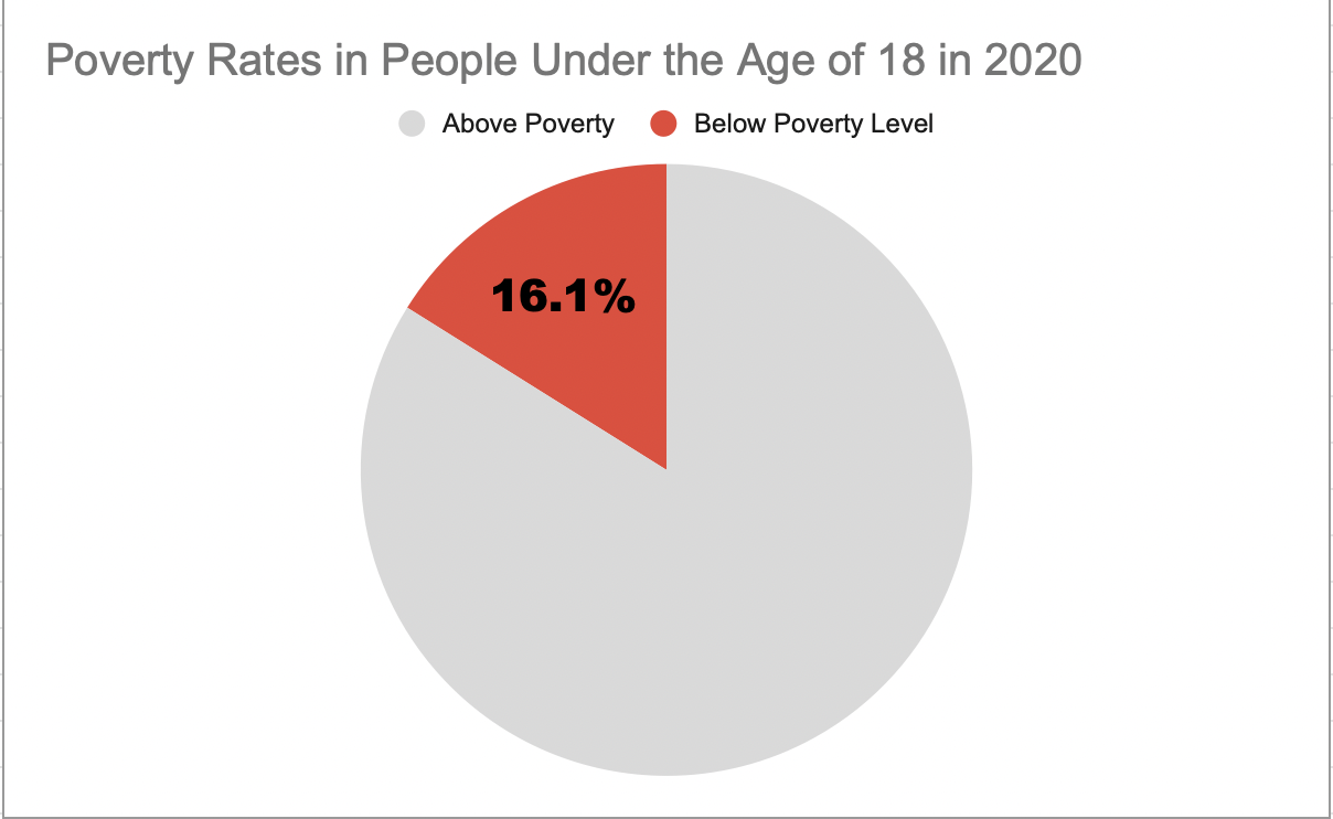
I believe this was a good example of data to use in a pie chart because it represents a part of a whole. Data like this I believe is perfect for pie charts. In this specific example, the whole is the US population under the age of 18 and the part is the percentage of those citizens who are under the poverty level.
This specific data I feel is best represented as a pie chart, however, the other data I found in the article I got this information from would have benefitted better from something like a line chart. That is because not only did this website tell me the percentage of minors under the poverty line, but it also told me that 2020 was the first time poverty rates have increased in the last 5 years. It would have been very beneficial to show the steady decline and sudden increase of poverty rates over the line chart. However, like I previously mentioned, for this specific data example I believe the pie chart was best.
As far as design choices I made for this chart, I chose to go with a bright color to highlight the important part of the chart. I also chose a muted grey color so the audience would focus more on the children in poverty. I also decided to only put the percentage of impoverished children to once again highlight the point of the chart.
This is the website I obtained my information from: https://www.census.gov/newsroom/stories/poverty-awareness-month.html
Abigail Moore
Pie Charts
Pie charts are great for displaying percentages or parts of a whole when it comes to data. Most likely, pie charts will be used when its based off of a percentage of 100. For example, I created a pie chart to present the household pets in New Jersey. Below you can see that of the households in New Jersey that have pets, we are looking at whether they have dogs, cats, or another kind of pet. Just by examining the chart we can see that the majority of households have some other kind of pet that is not a dog or cat. Then we see that the next biggest is dog, then cat.
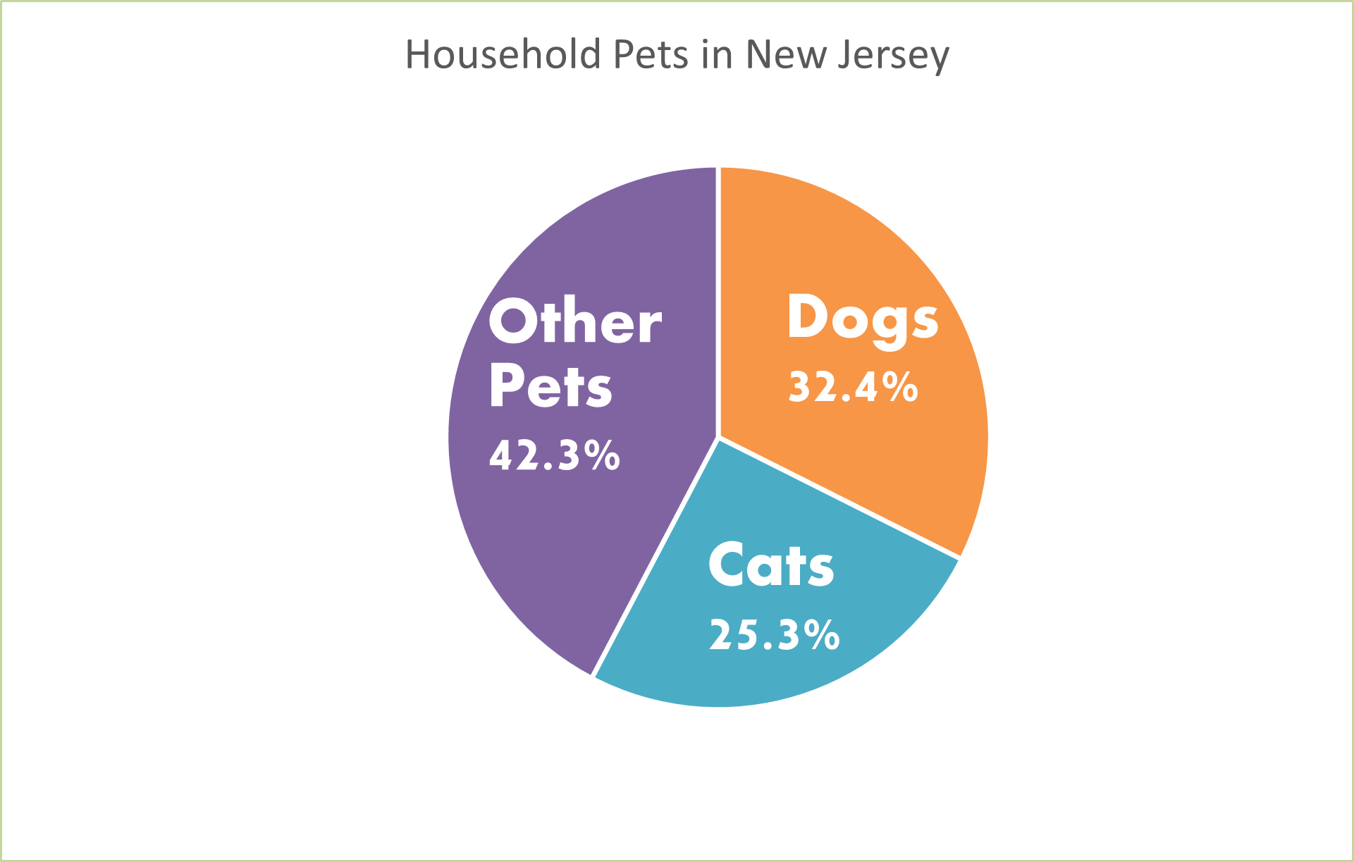
This information could also be displayed as a bar graph. We could have separate bars for each category but instead of using the percentages, we would use the real number of how many pets in each household rather than the percentage of each different pet in households. But since the numbers are very similar, I think that the pie chart is the best because it is showing percentages of each type of pet.
Pie charts are very easy to make on Microsoft Excel. You can make them unique by changing the color and style of them by making them 3d. You can add a legend and add the percentages to your chart as well. I like to add the percentages to my pie charts so your readers know what they are looking at and exactly what number is being displayed. Don’t forget when you create your pie charts to add titles and labels so your readers know what the pie chart is displaying.