Home » Designs
Category Archives: Designs
Pie Charts
What is a Pie Chart?
A Pie Chart is a common type of visualization that demonstrates parts of a whole. Each section represents a value in relation to the entire composition. The slices should be proportionate to the amount in each data set so that the viewer can compare each section by size to determine its value.
When should I use a Pie Chart?
A Pie Chart is a great visual for a part-to-whole relationship. It should be used when displaying the “percent of…” or “part of…” something. StorytellingWithData provides two primary use cases for a pie chart:
- having a general sense of the part-to-whole relationship is more important than comparing the precise sizes of the slices
- to convey that one segment is relatively small or large in comparison
The percentages should sum to 100% so that the visual is relative in size to its value.
The Perfect Pie
I created the “perfect pie” in Excel using 2024 Coffee Statistics by DriveResearch. I will break down what makes this a perfect use case as well as design tips for creating an effective pie. You can click on the image below to open my Excel spreadsheet.
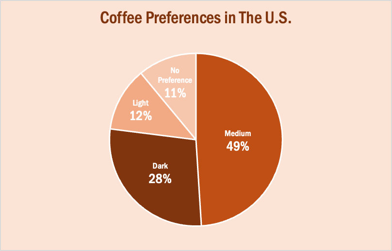
The data in this set is great for a pie chart because it equals 100% and one value is significantly larger than the others. It is also split up into 2-5 categories which is not too overwhelming for the viewer. The coffee preferences are all parts of a whole, making a pie chart the best choice over bar charts and other visualizations. To make it aesthetically pleasing to look at, I used different shades of brown throughout the entire chart which correlates with the coffee theme. I deleted the legend for a more minimalistic appearance, which the author of our textbook reiterates throughout each chapter. Because the values for Light Preference and No Preference are very similar, I added data labels to each segment so it is easy to comprehend. I also increased the font size for the numbers to make them stand out. Stephanie D.H. Evergreen suggests “unwrapping the pie” by making the largest slice start at noon and run clockwise in descending order (as seen above). When creating this chart, I was sure to avoid 3D and exploding effects in order to increase legibility. For more information, I suggest checking out this article on Tableau, which provides more examples of effective and ineffective pie charts.
Lollipop Charts
What is a Lollipop Chart?
A lollipop chart is another way to make lengthy bar charts less visually overwhelming. It is very similar to your standard bar chart, just without the “extra ink.” Instead of using a solid bar, the data is visualized using a lollipop shape (a thin line with a circle on top). After all, the main focus in a bar chart is the endpoint. The lollipop chart allows viewers to easily digest the data by focusing in on the values.
Examples…
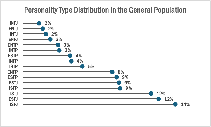
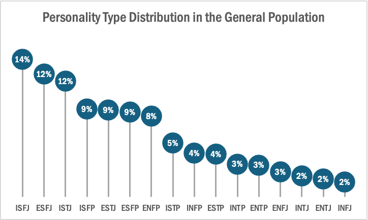
The two images above are examples of lollipop charts that I created. The data shows the percentage of each MBTI personality type within the general population. Lollipop charts can be both horizontal or vertical. The main point of the graph is to focus in on the endpoint values. I created my charts in Excel, and provided hyperlinks to my spreadsheet which includes my data and formatting. The vertical version was definitely easier to create. It only took a couple minutes, while the horizontal version had more steps and precise settings.
How to create a vertical lollipop chart:
- Insert a line graph with markers
- Delete the line
- Add Drop Lines
- Add data labels to center of markers
…and that’s it!
When to use a Lollipop Chart
A lollipop chart can be used for any kind of data that would work in a bar graph. It is simply an alternative that is more simplistic. Its “ink-friendly” design can impact readability of the data and lead to faster response times and greater accuracy (Gillan & Richman, 1994). It is especially useful when the visualization includes many data points that can become overpowering due to the solid bars.
Benchmark Comparisons
Some different ways people can show comparisons to a benchmark is through competitive, strategic, & performance. Competitive benchmarking is emphasized as the most effective form of benchmarking for businesses, allowing them to assess their true success by comparing themselves to competitors. It provides insights into industry trends and competitor strategies. To perform competitive benchmarking effectively, companies should establish clear goals and parameters and leverage digital tools for in-depth analysis, going beyond basic benchmarks like revenue and growth to gain a granular view of competitors’ data for more informed decision-making. Strategic benchmarking focuses on learning from industry leaders and best-in-class companies to understand their success and identify areas for improvement in your own business. It involves analyzing their business models and strategies to optimize various aspects of your own organization, such as marketing, online presence, or finances. Mobile app intelligence tools like Similarweb are highlighted as essential for gaining insights into mobile app trends and competitors’ strategies. Performance benchmarking aims to compare profitability and establish ambitious but achievable goals based on quantitative data comparisons, focusing on performance indicators like price, quality, speed, and reliability, ultimately driving continuous improvement.
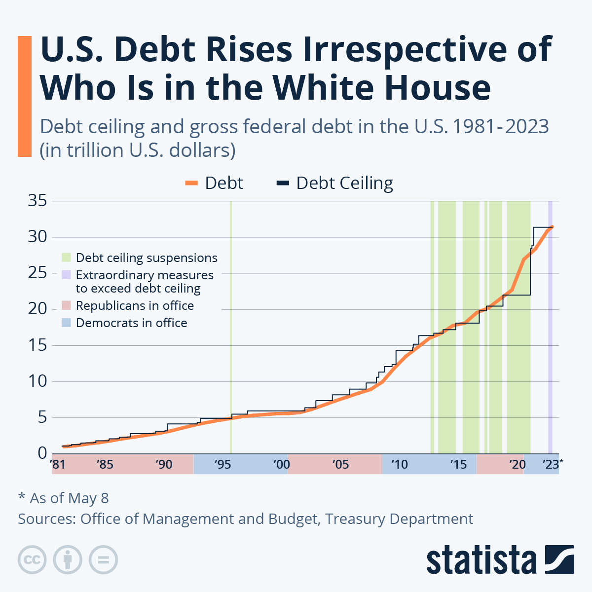
is this graph of the “U.S. Debt Rises Irrespective of Who Is in the White House” the benchmark is the debt. In this graph the numbers highlighted in blue at the bottom represent Democrats in office and red represents Republican. In this graph it shows typically it doesnt matter which group is in office because the debt rises no matter what.
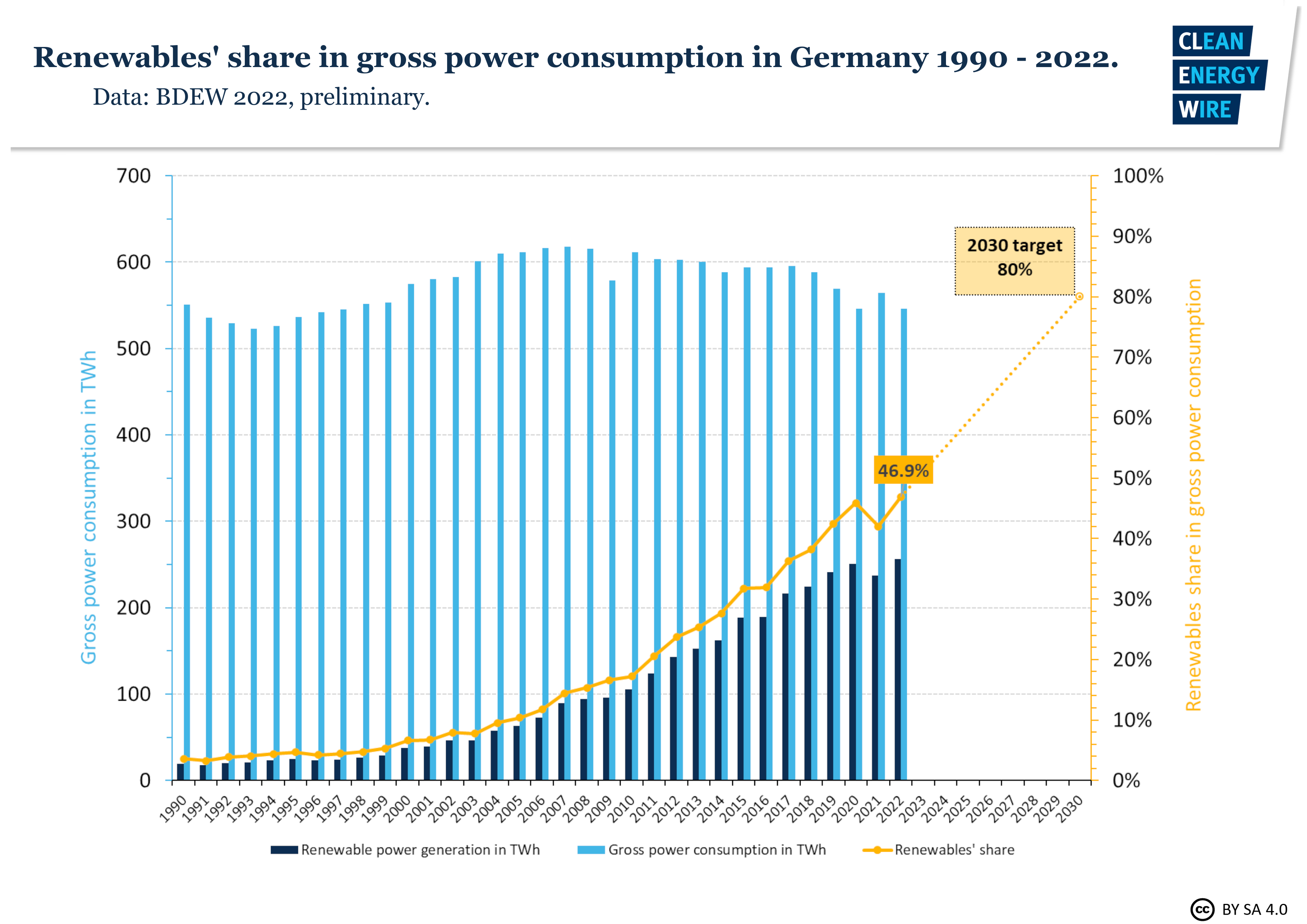
In this graph it shows Germanys power consumption throughout the years. The benchmark line is the yellow line indicating renewable shares. Germany is predicting that it will raise from 50% to 80% in the next 10 years.
sources
https://www.statista.com/chart/1505/americas-debt-ceiling-dilemma/
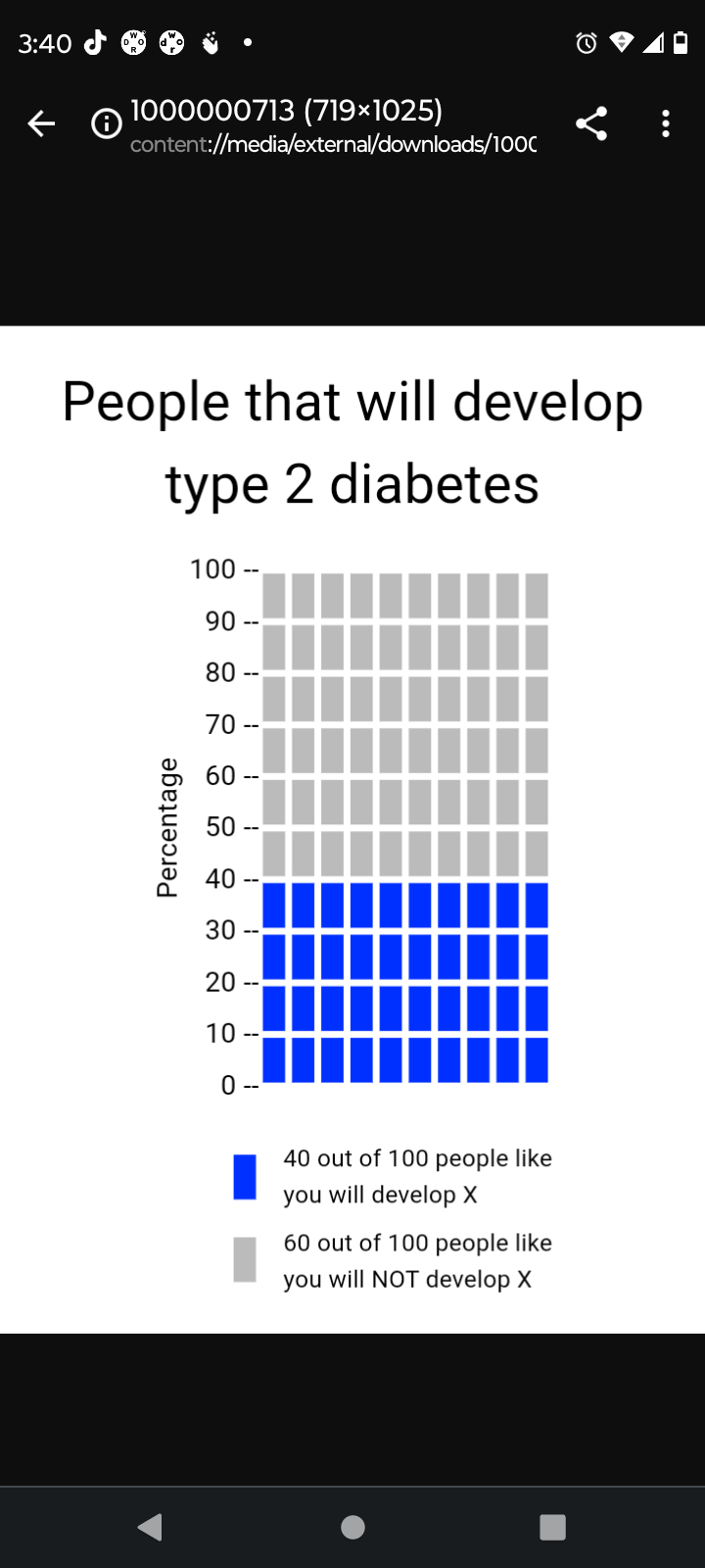
Using Visualization in Health
The implementation of visualization in health is a very crucial part in simplifying health literacy for the average individual/patient. This is especially true when one considers that patients come from many different cultures and backgrounds, all of which have an abundance of different languages. If done properly, a visualization transcends language barriers and cultural differences between a patient and a healthcare provider. With that being said, the Visualization in health website offers a variety of resources in order to create a proper visualization. To begin with, the website offers many different options for the types of graphs someone can use in order to measure a certain topic. There are disparities graphs and individual risk graphs which measure the likelihood of someone having a certain type of diseases/condition. There are also very simple risk graphs which can tell one their likelihood of contracting a certain type of disease based on the individuals health. As seen above, a simple graph was created in order to show the likelihood of someone contracting type 2 diabetes within their lifetime. The data being shown is very easy to understand and the graph properly conveys the values with proper labels. All of this was done in the span of 2 to 3 minutes and the features were very user friendly. People all around the world can use these features not only to see their likelihood of contracting a certain medical condition but also to find out what their current level of fitness is. All in all, this website can be used by both health professionals and regular patients in order to find out information and is a major part of data visualization.