Home » Data Sets
Category Archives: Data Sets
Benchmark Comparisons
Some different ways people can show comparisons to a benchmark is through competitive, strategic, & performance. Competitive benchmarking is emphasized as the most effective form of benchmarking for businesses, allowing them to assess their true success by comparing themselves to competitors. It provides insights into industry trends and competitor strategies. To perform competitive benchmarking effectively, companies should establish clear goals and parameters and leverage digital tools for in-depth analysis, going beyond basic benchmarks like revenue and growth to gain a granular view of competitors’ data for more informed decision-making. Strategic benchmarking focuses on learning from industry leaders and best-in-class companies to understand their success and identify areas for improvement in your own business. It involves analyzing their business models and strategies to optimize various aspects of your own organization, such as marketing, online presence, or finances. Mobile app intelligence tools like Similarweb are highlighted as essential for gaining insights into mobile app trends and competitors’ strategies. Performance benchmarking aims to compare profitability and establish ambitious but achievable goals based on quantitative data comparisons, focusing on performance indicators like price, quality, speed, and reliability, ultimately driving continuous improvement.
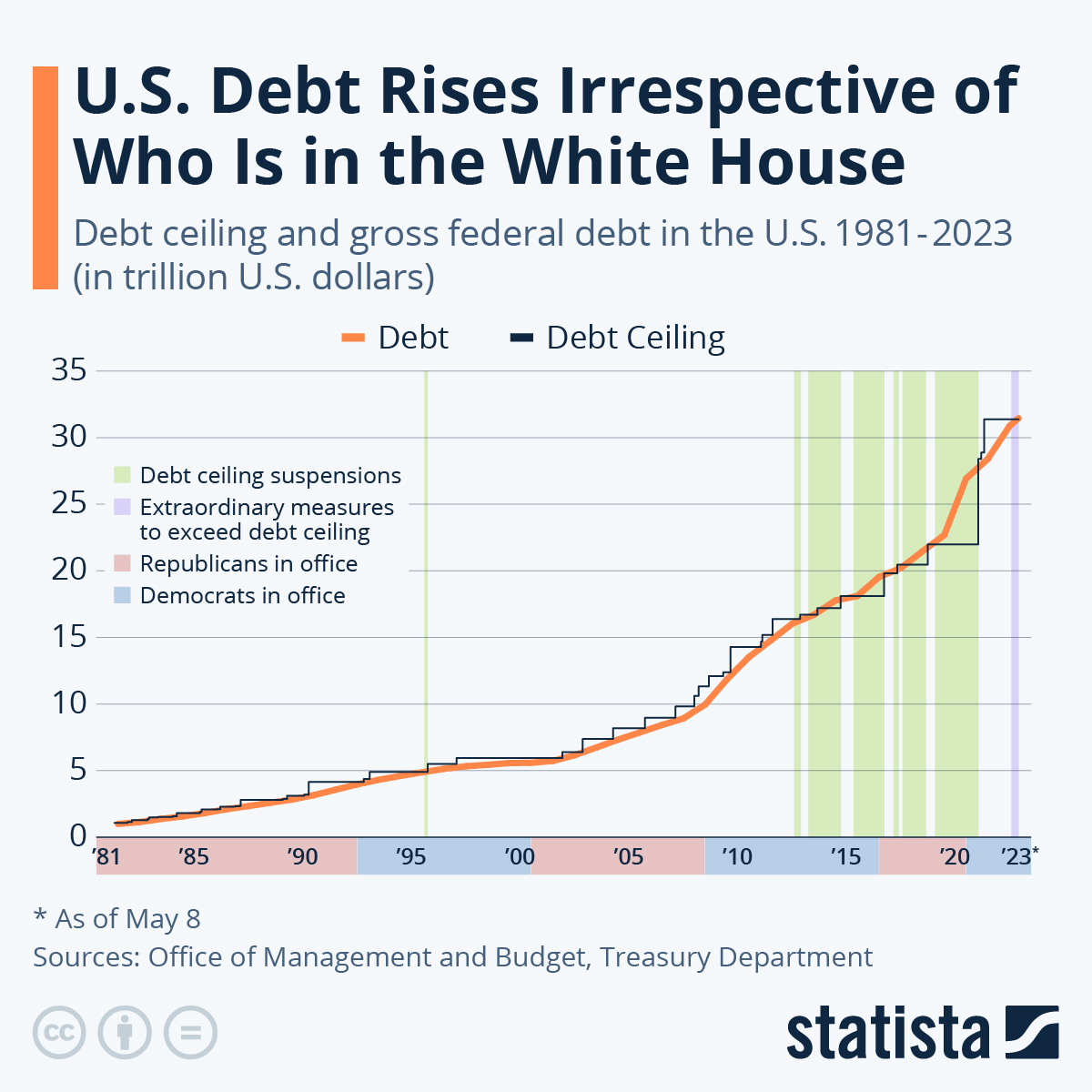
is this graph of the “U.S. Debt Rises Irrespective of Who Is in the White House” the benchmark is the debt. In this graph the numbers highlighted in blue at the bottom represent Democrats in office and red represents Republican. In this graph it shows typically it doesnt matter which group is in office because the debt rises no matter what.
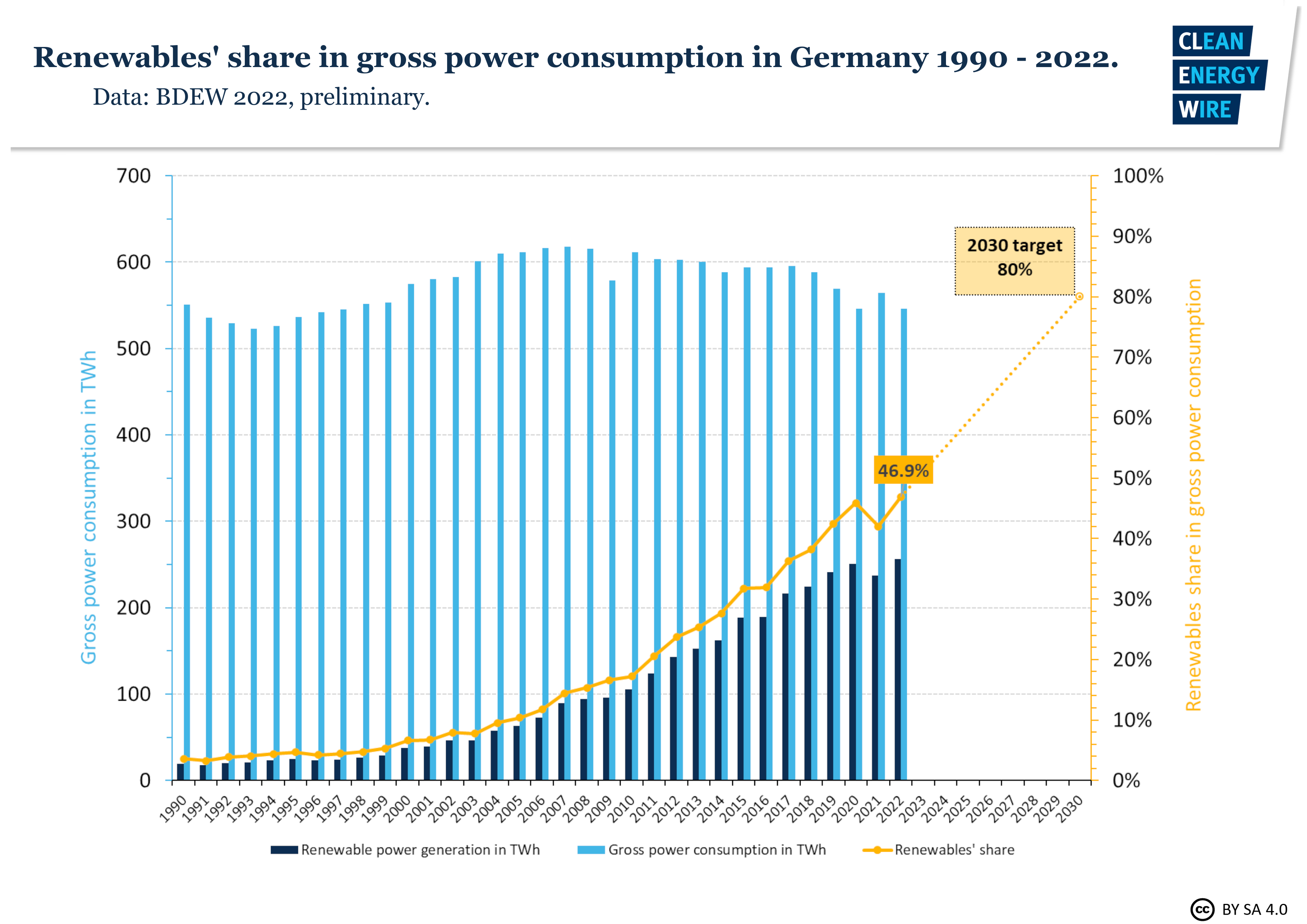
In this graph it shows Germanys power consumption throughout the years. The benchmark line is the yellow line indicating renewable shares. Germany is predicting that it will raise from 50% to 80% in the next 10 years.
sources
https://www.statista.com/chart/1505/americas-debt-ceiling-dilemma/
Useful Dataset Repositories for Information Visualization.
With the overwhelming of data to sort through to begin working on your infographics, choosing where to start can be daunting. Here are a few websites to get you started:
UC Irvine Machine Learning Repository
Link: https://archive.ics.uci.edu
UCI Machine Learning Repository is a free repository of datasets purposed for machine learning, maintained by UCI. With over 600 datasets excellently catalogued this website has excellent datasets to work from and build ideas if you’re unsure where to start.
If you’re unsure where you want to start and you want a well curated dataset to start off with.
Kaggle
Link: https://www.kaggle.com
Kaggle is a similar resource to the UCI Machine Learning Repository, in that it is also a repository geared to machine learning and A.I. applications, but the breadth is much greater as it is not as well curated as the UCI collection.
Perfect if you have a good idea of the type of data you’re looking for.
Data.gov
Link: https://data.gov
Data.gov is the United States government’s free and open repository featuring data collected from census, state and lower governments, and other various agencies and bureaus from around the country.
Great for information directly related to statistics regarding state and national characteristics.