Home » Benchmarks (Page 2)
Category Archives: Benchmarks
Benchmark Comparisons
When I look at data one of the most important concepts for me is relativity. What does that data mean relative to other data? When we look at relative data, we begin to really see the story of that data in the context that defines it. Benchmarking is a standard or point of reference by which data can be compared. Benchmarks represent a significant portion of data representation in many fields and can assist in the application of productivity concepts such as performance and service.
One of the most common benchmarks that we see often is financial benchmarks, specifically related to the stock market. People go to many different news sources to check on their investments but you will see charts that look very similar on every site. This graph shows the performance of Home Depot stock in the past year.

https://www.wsj.com/market-data/quotes/hd
This graph shows the performance of Home Depot stock compared to the benchmark set by the S&P 500:

https://www.wsj.com/market-data/quotes/hd
While HD is up 2.99% in the past year, it is not doing great when compared to the benchmark performance of the S&P 500, which is up 18.99%.
A New York Times article exploring the effects of pandemic school closures on the math scores of students showed some interesting results. In 2019 there was a distinct pattern between the students in wealthier districts scoring above average on math tests.


In 2012 there was a shift in all scores across the board. This change happened amongst all income levels and racial groups.

I enjoyed this article and the benchmarks showed that even though the researchers did not find the results that they had expected, they presented the data because it was quite remarkable. They had assumed that the children in poorer districts and minorities would have been even further behind benchmarks but the data showed otherwise. When data is presented that is the opposite of initial assumptions I find it more interesting because it shows the importance of data science and visualization. Without data we are left with assumptions…which are sorely lacking.
Benchmark Comparisons
Some different ways people can show comparisons to a benchmark is through competitive, strategic, & performance. Competitive benchmarking is emphasized as the most effective form of benchmarking for businesses, allowing them to assess their true success by comparing themselves to competitors. It provides insights into industry trends and competitor strategies. To perform competitive benchmarking effectively, companies should establish clear goals and parameters and leverage digital tools for in-depth analysis, going beyond basic benchmarks like revenue and growth to gain a granular view of competitors’ data for more informed decision-making. Strategic benchmarking focuses on learning from industry leaders and best-in-class companies to understand their success and identify areas for improvement in your own business. It involves analyzing their business models and strategies to optimize various aspects of your own organization, such as marketing, online presence, or finances. Mobile app intelligence tools like Similarweb are highlighted as essential for gaining insights into mobile app trends and competitors’ strategies. Performance benchmarking aims to compare profitability and establish ambitious but achievable goals based on quantitative data comparisons, focusing on performance indicators like price, quality, speed, and reliability, ultimately driving continuous improvement.
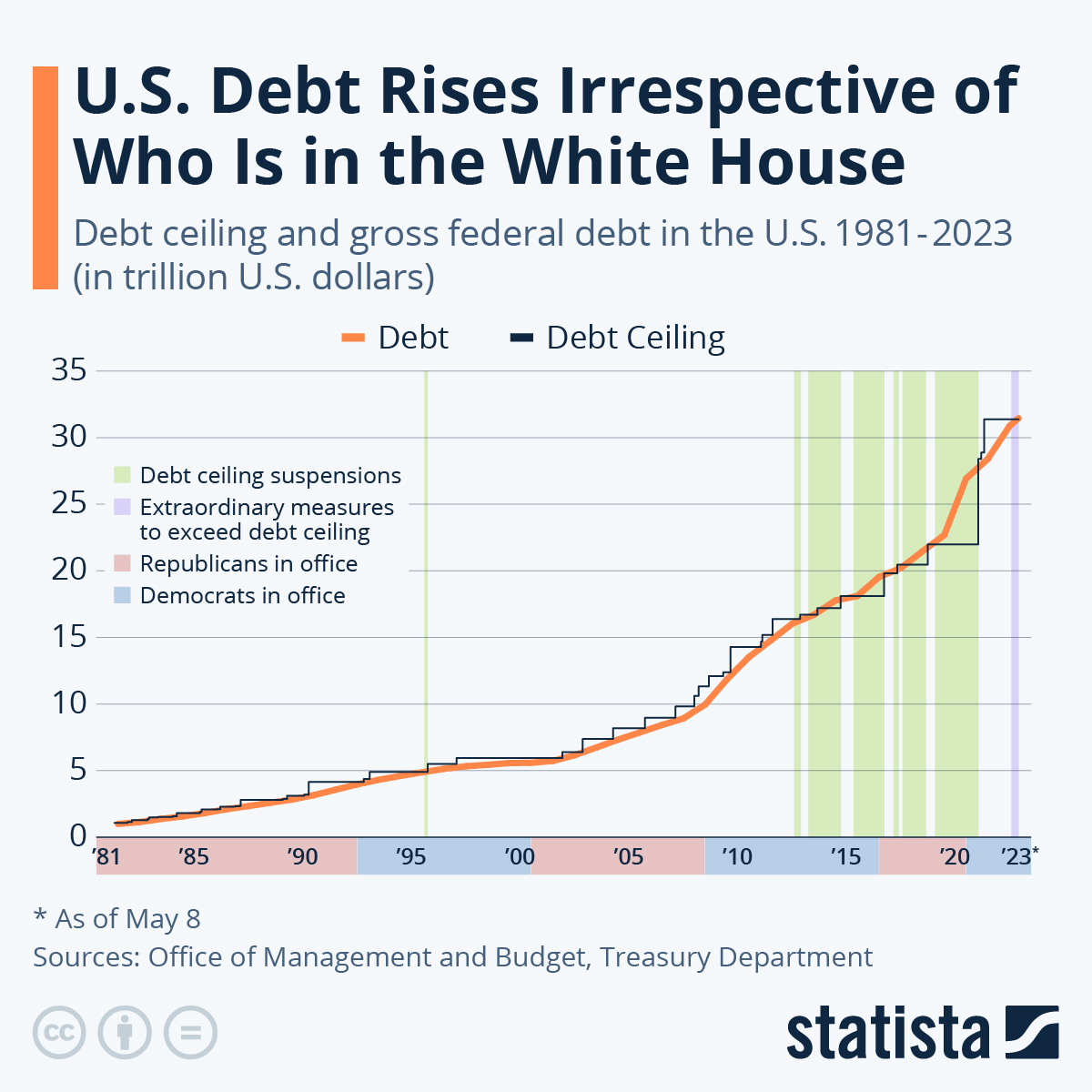
is this graph of the “U.S. Debt Rises Irrespective of Who Is in the White House” the benchmark is the debt. In this graph the numbers highlighted in blue at the bottom represent Democrats in office and red represents Republican. In this graph it shows typically it doesnt matter which group is in office because the debt rises no matter what.
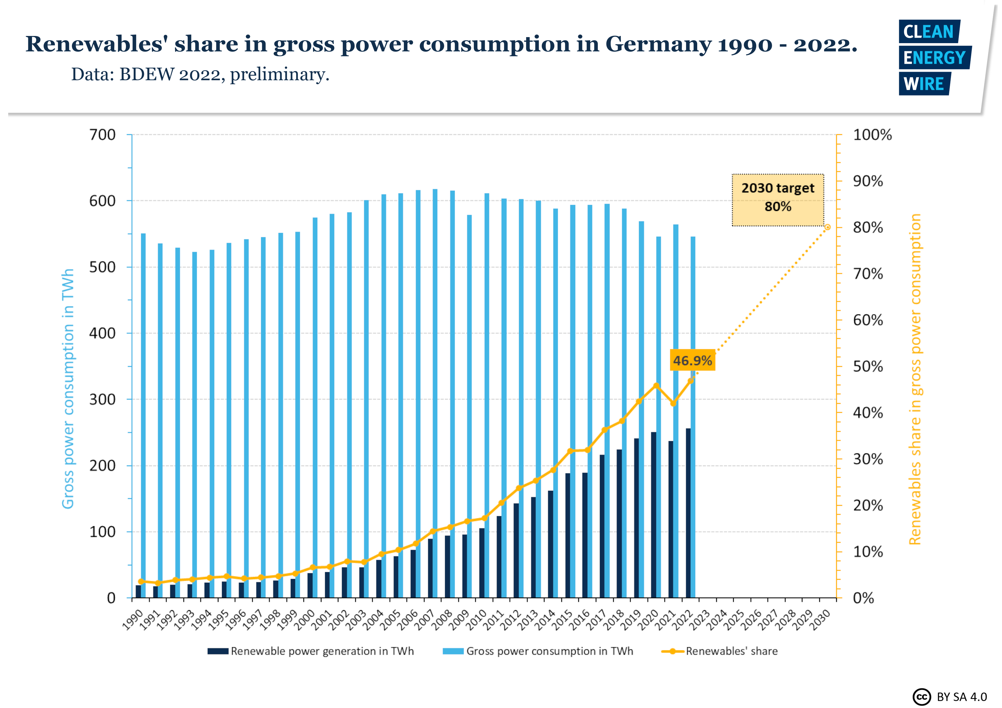
In this graph it shows Germanys power consumption throughout the years. The benchmark line is the yellow line indicating renewable shares. Germany is predicting that it will raise from 50% to 80% in the next 10 years.
sources
https://www.statista.com/chart/1505/americas-debt-ceiling-dilemma/
Benchmark comparisons
According to Merriam-Webster, a benchmark can be defined as something that serves as a standard by which others may be measured or judged. There are several benchmarking techniques used by businesses and individuals around the world. A few examples are benchmark lines, combo charts, overlapping bars, et cetera.
In this post, I am going to discuss how others use benchmarking techniques. The first example discussed in the blog highlights the use of line graphs to compare the performance of a stock to the S&P 500 (the industry average). The second example compares Arizona valley’s fire response time. Benchmarking can also help organizations identify areas, systems, or processes for improvements—either incremental (continuous) improvements or dramatic (business process re-engineering) improvements
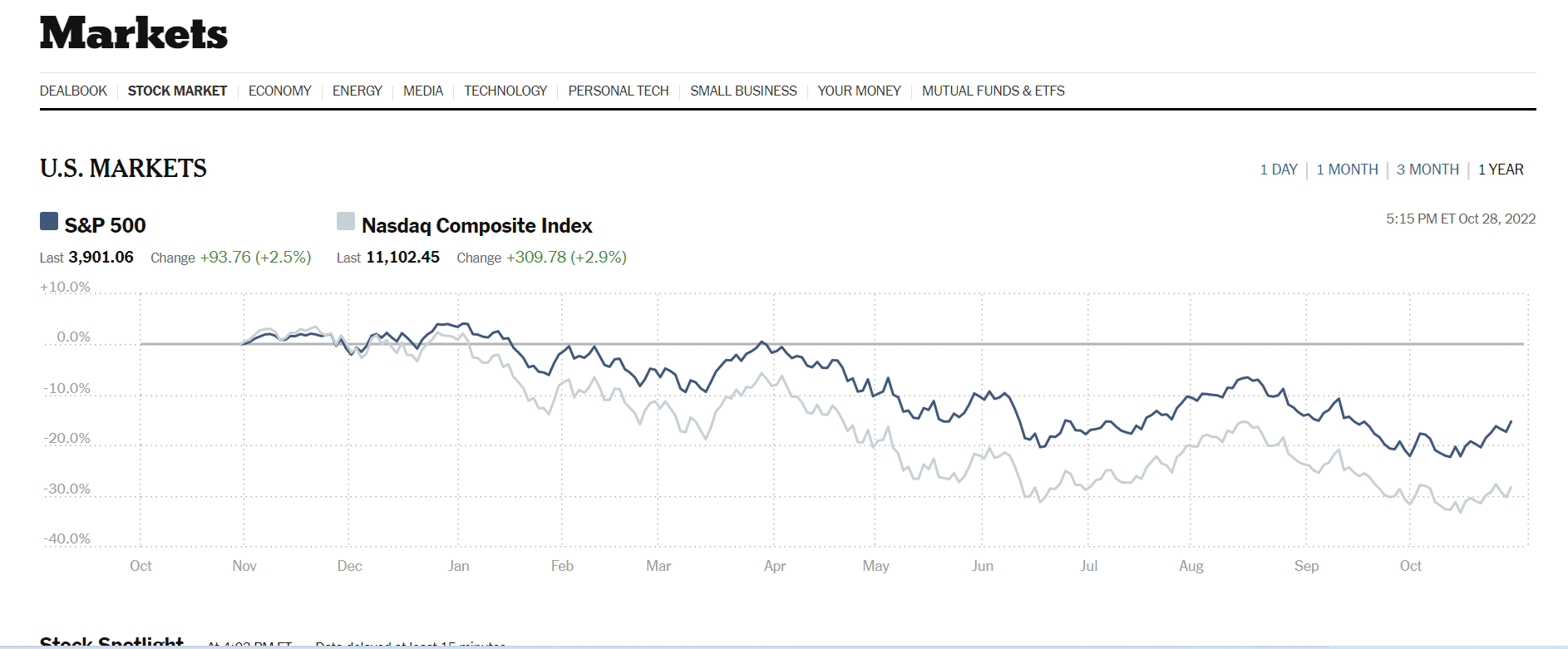
The data visualization above was sourced from The New York Times‘s website. Two line graphs are used to show how Nasdaq composite Index compares against the S&P 500. The S&P 500 acts as the industry benchmark. From this visualization, it is clear to see NASDAQ stocks are more volatile than the S&P 500. This helps investors to make informed decisions about their investments.
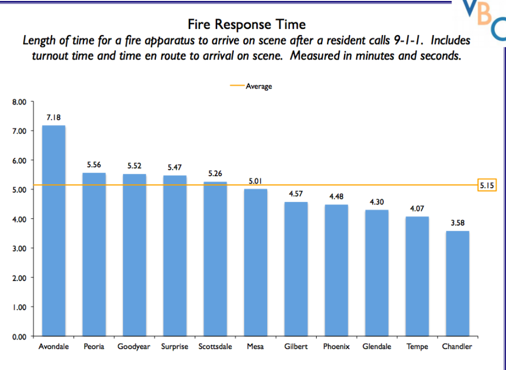
The author of this post uses external benchmarking to compare fire response times across multiple jurisdictions. Adding a benchmark line to a graph gives loads of content to the viewer. You can easily see that the benchmark mark response time for all the categories is 5.15 seconds. Several jurisdictions showed up minutes after the benchmark time while other categories also showed up before the benchmark time. A combo chart is used when each category is compared to a different benchmark
Benchmarking
By Emmanuel Mattey
A benchmark is used to display relative performance and allows readers to compare data. Benchmarking is typically useful when you want to compare the performance against a certain average or a certain standard.
For example, the graph below compares winter temperatures in the US from the 1900s to 2018 to the 20th century average temperature. The graph shows that on average, US winters are getting warmer
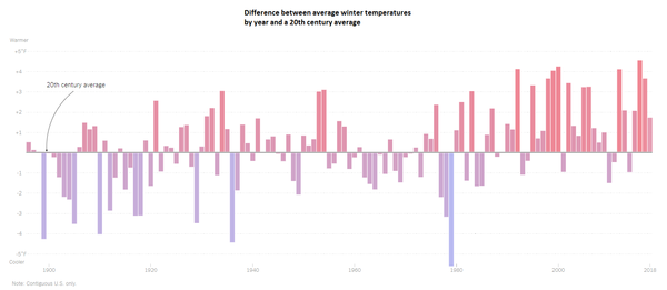
Source https://www.nytimes.com/2019/01/17/learning/whats-going-on-in-this-graph-jan-23-2019.html
The second graph also shows that oceans are generally getting warmer. It also shows both deep and shallow ocean warming and it demonstrates that the shallow part of the ocean, that is the portion of the ocean closest to the surface is heating up at a faster rate than the deeper part of the ocean.
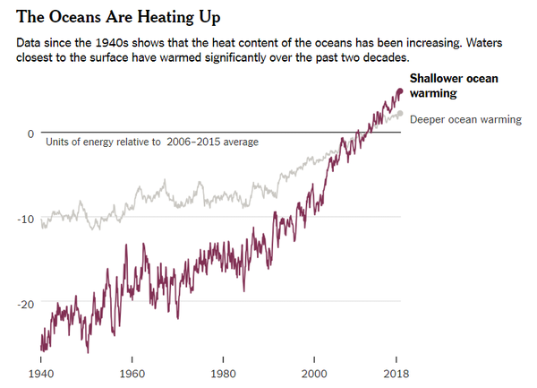
Source: https://www.nytimes.com/2019/01/10/climate/ocean-warming-climate-change.html
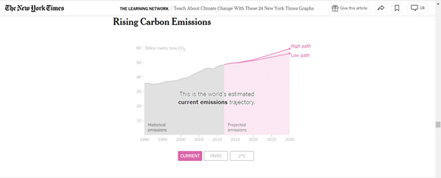
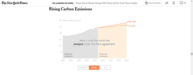
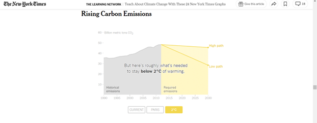
The final 3 graphs discuss global carbon emissions. In the first infographic, we see past emissions and projected global emissions. The second infographic compares historical emissions with the pledges that were made under the Paris agreement on climate change and the third one shows what actually needs to be done to keep global warming under 2 degrees by 2030. By comparing all 3 graphs, one will notice that both the Paris agreement and the projected emissions contain higher emission levels and this means that by 2030, global warming would have exceeded 2 degrees Celsius and the impact of global warming and climate change will get worse.
Benchmark Comparisons
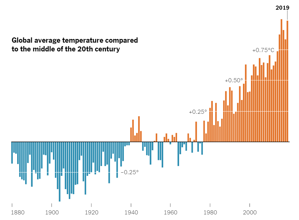
Here is a chart that uses a benchmark to show the varying global average temperatures. The benchmark is used along the x axis at 0 degrees Celsius. The blue lines represent the average temperature for that year, and it falls below the average global temperature of the middle 20th century. The orange lines represent the years with the average global temperature being above the average global temperature from the middle 20th century. As you can see, there is a general increase in global average temperature over the years. A benchmark is very effective here because it splits up the data into two groups. The years that fall below average, and the years that are above average. The trend of rising global temperatures is easily seen here, making this a very effective infographic.
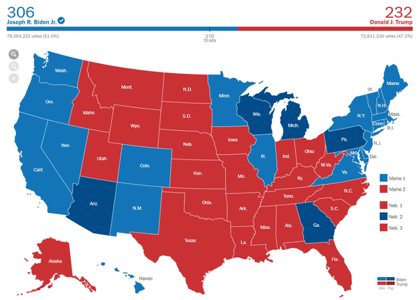
Here is another infographic that uses a benchmark in a different way. This is the 2020 presidential election map. The benchmark is shown above the map. It says “270 to win”. This means that 270 electoral college votes are needed in order to win the race. 270 is the benchmark. Joe Biden exceeded this benchmark, and Donald Trump failed to reach the benchmark. Therefore, Joe Biden won the election because he passed the benchmark. On the graph, you can see that Joe Biden passed the benchmark through color coding. Joe Biden is blue, and the blue line passes the benchmark of 270. This is a very effective infographic that uses a benchmark in a unique way. As shown by these two examples, there are many different ways to use benchmarks, and there are many different forms of benchmarks.
Benchmark Comparisons
This blog explains the comparisons that I found The New York Times uses with their benchmark graphs. My comparison is based on the 2022 Presidential Election Results. News companies tend to use benchmark graphs to explain Presidential and political races. It shows the number needed to be elected, along with each state’s final vote. 2020 was a unique situation because there were multiple recounts for the final voting results, which is shown on the map graph below.
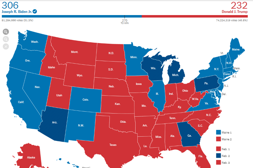
This benchmark represents 270 points needed for one of these competitors to win the overall election. Even with the recount of multiple states, multiple times, there was still a winner, which is our current President, Joe Biden. He was elected with 74 more points than former President Donald Trump.
Benchmark Comparisons
By Nick Ligameri
Today we are going to take a look at different ways you can use infographics to show comparisons to a benchmark. According to Google, benchmarking is when you “evaluate or check (something) by comparison with a standard.” There are many benefits and reasons to benchmark. According to bbgbroker.com, benchmarking is useful because it shows you how something stacks up against competitors, improves efficiency and effectiveness, allows you to track the progress of goals and objectives, and discover new growth opportunities. The results can be used to motivate staff and hold people accountable, boost the performance of sales, and improve the quality of products.
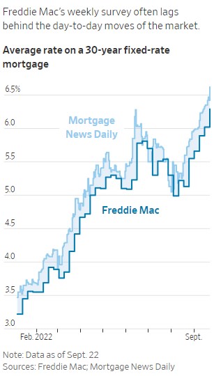
The first benchmark we are looking at is comparing Freddie Mac’s weekly mortgage rate survey compared to the actual daily mortgage rates. The Wall Street Journal utilizes line graphs to show the data. This infographic is powerful because you immediately see that Freddie Mac’s data always lags the actual mortgage rates. This is important because if you are in the market to buy a house, you want to have accurate mortgage rates. If you use old data that is up to a half percentage point off, that could lead to thousands of dollars difference in what you think you can afford compared to what you can afford.
The Wall Street Journal points out a few reasons that Freddie Mac’s data is lagging behind the actual data. One reason is that, right now, the housing market is extremely volatile. Historically, mortgage rates do not move as quickly as they are now. A weekly benchmark was usually a good measure of the market. Because the market is more volatile, there is a need for a more accurate benchmark. Another reason for the lag in data is that reported mortgage data is usually about a month behind what is happening. This is because it takes between thirty and forty-five days for a home purchase to close.
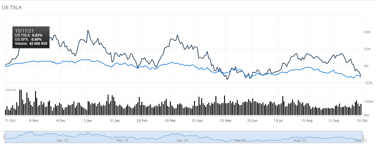
Another use of a line graph benchmark is this one that compares Tesla to the S&P 500. This is more straightforward. If you’re an investor who is looking to outperform the market, this is a useful tool. Using Barron’s comparison tool, you can see how different stocks compare to the index of your choice. You can change the range from the most recent day to all of the historical data available for the stocks you are comparing. This chart shows that, over the last year, Tesla has regularly performed better than the S&P500. Tesla may be a stock you would want to invest in.
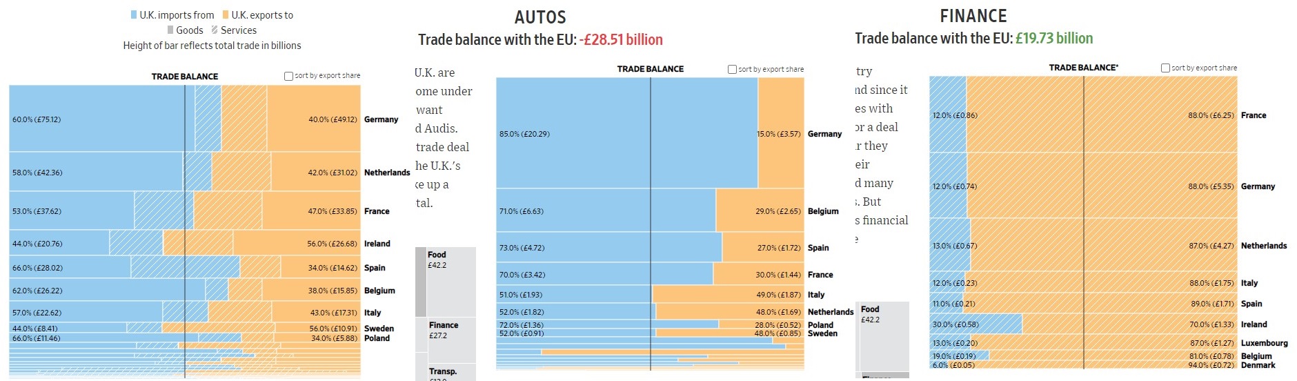
The next type of benchmark chart we will be looking at is a horizontal bar chart. This one is a bit different because instead of showing how something compares to a standard, it is showing parity between two different things: imports and exports. The “benchmark” here is the balance between the UK’s imports to the EU compared to its exports to the EU. A glance at the first chart shows that, overall, the UK imports more than it exports. A deeper dive shows how the UK imports and exports compare in different industries. The next graph shows that the UK heavily imports automobiles from different countries. The last chart shows that the UK provides a lot of financial services to the EU. The practical use of these graphs would be to show where the UK could improve its exports if it wishes to be less reliant on its neighboring countries.
There are many different ways to show a benchmark. The line chart is probably one of the most common in business. The horizontal bar chart shown here is a bit different from the norm and I liked how you can quickly understand what you are being shown. You can also gather a lot of information and make many different decisions based on how you break down the data. Hopefully, this helped show you some of the many uses of benchmark graphs.