Home » Benchmarks
Category Archives: Benchmarks
Benchmark Comparisons
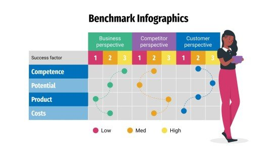
Visual components are used in comparison infographics to compare two or more objects, such as ideas or products. They may be a useful tool for assisting individuals in the comprehension of difficult facts and making reasonable choices. By comparing a company’s operations to other businesses’, benchmarking infographics can help find areas for growth. Benchmark graphs illustrate how various groups, like nations or businesses, perform against one another by comparing statistics. For example in the image shown below, benchmark comparisons assist in evaluating the performance and quality of products, goods, and industries as well. As shown below through a series of procedures and tests, you can find out if your system is operating at peak efficiency or whether there are issues that need to be fixed.
Infographics may be used in a variety of ways to display comparisons to a benchmark. Comparison infographics are frequently used by marketers when comparing a competitor’s product against their own. A great way to compare two items directly is by using comparison infographics. Utilizing a range of charts while choosing the appropriate chart and including visual features are some strategies for using infographics to display comparisons to a benchmark. To illustrate how a topic performs when compared to several groups, use a scatter plot with a solid benchmark line, a stacked bar chart, or a pie chart to compare portions of a whole. An infographic may display several kinds of information using a variety of chart formats. A table can be used to arrange information so that readers can look it up, or a numbered list can be used to indicate rank or order. Infographics demonstrate relationships between data, procedures, or individuals through the use of visual components.
Benchmarks and Electric Cars
The graph containing a benchmark that I wanted to look at was this one from the New York Times focusing on electric vehicle sales in the US, excluding Tesla. Tesla has been excluded from this graph since they are far and away in first place, with 140,187 vehicles sold in the first quarter of 2024. For comparison, this is seven times larger than Ford, who is in second place with 20,000 vehicles sold Q1 2024.
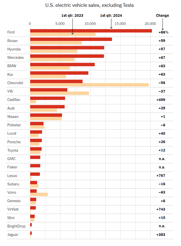
This visualization has a different benchmark for each company. The benchmark is their performance one year prior, in Q1 2023. Benchmarks are commonly represented as a line, but since each company is being compared to a different data value, they opted to represent the benchmarks as lighter colors that do not detract from the current year’s data. Using a dark red for current data catches the eye. It sticks out more than the old data, ensuring that there’s a clear distinction and the bars don’t fight with each other for clarity.
Overlapped bars could have been used as well, but I think I understand why the author opted not to. With 25 companies in this chart, overlapping the bars could lead to a lack of whitespace. All in all, this graph is a wonderful representation of its data. I’d also like to note the fact that this is a horizontal bar graph instead of a vertical one. With so many data points, it becomes hard to label the data in a way that preserves readability. Vertical bar charts such as this one help to alleviate that issue.
Benchmark Comparison
Benchmarks in graphs provide a reference point, allowing viewers to quickly assess how data compares to a standard goal or historical average. They help to contextualize values, which highlights trends or performance gaps. By including benchmarks in graphs, data visualizations become more informative, making it easier to interpret progress, identify outliers, and support information assessment at a glance.
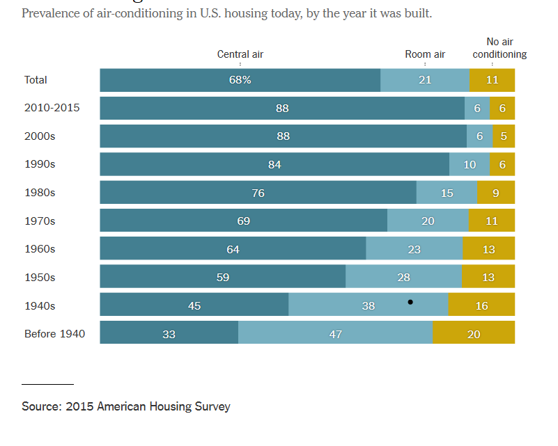
The graph below depicts the change over time of air conditioner use within residential buildings. By constructing this informative graphic using bars, the data can easily be assessed even by those who are not adept at data analysis. The topmost bar shows the benchmark for central air, room air, and no air conditioning while the bars below show a breakdown of each category in 10 year increments. The use of stacked row bars and a clearly separated benchmark lend to an organized, easy to read graphic that allows viewers to clearly determine the difference of each category over time. By visiting this article, you can read more about the changes in air conditioner use over time.
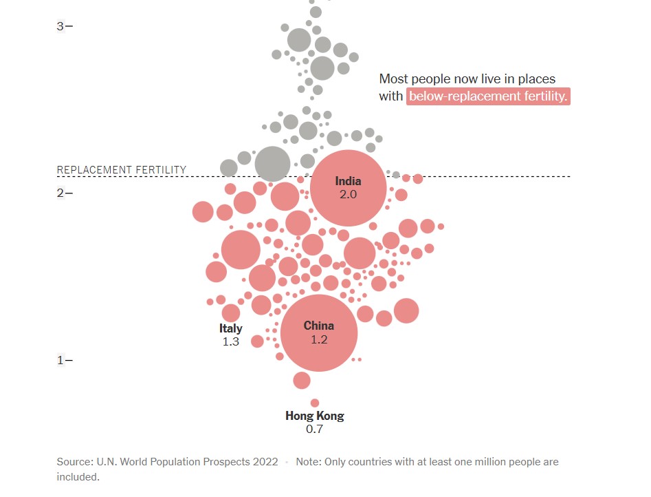
The next graph, found below, shows a comparison of countries (with populations over one million) and their replacement fertility rates. While there are only a few markers that have labels attached to them, population size is indicated by the size of the circle used to represent the country. This is not only a visually pleasing detail in this graph, but it is a simple and effective way to offer knowledge to the viewer without overcomplicating the graph. In this graph, the benchmark is displayed in the form of a dashed line with a label. This shows a clear indication of which countries fall above or below the benchmark for replacement fertility rate. Additionally, the coloration of the country markers help to indicate which countries are below the benchmark, even if it appears that they are touching it. To read more about population growth and decline, follow this link.
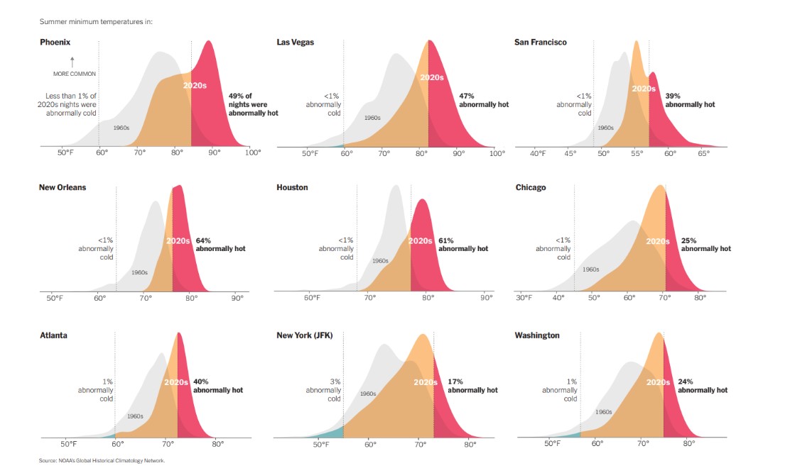
Another use of a line as a benchmark can be seen below in various graphs used to compare summer minimum temperatures in different cities across the United States. By utilizing vertical solid lines to show boundaries of where outlier temperatures are located, density plots are able to be used to properly display the temperature information for each city. Not only are solid vertical lines used, but temperature data from previous years are displayed as a benchmark to show the difference between summer temperatures in the 1960’s compared to 2020’s. There are additional graphs and information to compare climate change over time at this webpage.
Benchmark Comparisons
Lamar Miller
Here you will find a visual on phone phishing data. This visual uses the dashed line to indicate the benchmark for the industry. The visual goes on further to use stacked columns to indicate the different ways phishing can be delivered. The dashed line is a good way to show a benchmark because it is simple and stands out on a visual without a need for additional labels. Not using a solid line also allows a viewer to quickly interpret that it is intended to stand out and be different than the other lines in the visual.

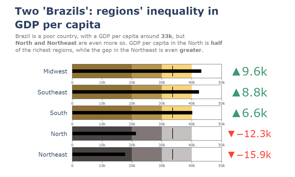
Here you will find a horizontal bullet chart depicting a comparison between North and Northeast Brazil GDP per capita while also indicating where the other regions stand. The benchmark is represented as a target line of 33k which can be easily interpreted. The visual goes on to show the gap in GDP by region.
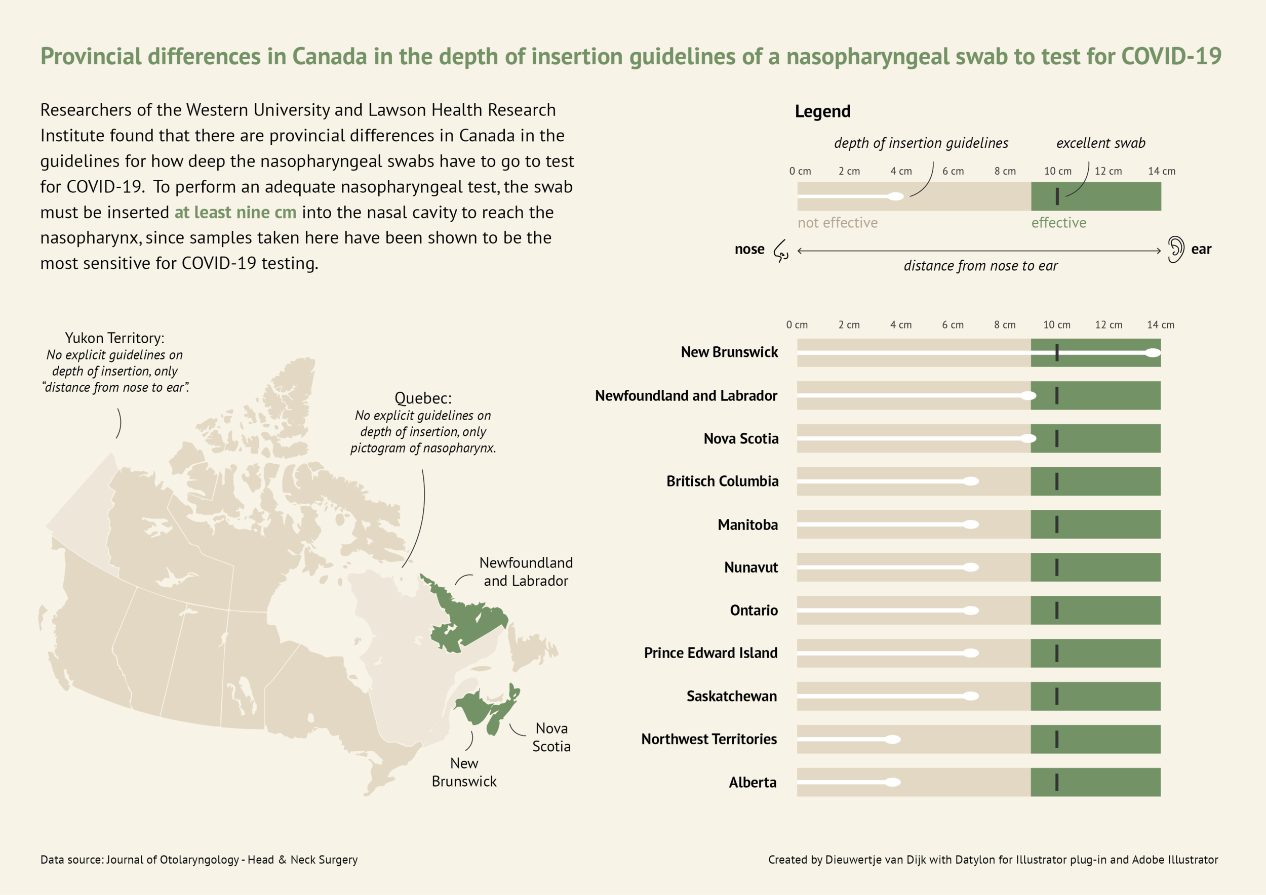
Here you will find a more in-depth horizontal bullet chart. I like this visual as it combines not only elements of a benchmark visual but incorporates other visual elements and really tells a story. This chart also uses target lines depicting the provincial differences in Canada regarding nasopharyngeal swab tests of Covid-19. The benchmark is indicated as 10cm in depth for the most effective swab.
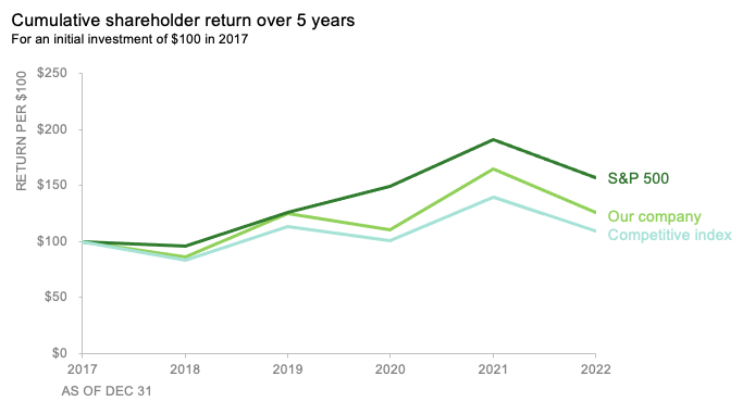
Here you will find a line graph with benchmark lines. The lines are represented as the competitive index and S&P 500 index versus their company. This chart incorporates two comparable benchmarks for a viewer to interpret against their trend. The visual shows the cumulative shareholder return over 5 years on an initial investment of $100 back in 2017. This chart is quick and to the point and provides an audience with just enough data to compare.
Benchmark Comparisons
This week we review Chapter 4 in our textbook, Effective Data Visualization, which goes over the importance of including a benchmark in our visuals. Benchmarks are extremely important because without that context, we limit the amount of information we can pull from a graph. Adding benchmark information clearly displays what the data is being compared to. This simple detail allows the viewer to easily determine whether performance was good, bad, or close to the mark.

This graph from The New York Times shows the monthly global temperature compared with preindustrial levels. The benchmark on this graph is the data for the year 2023, and the other years since 1940 are what is being compared to the benchmark. Just by quickly looking at this visual we can tell that global temperatures were much lower in previous years than in 2023. This benchmark stands out because the line is a darker color and much bolder than all of the others. This visualization is highly effective because the years prior to 2023 are a lighter opacity and color. The creator also only included data labels for the points in 2023.

Another graph from The New York Times displays the daily average sea surface temperatures. This visualization also includes a benchmark to help viewers easily process the data being shown. The gray dotted line, representing the average temperatures from 1991-2020, is the benchmark in this data. The blue line is the most current information which is being compared to the benchmark. In this graph we see that the temperatures in 2023 are much higher than the average between 1991-2020.

Lastly, this graph of Antarctica’s sea ice mass shows that levels in 2023 are much lower than the average from 1979-2010. The gray dotted line is the benchmark, while the red line is the data being compared. While this visualization is still effective, I believe the previous two were better. This is because the gray dotted line is not as prominent as the benchmarks in the other graphs. It gets lost in the data and takes a second for the viewer to notice it is there. Making the benchmark line a different color would help make it stand out.
Benchmarks and Economics
The United States economy and stock market like many other countries is driven by forecasts and hitting those expectations also considered to be benchmarks. In addition, most economies are dependent on how other countries economies are performing as we operate primarily in a global economy where the news and events of one country directly impact other countries. Forecasts act as benchmarks for particular data news such as consumer price index (CPI), producer price index (PPI), job creation numbers and unemployment rate to name a few. This forecasts act as targets and if the news comes in above or below expectations this can create volatility in the markets.
Above is a chart of the unemployment numbers represented as percentages. Each month the forecasts are created by analysis displayed as the gold bar. The actual number is the blue bar. When major news is released it is typically released at 8:30am EST an hour before the New York Stock Exchange opens. This is important as this will influence in what happens in the market that day and how it affects long term trends. A majority of people save for retirement by investing in 401ks, IRAs, and other retirement plans and the numbers being released give you a read on the pulse of the economy. These negative reactions can create downward pressure on the markets and lead to losing money or having diminishing returns on those accounts.
Another way benchmark performances are evaluated is by comparing a particular stock versus an index fund that is similar to the underlying stock. Take a look at the chart below.
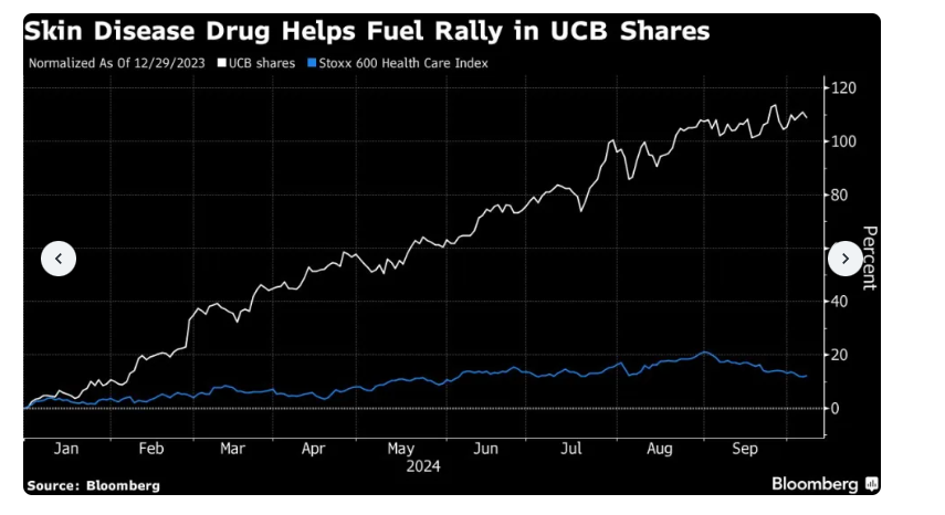
The chart above uses line graphs to compare ticker symbol UCB versus the Stoxx 600 Health Care Index. This shows that the shares of UCB has outperformed the index significantly. This largely is because of their release of a drug to treat psoriasis. This is important when managing funds and rotating different investments to receive the highest return possible.
Benchmark analysis is a critical component to not only our economy but the global economy. By being able to accurately evaluate the data it can help make informed decisions. There are different ways to display benchmarks but all are important when understanding the data and how to evaluate it.
Benchmark Comparisons for Phones
By Kevin Barksdale, in Benchmarks on October 2024
Introduction
In the cutthroat Smartphone market, any major parameter such as performance score, battery backup or market share comparison gives the users or manufacturers an idea of how a particular device fares against the other. These visualizations can be in any form of bar graphs, line graphs or the radar graphs depending on how the various phones are placed in relation to the standards or competitors.
Smartphone Performance Benchmarks
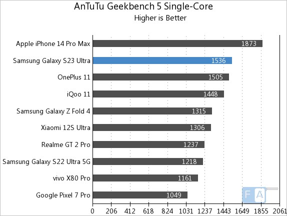
One common way to compare phone performance is through benchmarking software scores such as those from Geekbench or AnTuTu. A bar chart is often used to compare models, with the benchmark score indicated as a horizontal bar across the chart. In the example below, phones like the iPhone 15 and Samsung Galaxy S23 are compared against an industry benchmark score.
Battery Life Comparison
In this line chart from Tom’s Guide, various smartphones are compared based on battery life measured during standard tests. The benchmark is the industry-standard average, indicated by a dotted line. Phones that exceed this benchmark, like the iPhone 14 Pro Max, are shown above the line, while those with below-average battery life fall below it. This visualization allows consumers to easily spot which devices perform better in terms of battery longevity.
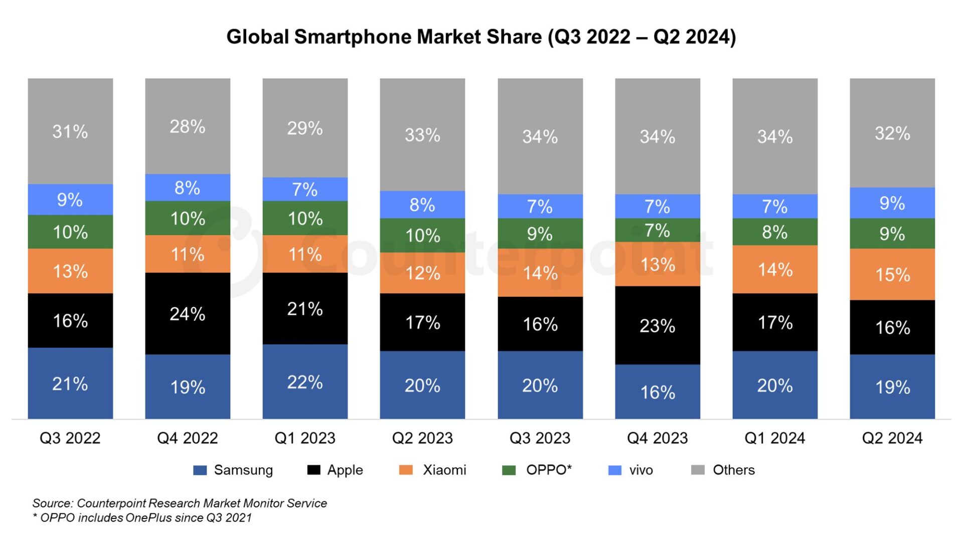
Market Share Comparison
In this stacked area chart, global smartphone market shares for different brands (Apple, Samsung, Xiaomi, etc.) are compared to the benchmark of global market trends. The visualization highlights how each brand’s market share has grown or shrunk over time. A consistent color represents the benchmark (overall market growth), while each company’s share is visually stacked, making it easy to compare how individual brands are performing relative to global trends.
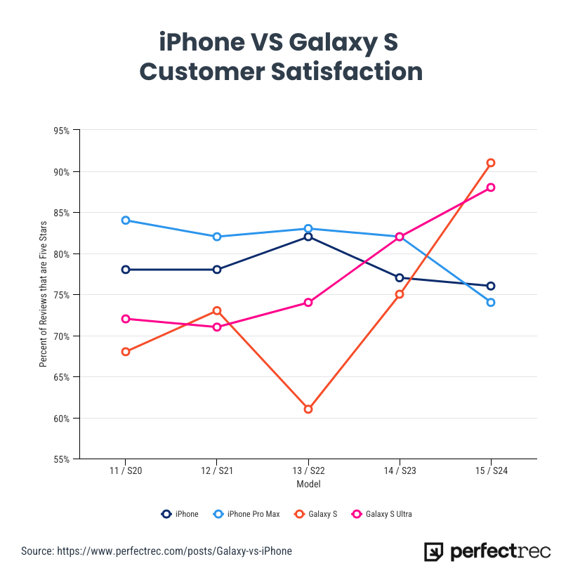
Customer Satisfaction
For the first time, the Samsung S24 line has surpassed the iPhone in customer satisfaction, according to a recent survey. Samsung’s latest flagship models received high praise for their superior battery life, advanced camera features, and customization options in the Android ecosystem, leading to a slight edge over the iPhone in overall user happiness. This marks a notable shift in the ongoing rivalry between the two tech giants, as the iPhone has traditionally dominated in customer satisfaction metrics. Samsung’s focus on user experience and performance appears to have resonated strongly with consumers, setting a new benchmark in the smartphone market.
Conclusion
Comparing smartphones to benchmarks helps consumers understand the strengths and weaknesses of a device, whether it’s performance, battery life, or camera quality. Using visualizations like bar charts, line graphs, and radar charts makes these comparisons clearer, offering valuable insights for buyers.
Benchmarks: Standardized Testing
Today we will be deep diving into how different people show comparisons to the benchmark. A benchmark is a standard or point of reference in which things can be compare. A great example is when benchmark testing was taken place during schooling. This data was used to see where you compare against students the same age as you.
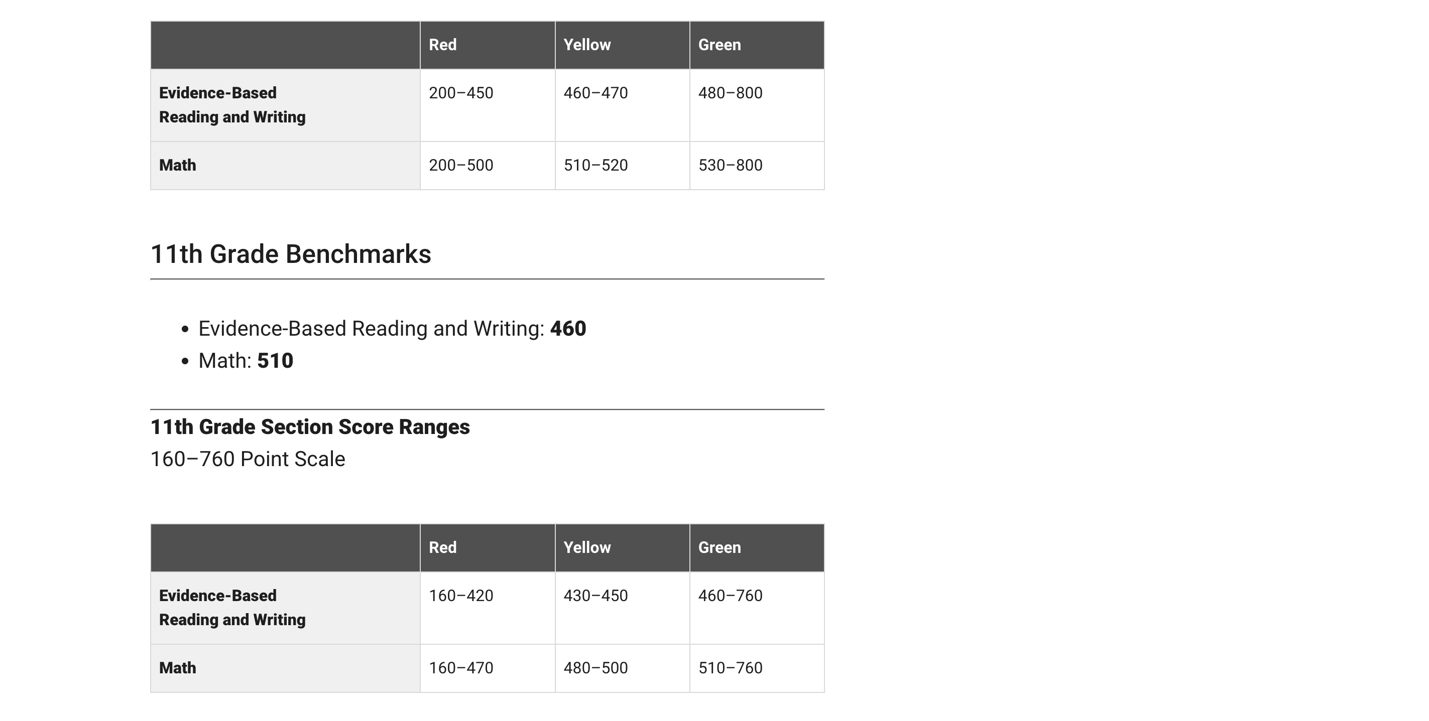
I will be using the college board SAT testing as an example. The college board uses benchmarking in order to determine where your test score should land based on your grade level. In the example below, they state that the benchmark is 430 for reading and 480 for math. These scores are based on if you were a 10th grader. They then breakdown the score into three categories: Red, Yellow, and Green. These sections represent how below or how above you are the benchmark.
In the article, How Perceptions Can Skew Reality: A Data Visualization Approach How NYC schools’ academic performance differs from public perception, they use benchmarking to determine where each borough of NYC lands with regards to SAT testing. In this article they take into consideration things such as poverty level.
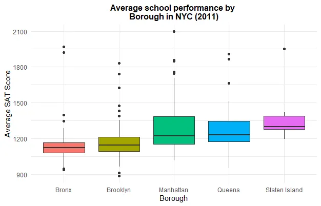
Schools in the Bronx performed worse due to the fact that the poverty rate is much higher. I feel as if data visualizations are very important especially with regards to benchmarking. It allows for an individual to compare themselves to the norm and make adjustments where needed. Everyone has grown up with benchmarking especially with regards to academic performance on things such as standardized testing. its interesting to put this into perspective.
Benchmark Comparisons
By Marc Joseph
Source https://humanbenchmark.com/users/6523996c62704b00084820c5/reactiontime
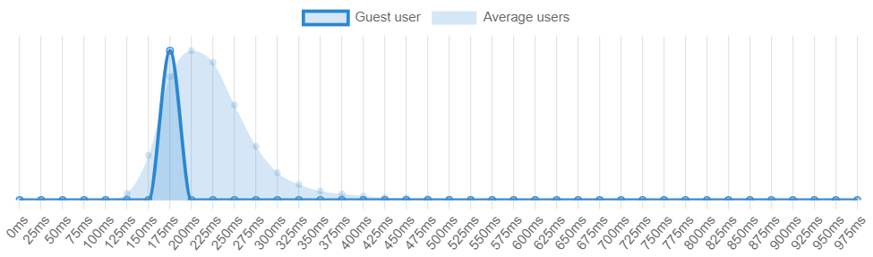
Reaction Time Charts
There are many different ways one can use benchmarks in order to determine whether a measurable value is over or under an expected value. As shown by the reaction time benchmark from Humanbenchmark.com where I scored an average of 191 m/s which put me in the top 74.46% percentile. The graph that is darker represents my value while the lighter colors represent the standard of comparison, or the average of all the other users. As shown, my values are slightly skewed to the left which means that my reaction time is above average when compared to the values of the lighter blue.
Investing Charts
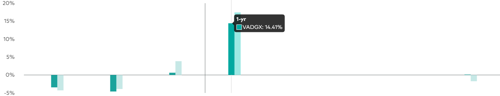
https://investor.vanguard.com/investment-products/mutual-funds/profile/vadgx#performance-fees
Another application of benchmark comparisons would be an investment or stock that generates a projected profit after a certain period of time. As portrayed by investorvanguard.com, they have a bar graph that shows the amount of returns and projected returns within a year. The darker green color represents the current value while the light green represents the expected goal. They used a darker color to bring attention to the value that they want the reader to see the most and a lighter color in order for the other value to be less distracting.
All in all, there are many different ways to shows benchmarks and simplify information. One can use bar graphs, line graphs, bell curve, and many more options in order to accurately portray data. Using the data, the audience can then make a more informed decision on their topic of interest (i.e. stocks, investing etc.). Hopefully this article gave you a good idea of the effectiveness of benchmarks and their many uses.
Benchmark Comparisons
Benchmarks are a commonly used feature in many data visualization charts, as they help to compare data in a comprehensive and easy way for viewers of all sorts. More frequently, we see benchmarks used to show things such as a budgeted/projected amount or numbers compared to the actual numbers for a specific data set, whether it be for a school, company, test, or experiment.
The unique thing about benchmarks is that they can be shown on graphs in a multitude of ways, from dotted lines and solid lines to different bars and solid colors on charts. Another notable feature about benchmarks is that there is no specific category that they have to be used for, meaning they could be used in/represent important statistical data or even smaller, less important information.
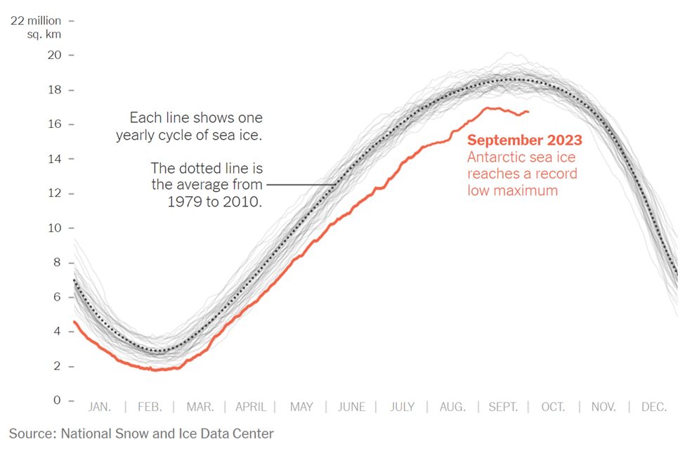
The example above is an instance where the benchmark line is used in a more serious setting and is represented by a dotted line on the line graph. The graph was taken from a New York Times article that discusses the current issue in the Antarctic Sea. As shown in the graph, this September marked the lowest ever recorded peak of sea ice, endangering wildlife. The red line represents the current levels recorded of the Antarctic Sea ice. In many scenarios, this would be considered the “actual” data in the graph/chart. In this specific graph, there are two types of benchmark (comparison) data. The first being the faded light gray lines that represent previous recordings of the sea ice level and the second is the dotted line with the average sea ice level, which is the main benchmark data and the comparison area. This chart was a great way to display this information, as it is clear to see the difference in sea ice throughout the years thanks to the comparison data/benchmark line.
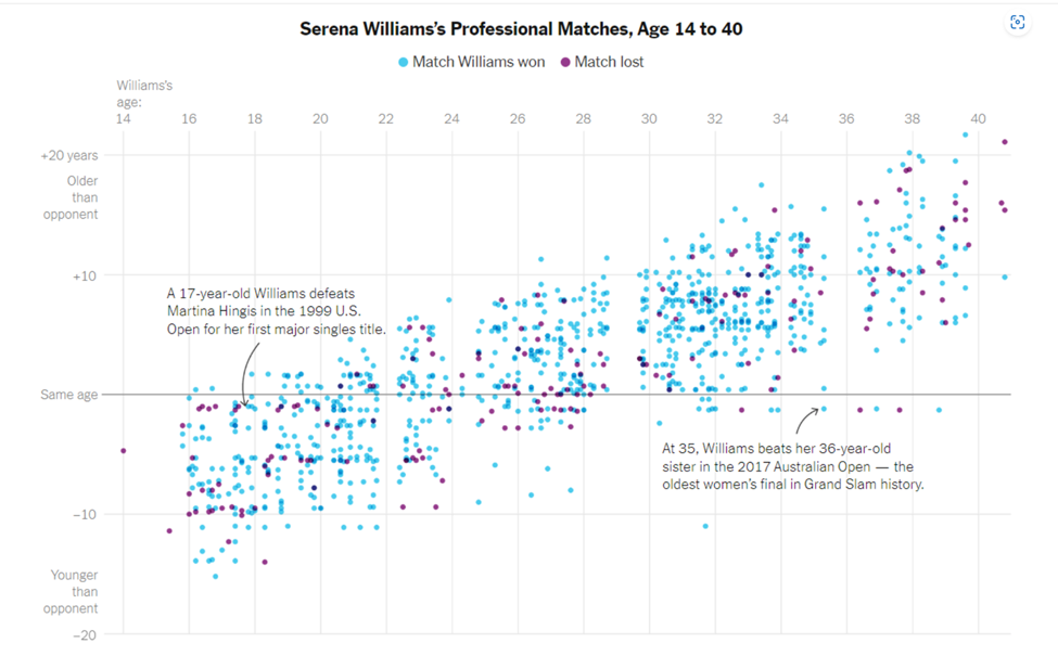
As previously mentioned, benchmark data sets can be used to represent and compare serious and important data, as well as data that is simply for fun. The chart above is a different presentation of a benchmark that takes on a less serious meaning. Serena Williams is a tennis player, and last year the New York Times put together an article and data visualization to compare Serena William’s age to all of the other people she has played and either won or lost to in each match. The gray solid line going across the entire scatter plot represents the benchmark (comparison) data, in which Serena Williams was the same age as her opponents. From here, it is easier to see how she performs with people younger than her, her age, and people older than her. While this type of chart looks chaotic, it is another perfectly acceptable use of a benchmark line within a data visualization.
In conclusion, benchmarks can be created and shown on almost any time of chart or graph that is trying to compare two or more things. It is an excellent tool that people can use to provide others with a better understanding of a situation. In different articles and publications that feature graphs, you will see them presented in a variety of ways depending on how the author chooses to do it. While none of the ways to show a benchmark are wrong, some are better suited for specific presentations of data. For instance, having a bar graph with overlapping bars to show the benchmark for all of Serena Williams’s matches and ages of opponents would have been acceptable, but a lot more confusing and chaotic than the scatter plot used with a simple solid benchmark line.