Sankey Visualizations
By John Wickham
As a person who likes a good chart, I am always open for suggestions that can make work better. This is why the use of Snakey would catch my eye to know if I could use it.
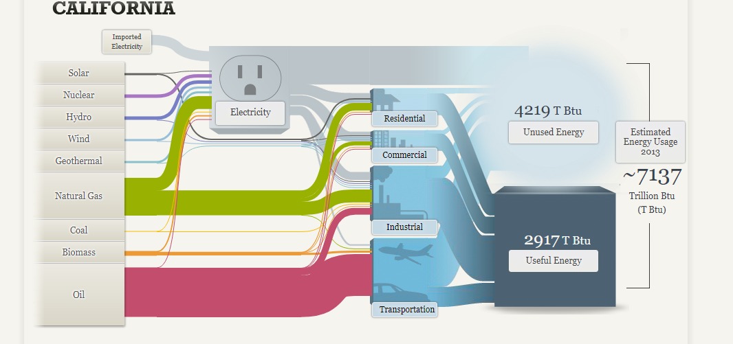
The chart above shows the information of the use of power that people from California use. You can see the huge amount of oil that people use in the largest state. There is the fact that there is only small string for Coal use, which is important to notice for coal supporters. The main source of worry is the small amount of power that is generated from alternative sources like wind, water, or solar. It worrys me.
The one complaint that I have is that this chart is very busy. It is hard to interpret data without taking some time to understand. You can get it, but it takes some effort.
Pie Chart/ Practice
By John Wickham
Pie charts are weirdly one of controversial bits of infographics scene. People say that they are very common in the space, but most people do not understand how to make. People make it hard to understand with problems such as not understanding the percentages or just having to many slices for the chart.
Pie charts are best used to show comparisons between small number of different categories (2-5 different sections) and when you want to highlight one specific piece of data.
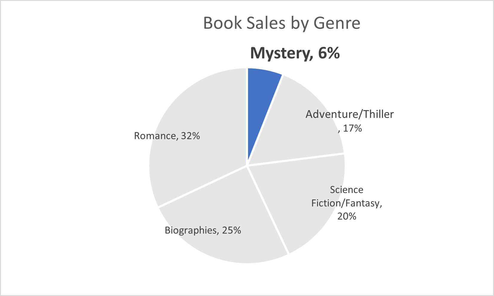
This pie chart above is about the sales of books within a group of genres. The main point I wanted to show was the low number of sales from the mystery genre. This highlights that more people should by mystery sections
SNL SCREENTIME STATS
By John Wickham
One of things that I do when I work on something is to try to put numbers into the things that I enjoy watching. For example, sometimes when I watch an episode of television is tracking to see how much screentime they have in an episode. This helps really show the importance of each cast member in the whole of show. However, until I was unsure of how to best display this data in a form to enjoy, until I read this chapter
The chart below shows the percentage of time each cast member was on screen in the very first episode of Saturday Night Live. The original cast (Laraine Newman, Jane Curtin, Dan Aykroyd, Garrett Morris, Chevy Chase, Gilda Radner, John Belushi and the short-term cast members George Coe and Michael O’Donoghue) was a boom in the 70’s comedy scene. Without them, both comedy and modern SNL would not exist to this day. However, it is hard to get a picture of the impact on the actual show.
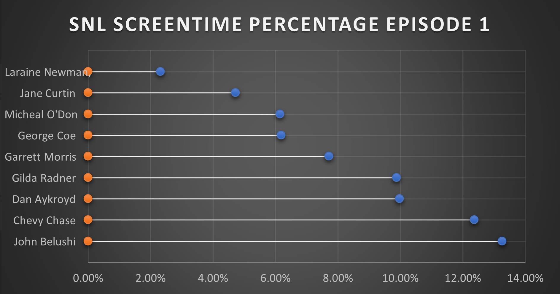
This is where this chart comes together in a quantitative fashion. From the data, you can see that John Belushi, Chevy Chase, Dan Aykroyd, and Gilda Radner where the frontrunners right away. Those would be the major stars on the show, and even in episode 1, the show had some faith in them. The other cast members had some work.
It is interesting that George Coe and Michael O’Donoghue (cast members who would be off the show in episode 5) had a decent amount of screen time in these first episode. Even more than long-term cast members Jane Curtin and Laraine Newman. It is a very interesting figure in the history of Saturday Night Live.
You can watch the first episode of Saturday Night Live on Peacock.