Pivot Tables
Created by: Victoria Valenzuela
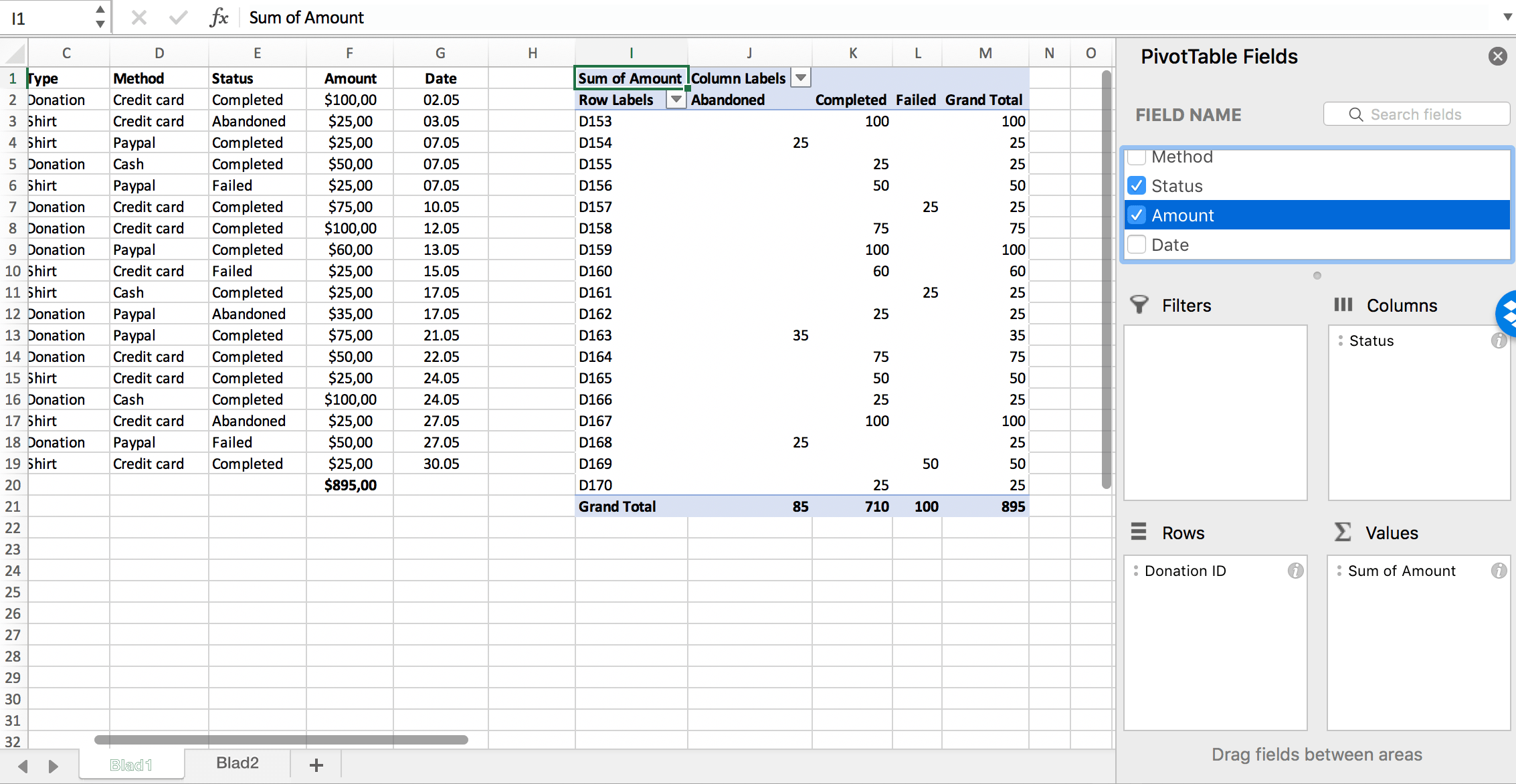
What Is a Pivot Table?
Pivot Tables are used to calculate and analyze data. It allows you to see a change in your data with trends, patterns, and comparisons. They are super helpful especially when you have a large data set. You can categorize your set to differentiate one data from the other.
How can you use a Pivot Table?
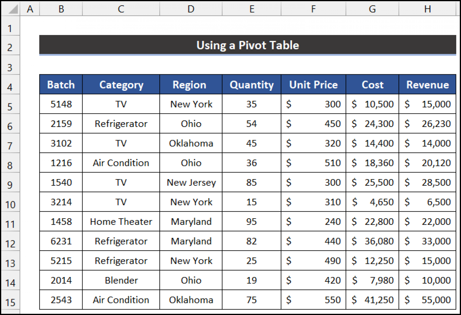
This particular pivot table includes a data set describing batches of home items. The data shows separation between the price, quantity, region, etc. The link posted shows exactly how to create a pivot table on Excel.
Why Is It Helpful?
Pivot Tables are helpful because they allow users to understand their data, have it organized into one block, and manage all of the numbers. You can clearly see all of your data split into rows and columns correlating to which it relates to. This will answer many questions any professor or outsider will have while analyzing your data set.
Perfect Case Pie Chart

I decided to use “Favorite Ice Cream Flavors” as my data set for this Pie Chart.
Why is this a “Perfect Case”?
Pie Charts are appropriate for parts-to-whole relationship data. Percentages and proportional data are great for pie charts. Here, I am showing vanilla, chocolate, and strawberry flavors. These are the three most popular ice cream flavors. When you take a count of how many people like each flavor, this is the normal outcome. The majority likes chocolate and vanilla flavor. The least amount of people like strawberry. This is the perfect case because it is showing a proportionate amount of data with a percentage and it is simple yet effective. I chose those colors for obvious reasons, they match the flavor of ice cream!
—————————————————————————-
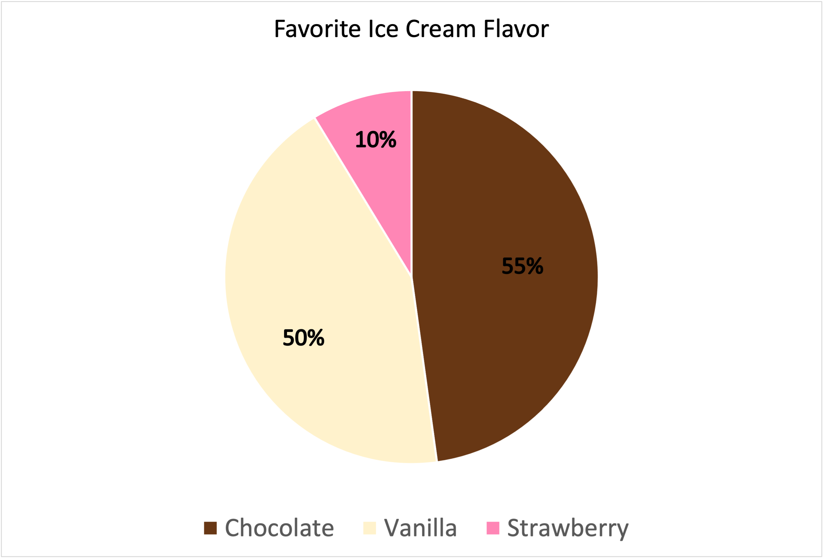
Data is based out of 115%.
Lollipop Chart
What is it? What is it used for?

Lollipop charts are used to make comparisons between different items or categories. They are great for when you need to display trends over time. They have both x and y values. It is best to use when you have a large set of high numbers. This includes comparing big sales or percentages. It looks similar to a bar chart, but the lines are normally thinner and there are dots/circles on the end of the lines just like the candy. I would not advise to use lollipop charts when showing relationships. All in all, it is a super unique chart type to display your data in a fun way.
Here is my lollipop chart!
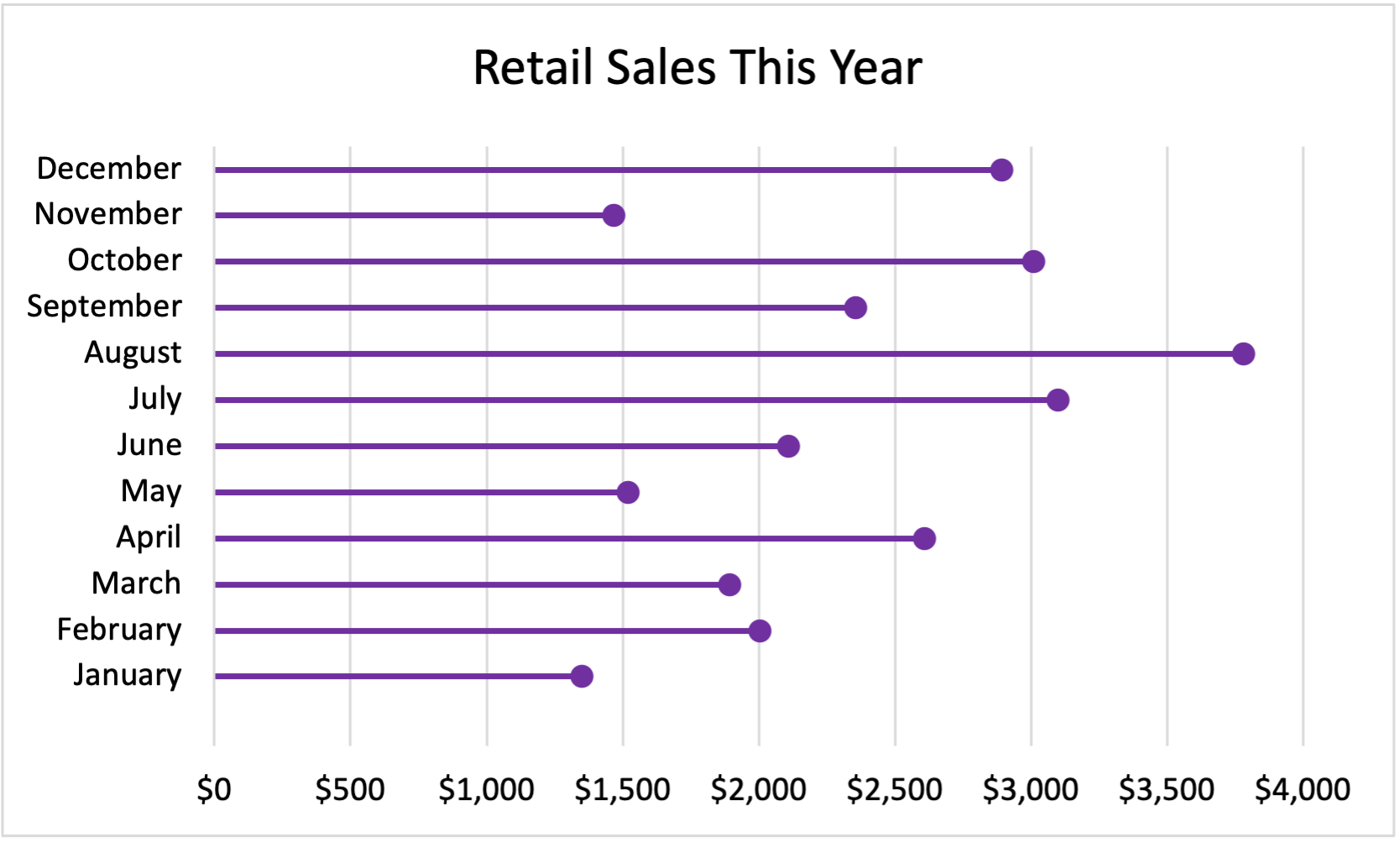
My Data:
January $1,350
February $2,003
March $1,894
April $2,609
May $1,521
June $2,109
July $3,100
August $3,780
September $2,356
October $3,009
November $1,467
December $2,891