Pivot Tables
A pivot table is an extremely useful and powerful feature in Excel. It allows you to extract the significant information from a large, detailed data set. When you have a very large data set it is hard to see any trends or come to conclusions about the data. With a couple clicks, pivot tables can help readers better understand the data by summarizing it and showcasing the important information.
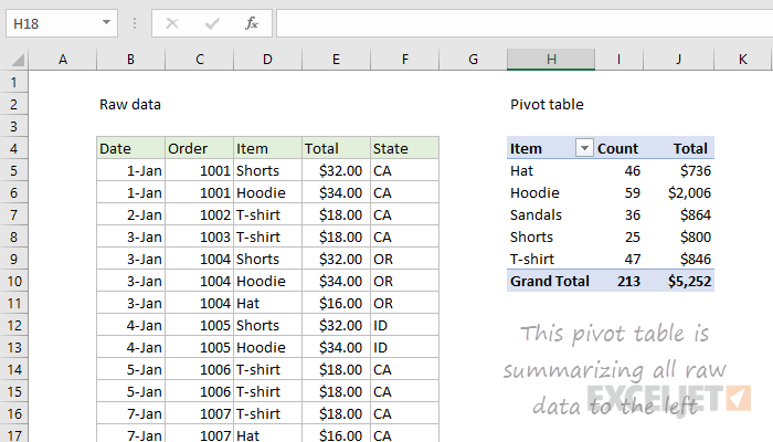
On the left is a raw data set of clothes sales. It includes the date of the sale, order number, item type, total cost, and state of purchase. The sheet extends for many rows and gets super overwhelming. The pivot table of the data is shown on the right. This organized the data and sorted it by the item of clothing. It then tallied up how much of each item was sold and also presented the total sales from each item. This is way easier to read and helps show trends and important information. You can see that hoodies were sold the most with 59 of them, and they also made the most money with $2,006. You can also see a total of 213 items were sold for $5,252. In conclusion, pivot tables are a great way to summarize a lot of information very quickly and easily.
Sankey Visualizations
A Sankey Diagram is a visualization that Is used to depict a flow from one set of values to another. They help locate the most important contributions to a flow. Sankey visualizations are best used when the topic is energy, time, or money.
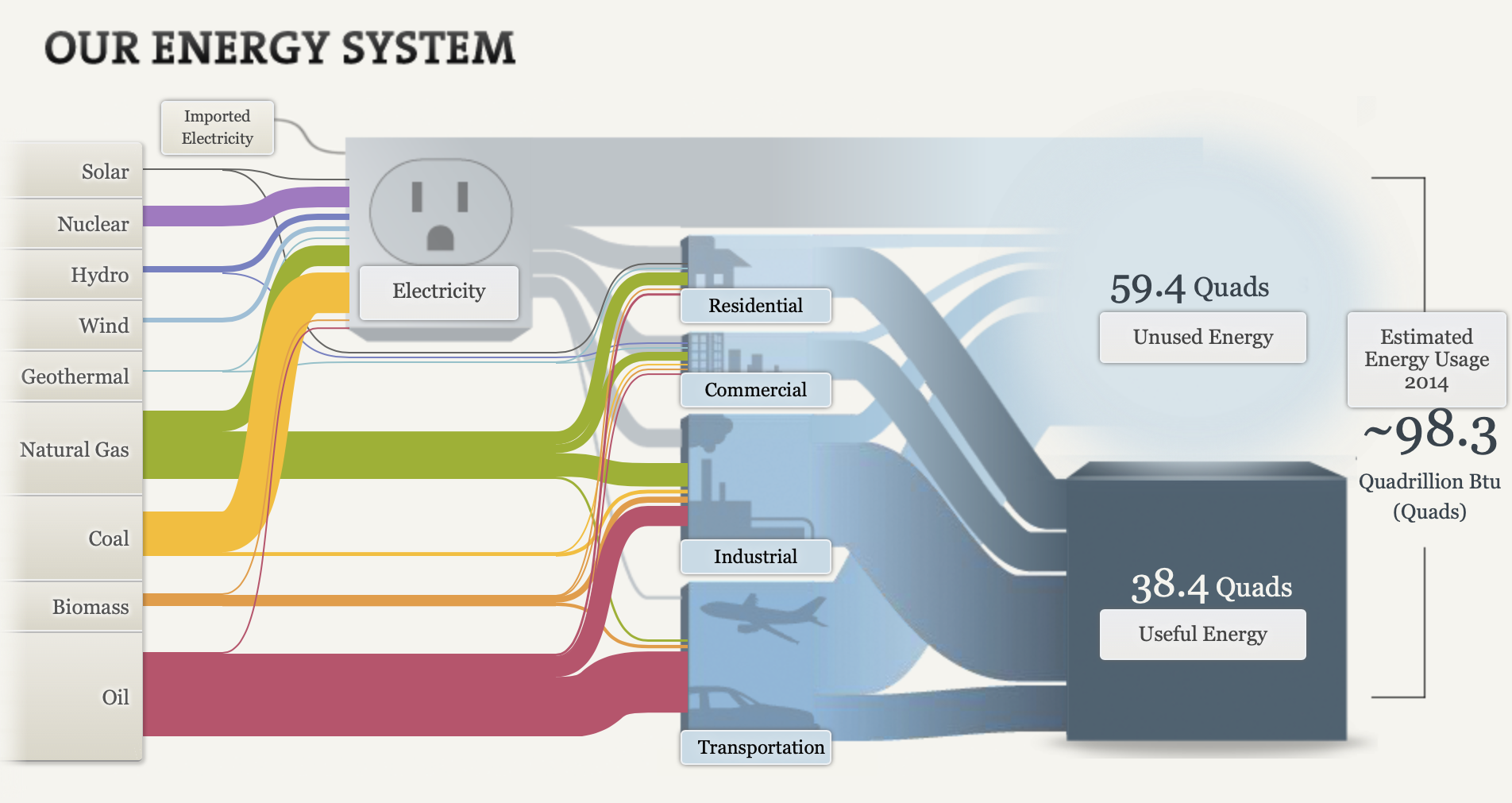
Although there is a ton of information presented in this visualization and it seems cluttered, I think this is the most effective way to view this data. This visualization is super effective considering that there are so many different aspects on this chart that are combined into one piece. Firstly, the energy system is broken down into the types of energy on the left hand side. The visualization allows you to click on each tab. When you click on each type of energy, it shows you what percentage of energy is expended and where it goes. For example, when you click on solar energy it shows you that solar energy accounts for 0.42% of all energy expended, and that 0.17% goes to electricity, and 0.25% goes to residential use. The infographic then breaks it down even more. It shows the amount of energy that is unused, and used from each category (electricity, residential, commercial, industrial, transportation). The thickness of the flow indicates the amount of energy. For example, you can see that most of the energy from transportation is unused because a larger flow moves from transportation to unused energy. All in all, there is so much information that can be digested from this visualization. It appears to be a lot, but when you break it down into pieces it is very effective. I believe this is the best way to display this information.
Pie Charts
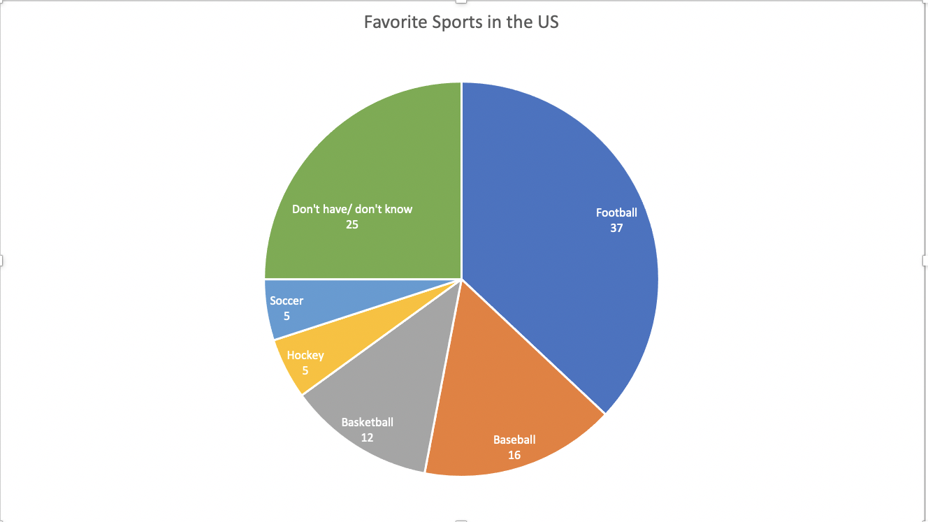
This data set is a perfect case for a pie chart. The percentages add up to 100. This means that all of the parts add up to a whole, which is a crucial part of a pie chart. A pie chart is also good to use here because there are only 6 categories. There is not too much going on and the chart does not look cluttered. It is very easy to read and the audience can easily compare the sizes of the slices to each other to tell which sport is more popular.
The data here is not served better as something other than a pie. A bar chart would work, but a pie chart is the most effective visualization for this data set.
I came across multiple design strategies to make this pie chart more appealing. First I color coded the different slices. This makes it easier to differentiate the slices from one another. Another thing I did was I put the category name and percentage in every slice of the pie. The percentage provides a more in depth look at the data. Also, adding the category name allowed me to take away the legend. This makes it easier for the reader to digest the information. They no longer have to glance at the legend, then to the chart, then back and forth. All of the information is in the pie chart.
Benchmark Comparisons
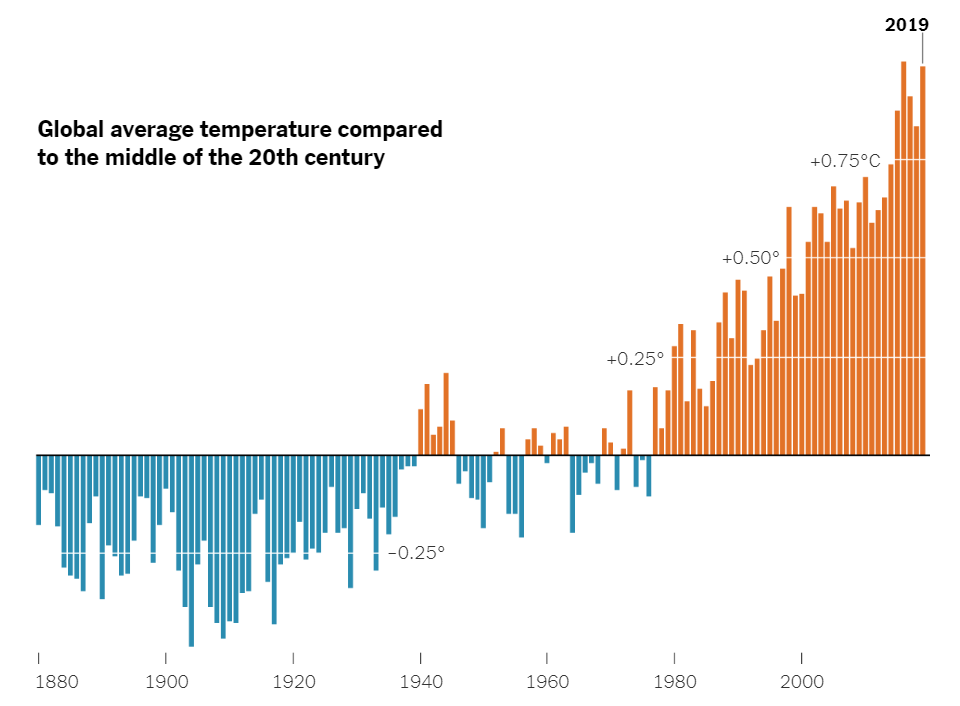
Here is a chart that uses a benchmark to show the varying global average temperatures. The benchmark is used along the x axis at 0 degrees Celsius. The blue lines represent the average temperature for that year, and it falls below the average global temperature of the middle 20th century. The orange lines represent the years with the average global temperature being above the average global temperature from the middle 20th century. As you can see, there is a general increase in global average temperature over the years. A benchmark is very effective here because it splits up the data into two groups. The years that fall below average, and the years that are above average. The trend of rising global temperatures is easily seen here, making this a very effective infographic.
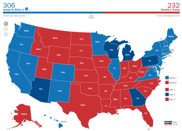
Here is another infographic that uses a benchmark in a different way. This is the 2020 presidential election map. The benchmark is shown above the map. It says “270 to win”. This means that 270 electoral college votes are needed in order to win the race. 270 is the benchmark. Joe Biden exceeded this benchmark, and Donald Trump failed to reach the benchmark. Therefore, Joe Biden won the election because he passed the benchmark. On the graph, you can see that Joe Biden passed the benchmark through color coding. Joe Biden is blue, and the blue line passes the benchmark of 270. This is a very effective infographic that uses a benchmark in a unique way. As shown by these two examples, there are many different ways to use benchmarks, and there are many different forms of benchmarks.