Pivot Table
What is a pivot table?
“A pivot table is a statistics tool that summarizes and reorganizes selected columns and rows of data in a spreadsheet or database table to obtain a desired report. The tool does not actually change the spreadsheet or database itself, it simply “pivots” or turns the data to view it from different perspectives.”
Example:
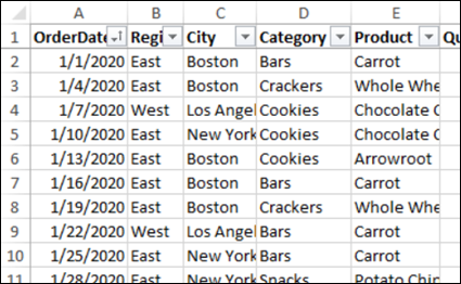
This here is an example of data that deals with food sales. This is much less than half of the data, it goes on to 244 rows. There are columns and one is filled with calculations.
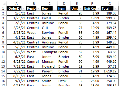
Here is another example. This one has 10 columns and 500 rows. These columns do not have calculations, but the rows have data on insurance policy.
Citations:
Debra, A. (2020, November 12). Excel sample data for pivot table testing. Excel Pivot Tables. Retrieved from https://www.pivot-table.com/2020/11/04/excel-sample-data-for-pivot-table-testing/
Lewis, S. (2019, August 8). What is a pivot table? definition from whatis.com. Data Management. Retrieved from https://www.techtarget.com/searchdatamanagement/definition/pivot-table
Blog Post 5- Pie Charts
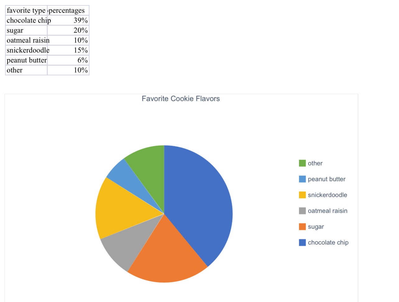
Here is the pie chart that I created for a group of people’s favorite cookie type. I think a pie chart would be the best for this because it is measured in percentages. If we were measuring it by exact number of people, we could have used a different chart or graph.
Pie charts are very fast and easy to make. All you need for a perfect pie chart are some labels, color, percentages, and data!
(The percentages inside the pie chart will not upload onto this website, but it is on the excel document attached to my assignment on blackboard!)
Lollipop Chart
Lollipop charts can be both vertical and horizontal. This is similar to a scatterplot and a bar chart. It has both x and y values. Using a lollipop chart is good for when you have a large value of numbers and when your number values are high . These are usually used for high percentages such as test grades and more. You can use this chart when you are making a comparison between categories and/or items. It can also be used for ranking. You can use color for the categories and the length of the bar can measure the magnitude. The circle at the end of the line represents the end of the data value and matches up to the number on the y axis.
My example:
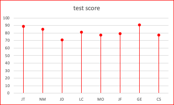
| Initials | Test Score |
| JT | 89 |
| NM | 85 |
| JD | 71 |
| LC | 81 |
| MO | 77 |
| JF | 79 |
| GE | 91 |
| CS | 77 |
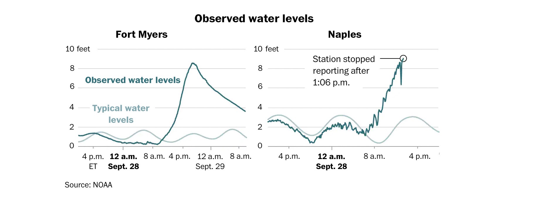
Benchmark Comparisons
The Washington Post shared an article “Maps show the impacts of Hurricane Ian.” Within this article the author shows the comparison of two different cities in Florida that got affected by Hurricane Ian on the same day. The light blue lines show the normal water levels while the turquoise line is how the levels were during the hurricane. After 8a.m. in both graphs, the levels started increasing a huge amount. The only thing that is different is the way the turquoise line is. One is smoother while the other is rigid and bumpy.