Home » Articles posted by Giana Sulpizio
Author Archives: Giana Sulpizio
Pivot Tables
A pivot table is a useful way to sum up large amounts of categorized data into a shorter and simpler table. It does this by taking each group or category and summing it up to get the totals per group rather than the every little piece of information. By using a pivot table, the information is presented in a much neater and efficient way. Pivot tables also allow you to sort and analyze the data much quicker and spot any outliers, or other sums that may need addressing.
The image below shows a sample of some data that could be best presented in a pivot table. The example uses resellers with different types of fruit over a three-month period to see how many sales and overall income each reseller brings in for each type of fruit.
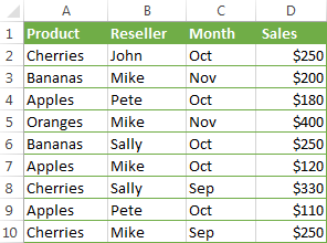
If we were to turn this charted data into a pivot table, we could easily see totals per fruit, per reseller, and per month in order to more easily analyze the data and get the results we need. The chart below shows the pivot table of this data.

As you can see, there are several different ways to display the data in a pivot table, depending on which type of information you want highlighted. Each of these examples gives the results and totals more quickly than if you were to just stare at the initial table and figure this out. While this example is just a sample with random fruits and resellers, it could also be applied to major corporations who are trying to figure out which of their chains needs more help or which is the most successful. Once again, pivot tables can really be used for a variety of data and ultimately make a person’s life a lot easier when it comes to analyzing and summarizing big sets of data.
https://www.ablebits.com/office-addins-blog/excel-pivot-table-tutorial/
Sankey Visualization
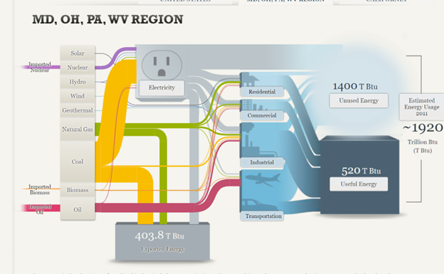
After examining the website on our Energy System by the National Academies of Science, Engineering, and Medicine, there is one main conclusion to be drawn: the energy system is very complex and there is a lot of data to unpack from it. The website attempts to do its best to explain energy usage and statistics through the use of a Sankey visualization, however without actually clicking on any data or the specifics, it appears very overwhelming to even look at. For instance, when you look at the section/visualization that focuses strictly on the MD, OH, PA, WV Region and do not click on the energy type (solar, nuclear, hydro, etc…) the visualization shows hardly any data that is clearly understandable and interpretable. The image shown below is what this visualization looks like without using the interactive feature.
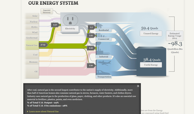
As you can see, the numbers are all over the place and hard to follow due to all of the “lines” and colors surrounding it. When you actually click on an energy source, however, the numbers, color, and “line” are singled out with more data and information that is more understandable. The image below is taken from the National energy system but is clicked to focus on the natural gas section of it. Here, the numbers are more directly highlighted, and an explanation is given and broken down in a way that is easier to understand. You can tell that 27.52 is the total energy in natural gas and the smaller numbers are where the energy is actually broken down.
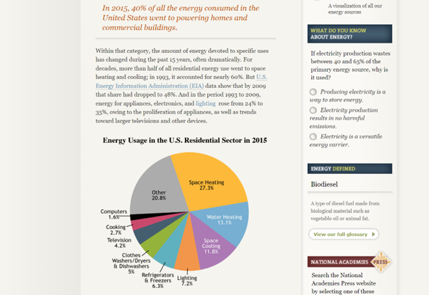
Despite this being a more clarified version of the Sankey visualization, I am not entirely sure that this was the best way to display the information. I feel that the website has too much information that they want to share and not enough innovative ways to share it, that the information becomes too overwhelming to look at in any section, not just the Sankey visualization. The entire website is very text heavy with a few visualizations thrown in between (including the Sankey visualization) and the visualizations end up having too much data because there are so few of them. For instance, even the pie chart featured below looks very overwhelming due to the amount of information and colors being packed into it. To add to this, there is also too much going on in the side legends of the website with the quizzes, polls, links, etc.. that your eyes are not truly able to focus on everything and take it all in.
In all, the Sankey visualization is a unique way to display information when done correctly. While this website tried its best to make it interactive and comprehensive, there was simply too much data and information in each that it became a little overwhelming until a specific part was highlighted. A simple flow chart may have been easier to read, but then again there was just too much information and text to fully know and understand.
Pie Charts
Pie charts are something that we are used to seeing, and have been practically since elementary school. They are commonly used for comparisons because they help people visualize a difference and also allow them to understand different categories and severities of things. For this reason, it is always important to make sure a pie chart is used properly, otherwise information can become too overbearing and confusing.
When tasked with creating a pie chart, I felt that it was important to pick something that was equally important to me and had data that was easily comparable, as this is what would work best for a pie chart. The image below shows the pie chart I created with sample data taken from Statista about the percentage of college students who are diagnosed with some sort of mental disorder.

One thing that not many people are aware of (unless they were or are in college) is the amount of stress and hard work that comes with the role as well. More often than not, these stresses cause college students to be diagnosed with some sort of mental disorder, and I felt that as a college student who is also suffering from the stress and pressure put on me, this was a good thing to talk about. The pie chart features five different types of mental disorders that college students are most commonly diagnosed with, with anxiety and depression being the highest amongst them.
I think this data was best shown in this pie chart because it puts the numbers and diagnoses into perspective about how significant and problematic the pressures of college are on a student. Due to the two large percentages taking up more than half of the circle, you get an idea of the severity of it.
As previously mentioned, this sample data was taken from a larger data set on Statista. However, Statista showed this information on a horizontal bar graph (as shown below).
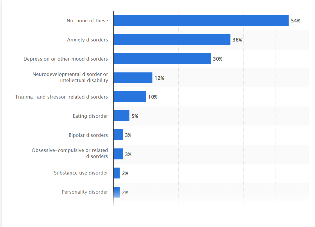
While the bar graph is still a great way to display this information, I think that taking the higher percentages/more common disorders and displaying them on the pie chart created a more urgent and dramatic effect that may not have been seen or fully acknowledged in the bar graph. On the other hand, if I were to include all of this information in the pie chart created, I do not think the pie chart would have as much of an effect or impact as it currently does.
In all, a pie chart is a great way to display certain types of information, including my sample data set on mental disorders in college students. It shows comparison of different categories and allows for easy interpretation and understanding of data. One thing that I discovered while creating this pie chart is that Excel has several hidden tools and features to help you create the pie chart to your liking, including pre-made color palettes that make it easy to keep a theme, as well as different examples of pie charts using your data. For instance, I found that it looked better to have the percentage and category labels on the outside of the pie chart rather than the inside due to clutter and I was able to do so with a simple click of a button. I think it is important to note these features because certain types of information and pie charts may need to be created depending on the data used, and Excel provides easy navigation to do just that!
Lollipop Chart
As we continue to learn throughout the course of this class, there are dozens of ways to display data aside from the typical charts that we are used to seeing. One such example of this is a lollipop chart. A lollipop chart is a great alternative to displaying a significant amount of data that may be too overwhelming to look at and compare in a bar graph due to all of the shapes, shading, and numbers. It can also be helpful with a smaller set of data that may look odd or misplaced in other types of graphs. A lollipop graph – which gets its name due to the fact that it replicates what a lollipop looks like – takes this significant data and displays the same information in a much simpler way due to the design of it. Many people describe it as being a more “minimalistic” graph compared to the typical bar graph and prefer to use it when some data are similar.
A lollipop chart can be created a few different ways, however, the two ways I chose to use started with a scatter plot and a line graph. The scatter plot gives the horizontal lollipop look (due to the way it formats) whereas the line graph creates a vertical lollipop shape, once again due to the way it formats. Using Excel, I decided to create both types of graphs using the same data to compare how it looks.

The image above shows the lollipop graph in a horizontal display, while the image below shows the graph in a vertical format. The main difference between the two is accuracy. As we read about in the textbook, the vertical lollipop graph looks “prettier” but is not always as accurate due to the size that the lollipops are made in order to look more “put together”. For this reason, I prefer the horizontal look better as it is easier for me to comprehend, and yes also more challenging to make!
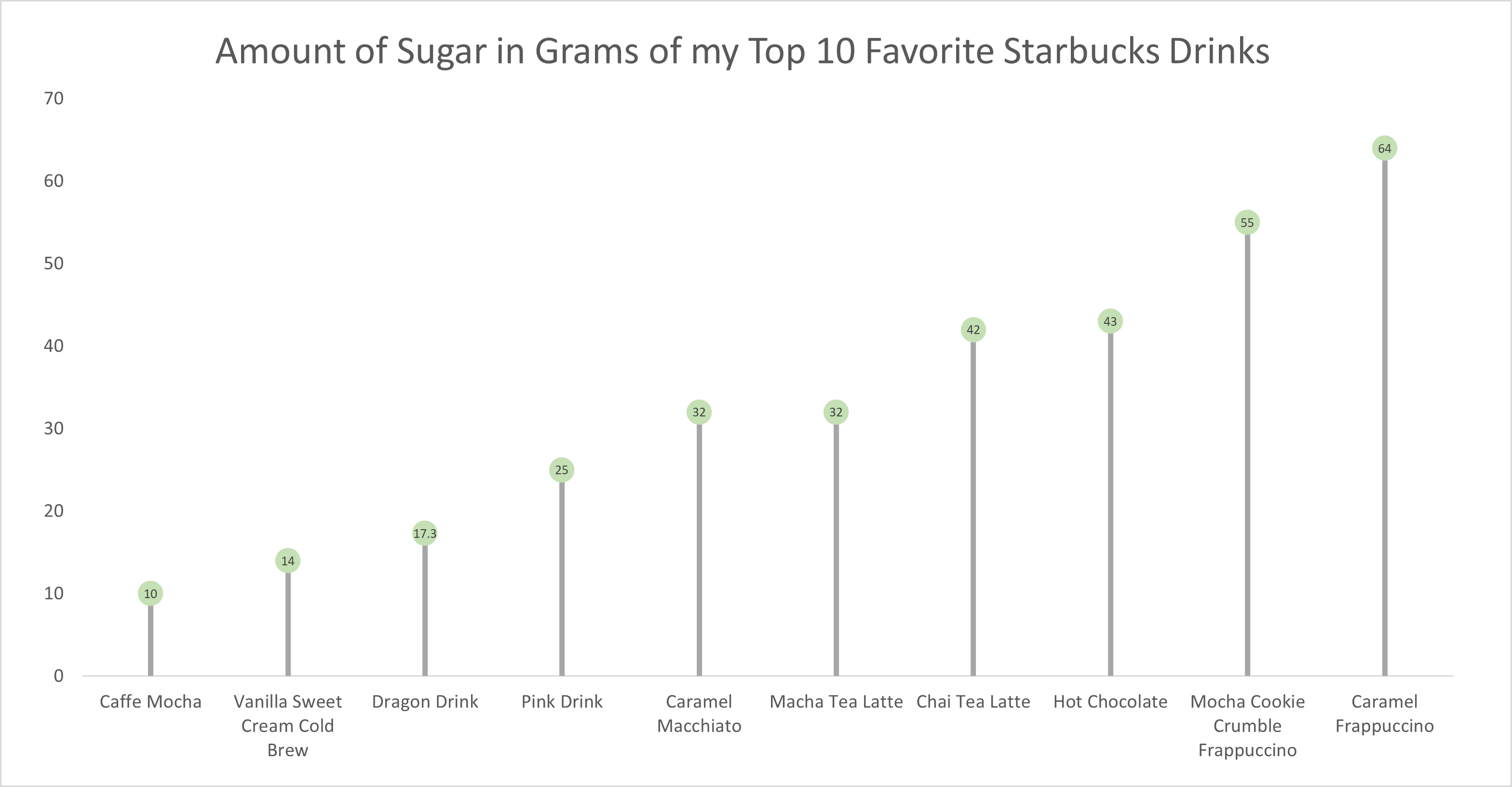
As for the actual data shown in each graph, I chose to create my own data based on research of the grams of sugar in my top ten favorite Starbucks drinks. The reason I chose to do this was because I am constantly getting Starbucks and attempting to “hop on the trends” of newer drinks, so I wanted to inform not only myself, but other people who like these popular drinks about how much sugar is in them. The grams of sugar are based on their “grande” size, although I typically end up getting a “venti”. As you can tell in the chart, which goes in order from least grams of sugar to most grams of sugar, nearly every drink with the exception of a few, has more than twenty grams of sugar in one of the smallest sizes available. Once again, this information presented is very eye-opening and something to be aware of. I ultimately think a lollipop chart was an easy and effective way to present this data because it is easy to get the important information and comparisons without getting overwhelmed.
Benchmark Comparisons
Benchmarks are a commonly used feature in many data visualization charts, as they help to compare data in a comprehensive and easy way for viewers of all sorts. More frequently, we see benchmarks used to show things such as a budgeted/projected amount or numbers compared to the actual numbers for a specific data set, whether it be for a school, company, test, or experiment.
The unique thing about benchmarks is that they can be shown on graphs in a multitude of ways, from dotted lines and solid lines to different bars and solid colors on charts. Another notable feature about benchmarks is that there is no specific category that they have to be used for, meaning they could be used in/represent important statistical data or even smaller, less important information.
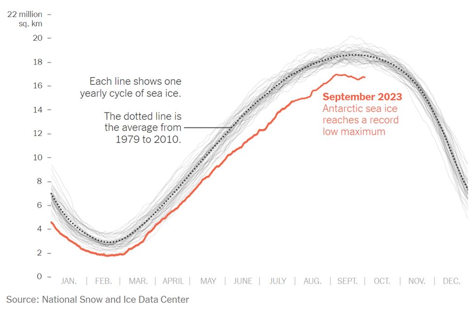
The example above is an instance where the benchmark line is used in a more serious setting and is represented by a dotted line on the line graph. The graph was taken from a New York Times article that discusses the current issue in the Antarctic Sea. As shown in the graph, this September marked the lowest ever recorded peak of sea ice, endangering wildlife. The red line represents the current levels recorded of the Antarctic Sea ice. In many scenarios, this would be considered the “actual” data in the graph/chart. In this specific graph, there are two types of benchmark (comparison) data. The first being the faded light gray lines that represent previous recordings of the sea ice level and the second is the dotted line with the average sea ice level, which is the main benchmark data and the comparison area. This chart was a great way to display this information, as it is clear to see the difference in sea ice throughout the years thanks to the comparison data/benchmark line.
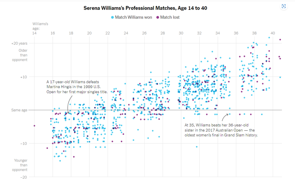
As previously mentioned, benchmark data sets can be used to represent and compare serious and important data, as well as data that is simply for fun. The chart above is a different presentation of a benchmark that takes on a less serious meaning. Serena Williams is a tennis player, and last year the New York Times put together an article and data visualization to compare Serena William’s age to all of the other people she has played and either won or lost to in each match. The gray solid line going across the entire scatter plot represents the benchmark (comparison) data, in which Serena Williams was the same age as her opponents. From here, it is easier to see how she performs with people younger than her, her age, and people older than her. While this type of chart looks chaotic, it is another perfectly acceptable use of a benchmark line within a data visualization.
In conclusion, benchmarks can be created and shown on almost any time of chart or graph that is trying to compare two or more things. It is an excellent tool that people can use to provide others with a better understanding of a situation. In different articles and publications that feature graphs, you will see them presented in a variety of ways depending on how the author chooses to do it. While none of the ways to show a benchmark are wrong, some are better suited for specific presentations of data. For instance, having a bar graph with overlapping bars to show the benchmark for all of Serena Williams’s matches and ages of opponents would have been acceptable, but a lot more confusing and chaotic than the scatter plot used with a simple solid benchmark line.
Insightful Data Visualizations that Compare Numbers
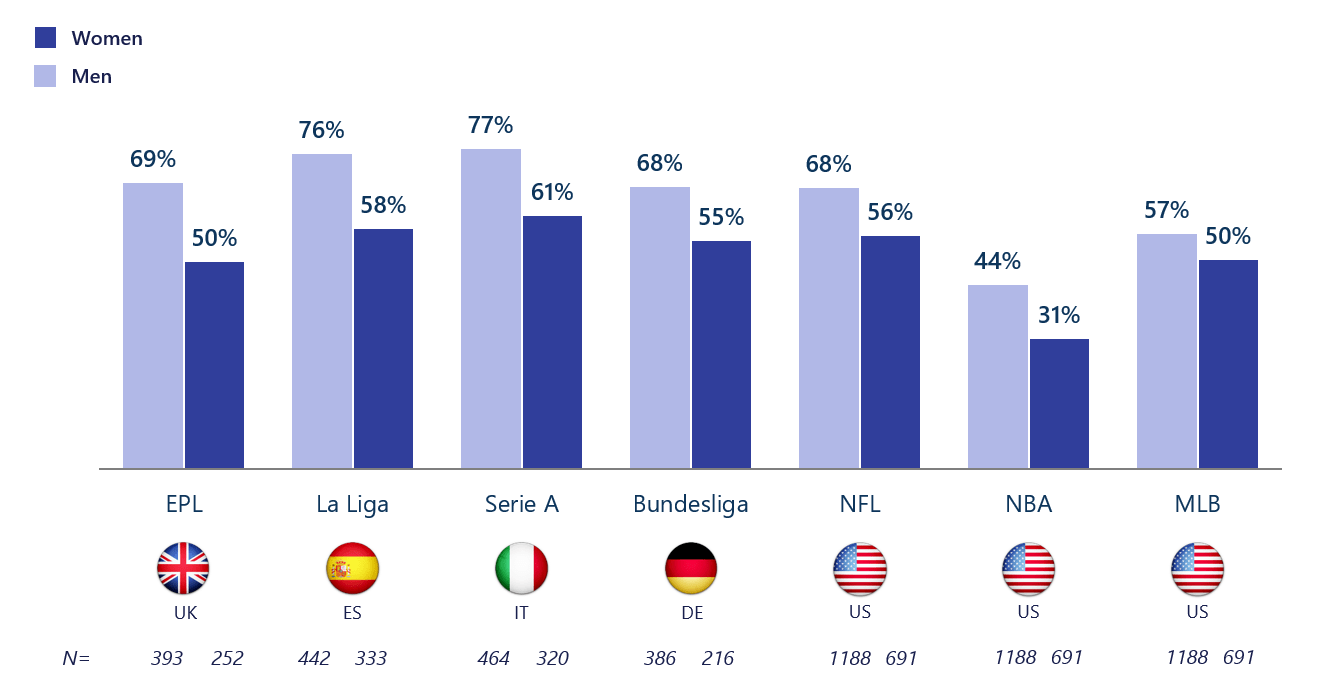
If there is one thing that should be known about data visualizations, it is that one can find a data visualization about almost any topic with the click of a button – and a quick google search. Due to the fact that baseball season is about to come to an end with the post-season approaching and the football season coming in full swing now, I thought it would be interesting to find a data visualization about sports and who exactly it is (by gender) that watches sports. As a female who watches baseball and even hopes to work for the MLB one day, I knew that the “MLB fan club” was mostly male dominated, but thanks to this data visualization, there is a better grasp about the true difference in the amount of males and females that watch and engage in sports such as baseball.
The unique thing about this visualization is that it not only focuses on U.S. statistics and sports, but also the UK, Spain, Italy, and Germany. This provides a perspective that might not have otherwise been known to people in the U.S. and other countries, and overall adds to the value of the data visualization.
Altman Solon, a telecommunications, media, and technology strategy consulting firm, created the data visualization pictured above and even went beyond by breaking it down even further. For instance, in the data visualization pictured below, viewers are able to just look at statistics for women in different countries and their interests in different sports leagues around the world.
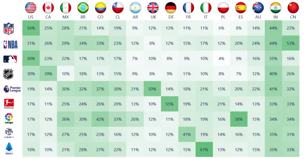
By breaking it down this far, viewers are able to get a better understanding of where females stand with sports interest compared to males, and hopefully make a difference so that the level of viewership becomes more balanced by gender in the future.
Visualizing Health
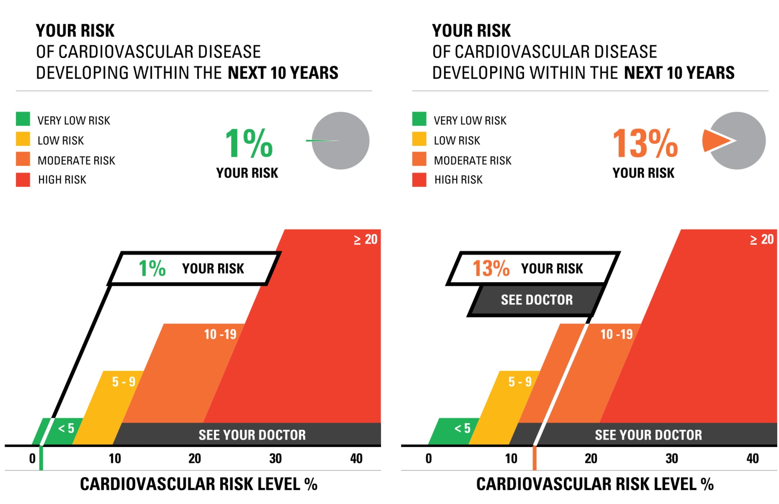
The site for Visualizing Health was very informative and neat to use. There were two data sets/numbers that I messed around with while using the risk calculator. The first was a young female (average height and weight) with normal levels for cholesterol, blood pressure, and overall good health. When I ran this calculator, I found that the risk for developing a cardiovascular disease was around 1%. I then ran the test again with a middle aged man (average height and weight) who had slightly elevated cholesterol and blood pressure, and was a smoker. The results for this test showed a 13% chance of developing a cardiovascular disease. While the website states that someone should not go directly based on this information and should still consult a doctor or another professional, I do believe that this provides a good starting point for someone who is concerned about their health and odds of developing a cardiovascular disease.
When I tested out the Icon Array generator, I felt as though I had a pleasant experience with it. Everything was very easy to navigate and understand, and it is a quick and easy tool to go to whenever someone has to create data visualizations such as this. I think it is beneficial that there are only four options for shapes and anywhere between 2 and three colors used. It makes it easier to look at and still very impactful in the end. The Icon Array I decided to create was based on the odds of women developing breast cancer. Upon research from the American Cancer Society, I found that 1 in 8 women develop breast cancer at least once in their lifetime, which translates to about 13 women out of 100. This data visualization is more impactful than simply hearing the statistic because it gives a better visual representation of just how many people are affected. I also like that I was able to change the color of the icons to light pink to represent and match the color for breast cancer. This simple feature once again makes it very impactful.
Overall, the sight is definitely valuable for learning about data visualizations because it teaches two simple ways to make data visualizations and is interactive, so learners are able to practice and have fun with it, which is key in learning these days.
Insightful Data Visualizations
Link to Image: https://cdns.tblsft.com/sites/default/files/pages/6_after_babylon.png
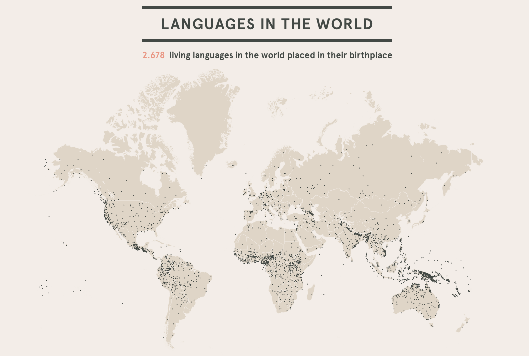
Infographics are an inventive and creative way to share information with others and hold their attention. The beauty of infographics is that there is no specific way that one should look, leaving creators with hundreds of different layouts to choose from. One such way to share information is through a data visualization, as shown above. Data visualizations are a form of infographics that allow a person to share a set of data through one big image rather than multiple facts and smaller images. In the case of the data visualization above, viewers are able to see just how many languages are spoken in the world. The creator of this visual decided that the best way to do this was to use a map of the world, with each small black dot representing the general area/region of the language. A data visualization like the language one puts into perspective how many different languages are spoken not only around the world, but also in a general area or community, which is something that a lot of people may not have been fully aware of before. If the number of languages were just listed in a chart with the region that it is spoken, it may not have been as fully effective as the one above.
The creators of this data visualization are a part of a project known as After Babylon. Their goal, as stated on their website, was to analyze the “current linguistic situation of the world”. The map above was only one of many different maps and graphs shown on their website to help people fully grasp the language situation in the world. One of the brilliant features on their website was to make some of the maps and graphs interactive, making it easier to pinpoint languages and their origins for a full understanding. Overall, After Babylon’s work of the languages in the world using data visualizations and infographics proved just how important these tools are when it comes to sharing information with your audience and keeping them interested in the topic.