AS. Pivot Table: Use Scenario
Several weeks ago, I utilized a pivot table to better visualize and organize data for a project. Our group examined the broad effects of the covid-19 pandemic, and I was responsible for analyzing medical information. The World Health Organization has some extremely reliable and relevant information, so I drew my data from here; however, the datasets can quite extensive and difficult to interpret.
As this data contained case and death rates of various countries and territories around the world, I created a pivot table that organized these values based upon a larger group. This larger group is the 6 global regions recognized by the World Health Organization. Therefore, the pivot table collected the data from each country and organized it by sum, based upon its respective global region.
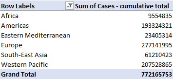
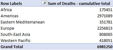
As a result, I often find that pivot tables best suit a large and/or extensive dataset in which several specific values or metrics want to be observed. These tables offer a significantly extensive amount of customization within the particular variable, value, or unit being displayed. An example of this would be column customization to determine dataset groupings sum, count, average, maximum, minimum, or product value.
Sources
World Health Organization. (2021). WHO Coronavirus (COVID-19) Dashboard. Who.int. https://covid19.who.int/data
Sankey. AS
Our Energy System explained: Our Energy System — The National Academies (nas.edu)
This website is an excellent source for anyone looking to get a quick and better understanding of the flow of energy on different levels of operation, such as nationally, regionally, or state-wide.
The first thing I noticed and liked about this section, is the transition of clicking this block to view the flow of energy within our National Energy System. The subtle splitting of the block opening up into the unused and useful energy divisions was a clever way of guiding our attention to the pertinent topics in the right order.
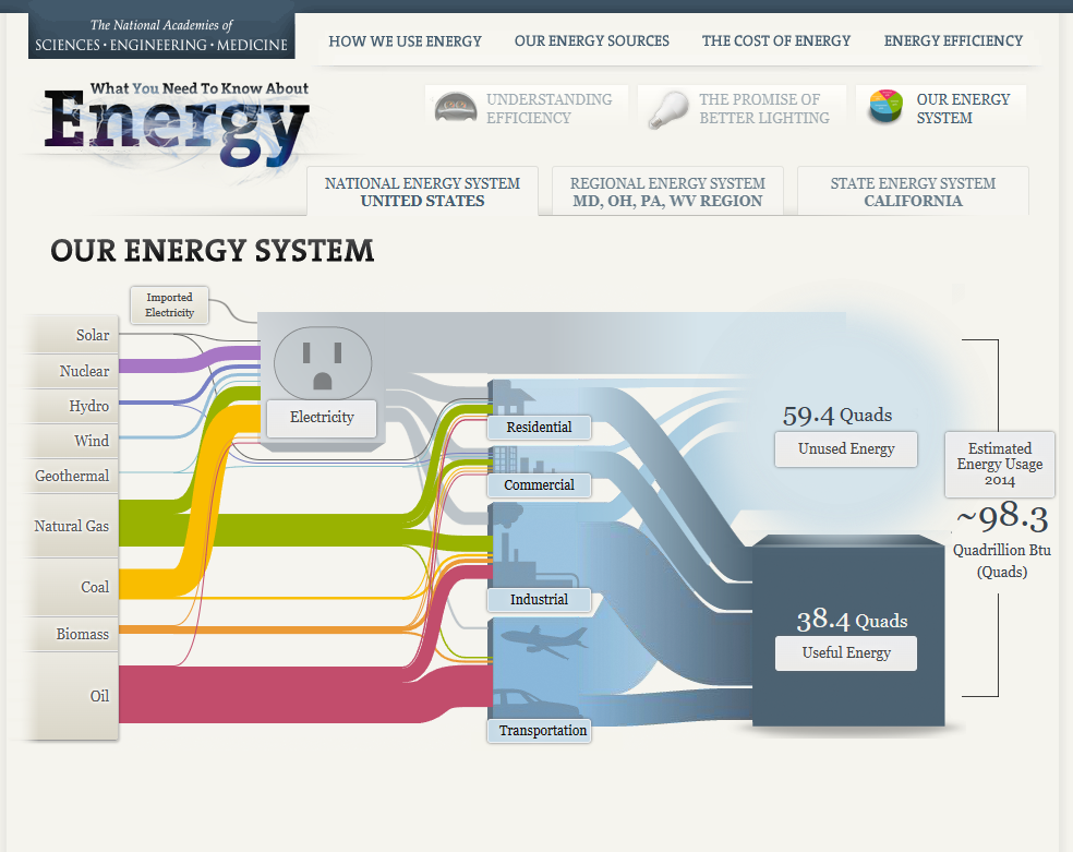
This graphic effectively illustrates a story within this visualization, with very little taking away from this process. The first thing I noticed that stands out to me with my ability to help digest this seemingly congested web of energy flow, is the little graphics next to the different sectors where energy is utilized or directed to (transportation, industrial, commercial, residential.) Even the opaque to semitransparent blue lines of varying size attached to these distribution networks helps to estimate how much of this supply is being used, or unused respectively. It is unclear whether or not there is intention with the sizes of the wires from different energy sources, however if not the case, I felt that this section created an unnecessary distraction and clutter. If these wires aren’t scaled to their relative unit distribution, this distraction takes away from the overall ease of understanding. This strategy of size manipulation is an excellent one, however as some of the lines get extremely minimal and hard to track, perhaps this strategy would have been better executed on a larger canvas. Overall, the flow of energy from left to right from production to distribution is organized very effectively, all the way to the used, unused, and estimated future energy usage. A final visualization I felt to be particularly effective, (as most individuals reading this information are doing so using electricity), is the electricity outlet graphic. This graphic helps to demonstrate generally how much more reliant the residential, commercial, and industrial sectors are than the transportation sector.
Source
Our Energy System — The National Academies. (n.d.). Needtoknow.nas.edu. http://needtoknow.nas.edu/energy/interactive/our-energy-system/
Pie Charts. AS
In the world of data visualization tools, pie charts appear simple and easy to use upon appearance, but actually require significant prior consideration and thought upon creation. This is due to its simplistic nature and form of distribution, which may lead many to believe that categorical data will translate well.
Pie charts may best be utilized to accomplish several end goals:
- To demonstrate a part to whole relationship
- To place emphasis on a particular segment (smaller or larger)
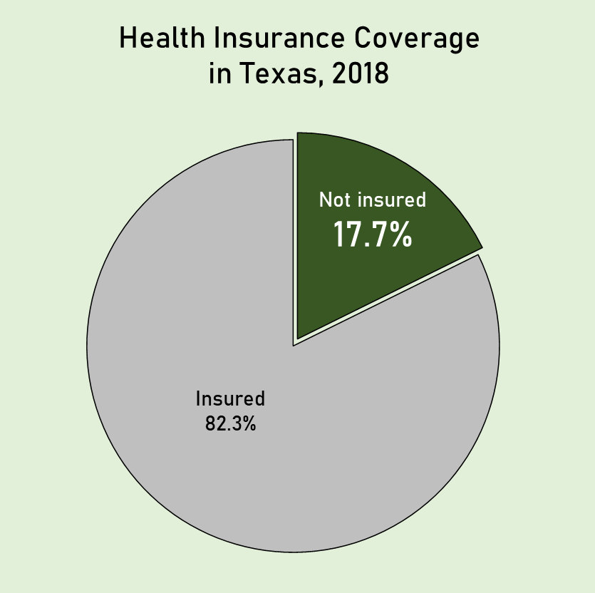
The pie chart I have created attempts to demonstrate how many individuals in the population of Texas lack health insurance coverage. As these two demographics are easily separated into two groups, a pie chart is an extremely effective way of calling attention to this statistic by placing emphasis on one segment.
Source:
Bureau, U. C. (2019, November 7). State-by-State Health Insurance Coverage in 2018. The United States Census Bureau. https://www.census.gov/library/stories/2019/11/state-by-state-health-insurance-coverage-2018.html
Lollipop Chart
As data is becoming both increasingly important and more widely used/applied, it only makes sense that simultaneously there would be a growing number of fields working around such factors. This can become an issue for visualization artists, as with an increasing complexity and density to existing bases and collection methods, too much data may often be readily available than immediately necessary for an infographic. Sometimes many words may be conveyed within the motion or placement of the simplest of figures. One clever chart that may assist with certain large data pools, is a lollipop chart.
A lollipop chart is an excellent way to effectively illustrate a pattern to an audience when this pattern is hidden within a lengthy or complex dataset. As a lollipop chart is a variant of a bar chart with less visual clutter, these graphs are best used to display a distribution of values.
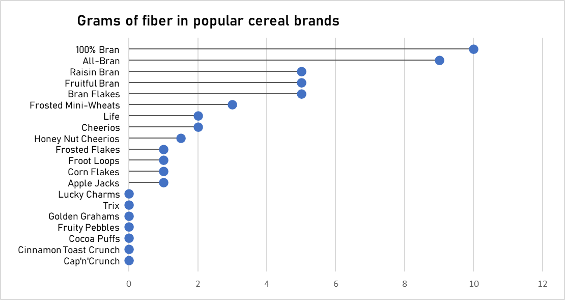
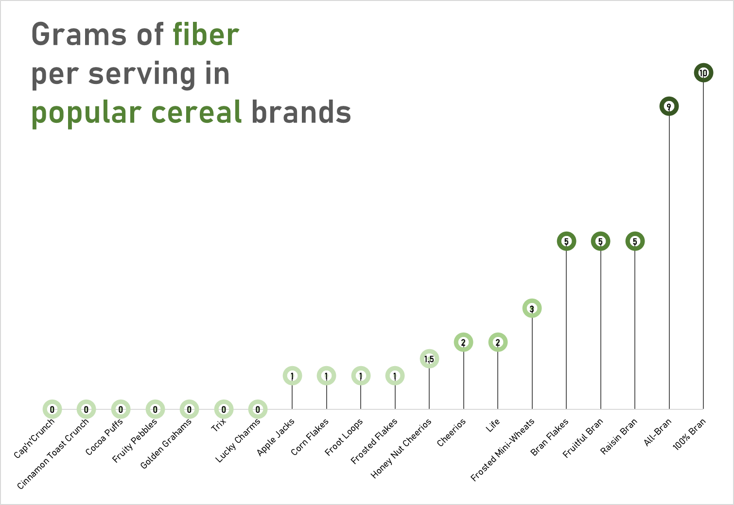
The data used to construct these charts was obtained from the “80 Cereals” dataset on kaggle.com
These charts would most likely visually fit a dataset with a more broadened distribution of values. However, with these two charts you can quickly see how a lollipop graph can demonstrate a concept with plenty of data to be easily deciphered. These graphs that I have created may be useful for someone who is looking to adjust their fiber intake, as I have separated the fiber content per serving in grams across popular cereal brands. However, the second graph is most effective, as with making use of the color spectrum of light to dark with increasing fiber content, the human eye may quickly identify significant regions of the graph.
Benchmark Comparisons
Benchmarks are an incredibly fast and effective way to provide a significant amount of context to a graphical display of information. This can be done in many ways, such as with a line or single symbol indicator. Benchmarks are most often used in financial matters; however, they still may prove useful for other purposes. In financial context, evaluating benchmarks may allow for insight into shifts in business over time. Whereas establishing benchmarks can allow businesses to more accurately gauge the performance of their employees as well as provide some motivation for progress.
In a New York Times article written by Clifford Krauss, he covers the significance of the dropping fuel demand in relation to how this affects oil suppliers.
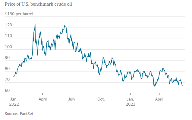
In the graph above, there is a clear trend of a dip in crude oil prices in the U.S. over the course of a little over a year. The benchmark of concern that was mentioned in the article, is $80 per barrel of crude oil. In a bold attempt to increase oil prices by cutting production, Saudia Arabia may have inadvertently caused the opposite effect to occur. Allies of the OPEC Plus cartel (Saudia Arabia included) have shown concern over this value remaining at or below $80 per barrel of crude oil. I feel as if the significance of this value may be better illustrated by highlighting this lines value differently than the others.
Comparing Numbers
Insightful data visualization comparison: Statista Chart
Statista.com is an excellent infographic source with exceptional examples of how data research and the art of digital design merge to tell a story. For this week’s blog post I will be sharing several examples of infographics I found to be interesting.
Many individuals, myself included, may fear the thought of wading or swimming through waters containing sharks. However scary this may seem; sharks are not the bloodthirsty and ravenous creatures they are depicted as in the media. Statista’s infographics on data pertaining to shark attacks does an excellent job at backing up this claim, as the numbers speak for themselves. The information sourced for both of the following infographics was obtained from the Florida Museum of Natural History located at the University of Florida.
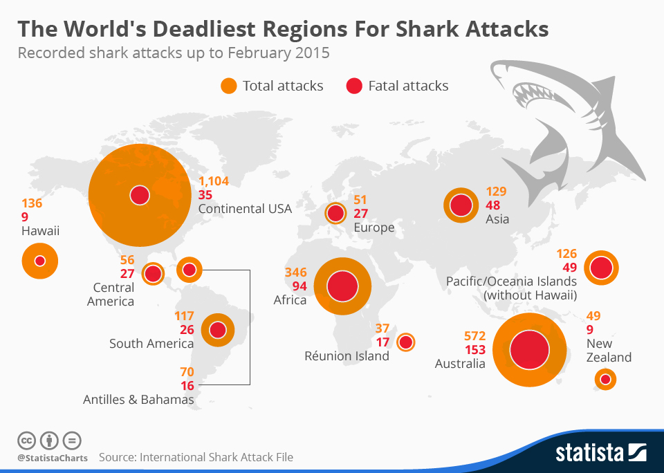
Chart: The World’s Deadliest Regions For Shark Attacks | Statista
The first excellent thing about this infographic that I noticed, is how quickly a few stories or interpretations may be picked up upon viewing this chart and the numbers. The concentrations of the total attacks are greater in the continental USA, Australia, and Africa. This sheds light upon which regions of the world contain the most concentrations of individuals swimming in large bodies of water. Additionally, by providing the total attacks versus the fatal attacks via a circle with increasing area within another, more interpretations may be derived. Do some of these regions have geographical constraints inhibiting healthcare providers from responding quick enough to attacks? Or are there different species resulting in different severity of the ultimate damage from these attacks across different regions? I also felt that the placement and scale of the circles atop the world map was strategically smart. By scaling the circles area roughly in unison with total attacks directly above the associated region, one can easier visualize where the most attacks were occurring.
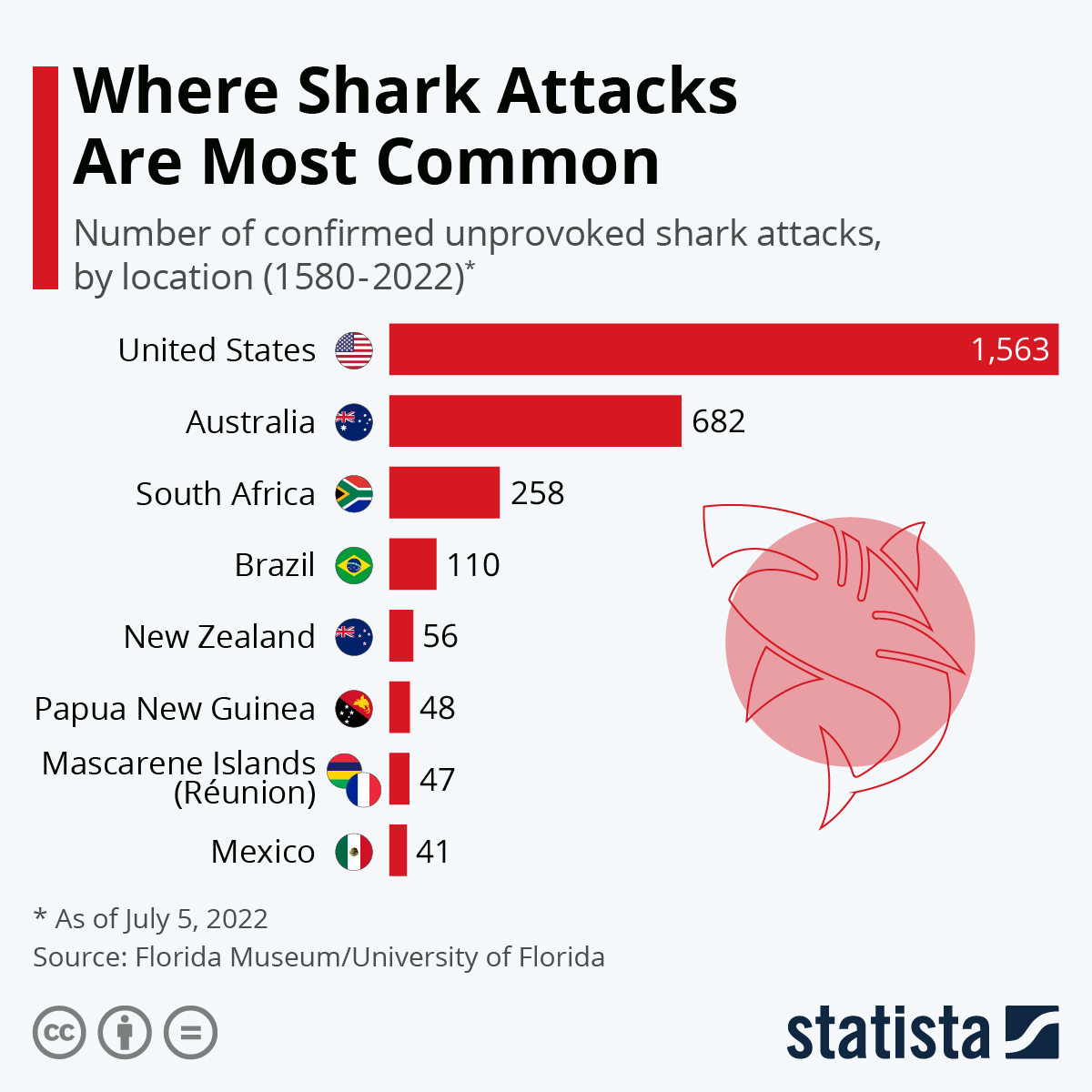
Chart: The World’s Shark Attack Hotspots | Statista
This chart provides an interesting and efficient addition with a miniature frame of each country’s flag, allowing the viewer quick association of the shark attacks per country. An interesting observation from the last infographic to this one, is how the number of sharks attacks has significantly increased in the last 7 years in the United States.
Sources:
McCarthy, N. (2015, May 25). Infographic: The World’s Deadliest Regions For Shark Attacks. Statista Infographics. https://www.statista.com/chart/3590/the-worlds-deadliest-regions-for-shark-attacks/
Armstrong, M. (2022, July 5). Infographic: The World’s Shark Attack Hotspots. Statista Infographics. https://www.statista.com/chart/8272/the-worlds-shark-attack-hotspots/
vizhealth.org – An excellent data visualization source
“Vizhealth” is an excellent website that provides information pertaining to data visualization in the health and science field. Specifically, their goal is to aid individuals with the creation process of infographics. A focus for these infographics is usually conditions affecting one’s health, incorporating risk as the primary concern. Resources like this one are extremely important, as the statistics surrounding severe illnesses and conditions are often quite complex and difficult to interpret for the affected general public.
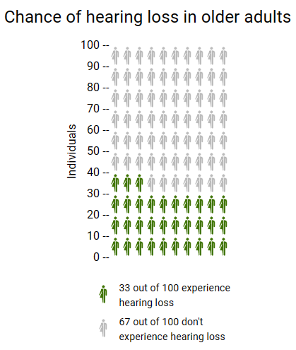
Using vizhealth.org and their “Icon Array Generator” tool, I was able to create this quick and effective chart at illustrating one’s chances at experiencing hearing loss past the age of 65. This chart could be useful in the sense that some people may not be aware of such odds. This image is based on original research and designs from Visualizing Health, a collaborative project between the University of Michigan and the Robert Wood Johnson Foundation made publicly available via Creative Commons license. Our use of this image should not be considered an endorsement from Visualizing Health. For more information, visit www.vizhealth.org.
Sources:
Zikmund-Fisher, B. J., & Witteman, H. O. (n.d.). Icon Array. Iconarray.com. Retrieved September 23, 2023, from https://iconarray.com/
National Institute on Aging. (2018, November 20). Hearing loss: A common problem for older adults. National Institute on Aging. https://www.nia.nih.gov/health/hearing-loss-common-problem-older-adults
Infographics
Exceptional visualization examples: Kurzgesagt

Link to image: Kurzgesagt | Logopedia | Fandom
Link to channel: Kurzgesagt – In a Nutshell – YouTube
For this week’s blog post, I am sharing one of my favorite content creators from YouTube. Their channel is titled “Kurzgesagt – In a Nutshell,” and they specialize in short, scientific, informational videos. All of their content contains a great deal of creative, and effective infographics. Kurzgesagt excels at achieving the ideal blend of artistic expression and information display, often the main focus of information visualization. Combinations of encaptivating characters, objects, and places alongside smooth and crafty transitions help to educate the general public on some fascinating topics. All that is required is to find a topic or title that jumps out to you, and their videos will speak for themselves.