Home » Articles posted by Lamar Miller
Author Archives: Lamar Miller
Using Pivot Tables
Lamar Miller
In our text, we learn that pivot tables are a great tool that allow us to see the relevant data within a flat file or summary table. A summary table is where your raw data are aggregated so you can build a graph.
A flat file has each piece of data on its own line. Here, you will find a site that explains use cases for pivot tables as well as what they can do to help us export and visualize data.
Some elements of a pivot table include values, rows, columns and filters.

Pivot tables can help with various real-world examples such as sales volume by country. This data can be aggregated in a way where it is simplified down to the relevant data when telling a data story. This data can be sorted by country, year, quarter and dollar amount. This is useful when presenting to clients at your job or helping analyze trends for your own business.

After editing your data to your liking, you will be able to create the example above. This example depicts multiple categories of data which have been aggregated to include sub-categories, timelines and financials.
Sankey Interpretations
Lamar Miller
Based on what I learned about Sankey visualizations, it appears coal is our largest resource contributing to electricity production. In addition, oil is used primarily for transportation. Overall, I would say this is a good use of a Sankey visual. The color coding within the visuals allows the viewer to decipher between the different resources. The thickness of each bar indicates the quantity. The flow of each resource to its intended use case shows which resources flow into which utility. Source

In the MD, OH, PA, WV region there is a large amount of coal production.
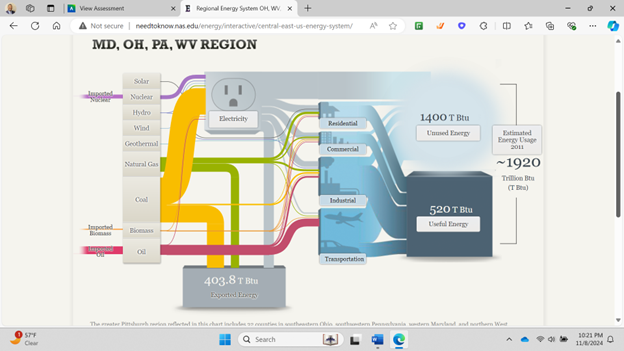
California has very minimal coal production but uses natural gas as an energy source more commonly.

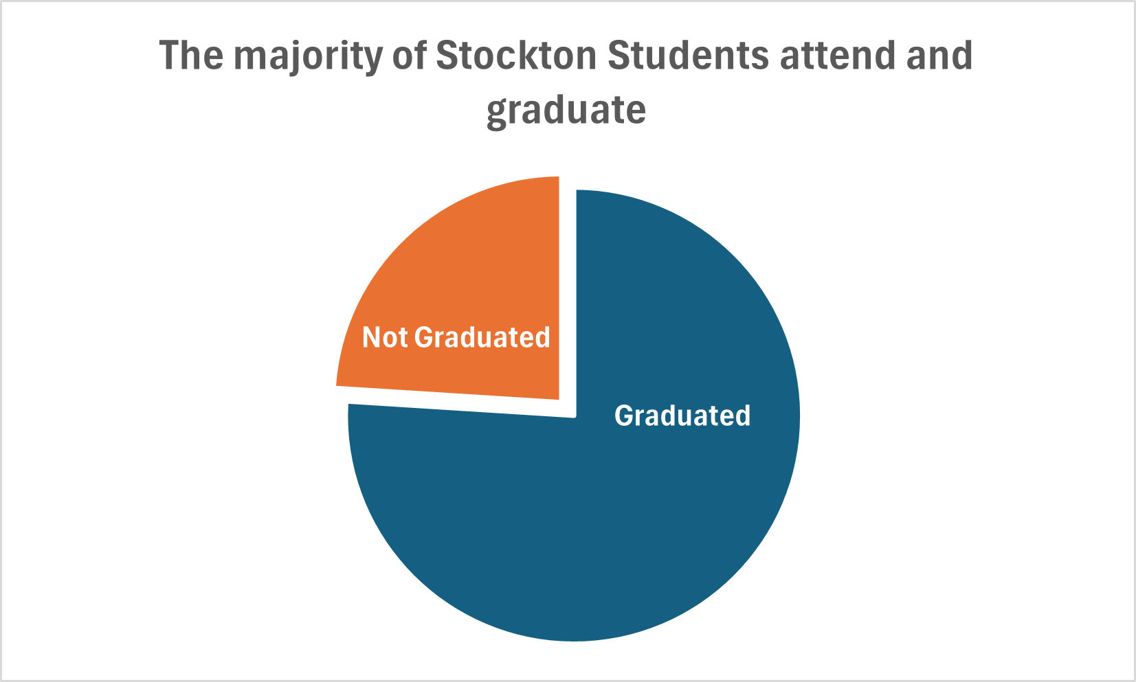
Pie Chart Use Cases
Lamar Miller
Here you will find data used to construct a simple pie chart with two data comparisons. The data I used was comparing Stockton University’s average student graduation rate vs those not graduated (out of 100% of students). It is discussed in our text that the best use cases for pie charts are when comparing a part to a whole. In addition, it is also recommended to begin the largest portion of data at 12 o’clock as most viewers begin there and view clockwise. It is recommended to use pie charts when we are showing four or less parts of a complete whole or 100%.
It’s stated in the text that most audiences relate well to circles as they are universally accepted as a whole. I believe this chart is the best example to display this data because we are simply comparing two parts of a whole. If we were comparing a larger data set, it may not be the best use case as viewers tend to have opportunity when viewing angles.
I believe Excel is sufficient to create this graphic and is easy to use for this particular example. The explosion option allows you to segment a part of the pie in order to highlight a particular piece of data and provide emphasis on the story you wish to tell.
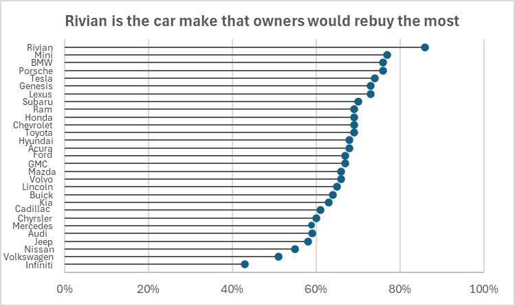
Lollipop Chart
Lamar Miller
Here you will find data I used to construct my lollipop chart. The data is based on car makes that owners would rebuy. The source also goes on to show the customers satisfaction scores which was not used for my visualization. I chose this data set because I am a fan of cars and wished to get more data on what models most users prefer. I would recommend using this chart type when you wish to make a lengthy bar chart less visually overwhelming. With this type of chart, we can remove unnecessary marks, ticks and labels that could be seen as distracting. What is also good about this chart is the horizontal line helps the scatter plot relate better to the Y-axis. It draws a viewer’s eyes to the data label without having to search through the visual to determine the relationship.
Benchmark Comparisons
Lamar Miller
Here you will find a visual on phone phishing data. This visual uses the dashed line to indicate the benchmark for the industry. The visual goes on further to use stacked columns to indicate the different ways phishing can be delivered. The dashed line is a good way to show a benchmark because it is simple and stands out on a visual without a need for additional labels. Not using a solid line also allows a viewer to quickly interpret that it is intended to stand out and be different than the other lines in the visual.

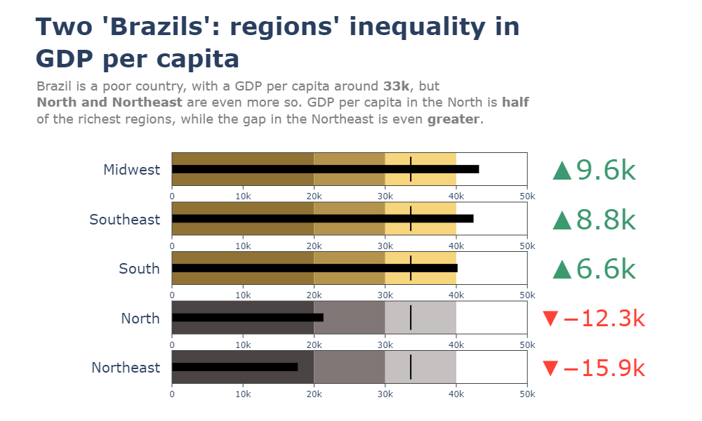
Here you will find a horizontal bullet chart depicting a comparison between North and Northeast Brazil GDP per capita while also indicating where the other regions stand. The benchmark is represented as a target line of 33k which can be easily interpreted. The visual goes on to show the gap in GDP by region.
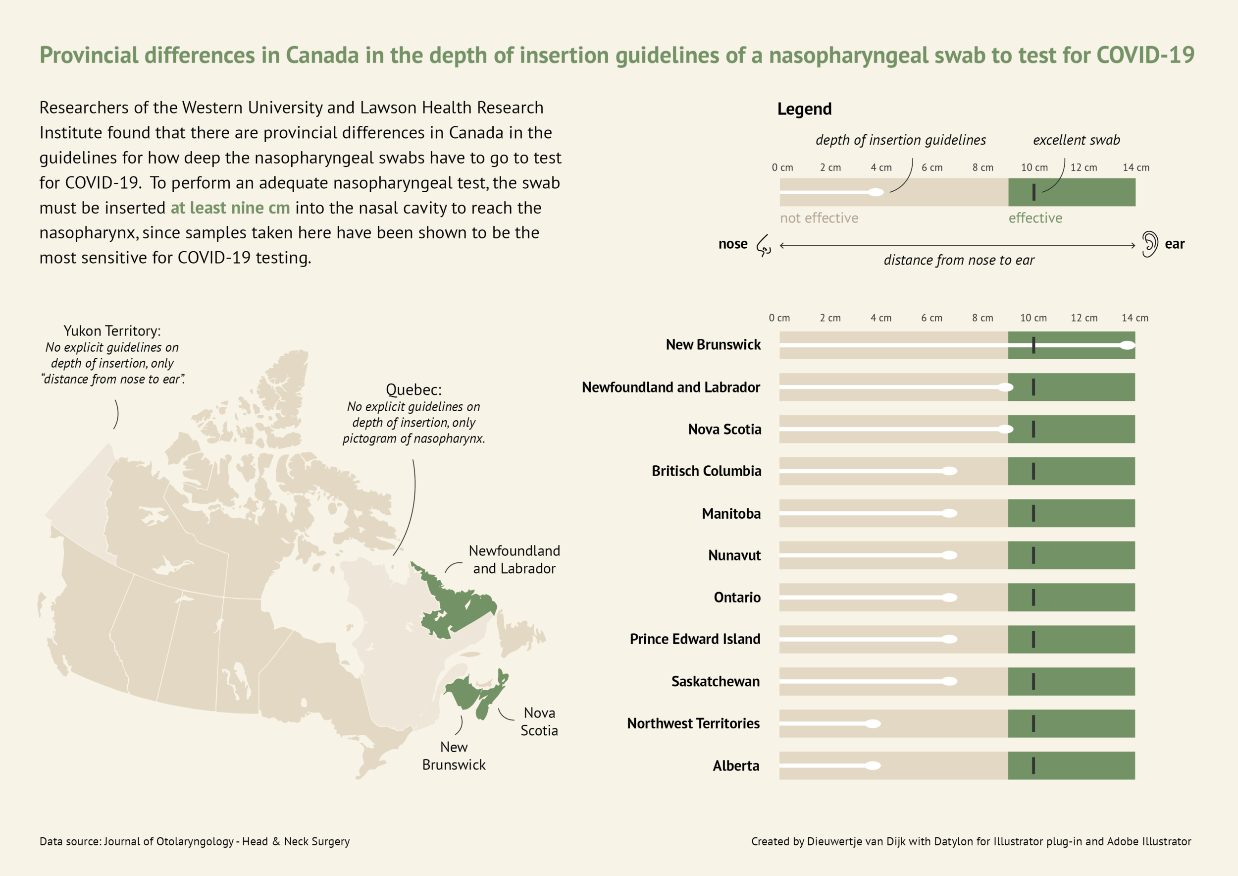
Here you will find a more in-depth horizontal bullet chart. I like this visual as it combines not only elements of a benchmark visual but incorporates other visual elements and really tells a story. This chart also uses target lines depicting the provincial differences in Canada regarding nasopharyngeal swab tests of Covid-19. The benchmark is indicated as 10cm in depth for the most effective swab.
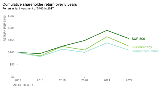
Here you will find a line graph with benchmark lines. The lines are represented as the competitive index and S&P 500 index versus their company. This chart incorporates two comparable benchmarks for a viewer to interpret against their trend. The visual shows the cumulative shareholder return over 5 years on an initial investment of $100 back in 2017. This chart is quick and to the point and provides an audience with just enough data to compare.
Examples of insightful data visualizations that compare numbers + Tools that may help us construct visualizations that compare numbers.
Lamar Miller
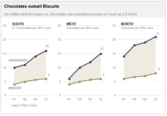
Here I found an informative article on making Small Multiples. This chart type stood out to me in Chapter 3 of our text not because of its design but the purpose behind the design. In our text, it explains the human psychology behind why the Small Multiple visual must be constructed in a way so it can be quickly interpreted with accuracy. It stated that eye-tracking studies show that people see a set of line graphs like the one depicting chocolate sales vs biscuits as one chunk. This style of visual is clearer than putting all lines in one graph which creates a confusing cluster of data points. This style also allows an illustrator to compare more than two pieces of data while maintaining visual cohesiveness. The key here is to ensure all lines along the X axis are symmetrical and that the Y axis numbers are mirrored within each subsequent data set so that an audience can see the comparison being made.
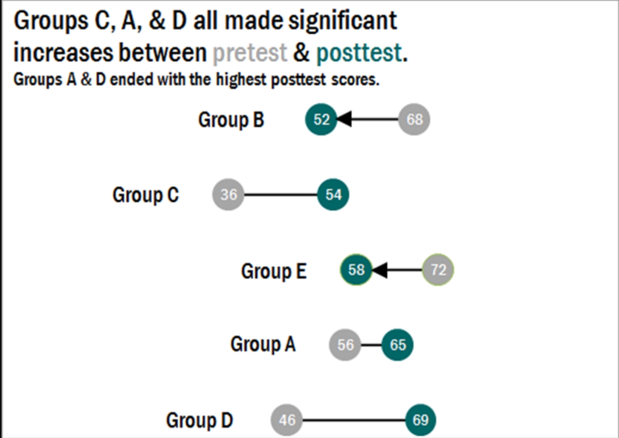
Here I found a step-by-step process on how dumbbell plots are constructed and a useful visual when comparing numbers. The main difference between the dumbbell plot and the standard dot plot is that the line connecting two data points emphasizes the distance between the data being compared. This helps an audience scan a graphic quickly and interpret the visuals intended purpose or story. This type of chart stood out to me because it’s a concise way of comparing two or more numbers across multiple groups or regions. The chart shows groups from A through E and their scores both pretest and posttest. This can be beneficial when segmenting groups of people to conduct case studies.
VizHealth Icon Array
Lamar Miller
I really enjoyed the personalization of the VizHealth website. I believe this is a very creative site that takes data visualization and allows the results to serve a greater good. It was informative and easy to follow. It was good to know I have about 5% risk of developing cardiovascular disease in the next 10 years. This data is critical to helping users detect risks early so they can begin treatment or make better lifestyle choices.
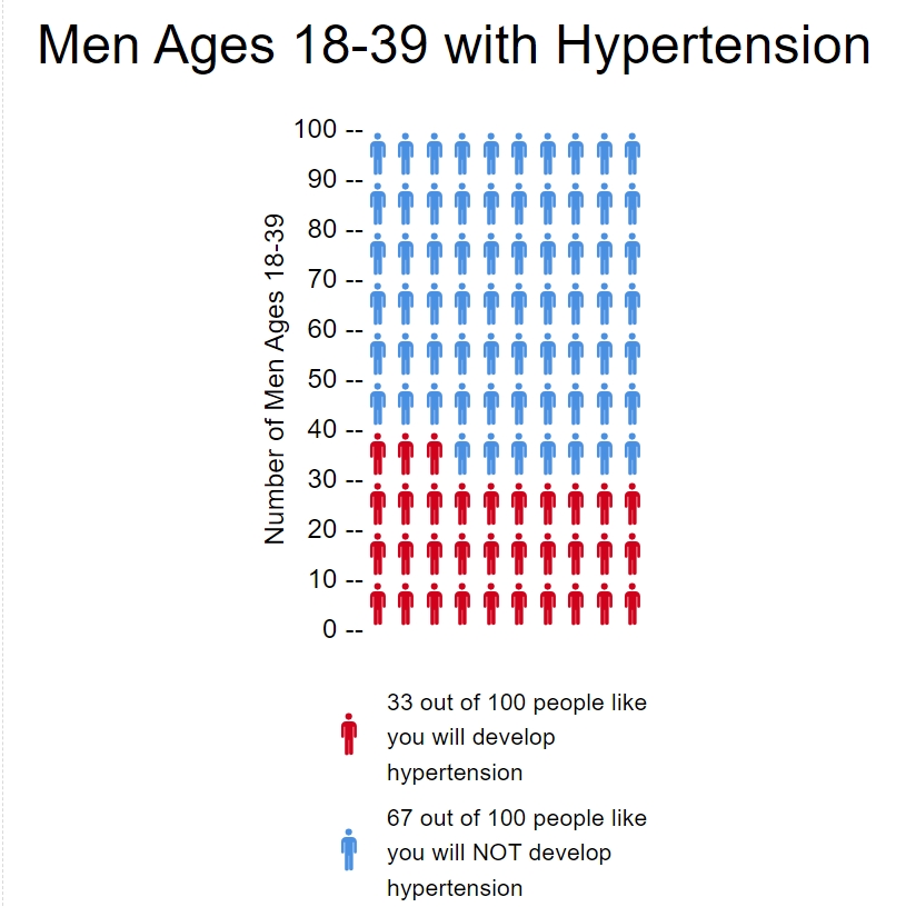
For my icon array, I researched data on hypertension in young men. As it pertains to men 18-39, there is a 1/3 chance that they have hypertension or blood pressure above 130/80. This can be seen in the icon array below with approximately 33 out of 100 males at risk.
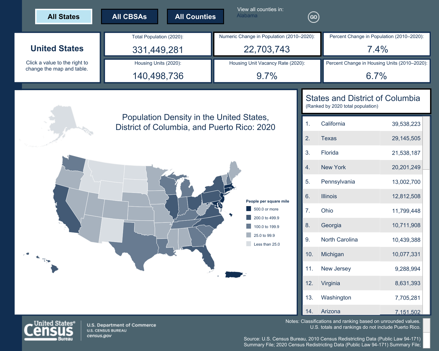
Example Datasets for Infographics
Lamar Miller
This is an example of a Census Bureau infographic depicting population density. Attached here you will find a link to redistricting datasets that were used to assist in building this graphic. Datasets like this one are used by government agencies and private firms to build insightful and factual infographics. The destination URL provided below will redirect to an interactive version of this graphic. Tableau offers tools that students can use to create interactive infographics. Graphic.