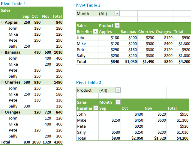
Demystifying Pivot Tables: A College Student’s Guide to Data Analysis
Introduction:
Just a little bit of interest and a desire to try something new will do; coding is not anything to be concerned about. We’ll dispel common misconceptions about pivot tables, go over their applicability, and demonstrate how to utilize them to make an impression on potential employers and teachers in this blog post.
What Makes Pivot Tables So Special?
“How on earth do I make sense of all this?” is undoubtedly on your mind as you look at this enormous spreadsheet filled with figures. Presenting pivot tables, your newfound ally in the data analysis space. You can organize and summarize your data using these useful tools without having to be a Ph.D. spreadsheet expert.
How Do They Work?
Think of pivot tables as virtual LEGO blocks for your data. You can drag and drop your columns into different areas to create a customized table that highlights the trends and insights you’re looking for. It’s like magic, but for data geeks like us.
Cool Features You Need to Know:
Summarize Like a Pro: Want to know the average, sum, or count of your data? Pivot tables have got you covered.
Filtering Magic: Zoom in on the stuff that matters by using filters to focus on specific data points.
Grouping Goodness: Let pivot tables do the heavy lifting by automatically grouping your data by date, category, or any other field you fancy.
Make it Pretty: Customize the look of your data with formatting options. Impress your friends with a sleek and professional-looking report.
Real-Life Applications for College Life:
Grade Analysis: Wondering which classes are your strong suits? Pivot tables can help you break down your grades by subject or semester.
Budget Crunching: Keep track of your spending habits by categorizing expenses and creating a budget overview.
Extracurricular Excellence: Use pivot tables to analyze your involvement in clubs, sports, or other activities. Spot trends and areas where you can level up.
Conclusion:
Pivot tables might sound a bit intimidating at first, but trust us, they’re a game-changer for anyone dealing with data – and that includes you, college student! As you navigate through your academic and personal life, having these skills in your toolkit will make you stand out. So, grab that spreadsheet, give pivot tables a spin, and get ready to conquer the world of data analysis with confidence!
Unveiling the Power of Pie Charts in Data Visualization
The Strength of Pie Charts
Pie charts are like the unsung heroes of data visualization. They might appear humble, but their ability to convey the composition of a whole is unmatched. They shine when you need to represent percentages and proportions, making it easy to grasp the distribution of elements. For instance, in a recent project, I employed a pie chart to showcase a company’s revenue breakdown by product category. The result was a clear and accessible snapshot of each category’s contribution to the total revenue.
When to Use Alternatives
While pie charts have their merits, it’s crucial to recognize when to opt for an alternative chart type. Bar charts are more effective when comparing many categories, and line charts excel at illustrating time-series data. In cases with numerous subcategories, stacked bar charts or treemaps might be the better choice.
Designing a Winning Pie Chart
To create an impactful pie chart, follow a few design principles. Use labels to identify each segment, explode important segments for emphasis, limit your color palette, avoid 3D effects, and add a legend if needed. These tweaks ensure clarity and readability, making your pie chart an engaging and comprehensible tool for data presentation.
In a world where data speaks volumes, mastering the art of pie chart design is a valuable skill for college students and aspiring data analysts. It’s simplicity combined with its versatility makes it a go-to choice for visually representing data. By understanding when to use a pie chart, and by adhering to these design principles, we can present data effectively and be well-prepared for the data-driven challenges of tomorrow.
Example
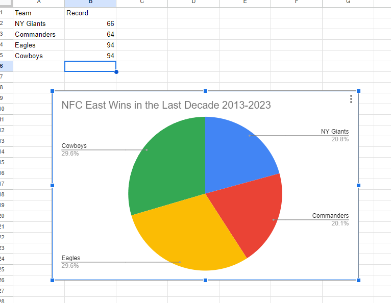
I made a pie chart on the NFC East in the NFL of choice to visualize the data. The chart effectively conveys the distribution of wins among the four teams in the division: the NY Giants, Washington Commanders, Philadelphia Eagles, and the Dallas Cowboys. This choice is compelling because it simplifies the complex data by visually showcasing how each team’s wins contribute to the whole, which, in this case, is the total wins in the division over the specified timeframe.
The pie chart excels when there’s a limited number of categories, which aligns perfectly with our scenario of only four teams. This ensures a clear and straightforward representation, making it easy to understand the proportions of wins each team has contributed. For viewers, this pie chart serves as a quick and intuitive way to gauge the performance of each team in the NFC East during the past decade.
By Shaun Sneddon
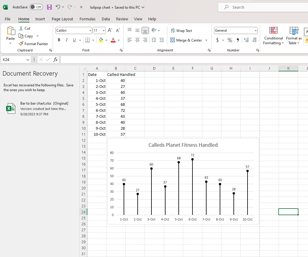
Lollipop Graphs
By Shaun Sneddon
Unveiling the Lollipop Chart: A Sweet Way to Visualize Data
In the world of data visualization, a lollipop chart stands out as a charming and efficient tool. It combines the best of bar charts and scatter plots to make your data pop. In this post, we’ll explore what a lollipop chart is, when you should use it, and we’ll create one together.
What’s a Lollipop Chart?
Imagine a vertical line (the “stick”) with data points as markers (the “candies”). This is a lollipop chart! It’s ideal for showcasing a handful of data points, ranking items, highlighting outliers, and tracking changes.
When to Use Lollipop Charts
Few Data Points: If you have a small set of data to compare, a lollipop chart simplifies it elegantly.
Outliers: It’s great at spotting unusual data points that stand out.
Rankings: Show rankings or positions in a dataset clearly.
Changes Over Time: Use it to track how data changes over time or across categories.
Data Distributions: Combine it with other charts to display data distributions.
Creating a Lollipop Chart
For our example, let’s track the quarterly sales of three products – A, B, and C.
Input Data: Use your preferred data tool, like Excel or Google Sheets. Create columns for “Product” and “Sales.”
Design the Chart: In your tool, use a bar chart or scatter plot. Make the data points circular (or use candies).
Customize: Personalize your chart by adding labels, changing colors, and adjusting the size.
Titles and Legends: Don’t forget to label your chart correctly.
Conclusion
Lollipop charts are a delightful way to make data more appealing and understandable. They shine when you want to highlight key points, compare a small dataset, or reveal outliers. So, spice up your data visualization and give lollipop charts a whirl!
Comparing Numbers
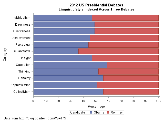
I came across an interesting dataset and a corresponding visualization that compared the characteristics of Barack Obama and Mitt Romney during the 2012 US presidential debates. The graph in question is a radar plot displaying 12 characteristics of the candidates’ words during the debates. These characteristics include “directness,” “talkativeness,” “sophistication,” and more.
However, I found the radar chart a bit challenging to interpret effectively when comparing the two candidates. I’d like to discuss two valuable tips that can make such comparisons clearer when using graph visualizations:
- Graphing the Differences: When comparing two groups, it’s often more intuitive to graph the differences between them rather than plotting each group separately. This can help viewers focus on what sets the groups apart. In the context of the 2012 debates, this could mean creating a graph that visually emphasizes the differences in characteristics between Obama and Romney, making it easier to identify distinctions in their speaking styles.
- Sorting Categories by Meaningful Quantity: In any plot that has a categorical axis, it’s essential to sort the categories by a meaningful quantity. This ensures that the visualization effectively conveys the message you intend. For instance, if the radar chart includes characteristics like “directness” and “sophistication,” consider sorting these characteristics in a way that highlights the most relevant differences between the candidates.
As for the dataset provided, it appears that the numbers represent the relative percentages of each characteristic attributed to Obama and Romney during the debates. For example, in the category “Individualism,” 47% of the phrases were attributed to Obama, while 53% were attributed to Romney.
By Shaun Sneddon
https://blogs.sas.com/content/iml/2013/08/21/comparing-two-groups-graphically.html
Benchmark Visualizations
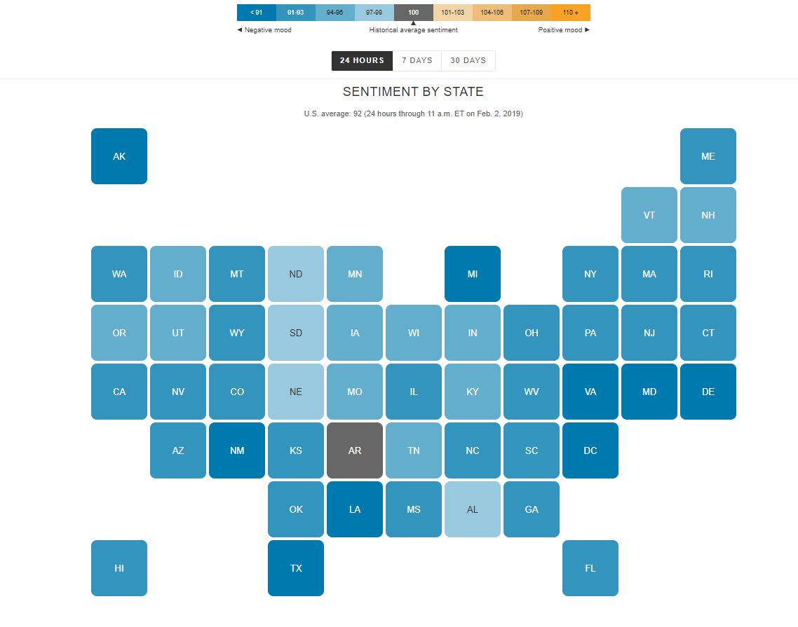
I find the “U.S. Social Sentiment Index” quite intriguing. It’s a creative way of harnessing the power of social media, specifically Twitter, to gauge our nation’s mood in near-real-time. What caught my attention, in particular, is how they use benchmarks to add context to the sentiment data.
In this case, they don’t just look at raw sentiment but also compare it to the current sentiment on Twitter. This means that they calculate a benchmark sentiment level based on the tweets they’re analyzing and then position the current sentiment relative to that benchmark. This approach is crucial because it provides a point of reference. It helps us understand whether the current sentiment is above or below the average sentiment of tweets from people across the country. For instance, if “most states are in the negative,” it suggests that the sentiment in those states is predominantly negative compared to the average sentiment in the analyzed tweets.
What’s even more fascinating is how this data is presented in near-real-time, updating hourly. It’s like having a live pulse on the nation’s emotions, and for data enthusiasts like us, that’s a treasure trove of insights. It’s a reminder of how data visualization can make complex information accessible and meaningful.
By Shaun Sneddon
http://graphics.wsj.com/twitter-sentiment/
Infographics
By Shaun Sneddon
- Examples of insightful data visualizations:
- First example I found that very interesting because I do love Star Wars was a graph of all the characters (over 20,000) are connected.

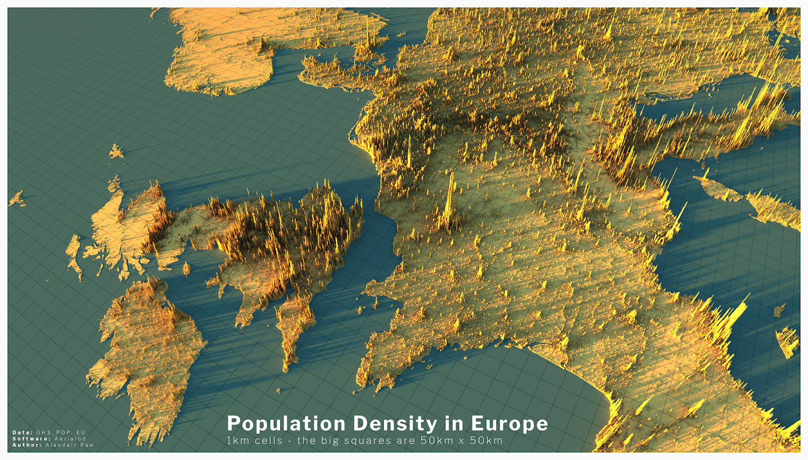
- The second example I found intriguing was a 3D data visual of where higher populations are located in Europe. When you look at a map of Europe you see the cities and can think that’s where a lot of people live but with this 3D visual you can see where people are vastly located.
- Example datasets for potential project use:
- Airline Safety
- Traffic accidents in a community
- Fatal Car accidents by country
- Stress at universities
- Tools that may help us construct Infographics:
- There is many websites that can help students construct Infographics such as Infogram, Adobe Express, and many more.
- Tools such as accessing data and images on the Internet.
- Website used for the images https://careerfoundry.com/en/blog/data-analytics/data-visualization-examples/