SANKEY
After playing around with the simulators within our energy system on National Academics: What You Need To Know About Energy, I am actually quite shocked. Within their page, there are multiple different walkthroughs of how to conserve wasted energy at home and even on the road. When I first started going through the pages, the first one that popped up stuck out to me.
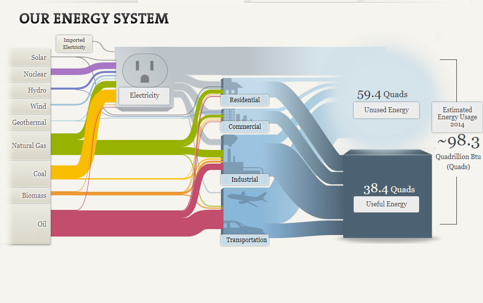
The picture above is one of the simulators on their website that shows you our energy system. Each category of energy is on the left side and it shows you where it goes to. What blew my mind was in the end, there were 38.4 Quads of useful energy, but there were 59.4 Quads of unused energy. Keep in mind “quads” is really quadrillion BTU. This is more than the used energy! I also liked how within this visualization, each category had a different color so you could see exactly where it goes to. For example, Natural Gas which is the color green goes to Industrial, commercial, and residential.
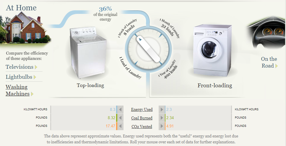
Another part of this website that I thought was beneficial, was the ways to conserve energy at home and on the road. Within the at-home section, you could choose between television, lightbulbs, and washing machines. I decided to play around with the washing machines page, which I thought was really cool. Washing machines were reported to use 36% of the original energy. You can turn the dial to either one load of laundry or 1 week of laundry. You could do the same with 1 month, and 1 year. You can see on each one how much energy you use, how much coal burns, and the CO2 vented between Top-loading and front-loading. This website is definitely beneficial to someone who could be looking to learn more about ways to conserve energy and interact with different pages of useful information.
Using Pie Charts to Represent NHL Playoff Percentages
Using pie charts is beneficial for showing percentages that display the proportions of the data. Each section of the pie chart resembles a different piece of data. For my pie chart example, I decided to take the Metropolitan NHL Teams and researched their percentages of making it into the NHL playoffs. It is still early in the season, so the data I have researched changes weekly. My information is based on playoff chances as of Sunday, October 23rd, 2022. Using monkeypuck, I took the percentages of all the Metropolitan Division Teams, which can be found on the NHL’s official website.
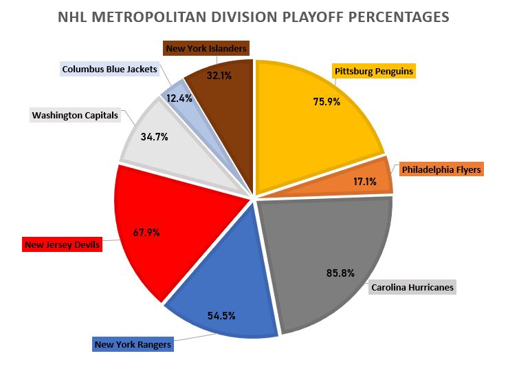
As I was making my pie chart, it was rather easy to display the numbers and data. I then realized, if I moved the data labels while they are outside of the pie chart, it would automatically draw a line to the corresponding data. I made each data label color match the corresponding team as well as each slot in the pie chart. For example, the Philadelphia Flyer’s team consists of black, orange, and white. As shown on the pie chart, you can see the Philadelphia Flyer’s slot is colored orange. I also related the colors of the other teams, to the boxes as well, which can be seen in my pie chart. I also changed the fonts and font sizes, along with adding text boxes for the percentages of each team, inside the pie chart. Specifically for the data set I used, the pie chart is the best way to display this data. Otherize, a bar graph could be used as well, but I do not think it is as visually appealing in this scenario. I believe this data is better served as a pie chart to visually see the different percentages of each team’s playoff odds.
Benchmark Comparisons
This blog explains the comparisons that I found The New York Times uses with their benchmark graphs. My comparison is based on the 2022 Presidential Election Results. News companies tend to use benchmark graphs to explain Presidential and political races. It shows the number needed to be elected, along with each state’s final vote. 2020 was a unique situation because there were multiple recounts for the final voting results, which is shown on the map graph below.
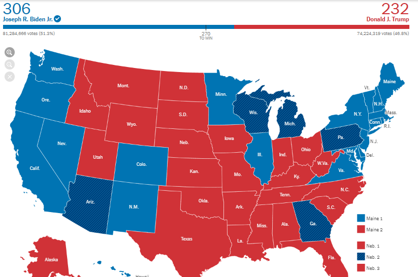
This benchmark represents 270 points needed for one of these competitors to win the overall election. Even with the recount of multiple states, multiple times, there was still a winner, which is our current President, Joe Biden. He was elected with 74 more points than former President Donald Trump.