Home » Articles posted by Jacqueline Ruiz
Author Archives: Jacqueline Ruiz
Pie Charts
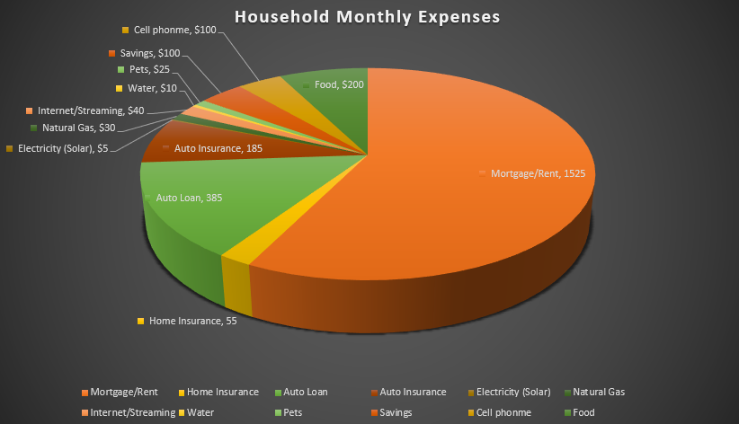
I felt a pie chart was an ideal choice to show monthly household expenses. It provides a clear and visually appealing way to represent various expense categories within a budget in proportion. Viewers can quickly identify the larger and smaller slices, thus providing immediate understanding where the money is going. You are able to make comparisons and it helps with seeing where spending is a priority and make informed decisions. I referred to From data to Viz | Find the graphic you need (data-to-viz.com) which helps you choosing an appropriate graph for your data and excel itself had tutorials that walked you through choosing correct pie chart. I also think a bar chart could work in this example as well.
Benchmark Comparisons
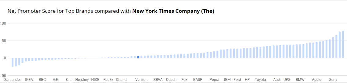
Benchmarks provide context, allows for assessment of performance, helps identify outliers within data and can be used to set goals and targets. Decision-making benefits, more informed choices, performance improvements and communication become effective with benchmark comparisons. There is quality assurance, allows for competitive analysis and even assessing effectiveness with programs and policy. You are able to conclude with meaningful insights. The example below is from NY Times and the Net Promoter Score for Top Brands. It’s a simple bar graph with minimal color. Net Promotor Score (NPS) is a customer loyalty metric that measures a customer’s willingness to return for another purchase/service but make recommendations as well. This can increase a company’s revenue. Scores higher than 0 are typically good and above 50 is excellent. The bar graph has list of companies on the y-axis with the scores on the x-axis
Art of Information: Free Infographic Tools
There are many websites that offer free, easy to use, infographics. I found one called Piktochart. Very easy to sign up at (piktochart.com).
With infographics, we know there is visual engagement, storytelling, clarity and simplification if done correctly. With the right visual, it becomes more memorable and sharable. People tend to remember information that is presented with an infographic.
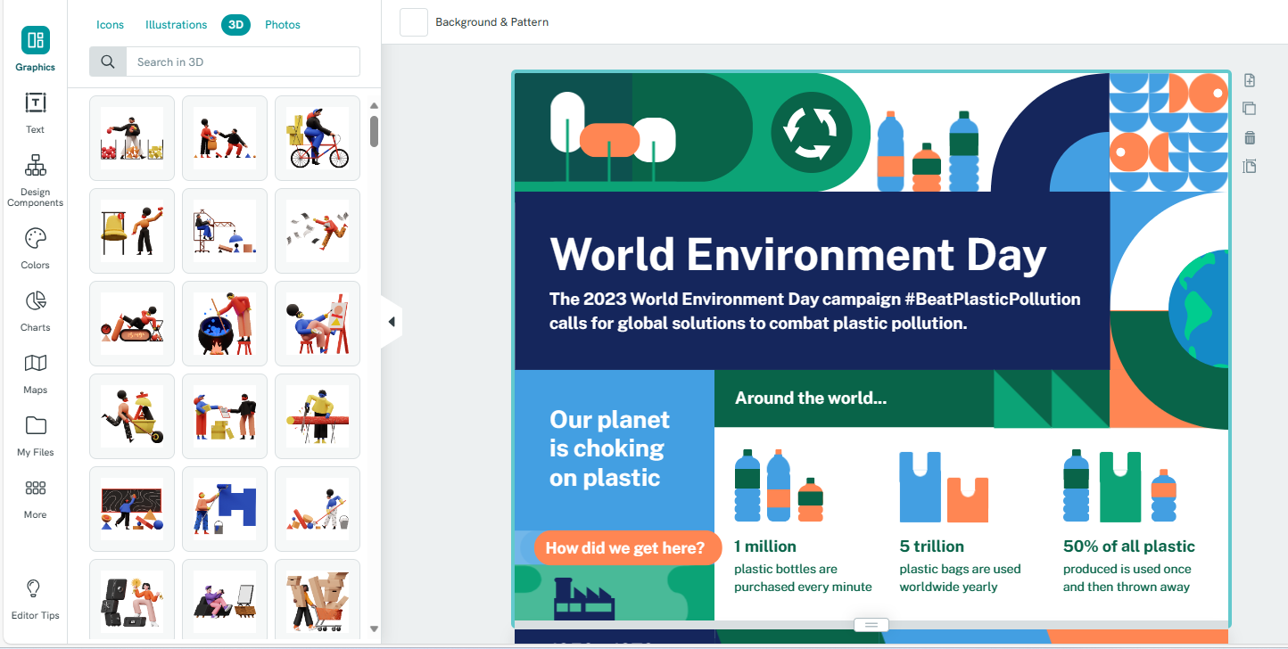
Below is an example of an infographic and its editing tools.
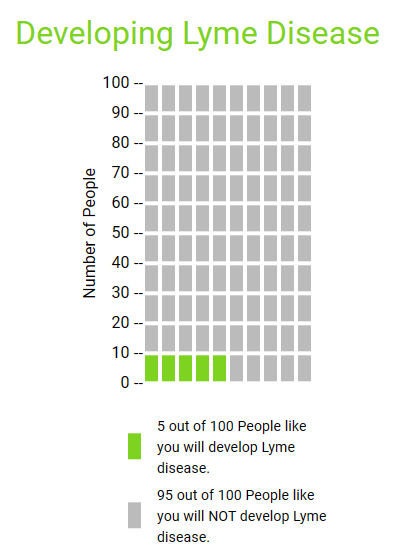
Developing Lyme Disease
I found Icon Array very useful and easy to use. I liked how it allowed me to change font size, color, etc. I would use it for simple data and no-frills visualizations to display for an audience. I played around with the colors for my example.


Podcast: Play in new window | Download