Infographics

This is an example of a mind map that can be made on a tool called Canva. Canva helps create info graphics. These graphics just don’t stop at minds it also expands further making charts, and diagrams. This tool makes it easy to map out where you would like to set elements to make your graphic easy to understand and fun to look at!
Comparing Numbers (McDonalds Age Demographics)

This graph was pulled from our final project and it highlights the comparison of ages that frequent McDonalds. This graph also highlights the most popular demographic, that being the ages 25-34. This age group visually is larger than the others and also can be seen through a number. Showing how large this demographic really is.
Real world use of Pivot Tables

This screenshot shows a real world example of how any company can quickly sort and summarize candidates for interviews. This pivot table houses over 1000+ people that are interviewing for different roles within a company. For a single person to manage this data and collect performance with experience is tough even through an excel sheet. A Pivot Table can make it easy for anyone to manage people to this size!
Sankey Graphs (Data on the move)

This is a Sankey Graph of energy moving from solar panels moving through the energy grid. I took an interest in this one because with California being such a progressive state, I would assume that solar would have a bigger impact to the energy grid when in reality the numbers state other wise. Seems that natural gas and oil sill are the main strong points that carry our energy consumption. I really enjoy this way to represent data because it is interactive. These types of graphs should only be used when the audience is on an unguided tour of collected data. It allows for the audience to explore and see how data can move from one place to another. Though this data can be represented by pie charts this is an amazing visual only due to the fact that it is interactive.
Pie Charts
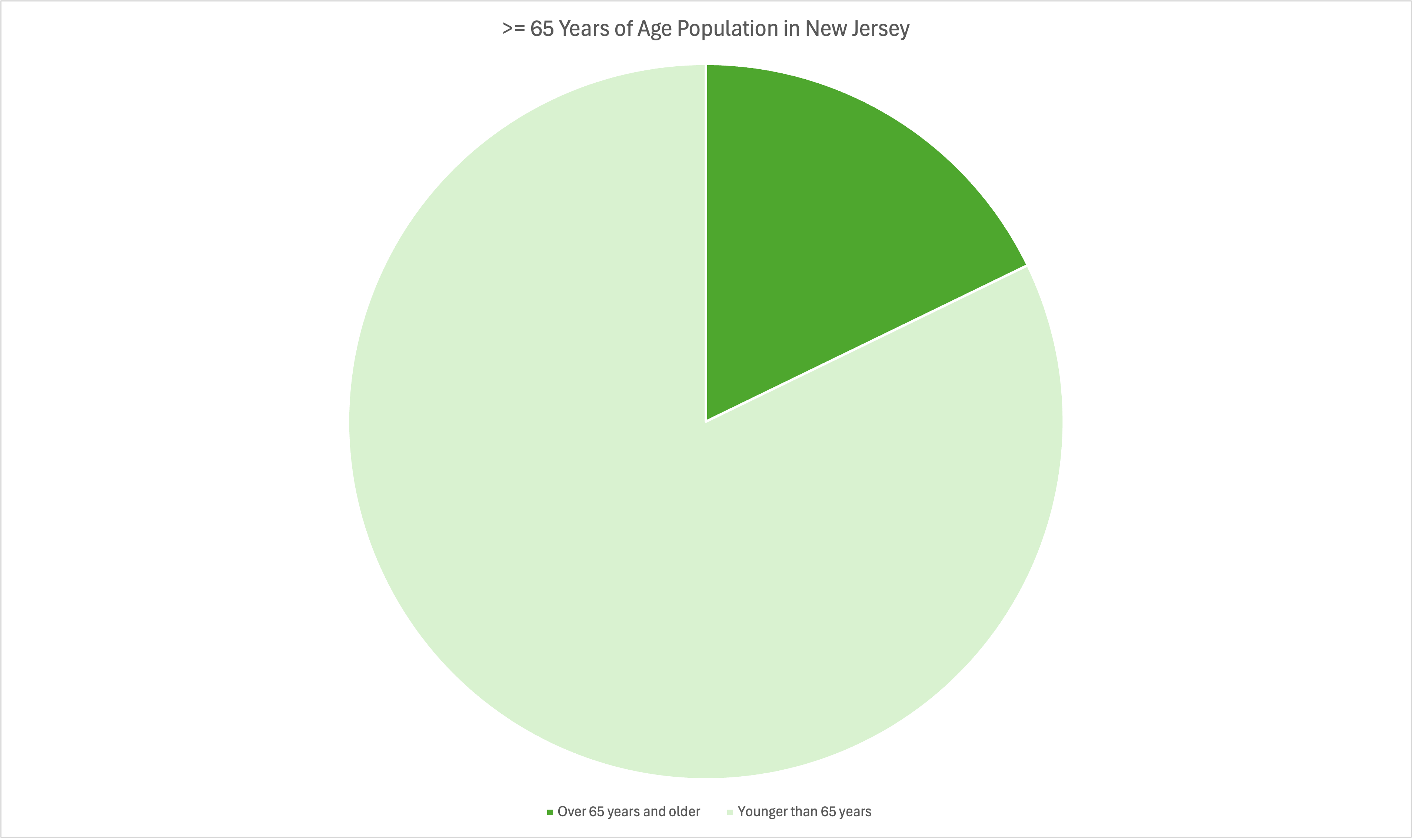
Pie Charts are a great way to show different pieces of a whole. In other words, as long as your data can be represented as 100% it can be represented as a Pie Graph. Pie Graphs are the easiest to understand at a glance and require little to no in depth explanation. When your data can be represented as 100% as a whole, the only reason where you wouldn’t use a pie graph is when most of the separate values are so similar that they can not be differentiated at a glance. In those cases the best graph to use would be a bar graph.
Lollipop Graph

This graph is a lollipop graph for average annual salaries found across different countries. The highest of those being leading countries in education and job opportunities. Those being such as US,Australia, Netherlands, and Germany. The countries in lower tiers communist countries such as China and though Russia is not shown their annual salary is about 14,000 a year. Since the wealth is distributed more in these countries show a lower annual income. Lollipop graphs outside of this typically are used in rankings or used to show trends across different mediums.