Benchmarks: Standardized Testing
Today we will be deep diving into how different people show comparisons to the benchmark. A benchmark is a standard or point of reference in which things can be compare. A great example is when benchmark testing was taken place during schooling. This data was used to see where you compare against students the same age as you.
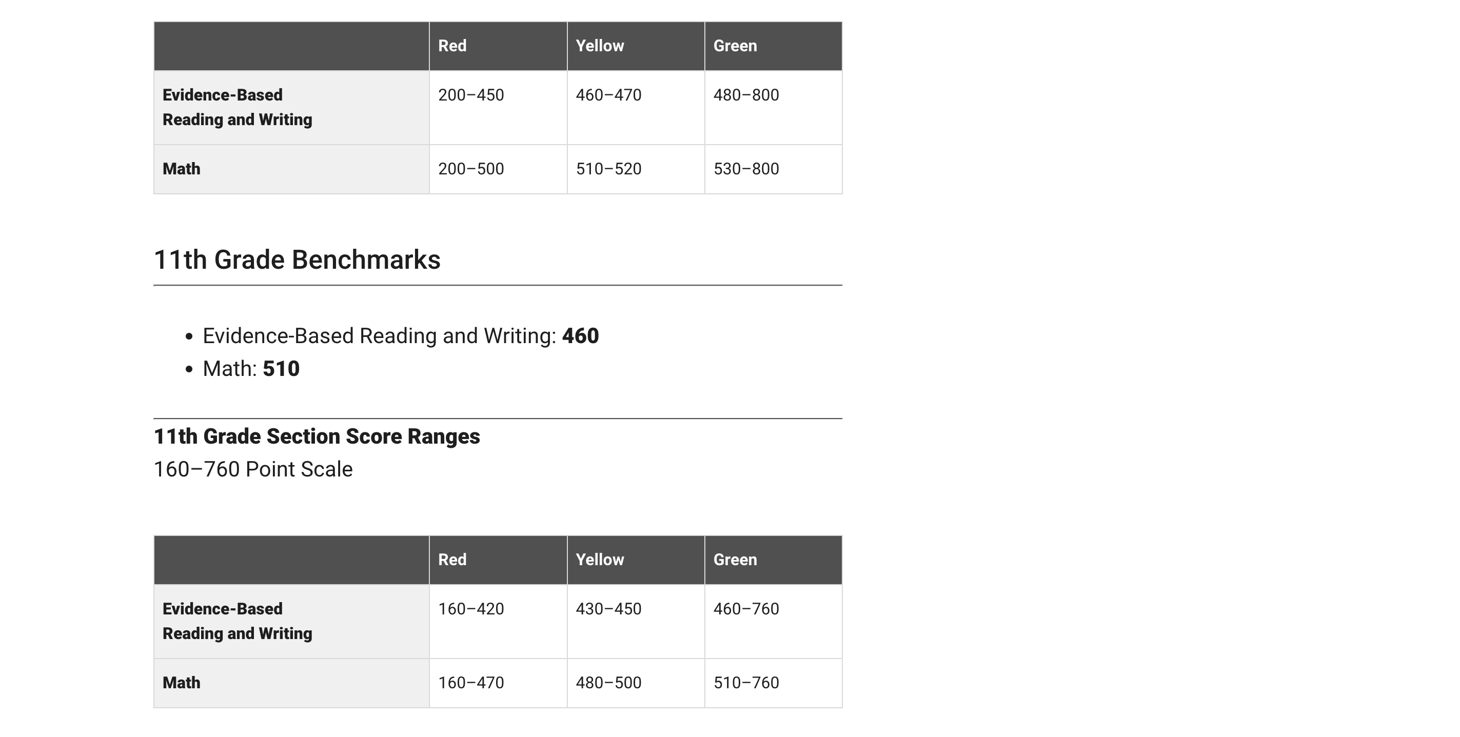
I will be using the college board SAT testing as an example. The college board uses benchmarking in order to determine where your test score should land based on your grade level. In the example below, they state that the benchmark is 430 for reading and 480 for math. These scores are based on if you were a 10th grader. They then breakdown the score into three categories: Red, Yellow, and Green. These sections represent how below or how above you are the benchmark.
In the article, How Perceptions Can Skew Reality: A Data Visualization Approach How NYC schools’ academic performance differs from public perception, they use benchmarking to determine where each borough of NYC lands with regards to SAT testing. In this article they take into consideration things such as poverty level.
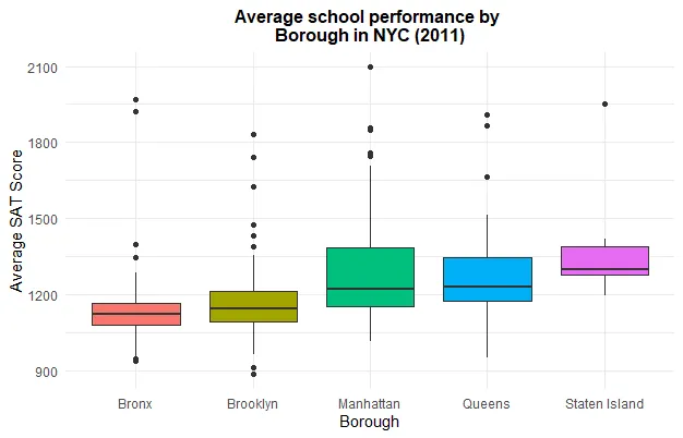
Schools in the Bronx performed worse due to the fact that the poverty rate is much higher. I feel as if data visualizations are very important especially with regards to benchmarking. It allows for an individual to compare themselves to the norm and make adjustments where needed. Everyone has grown up with benchmarking especially with regards to academic performance on things such as standardized testing. its interesting to put this into perspective.
VizHealth
Using the Vizhealth website has been quite interesting. The interactive website allows for you to calculate how at risk you are to cardiovascular disease. It uses interactive aspects with the ‘risk calculator’ to showcase how likely you are to develop this disease. Based on inputs, it showcases a visualization to showcase how at risk you are. This visual is very successful in all cases. It uses large numbers to showcase important data points within your results. I feel like it’s a really cool way to display really important medical information!
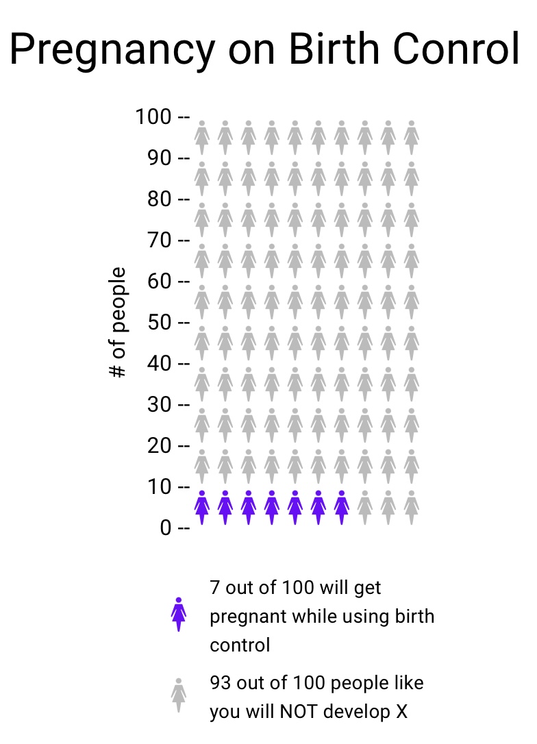
I found using the ‘Icon Array’ feature to be very simple to use. I found it as a quick and effective way to display data. I enjoyed how easy it was to use and edit. I used he example of pregnancy while using birth control. Although it is something that is unlikely, it still highlights the chance of possibility.
Insightful Data Visualization
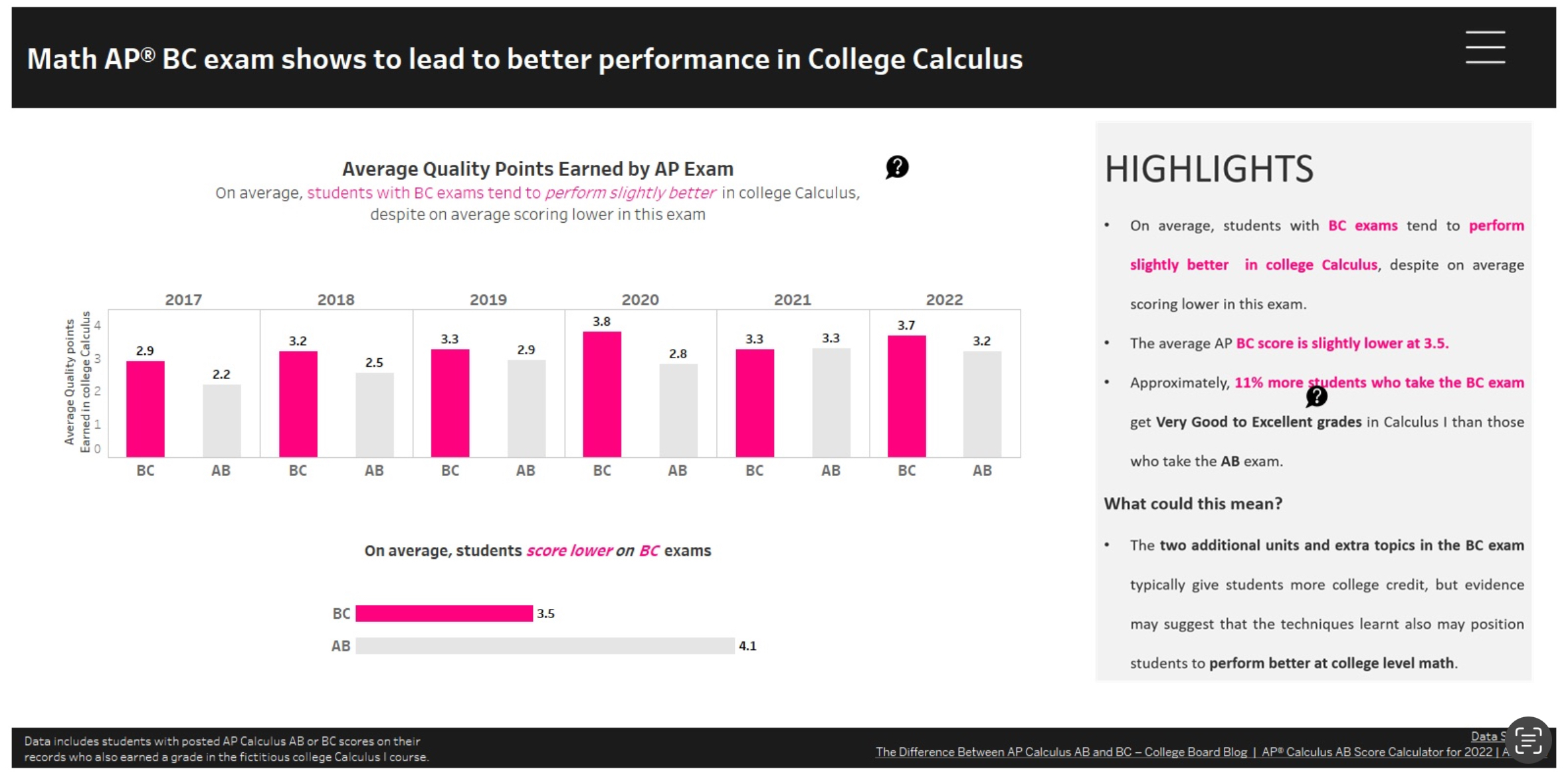
Data graphs are an essential way to display information effectively and efficiently. Graphs are essential to everyday and something seen all the time. Visual data has been around since 1786 when William Playfair used charts to showcase British trade and debts. One of the most important aspects of data visualization is clarity. In the image above, it depicts the relationship between student grades in AP Calculus and how well students perform on the test. What makes this infographic successful is the clarity shown throughout it. The infographic is clearly defined by the title given. They also included an interactive aspect to allow individuals to hover each column presented to view more details. By creating an interactive infographic, it causes more engagement due to the information scattered throughout. On the right hand side, they included important key details relating to the study. It allows for individuals to make their own discoveries and dissecting the information. According to UX Planet, “Insights are patterns in the observations we make in the world. They give us an understanding of a specific cause and effect within a specific context. They help us explain our observations.” Insights provide us with a different perspective in order to reframe the problem and provide a different way of thinking. The infographic above represents insightful data due to the offer of understanding of the topic.

Podcast: Play in new window | Download