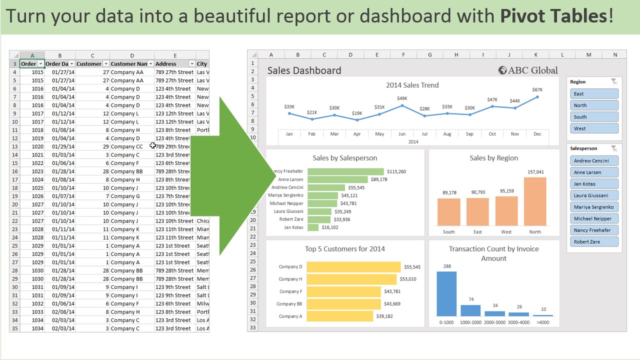
Pivot Tables
By: Veronica Perkins
Like any other visualization, the intention is to help visualize the data being presented to an audience. The purpose of a pivot table, is to help visualize and a large amount of data at one time. A typical pivot table looks like this:
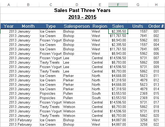
As you can see, a lot of information is presented in the format of a pivot table. This pivot table is an example of how a lot of information is summarized. In this example, the maker wanted to present the sales from the past three years. They decided to break it down between the following: year, month, type (meaning what was sold), the salesperson that sold it, the region of the sale, the sale amount, how many units were ordered and the order number that correlates to the sale. Pivot tables can be so helpful to use because they can help break down a large amount of data at a glance. This information, can also be used to make visualizations to help represent the data.
Sankey
By: Veronica Perkins
Sankey is a tool that can be used to create interactive visualizations in a way that helps your audience follow. Upon exploring Sankey for over ten minutes, I was so intrigued. However, it can be a little intimidating.
Now let’s discuss the usage in our energy system…
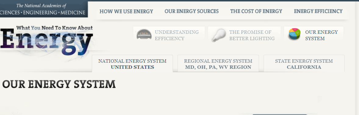
Right upon entry of this visualization, it takes you to the home screen pictured above. Within this home screen, you can see how at the top, it lists several other tabs that can move you to another data set. For example:
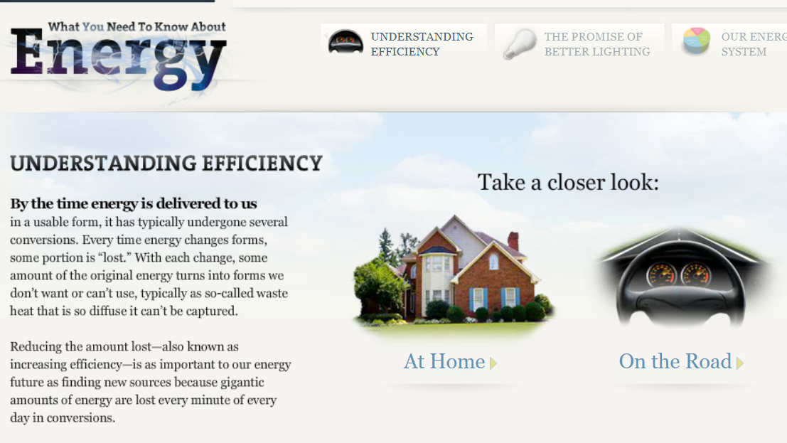
When I clicked on the “Understanding Efficiency” tab, it brought me to this page. On this page, it briefly explains the point of efficiency and what it does, while on the side it has two interactive buttons. These interactive buttons are just one great example out of the whole project. They allow the audience to click on them and explore. By having interactive features throughout your project, it allows for the audience to read, comprehend, and travel through each data set at their own pace.
Overall, I really enjoyed how interactive this project was. It was very well organized and left the reader/audience to go through each data set at their own pace. However, sometimes I feel like an entire website can feel like a bit of overkill when it comes to project like these. I feel as though there are other ways to keep your audience entertained while presenting them with data set; without having to do all of this. To be less harsh, I believe that sometimes an entire website can be a bit much and sometimes the audience can get bored or not want to participate anymore. Also, the Sankey graphs themselves can be very overwhelming to the audience and may even leave them feeling lost. Instead, providing simpler graphs with a lot of color variations and details, may be easier for both the creator and the audience.
Pie Charts
By: Veronica Perkins
Pie charts are a form of data visualizations that can help represent data given to us. Pie charts are ideal when your data adds up to 100. I made a pie chart to help represent this:
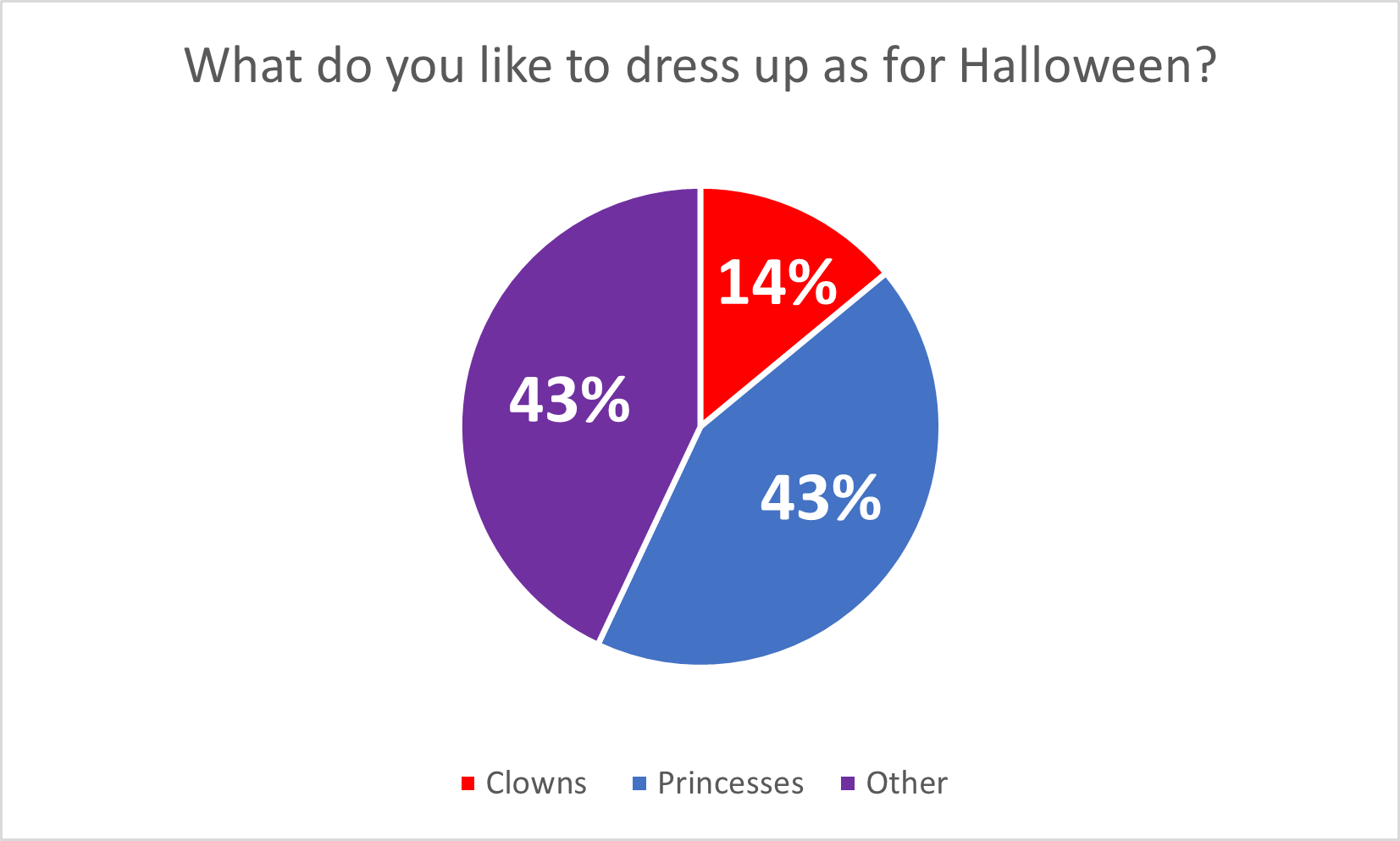
Pie charts are great for when you have multiple data points (that add up to 100%) because it allows the audience to see how the data is divided. In this case, the data I chose, represents what people want to be for Halloween and the data is completely made up. However, even though the data is made up completely, it still allows for the audience to see the data in a simpler way. I believe that this pie chart is a great version of data visualizations, but this data could also work on bar graphs as well. Here are a few tips for making pie charts: Be sure to vary each slice using different colors. Also adding data labels, such as numbers, can be a big help visually for the audience as well.
Happy creating! 🙂