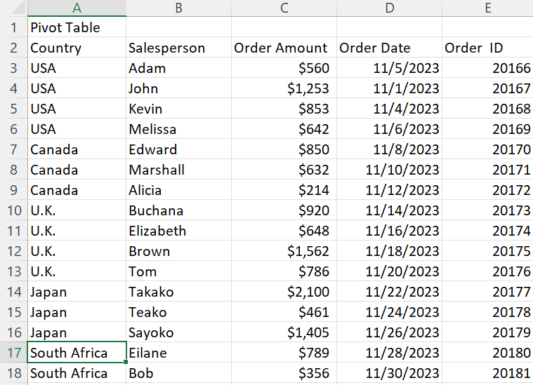
Pivot Table
Pivot tables are the best features in Excel. A pivot table is a powerful tool to calculate, summarize, and analyze data that lets one see comparisons, patterns, and trends in your data. Last semester I took a class in which I learned about pivot tables so I know how it’s work. A pivot table allows us to transform columns into rows and rows into columns. It allows grouping by any field and using advanced calculations on them.
In the real world, you are working in a company and your boss gives the big data to analyze and do organization in an order. A pivot table is the key to that problem. I am going to present my example of the pivot table. Here is an example of the pivot table in which salespersons are in different countries for sales. Now, I want to organize the salesperson’s name based on their country with the order amount. With the help of the pivot table, it will be very easy.
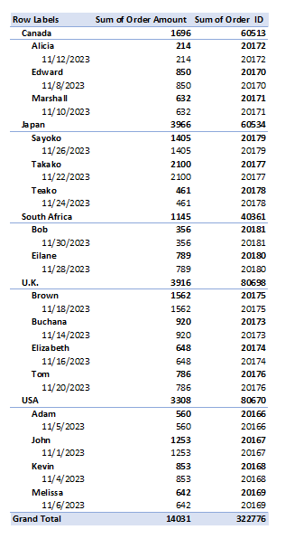
In conclusion, a pivot table is the most interactive way to quickly summarize large amounts of data. The pivot table summarizes complex datasets into a table that allows us to easily find patterns or solutions to any questions we might have about the datasets.
SANKEY
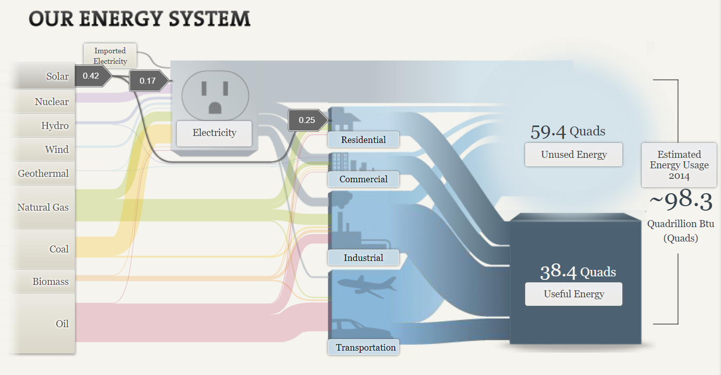
A Sankey energy flow chart is a specific type of diagram that visualizes the flow of energy within a system. It is generally used to analyze and display energy balances, showing how energy is generated, consumed, and lost within a given system. The first screenshot is about the solar energy consumed in the USA. Solar energy is the lowest energy consumed in the USA. I was shocked since solar energy is only used in residential areas. Solar energy is less harmful to the environment and it is renewable energy.
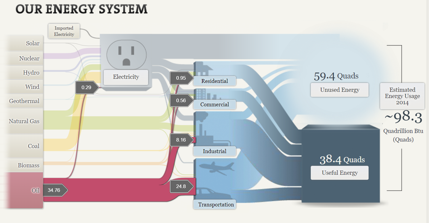
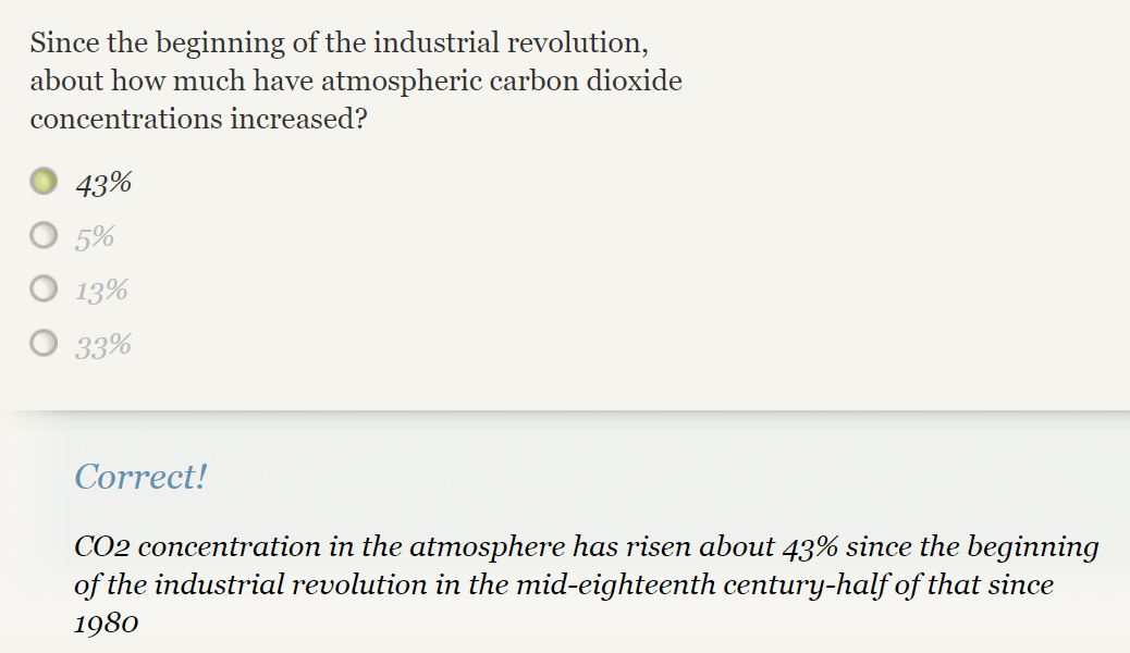
The second screenshot is about oil consumption in the USA. It is the highest among all. With the help of Sankey, it helps to determine how the usage of oil is classified into each sector. Transportation is the highest number in consumption of oil. Now here is the reason why our globe is impacted by climate change and global warming. Since the beginning of the Industrial Revolution, 43% of carbon dioxide concentrations increased. Carbon emissions come from human activities like the burning of fossil fuels such as coal, oils, and natural gas. In this SANKEY oil is the highest consumption for energy which was 34.76. The coal was 17.96 and natural gas was 27.52 which is quite enough for climate change and global warming.
To sum up, this website provides a good example of the energy system in the USA with different ways we utilize sources of energy. The website is really cool with the visualization it is clear and attractive By visualizing the energy flow in a clear and intuitive manner, SANKEY energy flow charts provide valuable insight into energy consumption patterns, helping to inform decision-making and improve energy efficiency.
Pie Charts
Pie charts are commonly used to visualize data that can be divided into distinct categories. Pie charts are used for showing the composition or distribution of a dataset. Using different colors, labels, and percentages, pie charts allow viewers to quickly understand the relative sizes of the categories and compare them visually. In a pie chart, the colors assigned to each slice play a crucial role in conveying information and making the chart easily interpretable. The choice of colors should be made carefully to ensure readability and accessibility. Pie charts are effective for displaying data with a small number of categories or when the differences in proportions are significant. Sometimes, it becomes less effective when too many slicers are created, and hard to understand for the reader. Here are examples of pie charts and how it used in data.
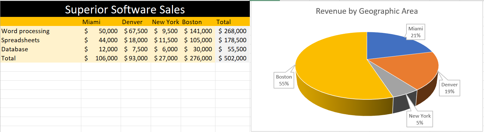
In this pie, I created data on superior software sales based on the top cities in the USA. The pie chart differentiate cities with different color giving the percentage values that Boston is getting 55% which highest and the lowest is New York which is 5%. Looking at the table feels like little complicated to understand but the pie chart attracts at first sight without any complication.
In conclusion, pie charts provide a clear and concise representation of categorical data and can be valuable tool for data visualization and communication.
Lollipop Chart
This blog is all about how lollipop charts should be used and how they effectively visualize data. A lollipop chart is typically used to compare two or more categories or variables. It consists of a horizontal axis and vertical lines that represent the values of each category or variable. Lollipop charts show changes over time since charts can be used to visualize changes in data over time. Lollipop chart highlighting differences between categories or variables. It is also used for presenting ranking or ordering. For instance, I made a lollipop chart in Excel based on ranking.
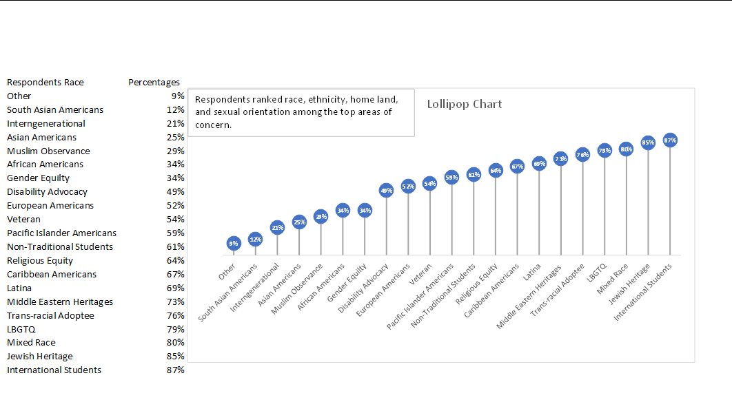
This lollipop chart is about respondents ranked race, ethnicity, homeland, and sexual orientation among the top areas of concern. You can see how each lollipop is labeled with data according to rank. Overall, lollipop charts are suitable for situations where you want to compare, rank, or highlight differences between categories or variables. Lollipop charts usually attract the reader because of the patterns within the data.
Reference
I chose this data from Evergreen Data.
Benchmark Analysis
In today’s world, many data charts have been used in the market economy and small businesses. This blog is about benchmark graphs and how they allow you to identify improvement areas to get the company on par with growth and success. With the help of a benchmark graph, it allows businesses to compare their performance against competitors. In addition, it gives strategic decision-making ideas by analyzing the performance of competitors. The benchmark graph is innovative in comparison with a regular bar graph. This blog, it’s all about “The Employment Situation in January” The number of jobs added in January came in well above market expectations after unemployment from 2020. Based on the report from the U.S. Bureau of Labor Statistics the unemployment rate ticked up by 0.1 percentage point to 4.0 percent.
Average monthly job growth over the last three months was 541,000 a fast pace.
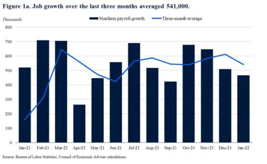
In this graph, the target line is a three-month average, and the bar graph represents nonfarm payroll growth. Since monthly numbers can be volatile and subject to revision, the Council of Economic Advisers prefers to focus on the three-month average rather than the data in a single month. This graph is the perfect example of good benchmark analysis since some bar column is above the target line which means there is growth in the number of jobs.
Labor force participation grew by 0.8% point year-over-year, a fast pace.
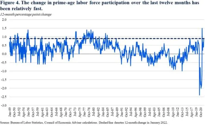
The above graph is an example of labor force participation. According to the Bureau of Labor Statistics, the labor force participation rate was 62.2% in January, up from 61.4% percent a year ago. The “prime age” (25 to 54) labor force participation rate was 82% up from 81.1% percent a year ago. The Council of Economic Advisers prefers the participation rate because it is less impacted by changes in educational enrollment and the natural slowdown in labor force participation caused by the aging of the population and retirements. As we can see in the graph back in the day the labor force was above the target line and it got below the line from the year 1990 till 2020.
Overall, a Benchmark graph is a powerful tool in data visualization for businesses and other organizations to gain better performance, tracking data, and identify areas for improvement and development. This activity cleared a concept of mine towards benchmarking and how it is used at a bigger stage. Getting the knowledge of this graph will help me in every sector of economic fields.
Reference
https://www.whitehouse.gov/cea/written-materials/2022/02/04/the-employment-situation-in-january-2/
COVID-19 Vaccine Comparison Chart
A comparison chart is an effective way to show and compare multiple options between two or more items. In this blog, there is a comparison between two COVID-19 vaccines which are Pfizer/BioNTech and Moderna COVID-19 vaccines. When both these vaccines approved by the FDA many people had questions about which vaccines were more effective and what are the side effects after receiving them. This comparison chart contains details of the vaccine age eligibility requirements, the number of shots required, days between shots, as well as side effects.
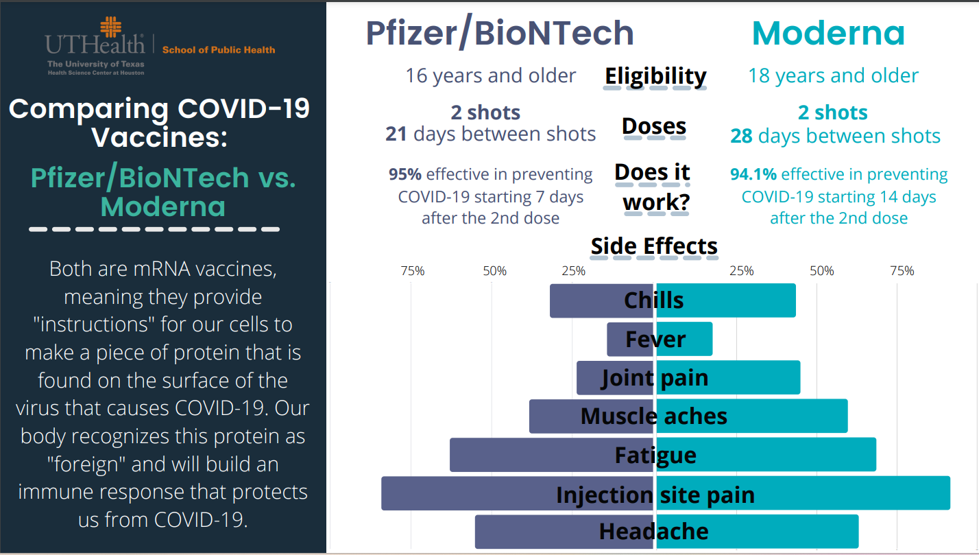
On the left-hand side, Pfizer/BioNTech provided data about the effectiveness of the vaccine and on the right-hand side, Moderna provided data about the effectiveness of the vaccine. Both vaccines are safe and effective based on their clinical trial results. The beauty of the comparison chart is it attracts reader at first sight and give important information right away about these two vaccines instead of reading whole in-text information. In addition, this chart mentions both vaccine’s side effects with percentage values so anyone can get an idea. The reason I choose this comparison chart since I am a certified immunizer and pharmacy technician at Walgreens and every time people have questions about vaccine’s effectiveness and their side effects. In conclusion, comparison charts enable us to make informed decisions and bring meaningful insights.
Reference
https://eagleanalytical.com/uthealth-covid-19-vaccine-comparison-chart/
Vizhealth
Visualization plays a crucial role in health science fields in terms of health education, analysis of numerical values, diagnosis treatment, and research. In this blog two important items: first of all risk calculator and second of all icon array. In the risk calculator going to calculate how much risk of cardiovascular risk in the next 10 years. The exciting thing about a risk calculator calculate the data and gives information in a color graph which basically, makes complex data into simplified information. The Icon Array Generator uses small icons to represent data.
Example of Risk Calculator
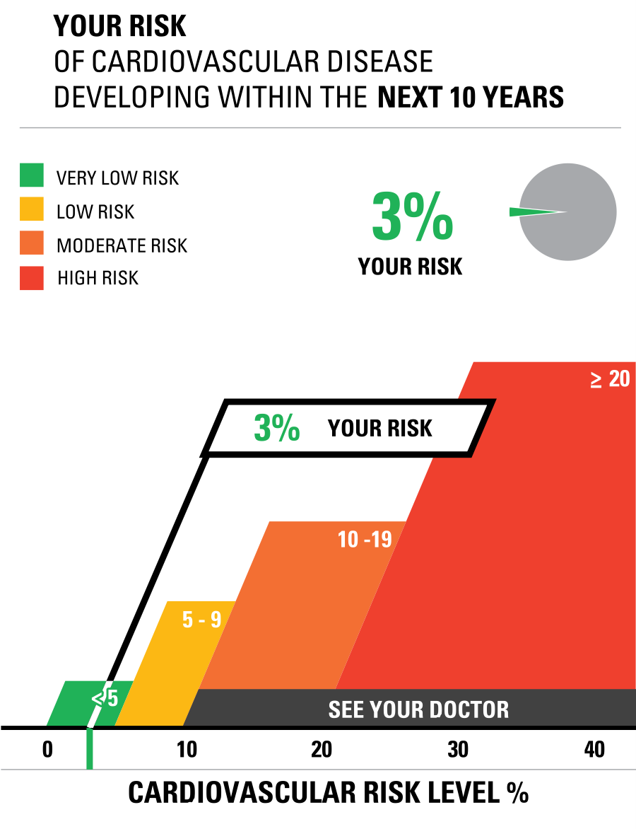
This is the chart used based on my father’s blood report in which I enter the data of cholesterol and blood measure at risk calculator. Finally, data visualization is the best tool to crack the numerical data into graphs.
Example of Icon Array
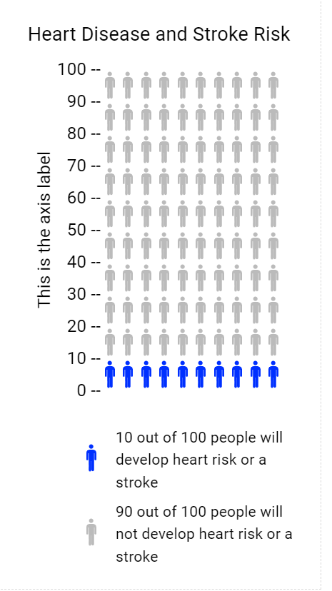
The Icon Array Generator I chose the topic of Heart Disease and Stroke Risk. Colored icons show the frequency of those at risk of Heart Disease and Stroke Risk and uncolored icons show the frequency of those not at risk. Both these tools of visualization are helpful techniques in the health science field. In addition, the Icon Arrays method is usually used in surveys, gathering data from worldwide, and many more.
Reference
www.cdc.gov
Infographic Design Tools: Visme
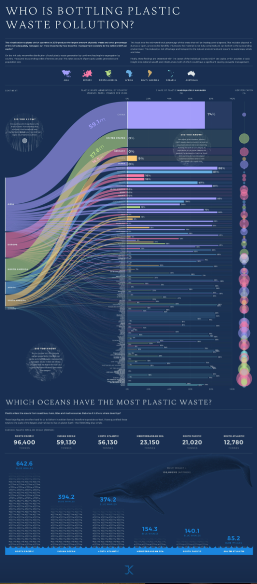
The above link to the infographic image
In our daily life how many plastic bottles of water, cold drinks or coffee cups are we using no one have any idea about how much plastic waste is thrown into the ocean worldwide. However, with the help of infographics, it is very easy to track that which country is doing more plastic waste pollution. This is the data based on the distribution of total plastic waste generation by continent. The purpose of this blog is to estimate the percentage of plastic waste that was inadequately disposed of. These types of graphics present complex information quickly and clearly. The infographic provides a great amount of complex information in a clear and precise picture of the current surface plastic mass by the ocean, measuring it in a creative way. In a bar graph, we can see plastic waste management for every country in a colored bar chart. The names of the countries that report 100% of all their plastic waste handled properly are highlighted in bold. In addition, the GDP of the country and efficient plastic waste management don’t always correspond as we can see by the irregular patterns shown in the infographic.
Reference
https://visme.co/blog/best-data-visualizations/