Pie Charts
Pie charts, when done the right way, can portray some of the simplest data in a very uniform and easy to comprehend way. The easiest data to portray using a pie chart would be data that represents “parts of a whole”, but this is not the only data that can be used in a pie chart. We can also use percentages to show contributions to a whole. One of the most important things to remember though when creating a chart to show this type of relationship, is that the data values within the pie chart must always add up to 100. It is also important to remember that pie charts, as well as any other chart or infographic, are used to tell stories. Because of this, we have to remember to keep the story as straightforward and concise as possible. Always remember to keep your infographics as clear as possible and to not jumble too much information or design in the graphic.
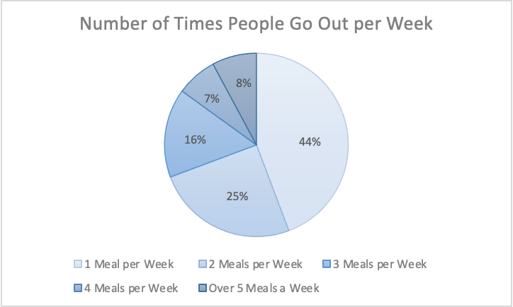
The information I gathered was from a study done of 626 restaurant goers, asking how many times a week they go out to eat. This information gathered from Tasting Table, I believe is best suited in a pie chart because it was presented to me in percentages of people. Percentages are easiest represented in a pie chart because it represents part of the 626 people surveyed.
Link to study: https://www.tastingtable.com/912246/new-survey-shows-how-often-people-typically-eat-out/
Data Visualizations in Health
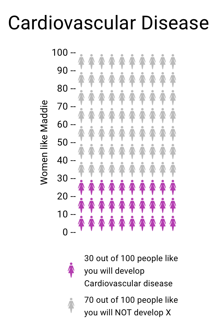
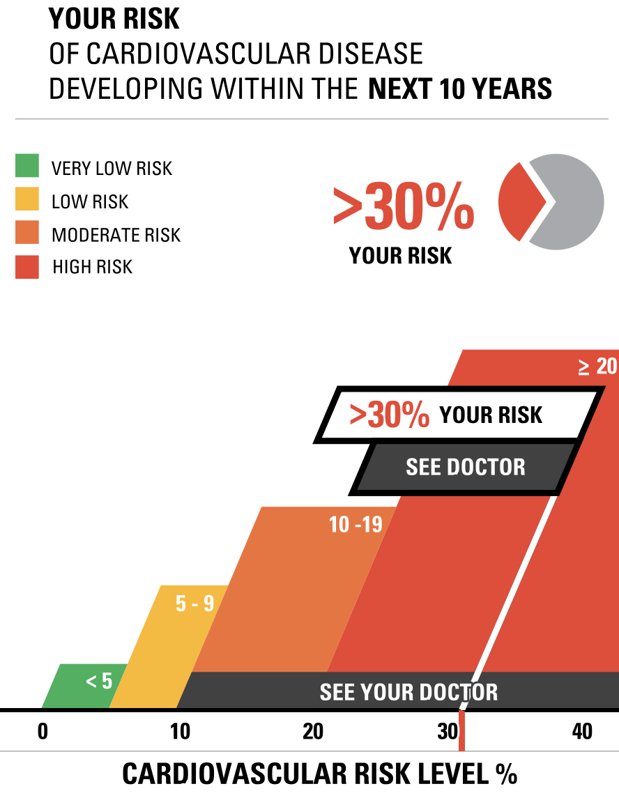
Vizhealth was a very interesting website to navigate and learn from. Two of the tools I used that helped create the data visualizations above was the risk calculator and the icon array generator. The first tool I used was the Risk generator. It prompted me with some questions to answer regarding my health, age, and other personal information. I decided to have fun with the calculator and input information that reflected an older woman with high cholesterol levels. The calculator then generated the visualizations to the right above to help me understand the results better. I think this is very helpful for visual learners in all fields, but especially the healthcare industry. This industry could not exist with performing studies and experiments, and these visualizations help make understanding results, ten times easier. After using this calculator, I then used the icon array generator. This tool was useful in visualizing the comparison between the true likelihood of a person with a similar health history to this woman developing cardiovascular disease.
Helpful Tools for Creating Effective Infographics

Link to image: https://www.buzzfeednews.com/article/stefficao/friendship-pinterest-board-tiktok-trends
One of the most important tools for creating an infographic, is finding a solid platform to find useful photos and images pertaining to the topic of your graphic. One of the most useful platforms I have found for this job is Pinterest. Pinterest is an interactive social media platform that allows you to create a virtual “scrapbook” of images and links pertaining to your interests and needs. Once the user makes their own account, they are then able to browse through millions of photos, videos, links, and webpages curated to their specific interests. The user is then able to create virtual boards and folders that can be personalized with names to keep projects and ideas organized. All the user has to do is “pin” whatever image or link they may find interesting to one of their personal boards. Many times Pinterest is used for planning parties, costume ideas, organizational tips, style inspiration, and so much more. There is also a growing use of people sharing art, photos, and different images that can be used in digital design and the making of infographics. These images can help curate different aesthetics and appeal to different audiences’ moods and emotions.