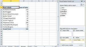
Pivot Tables
Pivot Tables, also known as summary tables, are tables that allow the user to observe all of their collected data in one place to analyze it. Upon entering the data, the user will then be allowed to analyze, find, or use any of the data they may need. A Pivot Table can be used for plenty of topics as well. Such as sales, how often something happens, keeping records of people, and more. For example, we have a short Pivot Table that discusses foods and their sales, after entering more data or leaving it as is, you should be able to use the analyzer tool inside excel and add a slicer.
Sankey Visualizations
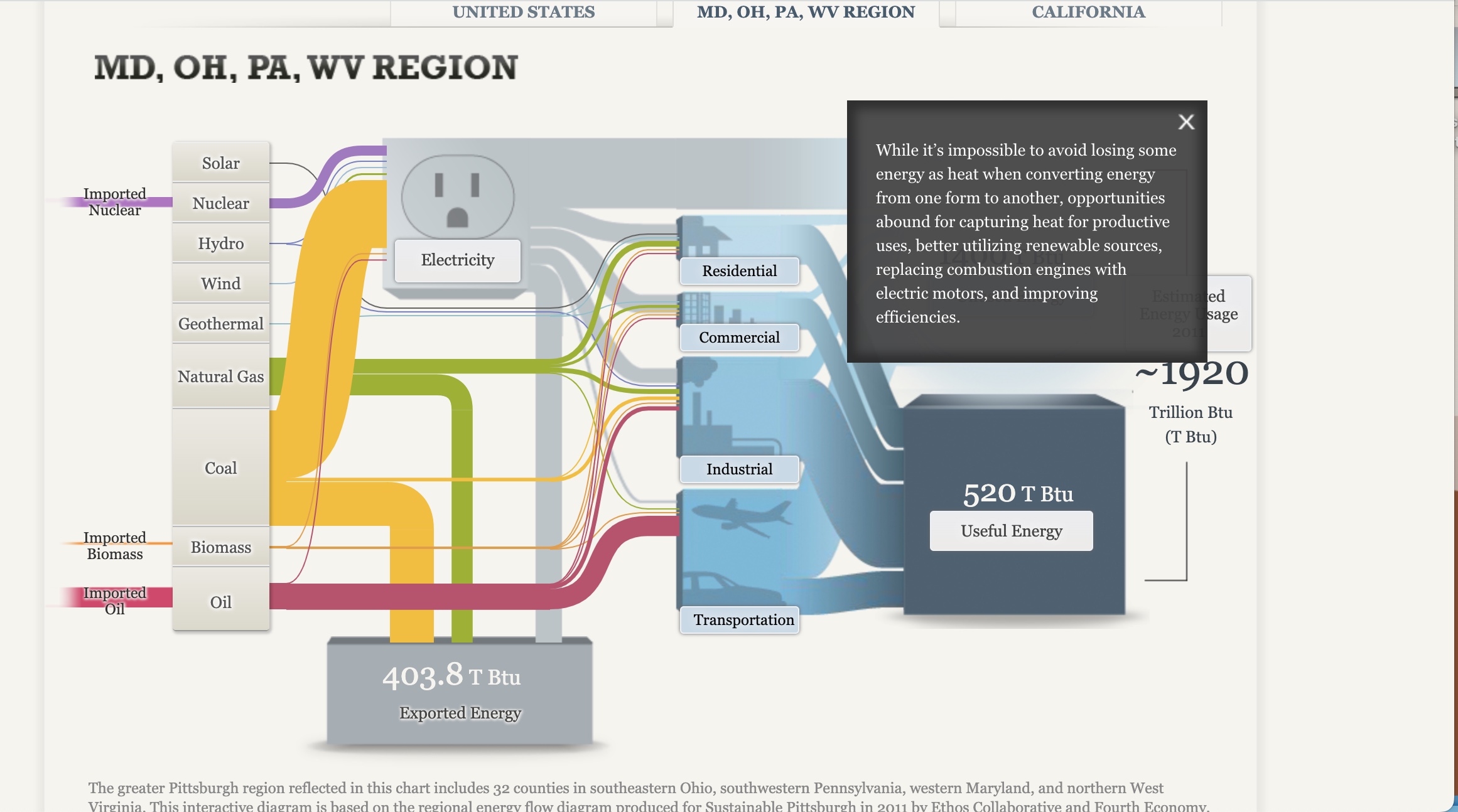
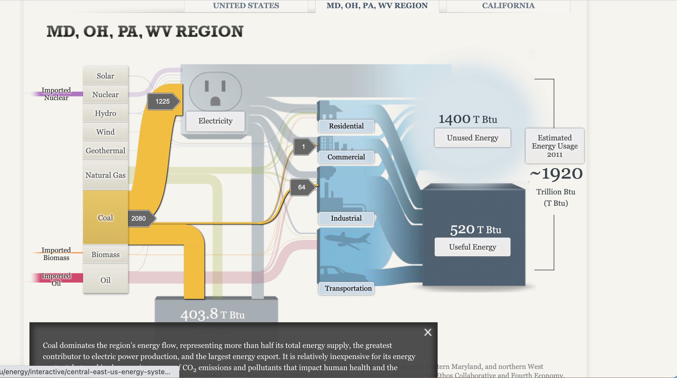
After playing with the site for some time, I got to see the ups and downs of using Sankey. It was nice and useful being able to click the different tabs and have them explain their purpose to the conductive flow, yet I can see where it still can be seen as confusing with the color of the lines being similar despite the background being blurred. I also noticed how some of the information is bunched together instead of flowing together. I would say making it easier to navigate for the person on the site is another way the site could improve
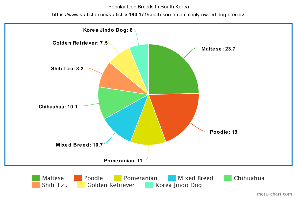
Pie Charts
I chose to display the Popular Dog Breeds in South Korea. I feel as though a pie chart is the best way to visualize this dataset. this is because of the ease that comes with working with pie charts. Pie charts are a type of data visualization that breaks down the slices as categories of their amount or percentage. This lets the consumer know which parts are heavier than others or vice versa. This is because more often than not there are categories close in similarity and very different. The separation in colors aids in what slices belong to each category
Lollipop Charts
Lollipop Charts are a type of visualization that assist in a form of a scatterplot. This scatterplot involves comparing different variations of possibly something in the same category. For the scatterplot, I compared the prices of a BigMac all over the world, with U.S Conversions. Lollipop charts should be used when comparing similarities in data.
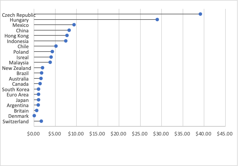
here is my data
Switzerland $1.70 Denmark $0.04 Britain $0.63 Argentina $1.00 Japan $1.06 Euro Area $1.07 South Korea $1.08 Canada $1.47 Australia $1.68 Brazil $1.79 New Zealand $2.01 Malaysia $3.80 Isreal $4.05 Poland $4.30 Chile $5.14 Indonesia $7.45 Hong Kong $7.79 China $8.28 Mexico $9.41 Hungary $29.00 Czech Republic $39.10