Pivot Tables
Pivot tables are a useful data management tool that I have had to learn and use in classes. Pivot tables can help filter through large amounts of data and highlight what you want in an organized table. It is a small step into learning how to create a database and organize mass amounts of data. Below is an example of a basic pivot table and its uses.
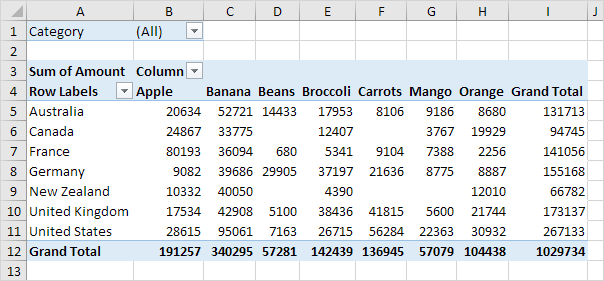
So here we can see a two dimensional table displaying 7 countries and their produce outputs. The drop down arrows next to the word column can change the way the table is organized. You can hide some data as well as shift it from alphabetic order to greatest to least in terms of output production. Hiding data can be useful when you want to display only certain things where any other data may distract from your objective.
Pivot charts can handle a lot of different inputs and a massive amount of data. Pivot tables can be transported across programs. One created in excel can then be shared into a data visualization software like Microsoft Access, Power BI or Tableau. They all take the data from the tables and take their properties and make visuals out of them.
The Cost of Energy
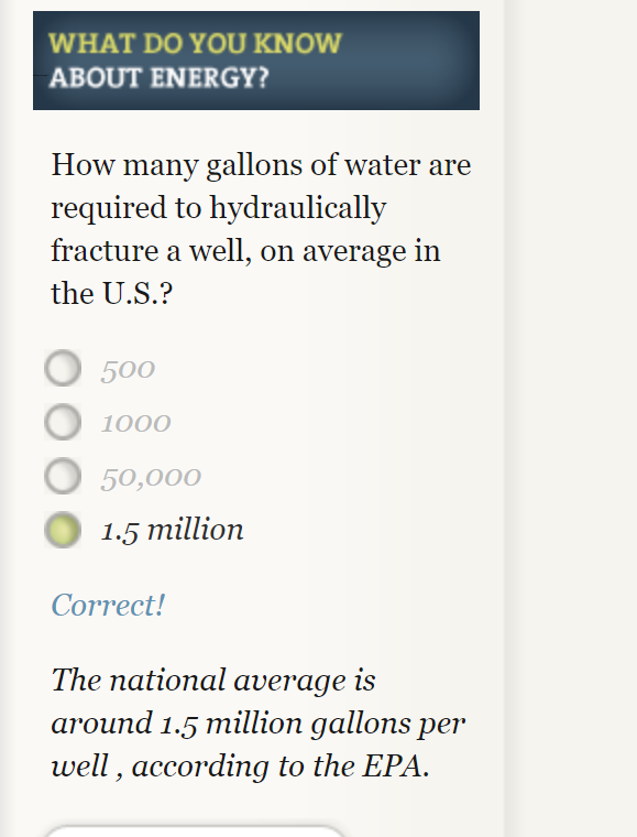
This website has a very immersive interactive display of the way energy is used in society. I spent a lot of my time clicking through and answering questions. That was probably my favorite part of the website, the option to answer questions along with the reading made it more interactive and entertaining. It also helped focus myself on to key facts I should take away. An example of one of these questions is pictured below.
This website provides a very clear and detailed description of different ways we use sources of energy. As a society we use water, wind, solar and other things to generate electricity and some of the statistics provided were very staggering. They used many different types of useful visuals to display increases in energy usage over time. My favorite were probable the simple line graphs because they were effective and clear.
My only problem with the websites layout is that it was often hard to get back to where I was once I clicked a new tab. There were so many links bringing me deeper into the website but I often forgot what I clicked to get back to that information. So some of this information needs to be more easily available with less searching.
Pie Charts
The perfect time to use a pie chart is to differentiate parts of a whole. A pie chart is easy to understand because slices of a pie are just a percentage of the whole thing. Bigger slices are bigger percentages for that variable. Pie charts need to be used sparingly because when they are used wrong they can be very confusing especially if portions of the graph are similar in size. When pie charts are used in the right scenarios they can be one of the most recognizable forms of data visualization.
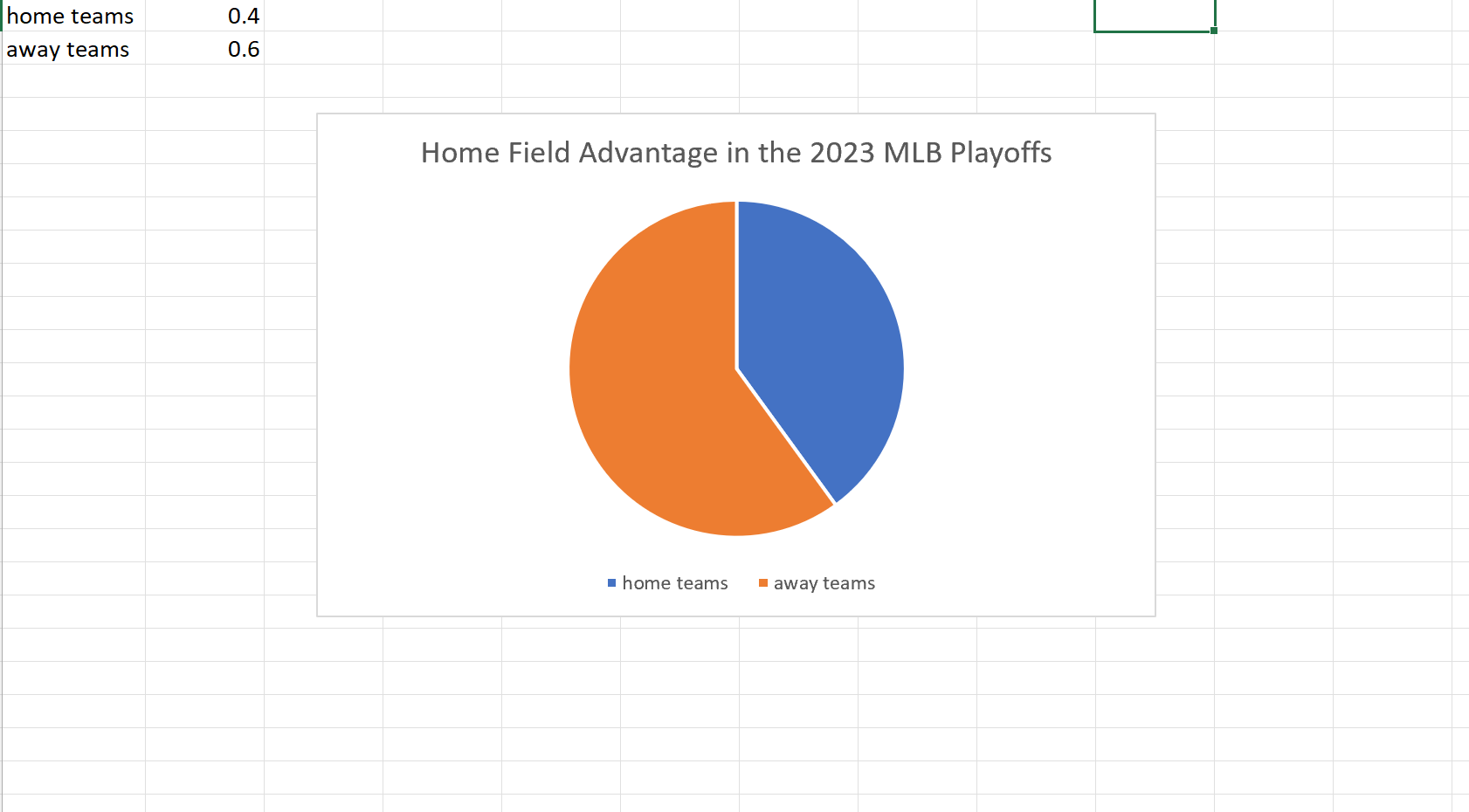
My example of a pie chart takes two variables. The win percentage for the home teams versus that of the away teams in this years MLB Championship Series. Although we usually see home field advantage in sports here we can clearly see a slight edge for the away teams. I found these results surprising but it is a small sample size so that may be why the results could be skewed one way or another.
Usage of Lollipop Charts
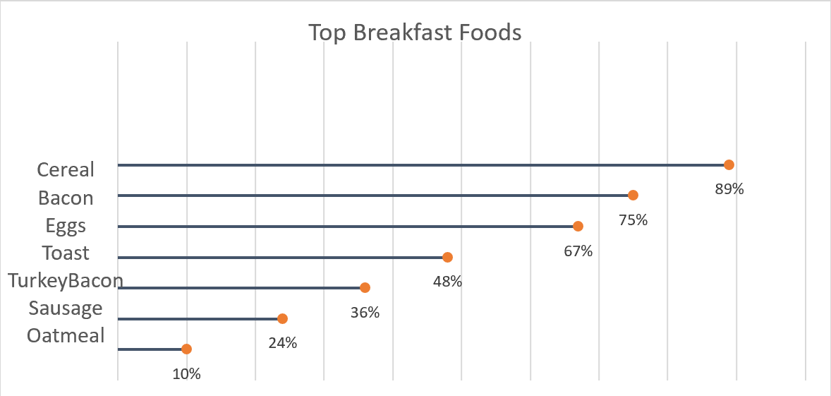
A good way to go about comparing large percentages is through a lollipop chart. Here we made one to show a percentage of the top breakfast foods that people eat. We could have used a bar chart or something similar to portray this same message but a lollipop was useful because we have some data points that are close in length and it also make it look less cluttered. Here we can use a very simplistic design, no need for different colors or legends. The chart I made was done in excel, by using a scatter plot of my data and then adding error bars. After modifying the bars a bit I got the look of bars with a round end point and the final product of the lollipop graph.
Benchmark’s in Data
Many different types of data have an underlying benchmark included. A benchmark put simply is just a target or a goal that the organizer wants to meet or exceed. I have worked for multiple organizations who set these goals on a monthly or quarterly level then looked back over them to make predictions for the future. There are multiple different ways we can use benchmarks to visualize our achievements. We will take a look at some of these different visuals and see which ones work the best to portray a message.
The Benchmark Bar Graph
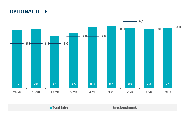
In a bar graph we can compare a value over time very easily but with the addition of a benchmark line we can see which time periods performed the best. Sometimes pure quantity doesn’t tell a whole story. Some months can see higher sales year after year. If we put a benchmark line in that month it is easier to see how it is really performing. This idea is highlighted in the above chart, the 20 year sales have exceeded goals by 2% which is great but as we get closer to the 2 year mark we see a miss of the goal yet a higher total sales. The 2 year mark obviously has a higher target to meet based on history and other factors. Growing benchmarks must mean the company is growing because they are achieving more and more goals.
Benchmark Line Graph
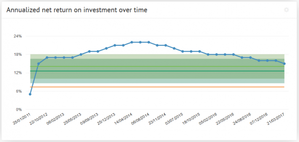
Here we see a different type of measuring a benchmark over time. The benchmark line here is the green portion and we can observe either exceeding expectations or shortcomings based on the blue line above. The benchmark is set steady at 18% and does not change. This means their goals do not change based on history or trends. Without changing goals how would this example grow. If we are trying to meet goals that always stay the same we’ll never see long term growth. Pushing goals up and up based on success will lead to meeting higher goals and higher growth.
Comparing Multiple Line Graphs
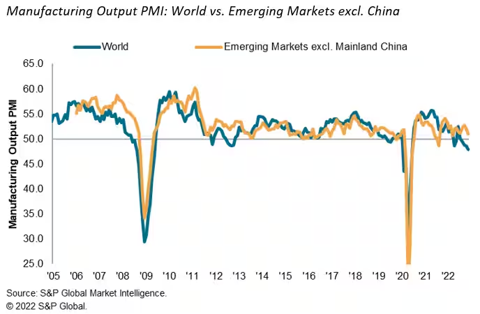
Here we have a graph of the emerging markets and how they stack up against the rest of the world. It measures total manufacturing output over the last 17 years. After a quick glance you don’t come away with much of an impression, this is due to a closely overlapping graph. I think this is a useful graph but it takes some time to really make a judgement on since the two lines are so closely related. I think it would be of more use if we saw it on a monthly level to really get some separation to see where the emerging markets are exceeding the world.
I think after all of these visuals we can understand what a benchmark really consists of. We also saw multiple different uses of them and can probably choose a favorite. I think the easiest one to read was the bar graph with clear benchmark lines that made it clear what points fell where in comparison with the benchmark.
How to Compare Numbers
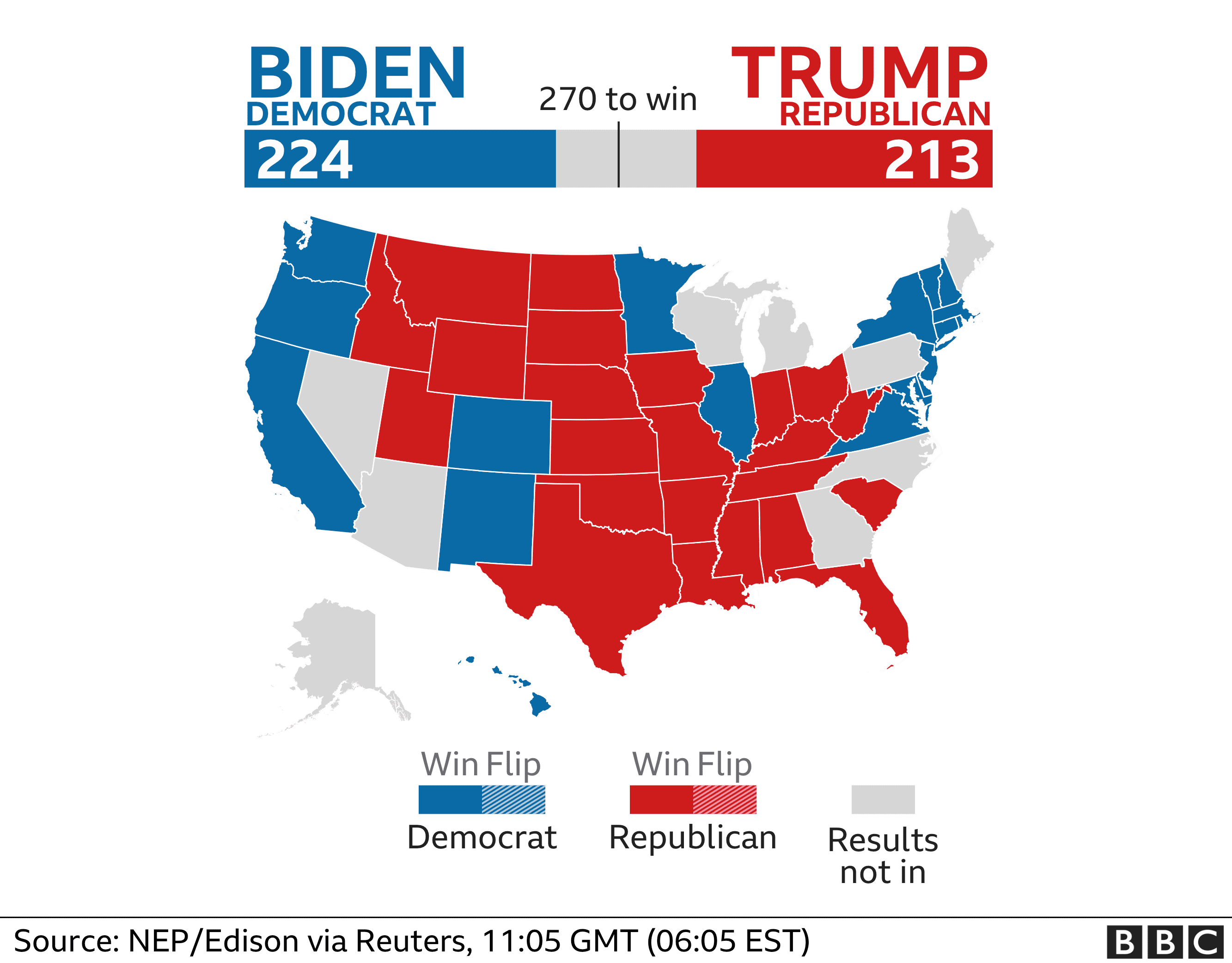
When analyzing multiple sets of data we must remember what the message is that we want to convey. While comparing two numbers to each other it is imperative that we portray them in a way that is easily readable for our audience. The first comparison visual that came to my mind is an election map. The reason this stood out to me is that they compare multiple things at once. They share with the audience the overall electoral votes for each candidate using raw numbers and then share where they came from using color on the states. These are a perfect example of how we want to compare our data, show the data and then the evidence for why it is this way. Pictured below is an example from 2020, notice how easy it is to comprehend at a glance.
Comparison Tools
There is countless ways to do analysis of data to create a comparison visual. The most user friendly is Microsoft Excel to record data and to evaluate it. There are many others however, companies are finding quicker and easier ways to take your data and do this work for you. Coding is something a little less user friendly and understood so companies are taking advantage of this knowledge and creating programs to do analysis and data comparison for their customers. One of these companies is Segment, collecting data “The right way”. These companies are extremely marketable to other organizations who want to do some research and development and don’t have the means to do it themselves.
Attached below is a link to the segment website which includes a product overview and tutorial.
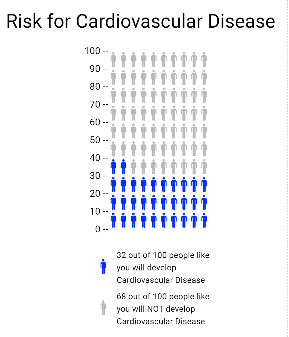
Cardiovascular Health
Through the visualizing health website I gained useful knowledge of a beneficial new tool. This website allows you to view different scenarios and how they may affect your health. For example in the risk calculator you could fill in statistics that resemble yourself and see how you fair against developing certain health risks. I tried multiple different outcomes to see the differences in outcomes. Things like smoking and body weight were key factors for risk of cardiovascular disease risk. A website such as this one can be a valuable tool for people concerned for their health and want to evaluate risk.
The icon array was another tool on the website used for creating a visual representation of risk. I used it to build on to the cardiovascular health from the risk calculator. I took a percentage from that and then made it into an array, pictured below.
How to Make a Useful Infographic
Useful Steps:
A lot of work goes in to successfully presenting information. Infographics have become a more and more popular way to do so. Infographics portray data and information quickly and accurately to your audience. The first step to doing so is to truly understand what it is you are trying to explain. Once you do then you will begin data collection. This step is crucial because your data is your story, if your data is incorrect or doesn’t support your story then your visual will not be useful. After you have data that accurately reflects your idea you must be able to visualize it in a way that is not only clear but appealing to look at. The audience will not take much away from a visual that is confusing or dry. Avoid throwing too much information out in the infographic itself, let the visual do the storytelling.
Infographic Examples:
Below are two different charts using the same data to portray different messages. The use of colors are uniform between both graphs allowing you to flow back and forth between the two. Also helping that idea is how they stacked them on top of each other. Overall these two visuals provide a clear set of information that you could understand without really having any prior knowledge on the subject.
Data Set Examples
Attached is a link to a site with examples of many different, useful, data sets. Click the link to explore the different ways data can be manipulated.


Podcast: Play in new window | Download