Pivot Tables
I have found that pivot tables are good ways to summarize a lot of data. I think they work particularly well with data that involves a large quantity of numbers. They are very useful because they are great visual and interactive ways for readers to conceptualize numbers within the data set and clearly see what is being portrayed in the overall data story.
Here are some great examples of pivot charts and why they are so helpful:
Example #1
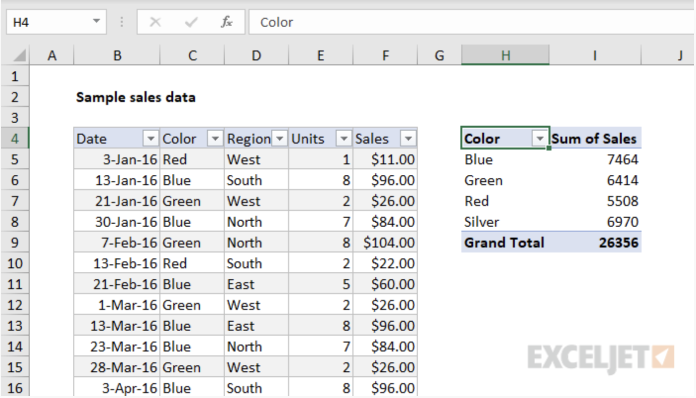
This is an example of a pivot table I got from a very helpful website that shows how to create great tables! On the left is their source data and on the right is their pivot table. It is much easier to see the data within the pivot table because it is much more condensed and only has the information that is important to the reader. Instead of being overwhelmed with numbers and data, it is way more digestible in this form.
Example #2
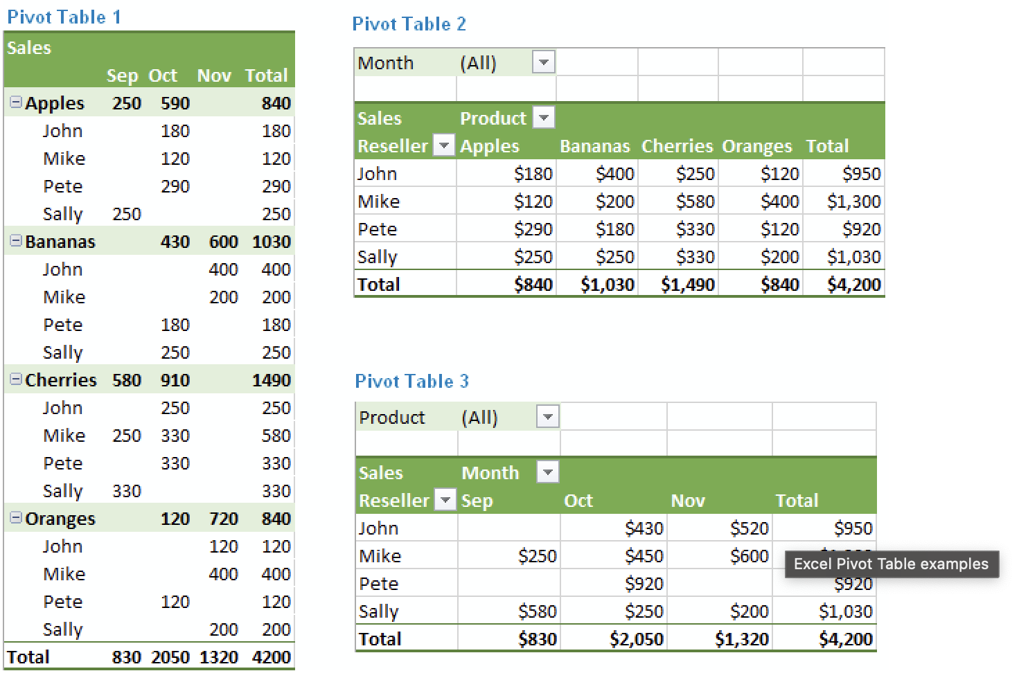
This next example also comes from a really helpful website to aid in creating pivot tables. What I really like about this particular example is that it highlights all the different ways the same information can be laid out. Excel does a really good job at offering the creator choices in layouts to make the creation of an effective pivot chart much easier. As seen here in this example, the layout of a pivot chart can really change the goals of what you want the chart to do.
All in all, I think pivot charts are great ways to display numerical information. There are plenty of websites to help in the aid of creating them and using tools like Excel also makes it very easy!
Sankey Visualizations
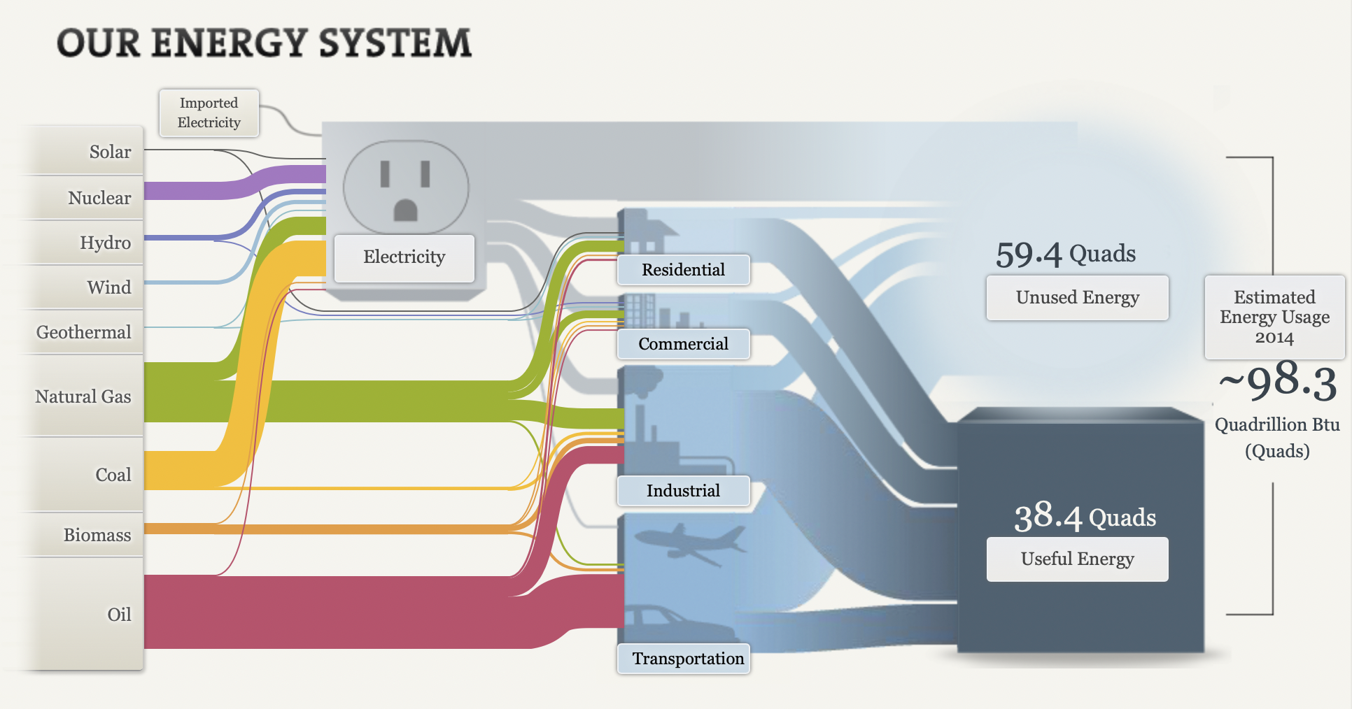
The picture above is an example of a snaky visualization. It is typically used to show the flow of the information being discussed. In this example, it is being used to show the flow of energy and how it is used.
Originally, I was extremely overwhelmed when looking at this chart. I had no idea where to look or where to start. After the initial shock, I just started reading from left to right like I would any other chart. I began clicking around on all the headings and reading what they said. I ended up finding this chart very helpful and interesting!
First, I really like the creativity behind it. It is about electricity and I could tell that right off the bat without actually reading anything on it. Second, I like that the information is hidden within the chart. I think it makes it look a lot more clean than it would if all the paragraphs were jumbled all over the screen. Lastly, I really like how it ties everything together. It starts out with the different kinds of ways we get electric and ends with how much we use.
Overall, while it can be a little overwhelming, I think it is a great way to show data because there are a lot of different facts that can be rolled up in one visualization that is easy to navigate.
Website: http://needtoknow.nas.edu/energy/interactive/our-energy-system/
Pie Chart
The pie chart that I chose to make depicts the poverty level of people under the age of 18 in the United States in the year 2020.
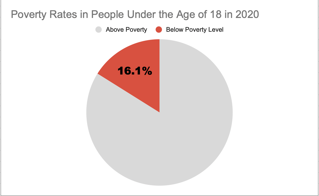
I believe this was a good example of data to use in a pie chart because it represents a part of a whole. Data like this I believe is perfect for pie charts. In this specific example, the whole is the US population under the age of 18 and the part is the percentage of those citizens who are under the poverty level.
This specific data I feel is best represented as a pie chart, however, the other data I found in the article I got this information from would have benefitted better from something like a line chart. That is because not only did this website tell me the percentage of minors under the poverty line, but it also told me that 2020 was the first time poverty rates have increased in the last 5 years. It would have been very beneficial to show the steady decline and sudden increase of poverty rates over the line chart. However, like I previously mentioned, for this specific data example I believe the pie chart was best.
As far as design choices I made for this chart, I chose to go with a bright color to highlight the important part of the chart. I also chose a muted grey color so the audience would focus more on the children in poverty. I also decided to only put the percentage of impoverished children to once again highlight the point of the chart.
This is the website I obtained my information from: https://www.census.gov/newsroom/stories/poverty-awareness-month.html
Abigail Moore