Sankey Visualizations
By Ryan Metch
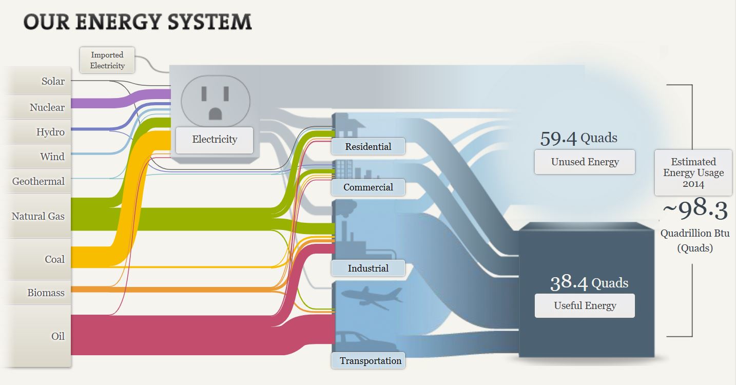
A Sankey visualization is a very unique way to display data. Sankey visualizations are a type of flow chart that can also be interactive, allowing the reader to click on certain areas of the chart to unlock more information on that topic.
In this screenshot I wanted to show just how much information there is in a Sankey visualization, because looks can be deceiving. All of the labels on this chart are actually links to more information on each topic. When you click on them it will further immerse you in that topic, this is something that a lot of charts cannot replicate making Sankey visualizations a very powerful tool.
Using Pie Charts
By Ryan Metch
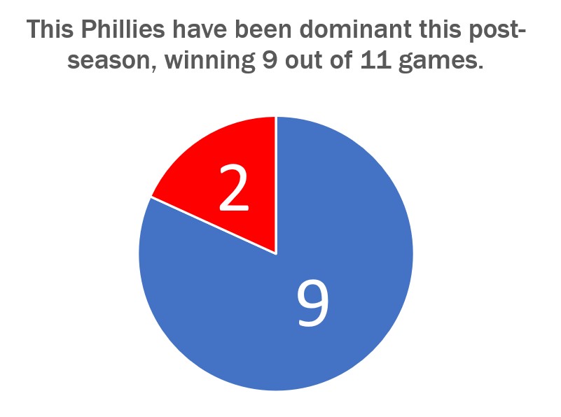
There are many ways to use a pie chart, but also many ways to misused one. The pie chart is a staple in data visualizations and is one of the most popular graphics used. To use a pie chart successfully there a few key pillars to go by; first, make sure that the pieces of the pie add up to a whole number which is already presented to a reader. For example most pie charts have pieces that add up to 100% the number 100% does not need to be displayed to the reader as it is already assumed that the pieces will add up to that number. Only present the number the pieces are adding up to when it is something other than 100, for example the pie chart shown above adds up to 11, and this number is clearly listed above. Second is that the pieces are clearly labeled with a number or image. This ensures that the pieces can easily be identified. Third is that the slices are color assigned to their value to show differences in the data. Fourth and final is that the legends clearly explain the data so the graph is easy to read.
Benchmark Comparisons
By Ryan Metch
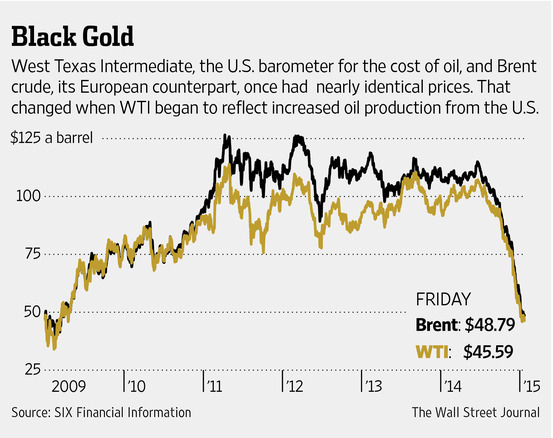
Using visualizations such as benchmark graphs allows us to better understand different types of data. The definition of a benchmark graph according to google is a visual tool that shows how fractions compare to a whole on a number line. Going off this graph from the Wall Street Journal, we can see how prices of European and American oil compare to one another. We can clearly see when changes occur on this graph, which is why a benchmark graph is a great tool to display this type of data.
Comparing Numbers Through Data Visualization
When comparing data across multiple categories it is crucial for the reader to understand the graph first. A good graph will label their axis’ along with the numerical values of their data. When analyzing the graphs, the reader can use the similarities between the graphs and the data to compare them. Through this comparison of data, a deeper understanding of the graphs can be reached. Visualizing the data makes comparing data especially easy, as the reader can quickly go from graph to graph reading the data. An article from Medium.com further explains the importance of visualizing data, the author states “humans will face a lot of difficult time interpreting datasets because normally human eyes can’t process a lot of information simultaneously, which is the job of data visualization to make it easier for us to understand.” This quote makes it easy to understand why data visualization is important when comparing numbers and data
Using Arrays for Data Visualization
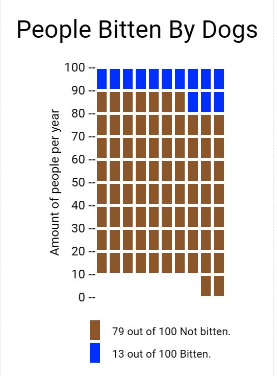
My experience using icon array was good. I enjoyed how easy the cite was to use and navigate. The array tool was very easy to use. I think this tool can be very beneficial for data analysis and visualization. I developed this array on the percentage of people who were bitten by dogs per year. As you can see the data is very easy to visualize and understand, which is why I like this method of data presentation. I believe others should use array icon too in any type of presentation they may have.
Insightful Data Visualization
Data graphics are an especially useful way to share information quickly and effectively. Somewhere data graphics can be useful is the classroom. To summarize from “8 Examples of How Middle Schools Can Incorporate Infographics in the Classroom” article from Venngage; within a classroom there is so much information for student to absorb. Having data graphics on the walls of the class would greatly help students in retaining information. Other ways data graphics could be used is for introducing new material to students, the visuals will be a nice aid for student who are learning topics for the first time. In conclusion information graphics can be a helpful tool for students.